

Notes on building smarter websites for actual humans.

What Your Website Is Really Saying (and Why Most People Get It Wrong)
Your website communicates long before anyone reads a word. Learn how Squarespace web design, UX strategy, and clear communication shape first impressions, build trust, and convert visitors into confident buyers.
Picture this: someone lands on your site for the first time. They don’t read a single word - not yet, anyway. They scan, they scroll, they feel.
In about three seconds, they’ve already decided whether your site gets them or not.
That’s not magic - that’s communication design. Your layout, colors, and copy are already saying something. The only question is: is it the right thing?
Most sites unintentionally send mixed signals - they’re trying to be helpful and unique but end up confusing or overwhelming their visitors. As a designer and strategist, I’ve seen this across eCommerce shops, nonprofits, and service-based businesses alike. The fix isn’t another redesign. It's not about picking a new template or adding more copy. It’s about taking a step back and getting the conversation right.
Websites Are Conversations, Not Brochures
Your website is having a conversation with every visitor - even before they start reading. Layout, photography, copy, and structure all speak volumes.
Think of your site as a stand-in for you at a networking event. Are you friendly and confident, offering a clear sense of who you are from the first handshake? Or do you ramble, jump between topics, and make people guess what you actually do?
That’s the difference between a clear website and a confusing one. A good site introduces itself, makes eye contact, and leads the conversation in a way that puts others at ease. A bad one leaves people looking for the nearest exit or begging for a friend to come save them from the conversation.
Your job is to make sure that first impression feels natural and intentional, not awkward or unclear. When your website opens the conversation confidently, the rest of the interaction flows naturally - visitors lean in, not away. And now that we have them, the real work begins which we're going to get to next.
👉 Related reading: You Don’t Need More Traffic, You Need More Trust
Three Common Mixed Messages
Every site, no matter how well designed, can end up saying the wrong thing in subtle ways. Here are three of the most common mixed messages I see across client projects - moments when the website’s conversation with its visitor goes sideways. If you’re a visual learner, you can also watch me walk through these same examples in my guest video on Inside the Square’s YouTube channel:
1. The Mystery Headline
If your main headline could apply to ten different industries, it’s not helping you. Remember: clarity first, clever second. “Custom Squarespace websites that build trust and drive sales” works far better than “Design that inspires.”
2. The Menu Maze
Your navigation should guide, not confuse. The biggest impulse people seem to have is to just keep adding more links but I would argue that it's way better to keep it short (five or fewer top-level links) and label pages in everyday language. “Work With Me” says far more than “Experience.”
3. The Everything Button
When every section shouts for attention - Shop Now! Learn More! Subscribe! - visitors stop listening. Prioritize one clear goal per page. A calm, confident site feels more trustworthy than a busy one. If you're worried that this sounds boring, buckle up, I've got news for you.
👉 See also: UX Tips for Every Phase of the eCommerce Journey
Why Familiar ≠ Boring
There’s a myth that familiar design equals bland design, but let’s be honest - that myth was probably started by someone who confuses chaos with creativity. Familiarity isn’t boring; it’s comforting. It’s the quiet confidence of a site that knows exactly what it’s doing. It's a big 'ol mug of hot cocoa.
Our brains are wired to trust patterns we recognize - it’s called familiarity bias. When your layout behaves the way users expect, they don’t have to think about where to click or how to navigate. They just get it. That sense of “I know how this works” lets them focus on your message instead of figuring out your interface.
Think about your favorite neighborhood coffee shop. You don’t need to re-learn where the sugar packets or napkins are every time you visit - they’re always in the same spot. You go there because it’s predictable in the best way. A good website should work the same: welcoming, easy, and familiar enough to feel safe, even if it’s your first visit.
Familiar design doesn’t mean unoriginal. It means frictionless at all the right points, stepping in only when necessary to engage and guide (think product variant choices or confirmation steps). Familiar means your visitors are free to notice your story, your offer, your value - instead of your layout. Creativity still belongs, but it’s there to serve the experience, not steal the spotlight. Use it in your copy, your photography, and your little brand moments, not in hiding your navigation or rethinking the contact button. Visitors want reassurance, not puzzles. Unless you're a puzzle site in which case, maybe that would work nicely for you!
👉 Try this next: How To Decide Between Sales & Discounts
The Bottom Line
Design is not decoration, it’s communication. The best websites don’t shout to be seen; they lead with confidence and clarity. Every element, from layout to language, should help your visitor understand who you are and what you want them to do next. When you design with purpose instead of polish, you create trust. And when you create trust, you don’t need gimmicks or flash to stand out - you simply feel solid, credible, and right.
I love design as a tool to earn trust and provide reassurance. Done right, design can close the loop between what your brand promises and how it behaves online. It allows you to show up with intention, invite people in, and leave them thinking, that felt easy. It should make you feel the same way a great conversation at that imaginary networking event ends - comfortable, confident, and clear about who you just met and why they made such a good impression.

Think Like a Buyer: How to Map Your Customer Journey
Most websites are built like a checklist. But what if your site could do more than just… exist? Discover how thinking like a buyer and mapping their journey can transform your website into a powerful sales tool, leading to more conversions and happier clients.
Most people design their website like a checklist:
✔ Design homepage
✔ Add services page
✔ Set up contact form
And technically… they’re not wrong. But if you only focus on what you offer (and ignore what your customer actually needs), your site experience can quickly break down. So instead of just building out pages because you think you should, let’s look at what really guides your buyer’s decisions so you can create with purpose.
Because your buyer isn’t following your site structure. They’re following their own journey - one that’s part emotional, part practical, and 100% driven by how well you earn their trust.
If you want more sales, whether you provide services, digital products, or a full-blown eCommerce storefront, you can’t just think like a business owner.
You have to start thinking like a buyer.

How to Improve the Add to Cart Rate on Your Squarespace Website
Tired of low "Add to Cart" rates on your Squarespace store? This post reveals why focusing before the click is crucial for organic sales. Learn how a blog can build trust, answer customer questions, and drive traffic, turning your Squarespace site into a powerful sales tool.
You’ve built a beautiful Squarespace store. Your product pages are polished, and your “Add to Cart” button is ready for action.
But… no one’s clicking it.
Here’s the problem: most small product-based businesses focus all their energy on the store itself—on what happens after someone lands on the site. But if you want more organic sales, you need to start earlier in the journey.
The Journey Before the Click
As Kristine Neil often says, the real strategy is about what happens before your customer clicks “Add to Cart.” It’s not enough to hope your product pages will do all the heavy lifting. You have to guide people there with purpose.
What questions are your customers asking before they even land on your site? What hesitations do they have? What would help them feel confident in their decision to buy from you?
That’s where content comes in.
The Blog: Your Most Underrated Sales Tool
Most Squarespace eCommerce sites don’t have a blog—and it shows.
A blog isn’t just a place to “share updates.” It’s the mechanism by which your business gets discovered—because people are already going to Google searching for what you offer.
Your blog is also a tool to:
Build trust with potential customers
Position you as the authority in your industry
Show your product in real-life context
Answer questions people didn’t even know they had
Good news! Squarespace makes blogging easy–and it's built right into your Squarespace website. You can easily format your posts, optimize them for search, and use features like Summary Blocks to strategically guide visitors to your products or other key pages on your site.
In short: A blog creates connection, clarity, and compelling reasons to take action.
"But I Don’t Have Time to Blog…"
Totally fair. Most makers and small product business owners are already stretched thin. You’re managing inventory, fulfilling orders, handling social media… and blogging sounds like one more impossible task.
But here’s the thing: Instagram posts disappear in 24 hours. Blog posts live on your website forever and continue working for you for weeks, months, and even years—building a robust resource library that brings in new traffic and supports your business growth long-term.
It’s a much better investment of your time than content that disappears in a day—and if you decide to keep using social media, having blog content makes it much easier to create posts—providing tons of content that can be repurposed anytime, not only by you, but also by anyone helping you in your business.
You don’t need to blog every week. You don’t even need to write it all yourself. You just need a plan. (And yes, you can outsource this.)
“What Should I Blog About?”
If you're not sure where to start, here are a few ideas for product-based blog posts:
How to Use Your Product: Tutorials, styling tips, or recipes.
Behind the Scenes: Share your process, materials, or inspiration.
Customer Spotlights: Tell stories about how people use and love your product.
Seasonal or Gift Guides: Help people find the perfect item for any occasion.
Problem/Solution Posts: What’s a challenge your product solves? Write about that.
Each post brings new people to your site—and each one moves them a step closer to buying. And remember: your blog shouldn’t be all about your business—it should be about your customer. Stay focused on helping them, answering their questions, and meeting their needs, and you’ll see better results.
Scale Beyond Social
If Instagram is your main marketing tool, you’re building your business on rented land—you don’t own your account or your followers. If your account gets shut down (and this does actually happen), you lose everything.
It’s also impossible to know whether your so-called “audience” is even made up of potential customers. It’s not uncommon to see someone rack up likes and followers while selling zero products. A blog on your own Squarespace site gives you a lasting, scalable way to grow your business by building a real connection with the right people.
Even better: you can use your blog to grow your email list. Remember that people are far more likely to engage when they get something in return. Offer a discount or freebie in exchange for an email address, or invite readers to subscribe for early access to new products or behind-the-scenes content. Lead generation is just as important for product-based businesses as it is for service-based ones—and your blog can be the engine that drives it.
Want to learn how to make this work for your business?
Learn the Framework
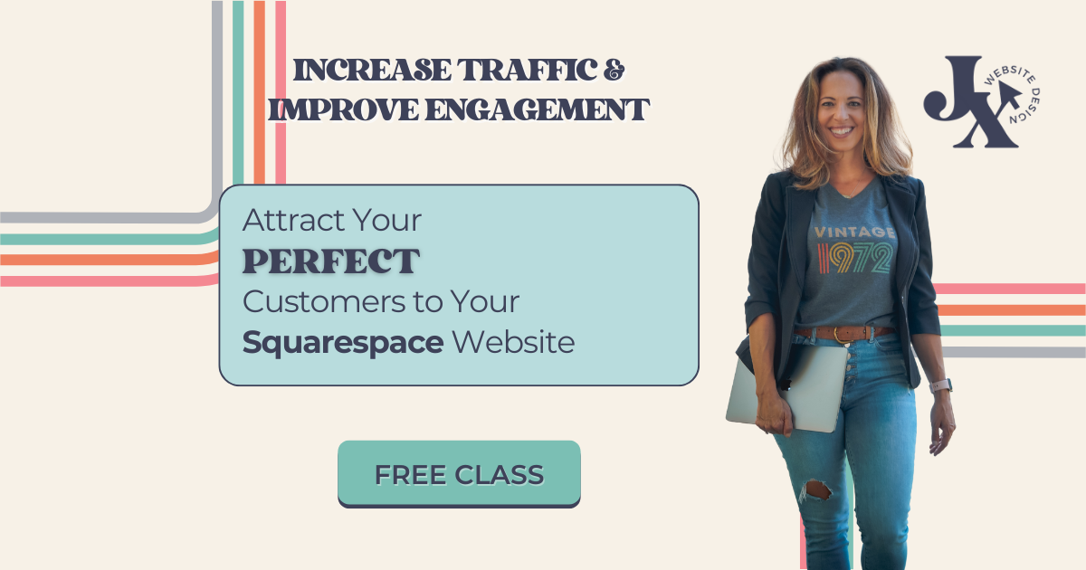
I created a free class called The 3-Part Framework for Increasing Organic Traffic to Your Squarespace Website, and it’s designed for small business owners just like you.
I’ll show you how I used this method to grow my traffic without ads or social media—and how you can use it to attract more of the right customers to your site and transform your business into the one you imagined when you started your business in the first place.

This article was written by Jennifer Barden, founder of Jen-X Website Design and Strategy.
Many Squarespacers feel defeated when their websites don’t attract and engage visitors.
In my blog, I share my secrets for effective Squarespace website design and strategy so that DIYers and Squarespace Website Designers can learn tips for building Squarespace websites that attract and engage the right visitors.

7 Proven Email List Building Tips for Squarespace Shops
Discover 7 effective strategies to grow your email list and boost sales on your Squarespace eCommerce site. Learn how to attract subscribers and drive customer loyalty.
If you're running a Squarespace Commerce site and haven't tapped into the power of email marketing yet, you're missing out on some serious revenue potential. Trust me, as a seasoned Squarespace expert and eCommerce strategist, I've seen firsthand how a well-crafted email strategy can skyrocket your sales and customer loyalty.
But here's the thing: Before you can start crafting compelling email campaigns, you need to build a list of eager subscribers ready to engage with your content and offers. Luckily, with a few savvy strategies and some irresistible incentives, you can transform your Squarespace site into an email list building powerhouse.
So, grab your favorite beverage, get comfy, and let's dive into my top 7 tips for growing your email list like a pro. These tried-and-true tactics have helped my clients boost their subscriber count and drive real results. Let's get started!
Offer an irresistible sign-up incentive - A discount code or offer of free upgraded shipping on their first order can be just the motivation people need to sign up for your emails. This strategy works especially well for new, small, or lesser-known brands that may need an extra nudge to encourage potential customers to try their products.
Leverage Squarespace's promotional pop-up feature - Grab your browsing shoppers' attention and drive sign-ups by utilizing Squarespace's built-in promotional pop-up tool. Customize the design and messaging to align with your brand and offer a compelling reason to join your list.
Include an email opt-in form in your website footer - Ensuring you have an email sign-up form in your footer means it will appear on every page of your site, maximizing conversion opportunities. Keep the form simple and straightforward, highlighting the key benefits of subscribing to your list.
Incorporate email sign-up into your checkout process - Make joining your email list a seamless part of your Squarespace checkout process. Add a checkbox or opt-in field to your checkout page, making it easy for customers to subscribe while completing their purchases. For more tips on optimizing your checkout, check out my post on creating a seamless checkout experience.
Create exclusive, gated content upgrades - Develop valuable content pieces related to your products or niche, such as guides, checklists, or insider tips. Position these resources as "VIP customer access" materials, requiring an email address to unlock them. This approach helps build your list while providing genuine value to your audience.
Pitch your list in post-purchase emails - After a customer makes a purchase, use the auto-confirmation email to highlight the benefits of joining your email list and include a sign-up link. This is a great opportunity to engage with customers who have already shown interest in your brand. If you want to take your post-purchase emails to the next level, check out this post on customizing transactional emails.
Experiment with creative calls-to-action - To find what resonates best with your audience, test different calls-to-action on your email sign-up buttons. Try phrases like "Join the VIP List," "Become an Insider," or "Get Exclusive Offers" instead of generic phrasing like "Subscribe." Track which CTAs drive the most conversions and optimize accordingly.
Actionable Takeaways
Choose an enticing sign-up incentive that aligns with your brand and target audience
Set up a pop-up and footer opt-in form on your Squarespace site today
Brainstorm a valuable content upgrade you can offer as a "VIP" opt-in incentive
Test at least 2 different CTA phrases on your sign-up buttons this week
FAQs
-
Aim to email your list at least once a month to keep your brand top-of-mind, but not so often that you overwhelm your subscribers. Consistency is key!
-
Mix it up with a blend of valuable content, exclusive offers, product updates, and behind-the-scenes peeks into your brand. Focus on providing value, not just pushing sales.
-
Keep an eye on your open rates, click-through rates, and conversion rates. If you're not seeing the results you want, don't be afraid to experiment and try new approaches.
Bottom Line
There you have it – 7 powerful strategies to supercharge your email list growth on Squarespace. Remember, building a thriving list takes time and consistency, but with these tips in your toolkit, you'll be well on your way to cultivating a community of loyal subscribers who can't wait to hear from you. So, pick a strategy, implement it on your site, and watch your list and your sales grow! You've got this!

6 Simple Tips for eCommerce Photography that Converts
The secret to more orders and fewer returns? Great photos! Learn the ins and outs of impactful product photography for your eCommerce site. Whether you choose to DIY or go professional, these tips will make sure your images really shine. Plus, discover my resources for great eCommerce photos to fit any budget!
Updated Jan 2024
I’ll avoid starting this post with the whole “a picture is worth a thousand words” schtick and just get right down to it: crap photos are killing your shop’s vibe. Images that are dark, blurry, inconsistent or make it difficult for people to see what they’re actually buying are more than just a turn off. Did you know that an estimated 22% of online purchases are returned simply because the item looks different in person than it did online? That’s a huge number but one we can easily improve upon simply by having better photos to begin with. More orders and fewer returns? Yes, please.

ECOMMERCE PHOTO TIP #1
Lighting is everything.
The best thing you can do to make your DIY photos look more professional is pay attention to the lighting. Just like none of us likes how we look when our pics turn out dark and gloomy, your products feel the same way!
Depending on the style you’re going for you could either wait around for some great natural light or invest in a few items to set up your own little photo studio. There are lots of options out there for stands, lights, backdrops and other accessories to make sure your products are shown in the best possible light.

ECOMMERCE PHOTO TIP #2
Go for clean backgrounds, or none at all.
I almost always recommend that each product have at least one image that has either a white/light background or no background at all. Photos with clean backgrounds make your shop look super modern and easy to browse, cutting down on too much visual clutter.
You can add fun photos with colored backgrounds or patterns as additional product images but the main product thumbnail almost always looks best with a very simple background. To achieve this look on your own, you will need to brush up on your Photoshop skills and pay attention to things like shadows to keep things looking professional.

ECOMMERCE PHOTO TIP #3
Keep your style consistent.
Coming up with new photoshoot ideas is great and all but remember that your product photos are all part of the bigger brand story you’re trying to tell. Keeping your style consistent can also help people identify your brand at a glance even if they interact with it on several different platforms i.e. your website, your social media + any other channels you may be selling on such as Etsy or Amazon.
You can create consistency in your photos by using the same backgrounds or scenes or by sticking to a well-defined color palette in your images.

ECOMMERCE PHOTO TIP #4
Use high-res images that are “zoom-able”.
One of the hard things about shopping online is that you miss out on the sense of touch. Without your potential customers being able to feel what they’re buying, give them the next best thing and make sure your images are high resolution and look great even when zoomed way in. I can’t tell you how many times I’ve been shopping online and appreciate the ability to zoom in to really see things like fabric details or the texture of a product. So helpful!
To enable product image zoom on Squarespace: from the product details page, click EDIT > click the Pencil icon > select ZOOM from the HOVER ACTION drop down menu.
Image size tip! Even though you can upload images up to 20MB, using images that are 500KB or less will help make sure that your site loads quickly.

ECOMMERCE PHOTO TIP #5
Show the whole product from all angles.
Again, the goal of eCommerce is to give people as much information as they could get if they were shopping with you in person. One way to do this is to make sure that you have images of the front, back and sides of your product. Even better - a 360° video or spinning gif!
It’s also important (and this really should go without saying) that you show your whole product in photos! This isn’t the time to get artsy with weird cropping, either intentionally or unintentionally.
One of the most common questions I get is how to fix product images from getting cut off on Squarespace. For this, you’ll just want to make sure that your finished photos all have the same ratios. They can be square or 2:3 or whatever you want them to be, they all just need to be the same to make sure they always look as intended.

ECOMMERCE PHOTO TIP #6
Have a photo of every product variation.
Lastly, even if you think your product variations are super simple and straightforward - take a picture of each and every one of them! This is obviously important for things like color variations but are also nice for product variations that come in different sizes or flavors. For example:
Color variations - example: you sell sweatshirts available in red, blue and green. Have one main pic that shows all three together + one image for each color variation.
Size variations - example: you sell candles and offer a one pack or a three pack. Have your main image be the single candle and a secondary image that shows three candles together.
Flavor variations - example: you sell CBD gummies that come in four flavor options. Have one main pic that shows all four flavors + one image for each flavor variation.
Bonus Budget eCommerce Photography Tip
If you’re going to invest in photography, I say it’s 100% worth it to spend the money photographing your products first. You can check out this post all about how to integrate free stock images for things like website backgrounds or other non-shop pages of your website. So, if you need to, don’t feel bad about using some carefully curated stock photos to set the mood or tone for your site. Just come in strong with your stellar product photos and things will feel personalized, professional and ready to sell.
My Recommended Source for Easy eCommerce Product Photos

Let’s say your calling in life isn’t to be a photographer. What to do? Meet Soona. Finally, an easy way to get great-looking photos and take the stress out of finding and hiring a photographer you can trust. Soona calls themselves a “self-service content creation platform” and here’s how they work:
You book a virtual shoot (or in-person if you’re near LA, Seattle, Austin, Minneapolis or Denver). You can choose from their different image or video packages or just select what you need ala carte. You can add-on special things like having a hand model, full body model, or even a pet model 😻 depending on your needs.
Mail them your products.
On the day of your shoot, you join in virtually where you can interact with the crew to give real-time feedback so the photos are exactly what you’re looking for.
Once your shoot wraps, you select the photos (or videos!) that you love and the finished, ready-to-upload results are sent to you within 24 hours. Flat-rate pricing ($39 photos & $93 videos) makes it easy to stick to your budget.
Here’s what I love the most about this process: you only pay for what you love and know that you’re actually going to use… versus paying a photographer hourly for a photoshoot where you’re not even sure what the results will be for weeks, sometimes months.
Overwhelmed by choices? Check out the eCommerce Starter Pack!
p.s. All pics in this post are from Soona!

A Step-by-Step Guide to Starting an eCommerce Business in 2024
Do you have a great idea for an eCommerce site but no idea where to start? This quick step-by-step guide will help you cover the basics, launch quickly, and be able to start selling with confidence on Squarespace. We’re going lean and mean!
In my many (many) years as a web design and former design agency owner, one of the biggest traps I've seen new business owners and startups fall into is wanting everything to be absolutely perfect before launch day. And not just in a “let’s make sure to spell check the copy” kind of way. No, more in an “analysis paralysis”, perfectionist kind of way. Here are some of their trademark behaviors:
They get stuck on minute details that won’t affect their initial sales or long-term success.
They put off launching while they worked on extras that could have easily been added in Phase 2 (or 3… or 5… or 10) of the project.
They research and research and research but never actually make decisions.
They stall out because they’re afraid they missed something.
And if you’re wondering why you clicked on a blog post about how to start an eCommerce business in 2024 and landed instead on a little side story about people who’ll probably never launch, here’s why:
Because I want you to see how simple it is to just do it.
One of the things I love about Squarespace is how easy it makes it to just jump in and start selling. You can’t put off making sales while you wait for your website to be ready for you. You need to start selling ASAP. The rest can come later.
Taking a Lean-Agile Approach to Web Design & Development
Let me tell you how my little minimalist heart just sings at the sound of the words “minimally viable product.” When others hear it and think “barebones”, I hear the cha-ching of that cash register ringing.
An MVP product is one that starts lean so that you can:
Keep initial investment costs in check.
Get feedback before adding on new features.
Start seeing revenue right away to fund and finance the implementation of those features.
It makes sense in product development and app development and all sorts of other areas so why not web design?
So here we are: how to actually make it happen.
The Step-by-Step Guide to Starting an eCommerce Business in 2024
I could write a college textbook-sized document that covers all the things you could ever need or want to do on your website at some point but these are the things that you need to launch your MVP site. You know, the one that’s going to start making you money ASAP before you even crack open a book. We’ll dig into each of these things in detail in a bit but here’s our shortlist of absolute must-haves:

The Right Website Subscription
A Domain Name
3 Basic eCommerce Settings (Money, Taxes, Shipping)
Simple Content + Images
Legal Policies
With these things set, just add your products and you’ll be ready to sell!
Now let’s dig into each item in more detail:
The Right Website Subscription
There are two parts to this: the right website platform + the right subscription plan.
Now, it’s no secret that Squarespace is the MVP of MVPs. It’s my eCommerce website builder of choice and it should be yours, too. Some people will tell you (falsely) that if you’re in eCommerce you’ve “got to be on Shopify” and - sure- that’s an option you could totally look at.
However, as both a longtime Squarespace Circle Member and a Certified Shopify Partner I feel like I’m uniquely qualified to speak objectively about both platforms. I’ve built sites of all types and sizes on both and yet still choose Squarespace 9 times out of 10 for the sites I work on. Here’s why:
Ease of Use - I’m guessing you didn’t get into business to also learn how to code something as simple as a landing page or contact form. You’re most likely going to be the one managing day-to-day things on your site and I don’t want you to go mental trying to do so.
More Commerce Features - Yep, you read that right. On Squarespace, you can offer more product variations and sell more product types all without the need for paid plugins.
Limited Monthly Costs - You’ll find no one that hates feeling nickel-and-dimed more than me so the type of thing that really grinds my gears is when you pay a monthly fee to a service provider only to quickly realize that in order to do what you really want you’ll need to sign up for 8,342 additional paid apps. Welcome to the Shopify experience: where the world is at your fingertips so long as you’re willing to string together multiple third-party apps with questionable security levels in order to do the one thing the platform claims to be able to do well: sell stuff. With Squarespace, everything’s built right in with the exception of a few very specific optional add-ons making it easy to not just sell but to run your entire business without the need for multiple additional paid apps.
(For more Squarespace vs. Shopify comparison notes check out this post: Squarespace vs. Shopify: Which is Best for Small Business?)
So now that we’re all on the same page with Squarespace, it’s just a matter of picking the right plan. I break down all the options in detail here but here’s the TL;DR:
Choose Basic Commerce ($27/mo) if you’re just getting started and are in super cost-saving mode. You can switch plans at any time so you can always upgrade later. This plan is probably also sufficient for smaller sellers whose primary income isn’t generated online.
Choose Advanced Commerce ($49/mo) if your eCommerce website is the centerpiece of your business. The advanced tools really are what’s going to help you compete most effectively and they come at a pretty reasonable premium over the Basic plan.
A Domain Name
Hot tip before we jump into all things domain-related: if you pay for your Squarespace subscription (above) annually you can register a new domain name FOR FREE for the first year! This will not only save you a few bucks, you’ll never have to figure out how to log in to your “web host” ever again. Because it’s Squarespace. And it’s all just right there. 🧘♀️ZEN
Ok, now on to picking a domain name. I have two slightly contradictory pieces of advice on this front:
On one hand, your domain name is super important. Probably more important than your business name or your product names or your brand colors or anything else.
On the other hand, just pick something and keep on trucking.
In this post, I give a bunch of my been-there-done-that advice on domain names but since we’re going for simple here, my number one piece of advice on domains is this:
Go for the .com version! Vanity domains are becoming slightly more ok but if you absolutely can, find a .com domain that you can live with instead. People will get your vanity domain wrong, like, 96% of the time and that’s annoying for them and bad for you.

Beyond that, I just recommend keeping things as short and easy to spell as possible!
3 Basic eCommerce Settings (Money, Taxes, Shipping)
eCommerce doesn’t have to be scary! There are 1,001 settings and features and options but what it boils down to when you’re just getting started is:
Have a way to get paid
Make sure you’ve got your tax situation on lock
Put together a simple shipping strategy
That’s it. Everything else is secondary or can be added on and taken care of later.
Money - Create a Stripe account so that you can accept cards plus Apple Pay and Afterpay. One account, all the payments. Simple. (More here.)
Taxes - Put ‘em on autopilot.
Shipping - Don’t be stubborn. Just offer free shipping already. Here’s my #1 most recommend strategy in detail!
Simple Content + Images
This is one of my 3 Mistakes New Online Sellers Make: they say too much. Yep, that’s right. Most eCommerce newbies feel the need to write way more than they need to for their websites when the truth of the matter is that people don’t read websites, they SKIM them.
Bottom line: the best sites are simple, straightforward, and highly skimmable.
Most e-commerce sites need only a few static pages (such as an about page and an FAQ page) but I often see newbies give more real estate to the history of their company than they do to what they’re actually selling. This is a huge mistake and has the unintended side effect of reducing sales, which makes people think e-commerce isn’t worth it. The truth is, we’re often getting in our own way when it comes to sales.
A good rule of thumb for web copy is to write out what you think you need to say, then cut it in half... and then cut it in half again. Upside: less to write and faster to launch!
When it comes to the images on your site, it’s also important to keep things simple. Here are two of my best simple image tips:
Don’t worry about minute details in stock photos that may not be exactly right. For example, I once had a client say that a stock photo (that was otherwise perfect for their fitness brand) wasn’t going to work because the brand of weights shown in the image wasn’t the same as the brand they own 🙃 I guarantee no customer is going to notice a thing like that! Images are just there to set the mood and visually contribute to a bigger story. Find ones that work but don’t sweat the small stuff.
Selecting images that are consistent in style is one of the best ways to make stock images look less… stock. Select images that have the same overall colors and tones or the same photographic style, such as all black and white images.
You’d also be surprised at how few photos you’ll actually need on an eCommerce website - aside from product photos, that is! A few well-chosen images for banners and backgrounds on your static pages and you’re in business!
Legal Policies
I know, I know: if the tiny print is really as important as it is, why isn’t it at least in a larger font?! 😂 Jokes aside, you really need to make sure your arse is covered in case something goes sideways. Chances are it won’t but just think of the legal policies on your site like buying insurance; you get it on the off chance that something does go wrong.
My #1 go-to for website policies is Termageddon because it’s an affordable way to make sure that I’m always covered. The policies are auto-updated any time a data privacy law changes (which is actually pretty often these days) which really aligns with my desire to make things as simple and streamlined as possible. Set things up once and you’ll be covered forever.
You may also like: Legal Checklist for New eCommerce Businesses
Putting It All Together
Now that you’ve got the basics taken care of all you need to do is add products and you’re in business! Your MVP website will be a true MVP! The most important thing you can do is just launch. That’s it. Getting started is the hardest part but with these few basics taken care of, you can start selling right away while you turn your attention to the rest of your business. By launching quickly:
You won’t be stuck obsessing over teeny, tiny, meaningless details that won’t affect your ability to sell now OR see success in the long run.
You can feel confident in selling online and add additional features funded from those first sales.
You can build on the strong foundation you have when the time is right.
Time to launch your MVP eCommerce website!

All About Courses on Squarespace
Sell access to course content directly on your Squarespace website. Same user experience, same content and branding - just a whole new way to expand your eCommerce offerings!
Squarespace’s latest update completely revamps digital products and adds a new feature: the ability to add course content right on your own Squarespace website! If you’ve been toying with the idea of augmenting your eCommerce lineup with a course or other digital product - I think you’re going to be so excited by this. If you haven’t yet thought about adding a course or digital bundle to your online shop, I think that once you’ll see how easy and beautiful it is your mind is going to start thinking of things (or at least that was just me 🤣)!
Crash Course on Squarespace Courses?
It’s as simple as it sounds and as pretty as you’d expect a feature from Squarespace to be! Squarespace Courses allows you to build online courses, offer them for sale in whatever way works for you and have everything live right online next to the rest of your content. Here’s the features in a nutshell:
Keep your students & customers on your site with everything you sell in one place.
Create a standalone course or bundle digital products together.
Offer pricing that works for you: one-time payments that offer lifetime access, monthly access with recurring payments, or free!
Courses can feature video, text or whatever content fits your needs & industry.
Offer discounts & promotions on digital products.
Customers are all managed in one place - the same as customers buying other products types from you.
Most importantly, it's easy to make your content look good because it's Squarespace! Built-in project tracking, clean course navigation, simple chapters & lessons and a beautiful course overview page are just the latest.
What’s the difference between Courses and Member Areas?
Good Q. Courses allow you to create sequential lessons (organized into chapters, if you’d like) where your customers aka students can visually track their progress. Even though both require paid access this differs from a Member Area in that it has that traditional course structure in place. So, for example: if you were an expert in making pies and wanted to offer student access to your paid video library of pie-making videos, creating gated content through a Member Area would be perfect for you. However, if you wanted to organize those videos into an order that helps give more structure to the lessons (first you talk about ingredients, then prep, then actually making the dough and rolling it out before moving on to fillings, etc.) then Courses is what you want.
What about bundles of content?
Want to bundle together your beginner’s guide to pie making and your advanced pie making tips into one mega pie making super class? DONE. New digital product pricing plans allow you to do just that so that granting access to multiple things can happen in one fell swoop.
What does Squarespace Courses cost?
Ok, let’s break this down because at first glance I’ll admit that it’s a lot to take in!
First, keep in mind that the pricing info below is on top of your regular Squarespace subscription. (Check out this post if you want my breakdown on those options. Hint: I always recommend at least Basic Commerce to all my clients to avoid transaction fees and score a ton of other perks.) Now this is also a benefit because if you’re on a Commerce Plan already, technically you don’t need to add anything else in order to start selling a Course or other digital product such as a Member Area. There are some
Selling Without
Add-On
Any Commerce Plan
9% Transaction Fees on Digital Products
(still 0% fee for physical products)
Digital Products
Add-On Pricing
Starter
7% Transaction Fees
10 Hours of Video Storage
$9/mo
Core
3% Transaction Fees
50 Hours of Video Storage
$34/mo
Professional
0% Transaction Fees
Unlimited Video Storage
$119/mo
So, as you can see the only thing that’s different about the options above are the transaction fees and the # of hours of allowed video storage. All other features including the ability to sell unlimited courses & memberships, have unlimited students, offer multiple pricing plans including bundled options, and access to customer analytics & insights are all included on ALL plans.
How does this pricing compare to other learning management platforms?
Things range quite a bit in this space so it can be tough to compare apples to apples. For example, my favorite course platform up to this point has been Podia and it’s most expensive plan tops out at $75/mo.
Comparatively speaking that does make Squarespace the more expensive option however, I think there’s something to having everything in one place.
Here’s how similar plans on other platforms compare to Squarespace’s top-of-the-line Professional Digital Products Add-On:
Kajabi - $399/mo
Teachable - $199/mo
Thinkific - $199/mo
Podia - $75/mo
Other alternative checkout methods with even more pared down features are available for less.
Bottom Line
This new feature is a really powerful addition to Squarespace’s Commerce lineup and if you’re anything like me, it should inspire you to start thinking of what knowledge you have that you might be able to start sharing with your audience. Even if you only offer a free class to start to try it out, I think you’ll find that brand fans are always eager for new ways to engage with you. Adding Squarespace Courses or new digital products can be a great way to augment your existing product lineup - or even offer a way to stick your pinky toe into the pool! Give it a try!

How FAQs Can Boost SEO and Customer Satisfaction on Your Squarespace eCommerce Website
Are you looking to enhance your online business and provide a seamless customer experience? Discover the power of FAQ pages! Learn how FAQs can answer burning questions, boost trust, save time, smooth the shopping experience, showcase your expertise, and amp up your SEO awesomeness.
Real talk: FAQ pages aren't exactly the most glamorous topic in web design. Let's face it, no one starts a conversation about their website by raving about their awesome FAQ page. But here's the thing: FAQ pages are often overlooked or added as an afterthought, leaving visitors searching for missing information. That's why I believe it's smart to include a FAQ page right from the start, even if you're not sure how "frequently" those questions are asked!
Here are my tips to ensure your FAQ page does its job:
Pay attention to design & organization: While FAQ pages may seem a bit mundane, they don't have to be ugly. Organize your page effectively using accordion menus, tabs, or dropdowns to prevent it from looking overwhelming. Headers and subheaders can make the page skimmable, and anchor links improve the user experience. Function matters more than form, but a messy FAQ page can be a red flag.
Answer the questions no one asked: Sure, FAQs are meant to address frequently asked questions, but they can also be an opportunity to showcase your brand's personality. Consider including questions that no one would think to ask, but that allow you to share a bit of your brand's story or values. Think of them as the "I'm so glad you asked that" type of questions.
It's okay to repeat yourself: Don't assume that visitors have read every page on your site. Even if you have a dedicated shipping page, include shipping-related FAQs on your FAQ page. People tend to skim websites, so your FAQ page serves as a highlight reel of important information from across your site. Include key details that visitors may have missed and provide links to relevant pages for more in-depth information.
If you're unsure about what to include on your FAQ page, here are some ideas:
Contact information
Unique selling points of your product or service
Guidance on choosing the right product/service
Things customers might need to know but haven't thought to ask
Return policy
Shipping options and timelines
Password reset instructions
Refund policy
In a nutshell, every website can benefit from a well-crafted FAQ page, even if it's short and sweet. Think of it as an opportunity to educate your customers and build their confidence in doing business with you. A well-organized FAQ page with thoughtful answers shows your commitment to providing exceptional customer support. So, let's give your visitors the answers they're looking for and create an FAQ page that truly shines.

5 Simple Steps to Optimize Your eCommerce Site for Mobile Sales
With mobile purchases making up about half of all eCommerce sales, it's important to optimize your website for mobile sales. It’s not enough to just put your products or services online for people to discover. You’ve got to make sure that your site is designed for selling on devices big and small.
It's highly likely that your clients or customers are searching for your products or services on their mobile phones, regardless of what you sell. In fact, some estimates suggest that mobile purchases account for roughly half of all eCommerce sales! This means it's crucial to consider these users when designing your website. They don't just want information about your company or offerings; they want to take action, make purchases, enroll, sign up, and connect with you. For many users, the entire process from research and discovery to purchase and beyond occurs on their mobile devices.
Is “Mobile First” outdated?
Web designers have been discussing "mobile-first" web design since the first iPhone was released, but as with all things tech, there have been numerous improvements and changes over the years. Mobile-first design simply means that instead of designing a website for desktop screens first and then attempting to scale it down to fit mobile devices, it may be more effective to approach it the other way around.
While this buzzword is relevant when considering eCommerce, modern web design platforms like Squarespace and Shopify now handle responsive design so well that we don't need to focus as much on creating two separate experiences. Instead, it's more important to build an empathetic brand that considers the distractions and emotions users may experience while visiting your site. This entails paying attention to your content, organization, structure, layout, and site architecture just as much as the design of your website.
So, knowing that mobile commerce is something we need to think about as we take all phases of our interaction with brands onto our phones, here are five things you can do to optimize your website for mobile sales.
1. Have your site built on a platform that does eCommerce well.
If you're considering building your eCommerce site on Squarespace or Shopify, you're already ahead of the game! Page layouts on both platforms automatically adjust to any screen size, from the smallest phone to the largest desktop. This is crucial because users prefer vertical scrolling on small screens rather than having to zoom in or scroll sideways. Plus, Google rewards mobile responsiveness with higher search engine rankings!
If you're struggling to make your design work seamlessly on mobile devices, Squarespace 7.1 Fluid Engine has got you covered. With the added feature of adjusting layouts exclusively for mobile, you can create bespoke designs that cater to users on varying screen sizes. For more information on Squarespace 7.1 and its impact on eCommerce sites, be sure to read this post.
2. Pay attention to site speed.
Slow loading times can be detrimental to your website's success, not just because it's frustrating for users. Google takes note of this and may penalize your site accordingly. To improve the speed of your site, pay attention to page size (keep them under 5 MB) and image size (below 500 KB or with a width of no more than 2500px). You can easily compress or downsize your image files using free online tools before uploading them to your site. If you're experiencing slow loading times, start by reducing your image sizes. If you're interested in doing more to optimize your Squarespace site's SEO, I highly recommend SEOSpace!
3. Consider a minimalist’s approach to visual content.
Some design trends may look stunning on a 27-inch iMac, but they can be a disaster when viewed on mobile devices. There’s a fine line between designing for the sake of design and designing for conversion. Every aspect of your website, from headlines to images to text blocks, buttons, and even white space, should serve a purpose. If an image looks great on your giant desktop but crops weirdly on mobile, it’s not going to work. And you’d be remiss to sacrifice the mobile experience for the sake of desktop aesthetics.
Keep in mind that things need to work when stacked vertically, one element at a time, which is how they are viewed on mobile. You’ve only got a few scrolls to get your point across or visitors will abandon your site - most likely off to one of your competitors.
Struggling to keep your design in check? Check out my post on this: A Minimalist’s Guide to Branding
4. Navigation matters more than page content.
I want to emphasize that your page's content is crucial, but I often see clients fixate on minor details for a paragraph buried deep in their website while neglecting the organization of their site as a whole. The way you structure and present your information, known as information architecture, is vital to your site's success, particularly if you want to appeal to mobile users.
Of course, page content matters too - visitors shouldn't have to struggle to understand what you're offering. To be mobile-friendly, prioritize smart content and intuitive navigation. For eCommerce sites, consider using categories and subcategories to thoughtfully nest information. When it comes to main navigation, keep titles brief and limit the number of links. Or consider one of my favorite suggestions: replace your typical website navigation (Home, About, Contact) with your shop categories instead!
For more on making sure your site is as user-friendly and easily navigable as possible, check out this post: UX Lessons from a Former Sign Designer.
5. Make checkout easy.
If you’ve done all of the above and got someone to add something to their cart, don’t make it hard for them once they get there! To optimize the checkout experience, I highly recommend minimizing the amount of information required. While it may seem beneficial to gather additional details such as a customer's birthday or how they found you, these actions create friction that can lead to lost sales. The checkout process is not the ideal time to get to know your customers better. Instead, consider shifting all extraneous communications to a weekly newsletter, social media feed, or personalized post-sale follow-up email. For more information on setting up product-specific email automations, check out this helpful guide.
Bottom Line: Elevating the Mobile eCommerce Experience
To maximize your mobile sales, it's crucial to pay attention to the small details. Keep in mind that your customers may be distracted or in a hurry when browsing on their mobile devices. Therefore, your goal should be to make it as easy as possible for them to discover and purchase your products. With the increasing number of mobile shoppers, optimizing your website's size, content, and checkout process is more important than ever. For additional web design tips, check out this post: Website Tips from an eCommerce Pro!

SEO Best Practices for Product Pages
How do you help the right people discover your products? Follow these tips and best practices for your product pages to appeal to customers and search engines alike.
When it comes to Squarespace SEO, I usually defer to the experts and always recommend starting from Squarespace’s own SEO checklist. This is a great resource to start dabbling in improving your site’s search performance and touches on all the site-wide best practices. There are some specific things you can do on your product pages to give things a boost as well though and that’s what we’re going to be talking about here!
First, A Big Fat Disclaimer
SEO is crazy complex and a niche unto itself. When we talk about improving things for SEO purposes, we’re talking about the super long game. Changes you make today will have virtually no impact on how things perform tomorrow but may have measurable ripple effects over time. So, if you’re here thinking that making these changes are going to magically change how your site performs in search overnight, you will be disappointed.
BUT this does not mean that they aren’t worth doing – just want to set some realistic expectations here! Ok, onward!
Squarespace eCommerce SEO
One of the most important things you can do before you jump into your product pages specifically is make sure your site is connected to Google Search Console. (Step-by-step instructions on that in this Squarespace support article.) Doing this will help serve up some pretty helpful info to your Squarespace analytics dashboard. You’ll want to use this info to help you compile a list of relevant keywords that you can incorporate into your product pages.
Related Post: Crash Course: The Squarespace Commerce Analytics Panel
Once you have that done, it’s time to head to your shop and take a look at your products.
How to Optimize Your Product Pages for SEO
Here’s a checklist of 6 specific things each of your product pages should have in place.

Product Names
Remember that keyword list I told you to make using the info from your analytics panel, above? Whenever possible, using one or more of those relevant keywords right in your product names can help connect your product to a customer's search query.
Don’t work too hard to force anything (human readers matter more than robot ones!) – and know that for the most part your product names are naturally going to be relevant without needing to try too hard. (If they aren’t, ask yourself whether they truly have a place in your shop.)
It can also be helpful to use descriptive words that might match up to your shop’s tags or categories right in the product name. Example: instead of “sweatshirt” try “Women’s 100% Cotton Vintage Sweatshirt”

Product Descriptions
For each product, you’ll want to be sure to write descriptions that include more of those keywords from your list. Describe what sets your item apart from the competition, highlight relevant features or explain what makes your product worth buying.
If you’re struggling with what to say, I always think that tapping into one of the 5 senses helps; for example - describing the way a fabric feels in detail or how a candle smells using descriptive words.
The one thing you don’t want to do is drone on for too long in your main product description. Keep things relatively short (roughly 3 sentences at most) is a good guide. Add other information, including technical details, product specs, longer descriptions and more to the Additional Information section. This makes it so people don’t have to scroll too far from the top of your page to get to the “Add to Cart” button!

Product Images
I promise not to tell you that a picture is worth a thousand words. But I can’t lie to you: your product photography can really make or break your entire eCommerce experience. There’s nothing that will make a potential customer click away faster than bad product photos (think: poorly shot, poorly lit, inconsistent in style). So don’t be stingy on product photos! For each product, include shots of the front, back and sides if you can. Depending on what you’re selling you may also want to include close-up shots of details (so people can see things like fabric texture or how a product is assembled) or other angles. Bonus points for 360 videos or gifs!
Related Post: 6 Simple Tips for eCommerce Photography that Converts

Product Prices
I’m kind of hoping that you already did this before deciding to launch your business 😬 but please take the time to research products similar to what you’re selling to make sure your prices are competitive. This is another situation where not only will your actual human shoppers notice when things feel off but so will Google and other search engines.
If there’s a reason why your products are significantly higher (or lower) than the competition, you’ll want to make sure that your copy (including relevant keywords) backs that up. Example: if your line of soda is priced significantly higher than average make sure that you’re describing why using keywords like: organic, hand-crafted, small batch, locally sourced ingredients, etc. This information can help explain that we’re not comparing apples to apples.

Product URLs
I’ve hinted at this a bit above but one of the most important things about SEO is to remember that you need to appeal to both humans and search engines alike. Sellers used to try to “trick” search engines by stuffing keywords into every nook and cranny, including product URLs. But remember that Google is very smart and you cannot get by with any dirty little tricks like this.
So, the secret to a great product URL is to keep things short and sweet. URLs with too many keywords are red flags as are keywords that contain much more than the simple product name.
If you followed the advice above on how to name your products using relevant keywords where appropriate, making your product URLs your simple product name is all you’ll need to do.
(Bonus tip: clean up any odd bits that get added automatically to URLs if you’re duplicating products. For example, change “womens-wool-socks-h3lm23” to just “womens-wool-socks.”

Product SEO Title & Description
For each of your products on Squarespace, you also get a chance to write specific information that you’d like search engines to pick up. In the absence of this info, Google will use the other info on the page to try to fill in the blanks so it’s best to just serve it up exactly how you’d like it.
SEO titles for products should be about 100 characters or between 5 and 10 words to make sure it appears correctly in search results. Longer titles may get cut off. If your product names are about this length, I would say to just make your SEO title = your product name but if you have any extra room you could add the name of your collection or another product attribute.
SEO product descriptions are what displays right below the title above in search results. You want to cap this at about 400 characters and first and foremost make it human-readable. Use product keywords naturally incorporated into a shortened product description and you’ll make it easy for customers to find your products as a result of their search queries!
Bottom Line
SEO can be a little overwhelming but most of the best practices help improve your site as much for your real life customers as they do search engines. Thinking about how your customers experience your site, what information they need and how you can best communicate to them digitally will ultimately also help your site perform better in search. When it comes to your product pages, incorporate the tips in the 7 areas above for each and every item you sell and over time you should find that more of the right people are finding you.

6 Steps to a Great Sales Page
If you're struggling with how to sell without feeling like a used car salesman, this post is for you! Six easy steps to show you that it's really all about building rapport and trust with your customers by clearly outlining your offer. This foolproof formula works every time!
Updated Sept 2022
“Sales page” does not have to be such a yucky word! Like, seriously, doesn’t just reading it skeeve you out a little?! Like I feel a little gross just typing this out! But, I will persist just for you! Because sales pages are important and done right can get you RESULTS.
Here’s the thing: kinda all the pages on your website are sales pages. Or at least they should be. Because really all a sales page is, is a page that is doing its damndest to get someone to buy. And isn’t that the point of your whole website? Anyways, let’s forge on.
According to Neil Patel, these are the 11 (count ‘em - eleven) components of a highly converting sales page:
Headline
Subheadline
Image
Video
Brief copy
Call to action
Trust signals
Explanation of the product or service
Benefits of the product or service
Testimonials
More CTA
Seems easy enough, right? Well, I would say that you could make it even easier! Here’s a simplified, pared-down version with just six key parts that anyone can do!
A Sales Page in Six Steps
Tip #1
Start With A Great Headline
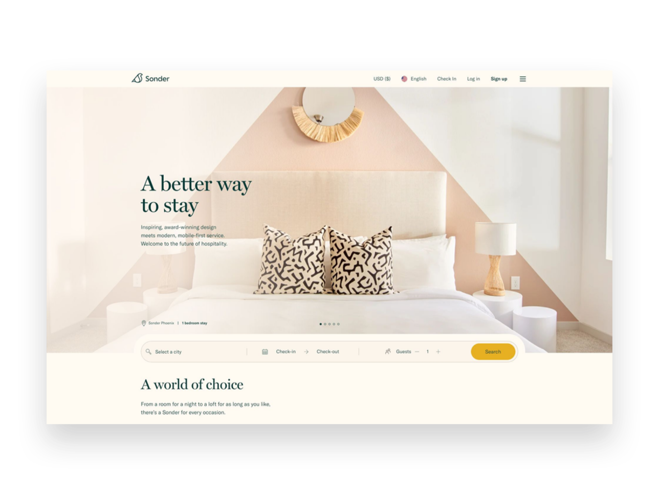
Here’s where Neil and I (and generally the rest of the internet) are on the same page. You’ve got to start off strong with a short, compelling reason to get people to stay on the page and keep reading. Our tendency when writing is to focus on ourselves (“Here’s what I offer!) but a stronger headline would help the visitor feel heard or understood, reassuring them that they are in the right place and that the answers to whatever problems you’re going to solve for them are just a bit down the page.
Example: Sonder.com shows off how they’re different but keeps it focused on what their customers want: short term rentals with impeccable design.

Tip #2
Build Some Rapport
After you’ve caught their attention, help readers know that you really do understand them. Tell a brief story they may relate to, use words or phrases they may use, show them that you know how they are thinking or feeling right in that moment. Remember, they landed on your page because they are actively thinking about a problem they are having.
Example: Ruby.com focuses on how their services can alleviate pain points for their customers.

Tip #3
Throw Out The Opening Pitch
You’ve gotta tell them what you’re selling and ideally (if you did your job right in step #2), your offer is the answer to all their problems! 😉If you’re a service-based business, selling what you offer in the form of a product can be very powerful and really help people understand what they’ll be getting.
Example: Purebarre.com invites beginners to try a free class or download their app to jump into training.

Tip #4
Be Transparent About Cost
This doesn’t have to be a super awkward slide-a-piece-of-paper-across-the-desk moment. Again, if you’ve done a great job at framing things as problem > solution above the price almost becomes irrelevant. Also, sorry to be obvious here, but no one is under the delusion that you’re doing what you do for free so just putting the price out there in plain sight is way less awkward than having them contact you only to realize that you’re selling champagne and they have a beer budget.
Example: Headspace.com flips the script a little by leading with their cost right up front but I love how simple it is!
Tip #5
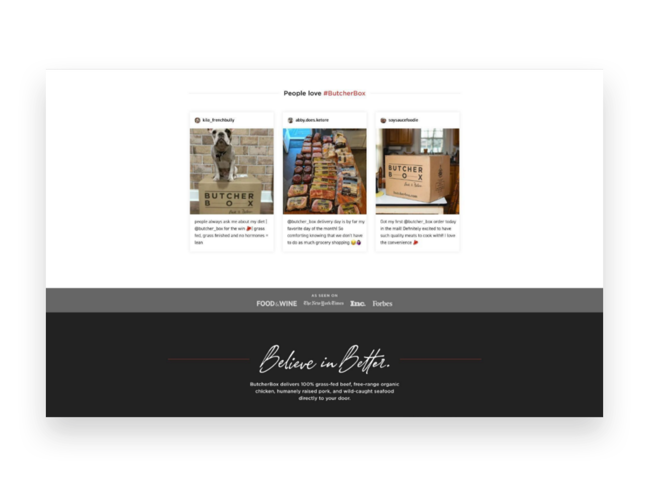
Prove You’re Worth It
Back up your claims to greatness with testimonials from past clients and/or descriptions of any guarantees you may offer. Help customers feel reassured that you’re legit and they’ll start to see themselves as one of the positive outcomes!
Example: Butcherbox.com shares testimonials people have posted to social media for a great dose of street cred!

Tip #6
Make the ask!
Whatever it is: your {“Buy Now” “Book Now” “Download Now”} button goes here! At this point, remember the 4 S’s and make it short, sweet, straightforward, and simple!
Example: Anchor.fm ends a great sales page with a simple & bold CTA - get started!

11 Lead Magnet, Offer & Freebie Ideas to Grow Your Email List
Smart, strategic ideas for lead magnets, offers and freebies that go beyond the typical to help you build your email list.
One of your best business assets may be something you don’t suspect. It’s not your website or your super-secret trademarked process or even your brand recognition or goodwill. It’s your email list! And if you’re not using your website to actively build a list, you are leaving money on the table.
Like I’ve mentioned before, you can’t count on social media to connect with your audience, and done right people are not annoyed or bothered by getting emails. Here are some quick email marketing stats (all stats from here.):
72% of consumers say that email is their favorite method of communication with companies they do business with. '
81% of US online shoppers are more likely to make additional purchases, either online or in a store, as a result of emails based on previous shopping behaviors and preferences.
66% of consumers have made a purchase online as a direct result of an email marketing message
Why Email Works
If you’re running an online business or have something to sell (your products, your services, even your time!) - the chances are good that it’s going to take more than one contact with a potential customer to get them to fork over some cash. Do you know what odds aren’t good? Hoping that the client comes back to your site on their own to check you out multiple times. So, email gets you in front of people who have already expressed at least some moderate amount of interest in what you have to offer on a timeline you can control.
Here’s the secret: you’ve got to sweeten the deal
Sorry but no one is signing up to your list just because they’re hoping to get an email from you at some point. Email isn’t that magical. But people want to feel connected to brands they are interested in so let potential subscribers know that discounts and the VIP treatment awaits and they’ll be more than happy to sign up! And, of course, while this post is all about how to grow your email list don’t forget that email marketing success is really about sending consistent content that’s of high value to your subscribers. Just think of all the ways you can be a resource to your customers or how you can help them get the most out of their purchases from you. (Related post: 4 Post-Sale Emails Every eCommerce Site Needs)
Lead Magnet, Offer & Freebie Ideas
We’ve all seen the sign up boxes offering a discount off our first order and those are good but I want you to think about how you can set up a sign up box with a message that 1) aligns with your brand and 2) isn’t just about dishing out discounts left and right. I do think that a welcome discount code can be good so I’ll share with you exactly how to set that up below but remember the goal is to think of ways that you can give something of value to subscribers and start to build a relationship with them. We’re not just looking for one-time signups who will unsubscribe as soon as they get their coupon code here!
Offer a Free Gift with Purchase. I especially like this over a pure discount because it doesn’t de-value your products.
Offer a free gift with purchase by creating a coupon code for one of your smaller “add-on” type items. To prevent people from taking advantage of things, just set a dollar limit. (i.e. Free XYZ with any purchase of $$$ or more.)
Offer free shipping - but only for first-time customers who spend $X
Offer a discount code that only applies to certain shop categories like your best sellers to encourage people to try you for the first time
Offer a “digital gift card” instead of a coupon code - it feels more special!
Offer a companion guide to your products. For example, if you sell genuine Italian leather goods, offer a free guide on how to take care of leather accessories.
Send free samples. For example, if you sell candles pop a free wax melt in the mail so people can try out your scents!
If you sell services or digital goods:
Use a free Canva template to create a workbook, cheatsheet, checklist, or printable that aligns with your larger services.
Offer a teaser of what to expect from your larger offering i.e. just the first chapter of your ebook (with a link to buy the full one at the end, obviously)
Giveaway access to a “resource library” of files (ex: Grab my 10 favorite business checklists!)
Create an email “mini-course” that triggers upon signing up
Offer a free trial or way to engage with you at low/no risk for a limited period of time
Whatever you decide upon, you’re sure to start seeing new list signups start flowing in!
How to Set Up an Automated Welcome Offer
Create/set up your freebie. It doesn’t have to be fancy! (See below for ideas if you’re struggling to think of what to offer.)
Add a newsletter block or popup to your site. Most people throw their newsletter signups in the footer but, hey, go crazy and put them wherever! Don’t feel like you can’t pop a signup mid-page if it makes sense. Or, if you’ve got something cool you don’t want people to miss, use the popup feature!
Don’t ask for more info than you need to. Email address only or email + name, max. That’s it.
In your email marketing system, create an automatic “welcome” email that goes out to anyone who has just signed up for your list and includes the offer within the body of the email, or use a link/button to attach a download.
Not sure which email marketing software to go with? Check out Email Marketing Platform Showdown (ConvertKit vs. Flodesk vs. Squarespace Email Campaigns) for my recommendations!

How to Use Squarespace Scheduling as an eCommerce Tool
Squarespace Scheduling makes it easy for you to turn your services into easy-to-shop products and it’s actually kind of the low-key rock star of the Squarespace family of features that we’ve all been sleeping on. Learn more about this infinitely customizable tool and why it’s one of my favorites for all sorts of businesses.
Updated: Aug 2022
If you’re a service-based business that’s looking for ways to productize your services (or a traditional eCommerce shop looking to add services to your mix), you’ve probably realized that you really have only a handful of good options: 1) Try to find a specific app or tool that’s focused on your industry so that it has all the features you need and just hope and pray it’s not $973 zillion dollars a month; 2) String together free or “freemium” apps that only kinda get the job done and also kinda make it look like you’re a high-end hobbyist and not the professional badass you are; 3) end up on this blog post because you’re like, “I just wish there was one tool that I could customize to do exactly what I want at a decent price so I can focus on running my business.”
Solution: Squarespace Scheduling
Whoa, now - I know what you’re thinking. You’re thinking that you need to sell access to events or provide packages of services or host virtual classes and sell gift cards, not a meeting scheduling tool. Good news: Squarespace Scheduling does all those things and more and it’s actually kind of the low-key rock star of the Squarespace family of features that we’ve all been sleeping on. I’ve used it for lots of clients to create an easy and professional way for them to move their service-based businesses online. The best part: it’s nearly infinitely customizable so no matter what industry you’re in, you can make it look and feel exactly how you need it to. The second best part: since it’s built right into your website, you can manage everything about your business in one place. Priceless.
Features
Appointment Types
If you’ve used any sort of online booking tool before, you’re probably used to thinking of appointment types in terms of “30-minute meeting” or “60-minute meeting” which are both totally possible with Scheduling. But you can ALSO set up group classes or a series of events, offer optional add-ons or upsells, or even create coupons or discounts for any of the above. There are also lots of little details you can add that help with merchandising and branding your offerings - from being able to add photos to displaying custom confirmation pages.
Availability
The Availability section has a lot of options but this is part of its strength. In this panel, you have options to set two types of resources: your time + rooms. There are all the settings you’d expect in a typical meeting scheduler when it comes to your own availability: setting daily/weekly hours, controls for how far in advance people can book, how many appointments can be booked each day, etc.
What sets Scheduling apart though is all of the other control it gives you. Want to minimize gaps in your day so that you don’t have unproductive downtime between meetings? Done. Want to only offer certain events on certain days? Easy. Want to look super popular and in-demand? Just enable the “look busy” feature so that it doesn’t look like you have all day every day completely wide open. 😳
The second resource you can control is “Rooms” but don’t let the name limit you. Sure, you can use this to set availability for actual rooms (think: booking the conference room at your coworking space) but you could also use it to represent stations or chairs (like in a hair salon) or even things - like how many snowboards your outdoor adventure company has available for rent. You could use this to control booking at a company level so that you can never overbook or oversell if you have more people or demand than you have resources or inventory.
Payment Options
It’s not eCommerce if you’re not getting paid! Scheduling allows you to connect Stripe, Square, or Paypal… plus a few combos of all of those. My favorite processor is Stripe because it’s super easy to get set up and it’s pretty much the gold standard for how to get paid via anything across the whole internet (which means you only need one account).
Customer Emails & Reminders
I’m a huge proponent of the idea that providing a great customer experience doesn’t end once a sale is made; to me, that’s just the beginning, and all of the interactions you have with your clients and customers after the sale are just as important! Scheduling allows you to customize and personalize every.single.detail. of all the confirmation, reminder, and follow-up emails that get sent out. You can also tailor them to each different appointment type, package, or subscription versus a lot of other tools that require you to create just one generic confirmation email that needs to work as a one-size-fits-all solution.
It’s also really easy to set up reminder and confirmation emails that put the power to cancel or reschedule into your customer’s hands (notice a recurring theme here on not spending time being your own secretary??).
Intake Forms
The name “intake” forms may make you think this feature is only helpful if you run a medical practice (which you could absolutely do with Scheduling as the advanced plan is HIPAA compliant!) - but you can also use forms to collect any other type of information from clients upon booking. You can also have some forms be internal only so that you can complete them on behalf of your clients or even use a form as a client agreement for “terms and conditions” or other fine print stuff. Back on the healthcare note, if you happen to be in the medical profession there’s even a built-in SOAP notes feature if you don’t feel like creating your own custom form.
Packages, Gifts & Subscriptions
This is where Scheduling really starts to feel like an eCommerce solution! By building on top of the foundation of a typical “scheduler”, Squarespace Scheduling allows you to transform simple standalone services into easily sold products. Booking a meeting is selling a service but buying a package of 3 consultations is a product. You can even get fancy and make and set up “Buy 2, Bet 1 Free” type offers! The best part of this is that the booking is still handled entirely by the client so you don’t have to be in charge of handling any of the admin.
Subscriptions are another way to take a standard service and transform it into a product with a recurring revenue stream. Subscriptions can either be for a set number of installments, such as every month for 6 months, or set to repeat indefinitely until canceled. You can choose to charge a “setup” or enrollment fee… or not. You can put packages into categories so that your booking pages and links only show the most targeted products. This would allow you to do things like creating targeted landing pages or sales pages and direct people just to the selected subset of your packages or subscription products, which can be a highly effective sales tool.
Generate & Send Customizable Invoices🆕
You no longer need a third-party invoicing tool to get paid from clients, regardless of whether they’ve scheduled with you yet or not. With Scheduling Invoices, you can quickly create invoices with your own custom line items and share them with clients via a link. They can pay online through the same account that you use to accept other payments through scheduling, either via Stripe or PayPal. This is a great option for people who may offer standalone or add-on services for clients before or after their scheduled appointments or classes. For example, if you are a personal trainer you could use scheduling to get paid for sessions and then follow up with a personalized invoice for supplements. All of the info for this client will be in one place, their payment experience will be consistent and you can easily see analytics for everything all on one dashboard. (Another great way to use Squarespace as your CRM!)
Clients
If you’re looking for a way to manage and view your client’s info all in one place, you’ll love that the Scheduling tool has a Client panel that is as good as any other CRM platform out there. You can see each client’s contact info, record private notes about them, and see a history of any forms they’ve completed. You can also schedule things for them on their behalf as well as place new orders for them for any packages or subscriptions you might offer. Also, for those that sell packages and subscriptions, you can manage all your orders and subscribers from within the same system. It’s like a powerful little POS system!
Reports
Any serious eCommerce business owner is always looking to get their hands on as much data as possible to help inform decisions and keep a finger on the pulse of their business. The Reports panel inside the Scheduling tool has built-in (and good-looking!) reports for things like revenue, tips, appointments, users, and forms. You can also export the data to a CSV file so that you can dig in further in a spreadsheet if that’s your jam.
Link & Embed Options
Since Scheduling is part of Squarespace, you probably already understand that you can add a Scheduling block to any page, post, or product anywhere on your website. Super easy. But Scheduling also gives you options for a branded landing page you can direct people to (perfect for that link in profile!) in addition to embed codes for booking buttons and booking bars that you can add anywhere else you might need them. You can even generate a QR code for the Client Mobile App to allow your clients to book and manage their own appointments, classes, subscriptions, and packages.
Integrations
As much as I always want the tools and apps I use to do as much as possible without the need for other subscriptions, there are also select times when stacking a few choice pieces of software together definitely makes a final tool that’s more powerful than the sum of its parts. Scheduling plays nice with the following tools/software. The list is long so I’ve bolded my favorites!
Accounting & Invoicing
Quickbooks
FreshBooks
Email Marketing
Squarespace Campaigns
MailChimp
AWeber
Active Campaign
ConvertKit
Constant Contact
Drip
MadMimi
Simplero
CRM
Google Contacts
Salesforce
Infusionsoft
Pipedrive
Google Sheets
Uplaunch
Wufoo
Zoho CRM
Daylite
Client Engagement
Referral Candy
ReviewRail
Video Conferencing
GoToMeeting
Zoom
Join.me
Google Meet
API
API & CSS Support
Zapier
Automate.io
Zoho Flow
Custom Sidebar Integration
Webhooks
Payments
Stripe
Square
Paypal
Web Builders & Social
Squarespace
Facebook
Analytics & Conversion Tracking
Google Analytics
Facebook Pixel
Sync With Other Calendars
IDK about you but I’m sure not into checking several different apps each day just to know what’s going on. It’s way easier to just sync everything into one place so you can get the big picture. No more accidentally booking a work meeting when you’re really supposed to be at the dentist's office. Scheduling syncs with Google calendar (everyone’s fave) and also with others like iCloud and Outlook.
Users
If you have multiple team members that all need access to your Scheduling tool (or even their own calendars), you can just add them as a contributor to your Squarespace account and give them only Scheduling permission. This will allow them to access everything in the Scheduling section but still not be able to edit or mess with the rest of the content on your website!
eCommerce Use Cases
Not sure if using Scheduling is a viable solution for your business/industry? Here are a few different use cases that could all use this tool:
Small Businesses - Set up a class series (like a cooking class or other educational series) or sell access to online or in-person workshops
Fitness or Health-based Businesses - Sell subscriptions or gift certificates to either in-person or virtual sessions
Consulting Businesses - Use Scheduling to sell group classes/workshops or book private sessions. You could also sell digital products like ebooks or other downloads by attaching links to those products to custom confirmation emails.
Retail Shops or Boutiques - Provide options to book private “shop in person” time slots or sell services like personal styling or shopping
These are just a few ideas to show you that there are so many ways to take your services (or launch new ones!) and make them easy products for people to engage with. I hope it also shows you that there are so many ways you can make the everyday interactions you have easier with a tool like Scheduling.
Give It A Try!
If you have a Squarespace site, it already comes with a free trial of Scheduling! From the home menu just click SCHEDULING and then follow the prompts to get started on your free trial.

What does Squarespace's new Fluid Engine mean for eCommerce?
Squarespace Fluid Engine is the latest release on Squarespace's 7.1 platform. Find out what's changed, what's stayed the same and what it all means if your shop is built on Squarespace.
July 21, 2022
The internet is all abuzz because Squarespace has just dropped an all new editing experience called Fluid Engine. Maybe you’ve heard about it already (or maybe you’re just learning about it now!) and you’re wondering — what does this mean for me and my site??? Here’s the scoop!
How We Got Here
As a reminder if you’ve had a Squarespace site for any number of years, you’re used to what’s now being called the “Classic Editor” which allows you to add any of Squarespace’s trademark “blocks” (things like text, images, buttons, video, etc.) onto your pages at predefined points. You may have had to use things like Spacer blocks to get things to line up the way you wanted. The Classic Editor offered a mostly intuitive design experience but some advanced layouts such as creating full bleed content or overlapping blocks required custom code.
Intro to Fluid Engine
What makes Squarespace’s new Fluid Engine different from the Classic Editor is that it offers the ability to add blocks anywhere in a section - even overlapping them if you’d like! Instead of adding blocks at predefined points in a section, blocks can now be added anywhere you want and dragged, dropped, stretched, resized, layered or manipulated to achieve just the look you’re going for. You don’t need Spacer blocks and there’s a chance you’ll be able to get by with a lot less custom code.
Fluid Engine also comes with one other big change and that’s to how your site looks on mobile. Previously your page layouts were automatically translated to mobile and there wasn’t really a way to change the way they looked without also editing the desktop view. With Fluid Engine, the desktop and mobile views can be edited independently offering more control over how things look on smaller screens.
What does this mean for eCommerce sites?
Good news if you’ve read this far and are worried that how you upload and mange products on your site will change — all of that stays exactly the same! There are no changes to the way eCommerce looks or works at all. Your product pages, shop page and other static pages like your cart and checkout are not changing in either the way you edit them or the way they work for your customers.
Fluid Engine only impacts content pages on your site (more on that below) so things like your home page, about page or other non-shop related pages. One of the biggest selling points for me on using Squarespace for eCommerce has always been in how creative and dynamic your non-shop pages can be versus those built on Shopify, for example. So while the release of Fluid Engine has no affect on how eCommerce works or functions in any way, I do think it makes a stronger case than ever for why Squarespace continues to be a great choice for online shops. After all, how you present your brand on your non-shop pages is as important and influential on conversion rates as any actual eCommerce function.
Who has access to Fluid Engine?
Fluid Engine is available now on all English language sites built on Squarespace 7.1. (If your site is still on Squarespace 7.0, this is just yet another reason to make the switch to 7.1 as there are no plans to release the new editor experience on the 7.0 platform.) If your site was built before early-mid July 2022 and is on Squarespace 7.1, you’ll notice an upgrade button in your Classic Editor sections. Should you click it? Up to you but here’s what that means:

(Here’s what a Classic Editor section looks like on 7.1 with the option to upgrade it to a Fluid Engine section in the top left corner.)
Upgrading a Classic Editor section that used custom code may cause that code to break. This may not be a bad thing (you can probably replicate the layout without code in the new Fluid Engine section) BUT you should know going in that things may not immediately look the way you want.
Once you click Upgrade on a section there’s no going back. This is a one way ticket situation so just be sure you want to board the train, you know what I mean?
If you’re going to be doing any DIY editing on your site, don’t forget to check out the mobile view. In my extensive beta testing of this product, I spent a lot less time writing custom code but a lot more time manually recreating all mobile page layouts.
Do you have to make the switch?
The short answer is not really. As long as your 7.1 site was built prior to the launch of Fluid Engine, all of your existing page sections will remain as Classic Editor sections. However, any new sections you add will be created with the new Fluid Engine powering them so you’ll end up having a little bit of a mixed bag of sections for a bit. In the long run, as you edit and add new content to your site old sections will be replaced with new ones - all built with Fluid Engine.
Bottom Line
This is a big announcement and a big change from Squarespace but don’t let it scare you. You don’t have to make any big changes right away if you don’t want to and how your online store looks and works is not changing in any way. This is just the latest in Squarespace continuing to push things forward in terms of innovative design capabilities. Have any questions about how to use Fluid Engine or adding new Fluid Engine sections to your eCommerce site? Feel free to contact me!

12 Ways to Build a More Empathetic Brand
Discover how taking an empathetic approach to eCommerce may be the competitive advantage you’ve been missing. Use my 12 tips to connect with stressed out and distracted customers on a more human level before, during and after each purchase.
In business, we usually focus on things like product and price as places to differentiate and optimize. But let’s be honest: there’s more than enough advice to go around out there on how to boost profit margins, how to price strategically, or how to drum up alternate revenue streams. That’s business. But what we know is that now more than ever, all business is really about people. It’s your people that are the true competitive advantage.
It’s you, your team, and anyone your customers or clients interact with on your behalf. That’s one-half of the people equation.
The other half is your customers. Despite our tendency to refer to them as visitors, readers, or buyers, they’re human, too! And the one thing they don’t want is to be sold to. What they want is to be understood. So how can you go about building a connection with people… online, no less? How can you start today to build a more empathetic brand?
A Quick Crash Course on Human-Centered Design
“Empathy sells in ways pricing tricks and sneaky buttons and fancy websites never will.”
There are lots of fancy official-sounding definitions of human-centered design out there but my take boils down to this: human-centered design asks us to use empathy to put aside our own notions in favor of what our customers need. It asks us to try to understand them before implementing a solution to any perceived problem(s) they may have.
In the case of eCommerce, it’s using an empathetic approach to thinking about how or why people shop, how to help them with whatever they are trying to do, and, ultimately, what needs to happen for them to feel comfortable enough to reach for their wallets.
The reason I bring this up before we jump into some ways to build a more emphatic brand is that as you think about the general ethos of your company right now you may discover that changes need to be made. You may decide that there’s room for improvement when you view your eCommerce website through a more empathetic lens.
Also, lastly, before you click away thinking this is a little too woo woo for you, that you thought you were here to learn how to make some money online and not get a philosophy lesson from a web designer… lemme tell you. Empathy sells in ways pricing tricks and sneaky buttons and fancy websites never will. After all, people do business with other people.
The eCommerce Process in Three Easy Steps
This may seem obvious but just so we’re on the same page: within the framework of commerce - online sales in particular- I always think of things as what happens before, during, and after the sale. In this case “the sale” is whatever action you’re asking people to take. The trap lots of eCommerce websites fall into is they only seem to care about the middle part: the actual sale. They forget about all that needs to happen before a customer or client decides to purchase. They forget about all the opportunities they have to build a human-connection relationship after the sale. Not you. You’re going to nail this from discovery to inquiry to purchase and beyond.
And just so we’re clear: to me, any website that does more than just provide static information is an eCommerce website. If you’re not sure if you have an eCommerce website, the best litmus test is to check out what all your buttons say.
Ecommerce website buttons say things like:
BUY NOW
BOOK NOW
DOWNLOAD
EXPLORE
SCHEDULE A CALL
RESERVE YOUR SEAT
ENROLL TODAY
SIGN UP
DISCOVER
DONATE
SUBSCRIBE
ADD TO CART
BASIC website buttons say things like:
READ MORE
LEARN MORE
CONTACT
See how the eCommerce buttons are all active and the others are all passive? That’s my definition of eCommerce. Are you asking people to take action? Then you have an eCommerce site! So, when I say “action” below, I want you to insert whatever your primary button asks. Really think about it. Before the “BOOK NOW”. During the “ENROLL TODAY”. After the “ADD TO CART”. Whatever it is for you.
Before The Action
“I often see people who are actively monitoring abandoned cart metrics attempt to find fault in the checkout process when, in fact, it’s their lack of empathy before the sale that’s likely the culprit.”
This is arguably the most important phase and offers some of the greatest opportunities to use empathy to build trust with visitors. If you do things right in this step, the others are much easier hurdles to get over. Conversely, I often see people who are actively monitoring abandoned cart metrics attempt to find fault in the checkout process when, in fact, it’s their lack of empathy before the sale that’s likely the culprit.
Tip 1: Show your understanding of the problem - This is probably what you think when you think of empathy but it’s a great place to start because too often we think of our websites as a great place to talk about ourselves. Wrong-o. When thinking about the copy for your eCommerce website, think first about what problems or challenges your target demographic has that your product or service solves. Address those points head-on. Customers want to feel seen, heard and understood first and foremost.
Tip 2: Envision the situation - Think about your target demographic again. Your people. Who are they? Are they older and less comfortable with technology? Focus on creating an online experience that’s accessible to them. Think about fonts sizes that are readable, high-contrast colors, buttons that feel natural. Is your audience more likely to visit your website on desktop or mobile? Are they searching for your product or service during leisure time or work time? While sitting on the couch in the evening at home or during a quick moment waiting in line somewhere? Is it quiet or noisy?
Tip 3: Offer ways to ease friction - Make it easy for people to discover and engage with your content, products or services. Organize things with tags and categories, add search functionality, or advanced filtering abilities so people can jump right to what they need. Bundle products that are frequently purchased together into one product to save people time and clicks. Highlight your best-selling items on your homepage. In short, think about any roadblocks that might come up between discovery and checkout and try to eliminate as many of them as possible.
Tip 4: Reveal the realness - Oddly, one of the best ways to show our customers and clients that we understand that they are real, human people is to reveal to them that we are also real, human people. I overcame one of my own hang-ups on this front when it comes to blogging, actually! As a bit of a perfectionist, it used to take me forever to write a blog post. As a result, I rarely blogged and my writing ended up feeling stiff and bland. When I gave up the ghost and decided I would just write the way I talk, blogging became so much easier and - surprise bonus! - it started feeling real. It resonated with readers because it was obvious another human was behind the keyboard. I’m not saying I don’t care about typos or grammatical errors anymore. I just care more about sounding like myself so that when you get an email from me in the future you aren’t wondering if I had a ghostwriter sub in for me that day.
During The Action
Ok, by “action” here I almost always mean adding to cart and the checkout process itself but as you’ll see there are lots of supporting ways to show empathy towards your customers during this phase. Since so much of these things are kind of “standard” (meaning there’s not a lot of room for variation or creativity when it comes to checkout procedures), this is one area that most commerce sites get mostly right. But that’s not to say there’s no room for improvement!
Tip 5: Empower your team - Whatever kind of customer service or support you provide, whether it’s by email, live chat, or phone, empower your customer service team to actually follow through on whatever promises you’ve made, be they implied or explicit. If you write on your home page about being a family-run business with down-home roots but your live chat is answered curtly by someone who is very clearly… not your family… you’ve broken a promise to me and now I feel lied to and I’m two seconds from calling this whole purchase off. Empower your team to be kind, understanding and flexible. Encourage listening and understanding. The worst leaders ask their customer service teams to be nothing more than code enforcers and hall monitors. When in doubt, take a lesson from Zappos on how to do it right.
Tip 6: Prioritize ease over information - This is another trap I see newbie commerce folks fall into: asking too many damn questions. Think back to the situation you envisioned above. With all the distractions people are facing these days, both internal and external, does it really matter if you ask them during checkout to answer no less than 27 questions about how they found you, what their favorite color is, and what’s their astrological sign? No. These things don’t matter. The truth is that people hate long forms and are petrified of too many choices so don’t go mucking your checkout process up with them! Keep checkout as simple as humanly possible. Ask only what’s absolutely necessary at the exact moment and save the rest for a follow-up.
Tip 7: Put technology to work - The cool thing about technology is that there’s so much that’s accessible to even the smallest of businesses these days to really wow customers. Find ways to use the tech and tools available to you to make buying from you (or booking, subscribing, enrolling, whatever it is) as easy and awesome as can be. Are they a repeat customer? Auto-fill their info from last time so they don’t have to type everything out again and only need to give it a quick verification. Find a way to productize your services, automating part of the process so they can get access more quickly. Use scheduling tools to make booking time with you a breeze.
Tip 8: Personalize everything - Every aspect of your cart and checkout process can (and should!) be personalized not just to your brand but also to your customer or client whenever possible. Inject your personality into the standard forms offered by Squarespace to follow through on the brand promises you made elsewhere on your site. Order confirmation emails, shipping notifications and booking confirmations are all places you can use technology to address your customers and clients by their first name, proactively answer questions you anticipate they may have about what’s next and provide a human touch.
After The Action
Amateurs assume that once someone makes the purchase, books the event or schedules the call that everything else is smooth sailing. But as you’ll see, there are several places in the post-checkout experience to show your customers some TLC and start to build that human connection that will hopefully lead to repeat business down the road.
Tip 9: Be consistent - Whoa! You got someone to trust you enough online to give you some money. Don’t drop the ball now! Haha! No, seriously. Buyer’s remorse is a real thing and you don’t want anyone feeling that way about you and your business. Keep your branding and messaging consistent once people move beyond your website. If you sell physical products, this can be making sure your packaging and follow up emails are on point. For service-based sellers, proposals, contracts, and invoices need to be on-brand. At this point in the process, people have shown that they trust your business enough to work with. Continue to build on that with every touchpoint after the “action”.
Tip 10: Show your appreciation - Telling your customers that you appreciate them is just a lovely thing to do. Period. But there’s a little empathy at play here too. Telling them thank you is your way of acknowledging that they had a choice. They could have chosen your competitor but instead, they chose you. They could have decided to do nothing but they didn’t. Let them know through your words that you understand what it took for them to be there or even provide them with a little bit about how your company gives back with product-specific email automations.
Tip 11: Follow up and then follow up again - Don’t leave people guessing or hanging about what to expect or what’s next. Especially for large dollar value purchases, follow up immediately and then clearly outline the next steps so that people can rest easy knowing they made the right investment. But you don’t have to sell big-ticket items to make following up a winning strategy; I always think of food delivery services that show the status of your order all along the way: dinner’s in the oven, it’s getting packed up, it’s out for delivery, here’s a little map of where it’s at exactly, etc. The goal here is to anticipate the questions or concerns that people are going to have after they purchase and just answer them without them needing to ask. Being proactive is a great way to show empathy. Even just linking out to your FAQ page lets people know that you’re there for them with answers to their questions.
Tip 12: Reward loyalty - Most long-term sustainable businesses are built on repeat customers and clients. They are your backbone. They’re your biggest fans, the ones most likely to recommend you to their friends and family, the ones who rave about you without even being asked to. Reward this as aggressively as you can afford to through a great referral program. I’ll never forget how a hotel we once stayed at in Vegas remembered that we’d stayed with them just once before. We hadn’t really planned to be repeat guests, it was just a good deal and we took it. But when the front desk agent greeted us by our first names and thanked us for coming back and gave us a complimentary newspaper every morning and an upgrade to a higher floor? You better believe we’ve stayed with them numerous times ever since. It was just so nice to be recognized. We felt like we were part of a VIP club. The cost to the hotel of all this? Negligible. The newspaper? The moving us to a room that was probably going to be empty for the weekend anyways? These things cost them nothing but meant the world to us. Reward your loyal customers and clients. Greet them by name. Remember their birthdays or how their dog really loves long walks on the beach. Go out of your way to accommodate them.
What will you do first?
Like I said above, there’s a chance that some of the ideas I’ve provided are making you think about changes that need to happen. Maybe they’re in how you train your staff, how you word or set up your email marketing, or in what info you provide on your website for all to see. Perhaps there’s room to improve your site’s navigation so it’s more clear and understandable or to update your checkout process so it’s respectful of the stresses and challenges your target demographic are likely feeling. Whatever it is, I can guarantee this: there’s no better ROI than starting now to build a more empathetic brand. Even small shifts in messaging, layout and experience can yield amazing results.

How to Use Unsplash to Curate Your Website Images
Finding great looking stock images sometimes feels like trying to find a needle in a haystack. Learn how to find the hidden gems and put together a cohesive selection of images for your eCommerce website - all for free!
Great photos can really make or break a website but sometimes it’s just not in the cards to have a bunch of your own. This could either be because it’s just not in the budget to have a photoshoot right now or because the high quality ones you do have just aren’t enough to fill out an entire website.
When I’m looking for photos for projects, the number one place I head it to unsplash.com. Check out the video below where I show you how to source royalty-free, good looking, stock images through Unsplash and also share some of my best tips for curating stock images that don’t feel too, well, stock. Watching video not your thing? Keep reading to catch the details!
p.s. Watch the video on Loom for video bookmarks to jump to specific sections or if you need a transcript/captions.
Tips on Using Unsplash
Create a free account so that you can save images you find into collections! This makes it so that you can be more organized and intentional when selecting images.
Add images to collections by clicking on the plus icon (NOT the heart icon) and either adding it to an existing collection or creating a new one.
Share a collection by heading to your profile, clicking into the collection you want to share and grabbing the url from your browser bar. That’s it - easy!
Stock Image Tips
Image Tip 1: Keep Things Consistent - Selecting images that are consistent in style is one of the best ways to make stock images look like a professional took them just for you. Select images that have the same overall colors and tones or the same photographic style, such as all black and white images. Making sure to stick to a well defined color palette is probably the number one way you can make things feel cohesive.
Image Tip 2: Think Micro to Macro - Try to choose a range of images that represent your industry, field or topic across the spectrum. Using the example from the video above about finding pictures for a farm to table restaurant website that might mean looking for pics of everything from individual ingredients to the fields they are grown in to the chef that selects them and finally the guests that enjoy each dish. Find images that show close ups and then others that give the bigger picture. Some of my favorite stock images are actually ones that are just used as background images on a website to “set the mood.” These images usually have alot of space that would look good with text or a button over the top of it or could even just be used as a transition between website sections.
Image Tip 3: Don't Get Lost in the Details - Don’t worry about minute details in stock photos that may not be exactly right. For example, I once had a client say that a stock photo (that was otherwise perfect for their fitness brand) wasn’t going to work because the brand of weights shown in the image weren’t the same as the brand they own 🙃 I guarantee no customer is going to notice a thing like that! Images are just there to set the mood and visually contribute to a bigger story. Find ones that work but don’t sweat the small stuff. Like I said, unless you had a photo shoot of your own you could scour all the stock photos on the whole internet and never find one of yourself!
Image Tip 4: Think Outside the Box - Get creative in the search terms you use which can help you uncover interesting photos for your site that other people in your industry may not be using. For example, it’s a pretty safe bet that every restaurant out there searched for “restaurant” photos but my bet is that not a lot of them searched for “Tokyo street food” or “friends celebrating over drinks.” Thinking about your target demographic and searching for things that may resonate with them or help them see themselves in your site is a good place to start if you’re feeling stuck on what to search for.
Example Website Photo Collections
Want to see how all these tips comes together to create four unique image collections? Check out these sample collections I created for four hypothetical food concept websites. Each of them has to do with food, cooking, baking, eating together with friends and family and yet none of them look alike at all. I’ve used a consistent photo style for each and focused on finding images that represent a wide range of keywords within each board so that there’s a wide range to choose from. I didn’t worry about little details like the brand of dishware or the type of vegetable, I just went for things that could help tell the story of each brand alongside their own personalized images and website copy.


Check out each collection to see how each could clearly represent four very different brands and let me know if you use Unsplash to curate your own image collections!

Email Marketing Platform Showdown (ConvertKit vs. Flodesk vs. Squarespace Email Campaigns)
Email marketing should absolutely be at the top of your marketing strategy but what platform should you go with if you’re selling on Squarespace? In this ultimate showdown software battle, we’ll check out my top 3 faves and help you find the right fit for your business.
Updated December 2023
I’ve talked alot before about the virtues of email marketing. We’ve covered why email beats social media, how to use email marketing to increase customer lifetime value, and lots of other things that all boil down to this: email marketing needs to be a part of your eCommerce strategy.
And not just a small part. Like, actually - a pretty big part. Some quick stats for the uninitiated:
Email generates $42 for every $1 spent. A 4,200% ROI is CRAZY, and also means this is a marketing strategy that you should absolutely be using, and using better.
Roughly half of all consumers want to hear from their favorite brands on a weekly basis.
Marketing and advertising emails influence the buying decision of more than half of customers.
Email is 40% better at converting compared to social media.
TL;DR - email marketing is super effective, customers want to get emails from you and they are willing to make purchases as a result of receiving an email from you.
Now for the big question: what email marketing platform to go with - especially if you’re using Squarespace for eCommerce? I’m comparing my top three faves below but first, a quick note about the emails your site sends automatically.
Non-Marketing Emails
There are some eCommerce emails that your Squarespace site is going to send automatically, no email marketing platform required. These are things like:
Order confirmation emails
Shipping confirmation emails
Abandoned cart emails
Waitlist notification emails
Etc.
You can find out more about these types of emails in this post, which also covers how you can customize them to match your brand and how you can personalize them to improve customer experience.
These emails don’t require you to receive any special consent or approval from your customers since they are sent as a result of an action they’ve already taken on your site: making a purchase (or not), or signing up for an out of stock email reminder, for example.
On the other hand, the emails we’re going to be talking about sending from an email marketing platform below are emails that are above and beyond the basics. These are emails that welcome people who sign up to your list with a special coupon code or offer, marketing promos that shout out a new product drop, or sales emails that invite past customers to revisit your shop.
Getting Approval to Send Emails
Anti-SPAM laws help protect people from getting junk they didn’t sign up for by outlining who you can send to and what needs to be included in each email. Luckily, all the email marketing platforms out there help make this easy by not allowing you to send emails to people that haven’t given their approval and by including an unsubscribe link in the footer of every email, amongst other protections. The important thing to note here is that customers can opt in/out of marketing messages while still receiving things like order confirmation and abandoned cart emails that are sent automatically from Squarespace.
Comparing Platforms
All this being said, all email marketing platforms are not created equal. There are definitely reasons why you may want to choose one over the other and the one that works best for you may be the worst choice for someone else. That’s why we’re going to look at the top 3 choices (ConvertKit, Flodesk and Squarespace Email Campaigns) within the lens of eCommerce and also as a Squarespace user.
Here’s the criteria that I think matters most:
Ease of use
Looks
Automations
Integration
Cost
Let’s jump in!

Squarespace Email Campaigns
I’m kicking off our email marketing platform battle with Squarespace’s built-in option: Squarespace Email Campaigns. There have been a lot of improvements to this feature since it first launched a few years ago making it a great option if you’re needing something relatively simple that has all the features you need and none that you don’t.
Ease of use - You literally cannot get any easier than Squarespace Email Campaigns. You can connect any newsletter block to your list with just one click. It’s super easy to style your emails to match the rest of your site since everything is in the same place. Adding content to emails is also a breeze; things like text, image and button blocks are as simple to use as those on your regular site. The fact that it looks and works just like the rest of your website is one of Squarespace Email Campaigns stronger selling points if you feel like the last thing you need is to learn yet another piece of software!
Looks - Squarespace emails look pretty great! There are lots of pre-styled templates you can use as a jumping off point but it’s also easy to make your own branded templates that you can re-use again and again to keep things consistent. Pulling in assets from your website like your logo, some images and your color palette is as easy as pressing one button but the font choices for emails are purposefully kept to a limited selection to make sure that your emails come through into pretty much every email tool and on any device. You can create nice-looking email layouts that feature your site’s content (or new content that you upload) and the options for controlling how each block displays are pretty intuitive.
Automations - You’ll need to be on the Core plan or above to have access to automations that allow you to create things like welcome emails or other emails based on subscriber or customer activity. You can create series of emails triggered by an event but those emails aren’t as organized or visual as those on ConvertKit or Flodesk. Squarespace Email Campaigns also doesn’t yet have some advanced workflow things like being able to tag people based on activity or route them down different paths based on variable conditions.
Integration - You can add product and blog info right into emails without needing to copy/paste links or other info which is AMAZING. And it should go without saying that because this is a tool that’s built right into Squarespace that there’s no need to fuss with embed codes or trying to figure out how to get different programs to play nice and talk to one another. One of the stronger points is that for simple purchase follow-up emails, you can use product purchases as a trigger for an automation due to the fact that this tool is built right into your eCommerce website. Having everything in one place sure is nice!
Cost - It costs nothing (nada, zip, zero!) to use Squarespace Email Campaigns to build your email list and you can also send your first three email campaigns for free. After that, the pricing tiers start at $5/mo and go up to $48/mo (Starter Plan and Max Plan, respectively - paid annually). Most people will want to skip the Starter plan though because it doesn’t offer email automations which I think are absolutely necessary for any eCommerce business. Beyond that, there is no difference between the other plans aside from how many campaigns and emails you’re allowed to send monthly (you’re allowed unlimited subscribers). If you’re just starting out, I recommend the Core plan which is super reasonable at just $10/mo and allows for up to 5 campaigns and 5,000 emails.
Overall Thoughts
There’s a lot to love about this simple email marketing solution and if you’re just getting started it should definitely be on your radar as a great all-in-one tool.
Flodesk
Flodesk is a relative newcomer to the email marketing arena but - hoo boy - did they come in like a wrecking ball! Everyone seemed to fall in love instantaneously with their great-looking templates and the simple pricing setup. Flodesk is a great option for beginners and more advanced marketers alike and it’s easy to incorporate into Squarespace. That said, it’s not without it’s own quirks and issues.
Ease of use - Based just on the simplicity of the interface alone, Flodesk is a dream to work with. It’s clean, modern and minimal which is a breath of fresh air over some other platforms that seem to make things unnecessarily cluttered. So for that alone, Flodesk wins points in my book. The interface is broken down into four parts: Emails, Forms, Workflows & Audience. Emails are where all the one off, newsletter-type emails live. Forms are where you can create either forms or landing pages to embed onto Squarespace for collecting sign ups. Workflows are where you can create visual automations like welcome sequences. And, lastly, Audiences is where you can create mailing list segments.
Looks - All of the pre-made forms, email layouts and layout blocks for within emails are very visually appealing and that’s a lot of what attracts people to Flodesk. You can also save some settings like your logo and custom color palette so that it’s easy to make sure those aspects are on brand every time. The one thing that kind of drives me crazy about Flodesk though is one of the most important: fonts! Every single time you add new blocks or copy in new text (which is likely going to be every single email you send since who sends the same thing each time?) you need to redo the font settings. This can either be really time consuming (if you actually take the effort to do it) or result in sloppy looking emails (if you don’t).
The other thing to note about the super pretty layouts is that a lot of your email will get converted into an image when it shows up in people’s inboxes. There are some studies out there that show that this can negatively impact deliverability rates and/or increase the chances of your email getting filtered into the promos tab or marked as spam. This is just a word of caution that while the layouts look really good that relying too much on them can mean that your emails also don’t have actual “readable” text in them that could be an accessibility issue.
Automations - Flodesk workflows are actually pretty powerful considering the interface is so simple - you may not realize all that you’re really able to do! Workflows are kicked off when someone is added to a segment and can include as many emails as you like set apart by any time delays you specify. Unlike Squarespace Email Campaigns, all the emails for a specific action are kept in one place which makes it easy to organize. You also have lots of advanced thing like conditional actions which are things like if/then rules based on whether someone clicks a link or has opened up the message that was sent prior.
What’s not so easy is setting up automations based on commerce activity, such as those on Squarespace that allow you to send emails after someone buys a certain product, for example. However, they recently launched a new Checkout add-on that allows you to set up sales pages and checkout pages, add upsells, accept payments and follow up instantly. This could be a pretty cool option if you’re not needing a full platform such as Podia to sell digital goods.
Integration - There are two ways to integrate Flodesk & Squarespace. The first is by embedding the code that’s automatically generated by Flodesk into a code block on Squarespace which is as easy as copy-and-paste! The second is by setting up Zapier so that you can use Squarespace forms but then map those submissions to various Flodesk segments. The latter option is great if you want to make sure your forms still always match the rest of your website 100%. An other option if you do use Podia is that Flodesk is now a native integration for that platform making it super easy to connect those two pieces!
Cost - The pricing on Flodesk is crazy simple: it’s a flat rate $38/mo and it includes unlimited everything, forever. You do get a month free if you pay annually and all new sign ups also come with a 30 day free trial of the software. This pricing set up is great because you’ll never pay more as your list grows and all the features are included so long as you’re a subscriber. The Checkout add-on can be purchased separately from email or in a bundle with it and increases the cost accordingly. (Bonus: use my link here to save 50% on your Flodesk subscription!) All this being said, there are more affordable plans with both Squarespace & Convertkit - especially for those with smaller lists.
Overall Thoughts
Flodesk is a good option if you’re looking for something that has a great user interface and if image-based emails are important to you. It integrates well with Squarespace but more so for traditional email marketing & list building than for eCommerce-specific automations.
ConvertKit
ConvertKit is an OG in the email marketing space and it shows. It has a robust suite of tools available to email marketers of all sizes and super powerful tools to help you automate and sell online. It has a bit of a bad rep for creating “ugly” emails but stay tuned because there may be a little method to the madness!
Ease of use - Even though Convertkit has been around for a long time, they still work on releasing improvements to the product which I really appreciate! For example, when I first tried Convertkit back in the day the interface was a little confusing and overwhelming but today it’s clean, simple and well-organized. It’s easy to see all the tools and understand how they relate to one another and even things like their email templates have received a nice facelift! The main dashboard is broken up into 4 main parts. The first is “Grow”, which houses all your subscriber info, forms and landing page. “Send” is where you can find broadcasts, sequences, email templates and snippets. “Automate” has visual automations, rules, integrations & RSS. And, lastly, “Earn” has products, tip jars, and payouts. Whew! So you can see that there are so.many.tools to choose from!
Something else worth noting is that of all the programs reviewed in this post, I find the dashboard of Convertkit the most helpful. It’s so easy to see stats and analytics at a glance!
Looks - Ok, on to the contentious topic of ConvertKit’s looks. And this is not in regards to the platform itself which is really great-looking but instead about the emails it sends. I mentioned above that ConvertKit tends to have a reputation for creating somewhat “boring” text-based emails. However, ConvertKit’s founder makes a very strong argument for this type of email (you can read more about it here) and I think that so many people have made a turn towards overly visual emails these days that text-based emails may have an even stronger appeal than they did almost a decade ago. All this is not to say that you can’t create nice-looking emails in ConvertKit because you actually can, just know that they will be somewhat less flashy than those created in either Squarespace Email Campaigns or Flodesk. You can still add nice images, brand colors and fonts - all the bare components of those other platforms - they’re just going to be a little more simple overall.
Automations - ConvertKit probably has the most powerful automations of any of the tools we’re looking at in this post! So much so that it actually breaks them down into two parts: Sequences and Visual Automations. Sequences are the simpler of the two and they can be compared to workflows in Flodesk. Sequences are a series of emails set off by an event such as signing up for a freebie or opting in to receive email updates. Visual Automations are Sequences on steroids and have some of the same features as Flodesk workflows but then 1,001 other options as well. You can do things like filter subscribers based on conditions, take actions based on when products/services are purchased, create multiple paths into the automation, add/remove subscriber tags, etc. If any of this all seems overwhelming, ConverKit also has automation templates that you can just duplicate and customize for everything from creating a paid newsletter to promoting and upselling other products.
Integration - ConvertKit integrates with Squarespace in much the same way as Flodesk, with one major notable addition. For basic things, you can either embed ConvertKit forms right into your Squarespace website using a code block or use Zapier to pull info into Flodesk from Squarespace forms and newsletter blocks. Where things get really cool though is the Squarespace Commerce API integration with ConvertKit. IT. IS. AWESOME. Once connected, this means that you can pull purchase activity from Squarespace into Flodesk and use it to tag subscribers, trigger automations - all sorts of things! You can even track revenue data for each subscriber and also see previous purchase history. ConvertKit also has integrations with tools like Teachable, Stripe and Podia so if you use any of those in other parts of your business it would be a great place to pull all your eCommerce data together on the marketing front.
Cost - ConvertKit has a free plan that would be great if you’re just getting started out and have a list of 300 subscribers or fewer. However, most people will want to subscribe to the Creator plan at $9/mo (if paid annually) in order to send automated emails and sequences. Plans go up to $49/mo if you have 3,000 subscribers, or more if you have more. There’s also a Creator Pro plan that includes things like subscriber scoring, advanced reports and a newsletter referral system that starts at $29/mo.
Overall Thoughts
If you’re as serious about email marketing as you are about selling online, ConvertKit should be at the top of your list of tools! It’s powerful where it needs to be and simple where it matters; it’s clear that everything about it is geared to convert.
Bottom Line
The good news is that in our email marketing software epic showdown battle, you really can’t go wrong. But you can definitely do… more right? Here’s how I think things shake out:
Choose Squarespace Email Campaigns … if you’re just getting started with both eCommerce and email marketing.
Choose Flodesk … if you’re focused on building your list but don’t necessarily need it to be based on Commerce activity.
Choose ConvertKit … if email marketing is the corner piece of your marketing strategy and it’s important to you that it’s integrated with all the places you sell online.

Don't Bank on Social Media: Why You Need to Build an Email List
Hot take: social media is not your small biz best friend. Here are four big reasons why building an email list is a much smarter eCommerce marketing strategy in the long run than banking on a social media following for traction.
A website is a must-have when it comes to business but it's not a standalone tool. Even though your website is going to help you look legit, help you sell your products or services, and is totally great for SEO - no website is an island. The cheese does not stand alone!
This means that your site needs to do all the eCommerce things, connect to your active social media accounts, and help you build your email list.
What’s an Email List?
This is the list of people (customers, clients, leads, people who like your blog, probably your mom) who have agreed to give you their email address in exchange for something of value that you have to offer. This could be informational like a newsletter filled with helpful tips or something more actionable like a freebie download or a discount on a future purchase from you.
Why Not Just Social?
Facebook and Instagram are okay enough tools to connect with others and get outside your initial sphere of influence but if this is where all the attention goes, what are you really building? Aside from physical business assets like equipment or inventory or your Macbook - your book of business is what it's all about. It's your contacts, your relationships, your everything.
So if all your interactions with your most valuable business asset are on social media, what happens when new platforms crop up, algorithms change, people leave? What happens when services crash and access to new leads dries up? How do you connect? Would you be starting from zero again?
Instead of waiting until that happens, I want you to start thinking now about how to build your amazing future-proofed online business. The best part is that you can still hang out on social media if you want but you know that you'll just be using those platforms as tools to drive new contacts you meet back to the real heart of your brand - your website and, yes, your email list.
4 Reasons Why You Need an Email List
So you can own your own contacts. Remember this is your #1 business asset! If you interact with your people only on social media, guess what you have? Nothing. Nada. Zip. Zero. This is no bueno, my friend. Take ownership of what's yours!
So you can stop worrying about algorithms. There are lots of competing stats out there on this but it's estimated that only 6-10% of your followers are actually seeing your posts. That is also no bueno. But guaranteed that if you pop up in their inbox with something of value for them that they will pay attention. This keeps your company top of mind for them and also allows you to build more personalized brand experiences. Let your competitors waste their time getting lost in the feed. You'll be right there in your customer’s inbox!
So you can show off your expertise. Notice the bit of emphasis from that last point: so you can provide something of value for them. That's the secret sauce. And it's super simple. In an email, you can get personal and provide tips, advice, tools, and resources that help establish you as an expert in your field. People want to learn and if you can solve a small problem for them for free (instead of just worrying about getting likes) they will turn to you when they're ready to make a bigger purchase.
It’s the best bang for your marketing buck! Email marketing can feel overwhelming at first since it definitely takes a bit of upfront work — but the payoff is so worth it! Email marketing brings in more ROI than SEO, display, advertising, and other forms of digital marketing. Studies have shown that for every $1 you spend on email marketing, you can expect an average return of $42.

Web Design Trend: The Mega Footer
First impressions are everything and a mega footer allows you to have all the links you want on your site without compromising on a clean, minimal header. Find out why this design feature works and what to include in the footer of your eCommerce website.
Trends come and go, but some website design elements stand the test of time for good reason. Mega menus packed with images, links and features were all the rage for years. However, these cluttered menus can easily overwhelm visitors, especially on an eCommerce site. Luckily, there’s a better solution that helps make a great first impression while still providing easy access to important site content: the mega footer. By keeping your header clean and focused, you capture visitors’ attention right away. Then the mega footer at the bottom of each page conveniently houses secondary info, links and features exactly when site visitors need them. Read on to learn why mega footers work so well for eCommerce sites and what to include in your own mega footer.
For years, “mega menus” were all the rage. For anyone not up on their website developer lingo a mega menu is like a regular drop-down menu on steroids. Instead of just containing a simple column of links, a mega menu might also include images, span multiple columns, or even fill up the whole page. Here’s an example of mega menus in action on Crate & Barrel’s site:

Now I love me some C&B but this site has ALOT going on “above the fold” - or before you even scroll down on the site. And I would argue that most businesses aren’t going to be able to get away with having this amount of content or this many CTAs without losing people. We’re bordering on way too cluttered! It’s hard to know where to look or what to do first!
Luckily, there’s a solution that allows you to make a nice first impression and still get all those links out there for people: the MEGA FOOTER. To get a better idea of what I’m talking about here check out the bottom of Squarespace’s site:

All of those links would make the top of a page look CRAZY but make perfect sense in the footer. And by keeping the header simple, the first impression can be super focused with just four main things: Products, Templates, Resources, and Get Started.
Why Do Mega Footers Work?
Website visitors spend much less time looking at the top of your site than you think they do so you have only a few precious seconds to capture their attention when they first land on a page. All of the info you have is important, it just may not be TOP OF THE PAGE important, you know what I mean?
Your top navigation (the links that appear at the top of every page) should really stay focused on your primary graphic + your primary CTA. Knowing that you have room in your footer for everything else can help you create a stronger first impression. I tend to think of the header needing to appeal to newbies or first-time visitors and the footer for everyone else. (More on that topic in this post about mapping user journeys on your eCommerce site!)
Mega footers aren’t even necessarily that new or trendy, but they’ve been around long enough and there are so many new eCommerce sites made every day that web users are used to (and expect!) to go to the bottom of the page for additional info. This is one of those cases where I think the more it’s been in use, the more acceptable it is for eCommerce. Providing people with the right info at the right time can help reassure customers thinking about making a purchase.
What should you put in your mega footer?
Ok, so I’ve convinced you to give a mega footer a try but you’re wondering what are some things that you can or should include? Here are a few ideas!
Links to all your shop categories (even if they are also in your header)
Links to secondary pages such as About and Contact
Links to your FAQ page plus any other pages where you talk specifically about returns, shipping, or other common inquiries
A signup form for new customers
Instagram feed
Links to other active social media accounts
Contact info such as your address, phone number, and/or hours
List of locations or divisions of your company, if they have dedicated pages
A search block
Legal info such as your privacy policy or terms & conditions
A website footer is also a great place to include a small version of your logo and even your tagline or mission statement! It’s a nice way to end each page and just another opportunity you have to create a cohesive, branded experience on your eCommerce site.

UX Tips for Every Phase of the eCommerce Journey
Explore specific ideas and recommendations to get the most out of the Squarespace tools available to you. Learn how to translate your customer’s needs to specific website content and design elements to improve user experience for every phase of the customer journey.
This is the second post in a 2-part series about how to create a user-focused eCommerce website. If you missed Part 1 where I show you how to quickly and easily identify information that your customers need to know and walk you through how to map it to the decision-making process you can check it out here. In this step, we pick up where we left off with some concrete ideas on translating your customer’s needs to specific website content and design elements to improve your eCommerce UX.
Understanding what customers need to know and when they need to know it will help you cater to people in each phase of the decision-making process so you’re not coming out guns blazing while people are still getting to know you or not providing the right CTAs when it comes time to close the deal.
More importantly, becoming super focused on the needs of your customers is your opportunity to stand apart from big box stores and mega online retailers who have to lump everyone into one mass, generic “buyer persona” and aren’t able to niche down and be as laser-focused or as personalized as you can be. This is your chance to really shine and make sure that your website has content and CTAs that cater to people in each phase of the decision-making process. As a reminder, these are the 4 phases of the decision-making process:
Awareness → Consideration → Decision → Post-Purchase
In this post, we’re picking up where we left off using the list of what my Fake Plant Co. customers need to know and when they need to know it. For a refresher, here’s the list we made using the activities from part one along with the phases I mapped them to:
What types of plants are available (Awareness)
Why our plants are better than the kind from their local big box store (Awareness)
How we ship plants without killing them (Consideration)
Where plants are grown and sourced (Consideration)
How to decide which plants are best for them (Consideration)
What we do to guarantee their happiness (Decision)
How to place an order and what happens next (Decision)
How to care for their plant purchases (Post-Purchase)
How they can subscribe or join our plant membership club (Post-Purchase)
Let’s jump into how I can translate this road map into specific content areas and website design elements for maximum impact on an eCommerce website!
Awareness
In this phase, people are just discovering your brand and trying to quickly determine whether you’re what they’re looking for. You usually only have a few seconds to capture someone’s attention and convince them to stay. Here are some website features you can incorporate that cater to people in this phase:
Make sure you have a clear and unique header area (the info that’s “above the fold”) to capture people’s attention visually.
Include a tagline or “brand bio” that tells people about your business in one simple phrase or sentence.
Include simple navigation that highlights the categories of your shop without a whole lot of other clutter or unnecessary links.
Add a bold CTA - either a button or an announcement bar - that links to content that addresses the biggest objection you need to overcome or the main action you want people to take when first landing on your website.
Example
For my Fake Plant Co. I mapped the following two pieces of content to this phase:
What types of plants are available
Why our plants are better than the kind from their local big box store
Here’s how I could address each of them with my site’s content and design:

Since I know that most people’s first question is really going to be why they should even care to buy from Fake Plant Co. versus just hitting up their local big box store I would address that head on in the header section above the fold. In this case, I added it to the copy along with a compelling tagline. Right away, it's made clear to visitors that Fake Plant Co. will provide them with more personalized service at lower prices than they could get somewhere else. That takes care of quickly answering a couple big objections right up front!
After that, I think people would be most interested in just getting an idea of what type of plants are available so I would make sure that the top navigation (the links at the top of every page) feature the shop categories.
Now, when someone new lands on the homepage I know that I’m giving them what they need to know without them having to do any scrolling or clicking which is great!
Consideration
In the Consideration phase, people already kind of have a gist of what you’re all about and are thinking more seriously about making a purchase. They may still have some lingering doubts or questions but they like what they’ve seen so far! Here’s how you can cater to them with your website content and layout:
Highlight features and selling points midway down your homepage.
Create a FAQ page and link to it in your website footer (the links that appear at the bottom of every page).
Create educational content to help people feel guided and supported in their purchase.
Example
For Fake Plant Co. I mapped the following three pieces of info to this phase:
How we ship plants without killing them
Where plants are grown and sourced
How to decide which plants are best for them
And here’s how I could incorporate those things into my site design:

On the homepage, I would turn the things I want people to know into an easily scannable list. It doesn’t take a lot of words to help people learn about the company or address concerns or objections. In this section that I would include about midway down my home page, I turn questions I know a lot of people have while considering a purchase into features. This section has fewer than 50 words but has a major impact in moving people towards making a purchase.

Another feature that I could incorporate that would help people who are still pondering a purchase is a section that provides access to a free PDF guide that covers all the types of plant that Fake Plant Co. sells and helps people identify good picks based on lighting conditions, care needs and whether the plants are safe around kids or pets. Not only does information like this help people feel confident about their purchase it’s also a great way to build an email list!
Decision
So you’ve introduced yourself and provided all the right info people need to think about making a purchase and guess what? You convinced them! You may think that once you get here that it’s as simple as slapping in an “add to cart” button and sailing right across the finish line. But your work (and the customer journey are just barely half over) so it’s not time to let off the gas.
Remember that it may not be until several sessions in before customers decide to make a purchase so you can’t count on them remembering how to pick up where they left off - you need to explicitly guide and show them!
With those things in mind, here are some ideas for this section:
Use product tags and categories to help people move around your shop.
Enable the shop category sidebar and breadcrumbs.
Enable the Squarespace related products feature.
Highlight any guarantees directly on product pages.
Bonus: Product Pages & Checkout
Luckily, Squarespace takes care of a lot of the hard work of creating a smooth checkout experience for us but there’s always room to personalize and optimize. Here are two posts that provide even more detail if you want to dive even deeper:
Example
I identified two things that I thought people really needed to know during the decision phase for Fake Plant Co.:
What we do to guarantee their happiness
How to place an order and what happens next
Since in this phase it’s important to make sure that people can easily find the products they are looking for, I would make sure that each of my products was assigned a category (and a subcategory, too, if that’s relevant). On Squarespace you can have up to three levels of nested categories to help people quickly find exactly what they’re looking for.

It can also be beneficial to repeat any brand promises that you may have made early on in the customer journey right on the product page where customers can see them without having to click away. Because I think that some people may still be a bit nervous about buying plants online, I referenced Fake Plant Co’s “Plant Happiness Guarantee™” right in the product description. I obviously would have detailed this elsewhere on the site (home page, FAQ page) but just referencing it here would be a good reminder to shoppers that their satisfaction is important to Fake Plant Co.
Post-Purchase
Depending on who you ask, it can be up to 25x cheaper to retain an existing customer than to acquire a new one. Knowing this, I always wonder why small eCommerce businesses with presumably limited marketing budgets seem more concerned about new customer acquisition than finding ways to build better relationships with past and existing customers ¯\_(ツ)_/¯ That’s a mystery we’re going to have to solve another day!
In the meantime, here’s how you can make sure your customers don’t fall off the map post-purchase:
Enable the option to sign up for email newsletters at checkout.
Send regular email communications out. (Bonus: use customer profiles to cater communications just to those who’ve purchased in the past to really personalize the experience!)
Provide options via tools like Member Areas or Squarespace Scheduling to create an ongoing relationship with past customers.
Example
Here are some opportunities I identified for Fake Plant Co. to connect with customers after their purchase:
How to care for their plant purchases
How they can subscribe or join our plant membership club

Since I already have all my customer’s data right inside Squarespace, sending super targeted post-purchase emails to customers using Squarespace Campaigns would be a no-brainer. Big companies rarely follow up on purchases in such a personalized way so it’s a great opportunity to use the tools at your disposal to easily connect in a meaningful way.

I think some of the most successful small businesses think beyond simple eCommerce transactions and consider ways to build lasting relationships with their customers. Fake Plant Co. could leverage Squarespace’s membership areas technology to provide super-personalized service with a side of bonus recurring revenue! Win-win!
Bottom Line
Carving out areas on your website that cater to customers on each phase of their journey isn’t just smart web design - it’s absolutely necessary to be competitive online. Small and medium businesses are rarely able to compete with Amazon or Walmart when it comes to price, fulfillment capabilities, or purchasing power. But they (and you!) have so many opportunities to connect with customers on a much deeper and more personal level.
Stop thinking about what you sell as a mere commodity and start thinking about the opportunities you have to create an experience for your customers that no one else can replicate. After all, being super focused on your niche is really the best UX tip!

Kristine Neil
Fractional Web Partner
I'm Kristine Neil - a communications strategist who has spent 20+ years designing websites, first running a full-scale design and marketing agency, and now leading my own studio. I've been the creative director managing the work, the coder quietly fixing what others couldn't, and the strategist in the room asking why before how. Somewhere between the MBA and the other degrees, I decided web design was just one tool in a much bigger toolbox - the real work is figuring out what you're trying to say, who needs to hear it, and what's getting in the way. A website is just where all of that comes to life.
I build on Squarespace, and after years deep in the platform I know how far it can go and when to push past its limits. These days, I'm especially drawn to working as a fractional partner - getting to know an organization over time and helping with whatever moves them forward, whether that's a full redesign, an ongoing hand with content and strategy, or just being the person who knows their site best. I write here about eCommerce, web strategy, and making the complex feel a little more human.