

Notes on building smarter websites for actual humans.

A Minimalist's Guide to Squarespace Sales & Marketing Extensions
Launching an eCommerce website is not a “build it and they will come” situation - you’ve got to do your work on sales & marketing! Here is my take on all the Squarespace extensions that can help you with things like getting customer testimonials, running digital ads, and syncing your product feed to other sales platforms or channels.
UPDATED: March 2026
Launching an eCommerce website is not a “build it and they will come” situation - you’ve got to do your work on sales & marketing! Squarespace has a few extensions just for things like getting customer testimonials, running digital ads, and syncing your product feed to other sales platforms or channels. Here’s the 411 on all of them!
Ad Manager
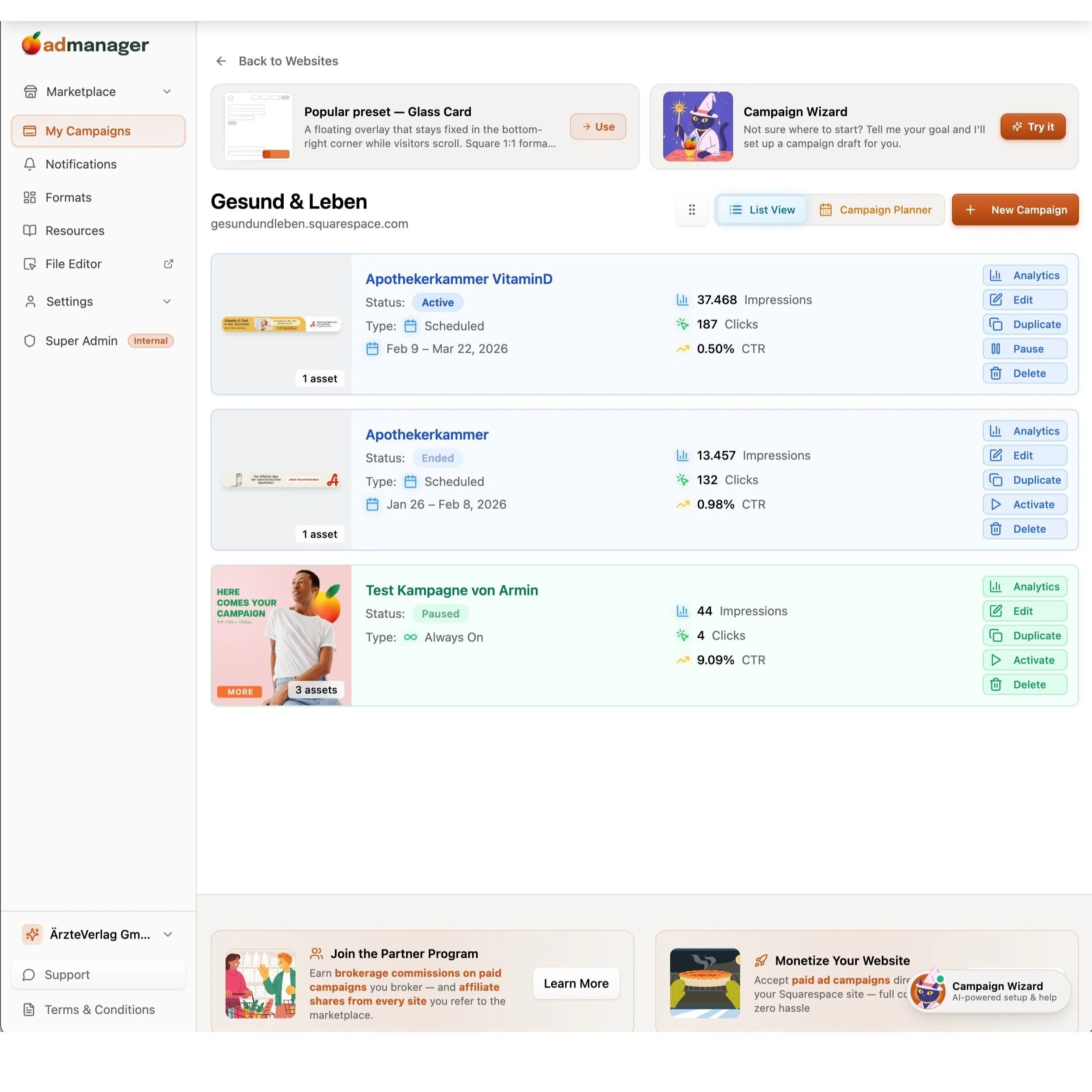
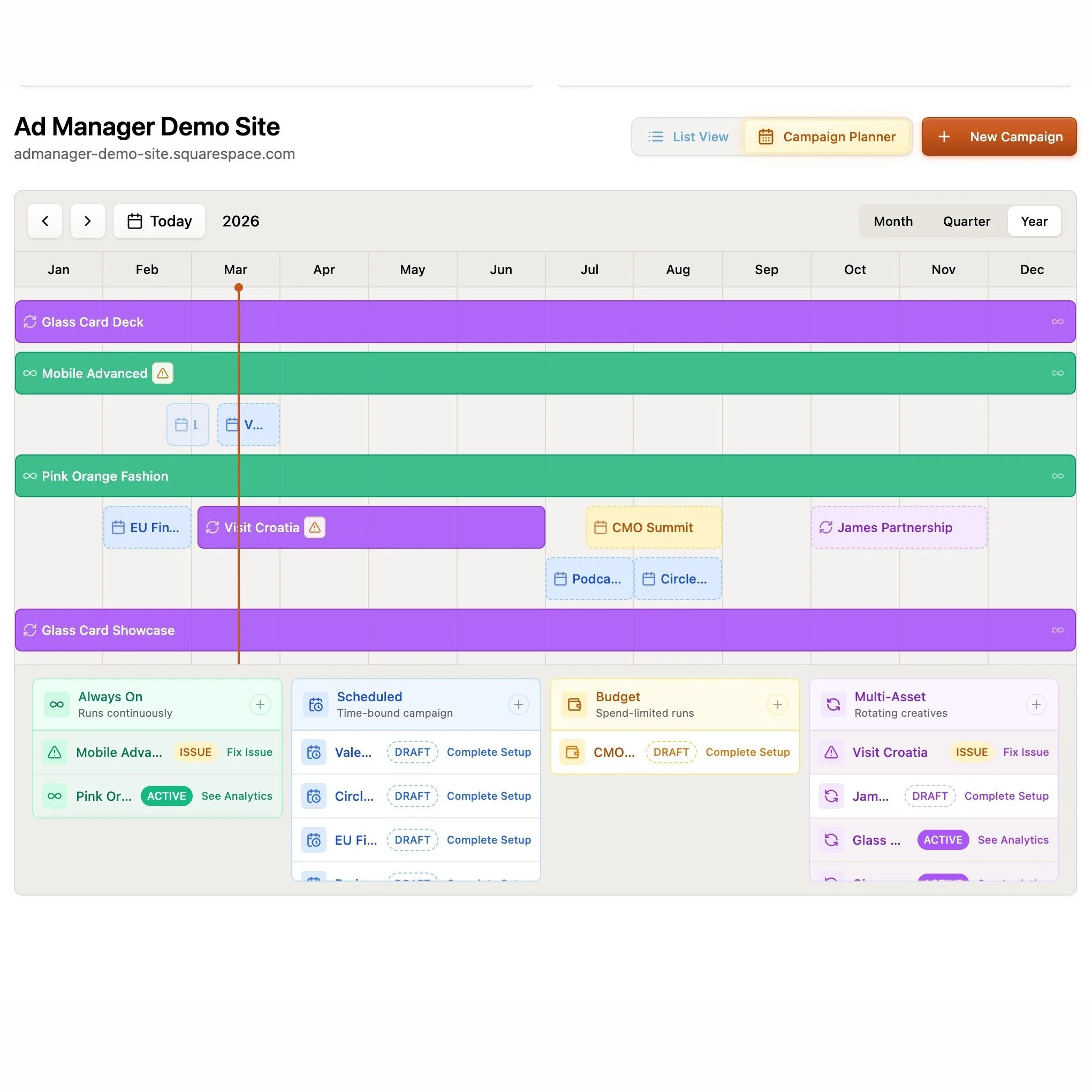
If you've ever wanted to run ads, promotions, or sponsored placements on your Squarespace site without handing the keys (or your sanity) over to Google AdSense, Ad Manager is worth a look. It was built by fellow Squarespace Platinum Partner Braunsberger Media after years of running into the same problem with clients - they wanted control over what showed up on their sites, and traditional ad networks just weren't it. I love tools built by fellow Squarespace pros because I know they have first hand knowledge of what it takes to solve real problems! With AdSense, you don't get to pick what shows up, the ads rarely match your brand, and they take a cut. Ad Manager flips that on its head.
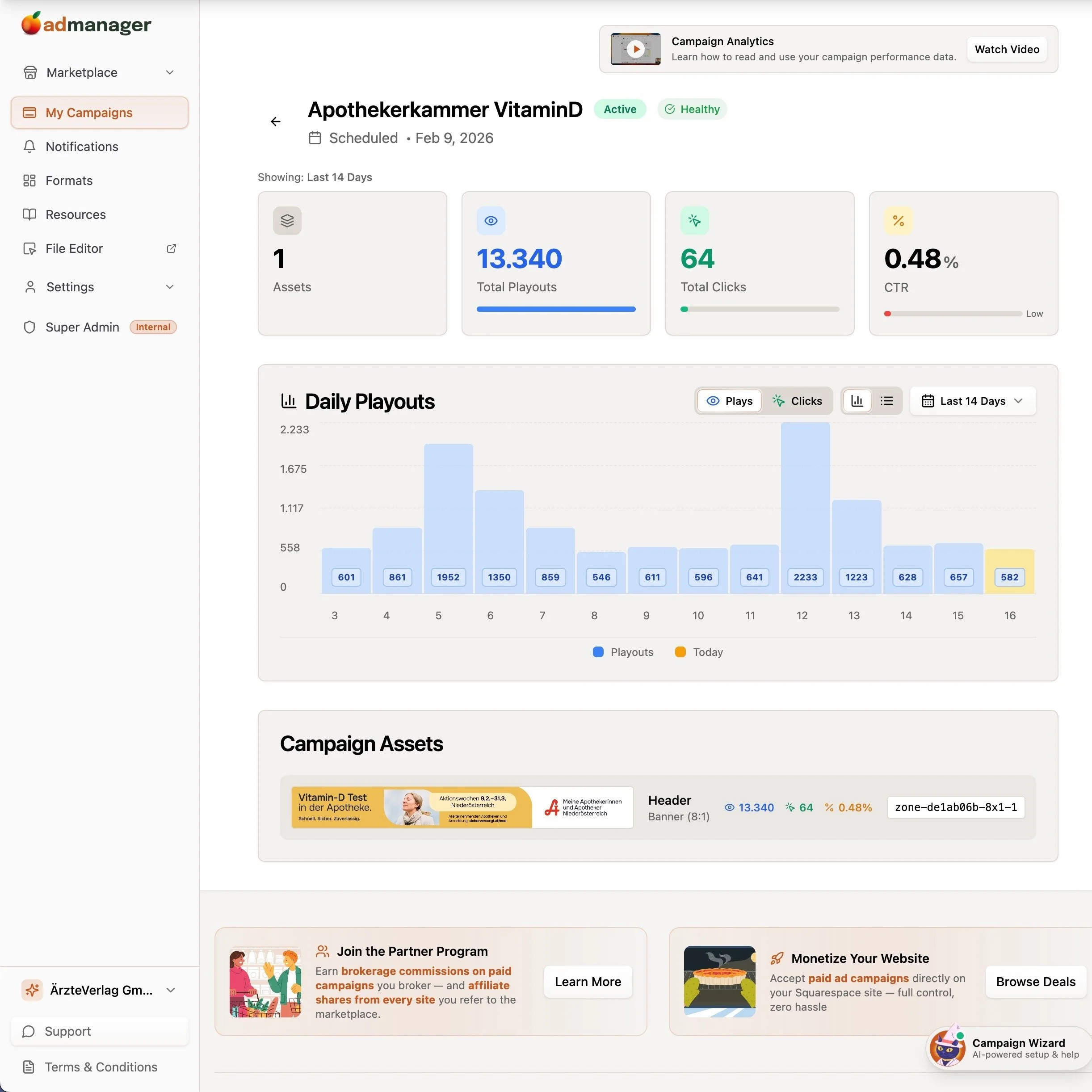

What it does:
Gives you a central dashboard to create, schedule, and track your own promotional content - banners, timed campaigns, sponsored placements, rotating creatives - directly on your Squarespace site. Setup is a one-time code injection paste and then everything else is managed from their dashboard. You also get real-time analytics for impressions, clicks, and click-through rates, plus a built-in image editor so you're not bouncing between tools.
What makes it really interesting is the marketplace model. You can collaborate with other site owners - either advertise on their websites or field proposals from brands who want to run campaigns on yours. The platform handles the money through an escrow system powered by Stripe Connect, so the website owner gets paid once the campaign has actually run. That's a smart setup for anyone looking to monetize without chasing invoices.
Who should try it:
Anyone who wants to monetize their site with ads or run partner campaigns but doesn't want a third-party network deciding what shows up. This is especially useful for bloggers, content-heavy sites, or agencies managing promotions for clients. You keep 100% of the revenue, which is a pretty big deal compared to the AdSense model.
Pricing:
You can use Ad Manager privately on up to 5 of your own websites for free. The marketplace features go beyond that, and the platform only takes a share on actual transactions - so you're not paying for something you're not using.
Delighted
Making sure that your customers had a great experience is obviously super important for brands of all sizes but Delighted makes it easy even for small businesses to get super actionable feedback from customers in the same way huge companies like Target, Uber, and Instacart do. Most importantly (to me, at least) is that it’s automated since this extension will automatically pull from your Squarespace order data.


What it does:
Allows you to send one-question surveys of several different types to customers either right after they order or on a specified delay. You can collect feedback in one area, track trends, or even automatically send responses to certain people on your team so they can follow up.
Who should try it:
Anyone looking to build up social proof with positive testimonials from customers without having to do a ton of setup tracking them down. Since the surveys are so simple and easy, customers are super likely to submit their feedback, which you can use on social media or your website to delight future customers. And the circle continues.
Pricing:
Free plan available that includes up to 1000 trackings per month and 3 users which I think would work for most teams. You only get one survey type on the free plan but everything can be automated so if you’re running a smaller shop, this would work great for you.
GoDataFeed
Not going to lie to you that setting up data feeds for shops on Facebook, Instagram, Google or Pinterest is NOT my jam. I know people who are great at this and am happy to refer them but for those that are looking to run online ads without having to worry about syncing product data across multiple channels or platforms, GoDataFeed will save you so many headaches.


What it does:
GoDataFeed automatically pulls in your Squarespace product data and optimizes your catalog for multichannel marketing. You can manage all your product info from one place, create optimized ads and make it so much easier for you to manage digital marketing campaigns in-house.
Who should try it:
Anyone who is looking to run ads or sell on platforms like Google, Facebook, Instagram, Pinterest, or 200+ marketing channels.
Pricing:
The lite plan is $39/mo will cover up to 1,000 SKUs and is still super robust in terms of all the other features (unlimited stores, users, and data modifications) compared to the Plus plan which is $99/mo. The right plan for you will really depend on how many products you have but the time GoDataFeed will save you on either plan is well worth it in my opinion.
Outfy
A lot of people have “social media” on the marketing to-do list but realize it can be… a lot. With Outfy, you can automate social media posting, saving you a ton of time working on getting new traffic to your site. You can easily create videos, GIFs, collages, or even put the whole thing into “autopilot” mode.


What it does:
Once you sync your Squarespace site to Outfy, you can easily generate ads for Facebook, Instagram, and Google for any product in your shop. Share on social media, automate posting or create graphics all from the Outfy dashboard.
Who should try it:
Anyone who wants to try their hand at social media marketing without needing to hire a graphic designer or digital marketer.
Pricing:
All the plans basically include the same features so you’re basically just going to pay for how much you use or share via the app. The free plan gets you 30 credits/month, where one credit = one post to a social network. If you want to use any of the GIF, video, or collage layouts those are more credits.
Bottom Line
Running an eCommerce business on Squarespace is made even more powerful by taking advantage of some of the extensions that are available to supercharge the experience. (See also: this post all about Squarespace shipping extensions!) If you’re looking to get more eyes on your store either through social media marketing, selling on other platforms, running digital ads, or building up a huge roster of satisfied customers, give one of the sales & marketing Squarespace extensions a try.

How to Add Restaurant Online Ordering to Your Squarespace Site (and Keep More Profit)
Adding online ordering to your restaurant’s Squarespace site doesn’t have to mean rebuilding from scratch or losing profits to delivery apps.
If you’ve ever tried to add online ordering to a restaurant website, you already know the pain points: either you’re handing over a chunk of your profit to a third-party app, or you’re rebuilding your entire site just to make it work.
Neither is ideal, especially if you already like your Squarespace site and just want an easy way for customers to place orders directly with you.
That’s where Allday Ordering comes in. It’s a new Squarespace extension that lets you add online ordering right to your existing site - no new platform, no technical chaos, and no middlemen taking their cut.
I’ve been testing it on a few projects lately, and I’m genuinely impressed by how simple it is to set up and how well it integrates with the way small restaurants actually run. So in this post, I’ll walk you through what it does, who it’s best for, and how to make it work harder for you.
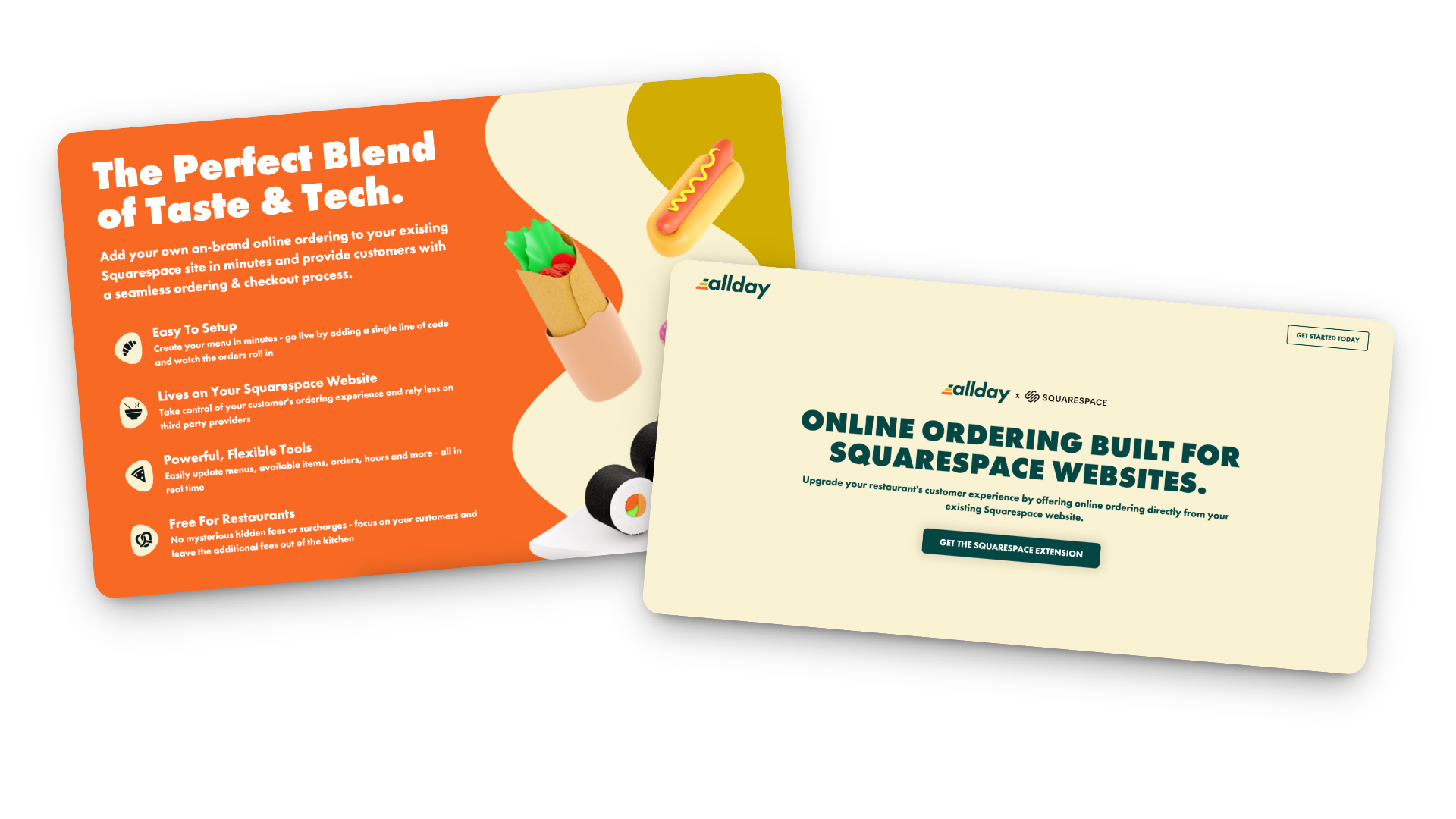
What Allday Does (and Why It’s Worth a Look)
Here’s the gist: Allday connects directly to your Squarespace website and adds a complete online-ordering experience - one that looks and feels like part of your brand.
Customers can:
Browse your menu
Customize their order
Check out without ever leaving your site
You keep your design, your data, and your margins.
Setup is easy too: just add a small code snippet, configure your menu, and go live. Seriously so simple!
How the Pricing Works
Here’s my favorite part: it’s actually transparent.
For restaurants: completely free.
For customers: a flat $2 fee per order (clearly shown at checkout).
Processing: standard Stripe fees (2.9% + 30¢).
Contracts: none 🚫
Plus, you can start, pause, or cancel anytime. And because everything runs through your own website, you keep the customer data - meaning you can actually build relationships instead of renting them from delivery apps.
Who Allday is Best For
In my opinion, Allday is a great fit for:
Independent restaurants that want to modernize without switching systems
Cafés and bakeries that sell daily specials, pre-orders, or meal kits
Catering services and pop-ups that need flexible menus
Small restaurant groups that want a consistent setup across multiple locations
Basically, if you’re already using Squarespace and want a way to accept online orders that feels native to your site (and not like a clunky bolt-on), this is worth exploring.
How to Make Online Oredering Work Harder for You
This is where the magic really happens. Adding online ordering is great, but optimizing how people use it can make a big difference in your sales.
Make “Order Now” Impossible to Miss
Add it to your header, footer, homepage hero, and anywhere else customers tend to land. If they have to hunt for it, they’ll give up and go back to DoorDash.
Use Mouth-Watering Photos
A couple of great shots of your best-sellers go a long way. You don’t need a full menu gallery — just enough to make people hungry.
Keep the Menu Tight
Too many options = decision fatigue. Focus on what you can fulfill quickly and consistently. Clear categories and smart modifiers (“Add chicken +$2”) help too.
Promote Direct Ordering Everywhere
Remind customers they can order directly from your site. Add a quick line to your emails or posts:
“Skip the apps — order directly from our website and help us keep prices fair.”
Use QR Codes Strategically
Add them to menus, packaging, and in-store signage that lead straight to your ordering page. Repeat customers will thank you.
Pay Attention to the Data
Because you own your analytics, you can actually see what’s working — top dishes, busy hours, repeat orders, and even drop-off points. Use that info to improve your menu and marketing.
Integrate with Your Email List
If you use Flodesk (like I do) or another email tool, send simple reminders:
“New week, new menu — order ahead now.”
“Early access to our seasonal menu — pre-order today.”
Test and Adjust
Watch how customers interact with the page. Are they clicking “Order Now” right away, or scrolling first? Do certain items always sell out? Tiny layout or wording tweaks can have a big impact.
Keep It Fresh
Menus change, seasons change, and so do your customers’ habits. Make updating your online ordering part of your regular routine — swap in seasonal dishes, highlight new items, or feature a “staff favorite” now and then.
Bonus Tip: Not only does this keep regular customers engaged, it also signals to Google that your page is active (which can help with SEO).
Restaurant Ordering on Squarespace FAQs
-
Install the official Allday extension, add your menu, set your pickup/delivery options, and embed “Order Now” buttons on your site. It takes less time than you’d think.
-
It’s free for restaurants. Customers pay a small flat fee ($2 per order), plus standard Stripe processing.
-
Yep! You can set different menus, hours, and fulfillment options for each.
-
Yes! Everything happens right on your Squarespace site, so your fonts, colors, and overall style stay consistent.
-
I’d recommend it for small to mid-sized restaurants, cafés, bakeries, catering businesses, and pop-ups - basically anyone who doesn’t want to hand off their customer experience to a third-party app.
-
Visibility + communication. Make the ordering button clear, mention it in your emails and social posts, and highlight the benefits (lower fees, faster pickup, direct support for your business).
Bottom Line
Adding restaurant online ordering to your Squarespace site doesn’t have to be complicated or expensive. With Allday, you can keep your website, your brand, and your customer relationships intact - all while giving your diners a smoother, more personal way to order.
If you’re ready to give it a try, you can get started here. I’ll help you set it up and make sure it looks and functions exactly the way you want.
Because really, you should be focused on your menu - not a middle man.

The Case for Intentional Friction: Why Effort Isn’t Always the Enemy
We’ve been told to remove friction at all costs, but the smartest websites know when to slow people down. Discover how thoughtful UX friction can reduce errors, increase confidence, and create smoother, more human digital experiences.
This is my manifesto to fellow web designers and UX enthusiasts everywhere. I'm concerned. We may have spent so much time preaching the gospel of seamless design that we’ve forgotten something important: a little effort can be a good thing.
Not the kind that makes people rage-click or want to throw their laptop over the balcony, but the kind that slows them down just enough to help them make better decisions.
This is the case for intentional friction: small, thoughtful speed bumps that protect users, build commitment, and create trust.
When Friction Works
There’s a difference between accidental friction and intentional friction. Accidental friction is the stuff we all hate: broken links, confusing layouts, forms that reload when you hit “Enter.” Basically anything that's the design equivalent of a pothole.
Intentional friction, on the other hand, is more like... a crosswalk. It’s a purposeful pause that helps people think before they act. It’s not there to frustrate, it’s there to prevent regretful accidents.
Think of your online checkout. Automatically selecting the first product variant might seem convenient, until someone buys the wrong size and has to email support. A quick “Choose your size” step adds a split second of friction but saves time, money, and goodwill in the long run.
The same principle applies elsewhere: adding a confirmation page before finalizing a donation, or a quick note reminding users that digital downloads are non-refundable. Even something as small as requiring a user to check a box acknowledging store hours before booking an appointment can prevent confusion later.
These moments of purposeful pause show respect for the user - and for your time.
The Psychology Behind Productive Friction
A bit of friction can build commitment. When people have to take a small action - confirm a donation, pick a size, type in their email - it shifts them from passive observer to active participant. Behavioral researchers call this effort justification: when we work for something, we value it more.
It’s why a one-click checkout feels amazing in the moment but can backfire later with buyer’s remorse. The lack of effort means the action carries less emotional weight. Thoughtful friction, on the other hand, turns impulse into intention.
👉 Related reads:More Pricing Psychology Tips to Increase Sales and Pricing & Product Lineup Strategies for Sustainable Business Growth - both explore how buyer effort and perception shape long-term satisfaction and trust.
Where to Add (and Avoid) Friction
Add friction where clarity or confirmation matters:
Choosing product variants or customization options
Confirming high-stakes actions (donate, delete, publish, buy)
Reviewing information before submission
Avoid friction where momentum matters:
Browsing and discovery
Navigating between sections
Low-stakes conversions (like newsletter signups)
💡 Rule of Thumb: Friction should never feel like punishment, it should feel like protection.
The Bottom Line
Designing for zero friction might sound like the goal, but total ease can make experiences forgettable. Engagement lives in the balance, enough smoothness to feel intuitive, enough resistance to keep people present. The best brands know this instinctively: they design moments that feel effortless and intentional.
Good UX is like good storytelling. It needs rhythm, contrast, and the occasional pause for tension. Those pauses aren’t bugs; they’re features. This is where our users can reconnect with our purpose. Basically, too much friction and people give up. Too little, and they lose interest.

Why Boring Websites Often Convert Better
Sometimes “boring” is just another word for effective.
We’ve all seen those websites - loud, over-designed, stuffed with animations. Why is everything scrolling and floating everywhere? Are we playing a game of chase the button? What is going on??
Sites that are trying to do so much and yet still somehow leave you feeling very, very confused.
Landing on one is like watching a movie that’s all explosions, chase scenes, and stupid sound bites - but at the end you walk out of the theater still wondering what the movie was... about? Flash may grab your attention, but it doesn’t hold it. Without a story or a clear plot, its all just noise.
The same thing happens online when a website tries way too hard to impress without giving visitors something to understand or trust right away.
So here's your permission slip (not that you needed one) but you don’t need a louder website. You need one your audience’s brain doesn’t have to decode.
Because clarity, not chaos, is what earns trust.
We live in a design world obsessed with “standing out,” but the truth is, the sites that quietly guide visitors with confidence are the ones that win. The best part is that this all isn’t just luck - it’s proven psychology. And double bonus? It doesn't take a zillion dollar mega studio budget to pull off.
🎥 Related Watch: Why "Boring" Websites Convert Better
The Science of Familiarity Bias
Humans are creatures of habit. When something feels familiar, our brains release a little hit of safety. That’s familiarity bias - we naturally trust what we recognize. And while we should all work hard to overcome our biases IRL, when it comes to UX and web design it's time to embrace our little monkey minds.
It's why checkouts from Amazon to Target look nearly identical.
It’s why “Add to Cart” buttons are usually in the same spot across eCommerce stores.
It's how we nearly all know to scroll to the footer for more info or click on a logo to go to the home page.
Consistency helps users relax and focus on the content, not the structure. For websites, it’s the same principle. A clear CTA in a predictable place outperforms an experimental layout every time.
Predictability builds trust, and trust builds action.
Cognitive Load: The Hidden Conversion Killer
Every unexpected design choice adds mental effort - what psychologists call cognitive load. The more effort it takes to understand your site, the faster people leave. Because let's face it, we've all got enough going on and are processing just an insane amount of information every day. Unless your site is the NYT puzzles app, I simply do not want to have to work at it.
And I'm not just making this up based on my own inclination towards simple. Studies show that visitors make a stay-or-go decision almost immediately - often within just a few seconds of landing on a page - and the likelihood of them leaving drops sharply after the first 30 seconds, which is forever in internet time.
In short, if they don’t feel confident they can find what they need right away, people will bounce.
Your job as a designer or as a brand owner is this: make every step effortless. Now, this doesn’t mean boring or without friction where needed; it means intentional.
The Predictabile to Professional Pipeline
Predictability doesn’t just make a website feel polished - it signals competence.
When visitors see consistent spacing, steady typography, and patterns that behave the way they expect, they subconsciously read that as professionalism. It’s the same reason we trust brands whose tone and visuals never feel off-script. Basically, consistency = credibility.
The trick here is just to not confuse predictability with sameness.
The best sites balance consistency with a little spark - something that’s uniquely you but still easy to navigate. It’s the tension between structure and surprise that keeps visitors engaged.
If your website were a film, predictability would be the plot structure. It’s what keeps people oriented so your creativity can shine in the details: the cinematography, the dialogue, the pacing. Good design, like a well-told story, gives your audience clarity about what they’re watching and, ultimately, why they should even care.
Familiar layouts don’t just make users comfortable - they make your brand feel established. A calm, structured website signals confidence. An over-designed one often reads as overcompensating. The brands that “feel big” usually aren’t the loudest, they’re the clearest.
👉 Further reading: You Don’t Need More Traffic, You Need More Trust
The Bottom Line
At the end of the day, clarity and consistency aren’t the enemies of creativity - they’re what make it possible. Predictability gives your story structure; creativity gives it spark. A great website blends the two so effortlessly that users don’t even notice the design, they just feel understood.
So, if your site is the movie trailer, your job isn’t to boost the pyrotechnics budget. It’s to make sure people know exactly what they’re signing up to watch and hype them up so that they can’t wait to see more.
That’s not boring. That’s brilliant design.

What Your Website Is Really Saying (and Why Most People Get It Wrong)
Your website communicates long before anyone reads a word. Learn how Squarespace web design, UX strategy, and clear communication shape first impressions, build trust, and convert visitors into confident buyers.
Picture this: someone lands on your site for the first time. They don’t read a single word - not yet, anyway. They scan, they scroll, they feel.
In about three seconds, they’ve already decided whether your site gets them or not.
That’s not magic - that’s communication design. Your layout, colors, and copy are already saying something. The only question is: is it the right thing?
Most sites unintentionally send mixed signals - they’re trying to be helpful and unique but end up confusing or overwhelming their visitors. As a designer and strategist, I’ve seen this across eCommerce shops, nonprofits, and service-based businesses alike. The fix isn’t another redesign. It's not about picking a new template or adding more copy. It’s about taking a step back and getting the conversation right.
Websites Are Conversations, Not Brochures
Your website is having a conversation with every visitor - even before they start reading. Layout, photography, copy, and structure all speak volumes.
Think of your site as a stand-in for you at a networking event. Are you friendly and confident, offering a clear sense of who you are from the first handshake? Or do you ramble, jump between topics, and make people guess what you actually do?
That’s the difference between a clear website and a confusing one. A good site introduces itself, makes eye contact, and leads the conversation in a way that puts others at ease. A bad one leaves people looking for the nearest exit or begging for a friend to come save them from the conversation.
Your job is to make sure that first impression feels natural and intentional, not awkward or unclear. When your website opens the conversation confidently, the rest of the interaction flows naturally - visitors lean in, not away. And now that we have them, the real work begins which we're going to get to next.
👉 Related reading: You Don’t Need More Traffic, You Need More Trust
Three Common Mixed Messages
Every site, no matter how well designed, can end up saying the wrong thing in subtle ways. Here are three of the most common mixed messages I see across client projects - moments when the website’s conversation with its visitor goes sideways. If you’re a visual learner, you can also watch me walk through these same examples in my guest video on Inside the Square’s YouTube channel:
1. The Mystery Headline
If your main headline could apply to ten different industries, it’s not helping you. Remember: clarity first, clever second. “Custom Squarespace websites that build trust and drive sales” works far better than “Design that inspires.”
2. The Menu Maze
Your navigation should guide, not confuse. The biggest impulse people seem to have is to just keep adding more links but I would argue that it's way better to keep it short (five or fewer top-level links) and label pages in everyday language. “Work With Me” says far more than “Experience.”
3. The Everything Button
When every section shouts for attention - Shop Now! Learn More! Subscribe! - visitors stop listening. Prioritize one clear goal per page. A calm, confident site feels more trustworthy than a busy one. If you're worried that this sounds boring, buckle up, I've got news for you.
👉 See also: UX Tips for Every Phase of the eCommerce Journey
Why Familiar ≠ Boring
There’s a myth that familiar design equals bland design, but let’s be honest - that myth was probably started by someone who confuses chaos with creativity. Familiarity isn’t boring; it’s comforting. It’s the quiet confidence of a site that knows exactly what it’s doing. It's a big 'ol mug of hot cocoa.
Our brains are wired to trust patterns we recognize - it’s called familiarity bias. When your layout behaves the way users expect, they don’t have to think about where to click or how to navigate. They just get it. That sense of “I know how this works” lets them focus on your message instead of figuring out your interface.
Think about your favorite neighborhood coffee shop. You don’t need to re-learn where the sugar packets or napkins are every time you visit - they’re always in the same spot. You go there because it’s predictable in the best way. A good website should work the same: welcoming, easy, and familiar enough to feel safe, even if it’s your first visit.
Familiar design doesn’t mean unoriginal. It means frictionless at all the right points, stepping in only when necessary to engage and guide (think product variant choices or confirmation steps). Familiar means your visitors are free to notice your story, your offer, your value - instead of your layout. Creativity still belongs, but it’s there to serve the experience, not steal the spotlight. Use it in your copy, your photography, and your little brand moments, not in hiding your navigation or rethinking the contact button. Visitors want reassurance, not puzzles. Unless you're a puzzle site in which case, maybe that would work nicely for you!
👉 Try this next: How To Decide Between Sales & Discounts
The Bottom Line
Design is not decoration, it’s communication. The best websites don’t shout to be seen; they lead with confidence and clarity. Every element, from layout to language, should help your visitor understand who you are and what you want them to do next. When you design with purpose instead of polish, you create trust. And when you create trust, you don’t need gimmicks or flash to stand out - you simply feel solid, credible, and right.
I love design as a tool to earn trust and provide reassurance. Done right, design can close the loop between what your brand promises and how it behaves online. It allows you to show up with intention, invite people in, and leave them thinking, that felt easy. It should make you feel the same way a great conversation at that imaginary networking event ends - comfortable, confident, and clear about who you just met and why they made such a good impression.

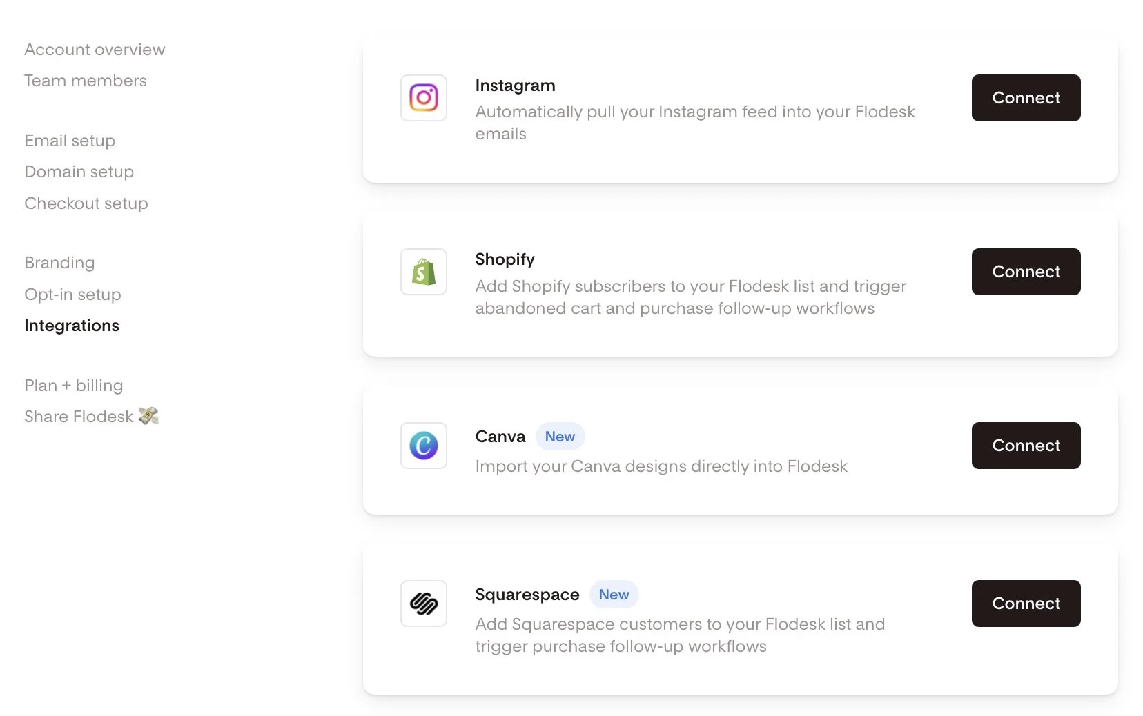
Flodesk + Squarespace Commerce: A Real Look at The New Integration
Flodesk’s new integration with Squarespace Commerce means no more Zapier hacks. Now you can sync customers instantly, trigger post-purchase workflows, and build smarter automations - without extra tools.
If you’ve ever strung together Squarespace and Flodesk with a series of zaps and a prayer, I know you’ve thought: surely there must be a better way? Good news: Flodesk now offers a direct integration with Squarespace Commerce. No Zapier or duct tape necessary. But real talk: there are still a couple of kinks to iron out and some pitfalls you’ll want to look out for. Let’s break down exactly what you can do, the smart ways to take advantage of this update, and what you still can’t, so you can plan your automations confidently.
What This Integration Actually Enables
Finally! Here’s what you can now do with Squarespace x Flodesk:
Customer Sync: Automatically import all customers into Flodesk as a segment.
Post-Purchase Triggers: Launch workflows the moment a purchase completes - just pick Squarespace as the trigger in Flodesk (Makes a purchase → On the store …), then optionally filter by product.
Powerful Workflow Capabilities: From cart purchase to final email, Flodesk handles the workflow logic. Use delays, conditions, and design strategic sequences to ask for reviews, cross-sell, or welcome repeat buyers. (More on this below!)
What It Still Doesn’t Do :(
No Abandoned Cart Emails: Squarespace's API doesn’t support the detection of abandoned carts, so recovery sequences still aren’t possible. No tool outside of Squarespace’s own email campaigns can trigger upon cart abandonment yet.
No Real-Time Form Opt-In Sync: New sign-ups via Squarespace forms are only synced to Flodesk every six hours, unlike purchases, which sync instantly. IF you need form submissions to sync instantly that’s not a problem though - just embed your Flodesk forms like normal vs. using the integration.
Doesn’t Replace Squarespace Transactional Emails: This integration does not replace the automated Squarespace customer notifications, such as the order confirmation email or shipping confirmation email. Those are transactional and are handled by Squarespace. Flodesk handles the relational follow-ups. You can’t turn off Squarespace’s system emails, so make sure you customize and brand them (more on that in this post).
What Gets Sent via Squarespace vs. Flodesk Cheat Sheet
Via Squarespace
Order confirmation (via Customer Notifications)
Shipping confirmation (via Customer Notifications)
Abandoned Cart (via Campaigns)
Via Flodesk
Product-specific emails or workflows
Customer-specific emails or workflows
Wildcard
Review Request email - your pick on this one! Just make sure that if you enable the automatic Squarespace review email that you don’t set one up via Flodesk and vice versa.
How the Integration Works Behind the Scenes
When you connect, a segment is automatically created and named after your Squarespace store URL. You can rename it after the fact without breaking the sync.
The initial import includes all customers who’ve opted into marketing.
Ongoing sync runs automatically every six hours for form opt-ins. Purchases sync immediately and are marked as either Unconfirmed (if not opted into marketing) or Active (if opted-in).
How to Connect Squarespace & Flodesk
Ok, so you’re into this? Making the connection is super easy! Just go to Account settings > Integrations, click Connect on the Squarespace card, and follow the prompts!
Screenshot of Flodesk and Squarespace integration
How to set up a Squarespace Purchase Follow-up workflow in Flodesk:
Alternatively, if you haven’t done that yet and you’re in the middle of building out a workflow, you can also do it right there by choosing Squarespace as a trigger in a purchase follow-up workflow.
Head to the Flodesk dashboard under Workflows → + New → Purchase follow-up.
Select Your Trigger: Choose 'Makes a purchase' and select your Squarespace store.
Product-Specific Workflows: Filter by product if needed. Note that each workflow currently supports filtering for one product, requiring a specific workflow for each.
Build Your Customer Journey: Incorporate time delays, conditions, and multiple emails to craft a personalized customer experience.

Setting up a workflow in Flodesk
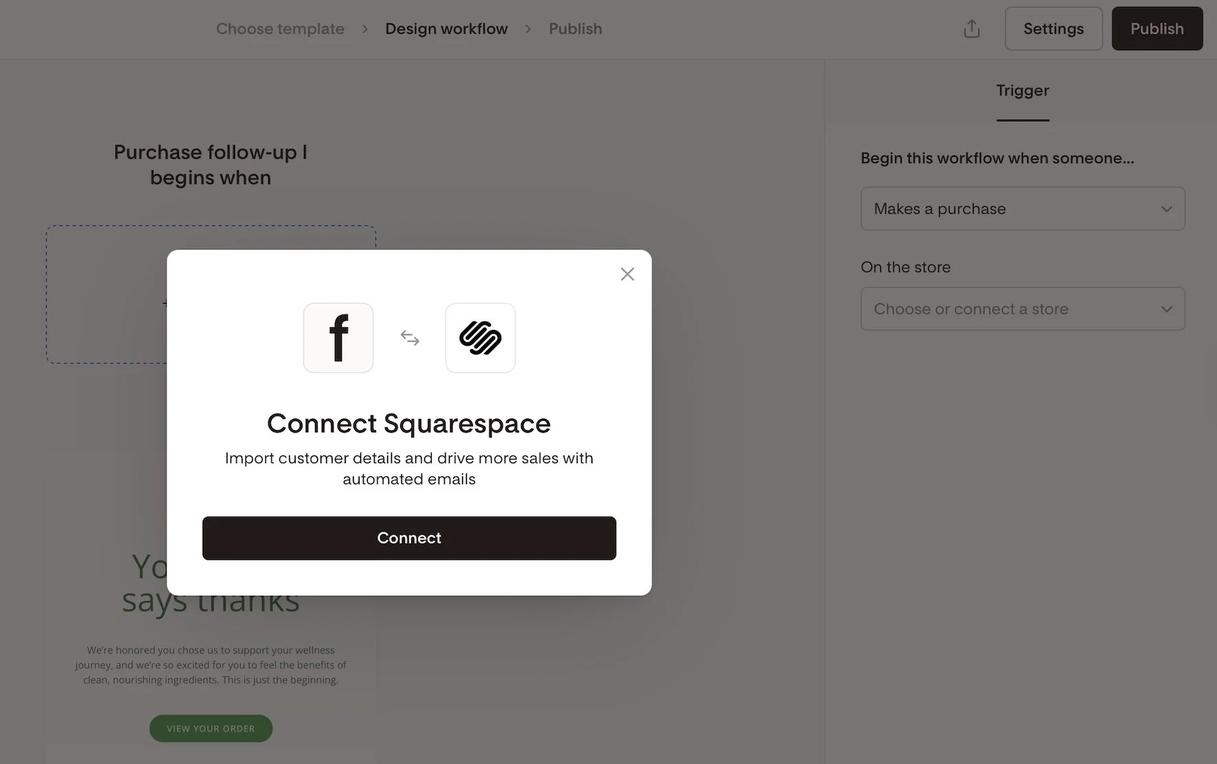
Connecting Squarespace as an integration in Flodesk
Creative Workflow Implementation Ideas:
Not sure where to start with commerce-related workflows? Here are some ideas to get the wheels spinning!
Thank-you email after a purchase
Detailed how-to-use instructions for a product
Address common product or service FAQs
Upsell or cross-sell related products
Send a review request email post-delivery
Offer an exclusive discount for repeat buyers
Invite customers to join a membership, subscription, or community
Implement seasonal or collection-based follow-ups
Squarespace x Flodesk FAQs
-
Nope. Everything you can currently do (customer sync and purchase-triggered workflows) happens natively.
-
Not currently - Squarespace doesn’t send that kind of trigger through the API.
-
Form opt-ins every six hours; purchases are synced instantly. If you need forms to sync instantly though, just embed a Flodesk form!
-
In a dedicated segment named after your store URL - you can rename it later if you’d like.
-
Absolutely - but note that each workflow only supports a single product filter. So if you want to send 3 unique automated emails for 3 specific products, just set up 3 workflows in Flodesk.
-
Flodesk workflows could overlap. To avoid duplicates, disable Squarespace post-purchase emails if you’re using Flodesk for follow-ups.
-
On Squarespace, go to Settings > Selling > Checkout and toggle Email Signup ON. You can also customize the text displayed in the signup box by clicking on Email Signup Settings.
Bottom Line
This new integration is exactly what so many Squarespace sellers have been hoping for. Now, you can finally say goodbye to Zapier, create purchase-triggered workflows, and send out beautiful follow-up emails—no complicated workarounds needed. While things like abandoned cart emails and instant form syncing are still on the wish list, this update is a big step forward for building stronger customer relationships right inside Squarespace.
If you’re excited to try it out, you can sign up using my Flodesk affiliate link. Not only will you get access to these handy new features, but you’ll also be supporting more tutorials like this one in the future. It’s a win for your business and helps our whole community grow!

Think Like a Buyer: How to Map Your Customer Journey
Most websites are built like a checklist. But what if your site could do more than just… exist? Discover how thinking like a buyer and mapping their journey can transform your website into a powerful sales tool, leading to more conversions and happier clients.
Most people design their website like a checklist:
✔ Design homepage
✔ Add services page
✔ Set up contact form
And technically… they’re not wrong. But if you only focus on what you offer (and ignore what your customer actually needs), your site experience can quickly break down. So instead of just building out pages because you think you should, let’s look at what really guides your buyer’s decisions so you can create with purpose.
Because your buyer isn’t following your site structure. They’re following their own journey - one that’s part emotional, part practical, and 100% driven by how well you earn their trust.
If you want more sales, whether you provide services, digital products, or a full-blown eCommerce storefront, you can’t just think like a business owner.
You have to start thinking like a buyer.

Why I Moved My Digital Products from Squarespace to Podia
Learn why I moved my digital products from Squarespace to Podia. Compare features, pricing, and user experiences to find the best platform for your online business and digital product offerings.
Updated Oct 2024
My journey with online course platforms has been quite the adventure, filled with twists, turns, and a fair share of "aha" moments. From Podia to Squarespace, and back again, here's the story of how I found the right fit for my digital products.
Picture this: It's late 2019, and I'm exploring the world of digital products with Podia. Life's good, ideas are flowing, and then... 2020 arrives with its, well let’s just call them unexpected challenges. Suddenly, my focus shifted to blogging and 1:1 services, and Squarespace seemed like the better perfect fit for those needs at that time.
As time went on, Squarespace introduced Member Areas and Courses and I was genuinely excited. The prospect of having built-in digital product tools on a platform I already knew and loved was enticing. It seemed like the perfect solution.
But here's the thing about shiny new objects - sometimes the shine wears off, revealing a few limitations underneath. Don't get me wrong, Squarespace is still an excellent platform for many projects, and I remain a proud Squarespace Circle member and Community Leader. However, I've always believed in using the best tool for the job, and for digital products, I realized I needed to look elsewhere.
In my search for the ideal platform, I've explored options like Kajabi and Teachable. Each has its strengths, but none quite hit that sweet spot I was looking for. It was starting to feel like I was on an endless quest for the perfect solution.
That's when I remembered Podia. Like an old friend who got a cool makeover, it had evolved. Improved blogging capabilities? Check ✅ Enhanced website builder? Double-check ✅✅ It was like Podia had been quietly improving while I wasn't looking, and I was intrigued.
So, why am I telling you all this? Because whether you're a fellow web designer juggling client sites or a DIY enthusiast trying to wrap your head around digital products, I've been in your shoes. I've wrestled with the platforms, I've navigated the learning curves, and I've experienced the joy when things finally clicked.
In this post, I'll walk you through my decision to return to Podia, comparing its features with Squarespace and explaining why it's now my go-to platform for digital products. We'll dive into the details - the advantages, the considerations, and the "why didn't I think of that before?" moments.
Whether you're team Squarespace, curious about Podia, or just trying to make sense of the digital product landscape, this post is for you. Let's explore together and find the right platform for you.
Why Podia Won Me Over
1. Reliability and Ease of Use
One of the biggest draws of Podia is its reliability and ease of use. While Squarespace is known for its user-friendly interface, I found myself spending more time troubleshooting and tinkering with layouts than actually creating content. With Podia, things just... work.
Key benefits:
Less buggy experience compared to recent Squarespace issues
Intuitive web builder with consistent design across all screen sizes
More time for content creation, less time spent on technical issues
Personal experience: A particular pain point with Squarespace was (and is) the tablet view. While I've developed some workarounds, none are perfect. I really dislike having to tinker with mobile view separately on Squarespace when things should just stack beautifully with perfect spacing and no overlapping content. Podia solves this issue effortlessly, allowing me to focus on creating valuable content rather than endlessly tweaking layouts.
2. Comprehensive Feature Set
Podia offers a robust set of features that cater specifically to digital product creators. Here's how it compares to Squarespace:
Unlimited video storage (Squarespace has limitations depending on the plan)
Built-in communities (not available on Squarespace)
Easy upsells and bundling options (either not available or limited on Squarespace)
Built-in customer chat (extra cost on Squarespace, using a third-party tool)
Integrated affiliate program (extra cost on Squarespace, using a third-party tool)
Personal take: These integrated features have streamlined my workflow significantly. No more juggling multiple platforms or paying for additional tools – it's all right there in Podia.
3. Superior Digital Product Management
When it comes to managing digital products, Podia truly shines:
Cohesive "storefront" for digital products
Intuitive course platform with less tinkering required
Easy creation of bundles and payment plans
Ability to sell subscriptions and options for digital products
My experience: On Squarespace, I felt like I was constantly cobbling together digital product blocks, trying to create a cohesive offering. It was technically possible to do some of these things, but it required stringing together multiple features in a way that felt clunky. With Podia, I can focus on creating content rather than moving blocks around, and the ease of creating bundles has noticeably boosted my sales.
4. Enhanced Customer Experience
Podia provides a seamless experience not just for creators, but for customers too:
Clear, unified dashboard for customers to access all purchases
Improved delivery of digital products
What this means for my customers: On Squarespace, it was often hard for customers to see everything they've purchased or have access to. With Podia, I can easily provide access to multiple files, larger files, and even provide supporting content for each download. It's a night-and-day difference in terms of user experience.
5. Integrated Marketing and Sales Features
Podia's marketing and sales features are where it really sets itself apart:
Comprehensive email marketing integration
Advanced features like tagging/segmenting and automated sequences
Simplified, truly all-in-one solution
My journey: I was previously using ConvertKit for email marketing (and still really recommend it especially for their eCommerce integration with Squarespace), but when they announced they’re rebranding, I took it as an opportunity to just see what else was around. Squarespace's built-in email marketing platform (Email Campaigns) lacks features I need, such as tagging/segmenting and true automated sequences. Podia's email marketing is simpler than ConvertKit, but it offers all the features I actually use. Having everything built into one platform is a dream - it's what I wished Squarespace's Email Campaigns could be, but with Podia, it actually works!
6. Stellar Customer Support
One of the standout features of Podia is its exceptional customer support:
Responsive and helpful support team
Comprehensive knowledge base and resources
A real-life example: Recently, I noticed a small bug in Podia's color themes. The support person responded personally and quickly, acknowledging the problem, offering a viable short-term solution, and promising a complete fix within one business day. True to their word, the tech person followed up, and the issue was resolved promptly. This level of responsiveness and follow-through is refreshing, especially when compared to my recent experiences with Squarespace where bugs are often acknowledged half-heartedly and never actually resolved.
Pricing Breakdown: Simplicity vs. Complexity
Let's talk money, folks. One of the things that drew me back to Podia was its refreshingly simple pricing structure. They've got two plans and a couple straightforward add-ons. Squarespace, on the other hand, has a pricing structure that's about as straightforward as a corn maze. Let's break it down:
Podia Pricing
Mover Plan
$33/MO (PAID ANNUALLY)
5% fees
Includes:
30-day free trial
Unlimited download products
Unlimited coaching
Online community w/ unlimited members
Unlimited courses
Unlimited webinars
Unlimited product bundles
Free migration of up to 20 products
Shaker Plan
$75/MO (PAID ANNUALLY)
0% fees
Includes:
30-day free trial
Unlimited download products
Unlimited coaching
Online community w/ unlimited members
Unlimited courses
Unlimited webinars
Unlimited product bundles
Free migration of up to 30 products
Affiliates
Podia Add-Ons:
Email Marketing: Free for first 100 subscribers, $7/mo for up to 500, $13 for up to 1500, etc. All plans include all features including unlimited emails.
Teammates: Add 1 teammate for $16.67/mo, 5 for $41.67/mo, etc. Granular permissions mean teammates only see what you want them to.
ℹ️ For more about Podia features, check out this post.
Squarespace Pricing
Business
$23/MO
3% fees
Includes:
14-day free trial
Unlimited download products
Unlimited contributors
Basic Commerce
$28/MO
0% fees
Includes:
14-day free trial
Unlimited download products
Unlimited contributors
Advanced Commerce
$52/MO
0% fees
Includes:
14-day free trial
Unlimited download products
Unlimited subscription products
Unlimited contributors
Squarespace Add-Ons:
Courses & Memberships: On any plan above, sell unlimited courses & memberships for an additional 9% transaction fee. Alternatively, add a Digital Products subscription:
Starter Plan: $9/mo (7% fees)
Core Plan: $29/mo (3% fees)
Pro Plan: $89/mo (0% fees)
Higher plans also come with increased video storage limits.
Email Marketing: Free to collect subscribers, then:
Starter Plan: $7/mo (500 email limit)
Core Plan: $14/mo (5,000 email limit)
Higher plans available for additional emails. All plans include unlimited subscribers.
Scheduling: Add booking capability for coaching sessions:
Emerging Plan: $16/mo for 1 calendar & unlimited services/appointments
Higher plans available for additional features.
ℹ️ For a full Squarespace plan comparison, check out this post.
Now, let's put this into perspective with a real-world scenario:
Imagine you're an aspiring entrepreneur, ready to take the digital world by storm with a course, a few digital downloads, and some coaching sessions. You also want to build an email list and maybe dabble in affiliate marketing. Let's see how the costs stack up after a year:
Podia Path:
Shaker Plan: $75/month x 12 = $900/year
Email Marketing (assuming 500 subscribers): $7/month x 12 = $84/year
Total: $984/year
With this, you get unlimited everything (courses, downloads, coaching, webinars), affiliate capabilities, and email marketing.
Squarespace Route:
Advanced Commerce: $52/month x 12 = $624/year
Digital Products (to avoid 9% fee): $89/month x 12 = $1,068/year
Email Marketing (500 emails/month): $7/month x 12 = $84/year
Scheduling: $16/month x 12 = $192/year
Total: $1,968/year
And even with this higher price tag, you're still missing out on features like webinars and affiliate marketing.
The bottom line? Podia not only comes out cheaper in this scenario but also offers more features and flexibility. Plus, you're not nickel-and-dimed for every additional feature you need.
Of course, your specific needs might be different, and Squarespace could be the better choice if you're primarily focused on a content-heavy website with just a few digital products. But for serious digital product creators, Podia's pricing structure offers both simplicity and value that's hard to beat.
Remember, the best platform for you depends on your specific business needs. Whether you're a web designer looking to expand your service offerings or a DIY enthusiast venturing into the world of digital products, I hope this breakdown helps you make an informed decision.
Where Squarespace Truly Shines
While Podia is my new go-to for digital products, Squarespace still has its strengths and place in your platform lineup:
Excellent for simple physical product e-commerce and service-based businesses. Squarespace is a strong alternative to Shopify for simple physical products and most small business eCommerce solutions.
Superior overall website design capabilities - if you like to add custom code or want to tweak things Squarespace is the way to go.
Ideal for businesses primarily focused on content creation and not offering any digital products.
It's worth noting that I've personally kept my main homepage and blog on Squarespace due to the domain authority I've built over time. If you don't sell digital products and are solely a service-based company, Squarespace is likely the better solution.
Additional reading:
Making the Transition
Transitioning from Squarespace to Podia for digital products was surprisingly smooth:
For those considering the switch, Podia's migration service is a game-changer. Depending on your plan, they can move a significant number of your products, and even transfer your email subscribers, tags, segments, and campaigns if you opt for an annual Podia Email plan.
Podia offers the ability to embed Podia buy buttons on Squarespace sites for a hybrid approach. This could be a great solution for people wanting to stay on Squarespace but still have some of the advanced digital products capabilities of Podia. Like I did, this option would allow you to keep some pages on Squarespace for SEO benefits - a potential “best of both worlds” solution.
The Results: Why I'm Sticking with Podia
Since making the switch to Podia for my digital products, I've seen significant improvements:
More time for content creation ⏲️
Increased sales due to better upsell and bundling options 💰
Improved customer satisfaction with the unified dashboard 🤩
Streamlined workflow with all digital product tools in one place 🎯
The Bottom Line
Choosing the right platform for your digital products is crucial for your online business success. While Squarespace remains an excellent choice for many website needs, Podia has proven to be the superior option for my digital product offerings.
Remember, the best platform for you depends on your specific business needs. Whether you're a web designer looking to expand your service offerings or a DIY enthusiast venturing into the world of digital products, I hope my experience helps you make an informed decision.

6 Proven Ways to Create a User-Friendly Online Store
Lost in the digital aisles of online stores? Learn how to transform your shop from a confusing maze into a shopper's paradise. Discover the secrets to intuitive design that keeps customers coming back for more!
Ever walked into a store where everything seemed... off? Like the cashier was hidden behind a plant, or all the price tags were written in a foreign language you don’t understand? Welcome to the digital equivalent of that nightmare - a poorly designed online store. But fear not, we're about to embark on a journey through the wild world of user-friendly design, where we'll discover why putting yourself in your customers' shoes is your secret weapon in the battle for their hearts (and wallets).
1. Easy Navigation: Don't Make Your Customers Feel Like They're in a Corn Maze
Picture this: You're looking for a new pair of snazzy socks on "SuperSocks.com" (not a real site, but wouldn't it be great if it was?). You click on "Men's Socks," then "Patterned Socks," then "Ankle Length," and suddenly... you're staring at a page full of women's scarves. What in the name of mismatched laundry just happened?
This, my friends, is what we call a navigation nightmare. (And it's not fun like a corn maze is.)
Good navigation is like a well-organized sock drawer (sticking with our theme here). Everything should be where you expect it to be, clearly labeled, and easy to access.
Here's how to nail it:
Keep it logical: Group similar items together. Socks with socks, scarves with scarves. It's not rocket science, but you'd be surprised how often this gets messed up.
Use clear labels: "Funky Feet Coverings" might sound cool, but "Socks" is what people are actually searching for. Save the creativity for your product names.
Provide breadcrumbs: No, not the kind that mess up your keyboard. We're talking about those handy little navigation trails that show users exactly where they are on your site.
Offer search functionality: Because sometimes, people just want to type "polka dot socks" and be done with it.
Remember, every extra click is an opportunity for your customer to get frustrated and leave. And trust me, nobody wants to be responsible for sock-related rage quits.
2. Clear Product Presentation: Show, Don't Just Tell (But Also Tell)
Let's face it, we've all been burned by misleading product photos online. You order what you think is a life-sized cardboard cutout of Danny DeVito, and bam! you end up with a 2-inch keychain. Disappointing.
Good product presentation is about creating a virtual "try before you buy" experience. Here's how to do it right:
High-quality images: Multiple angles, pictures of every color option, zoom functionality, and for clothing, please, for the love of all that is holy, show it on a real person. We need to know if that shirt makes arms look like sausages wrapped in fabric.
Detailed descriptions: Don't just say "100% cotton." Tell me if it's softer than a kitten's belly or if it'll shrink the second I put it in the washing machine.
Customer reviews and photos: Encourage customers to post photos and reviews. Nothing builds trust like seeing real people using your products (and looking slightly less photoshopped than your models). People like imperfect!
3. Smooth Checkout Process: Don't Make It Feel Like Running a Marathon
Imagine you're at a grocery store. You've got your cart full, you're ready to pay, and suddenly the cashier asks for your shoe size, your mother's maiden name, and a blood sample. Bit much, right?
Your checkout process should be smooooooth and easy breezy. Here's how:
Reduce form fields: Do you really need to know my favorite color to sell me a toaster?
Offer guest checkout: Some relationships aren't ready for account commitment. It's not you, it's them.
Show progress: Let customers know how close they are to completing their purchase. It's like those "You Are Here" maps in malls, but less depressing.
4. Mobile-Friendly Design: Because Phones Aren't Just for Doom-Scrolling!
Did you know that 79% of smartphone users have made a purchase online using their mobile device in the last 6 months? The other 21% were probably lost in a corn maze.
Here's how to make your mobile experience the best it can be:
Responsive design: Your site should look good on everything from a smartwatch to a smart fridge.
Touch-friendly: Buttons should be big enough for even the clumsiest of thumbs.
Simplified navigation: Nobody wants to feel like they need to be a member of the FBI just to find the "Contact Us" page.
5. Personalized Experience: Make Your Customers Feel Like VIPs (Very Important Purchasers)
Personalization is like remembering your friend's coffee order. It shows you care, and it makes their experience smoother. But there's a fine line between thoughtful and creepy. You want to be more "You might like this based on your recent purchases" and less "I see you're running low on toilet paper."
Some ways to personalize without being a digital stalker:
Product recommendations: Based on browsing history or past purchases.
Tailored email marketing: "Hey [NAME], we thought you might like this" is way better than "Dear Valued Customer."
Remember preferences: If they always sort by price: low to high, maybe do that automatically next time.
6. Inclusive Design: Create for Your Target Demographic, Not Just For Yourself
Designing for all users isn't just nice to have, it's essential. And no, adding alt text to your images isn't just for SEO. It's for people who use screen readers. Remember, not everyone navigates the web the same way you do.
Some key points for inclusive design:
Color contrast: Make sure your text is readable. "Neon yellow on white" isn't a color scheme, it's an eye exam.
Keyboard navigation: Some people can't use a mouse. Make sure your site is navigable with just a keyboard.
Clear error messages: "Oops, something went wrong" isn’t helpful, it’s annoying.
Bottom Line: Let Understanding Your Customers Become Your Superpower
Creating a user-friendly online store isn't about mind-reading (though that would be cool). It's about putting yourself in your customers' shoes, or socks, or whatever it is you're selling.
Remember, behind every click, swipe, and purchase is a real person. They might be stressed, tired, or just really excited about finally finding those elusive polka dot socks. Your job is to make their journey as smooth and enjoyable as possible. And remember, if all else fails, just ask yourself: "Would I enjoy shopping on this site?" If the answer is no, it's time to channel your inner customer-friendly superhero to save the day.

7 Proven Email List Building Tips for Squarespace Shops
Discover 7 effective strategies to grow your email list and boost sales on your Squarespace eCommerce site. Learn how to attract subscribers and drive customer loyalty.
If you're running a Squarespace Commerce site and haven't tapped into the power of email marketing yet, you're missing out on some serious revenue potential. Trust me, as a seasoned Squarespace expert and eCommerce strategist, I've seen firsthand how a well-crafted email strategy can skyrocket your sales and customer loyalty.
But here's the thing: Before you can start crafting compelling email campaigns, you need to build a list of eager subscribers ready to engage with your content and offers. Luckily, with a few savvy strategies and some irresistible incentives, you can transform your Squarespace site into an email list building powerhouse.
So, grab your favorite beverage, get comfy, and let's dive into my top 7 tips for growing your email list like a pro. These tried-and-true tactics have helped my clients boost their subscriber count and drive real results. Let's get started!
Offer an irresistible sign-up incentive - A discount code or offer of free upgraded shipping on their first order can be just the motivation people need to sign up for your emails. This strategy works especially well for new, small, or lesser-known brands that may need an extra nudge to encourage potential customers to try their products.
Leverage Squarespace's promotional pop-up feature - Grab your browsing shoppers' attention and drive sign-ups by utilizing Squarespace's built-in promotional pop-up tool. Customize the design and messaging to align with your brand and offer a compelling reason to join your list.
Include an email opt-in form in your website footer - Ensuring you have an email sign-up form in your footer means it will appear on every page of your site, maximizing conversion opportunities. Keep the form simple and straightforward, highlighting the key benefits of subscribing to your list.
Incorporate email sign-up into your checkout process - Make joining your email list a seamless part of your Squarespace checkout process. Add a checkbox or opt-in field to your checkout page, making it easy for customers to subscribe while completing their purchases. For more tips on optimizing your checkout, check out my post on creating a seamless checkout experience.
Create exclusive, gated content upgrades - Develop valuable content pieces related to your products or niche, such as guides, checklists, or insider tips. Position these resources as "VIP customer access" materials, requiring an email address to unlock them. This approach helps build your list while providing genuine value to your audience.
Pitch your list in post-purchase emails - After a customer makes a purchase, use the auto-confirmation email to highlight the benefits of joining your email list and include a sign-up link. This is a great opportunity to engage with customers who have already shown interest in your brand. If you want to take your post-purchase emails to the next level, check out this post on customizing transactional emails.
Experiment with creative calls-to-action - To find what resonates best with your audience, test different calls-to-action on your email sign-up buttons. Try phrases like "Join the VIP List," "Become an Insider," or "Get Exclusive Offers" instead of generic phrasing like "Subscribe." Track which CTAs drive the most conversions and optimize accordingly.
Actionable Takeaways
Choose an enticing sign-up incentive that aligns with your brand and target audience
Set up a pop-up and footer opt-in form on your Squarespace site today
Brainstorm a valuable content upgrade you can offer as a "VIP" opt-in incentive
Test at least 2 different CTA phrases on your sign-up buttons this week
FAQs
-
Aim to email your list at least once a month to keep your brand top-of-mind, but not so often that you overwhelm your subscribers. Consistency is key!
-
Mix it up with a blend of valuable content, exclusive offers, product updates, and behind-the-scenes peeks into your brand. Focus on providing value, not just pushing sales.
-
Keep an eye on your open rates, click-through rates, and conversion rates. If you're not seeing the results you want, don't be afraid to experiment and try new approaches.
Bottom Line
There you have it – 7 powerful strategies to supercharge your email list growth on Squarespace. Remember, building a thriving list takes time and consistency, but with these tips in your toolkit, you'll be well on your way to cultivating a community of loyal subscribers who can't wait to hear from you. So, pick a strategy, implement it on your site, and watch your list and your sales grow! You've got this!

9 eCommerce Design Tips I Love from GoLive's eCommerce Template
Check out my review of GoLive’s beautiful new Trove ecommerce template. I highlight seven specific design elements from Trove that any online shop should implement to drive more sales, along with a link to my full video walkthrough of the template.
I recently had the chance to dive into Trove, the latest eCommerce template offering from web design mavens GoLive. As a proud Squarespace partner myself, I was drooling over how beautiful and retail-ready this template is right out of the gate!
Whether you sell furniture, run a fashion boutique or curate artisanal wares, Trove provides a polished yet flexible foundation for your online shop. But beyond just being pretty, this template packs in smart eCommerce features that drive sales.
I highlighted some of my favorite elements in a recent YouTube template walkthrough. Check that out below to see Trove in action!
For those looking for hard-hitting tips to improve your own online shops though, here are 9 key eCommerce design takeaways from the Trove Template:
Include Shop Categories in Your Main Navigation - Having clearly labeled shop categories prominently placed in your header navigation helps visitors immediately understand the different products you offer.
Spotlight a Best Sellers Section - Featuring your most popular products front and center builds credibility by showcasing what you do best and what shoppers love.
Share Your Company Values and Story - Devoting website space to communicate your brand values, ethical sourcing commitments or origin story allows visitors to connect with the real people and passions behind your business.
Incorporate Customer Reviews and Testimonials - Sprinkling in social proof through reviews, testimonials and press features helps reinforce quality and trustworthiness.
Add a Visible New Arrivals Section - Giving customers an at-a-glance place to view your latest product drops and inventory additions encourages discovery of items they may have missed otherwise.
Structure Intuitive Category Pages - Clean sidebar navigation on your category pages lets visitors easily self-serve and find what they are looking for.
Keep Your Product Page Descriptions Focused - Leading with scannable yet hard-hitting product details helps visitors quickly grasp the essence of each item.
Include Supplementary Product Sections - Extended areas covering FAQs, care instructions, shipping specifics etc. answer common questions without cluttering up the main description.
Show Related or Recommended Products - Suggesting complementary or popular items encourages customers to shop more.
As you can see, beyond just looking absolutely stunning, Trove sets up some ecommerce best practices that any online seller should have in their playbook!
Ready to check out Trove for your own upcoming store build or redesign? Hop over to GoLive’s site for all the details on this standout template.
Hopefully these tips sparked some ideas on how to better spotlight products and craft intuitive experiences for your online shop! For more eCommerce web design inspiration, check out one these popular posts:
Watch The Video Walkthrough of Trove:

Top 5 Squarespace Shop Mistakes & How to Fix Them
Squarespace makes opening an online store smooth but scaling operations takes strategy. This post reveals the top 5 store management mistakes that may be hurting your growth and actionable ways to get back on track.
Listen, I get it. Setting up an online store via Squarespace offers a ton of out-of-the-box simplicity compared to tackling site design and a pile of code, and the beautiful templates and intuitive CMS make opening up shop online a breeze.
But don’t let that ease fool you - scaling eCommerce operations into a high-performing machine still takes savvy strategy. Without thoughtful setup and smart management choices, what seems straightforward can quickly snowball into an overwhelming headache.
Over my years building websites and consulting for scaling entrepreneurs looking to unlock growth through eCommerce, I’ve seen merchants make some common Squarespace store management mistakes that shoot future success in the foot.
Lucky for you though, these pitfalls are avoidable if you know what to watch out for! In this post, we’ll review five frequent problem areas and - more importantly - how to course correct.
Mistake #1
Improper Inventory Tracking
Without careful record keeping, items get lost in distribution centers and warehouses faster than a banana bread disappears at a farmer’s market.
Problem: Failing to thoughtfully organize inventory into Squarespace’s categories, tags or other filters makes scaling untenable. Plus not actively monitoring stock levels and reordering timeframes means unpleasant sell outs and scrambling to restock hot items.
Outcome: You can’t find product inventory when needed for an order. Items sell out and diehard customers get turned away empty handed. Massive revenue opportunity cost.
Solution: First, logically segment your catalog with categories and nested subcategories so both you and shoppers can navigate quickly at scale. For example, categorize apparel by type (shirts, pants), further broken down by style (casual, dress), gender, brand, etc.
Monitor best selling items and set minimum stock alerts tied to reorder timeframes by leveraging Squarespace’s built-in analytics and integrating an inventory management extension. Data is your friend!
Mistake #2
Complicated Shipping Options
Free shipping or no free shipping? Zones or flat rates? Tiered pricing by item cost or calculated by carrier? Decisions, decisions.
Problem: It’s easy to get excited by Squarespace’s expansive built-in shipping functionality and go overboard configuring a confusing spider web of custom rates, surcharges, and limitations. But this complexity quickly becomes a barrier preventing checkout and you’ll start to see abandoned cart rates skyrocket.
Outcome: Customers bounce from cart when they can’t clearly understand shipping fees or find an option that seems reasonably priced. Plus you sink unnecessary hours fielding customer service inquiries trying to explain variances.
Solution: I cannot stress enough - simple is best! Studies show free shipping dramatically increases conversion. So make that your hero offer as much as possible by baking modest shipping costs into base prices.
For supplementary paid shipping, configure just 2-3 flat rate tiers based on cart value brackets like under $50, $50-$100, and over $100. Publish handling times by common carriers. Be transparent upfront to set expectations. (p.s. This is all great info for an FAQ page.)
Mistake #3
Discounts Devaluing Products
Everyone loves a deal, there’s no doubt about it. But the lure of juicing short-term sales through discounts often backfires over the long haul.
Problem: Rather than special limited-time or targeted offers, you fall into the trap of keeping items perpetually “on sale” through sitewide promo codes plastered on your site.
Outcome: Customers quickly become trained to only purchase when receiving a discount and abandon carts or hold off buying items at full retail value. Your products seem meaningless without deals.
Solution: Shift promotional focus from widespread price cuts to exclusivity. Highlight specialty collaborations driving scarcity. Use segmented emails with special subscriber sales. Offer new customer discounts but fade them over time through customer lifetime value marketing.
Sparingly advertise discounts around seasonal launches or holidays using banners - then quickly revert back to regular prices. You want to seem generous at times without eroding product value. (Check out this post for more pricing psychology tips.)
Mistake #4
Gaps in Inventory & Order Visibility
With countless product details and customer orders to track daily, it's easy for gaps in visibility to emerge if you’re not proactive.
Problem: Relying on manual spreadsheets and notes rather than a centralized system leads to order processing delays, inventory blindspots, lack of customer purchase history, and more.
Outcome: You oversell out-of-stock items, mishandle customer data, respond slowly to fulfill orders without a 360-degree view. And with no analytics insights, you miss sales trends.
Solution: Eliminate blindspots by centralizing critical info and workflows into Squarespace’s stock tracking, order management, and customer profiles. Standardize order processing procedures. Export analytics reports to make smart decisions based on data.
Staying on top of the details can help you know when to cut items from your inventory, understand which customers purchase most often and help you streamline your back office procedures. Start leveraging the platform tools available to you!
Mistake #5
Transactional vs. Personalized Customer Experience
In the early days of your business, my guess is that you were on a first name basis with every shopper. And while growth is good, it’s easy to forget how important personalization was in making it all happen.
Problem: Once you scaled, customers became faceless transactions rather than unique individuals with preferences and a previous purchase history with your brand.
Outcome: Failure to make shoppers feel special can send them elsewhere to shop, which also means you miss out on referrals and community enthusiasm from loyal brand advocates.
Solution: Tap back into the CRM power built right into Squarespace like saved customer profiles and order data. Segment users by lifetime value bands so your VIP shoppers feel appreciated through special treatment and exclusive offers.
Send post-purchase surveys to identify pain points requiring attention across the buying journey. Personally respond to negative reviews. Have loyalty or affiliate programs that foster community among top fans.
Remember - personalized customer experiences drive measurable revenue gains, increased retention, valuable insights, and free word-of-mouth promotion! Don’t leave that money on the table.
Bottom Line
While it's easy to fall into these common eCommerce pitfalls, the good news is that they are all avoidable with a bit of diligent preparation and process focus upfront. Leverage the tools already available in your Squarespace platform and think proactively. Carefully organize behind-the-scenes workflows just as thoughtfully as you design the customer-facing storefront. Monitor key metrics. Continuously gather feedback. And never lose sight of the individual people who make this business possible - your customers!
By taking the time to purposefully streamline operations and experiences, you equip your brand for scalable, sustainable growth. So be confident in your path forward, learn from mistakes, and continue delighting shoppers - that's the recipe for long-term eCommerce success.

6 Simple Tips for eCommerce Photography that Converts
The secret to more orders and fewer returns? Great photos! Learn the ins and outs of impactful product photography for your eCommerce site. Whether you choose to DIY or go professional, these tips will make sure your images really shine. Plus, discover my resources for great eCommerce photos to fit any budget!
Updated Jan 2024
I’ll avoid starting this post with the whole “a picture is worth a thousand words” schtick and just get right down to it: crap photos are killing your shop’s vibe. Images that are dark, blurry, inconsistent or make it difficult for people to see what they’re actually buying are more than just a turn off. Did you know that an estimated 22% of online purchases are returned simply because the item looks different in person than it did online? That’s a huge number but one we can easily improve upon simply by having better photos to begin with. More orders and fewer returns? Yes, please.

ECOMMERCE PHOTO TIP #1
Lighting is everything.
The best thing you can do to make your DIY photos look more professional is pay attention to the lighting. Just like none of us likes how we look when our pics turn out dark and gloomy, your products feel the same way!
Depending on the style you’re going for you could either wait around for some great natural light or invest in a few items to set up your own little photo studio. There are lots of options out there for stands, lights, backdrops and other accessories to make sure your products are shown in the best possible light.

ECOMMERCE PHOTO TIP #2
Go for clean backgrounds, or none at all.
I almost always recommend that each product have at least one image that has either a white/light background or no background at all. Photos with clean backgrounds make your shop look super modern and easy to browse, cutting down on too much visual clutter.
You can add fun photos with colored backgrounds or patterns as additional product images but the main product thumbnail almost always looks best with a very simple background. To achieve this look on your own, you will need to brush up on your Photoshop skills and pay attention to things like shadows to keep things looking professional.

ECOMMERCE PHOTO TIP #3
Keep your style consistent.
Coming up with new photoshoot ideas is great and all but remember that your product photos are all part of the bigger brand story you’re trying to tell. Keeping your style consistent can also help people identify your brand at a glance even if they interact with it on several different platforms i.e. your website, your social media + any other channels you may be selling on such as Etsy or Amazon.
You can create consistency in your photos by using the same backgrounds or scenes or by sticking to a well-defined color palette in your images.

ECOMMERCE PHOTO TIP #4
Use high-res images that are “zoom-able”.
One of the hard things about shopping online is that you miss out on the sense of touch. Without your potential customers being able to feel what they’re buying, give them the next best thing and make sure your images are high resolution and look great even when zoomed way in. I can’t tell you how many times I’ve been shopping online and appreciate the ability to zoom in to really see things like fabric details or the texture of a product. So helpful!
To enable product image zoom on Squarespace: from the product details page, click EDIT > click the Pencil icon > select ZOOM from the HOVER ACTION drop down menu.
Image size tip! Even though you can upload images up to 20MB, using images that are 500KB or less will help make sure that your site loads quickly.

ECOMMERCE PHOTO TIP #5
Show the whole product from all angles.
Again, the goal of eCommerce is to give people as much information as they could get if they were shopping with you in person. One way to do this is to make sure that you have images of the front, back and sides of your product. Even better - a 360° video or spinning gif!
It’s also important (and this really should go without saying) that you show your whole product in photos! This isn’t the time to get artsy with weird cropping, either intentionally or unintentionally.
One of the most common questions I get is how to fix product images from getting cut off on Squarespace. For this, you’ll just want to make sure that your finished photos all have the same ratios. They can be square or 2:3 or whatever you want them to be, they all just need to be the same to make sure they always look as intended.

ECOMMERCE PHOTO TIP #6
Have a photo of every product variation.
Lastly, even if you think your product variations are super simple and straightforward - take a picture of each and every one of them! This is obviously important for things like color variations but are also nice for product variations that come in different sizes or flavors. For example:
Color variations - example: you sell sweatshirts available in red, blue and green. Have one main pic that shows all three together + one image for each color variation.
Size variations - example: you sell candles and offer a one pack or a three pack. Have your main image be the single candle and a secondary image that shows three candles together.
Flavor variations - example: you sell CBD gummies that come in four flavor options. Have one main pic that shows all four flavors + one image for each flavor variation.
Bonus Budget eCommerce Photography Tip
If you’re going to invest in photography, I say it’s 100% worth it to spend the money photographing your products first. You can check out this post all about how to integrate free stock images for things like website backgrounds or other non-shop pages of your website. So, if you need to, don’t feel bad about using some carefully curated stock photos to set the mood or tone for your site. Just come in strong with your stellar product photos and things will feel personalized, professional and ready to sell.
My Recommended Source for Easy eCommerce Product Photos

Let’s say your calling in life isn’t to be a photographer. What to do? Meet Soona. Finally, an easy way to get great-looking photos and take the stress out of finding and hiring a photographer you can trust. Soona calls themselves a “self-service content creation platform” and here’s how they work:
You book a virtual shoot (or in-person if you’re near LA, Seattle, Austin, Minneapolis or Denver). You can choose from their different image or video packages or just select what you need ala carte. You can add-on special things like having a hand model, full body model, or even a pet model 😻 depending on your needs.
Mail them your products.
On the day of your shoot, you join in virtually where you can interact with the crew to give real-time feedback so the photos are exactly what you’re looking for.
Once your shoot wraps, you select the photos (or videos!) that you love and the finished, ready-to-upload results are sent to you within 24 hours. Flat-rate pricing ($39 photos & $93 videos) makes it easy to stick to your budget.
Here’s what I love the most about this process: you only pay for what you love and know that you’re actually going to use… versus paying a photographer hourly for a photoshoot where you’re not even sure what the results will be for weeks, sometimes months.
Overwhelmed by choices? Check out the eCommerce Starter Pack!
p.s. All pics in this post are from Soona!

Take the Extra Step: Customizing Your Store’s Email Notifications
Let your customers know that they matter to you beyond the sale by bringing your brand into their inbox. Customizing the default emails your site sends is a quick way to create a personalized experience and Squarespace offers lots of options to quickly and easily edit all the stock emails in one place.
Updated Dec 2023
Customer email notifications are one of those things that often get overlooked or skipped by eCommerce novices. They assume the defaults will work just fine and don’t do much beyond maybe adding a logo. This is a giant missed opportunity! Taking just a small amount of time to customize your store’s email notifications lets your customers know that you care about their experience beyond the sale and goes a long way in helping build brand credibility.
Customers get email notifications for a whole bunch of different activities they may take on your site including when they buy something, create an account, join a membership area, or even make a donation! Squarespace recently updated the entire email editor to provide more design and personalization options so it’s a great time to revisit this even if your site’s been live for years.
WATCH THE VIDEO
GET THE DETAILS
How to Personalize Your Emails
Something that’s a great time-saver is the ability to set some global styles that will apply to ALL the emails that your site sends. (Also points for keeping branding consistent!) To get to the settings, just click on COMMERCE > CUSTOMER NOTIFICATIONS. To change the style options, just click the EDIT EMAIL button in the Global Email Styles preview pane. Business settings are under the… Business Settings link. Here’s a summary of all the possibilities and some important things to note:
Global & Business Settings
Global Email Styles
In terms of style, you have lots of control. You can edit colors, fonts, buttons, and the header & footer appearance.
Colors - I would recommend keeping a white/light background so that your emails are always easy to read. Then, just add in your signature brand color as buttons, below. Choose colors that match the ones in your Site Styles exactly.
Fonts - You’re only allowed to select from certain custom-paired font packs and cannot use custom fonts in emails (more on this at the end of the email if you need an explanation on why). You can change things like font sizes and text & link colors to suit your brand but you’ll need to pick a font pack that feels like your brand even if the fonts aren’t exactly the same. A good tip if you used one of the font packs in your Site Styles for your website, just pick a similar themed one for your emails; i.e. serif, sans, or mixed.
Buttons - You can change the style, alignment, colors & font of the buttons that appear in your emails. Don’t think too hard on this and just make them match your site’s settings!
Header & Footer- You have lots of options to be able to set your email headers & footers up so they don’t look so “default-y” 🙃 Play around with some great preset layout options but then choose colors and fonts that match the other choices you’ve made, above. I always think it’s a good idea to choose to display your logo in emails - it makes things look really official and personalized vs just having your site title. Or, you could choose to show your site title in the header and your logo in the footer! Another great footer option that you should enable if you are active on social media is including social links!
Don’t worry if this seems like a lot of options. The best part about taking the time to just edit the global email settings is that you only have to do it once and it automatically applies to everything!
Business Settings
You’ll want to make sure that you’ve added your business info by clicking on SETTINGS > BUSINESS INFORMATION from the home screen. This will feed that info into the email notifications section. Don’t omit this information because not only is it helpful to your customers, in some places it’s actually legally required to include in the footer. Here are a few tips when it comes to the business settings in this section:
The “From” email address should absolutely be a custom, branded email address. Do NOT use a Gmail, Yahoo, or other free email address! Not only does this look unprofessional but it can also affect email deliverability issues. You don’t want to end up in everyone’s spam box!
The “Reply-To” email should be whatever inbox you or your team check the most often. You want to be able to read and reply to customer emails quickly. If you’re setting up an email alias for all your shop emails (ex: shop@yourdomain.com) that’s not your main inbox, I would suggest also setting up forwarding on that email. This could be simple (all shop emails go to X person/dept) or more complex using a tool like Zapier.
💁♀️ Note: if you send test emails to yourself to check out how things look, they are all going to come from “no-reply@squarespace-mail.com” but that’s just for testing! Your actual reply-to email will be used for real emails sent from your site!
Customize With Merge Tags
Before we get into all the different types of emails you can customize, a quick review of merge tags! Honestly, these are the key to making sure your customers feel loved and appreciated. It’s like getting a piece of snail mail that isn’t junk! Here are the different elements you can insert into your emails:
Customer first name - abandoned cart, product restock, customer account welcome, password reset & password updated emails
Linked site title - all emails
Order number - order confirmed, order refunded, order fulfilled, and digital download emails
Subscriber first name - subscription canceled and subscription authorization required emails
Subscription name - subscription canceled, subscription authorization required and subscription payment declined emails
Donor first name - donation confirmation emails
To add a merge tag, just highlight the text you want to customize and click the arrow icon in the formatting bar. Then just select the tag from the options. Here’s what it looks like:

💡 Merge Tag Tip! You can also work merge tags into subject lines or the email preview text to make emails really feel personalized and stand out in your customer’s inbox!
Descriptions of All The Email Types
Ok, now for the fun part! I promise that this may seem like a TON of emails to have to work on but for the most part, you’re going to let the default language and global style settings do most of the work and then just pepper in some personalization and merge tags here and there so that your emails stand out from the rest. I’ve listed out all the emails below and then added some ideas for how to customize them where I feel like it would be most impactful.
🤓 Remember in general I wouldn’t mess around at all with styling individual emails; do that at the global level! This is just focusing on the content or the actual wording of the emails.
💡 Tip! Squarespace is going to automatically fill in things like order numbers, order details, transaction info, tracking info, etc. into the various emails so you don’t need to add any of that info on your own. Along those lines, keep the personalized copy you add as general as can be as the same email(s) will be sent for all of your products/orders even if you sell lots of different things.
🚩 I’ve bolded the emails below that I think are most important so if you’re short on time, customize these ones first and come back to the others. I’ve also noted some emails as self-explanatory which is… self-explanatory.
General Orders
Order confirmed - this is arguably the most important email your site will send to a customer. It has the potential to go way beyond just providing a record of their order. A great confirmation email reassures the customer that they made a great choice, expresses gratitude for their business, and opens up the 1:1 conversation between them and your brand. It allows you to use your brand voice beyond your website and welcome customers into the fold. You can do things like asking them to follow you on social media or provide additional value by directing them to additional content on your site that relates to what they ordered. If you customize nothing else, do this one.
Customizing Product Emails by Product Type
Update! Since this post was first published, Squarespace released the option to create custom order confirmation emails based on the product purchased. This means that if you sell a mix of physical, digital & service products your order confirmation emails can have a custom copy for each one. This is super helpful because it means that if you want to include special information about shipping or lead times that would make sense for an order for a physical product but not for a digital good or service you can do that. It may make sense to include a link to your scheduler in a service email order confirmation or download instructions for a digital good order. Lots of possibilities! To customize these from the Customer Notifications panel go to General Orders > Order Confirmed > Edit > Add an optional custom message based on product type.
Order fulfilled - this is the email that’s going to include the tracking information that you’ve added (or your Squarespace shipping extension has added) to the order. Get people excited for what’s on the way by including an opening sentence or two thanking them for their order and getting them hyped for the delivery.
Ready for Pickup - if you offer a local pickup option, this email is sent instead of the “order fulfilled” email, above. Use this email to provide locals with precise pickup information. Some suggestions are to repeat the hours you’re available for pickup orders, your address, and what’s required to pick up their order. For example, you might require a photo ID or just for them to show you their order confirmation on their phone. If your location has any special parking instructions or a special area for curbside pickups be sure to note that as well.
Order refunded - self-explanatory
Digital downloads - if you sell digital products, apply everything I said for the order confirmation email, above, to this email instead.
Donation confirmed - if you’re a nonprofit or an organization that accepts donations, apply everything I said for the order confirmation email, above, to this email instead.
Payment declined - haha never a fun email to get but you could lessen the sting by injecting some humor into the situation!
Product not available - this email only gets sent if the product inventory drops to zero while an order is processing. If you’re releasing product drops that often sell out or have lots of traffic competing for a small amount of product, this one can be worth customizing. Otherwise, default is probably ok because for most sellers this will not ever end up ever being sent out.
Point of Sale
Order receipt - think of this as the in-person version of the order confirmation email so if you sell via Squarespace POS you could add some pizazz here. I think it’s less important than strictly eCommerce order confirmations because the customer presumably had some sort of in-person interaction with your brand but it’s still an opportunity to continue the conversation or make a good impression.
Refund receipt - self-explanatory
Customer Engagement
Abandoned Cart - according to this recent study, roughly 3 out of every 4 shoppers will leave a site without completing check out. Enabling - and customizing! - your abandoned cart email can help you recover 10% or more of that otherwise lost revenue. I think a strategic abandoned cart email cuts straight to the point so I wouldn’t add too much in the way of copy but your subject line and an opening header or sentence could really make things stand out in a crowded inbox. Don’t forget that you can use merge tags in email subject lines and preview lines!
Waitlists - if you’ve enabled waitlists for sold out, back-ordered or not-yet-launched products, this email is what will let people know when a product they were interested in is available for purchase. Note: these emails aren’t automatically sent by the system; you’ll need to indicate that you’re ready to send them by going to COMMERCE > WAITLISTS.
Customer Accounts
Account created - if you’ve enabled customer accounts, I think this is a good email to give a little love to. Add some personality and let people know what to expect and what they can do to manage their own accounts.
Reset password - self-explanatory
Password updated - self-explanatory but keep in mind that the reset password link expires after 24 hours.
Gift Cards
Gift card issued - this is admittedly not the best-looking feature on Squarespace BUT you can make the best of the situation by at least adding some exclamation points!? Yay! A gift!!
Gift card voided - self-explanatory
Subscription Orders
Subscription canceled - self-explanatory, but make sure they know if there is any fine print just to cover your bases
Subscription verification needed - self-explanatory
Payment failed - self-explanatory but see the payment declined email, above. (TL;DR when in doubt, make a joke.)
Member Areas
Membership Welcome - if you’re using the awesome new Squarespace Member Areas feature, this email is the equivalent of an order confirmation email (minus the transaction info, that’s sent separately). This email is your opportunity to offer valuable “getting started” type info, suggest the best next steps, and let people know how to contact you or manage their membership. Don’t make it too long but know that a lot of people will save or bookmark emails and refer back to them later!
Membership Canceled - express some sadness if you must but please don’t do that thing where you guilt/shame people for canceling. Just confirm what happened and move on.
What You Can’t Do
Just a reminder of a few requests that come up occasionally that are not possible:
You can’t turn off any of the emails to stop them from sending. If you are wanting to do this, I would suggest working through WHY. There may be something about the way you have the product or service set up or your own internal process that needs to change if you’re thinking about needing to do this.
You can’t change the default portions that automatically populate i.e. order details, transaction info, tracking info, etc. This is for a good reason - it saves you time! Just like above, if you’re thinking about trying to edit these types of things I would look instead at your fulfillment process or internal business systems first.
Change styles on an email-by-email basis. Another time-saver. Set these things at the global level and be done with it.
Use custom fonts. The reason for this is that the fonts need to be universal so that they display nicely in all different email providers. Custom fonts can be tricky and you’re better off picking something similar but standard even if it’s not a perfect match. Some brand designers will even provide recommended system fonts to use for situations like this since it’s pretty common.
Other Site Emails
While all of the emails above may seem like a lot, there are actually even more emails that your site can send depending on what other features you’re using. These features are:
Squarespace Scheduling
Squarespace Email Campaigns
Afterpay payment plan emails
Email notifications to the store owner & contributors about orders and low inventory
The thing to remember on these emails is that you’ll need to set them up and style them in addition to any of the customer notification emails described in the main part of this post. Most of them have similar options for things like adding a logo to the email header or customizing button colors, etc. but they may not look 100% the same. Just do your best to make them look as cohesive as possible and don’t sweat the small stuff on this. It’s ok if these emails look like sisters instead of twins.

My Most Recommended Squarespace Shipping Strategy for eCommerce Success
Are customers tired of your surprise shipping costs? Discover my most recommended shipping strategy for Squarespace that will increase your average cart values and provide a seamless shopping experience. Say goodbye to surprises and boost your eCommerce success with Squarespace shipping.
Watch The Video
READ THE POST
Are your customers abandoning their shopping carts without completing a purchase? It's possible that your current shipping strategy is working against you! If you want to improve abandonment rates, increase your average cart values, and provide a seamless shopping experience on Squarespace, look no further than my highly recommended shipping strategy. In this post, I'll guide you through the steps of setting up this conversion-optimized shipping strategy on Squarespace. Not only will it boost your sales, but it will also leave your customers super happy. That’s what we call a win-win!
The Importance of a Free Shipping Offer on Squarespace
Setting up a free shipping offer is the key to encouraging customers to buy more on Squarespace. By providing a flat rate shipping option and allowing customers to bypass it by spending a certain amount, you eliminate any surprises and reduce friction in the cart. Customers won't feel nickel and dimed when they see the shipping cost, and they'll appreciate the added value of getting something for their money. Plus, this strategy will ultimately increase your average cart values, benefiting your Squarespace business in the long run. This is seriously a win-win strategy all around!
Step-by-Step Guide to Setting up Squarespace Shipping with My Recommended Strategy
Let's dive into the details of setting up Squarespace shipping. Start by determining your current average cart value on Squarespace. For example, let's say it's $50. Your goal is to entice customers to spend a little more, so consider setting a free shipping threshold slightly higher than your average, such as $70. Customers who don't meet this threshold will be offered a flat rate shipping cost, which covers the bulk of your shipping expenses.
To implement this strategy on Squarespace, follow these steps:
Go to your Squarespace settings and navigate to the shipping section.
Set up two flat rate options: one for the affordable, slower shipping option, and another for the faster upgrade option. For example, you can offer priority mail for $9.99 per order as the flat rate option on Squarespace. Be mindful of your shipping zones and consider limiting shipping to specific regions to avoid incurring high costs. For instance, you may choose to ship only within the United States on Squarespace.
In addition to the flat rate options, give customers the choice to upgrade to express shipping on Squarespace. This caters to those who value faster delivery and are willing to pay a premium for it. Offering an express shipping option, such as UPS second day air for $18.99, taps into the mindset of customers who are accustomed to quick deliveries from major online retailers.
Offering Free Shipping as an Incentive on Squarespace
Now, let's talk about the highlight of this strategy on Squarespace: the free shipping offer. Create an automatic discount for orders that meet the minimum spending threshold (e.g., $70) on Squarespace. This discount will remove the flat rate shipping cost, providing customers with free shipping as long as they choose the priority mail option. Make sure to communicate this offer clearly during checkout on Squarespace, so customers are aware of the potential savings.
To further promote your free shipping offer on Squarespace, utilize marketing tools like the announcement bar. Enable this feature and prominently display the message "Free shipping on orders over $70" along with a call-to-action like "Shop now." This clickable bar will redirect customers to your Squarespace shop, ensuring they don't miss out on the opportunity to benefit from the free shipping offer.
Enhancing the Shopping Experience on Squarespace
By following these simple steps on Squarespace, you can set up my most recommended shipping strategy and enhance the shopping experience for your customers. No more surprises at checkout, no more feeling nickel and dimed. Transparency and the allure of free shipping will entice customers to spend a little more on Squarespace, ultimately boosting your sales and average cart values.
Give this strategy a try on Squarespace and let me know how it works for you. Happy shipping!

Everything You Need to Know About Podia
Podia is a (nearly) all-in-one platform that been making headlines if you're looking to sell digital downloads, courses, workshops, webinars, coaching, consulting or access to a community. Should you give it a try?
Updated Oct 2024
If there’s an eCommerce trend that I don’t think is going away anytime soon (if ever!) it’s the continued productization of services. Customers love the ease of eCommerce and want interacting with other parts of their favorite businesses to be just as simple. For you, the business owner, making it easier for clients to book with you, learn from you, engage with you and even interact with your other fans is a great way to boost revenue or even create passive income. (I’ve even done this myself - learn about it here!)
The trouble I find most people have in getting started is just in the pure overwhelm of all the technology and tools out there to get the job done! (How to choose? Which is best? How to link everything together??)
With this in mind, I’d like to introduce you to Podia. Podia, meet business owner - they’re looking to create a course or launch a community or book webinars or sell digital products.
Business owner, meet Podia. The (nearly) all-in-one tool to do all of the above and more.
What is Podia?
Podia started off back in the day as a simple course-building platform that also had some cool features if you sold digital products but it has evolved into a really well-built platform with a range of capabilities for all types of businesses that have digital products. This could be anything from an ebook to a webinar, full-fledged course or even an online community.
Here’s a high level overview of the main features:
Website Builder - Podia’s website builder is SIMPLE. As in, it doesn’t hold a candle to Squarespace or any of the other builders out there. BUT. It is easy to use and there’s a case to be made for simplicity. If what you’re needing is just a simple sales page or landing page for your stuff to live on, Podia is going to make that super easy. For everything else, I would recommend checking out the section below on how to integrate Podia with Squarespace.
Email Marketing - Much like the built-in website builder, Podia’s email marketing platform is simple and easy to use. It’s another feature that I would lean on for simple updates for products within Podia itself such as notifying students of course updates, etc. Personally, I think email should be such an integral part of any eCommerce marketing strategy that most people will be better served by another platform. (Check out this post for my faves - and note that ConvertKit integrates supremely with Podia!)
Digital Downloads - Ok, now we’re getting into where Podia really shines! Digital downloads can be pretty much any file type you can think of so you can sell ebooks, templates, audio files, video files, spreadsheets - whatever your little heart desires. Selling digital products on Podia is a dream and has some powerful capabilities that Squarespace doesn’t. The biggest of these is that customers are able to access a history of all the digital products they have purchased from you by logging into their account. On Squarespace, they need to go back to their inbox, find the original order confirmation and request the download be resent to them (original download links expire after just 24 hours). Other notable features are the ability to create bundles, add upsells, do pre-sales or use digital products as free lead magnets. So many possibilities!
Coaching - Podia makes it easy to “sell your knowledge” via consultations or other session types. The built-in coaching tools are perfect for any type of expert that’s been trying to use a traditional scheduling tool to book and get paid for their time. Now, I do really enjoy Squarespace Scheduling for this type of set up as well but just like with digital downloads above, there are some features in Podia that may tip the scale in its direction. The biggest of these is that it’s just a really great customer interface! Not that Squarespace Scheduling isn’t - just that I do think customers really like using Podia. And, just like with digital downloads, coaching products can be bundled with any other product or used as upsells (or with an upsell). This makes marketing your coaching options or consulting services a breeze!
Communities - I’m going to throw a curveball out there and say that this may be one of my favorite features of Podia? I know, I know - weird, right? Well, you know I’m no fan of social media and I will tell everyone who will listen that they need to do all they can to make sure they actually own their audience and the interactions they have with them. Think of the community feature on Podia as a Facebook group that you set up except for you own everything about it and you don’t have to compete for your audience’s attention while engaging with you or one another. Communities can be free (like a private FB group) or paid (more like a VIP slack channel). You can also use a community similar to a Patron or Substack where it’s a place you release exclusive content or provide VIP access to you or your products. You can even set up things like subscription tiers with communities, giving some members more exclusive access than others.
Courses - Courses are where Podia got its start and I would say that it’s probably what most people know them for. Podia’s course builder is just like everything else they offer: well-organized and straightforward. I personally find it less overwhelming to use than other products in this category such as Teachable - which has a ton of features but is almost so bloated it’s unusable and not very intuitive to use. Podia has the features you need to set up and sell courses (bundles, drips, pre-sales, pre-launches, upsells, bundles, quizzes, etc.) but somehow just makes all those things so accessible and easy to use. Of course another strong selling point on using Podia as your course platform is that it integrates with all the other features you may also have there like digital downloads or coaching products so it’s easy to use the different parts to leverage off of and support one another.
Webinars - If you’ve been using YouTube Live or Zoom to host online workshops, webinars on Podia are a huge win; no more anonymous views or losing people to someone else’s competing content. If you offer paid webinars you can even earn passive income through replays of your content, automatically stored by Podia.
Affiliates - The last big feature worth highlighting is Podia’s built-in affiliate management capabilities. If you’re looking at adding an affiliate program (as you should) and you have everything on Podia anyways it’s nice to know that you won’t have to add a third-party system to the mix.
Are there any Podia alternatives worth trying?
As I mentioned above, there are quite a few platforms that you could look at if you’re just interested in one specific aspect of Podia and not all the others: Squarespace Member Areas, Squarespace Scheduling, Slack, Teachable, Peach’s, etc. All together though, Podia could in theory replace all those extra subscriptions except Squarespace + your email marketing platform of choice which I think are still best handled independently. Together, those three could become your ultimate tech stack!
The only other platform that I’ve come across that has similar all-in features as Podia is Kajabi but I personally find Kajabi to be a headache to work with and not worth the hefty price tag. Compared to the closest plan possible, you’ll save up to $2400 per year by skipping Kajabi in favor of Podia! Speaking of pricing…
Which Podia plan is best?
Podia has two simple plans. Here’s how they compare:

When selecting a Podia plan, the most significant factor to consider is the transaction fees. Podia has recently updated its pricing structure, simplifying it to just two plans:
Mover: $33/month with 5% transaction fees
Shaker: $75/month with 0% transaction fees
Let's break down which plan might be best for you based on your monthly sales:
If your monthly sales are less than $840, the Mover plan is more cost-effective, even with the 5% transaction fee.
If your monthly sales are $840 or more, the Shaker plan becomes more economical due to the absence of transaction fees.
Here's a quick calculation to illustrate:
At $840 in monthly sales:
Mover: $33 + (5% of $840) = $75
Shaker: $75 flat fee
Beyond the cost considerations, there is one other key feature to take into consideration: affiliates. If you're interested in using affiliates to promote your products, you'll need to opt for the Shaker plan, as this feature is not available in the Mover plan.
Summary:
Choose the Mover plan if:
Your monthly sales are less than $840
You don't need affiliate marketing capabilities
Choose the Shaker plan if:
Your monthly sales are $840 or more
You want to use affiliate marketing
Remember, as your business grows, you can always upgrade from the Mover to the Shaker plan to take advantage of the 0% transaction fees and affiliate features.
Who is Podia a good fit for?
Anyone who has knowledge to share, is an expert in their field or creates things! I’ve also seen so many of my “traditional” eCommerce clients look to add features like those that Podia offers as a way to transition some of their services into products or add a human touch to an otherwise very transactional experience. I also think Podia is a great fit for anyone who has been running a private (or public) Facebook group, allowing you to take control of your audience and message, build community and cross-sell your other products.
How to integrate Podia with Squarespace
Since I recommend you keep all of your main content on your primary domain for SEO purposes, I would suggest linking out to Podia from your Squarespace site via buttons and text links placed strategically throughout your site. Here’s a quick checklist of where and how to do that:
Podia Account Login Link - Add a link to the top level navigation on your main site for existing clients to login to their podia accounts. This makes it so people only have to remember your main domain but can then easily access their purchased products via Podia.
Links to Products - Use the provided checkout embed codes from Podia to send people directly from a sales page on your website to the Podia checkout for that particular product. Again, this allows you to keep all that great keyword content on your main site (good for SEO!) and still take full advantage of all Podia’s features.
Links Back to Your Site - Even if you keep the majority of your content on your main site, customers and clients are still going to end up on your Podia site as they interact in your community, work through courses or access digital content, etc. To keep people from ending up down a dead end road, be sure to also add a link back to your home page in the navigation area of your Podia site. You can also add links in Podia to any other frequently visited pages on your main site such as your blog.
I’m sure there are lots of other places you can think of to organically link content back and forth between Squarespace and Podia but the three things above are the must haves!
The Bottom Line
Podia is an awesome nearly all-in-one platform that people looking to sell digital content, offer workshops or webinars, sell courses, build communities or even sell coaching or consulting services should definitely check out. It’s an affordable solution that can help simplify things for both you and your customers while still being super rich in features and tools. For some, it could even replace a website builder and email marketing provider but for most I think of it as a perfect addition to those platforms.

How to Use Product Categories & Tags in Squarespace
In this post, we’ll discover the difference between a category & a tag (hint: they aren’t the same!), how to incorporate them into your site’s navigation and how to create shop subcategories on Squarespace. Plus, I’ll share 4 of my favorite ways to use categories and tags that you may not have thought of yet!
Updated November 2023
Product categories and tags sometimes get relegated to the “I’ll take care of that later” pile for busy eCommerce sellers. But I say put this off at your own peril because categories and tags are AWESOME. Not only can they help people quickly and easily find things, they also have SEO-boosting secret powers! It’s definitely worth it to think strategically about how you can use product categories and tags on Squarespace to help your customers or clients find what you’re selling, discover new things and understand what you’re all about at a quick glance. In this post, we’ll discover the difference between a category & a tag (hint: they aren’t the same!), how to incorporate them into your site’s navigation and how to create shop subcategories on Squarespace. Plus, I’ll share 4 of my favorite ways to use categories and tags that you may not have thought of yet! Let’s get started!
What’s the difference between a category & a tag?
Great question. At first glance, there doesn’t seem to be any difference between these two different classifications. However, these should not be used interchangeably and you definitely want to plan out how you’ll use them before you just go willy nilly tagging products with all sorts of crazy things.
I always use the example of a t-shirt shop because it’s pretty easy to understand but you don’t have to sell physical products to use categories or tags! So, pretend we have a t-shirt shop and we want people to be able to find what they are looking for quickly. Think of categories as the “departments” of a department store. They are what organizes what you offer by subject or category. Smart categories might be :
Men’s
Women's
Kids
Tags, on the other hand, are descriptions of products in each of those categories. So, in the example of our t-shirt shop, some helpful tags might be:
Colors (red, blue, yellow, etc.)
Brand (Hanes, Bella/Canvas, Under Armour, etc.)
Material (Cotton, Polyester, Triblend, etc.)
Another way to think about the difference between categories & tags is that most products/services will fall into only one category but may have several different tags. So a blue, cotton, Hanes youth tee is going to be in just the “Kids” category but then be tagged blue + cotton + Hanes.
Categories are great for SEO
I wasn’t lying when I said that categories have SEO-boosting secret powers! Why? Because categories and tags are considered “metadata” and it’s little language snippets like these that search engines like Google can pick up on to help decipher what you’re all about. Turns out it doesn’t take a ton of artificial intelligence to figure out that if my store’s categories are:
Haircuts
Color
Blowouts
Styling
… that I’m probably operating a salon.
Video: More on categories & tags, when to use them, and why they matter
During a live November 2023 webinar with Squarespace called Five eCommerce Tips, a viewer asked a great question about categories & tags! Check out my answer for more about how to use categories & tags on Squarespace:

Incorporating Categories Into Your Site’s Navigation
Here’s the other awesome thing about product categories on Squarespace: every category is automatically added to the navigation area of your shop. Magic. But, also: dangerous. This is why it’s so, so, so important to make sure that you have a plan in place for your categories. You don’t want your navigation to be too long or cluttered.
It’s also important to note that categories and tags are case sensitive so if you create categories named: Womens, womens and WOMENS you’ll end up with THREE navigation links in your shop with all essentially the same name but none of the same products. Messy!
Another way to use category or tag landing pages in your site’s navigation is to use them to create drop-down navigation menus. This allows you to create another layer of organization.
Creating Nested Categories
Creating multiple levels of shop navigation is like making sure your department store is organized logically into different departments, each with its own little “sub-departments” within them. This makes it easy for people to find what they are looking for quickly, which can reduce frustration and lead to higher conversion rates.
Let’s consider an expanded example from our simple t-shirt shop and pretend we have a full-fledged department store. It would make sense that the navigation would need to visually allow us to “nest” categories within each other. So instead of just lumping everything together in one category called “Women’s” you can instead make subcategories like this:
Women’s
Tops
Tees
Hoodies
Bottoms
Denim
Joggers
Accessories
Sunglasses
Bags
* Note that if you want to create nested subcategories like above that you can add up to three levels max. This means you can have Main Category > Subcategory > Subcategory like in the example above. You would not be able to break the Denim category into more subcategories. If you wanted to do something like that, I would recommend just moving the category up the food chain. If you have enough products that you need more than two subcategories beneath it, that probably means it’s important enough to be the main category all by itself.

Look how fast we can find exactly what we’re looking for!
Other Ways To Use Categories & Tags on Squarespace
Link to filtered collections - Another benefit of creating categories and subcategories is that doing so creates individual page path URLs for each category, optimized for SEO and allowing categories to act as standalone pages. This means that if you are running an ad or a promo for all blue shoes, you can link people right to the filtered subcategory: Shoes > Blue. 🤯 For more on this, check out this Squarespace help article.
Make summary blocks smarter - This is one of my absolute favorite things about Squarespace summary blocks! I almost always add one to a home page design as a way to feature selected categories of products… or to feature “featured” products! Doing this is simple by just clicking on the content tab of your summary block settings and then choosing “Filter Items” to have that block only show what you want it to.
Influence what related products are displayed - I recommend everyone turn on the Related Products feature in their commerce settings because why not?? This is such an amazing built-in Squarespace selling tool that I think gets underutilized by most new sellers. Not only does it help keep people on your site longer by showing them more to look at it, but it can also actually show them more of what they WANT to look at. By default, products that share the same first category are shown in the related products section. If your product happens to not have a category, then matches using the first tag will be shown. If you’re into related products, you might also like this post: How to Upsell & Cross-Sell on Your Online Store.
Display more accurate search results - Adding search blocks or using your store’s built-in search page are other ways to help customers find what they are looking for. And, you guessed it, adding categories to your products helps here too! This is because both categories and tags are indexed for search results in addition to being indexed by major search engines such as Google.
Who should be using categories & tags?
I think everyone could benefit from using categories and tags, if only for their aforementioned SEO benefits! From a size standpoint, you probably don’t need to worry about people not finding what they’re looking for if you only sell one signature service or only a handful of products. But even if you have a small shop with just a dozen or so products or services, why not add that layer of categorization to help people be able to decide what is best for them? For example, if you’re an interior designer and offer multiple virtual design sessions you could categorize them by investment level:
$
$$
$$$
This would help people self-sort and see just the services that they can afford. When you start to think about tags & categories as strategic tools to help visitors find what they need on their own, all sorts of doors start to open up! Done right, taking advantage of this simple feature can boost your SEO, help reduce visitor frustration and increase sales. Thinking about what you sell in terms of categories (and tags, to a lesser extent) can help you create ways for customers to easily discover more and help you create a more dynamic eCommerce website.

How to Set Up Product Add-Ons on Squarespace
Learn how to set up add-on products in your Squarespace shop to offer complementary items and increase your average cart value. Follow a step-by-step guide to enable the add-on feature and link add-on products to your main shop. Boost your sales and enhance your customers' shopping experience!
UPDATED 11/29/23
Watch The Videos
Read The Steps
I have a cool update from Squarespace to share with you that can make your Squarespace shop even better. In this blog post, I'll show you step-by-step how to set up add-on products in your Squarespace shop. It's a great way to offer complementary items to your customers and increase your average cart value. So let's dive in!
First things first, log in to your Squarespace account and go to your shop dashboard. Once you're there, follow these simple steps:
Choose the product you want to add an add-on to: Let's say you're selling a delicious marinara sauce. To set up an add-on product, go to the product page and click on "Edit Product".
Scroll down to the "Selling Tools" section: You'll find it by scrolling down the page or clicking on "Settings" and then "Selling Tools".
Enable the add-on feature: Squarespace has made it super easy for you to include a product add-on on your product page. Look for the option that says "Product Add-On" and click on it.
Add the add-on product: You can add up to two four products as add-ons. Keep in mind that the add-on products need to be physical, service, or digital products. They can't be subscription-based, and they can have up to one product variation. In our example, let's add some fresh ravioli as an add-on to the marinara sauce.
Save and publish: Once you've added the add-on product, click on "Save" and let Squarespace do its magic. Now, when your customers visit the marinara sauce product page, they'll have the option to add the fresh ravioli as well.
Repeat the process for other products: If you have another product, like pesto sauce, that you want to offer add-ons for, simply go to the product page, click on "Edit Product", and follow the same steps to set up the add-on.
Remember, if a product has multiple variations such as both size and flavor, like our marinara sauce, that product can’t be set up as an add-on to any other product. However, if a product such as the parmesan which only has one product variation (size) or no product variations (ravioli) that can be set up as an add-on to another product.
But what if you want to offer an add-on that is not available in your main shop? No worries! Squarespace has a solution for that too. Here's what you can do:
Create a new store: In your shop dashboard, click on the plus icon and select "Store". Instead of adding a new category in your existing shop, create a new store.
Add the add-on product: Let's say you want to offer handmade spaghetti as an add-on. Fill in the necessary details like title, description, image, and price. Don't worry, this new store won't be visible to your customers.
Link the add-on to your main shop: Go back to your main shop, choose the product you want to add the add-on to, and follow the same steps as before. This time, you'll find your handmade spaghetti available as an add-on.
And that's it! With Squarespace's new add-on feature, you can easily set up add-on products in your Squarespace shop. It's a fantastic way to offer complementary items and enhance your customers' shopping experience.
I hope this step-by-step guide has been helpful to you as a small business owner running your eCommerce business on Squarespace. Give it a try and see how it can boost your sales. Happy selling!

The Importance of Accessibility in Web Design
Web accessibility is essential for creating an inclusive online experience. It helps websites reach a wider audience, improve search engine rankings, and reduce maintenance costs. Here’s how to do it.
Dream scenario: A world where everyone is able to enjoy every website online, regardless of their ability.
Accessibility has been a topic close to my heart for years. It's not just about creating an inclusive online experience; it's about ensuring that every individual, regardless of their abilities, can access and engage with digital content. In this post, I want to emphasize the significance of accessibility in web design, provide you with practical tips to make your website more inclusive, and share my favorite accessibility tool. But first, let's talk about why accessibility matters.
Designing for All
When we discuss accessible design, we often think about people with permanent visual, auditory, or cognitive disabilities. However, the scope is much broader. Accessibility also encompasses those with temporary disabilities as well as individuals with varying levels of ability, like the elderly. Additionally, we must consider users with limited internet access or those who rely solely on mobile devices to browse the web. It’s why designing with empathy is so important. By designing with inclusivity in mind, we ensure that everyone, regardless of their situation, can access and navigate our websites seamlessly.
Four Tips for Creating an Accessible Website
Keep layouts clean and minimal: Cluttered layouts not only hinder comprehension but also pose challenges for interaction. Design your website with a clear and intuitive structure, making it easy for visitors to find information and take desired actions. Remember, simplicity is key.
Use color wisely: While aesthetics play a vital role in web design, it's important to go beyond visual appeal. Consider users with color blindness or those accessing your site in challenging lighting conditions. Provide high contrast elements and alternative visual cues to ensure that your content remains accessible to all.
Put alt text, metadata, and links to work: Enhance both user experience and search engine optimization by incorporating descriptive alt text for images and providing additional context through captions and text transcripts for multimedia content. Avoid using vague hyperlinks like "read more here" and opt for clear, descriptive language instead.
Remember, boring and consistent can be good things: While innovative design concepts are exciting, when it comes to web accessibility, consistency is key. Users rely on familiar structures and functionalities to navigate websites efficiently. By sticking to established design patterns, you create a more inclusive and user-friendly experience.
Everyone Wins with Inclusive Design
By implementing accessible design principles, you not only ensure that your website is available to a broader audience but also reap various benefits. Accessible websites tend to:
Perform better in search engine rankings 📈
Reduce maintenance costs 📉
Increase audience reach 🌎
As technology evolves the long story short is that we all benefit from accessible design, whether we interact with the web through smartphones or voice assistants, screen readers or other accessibility tools.
How to Make Your Website Accessible Today
Designing an accessible website is not only the right thing to do, but it's also essential for legal compliance. The Department of Justice has made it clear that business websites should align with specific accessibility standards. Non-compliance can lead to potential lawsuits, putting your business at risk. But don't worry, I've partnered with accessiBe to provide you with a simple, streamlined solution.
accessiBe is an AI-powered web accessibility solution that ensures your website complies with WCAG, ADA, and other accessibility regulations. By incorporating accessiBe, you empower individuals with disabilities to adjust how they view and interact with your website without compromising the codebase, layout, or design. With accessiBe's continuous monitoring and personalized reports, you can easily prove compliance and maintain an inclusive online presence.
Remember, designing for accessibility isn't just about meeting legal requirements; it's about embracing diversity, empathy, and equal opportunities. Join me in creating a digital landscape that truly serves everyone with accessiBe!

All About Courses on Squarespace
Sell access to course content directly on your Squarespace website. Same user experience, same content and branding - just a whole new way to expand your eCommerce offerings!
Squarespace’s latest update completely revamps digital products and adds a new feature: the ability to add course content right on your own Squarespace website! If you’ve been toying with the idea of augmenting your eCommerce lineup with a course or other digital product - I think you’re going to be so excited by this. If you haven’t yet thought about adding a course or digital bundle to your online shop, I think that once you’ll see how easy and beautiful it is your mind is going to start thinking of things (or at least that was just me 🤣)!
Crash Course on Squarespace Courses?
It’s as simple as it sounds and as pretty as you’d expect a feature from Squarespace to be! Squarespace Courses allows you to build online courses, offer them for sale in whatever way works for you and have everything live right online next to the rest of your content. Here’s the features in a nutshell:
Keep your students & customers on your site with everything you sell in one place.
Create a standalone course or bundle digital products together.
Offer pricing that works for you: one-time payments that offer lifetime access, monthly access with recurring payments, or free!
Courses can feature video, text or whatever content fits your needs & industry.
Offer discounts & promotions on digital products.
Customers are all managed in one place - the same as customers buying other products types from you.
Most importantly, it's easy to make your content look good because it's Squarespace! Built-in project tracking, clean course navigation, simple chapters & lessons and a beautiful course overview page are just the latest.
What’s the difference between Courses and Member Areas?
Good Q. Courses allow you to create sequential lessons (organized into chapters, if you’d like) where your customers aka students can visually track their progress. Even though both require paid access this differs from a Member Area in that it has that traditional course structure in place. So, for example: if you were an expert in making pies and wanted to offer student access to your paid video library of pie-making videos, creating gated content through a Member Area would be perfect for you. However, if you wanted to organize those videos into an order that helps give more structure to the lessons (first you talk about ingredients, then prep, then actually making the dough and rolling it out before moving on to fillings, etc.) then Courses is what you want.
What about bundles of content?
Want to bundle together your beginner’s guide to pie making and your advanced pie making tips into one mega pie making super class? DONE. New digital product pricing plans allow you to do just that so that granting access to multiple things can happen in one fell swoop.
What does Squarespace Courses cost?
Ok, let’s break this down because at first glance I’ll admit that it’s a lot to take in!
First, keep in mind that the pricing info below is on top of your regular Squarespace subscription. (Check out this post if you want my breakdown on those options. Hint: I always recommend at least Basic Commerce to all my clients to avoid transaction fees and score a ton of other perks.) Now this is also a benefit because if you’re on a Commerce Plan already, technically you don’t need to add anything else in order to start selling a Course or other digital product such as a Member Area. There are some
Selling Without
Add-On
Any Commerce Plan
9% Transaction Fees on Digital Products
(still 0% fee for physical products)
Digital Products
Add-On Pricing
Starter
7% Transaction Fees
10 Hours of Video Storage
$9/mo
Core
3% Transaction Fees
50 Hours of Video Storage
$34/mo
Professional
0% Transaction Fees
Unlimited Video Storage
$119/mo
So, as you can see the only thing that’s different about the options above are the transaction fees and the # of hours of allowed video storage. All other features including the ability to sell unlimited courses & memberships, have unlimited students, offer multiple pricing plans including bundled options, and access to customer analytics & insights are all included on ALL plans.
How does this pricing compare to other learning management platforms?
Things range quite a bit in this space so it can be tough to compare apples to apples. For example, my favorite course platform up to this point has been Podia and it’s most expensive plan tops out at $75/mo.
Comparatively speaking that does make Squarespace the more expensive option however, I think there’s something to having everything in one place.
Here’s how similar plans on other platforms compare to Squarespace’s top-of-the-line Professional Digital Products Add-On:
Kajabi - $399/mo
Teachable - $199/mo
Thinkific - $199/mo
Podia - $75/mo
Other alternative checkout methods with even more pared down features are available for less.
Bottom Line
This new feature is a really powerful addition to Squarespace’s Commerce lineup and if you’re anything like me, it should inspire you to start thinking of what knowledge you have that you might be able to start sharing with your audience. Even if you only offer a free class to start to try it out, I think you’ll find that brand fans are always eager for new ways to engage with you. Adding Squarespace Courses or new digital products can be a great way to augment your existing product lineup - or even offer a way to stick your pinky toe into the pool! Give it a try!

Kristine Neil
Fractional Web Partner
I'm Kristine Neil - a communications strategist who has spent 20+ years designing websites, first running a full-scale design and marketing agency, and now leading my own studio. I've been the creative director managing the work, the coder quietly fixing what others couldn't, and the strategist in the room asking why before how. Somewhere between the MBA and the other degrees, I decided web design was just one tool in a much bigger toolbox - the real work is figuring out what you're trying to say, who needs to hear it, and what's getting in the way. A website is just where all of that comes to life.
I build on Squarespace, and after years deep in the platform I know how far it can go and when to push past its limits. These days, I'm especially drawn to working as a fractional partner - getting to know an organization over time and helping with whatever moves them forward, whether that's a full redesign, an ongoing hand with content and strategy, or just being the person who knows their site best. I write here about eCommerce, web strategy, and making the complex feel a little more human.