

Notes on building smarter websites for actual humans.

The Case for Intentional Friction: Why Effort Isn’t Always the Enemy
We’ve been told to remove friction at all costs, but the smartest websites know when to slow people down. Discover how thoughtful UX friction can reduce errors, increase confidence, and create smoother, more human digital experiences.
This is my manifesto to fellow web designers and UX enthusiasts everywhere. I'm concerned. We may have spent so much time preaching the gospel of seamless design that we’ve forgotten something important: a little effort can be a good thing.
Not the kind that makes people rage-click or want to throw their laptop over the balcony, but the kind that slows them down just enough to help them make better decisions.
This is the case for intentional friction: small, thoughtful speed bumps that protect users, build commitment, and create trust.
When Friction Works
There’s a difference between accidental friction and intentional friction. Accidental friction is the stuff we all hate: broken links, confusing layouts, forms that reload when you hit “Enter.” Basically anything that's the design equivalent of a pothole.
Intentional friction, on the other hand, is more like... a crosswalk. It’s a purposeful pause that helps people think before they act. It’s not there to frustrate, it’s there to prevent regretful accidents.
Think of your online checkout. Automatically selecting the first product variant might seem convenient, until someone buys the wrong size and has to email support. A quick “Choose your size” step adds a split second of friction but saves time, money, and goodwill in the long run.
The same principle applies elsewhere: adding a confirmation page before finalizing a donation, or a quick note reminding users that digital downloads are non-refundable. Even something as small as requiring a user to check a box acknowledging store hours before booking an appointment can prevent confusion later.
These moments of purposeful pause show respect for the user - and for your time.
The Psychology Behind Productive Friction
A bit of friction can build commitment. When people have to take a small action - confirm a donation, pick a size, type in their email - it shifts them from passive observer to active participant. Behavioral researchers call this effort justification: when we work for something, we value it more.
It’s why a one-click checkout feels amazing in the moment but can backfire later with buyer’s remorse. The lack of effort means the action carries less emotional weight. Thoughtful friction, on the other hand, turns impulse into intention.
👉 Related reads:More Pricing Psychology Tips to Increase Sales and Pricing & Product Lineup Strategies for Sustainable Business Growth - both explore how buyer effort and perception shape long-term satisfaction and trust.
Where to Add (and Avoid) Friction
Add friction where clarity or confirmation matters:
Choosing product variants or customization options
Confirming high-stakes actions (donate, delete, publish, buy)
Reviewing information before submission
Avoid friction where momentum matters:
Browsing and discovery
Navigating between sections
Low-stakes conversions (like newsletter signups)
💡 Rule of Thumb: Friction should never feel like punishment, it should feel like protection.
The Bottom Line
Designing for zero friction might sound like the goal, but total ease can make experiences forgettable. Engagement lives in the balance, enough smoothness to feel intuitive, enough resistance to keep people present. The best brands know this instinctively: they design moments that feel effortless and intentional.
Good UX is like good storytelling. It needs rhythm, contrast, and the occasional pause for tension. Those pauses aren’t bugs; they’re features. This is where our users can reconnect with our purpose. Basically, too much friction and people give up. Too little, and they lose interest.

What Your Website Is Really Saying (and Why Most People Get It Wrong)
Your website communicates long before anyone reads a word. Learn how Squarespace web design, UX strategy, and clear communication shape first impressions, build trust, and convert visitors into confident buyers.
Picture this: someone lands on your site for the first time. They don’t read a single word - not yet, anyway. They scan, they scroll, they feel.
In about three seconds, they’ve already decided whether your site gets them or not.
That’s not magic - that’s communication design. Your layout, colors, and copy are already saying something. The only question is: is it the right thing?
Most sites unintentionally send mixed signals - they’re trying to be helpful and unique but end up confusing or overwhelming their visitors. As a designer and strategist, I’ve seen this across eCommerce shops, nonprofits, and service-based businesses alike. The fix isn’t another redesign. It's not about picking a new template or adding more copy. It’s about taking a step back and getting the conversation right.
Websites Are Conversations, Not Brochures
Your website is having a conversation with every visitor - even before they start reading. Layout, photography, copy, and structure all speak volumes.
Think of your site as a stand-in for you at a networking event. Are you friendly and confident, offering a clear sense of who you are from the first handshake? Or do you ramble, jump between topics, and make people guess what you actually do?
That’s the difference between a clear website and a confusing one. A good site introduces itself, makes eye contact, and leads the conversation in a way that puts others at ease. A bad one leaves people looking for the nearest exit or begging for a friend to come save them from the conversation.
Your job is to make sure that first impression feels natural and intentional, not awkward or unclear. When your website opens the conversation confidently, the rest of the interaction flows naturally - visitors lean in, not away. And now that we have them, the real work begins which we're going to get to next.
👉 Related reading: You Don’t Need More Traffic, You Need More Trust
Three Common Mixed Messages
Every site, no matter how well designed, can end up saying the wrong thing in subtle ways. Here are three of the most common mixed messages I see across client projects - moments when the website’s conversation with its visitor goes sideways. If you’re a visual learner, you can also watch me walk through these same examples in my guest video on Inside the Square’s YouTube channel:
1. The Mystery Headline
If your main headline could apply to ten different industries, it’s not helping you. Remember: clarity first, clever second. “Custom Squarespace websites that build trust and drive sales” works far better than “Design that inspires.”
2. The Menu Maze
Your navigation should guide, not confuse. The biggest impulse people seem to have is to just keep adding more links but I would argue that it's way better to keep it short (five or fewer top-level links) and label pages in everyday language. “Work With Me” says far more than “Experience.”
3. The Everything Button
When every section shouts for attention - Shop Now! Learn More! Subscribe! - visitors stop listening. Prioritize one clear goal per page. A calm, confident site feels more trustworthy than a busy one. If you're worried that this sounds boring, buckle up, I've got news for you.
👉 See also: UX Tips for Every Phase of the eCommerce Journey
Why Familiar ≠ Boring
There’s a myth that familiar design equals bland design, but let’s be honest - that myth was probably started by someone who confuses chaos with creativity. Familiarity isn’t boring; it’s comforting. It’s the quiet confidence of a site that knows exactly what it’s doing. It's a big 'ol mug of hot cocoa.
Our brains are wired to trust patterns we recognize - it’s called familiarity bias. When your layout behaves the way users expect, they don’t have to think about where to click or how to navigate. They just get it. That sense of “I know how this works” lets them focus on your message instead of figuring out your interface.
Think about your favorite neighborhood coffee shop. You don’t need to re-learn where the sugar packets or napkins are every time you visit - they’re always in the same spot. You go there because it’s predictable in the best way. A good website should work the same: welcoming, easy, and familiar enough to feel safe, even if it’s your first visit.
Familiar design doesn’t mean unoriginal. It means frictionless at all the right points, stepping in only when necessary to engage and guide (think product variant choices or confirmation steps). Familiar means your visitors are free to notice your story, your offer, your value - instead of your layout. Creativity still belongs, but it’s there to serve the experience, not steal the spotlight. Use it in your copy, your photography, and your little brand moments, not in hiding your navigation or rethinking the contact button. Visitors want reassurance, not puzzles. Unless you're a puzzle site in which case, maybe that would work nicely for you!
👉 Try this next: How To Decide Between Sales & Discounts
The Bottom Line
Design is not decoration, it’s communication. The best websites don’t shout to be seen; they lead with confidence and clarity. Every element, from layout to language, should help your visitor understand who you are and what you want them to do next. When you design with purpose instead of polish, you create trust. And when you create trust, you don’t need gimmicks or flash to stand out - you simply feel solid, credible, and right.
I love design as a tool to earn trust and provide reassurance. Done right, design can close the loop between what your brand promises and how it behaves online. It allows you to show up with intention, invite people in, and leave them thinking, that felt easy. It should make you feel the same way a great conversation at that imaginary networking event ends - comfortable, confident, and clear about who you just met and why they made such a good impression.

Think Like a Buyer: How to Map Your Customer Journey
Most websites are built like a checklist. But what if your site could do more than just… exist? Discover how thinking like a buyer and mapping their journey can transform your website into a powerful sales tool, leading to more conversions and happier clients.
Most people design their website like a checklist:
✔ Design homepage
✔ Add services page
✔ Set up contact form
And technically… they’re not wrong. But if you only focus on what you offer (and ignore what your customer actually needs), your site experience can quickly break down. So instead of just building out pages because you think you should, let’s look at what really guides your buyer’s decisions so you can create with purpose.
Because your buyer isn’t following your site structure. They’re following their own journey - one that’s part emotional, part practical, and 100% driven by how well you earn their trust.
If you want more sales, whether you provide services, digital products, or a full-blown eCommerce storefront, you can’t just think like a business owner.
You have to start thinking like a buyer.

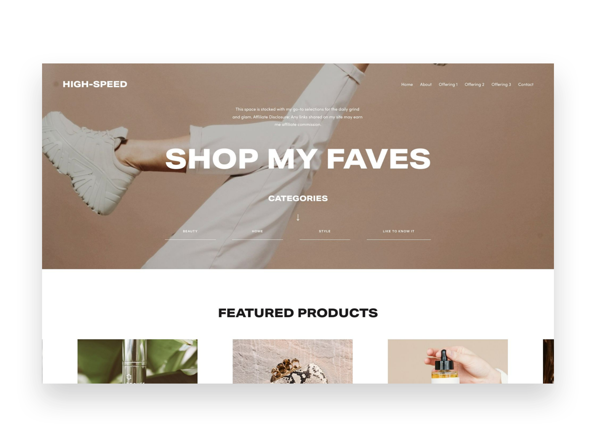
Squarespace Web Design: Crafting Irresistible Site Styles
The goal: craft a storefront and Squarespace eCommerce website experience so captivating, shoppers won't be able to tear their eyes away. I'll help you style up shop experiences that stop scrollers dead in their tracks. Consider yourself the next Squarespace web design pro!
The goal: craft a storefront and Squarespace eCommerce website experience so captivating, shoppers won't be able to tear their eyes away. I'll help you style up shop experiences that stop scrollers dead in their tracks. Consider yourself the next Squarespace web design pro!
My Take on Squarespace Web Design & Style
Stunning yet conversion-focused ecommerce design is both an art and a science. The goal is to craft a visual experience that gets people paying attention while also removing any friction standing between desire and purchase. Don’t worry, it’s not as tricky to balance as it sounds!
To me putting this into practice just means that eCommerce website owners need to pay attention to both the obvious things we think about when it comes to design & style… and the not so obvious. What do I mean by that?
Well, obvious things are things like which template to choose, how to design your brand, or using code to customize your site so it feels special.
Not so obvious things are those that generally seem to fall into the category of user experience and might impact how we design sites to be more accessible or empathetic.
Design also encompasses things like site navigation and one of my favorite tips to help level up basic eCommerce sites is to simply change your navigation! It’s easy to fall into the trap that your site needs to feature links to pages like About Us, Our Story, Our Blog and Contact Us. These are all good pages to have (and they’re perfect for your website footer) but by simply changing your site navigation to be more customer-focused you’ll instantly see an uptick in interaction. The easiest way to do this is to simply turn your shop categories into your main navigation items!
When it comes to selling online, some of the best design advice is to just not overdo it! Create a brand that allows your beautiful products speak for themselves. In 2024, consumers are on to gimmicks and crave real-ness and authenticity. If you do want to trick things out just a bit, there are some plugins that I often use to just add a few special touches to sites here and there. Just don’t go crazy with them!
Keep product page layouts simple to help keep things focused on that all import Add To Cart button. Write product descriptions that focus on your customer’s motivations and benefits to them. Unify your product photos in style and in composition so that they feel like your brand.
The end result is a Squarespace eCommerce site experience with substance behind the style—a website equipped not just to attract dream customers, but convert them into loyal, repeat buyers. This means crafting accessible, frictionless journeys that guide customers seamlessly from discovery to purchase.
Blog Posts about Squarespace Web Design & Style


Videos about Squarespace Web Design & Style


Common Squarespace Web Design & Style FAQs
-
Yes and no. You can (and should!) definitely style your checkout page so that the style matches the rest of your site. You can find your checkout page by going to WEBSITE and scrolling down to SYSTEM PAGES > CHECKOUT.
However, aside from adding a custom order form, you cannot make any changes to the cart page itself (the one where people enter their information + credit card info). This is for security reasons and helps make sure that people can shop safely on your site knowing their info is secure.
-
This really depends on your own goals and situation. If you’re ready to get going ASAP and don’t want to waste any time, a paid template can help you get to launch day super fast while still ensuring designer-level results on a budget. Some of my favorite templates are always from either Ghost or GoLive.
If you have a little more time on your hands, starting from one of Squarespace’s free templates can be a good way to learn how things work. This is also a way to help control the cost of Squarespace website setup. I have several posts with some of my top template picks here, here and here.
The last option is actually my preference is actually to skip both of the above and design your own template! All the details on that here.
-
When it comes to choosing design assets like fonts and colors for ecommerce sites like a pro Squarespace site designer, stick with options that appeal to a wide demographic rather than niche stylistic tastes. Why? Research shows that customers make subconscious judgments about a brand’s trustworthiness and quality within just 50 milliseconds (!!) based only on visual factors like color and typography.
Web Design Font Tips - Clean, simple sans-serif fonts tend to test best for conversion across sites. They have a modern, minimalist look and feel that aligns with strong brands. Try font pairs like Open Sans or Lato for an accessible option.
Web Design Color Tips - Neutral, desaturated palettes lend an air of sophistication while still allowing accent shades to stand out. Composed schemes also align better with photography. And unless they are part of your (carefully curated) brand color palette, avoid jarring choices like neon hues and that may land as unprofessional or loud.
The goal is maximizing universal appeal through design choices backed by data and trends. Select assets that reflect the style and quality customers expect from reputable ecommerce brands selling desirable products - like yours!
-
When it comes to ecommerce design, rookie mistakes can cost you sales. Steer clear of these blunders that even some seasoned site owners make:
Choosing a template based only on looks - make sure it also aligns with your brand and has space for key pages and content.
Overloading every page - keep it clean and minimum. Fancy animations and effects often distract more than dazzle.
Blocking ADA accessibility - ensure your site works for all visitors through standards like alt text, color contrast, and useful image alt text.
Ignoring mobile - most shopping happens on phones now. Test for responsiveness and slim menus/content.
Forgetting the footer! - place essential secondary pages like Contact and FAQs down there to keep prime real estate for spotlighting products.
As always, the key is balancing visual flair with utility and conversion. When in doubt, minimal is best!
Top 3 Squarespace Web Design & Style Resources

Accessibe
Did you know that the vast majority of digital accessibility lawsuits in 2023 targeted eCommerce businesses? The solution to ensuring legal compliance is Accessibe. Of course, it's also my absolute favorite tool to ensure sites can be viewed by shoppers of all abilities! (More on designing for accessibility in this post.)

Ghost Plugins
Whenever I’m looking for a little code snippet to spice things up, Ghost is my first stop. In addition to the free plugins, they also have really high quality paid plugins for more advanced tweaks and sleek, modern Squarespace templates.
Use code KRISTINENEIL for 10% off paid plugins & templates.
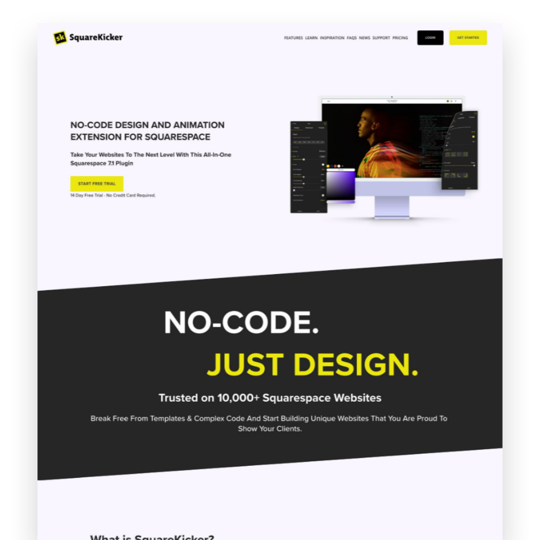
SquareKicker
Custom design without code? It’s easy - and fun - with SquareKicker to create visually interesting layouts with special effects that layer seamlessly on top of Squarespace’s built-in capabilities.
9 eCommerce Design Tips I Love from GoLive's eCommerce Template
Check out my review of GoLive’s beautiful new Trove ecommerce template. I highlight seven specific design elements from Trove that any online shop should implement to drive more sales, along with a link to my full video walkthrough of the template.
I recently had the chance to dive into Trove, the latest eCommerce template offering from web design mavens GoLive. As a proud Squarespace partner myself, I was drooling over how beautiful and retail-ready this template is right out of the gate!
Whether you sell furniture, run a fashion boutique or curate artisanal wares, Trove provides a polished yet flexible foundation for your online shop. But beyond just being pretty, this template packs in smart eCommerce features that drive sales.
I highlighted some of my favorite elements in a recent YouTube template walkthrough. Check that out below to see Trove in action!
For those looking for hard-hitting tips to improve your own online shops though, here are 9 key eCommerce design takeaways from the Trove Template:
Include Shop Categories in Your Main Navigation - Having clearly labeled shop categories prominently placed in your header navigation helps visitors immediately understand the different products you offer.
Spotlight a Best Sellers Section - Featuring your most popular products front and center builds credibility by showcasing what you do best and what shoppers love.
Share Your Company Values and Story - Devoting website space to communicate your brand values, ethical sourcing commitments or origin story allows visitors to connect with the real people and passions behind your business.
Incorporate Customer Reviews and Testimonials - Sprinkling in social proof through reviews, testimonials and press features helps reinforce quality and trustworthiness.
Add a Visible New Arrivals Section - Giving customers an at-a-glance place to view your latest product drops and inventory additions encourages discovery of items they may have missed otherwise.
Structure Intuitive Category Pages - Clean sidebar navigation on your category pages lets visitors easily self-serve and find what they are looking for.
Keep Your Product Page Descriptions Focused - Leading with scannable yet hard-hitting product details helps visitors quickly grasp the essence of each item.
Include Supplementary Product Sections - Extended areas covering FAQs, care instructions, shipping specifics etc. answer common questions without cluttering up the main description.
Show Related or Recommended Products - Suggesting complementary or popular items encourages customers to shop more.
As you can see, beyond just looking absolutely stunning, Trove sets up some ecommerce best practices that any online seller should have in their playbook!
Ready to check out Trove for your own upcoming store build or redesign? Hop over to GoLive’s site for all the details on this standout template.
Hopefully these tips sparked some ideas on how to better spotlight products and craft intuitive experiences for your online shop! For more eCommerce web design inspiration, check out one these popular posts:
Watch The Video Walkthrough of Trove:

6 Simple Tips for eCommerce Photography that Converts
The secret to more orders and fewer returns? Great photos! Learn the ins and outs of impactful product photography for your eCommerce site. Whether you choose to DIY or go professional, these tips will make sure your images really shine. Plus, discover my resources for great eCommerce photos to fit any budget!
Updated Jan 2024
I’ll avoid starting this post with the whole “a picture is worth a thousand words” schtick and just get right down to it: crap photos are killing your shop’s vibe. Images that are dark, blurry, inconsistent or make it difficult for people to see what they’re actually buying are more than just a turn off. Did you know that an estimated 22% of online purchases are returned simply because the item looks different in person than it did online? That’s a huge number but one we can easily improve upon simply by having better photos to begin with. More orders and fewer returns? Yes, please.

ECOMMERCE PHOTO TIP #1
Lighting is everything.
The best thing you can do to make your DIY photos look more professional is pay attention to the lighting. Just like none of us likes how we look when our pics turn out dark and gloomy, your products feel the same way!
Depending on the style you’re going for you could either wait around for some great natural light or invest in a few items to set up your own little photo studio. There are lots of options out there for stands, lights, backdrops and other accessories to make sure your products are shown in the best possible light.

ECOMMERCE PHOTO TIP #2
Go for clean backgrounds, or none at all.
I almost always recommend that each product have at least one image that has either a white/light background or no background at all. Photos with clean backgrounds make your shop look super modern and easy to browse, cutting down on too much visual clutter.
You can add fun photos with colored backgrounds or patterns as additional product images but the main product thumbnail almost always looks best with a very simple background. To achieve this look on your own, you will need to brush up on your Photoshop skills and pay attention to things like shadows to keep things looking professional.

ECOMMERCE PHOTO TIP #3
Keep your style consistent.
Coming up with new photoshoot ideas is great and all but remember that your product photos are all part of the bigger brand story you’re trying to tell. Keeping your style consistent can also help people identify your brand at a glance even if they interact with it on several different platforms i.e. your website, your social media + any other channels you may be selling on such as Etsy or Amazon.
You can create consistency in your photos by using the same backgrounds or scenes or by sticking to a well-defined color palette in your images.

ECOMMERCE PHOTO TIP #4
Use high-res images that are “zoom-able”.
One of the hard things about shopping online is that you miss out on the sense of touch. Without your potential customers being able to feel what they’re buying, give them the next best thing and make sure your images are high resolution and look great even when zoomed way in. I can’t tell you how many times I’ve been shopping online and appreciate the ability to zoom in to really see things like fabric details or the texture of a product. So helpful!
To enable product image zoom on Squarespace: from the product details page, click EDIT > click the Pencil icon > select ZOOM from the HOVER ACTION drop down menu.
Image size tip! Even though you can upload images up to 20MB, using images that are 500KB or less will help make sure that your site loads quickly.

ECOMMERCE PHOTO TIP #5
Show the whole product from all angles.
Again, the goal of eCommerce is to give people as much information as they could get if they were shopping with you in person. One way to do this is to make sure that you have images of the front, back and sides of your product. Even better - a 360° video or spinning gif!
It’s also important (and this really should go without saying) that you show your whole product in photos! This isn’t the time to get artsy with weird cropping, either intentionally or unintentionally.
One of the most common questions I get is how to fix product images from getting cut off on Squarespace. For this, you’ll just want to make sure that your finished photos all have the same ratios. They can be square or 2:3 or whatever you want them to be, they all just need to be the same to make sure they always look as intended.

ECOMMERCE PHOTO TIP #6
Have a photo of every product variation.
Lastly, even if you think your product variations are super simple and straightforward - take a picture of each and every one of them! This is obviously important for things like color variations but are also nice for product variations that come in different sizes or flavors. For example:
Color variations - example: you sell sweatshirts available in red, blue and green. Have one main pic that shows all three together + one image for each color variation.
Size variations - example: you sell candles and offer a one pack or a three pack. Have your main image be the single candle and a secondary image that shows three candles together.
Flavor variations - example: you sell CBD gummies that come in four flavor options. Have one main pic that shows all four flavors + one image for each flavor variation.
Bonus Budget eCommerce Photography Tip
If you’re going to invest in photography, I say it’s 100% worth it to spend the money photographing your products first. You can check out this post all about how to integrate free stock images for things like website backgrounds or other non-shop pages of your website. So, if you need to, don’t feel bad about using some carefully curated stock photos to set the mood or tone for your site. Just come in strong with your stellar product photos and things will feel personalized, professional and ready to sell.
My Recommended Source for Easy eCommerce Product Photos

Let’s say your calling in life isn’t to be a photographer. What to do? Meet Soona. Finally, an easy way to get great-looking photos and take the stress out of finding and hiring a photographer you can trust. Soona calls themselves a “self-service content creation platform” and here’s how they work:
You book a virtual shoot (or in-person if you’re near LA, Seattle, Austin, Minneapolis or Denver). You can choose from their different image or video packages or just select what you need ala carte. You can add-on special things like having a hand model, full body model, or even a pet model 😻 depending on your needs.
Mail them your products.
On the day of your shoot, you join in virtually where you can interact with the crew to give real-time feedback so the photos are exactly what you’re looking for.
Once your shoot wraps, you select the photos (or videos!) that you love and the finished, ready-to-upload results are sent to you within 24 hours. Flat-rate pricing ($39 photos & $93 videos) makes it easy to stick to your budget.
Here’s what I love the most about this process: you only pay for what you love and know that you’re actually going to use… versus paying a photographer hourly for a photoshoot where you’re not even sure what the results will be for weeks, sometimes months.
Overwhelmed by choices? Check out the eCommerce Starter Pack!
p.s. All pics in this post are from Soona!

What does it cost to start an eCommerce website in 2024?
Are you thinking about starting a website on Squarespace in 2023? In this blog post, I break down the costs of getting started on Squarespace, including domain registration, hosting fees, and premium design templates. Whether you're launching a simple shop or a robust online store, I've got you covered with all the pricing information you need to make an informed decision. Find out what it really costs to start a Squarespace website in 2023 and start building your online presence today.
Starting an eCommerce website can be an exciting way to sell products or services online and reach a wider audience. It’s no secret that my favorite platform for building an eCommerce website is Squarespace, which offers a range of templates and features to create a professional-looking website and super powerful online shop. But what does it cost to start an eCommerce website on Squarespace in 2024? In this post, I’ll break down the various costs associated with building and maintaining an eCommerce website on Squarespace, including template and plan pricing, payment processing fees, and other potential expenses.
Before we jump into the details, I have a few helpful tips to keep in mind about pricing in general:
Tip #1
Choose the right tool (or suite of tools) for the job
There are still a lot of people out there who seem to think that eCommerce is a costly undertaking, completely out of their reach. While this can definitely be the case if you’re using the wrong tools, I think it’s why it’s so important to make sure you know about all the options out there and what exactly each tool does. It’s also important to have a clear idea of exactly how each piece of software or app you plan on using specifically fits into your business ecosystem. I’ve seen too many business owners paying for redundant systems because they didn’t realize that Software A had the same features or capabilities as App B. (For some of my favorite tech combos for small businesses check out this post.)
Tip #2
Don’t be afraid of monthly subscription costs - just be smart about them
Look, I hate being nickel-and-dimed as much as the next person and I know it’s super annoying that everything these days seems to come with a monthly or annual subscription cost. However, paying monthly subscription costs for apps or software is definitely no more expensive than developing something custom. In fact, custom development is often much, more more expensive. I’ve had more than a few potential clients come to me over the years and inquire about building a custom solution for them because they either “can’t afford” or “don’t like” the monthly costs associated with various apps or tools to do the job. TL;DR things didn’t work out.
Think of it like this: if a company like Squarespace spends a lot of money on R&D to build a powerful eCommerce platform they can either charge a small number of big companies a ton for it (because those companies can afford it) -- or they can charge a large number of small businesses a little for it. Monthly subscription costs offer smaller players the opportunity to use the same tools that used to only be available to the big guys and so I say this is a huge win for small businesses! Love it or hate it, that SaaS model is what has helped put the cost of eCommerce website development into the realm of possibility for many small business owners that may not otherwise be able to afford it.
Tip #3
Don’t forget about tangential costs
It would be impossible for me to estimate all of these things because there are so many variables but there can be quite a few “non-website” costs that can impact the overall success of a website. Upfront costs are things like investing in great branding, strong product photography and compelling copywriting. You might also have ongoing expenses for things like paid ads, promoted posts, social media marketing, social media strategy and SEO. All of this is just to say that while the costs I’m going to outline below are a good place to start for the actual website part of things that you should expect to budget for these other upfront and ongoing costs to get the most out of your investment in a website.
What does it cost to start an eCommerce website in 2024?
Upfront Costs
The bulk of the expenses of an eCommerce website project come in the setup / getting started stage. There are three main factors to consider: the cost of a custom website template (if you choose to go that route), the cost of working with a web design professional to design/build/develop your site, and whether you need to add any third party plugins to customize your site.
Squarespace Template
All modern websites are built off a starting theme or template. This is just a framework that’s used as a jumping-off point so that you don’t have to reinvent the wheel with every new website.
One of my favorite things about Squarespace is that even the free templates are all modern and beautiful. Even better, sites built on the Squarespace 7.1 platform don’t even really need to choose between templates like before because all templates have the exact same features. This means that you’ll never be locked into anything by choosing the “wrong” template.
You also have the option on Squarespace from buying a template design from a third-party designer which is kind of like a compromise between using one of the free templates and going all-in with a web designer (like below). Paid templates are a really affordable way to get a “custom” look without the custom price tag and allow you to get started really quickly so IMHO they are well worth their very affordable price tags!
For more on templates, check out these posts:
Total template cost: $0-$399
Web Designer
I mean, not to be too biased or anything but this is where your investment can really make the difference 😉 especially when it comes to making your chosen template stand out from the crowd. An experienced web designer can use custom CSS, HTML, and javascript to tweak templates so they don’t look so generic and will have an excellent understanding of UX/UI best practices so that your finished site looks professional and converts visitors into customers!
The cost of a web designer is going to vary based on their years of experience but also just the going rate for the type of projects they specialize in and the clients they work for. For example, a designer that works mostly for local businesses in a small, rural town is probably going to have a lower hourly rate than someone who works for brand name companies in NY or LA. This doesn’t mean that one’s work is necessarily more valuable than the other, just that they cater to different markets and meet different needs. For an average small-to-medium business looking to either build their first eCommerce site or revamp an existing one, I have seen designers charge as little as $1000 and as much as $7000 or more.
When comparing web designers, it’s important to not just compare the bottom line cost but also the deliverables. What are you getting exactly? How many pages? How many products? Will you be getting help with SEO or copywriting in addition to the web design setup? What’s not included or is going to cost extra? Take a look at all of these things so you know exactly what you’re paying for.
Last note on this subject: if you feel like you’re somewhat technically inclined and interested in learning some of the basics you could always forgo hiring a designer and go the DIY route. As with most things of this nature, you have to understand that what you save in money doing it yourself will probably cost you in time. An expert can work a zillion times faster and knows what pitfalls and roadblocks to look out for. In most cases, I think that optimizing your time to market is a super relevant factor to consider; after all, you can’t start making money until you launch so spending too long in the development phase has a cost all its own.
Total web designer cost: $0-$7000+
Squarespace Plugins
These are code snippets that extend the functionality of your site and unlike other third party apps below, most of these you only have to pay for once when you first set them up. Check out my favorite plugins for Squarespace eCommerce in this post.
Total Squarespace plugin costs: $0-$160
Recurring Costs
Beyond the initial setup, there are some website expenses that you’re going to get billed regularly for, either monthly or annually. Paying annually almost always comes with a discount over paying monthly so save yourself some $$ and always sign up for subscriptions annually!
Squarespace Costs
Here are the main expenses for a Squarespace eCommerce website:
Website Subscription $276 - 588 / year - I break down the difference in all the plans in this post but this cost is for either the Basic or Advanced Commerce plans
Domain $9-12 / year - Unless you’re new to Squarespace and pay for an annual subscription in which case you get your first year FREE!
Email (G Suite)* $6 / user / month - Same as with the domain/hosting, above - Squarespace offers this FREE for one year for new accounts.
Third Party Tools
Alright, this is where things get VARIABLE because the apps you choose to use are going to probably different than the apps someone else uses making this super unique to each business. That being said, here are the rough costs for the things that I recommend for ALL business:
Email Marketing Subscription $60 - $420 / year - Compare my top three picks in this post
LiveChat $492 / year - more on my favorite tool for this and why I think it’s so important here
Legal Policies $99 / year - make sure you protect your business with an ironclad privacy policy and terms of service
Aftership $108 - $1188 / year - a custom order tracking page can make your small business look totally awesome
Automatic Returns Platform $0 - $1188 / year - worth every penny even if no one returns a thing. Find out why in this post.
Bottom Line
Modern eCommerce software has made it so much more affordable for small businesses to enter the market and even those pesky monthly costs should be considered manageable versus the high custom development costs of yesteryear. When it comes to total expenses, there are some ways to make sure you get the best bang for your buck by carefully selecting a platform and template that meets your business needs. Armed with the right tools and people on your team, you can keep monthly expenses in check and focus on growing your business.

The Importance of Accessibility in Web Design
Web accessibility is essential for creating an inclusive online experience. It helps websites reach a wider audience, improve search engine rankings, and reduce maintenance costs. Here’s how to do it.
Dream scenario: A world where everyone is able to enjoy every website online, regardless of their ability.
Accessibility has been a topic close to my heart for years. It's not just about creating an inclusive online experience; it's about ensuring that every individual, regardless of their abilities, can access and engage with digital content. In this post, I want to emphasize the significance of accessibility in web design, provide you with practical tips to make your website more inclusive, and share my favorite accessibility tool. But first, let's talk about why accessibility matters.
Designing for All
When we discuss accessible design, we often think about people with permanent visual, auditory, or cognitive disabilities. However, the scope is much broader. Accessibility also encompasses those with temporary disabilities as well as individuals with varying levels of ability, like the elderly. Additionally, we must consider users with limited internet access or those who rely solely on mobile devices to browse the web. It’s why designing with empathy is so important. By designing with inclusivity in mind, we ensure that everyone, regardless of their situation, can access and navigate our websites seamlessly.
Four Tips for Creating an Accessible Website
Keep layouts clean and minimal: Cluttered layouts not only hinder comprehension but also pose challenges for interaction. Design your website with a clear and intuitive structure, making it easy for visitors to find information and take desired actions. Remember, simplicity is key.
Use color wisely: While aesthetics play a vital role in web design, it's important to go beyond visual appeal. Consider users with color blindness or those accessing your site in challenging lighting conditions. Provide high contrast elements and alternative visual cues to ensure that your content remains accessible to all.
Put alt text, metadata, and links to work: Enhance both user experience and search engine optimization by incorporating descriptive alt text for images and providing additional context through captions and text transcripts for multimedia content. Avoid using vague hyperlinks like "read more here" and opt for clear, descriptive language instead.
Remember, boring and consistent can be good things: While innovative design concepts are exciting, when it comes to web accessibility, consistency is key. Users rely on familiar structures and functionalities to navigate websites efficiently. By sticking to established design patterns, you create a more inclusive and user-friendly experience.
Everyone Wins with Inclusive Design
By implementing accessible design principles, you not only ensure that your website is available to a broader audience but also reap various benefits. Accessible websites tend to:
Perform better in search engine rankings 📈
Reduce maintenance costs 📉
Increase audience reach 🌎
As technology evolves the long story short is that we all benefit from accessible design, whether we interact with the web through smartphones or voice assistants, screen readers or other accessibility tools.
How to Make Your Website Accessible Today
Designing an accessible website is not only the right thing to do, but it's also essential for legal compliance. The Department of Justice has made it clear that business websites should align with specific accessibility standards. Non-compliance can lead to potential lawsuits, putting your business at risk. But don't worry, I've partnered with accessiBe to provide you with a simple, streamlined solution.
accessiBe is an AI-powered web accessibility solution that ensures your website complies with WCAG, ADA, and other accessibility regulations. By incorporating accessiBe, you empower individuals with disabilities to adjust how they view and interact with your website without compromising the codebase, layout, or design. With accessiBe's continuous monitoring and personalized reports, you can easily prove compliance and maintain an inclusive online presence.
Remember, designing for accessibility isn't just about meeting legal requirements; it's about embracing diversity, empathy, and equal opportunities. Join me in creating a digital landscape that truly serves everyone with accessiBe!

More Squarespace Plugins to Level Up Your eCommerce Site
Ready to take your site to the next level? Give one of these plugins or apps a try to take your basic site up a notch. From shipping to marketing there’s a little something here for you!
Here are some of plugins and apps I’ve been turning to again and again lately! These will take your already awesome Squarespace site and turn it into a super powerful eCommerce powerhouse. As a reminder, my take on plugins or apps is to use them judiciously; add in one or two to tweak or customize your site - you don’t need them all!
However, unlike some of my previous posts about plugins (check the bottom of this post for links!) these ones really hone in on specific pain points you may be facing on your Squarespace site. From making sure your shop pages look super unique to adding video to your product details pages, all of these plugins or apps come in super handy for eCommerce on Squarespace!
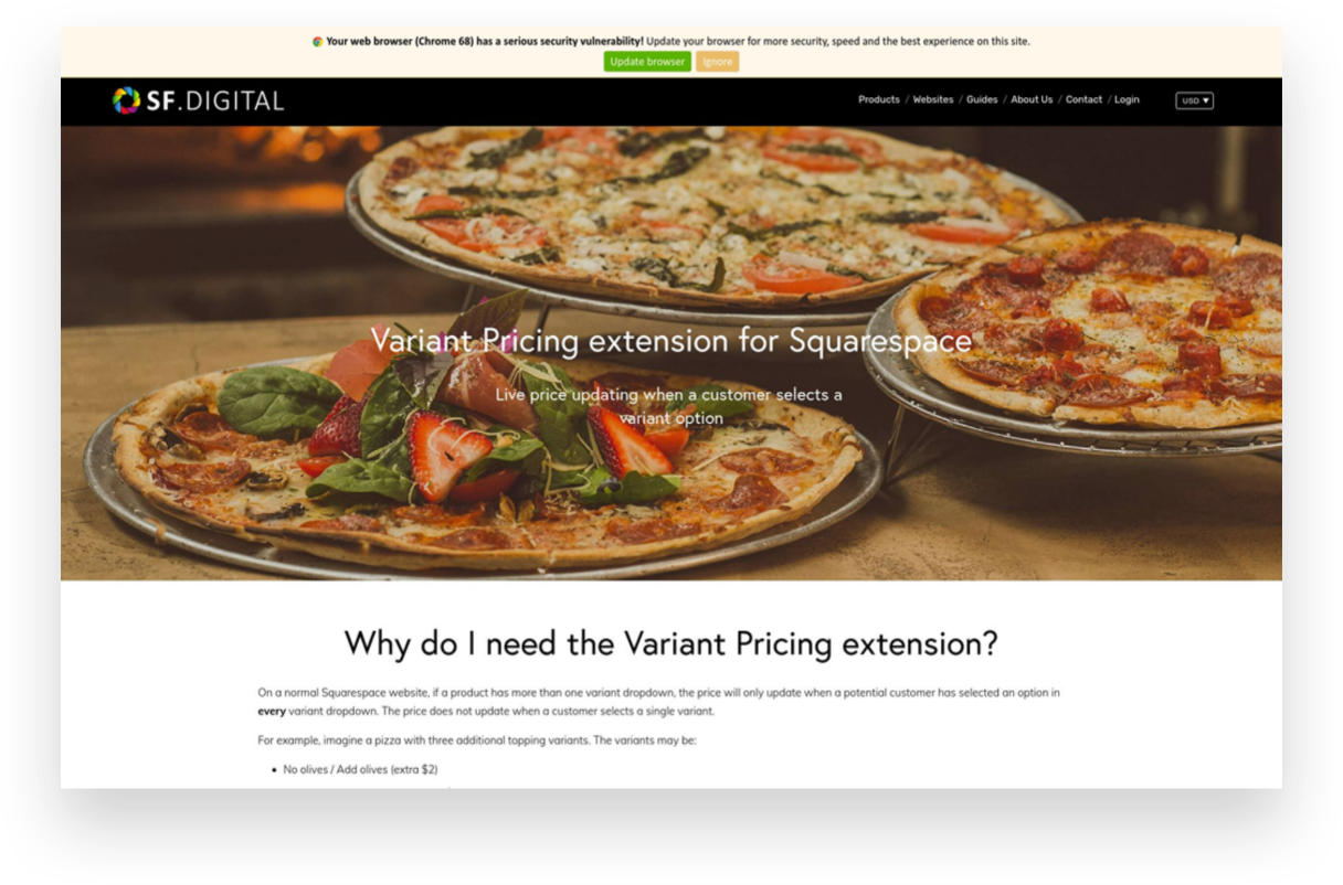
Variant Pricing Extension
Paid ($30)
If you’re selling customizable products on Squarespace or want to offer upsells or add-ons, this plugin is for you! It ingeniously creates an intuitive customer experience where they can select from some options/variants to increase the cost but can also bypass options if they’re fine with the base product.
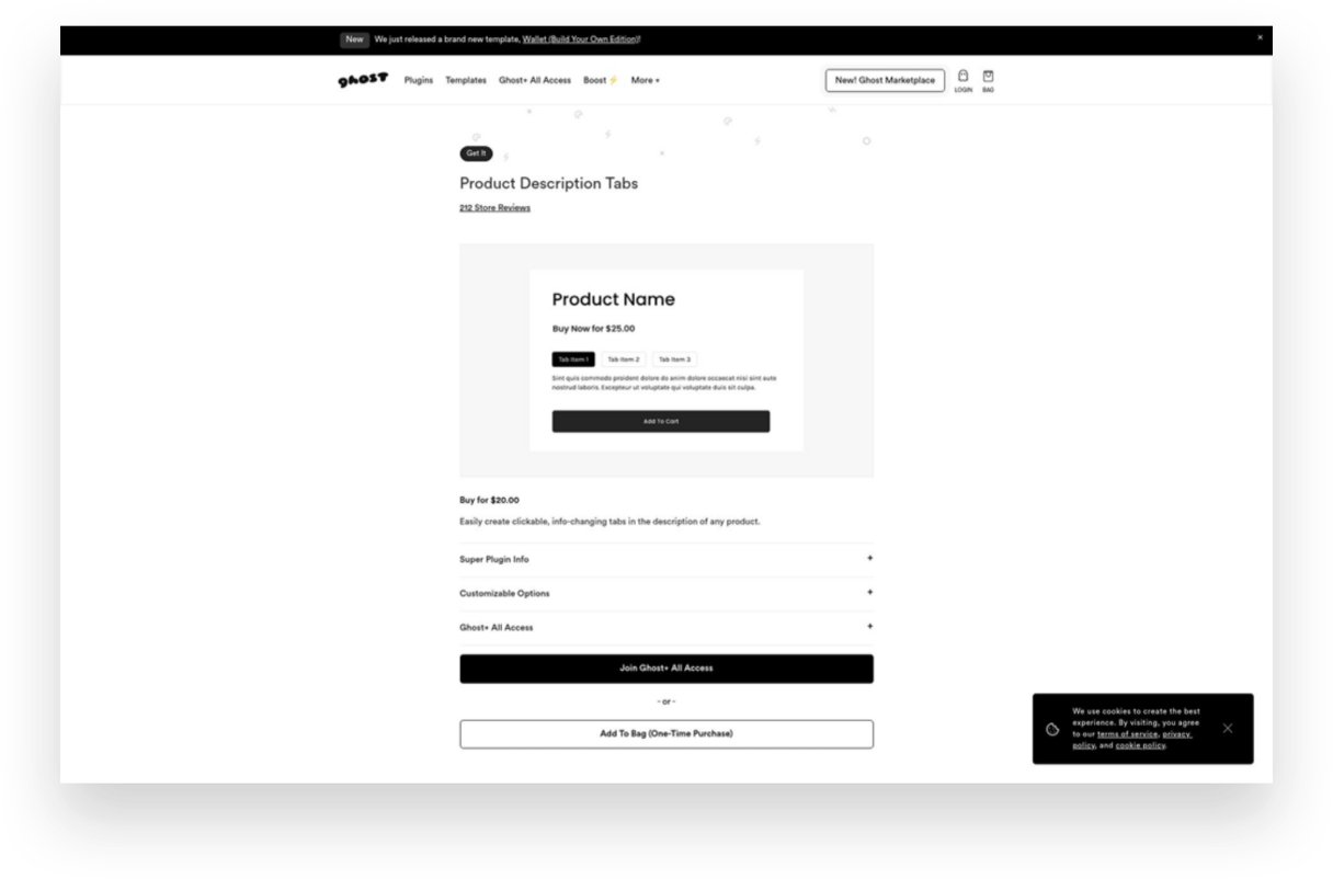
Product Description Tabs
Paid ($20)
Want to give your product details pages a little facelift? Ditch the long, boring descriptions and consolidate info into these cool-looking product tabs. I especially like this type of layout for products that have details like care instructions or other specs that might be helpful to some shoppers but that everyone doesn’t necessarily need to see right up front.
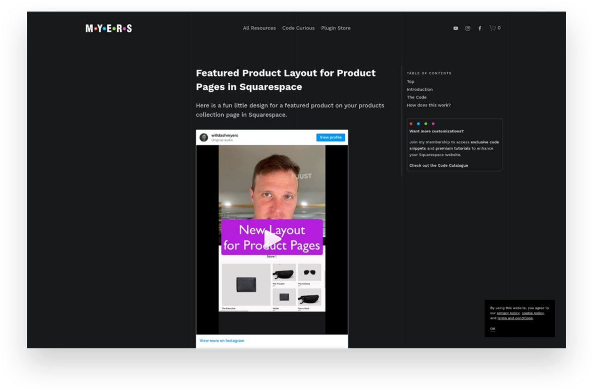
Featured Product Layout for Product Pages
Free
I showed my pal Will Myers if he could come up with a solution for shop pages that would allow you to feature a product versus just having everything the same size in the grid. You know, just to give things a little more flavor. Boy did he deliver! This simple code does just the trick and will help your shop pages look way more interesting.
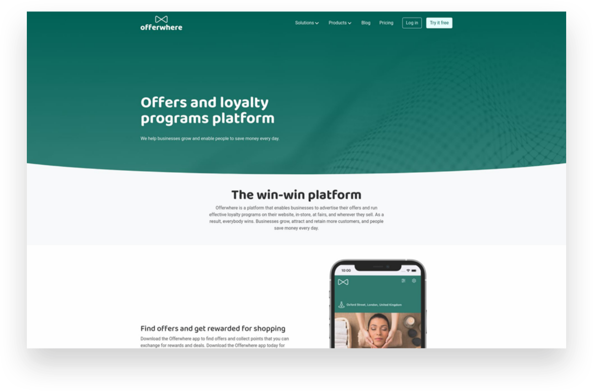
Offerwhere App
Paid ($40/mo+)
I often have clients ask about how to set up a loyalty program on Squarespace and this the app I refer to them to. This app allows your customers to collect points for shopping with you and then allows them to use them in exchange for rewards or deals you set up. This is a fun way to reward your most loyal customers!
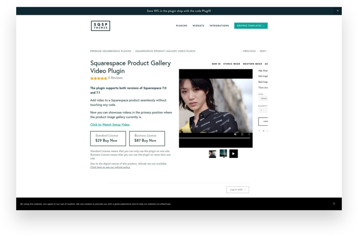
Squarespace Product Gallery Video Plugin
Paid ($29)
Product videos - especially ones that can show your product from all angles or those with 360 degree views - are super highly converting. Oddly, Squarespace doesn’t allow you to add video alongside product thumbnails on your product details pages. Luckily, this plugin does just that and videos look just like the native Squarespace thumbnails so no one would ever know this is an add-on!
Looking for more great eCommerce plugins for Squarespace?
Check out these other plugin posts:

Squarespace Holiday Selling Guide: Boost Your eCommerce Success
Are you ready for the 2023 holiday selling season? Discover 10 essential tips and strategies to maximize your eCommerce success on Squarespace. From chat widgets to free shipping and personalized checkout forms, my comprehensive guide will help you navigate the holiday rush and boost your sales.
Are you ready for the 2023 holiday selling season? The holiday shopping season provides a huge opportunity to bring in business from new and returning customers, and it's the most wonderful time of the year to spread some holiday cheer while boosting your sales. There’s a reason it’s called Black Friday, after all!
We all know that Black Friday and Cyber Monday are known for incredible deals and major discounts, setting the stage for a frenzy of shopping both in real life and online. The weeks between Thanksgiving and New Year's Day are the most hectic time of the year for brick-and-mortar retailers in the U.S., but eCommerce sellers tend to have a much longer crazy period. (In 2022, Black Friday generated a record-breaking $10.8 billion in online sales, making it the largest online spending day in U.S. history. Not to be outdone, Cyber Monday recorded a staggering $11.0 billion in online sales, surpassing Black Friday as the top online spending day ever.) What’s important to note is that the holiday season has expanded way beyond the traditional Thanksgiving weekend, encompassing the entire period from late November to early January. Shoppers now spread their purchases across several weeks and months, making it crucial for businesses to maintain consistent marketing efforts and be at the top of their games throughout the entire season.
To get ahead of this months-long holiday rush, here are my top 10 tips to get your brand ready for the season:
1. Have a Clear Return Policy (& Offer Free Returns)
One of the best eCommerce tips I can offer is to have a clear return policy and offer free returns. This will increase online sales, build trust with customers, and reduce abandonment rates. Customers may feel hesitant to make a purchase if they think they won't be able to return it if it's not what they expected. In fact, I've personally decided not to shop with companies that don't offer returns or exchanges. This time of year is a great opportunity to make sure your return policy is clear and easy to use. You don't want to be the scrooge that ruins a great experience with your stingy policies! For more information on setting up a self-serve returns portal, check out this post!
2. Offer Free Shipping
It's no secret that customers love free shipping, especially during the holiday season. This is why it’s a cornerstone of my most recommended shipping strategy! Even if you don’t do it the rest of the year (even though you should) offering free shipping as a way to incentivize shoppers to make a purchase is a great idea during the holidays. You can choose to provide free shipping on orders over a specific amount or for a limited time. This strategy not only encourages customers to buy but also eliminates any hesitation they may have due to additional shipping costs. Spread the holiday cheer by offering free shipping!
3. Turn on Afterpay
Many people prefer to spread out their purchases over time without relying on credit cards. It's similar to how your grandma might have put something on layaway at Kmart in the summer and paid it off over several months just in time for Christmas. However, with Afterpay, customers receive their order right away and pay Afterpay back over time. (Don't worry, you still receive 100% payment up front!) To learn more about how Afterpay works and how to enable it on your shop, check out this post.
4. Add Gift Cards
Gift cards are a fantastic option for shoppers who may be unsure of what to buy or prefer to let the recipient choose their own present. Some people think that gift cards are impersonal but I say that’s only true if the gift card is from a big box retailer. People LOVE shopping with small brands so consider adding gift cards to your product offerings. You can allow customers to purchase gift cards directly from your website by simply adding a new product and choosing the gift card option. This not only expands your sales opportunities but also caters to a wider range of customer preferences. Spread the joy of giving with the flexibility of gift cards.
5. Use Your Announcement Bar
The announcement bar on your website is valuable real estate for sharing important information with your customers. During the holiday season, make the most of this space by displaying enticing offers, shipping cut-off dates, or any other promotions you want to highlight. Captivate your visitors' attention and drive them towards making a purchase by leveraging the power of your announcement bar. 💡Bonus tip: if you’re looking to jazz up your announcement bar, I love this code from my pal Becca!
6. Reward Loyal Shoppers
Last Christmas, my family and I did a “favorite things” party instead of traditional Christmas gifts. The point was to share a little something that you used and loved throughout the year. The gifts weren’t necessarily huge or fancy - a really great pair of socks, a jar of someone’s favorite local-made hot sauce, another person’s must have scented candle. The point is that this is the time of year people are looking to the brands they already know and trust for gifts. Rewards could be simple (a special coupon code sent out to your VIP customer list) or more complex (I’m loving Offerwhere for a loyalty program that integrates amazingly with Squarespace) - whatever works best for you!
7. Add a Chat Widget
The holiday season can get pretty hectic, and this is when providing exceptional customer service is mission crucial. A chat widget (my favorite is LiveChat - all about that here!) can be a game-changer. By implementing a chatbot on your website, you can quickly address frequently asked questions, guide customers through the checkout process, provide product recommendations, and offer support in real-time. This efficient tool will help your customers feel heard and attended to, even during the busiest shopping days.
8. Offer Local Pickup
Even in the world of eCommerce, supporting local customers is important. By offering a local pickup option, you provide convenience to those who prefer to avoid shipping costs and long delivery times. Local pickup also gives you the opportunity to connect with your community and foster a sense of local pride. Don't forget to highlight this option on your website and let your customers know they can shop local even in the digital realm. For more on this, check out this post on how to set up local pickup or curbside delivery on Squarespace.
9. Add a Custom Checkout Form
Personalize the gift-giving experience by adding a custom checkout form to your website. This is such a simple way to allow customers to include a heartfelt gift note with their orders or offer them the option to add gift wrapping, if you offer it. Don’t forget, for those who want their purchases shipped directly to recipients, at checkout customers can enter the recipient's address in the shipping section instead of their own. You could use a custom form to allow people to indicate that the order is a gift and to not include any billing info along with the shipment. This small touch goes a long way in adding a personal and thoughtful element to each order that goes out this holiday season.
10. Create Gift Guides
Holiday shopping can sometimes feel overwhelming, with countless options to choose from. (And people are notoriously bad at making decisions when given too many options.) Help your customers navigate the gifting process by creating thoughtful gift guides. Curate collections for different categories of recipients, such as "gifts for him," "gifts for kids," or "gifts for the home." Include a mix of your own products and/or complementary offerings from other brands. By providing curated options, you make it easier for shoppers to find the perfect gifts and increase the likelihood of making a purchase. 💡Bonus tip! - an easy way to create shoppable gift categories is by using tags or categories to help shoppers filter their search!
As the holiday season approaches, it's essential to prepare your eCommerce business for the bustling days ahead. By following these tips, you can optimize your online presence, engage with customers effectively, and boost your sales during this festive time of year. Embrace the spirit of the season, spread holiday cheer, and get ready for a successful sales season!

Creating a Custom Print on Demand Store with Squarespace
Discover how to create a custom print-on-demand (POD) store with Squarespace and stand out in the competitive eCommerce market. This step-by-step guide will help you set up your Squarespace store, choose a POD provider, optimize your website for SEO, and launch your store to start selling customized products worldwide.
The eCommerce market provides a huge opportunity for entrepreneurs to start their own successful businesses. However, given the huge number of opportunities, the industry swells with competition too.
Customers today are more likely to buy from online retailers who have well-designed websites. After all, things might get a bit boring if everyone follows the same format and offers the same things in the online stores that all look the same. Therefore, one of the keys to eCommerce success is finding ways to differentiate yourself from the competition.
It's always beneficial to have an advantage over the opposition with a well-designed online store that will attract more customers and result in more purchases. The good news is that those who have joined the most recent waves of online businesses can rely on Squarespace for being their hidden weapon.
Wondering how to get started? In this article, I’ll help you create your very own custom print-on-demand (POD) store with Squarespace.
Benefits of Having a Print-on-Demand Store With Squarespace
With a POD business, you partner with a third-party vendor that prints out individual orders as they come in from your customers. So, for example, if you’re selling custom tumblers, they will only manufacture it when someone places an order for it on your website.
One major perk is that you and others like you may launch a business without having to worry about the hassle of investing in an inventory or managing it. You can focus on running your company while your POD partner handles production, packaging, and shipping.
There are several options for setting up a POD storefront, including eCommerce platforms, such as Shopify, WooCommerce, BigCommerce, etc. Out of these, Squarespace makes a compelling case for why it should be your ideal website builder. They offer superior graphic power, ease of use, and overall value for your money. A personal domain name and unlimited storage space are both included.
Steps to Create a Custom Print-on-Demand Store With Squarespace
Now that you understand why creating a POD website with Squarespace is your best bet let’s help you set up a store and start earning.
1. Set Up Your Squarespace Store
To set up your Squarespace store, you’ll need to first create an account. Squarespace provides a 14-day free trial that allows you access to all its tools. (p.s. When you’re ready to subscribe, you can use my code KRISTINE10 to save 10% on your annual subscription!)
After you’ve created an account, choose a template or design your own! You will have lots of options to choose from but this post will help you know what to look for.
Simply enter your email address or use your Google account to sign in to Squarespace. The next page will prompt you to enter a title for your website before providing some general editing tips. Depending on your vision for your website, you can:
Add pages
Organize the structure for easy navigation
Add content
Choose color scheme
Add branding elements like logos, fonts, store policies, etc.
Once your store is all set up, you’re ready to move to the next step.
2. Pick Print-on-Demand Provider
You may connect to a number of print-on-demand services with Squarespace Extensions. The success of your print-on-demand venture hinges on picking the right POD partner to work with your eCommerce platform. But how do you choose the best POD service when there are so many? Here's a rundown of some things to think about:

Your budget
The catalog size
Quality of products
Customization options
Delivery timeline
Quality of support
Ease of integration
I like Printify because it provides an extensive catalog of more than 800 high-quality white-label products. You can sell anything and everything from custom jackets to custom phone cases, stickers to shoes - whatever you can think of! They also have a free mockup generator that helps you create beautiful designs easily and create 3D mockups. Lastly, they guarantee a production time of 10 days. If they don’t meet the timeline, they’ll process a refund! And if you ever get stuck, they’re available around the clock to help you with any issues.
Once you’ve selected your POD provider, it’s time to understand what it’ll take to survive and thrive in the market. For that, we move on to the next step!
3. Do a Competitive Analysis
Competitive analysis is a technique for gauging the business's market standing in relation to that of its competitors. It is a technique for gathering information and making it useful.
Conducting a comprehensive competitive analysis positions you to outperform the competition and win over loyal customers. Competitor analysis is an integral part of developing a successful company plan. A thorough competitor analysis will help you in the following ways:
Learn more about the current corporate climate, which may assist you in better positioning your brand;
Find your niche and stand out from the competition;
Take note of the areas in which your rivals excel;
Use opportunities to benefit you and take advantage of your rivals' shortcomings.
Learn from the marketing moves made by your competitors and use those lessons in your own approach.
4. Choose Your Products and Upload them to the Store
After the competitor analysis, you should be clear about what you want to offer. Now, link your POD provider with Squarespace and display your products on your website.
With Squarespace and Printify working together with its integration, this is a breeze. Browse the comprehensive collection and pick the items that you believe will appeal best to your intended audience.
Using Printify's straightforward interface, you can add your company's logo or other custom artwork to any of your selected products. You may easily customize the appearance of your products by uploading and positioning your own custom artwork. You can personalize your products with art, typography, and more with Printify's mockup generator and state-of-the-art design tools.
Once your designs are ready, simply upload them to your store with a descriptive title, compelling description, and the selling price.
5. Create a Marketing Strategy
Online retailers need to work harder to attract customers than traditional stores since they can't just rely on foot traffic. You can't expect clients to appear out of thin air if you launch an online store.
While the products offered in each online store may be unique, their marketing approaches are consistent. To help you replicate this strategy on your own, you’ll have to do the following:
Define your unique selling point, meaning what makes you stand out from your competitors.
Create a marketing funnel from discovery to purchase to understand the customer journey.
Set marketing objectives for each stage of the funnel and how you’ll achieve them.
Define your budget and determine what methods you can afford.
Define your marketing channels and key performance indicators (KPI) to measure progress.
Determine a timeline to implement the strategies and stick to them.
Track your progress, see what you can do better, and implement changes.
Related Post: Crash Course: The Squarespace Commerce Analytics Panel
6. Launch Your Store
Once your marketing strategy is in place, it’s time for action! Find out what kind of fulfillment alternatives and shipping costs the POD provider offers before you start selling online. Some POD services may have the ability to fulfill and ship orders mechanically.
Make sure your shipping policies are in line with the requirements of the POD supplier you plan to use before you announce them to the public.
That’s it launch your store and publish it on all marketing channels to start making sales!
More Tips While Creating a Custom Print-on-Demand Store With Squarespace
Squarespace websites are built keeping search engine indexing in mind, but how well people find your new store still depends heavily on the material you provide as well as how you exhibit it. I strongly suggest you take advantage of the SEO tools that Squarespace provides or use a tool like SEOSpace to help your site get noticed. You can also optimize your Squarespace website by:
Targeting keywords
Optimizing product pages, their images, title, and description
Creating regular content in the form of blogs
Creating inbound and outbound links
and following other SEO practices found on their official checklist.
Another strategy you can implement is setting up an affiliate or referral program for your shop. Adding an affiliate strategy will boost your marketing returns multi folds and visibly show results with increased brand awareness, customer loyalty, generation of leads, and conversion rates. For more on my favorite affiliate and referral marketing tool check out this post!
Conclusion
The eCommerce industry is booming with opportunities, and Squarespace provides a great solution for entrepreneurs to create visually stunning websites with little to no coding knowledge. You have a lot of freedom with Squarespace when it comes to designing your eCommerce platform and handling client orders, including the option to use POD services. With this article, you’re equipped to start your own print-on-demand store and sell customized items to the world. Get started with your very own POD store on a Squarespace website today!

How to Design Your Own Squarespace Template
Your search for the perfect template for your new eCommerce website ends here. In this post, I’m going to show you how you can design your own custom template in just a few easy steps. Includes a walk-through video showing you exactly what to do!
I know what you’re thinking — designing your own custom Squarespace template must be a super hard process that only the most advanced and skilled Squarespace web designers can pull off, right? Don’t worry; it’s easier than it sounds!
Sure, there are a lot of templates out there to comb through and pick from, and I even have a bunch of posts all about templates if you’d like to check those out:
But I really think that designing your own template is an option worth your serious consideration.
Here’s why:
It’s fast and easy to customize your own template, so you can spend more time on other things.
It's free and included on Squarespace, so you can just jump in and start editing.
It’s flexible, so no matter how you decide to pivot or grow, there’s room to build on.
Get Started
So how exactly do you design your own template for your eCommerce website on Squarespace? The exact steps are covered below, but if you prefer to watch, check out my walkthrough of this process in my YouTube video.
You can also follow along with my steps by starting your own free trial of Squarespace. Click the button below to get started and you can work along with me!

Squarespace Blueprint’s Step-by-Step Guide
We’re skipping the template library and building our very own template. Squarespace makes this as easy as pie! Just by selecting from a few preliminary options and settings, a completely custom site is created for you, ready to fill in with your content and products.

STEP 1
Add Your Site Title
The first step asks you to give your website a name. This is important because even if you end up adding a logo to your site later on, the Site Title is what search engines see. So don’t get weird - just give this your company name!

STEP 2
Build Your Homepage
In this section, you’ll work through recommendations for your home page layout from top to bottom. You can change up any of these if they aren’t perfect but try to pick layouts and sections that are as close as possible as you’d like each to look like to save yourself time later on. You can choose as many or as few sections as you like, but I recommend definitely adding one from each, as it will help you frame out a complete home page.

STEP 3
Add Additional Pages
This section is where you can define which other pages you’d like Squarespace to populate for you, so take the shortcut! Select all but Services (unless you also offer services, of course). That means that Shop, About & Contact should all be selected.

STEP 4
Choose Your Color Palette
Here you’ll be presented with some designer-approved color palettes to select from. It’s probably not very likely that your exact brand colors are represented, and that’s ok - just pick something close. If you’re unsure where to start, I recommend selecting from an option in the “Neutral” section - most of those make for a nice jumping-off point and work with a wide range of brand accent colors.

STEP 5
Choose Your Font Pairing
Lastly, you’ll need to select a set of fonts to use as a (you guessed it) jumping-off point. Just like with colors, it’s ok if you have some predefined fonts you use for your brand and don’t see them represented in the options. You can always tweak them later as needed. That being said, if you don’t already have any brand fonts picked out or aren’t sure that the fonts you’ve chosen will work well for the web, these are all great options. Choose a sans serif font pairing if your brand skews minimal/modern, a serif font pairing for a traditional/elevated brand or a mixed pair to make things feel dynamic/fun.
TADA!
Check Out Your New Site & Next Steps
Once you’ve worked through the 5 onboarding steps, Squarespace will do its magic and generate your own custom template to match your preferences and selections! It’s ok if everything isn’t exactly perfect; my guess is that it’s already feeling a lot more YOU than a generic template. From here, you’ve got the groundwork set to go in and customize the placeholder text and swap out the stock images with your own. Use the template wording as a guide for how much copy you need to write and what spaces you have to fill. If you’re needing a little help with stock photography, check out this post all about how to use Unsplash to curate your website images. W
When you’re ready to start selling, follow these steps in A Step-by-Step Guide on How to Set Up Your First Online Shop and use code KRISTINE10 for 10% off your Squarespace subscription! You’re in business!

My Favorite Squarespace eCommerce Templates for 2023
Check out 6 of my favorite new templates + exactly what I would do to each of them to make them eCommerce ready.
I’ve posted before about some great templates to check out if you’re looking to launch or update your Squarespace eCommerce website (see here and here) but I’m back with some of the latest and greatest for 2023!
Keep in mind that while not all of these are necessarily eCommerce-forward right out of the gate, there’s no reason why you can’t add a shop big or small to any of them. This is one of the things I love most about Squarespace: that you can have a beautiful content-rich website AND an eCommerce storefront all in one place. If you’re feeling skeptical about how to transform any template you may find into your online shop’s new home, be sure to read the notes on each template below on what I would do for each of these to make them more shop-able. It may be easier than you think!

Plate
GHOST - $199
What I like:
This fun template by Ghost (one of my faves!) immediately stands out because of it’s bright color but that’s not the only thing to love. I really like how the lines and shapes create well-defined sections. This template’s design allows for plenty of areas to call out content without feeling cluttered in any way.
What would make it even better for eCommerce:
This template could easily transform into something perfect for an online shop. I would use the sections at the top of the home page to call out shop categories and the section on the home page that currently features the menu a place for shop bestsellers. This template would work especially well for a brand with a mission that needs to be conveyed - think: a B Corp or woman-led business, etc.
Save 10% off any Ghost template with discount code: KRISTINENEIL

Quinn Method
GOLIVE - $299
What I like:
GoLive always does a great job at providing lots of space for content to shine so I would use this template to show off benefits and features of your online course, membership, classes or community. I love that it has a place for reviews and that pricing table is also pretty cool!
What would make it even better for eCommerce:
This template is already set up as a sales page for an online course so I think it would be perfect if you’re selling any sort of digital good or services. I think this template would also work well if you’re using Squarespace Scheduling or Podia to book classes, sell memberships, provide access to a community and more.
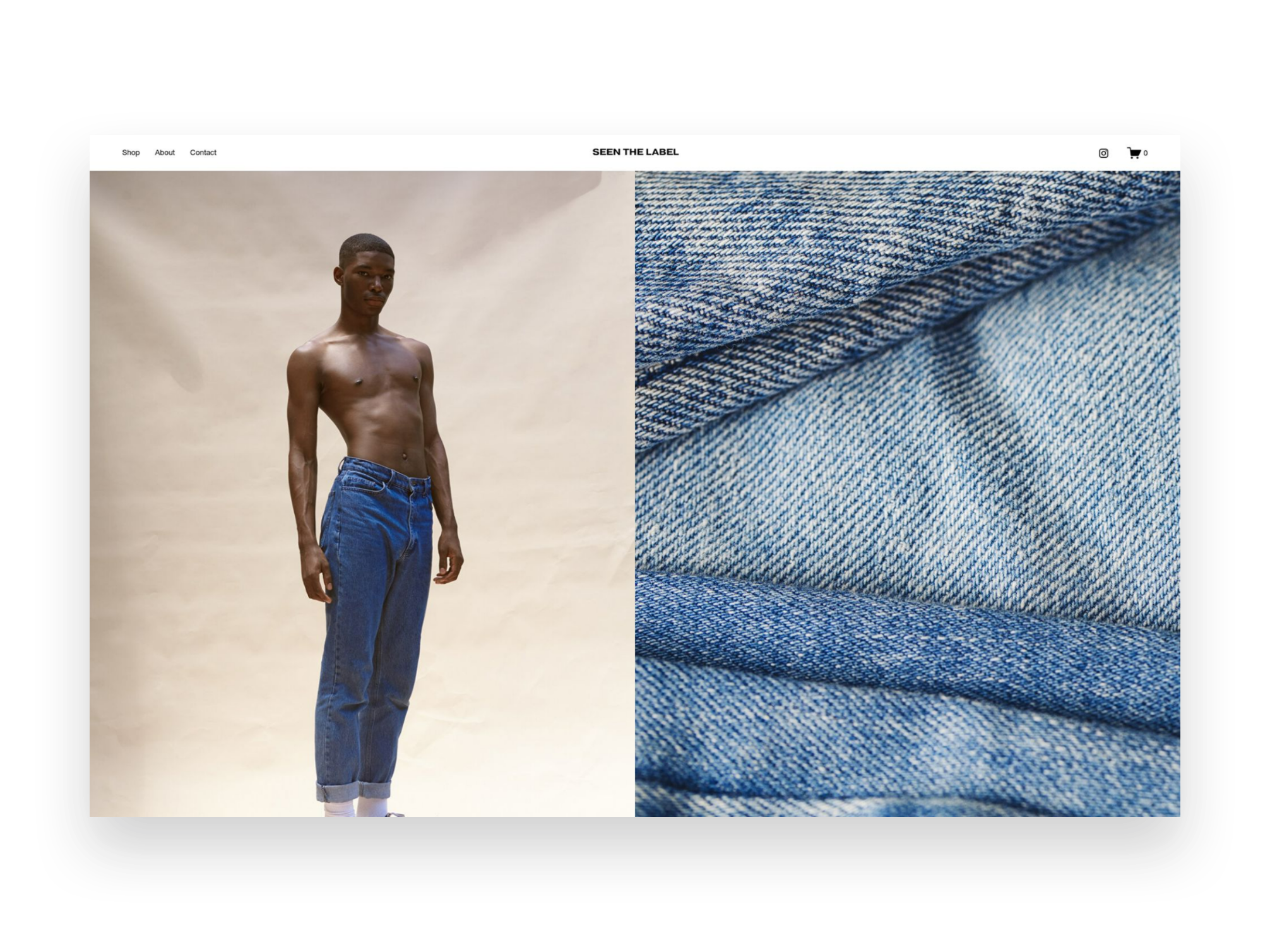
Seen
Squarespace - FREE
What I like:
This free template from Squarespace is already set up as an eCommerce shop so it’s a great jumping off point. I love the minimal aesthetic and it would expand easily to fit almost any brand. I especially enjoy the scrolling banner on the homepage with the featured coupon code. Many sites put this at the very top so adding it a little below the fold makes it unique and eye-catching.
What would make it even better for eCommerce:
I would bulk up the home page content by adding a section about the brand plus ones that help shoppers discover helpful information such as a FAQ page or returns info. Also, instead of the section with a featured product I might make that for featured shop categories so that people can see at a glance what the shop is all about.

Boho Social
Applet Studio - $189
What I like:
This template by Applet Studio is a great mix of cheerful + minimal which is an aesthetic right up my alley! I love the strong CTA in the home page banner and that there’s a spot right away to sign up for an email list - so important for eCommerce! I could easily see this template working well for a fashion, jewelry or home good line.
What would make it even better for eCommerce:
Something to keep an eye out for whenever you’re looking for an eCommerce template is a template that already highlights a blog, as this one does. It’s easy to convert section highlighting posts into ones featuring products. A shop is really just a blog that you can take action on!

Tilt - Paper Template
Ghost - $149
What I like:
If you have a hard time seeing the forest through the trees, any of the Paper templates from Ghost should be on your radar. These are just like regular templates except there’s no placeholder branding to have to update; everything is in black and white making it a blank slate ready for you to customize to match your brand. Genius!
What would make it even better for eCommerce:
What I like about this template (be sure to check out the demo) is the tidy header area. I would add shop categories and just like my tip above, change any featured blog posts out to shop products instead. All those pics on the home page could be featured products or categories!
Start Your Site With Tilt - Paper →
Save 10% off any Ghost template with discount code: KRISTINENEIL
Affiliate Shop Page Add-On
GoLive - $99
What I like:
The last item on this list is another one that’s a little different but I think is so smart! This template from GoLive is designed to be an add-on to any existing website. It will automatically update to match your existing site’s branding and is perfect if you are looking to add an affiliate shop to your site so that you can show off sponsored content or even link out to your Like To Know It.
What would make it even better for eCommerce:
I wouldn’t change a thing! This add-on is already perfectly designed for adding an affiliate shop to your existing Squarespace site. I think it’s so important that this add-on allows you to keep all this content on your own site - great for a SEO boost!

eCommerce Lessons from an Online Shopper
I've been waiting my whole eCommerce career to use the line "I'm more than just an eCommerce web designer, I'm also a shopper" and the time has finally arrived.
One of my earliest memories of online shopping in its modern form was when I first discovered sephora.com while cruising the internet at the job I had during my last semester of undergrad. It was 2002 and I worked in reservations at a golf resort. In between booking hotel rooms, coordinating spa treatments and reserving tee times, I spent most of my time in my little half-cubicle online shopping.
I loved that I could see all of the things and take all the time I wanted to compare products. I had a particular fondness for “value sets” of products and often made little spreadsheets calculating what the savings were for buying a bundle vs. buying individual items separately. I was lured by free gifts with purchase. I found great joy in the unboxing of things I bought just days earlier when I probably should have been working. It was a weird transitional time in my life but also one of the first times I had a regular 9-5 job and the splurges on high-end skincare were a salve for much more than my face.
To this day, it stands in great debate as to whether I quit or was fired from that job. What is true is that it definitely set in motion my love for all things e-commerce. And it wasn’t just because I thought it would be easier to have everyone just book their rooms and spa treatments and tee times online themselves so that I could be free to shop online.
It was just that even then, from a business standpoint, I thought it would be much smarter to invest in ways to empower resort guests to make reservations themselves in the same way Sephora allowed me to browse virtually. I knew I spent way more online than I ever would in person at the mall.
There was something way less confrontational about being able to read product details at my leisure, without the pressure to buy. There was room to explore, to discover, to truly take it all in. Whether booking hotel rooms or buying designer perfume, it was novel then to be given the authority to manage things yourself and I liked it.
Around this same time, there were the cries from small businesses everywhere that online shopping was either going to kill brick-and-mortar altogether, or that it was just a fad not worth investing in. The vestiges of these beliefs exist to this day - less so for startups who tend to be more open to seeing the value in technology - but definitely in the small business sector. You either see yourself as a local business that only serves other locals and therefore has no need for a website… or you understand the power of ecommerce but are not sure where you fit into the whole scheme of things.
Interestingly, in a new role sometime after the end of my storied stint at that resort I did go on to work for a company where I was given the opportunity to actually develop an entire eCommerce platform. I didn’t necessarily have any professional experience in the field yet but I had the overconfidence that comes with being fresh out of college and someone willing to give me a chance. If I knew nothing else, I knew that so long as I built interactions that would satisfy me as an online shopper that there was a pretty good chance it would resonate with others. I was right. That platform is still in use to this day and generates multiple millions of dollars for the company every year.
Here are some lessons from my early days as an online shopper that are still just as relevant today and which have now been thoroughly vetted through my involvement in successfully bringing hundreds of businesses to life online, many for the very first time:
1. Constantly give me new things to look at and explore.
If you want me to keep coming back to your site time and time again, you better give me some exciting reasons to do so. Change up that homepage hero banner and link it to some fresh content. Create a “new” category in your shop so that I can see everything that’s dropped since my last visit. Make me feel like I need to check back in often or else run the risk of missing out on something big.
A frequently updated website draws people (and Google) in and creates the ultimate sense of FOMO. Use this to your advantage.
2. Answer all the questions I didn’t know I had.
Your FAQ page matters more than you know. I feel like I can always pick up on how well a company treats their customers based on an FAQ page alone. People like me do, in fact, read every single question and answer – and not just because I want to learn more about your products or services. I do it because I want to see how you answer questions. Is your tone sassy? Sweet? Direct? Blunt? Does it sound like you would truly help me if I had a problem or does it sound like you’re just setting yourself up to cover your own ass with rules and fine print?
A great FAQ page is your secret, hidden way to show your customers a bit of your brand personality. Yes, that should come through in the copy on your other pages but those pages are where you talk about everything going right. An FAQ page is generally the only place where you talk openly about all the things that could go wrong. And it’s in those moments where I want to know you’ve got my back.
3. Show up in my inbox.
If I truly like your brand or your company or your products, I’m signing up for your email list. So, entice me with a coupon code or lure me in with the promise of special offers, whatever it is - I want to be in the loop and I’m willing to give you my email address in exchange for the good stuff.
The crazy thing about email marketing is that I know how the sausage is made and I still want some. I know the messages I get in my inbox aren’t really personalized, written just for me and catered to my personal shopping whims. I know that emails are, for the most part, trying to sell me something. And yet, for brands that I really love - I do not care. I like being invited back. I like feeling like I’m part of the family. I know I’m being marketed to and yet, done right, I don’t mind one bit.
4. Treat me like the VIP I think I am.
Perhaps you haven’t noticed a trend yet but most of what I like about shopping online are the ways it mimics (and sometimes goes beyond) the in-person experience. The best online retailers understand this and follow through with awesome ways for me to feel like I’m their #1 customer. There are so many ways to roll out the red carpet for your online guests and not all of them need to be expensive or complicated:
One of the easiest things you can do is enable customer accounts so that repeat customers like me can easily access my order history.
You can add a live chat widget so I can skip the customer service phone queue and not stress over sending a cold email.
Roll out an affiliate or referral program that recognizes repeat business or encourages customers to share your brand with friends.
Set up a simple, automatic returns process so that if I need to swap out a size or just return something that’s not exactly what I thought it would be I can do so in the easiest way possible.
Customers have a lot of options when browsing around online and all of these things just boil down to making each and every customer feel like they're your best one. Think of ways you can make their lives easier. Be empathetic to their needs. Reward them for their loyalty.
5. Send me packages that show me you love your own brand.
Lastly, the experience with your eCommerce brand lasts longer than you think it does. It goes way beyond the checkout page and extends right to my front door and beyond. Make a lasting impression with packaging that excites me. This means it needs to be 1) on brand, 2) potentially contain a little surprise and 3) anticipate my needs. And, yes, packaging can do all these things.
A branded box and packaging that’s filled with branded tissue or fill, and topped with a branded sticker or card – that’s the holy grail for an online shopper. This is the pay off for not just getting in the car and heading out to the store. The unboxing experience is the whole thing. That’s what we’re here for.
And it just says so much to me when I order something that shows up in a plain old, boring box with not so much as a thank you note. There’s something special about interacting with a company that’s confident enough in their own brand that they want to slap it all over everything and send it all over the world. Whatever it is, packaging matters.
The Bottom Line
20 years on from my short-lived stint as a hotel reservationist and I can tell you to not underestimate the power of eCommerce. It doesn’t matter your business or industry. I could be booking a facial, buying shoes, accessing exclusive digital content, or scheduling a meeting – and all of them are chances for your business to impress me, influence me and convert me into a fan for life. It’s not a coincidence that even after all these years, there’s still a magical delight in receiving one of those black-and-white Sephora packages at my door.

12 Ways to Build a More Empathetic Brand
Discover how taking an empathetic approach to eCommerce may be the competitive advantage you’ve been missing. Use my 12 tips to connect with stressed out and distracted customers on a more human level before, during and after each purchase.
In business, we usually focus on things like product and price as places to differentiate and optimize. But let’s be honest: there’s more than enough advice to go around out there on how to boost profit margins, how to price strategically, or how to drum up alternate revenue streams. That’s business. But what we know is that now more than ever, all business is really about people. It’s your people that are the true competitive advantage.
It’s you, your team, and anyone your customers or clients interact with on your behalf. That’s one-half of the people equation.
The other half is your customers. Despite our tendency to refer to them as visitors, readers, or buyers, they’re human, too! And the one thing they don’t want is to be sold to. What they want is to be understood. So how can you go about building a connection with people… online, no less? How can you start today to build a more empathetic brand?
A Quick Crash Course on Human-Centered Design
“Empathy sells in ways pricing tricks and sneaky buttons and fancy websites never will.”
There are lots of fancy official-sounding definitions of human-centered design out there but my take boils down to this: human-centered design asks us to use empathy to put aside our own notions in favor of what our customers need. It asks us to try to understand them before implementing a solution to any perceived problem(s) they may have.
In the case of eCommerce, it’s using an empathetic approach to thinking about how or why people shop, how to help them with whatever they are trying to do, and, ultimately, what needs to happen for them to feel comfortable enough to reach for their wallets.
The reason I bring this up before we jump into some ways to build a more emphatic brand is that as you think about the general ethos of your company right now you may discover that changes need to be made. You may decide that there’s room for improvement when you view your eCommerce website through a more empathetic lens.
Also, lastly, before you click away thinking this is a little too woo woo for you, that you thought you were here to learn how to make some money online and not get a philosophy lesson from a web designer… lemme tell you. Empathy sells in ways pricing tricks and sneaky buttons and fancy websites never will. After all, people do business with other people.
The eCommerce Process in Three Easy Steps
This may seem obvious but just so we’re on the same page: within the framework of commerce - online sales in particular- I always think of things as what happens before, during, and after the sale. In this case “the sale” is whatever action you’re asking people to take. The trap lots of eCommerce websites fall into is they only seem to care about the middle part: the actual sale. They forget about all that needs to happen before a customer or client decides to purchase. They forget about all the opportunities they have to build a human-connection relationship after the sale. Not you. You’re going to nail this from discovery to inquiry to purchase and beyond.
And just so we’re clear: to me, any website that does more than just provide static information is an eCommerce website. If you’re not sure if you have an eCommerce website, the best litmus test is to check out what all your buttons say.
Ecommerce website buttons say things like:
BUY NOW
BOOK NOW
DOWNLOAD
EXPLORE
SCHEDULE A CALL
RESERVE YOUR SEAT
ENROLL TODAY
SIGN UP
DISCOVER
DONATE
SUBSCRIBE
ADD TO CART
BASIC website buttons say things like:
READ MORE
LEARN MORE
CONTACT
See how the eCommerce buttons are all active and the others are all passive? That’s my definition of eCommerce. Are you asking people to take action? Then you have an eCommerce site! So, when I say “action” below, I want you to insert whatever your primary button asks. Really think about it. Before the “BOOK NOW”. During the “ENROLL TODAY”. After the “ADD TO CART”. Whatever it is for you.
Before The Action
“I often see people who are actively monitoring abandoned cart metrics attempt to find fault in the checkout process when, in fact, it’s their lack of empathy before the sale that’s likely the culprit.”
This is arguably the most important phase and offers some of the greatest opportunities to use empathy to build trust with visitors. If you do things right in this step, the others are much easier hurdles to get over. Conversely, I often see people who are actively monitoring abandoned cart metrics attempt to find fault in the checkout process when, in fact, it’s their lack of empathy before the sale that’s likely the culprit.
Tip 1: Show your understanding of the problem - This is probably what you think when you think of empathy but it’s a great place to start because too often we think of our websites as a great place to talk about ourselves. Wrong-o. When thinking about the copy for your eCommerce website, think first about what problems or challenges your target demographic has that your product or service solves. Address those points head-on. Customers want to feel seen, heard and understood first and foremost.
Tip 2: Envision the situation - Think about your target demographic again. Your people. Who are they? Are they older and less comfortable with technology? Focus on creating an online experience that’s accessible to them. Think about fonts sizes that are readable, high-contrast colors, buttons that feel natural. Is your audience more likely to visit your website on desktop or mobile? Are they searching for your product or service during leisure time or work time? While sitting on the couch in the evening at home or during a quick moment waiting in line somewhere? Is it quiet or noisy?
Tip 3: Offer ways to ease friction - Make it easy for people to discover and engage with your content, products or services. Organize things with tags and categories, add search functionality, or advanced filtering abilities so people can jump right to what they need. Bundle products that are frequently purchased together into one product to save people time and clicks. Highlight your best-selling items on your homepage. In short, think about any roadblocks that might come up between discovery and checkout and try to eliminate as many of them as possible.
Tip 4: Reveal the realness - Oddly, one of the best ways to show our customers and clients that we understand that they are real, human people is to reveal to them that we are also real, human people. I overcame one of my own hang-ups on this front when it comes to blogging, actually! As a bit of a perfectionist, it used to take me forever to write a blog post. As a result, I rarely blogged and my writing ended up feeling stiff and bland. When I gave up the ghost and decided I would just write the way I talk, blogging became so much easier and - surprise bonus! - it started feeling real. It resonated with readers because it was obvious another human was behind the keyboard. I’m not saying I don’t care about typos or grammatical errors anymore. I just care more about sounding like myself so that when you get an email from me in the future you aren’t wondering if I had a ghostwriter sub in for me that day.
During The Action
Ok, by “action” here I almost always mean adding to cart and the checkout process itself but as you’ll see there are lots of supporting ways to show empathy towards your customers during this phase. Since so much of these things are kind of “standard” (meaning there’s not a lot of room for variation or creativity when it comes to checkout procedures), this is one area that most commerce sites get mostly right. But that’s not to say there’s no room for improvement!
Tip 5: Empower your team - Whatever kind of customer service or support you provide, whether it’s by email, live chat, or phone, empower your customer service team to actually follow through on whatever promises you’ve made, be they implied or explicit. If you write on your home page about being a family-run business with down-home roots but your live chat is answered curtly by someone who is very clearly… not your family… you’ve broken a promise to me and now I feel lied to and I’m two seconds from calling this whole purchase off. Empower your team to be kind, understanding and flexible. Encourage listening and understanding. The worst leaders ask their customer service teams to be nothing more than code enforcers and hall monitors. When in doubt, take a lesson from Zappos on how to do it right.
Tip 6: Prioritize ease over information - This is another trap I see newbie commerce folks fall into: asking too many damn questions. Think back to the situation you envisioned above. With all the distractions people are facing these days, both internal and external, does it really matter if you ask them during checkout to answer no less than 27 questions about how they found you, what their favorite color is, and what’s their astrological sign? No. These things don’t matter. The truth is that people hate long forms and are petrified of too many choices so don’t go mucking your checkout process up with them! Keep checkout as simple as humanly possible. Ask only what’s absolutely necessary at the exact moment and save the rest for a follow-up.
Tip 7: Put technology to work - The cool thing about technology is that there’s so much that’s accessible to even the smallest of businesses these days to really wow customers. Find ways to use the tech and tools available to you to make buying from you (or booking, subscribing, enrolling, whatever it is) as easy and awesome as can be. Are they a repeat customer? Auto-fill their info from last time so they don’t have to type everything out again and only need to give it a quick verification. Find a way to productize your services, automating part of the process so they can get access more quickly. Use scheduling tools to make booking time with you a breeze.
Tip 8: Personalize everything - Every aspect of your cart and checkout process can (and should!) be personalized not just to your brand but also to your customer or client whenever possible. Inject your personality into the standard forms offered by Squarespace to follow through on the brand promises you made elsewhere on your site. Order confirmation emails, shipping notifications and booking confirmations are all places you can use technology to address your customers and clients by their first name, proactively answer questions you anticipate they may have about what’s next and provide a human touch.
After The Action
Amateurs assume that once someone makes the purchase, books the event or schedules the call that everything else is smooth sailing. But as you’ll see, there are several places in the post-checkout experience to show your customers some TLC and start to build that human connection that will hopefully lead to repeat business down the road.
Tip 9: Be consistent - Whoa! You got someone to trust you enough online to give you some money. Don’t drop the ball now! Haha! No, seriously. Buyer’s remorse is a real thing and you don’t want anyone feeling that way about you and your business. Keep your branding and messaging consistent once people move beyond your website. If you sell physical products, this can be making sure your packaging and follow up emails are on point. For service-based sellers, proposals, contracts, and invoices need to be on-brand. At this point in the process, people have shown that they trust your business enough to work with. Continue to build on that with every touchpoint after the “action”.
Tip 10: Show your appreciation - Telling your customers that you appreciate them is just a lovely thing to do. Period. But there’s a little empathy at play here too. Telling them thank you is your way of acknowledging that they had a choice. They could have chosen your competitor but instead, they chose you. They could have decided to do nothing but they didn’t. Let them know through your words that you understand what it took for them to be there or even provide them with a little bit about how your company gives back with product-specific email automations.
Tip 11: Follow up and then follow up again - Don’t leave people guessing or hanging about what to expect or what’s next. Especially for large dollar value purchases, follow up immediately and then clearly outline the next steps so that people can rest easy knowing they made the right investment. But you don’t have to sell big-ticket items to make following up a winning strategy; I always think of food delivery services that show the status of your order all along the way: dinner’s in the oven, it’s getting packed up, it’s out for delivery, here’s a little map of where it’s at exactly, etc. The goal here is to anticipate the questions or concerns that people are going to have after they purchase and just answer them without them needing to ask. Being proactive is a great way to show empathy. Even just linking out to your FAQ page lets people know that you’re there for them with answers to their questions.
Tip 12: Reward loyalty - Most long-term sustainable businesses are built on repeat customers and clients. They are your backbone. They’re your biggest fans, the ones most likely to recommend you to their friends and family, the ones who rave about you without even being asked to. Reward this as aggressively as you can afford to through a great referral program. I’ll never forget how a hotel we once stayed at in Vegas remembered that we’d stayed with them just once before. We hadn’t really planned to be repeat guests, it was just a good deal and we took it. But when the front desk agent greeted us by our first names and thanked us for coming back and gave us a complimentary newspaper every morning and an upgrade to a higher floor? You better believe we’ve stayed with them numerous times ever since. It was just so nice to be recognized. We felt like we were part of a VIP club. The cost to the hotel of all this? Negligible. The newspaper? The moving us to a room that was probably going to be empty for the weekend anyways? These things cost them nothing but meant the world to us. Reward your loyal customers and clients. Greet them by name. Remember their birthdays or how their dog really loves long walks on the beach. Go out of your way to accommodate them.
What will you do first?
Like I said above, there’s a chance that some of the ideas I’ve provided are making you think about changes that need to happen. Maybe they’re in how you train your staff, how you word or set up your email marketing, or in what info you provide on your website for all to see. Perhaps there’s room to improve your site’s navigation so it’s more clear and understandable or to update your checkout process so it’s respectful of the stresses and challenges your target demographic are likely feeling. Whatever it is, I can guarantee this: there’s no better ROI than starting now to build a more empathetic brand. Even small shifts in messaging, layout and experience can yield amazing results.

How to Use Unsplash to Curate Your Website Images
Finding great looking stock images sometimes feels like trying to find a needle in a haystack. Learn how to find the hidden gems and put together a cohesive selection of images for your eCommerce website - all for free!
Great photos can really make or break a website but sometimes it’s just not in the cards to have a bunch of your own. This could either be because it’s just not in the budget to have a photoshoot right now or because the high quality ones you do have just aren’t enough to fill out an entire website.
When I’m looking for photos for projects, the number one place I head it to unsplash.com. Check out the video below where I show you how to source royalty-free, good looking, stock images through Unsplash and also share some of my best tips for curating stock images that don’t feel too, well, stock. Watching video not your thing? Keep reading to catch the details!
p.s. Watch the video on Loom for video bookmarks to jump to specific sections or if you need a transcript/captions.
Tips on Using Unsplash
Create a free account so that you can save images you find into collections! This makes it so that you can be more organized and intentional when selecting images.
Add images to collections by clicking on the plus icon (NOT the heart icon) and either adding it to an existing collection or creating a new one.
Share a collection by heading to your profile, clicking into the collection you want to share and grabbing the url from your browser bar. That’s it - easy!
Stock Image Tips
Image Tip 1: Keep Things Consistent - Selecting images that are consistent in style is one of the best ways to make stock images look like a professional took them just for you. Select images that have the same overall colors and tones or the same photographic style, such as all black and white images. Making sure to stick to a well defined color palette is probably the number one way you can make things feel cohesive.
Image Tip 2: Think Micro to Macro - Try to choose a range of images that represent your industry, field or topic across the spectrum. Using the example from the video above about finding pictures for a farm to table restaurant website that might mean looking for pics of everything from individual ingredients to the fields they are grown in to the chef that selects them and finally the guests that enjoy each dish. Find images that show close ups and then others that give the bigger picture. Some of my favorite stock images are actually ones that are just used as background images on a website to “set the mood.” These images usually have alot of space that would look good with text or a button over the top of it or could even just be used as a transition between website sections.
Image Tip 3: Don't Get Lost in the Details - Don’t worry about minute details in stock photos that may not be exactly right. For example, I once had a client say that a stock photo (that was otherwise perfect for their fitness brand) wasn’t going to work because the brand of weights shown in the image weren’t the same as the brand they own 🙃 I guarantee no customer is going to notice a thing like that! Images are just there to set the mood and visually contribute to a bigger story. Find ones that work but don’t sweat the small stuff. Like I said, unless you had a photo shoot of your own you could scour all the stock photos on the whole internet and never find one of yourself!
Image Tip 4: Think Outside the Box - Get creative in the search terms you use which can help you uncover interesting photos for your site that other people in your industry may not be using. For example, it’s a pretty safe bet that every restaurant out there searched for “restaurant” photos but my bet is that not a lot of them searched for “Tokyo street food” or “friends celebrating over drinks.” Thinking about your target demographic and searching for things that may resonate with them or help them see themselves in your site is a good place to start if you’re feeling stuck on what to search for.
Example Website Photo Collections
Want to see how all these tips comes together to create four unique image collections? Check out these sample collections I created for four hypothetical food concept websites. Each of them has to do with food, cooking, baking, eating together with friends and family and yet none of them look alike at all. I’ve used a consistent photo style for each and focused on finding images that represent a wide range of keywords within each board so that there’s a wide range to choose from. I didn’t worry about little details like the brand of dishware or the type of vegetable, I just went for things that could help tell the story of each brand alongside their own personalized images and website copy.


Check out each collection to see how each could clearly represent four very different brands and let me know if you use Unsplash to curate your own image collections!

8 Ways to Make Your Small Business Look Big Online
Just because you're small doesn't mean you have to look it! Here are 8 ways your small business can turn up, compete with the big guys, and use your size as a competitive advantage!
Updated April 2022
Most of the businesses I work with are startups or small-medium businesses so if anyone has a soft spot for SMBs, it’s me. And there are tons of reasons why you should actually really lean into the fact that you’re on the smaller side because it is definitely not a weakness. In fact, it can be a real competitive advantage! Small businesses can offer more personalized service than larger businesses and are often much more capable of pivoting to adapt quickly to new trends or changing marketing conditions. All this being said, there are still some things you can do to make sure your SMB looks big - in a good way.
1. Understand that your brand matters more than your logo.
Big companies get this right. To them, the brand ethos - everything the brand stands for, the brand voice, the mission and goals, and all the visual collateral is the grounding force. Many small businesses make the mistake of overthinking their logo and not thinking enough about how they’re going to fulfill the promises they want their brand to make to their customers. Branding is important but when it comes to logo design, think minimal to look big and remember that consistency matters more than anything.
2. Think global.
The beauty of the internet is that it makes almost anyone the world over a potential customer. Unless you also have a brick-and-mortar location you need to promote, being too hyperlocal can really limit your growth potential and alienate potential shoppers from outside your area. This applies to everything from your actual business name to your choice of photos.
3. Add a live chat widget.
Live chat isn’t just a trend, customers have come to expect it as a key way to interact with brands they love. The biggest concern I’ve heard from SMBs is that enabling live chat on their site will somehow chain them to their desk like a customer service agent but so many of them can allow you to set up automations and link to FAQs or help articles based on what people are asking. This leads us to...
4. Use automation to look like a superhero.
By now I think you may know about how much I love Zapier - and one of the biggest reasons why is that I can automate a ton of mundane tasks that make me look like I’m super on it, even if I’m not even at my desk. There are lots of other tools and apps that have automations that you can (and should) be taking advantage of. From email marketing workflows, the automated emails your eCommerce store sends out or your CRM, there are lots of ways to “set it and forget it” in the name of better customer service. (Looking for some new tech tools? Check out this post all about refining your tech stack or my resources page here for links to my recommendations.)
5. Branded email is your friend.
Email addresses are cheap. You have no excuse for using a Gmail email address for your business. Get GSuite for your brand and make sure everyone in your company has an email, plus general addresses for things like returns, shipping, orders, etc. If need be, you can even just use aliases to route those all to your inbox. No one needs to know that you’re the CEO, creative director, returns specialist, customer service agent, and shipping department! 🤣
6. Keep your inventory up to date.
Managing your inventory and keeping everything up to date is super important. If you’re feeling overwhelmed by this, you can always outsource it but it’s actually probably easier than you think to manage inventory or even fulfill orders yourself right from your phone. All of the eCommerce platforms have mobile apps that you can download on your phone or iPad that make it super easy to scan in new inventory as you receive it. Some of them even help you with shipping so that’s a bonus, too!
7. Add a “Buy Now, Pay Later” option to your site.
Not only are "Buy Now, Pay Later" services super popular, but they also make your store look big! Adding one of these payment gateways puts you amongst big name brands which instantly shows everyone that you may be small but you mean business! All of the big providers in this realm (Afterpay, Affirm, Klarna) include merchants who use their services in their own special shopping portals, and having your name on their list is a definite perk!
8. Do what you can to stand out.
Many startups and SMBs fall into the trap of doing exactly what their competitors are doing, not just in terms of how they look and feel but even in their websites, products, and service offerings. Just because everyone else offers a certain package or has a specific feature on their website, does not mean you need to follow suit. Big brands aren’t afraid to be different and know that they will benefit from the courage to stand out. If things are feeling a little stale or too much like everyone else, sometimes something as simple as a website template switch can really give things new life!

My Favorite Source for Custom eCommerce Packaging
Custom, branded packaging makes such an impact - not just in the unboxing experience but in building brand loyalty, referrals, and repeat visitors. Bonus points for you when it’s affordable, eco-friendly, and looks as great as your eCommerce website itself!
Half the fun of shopping online is that whenever the mail comes you get to unwrap a little present to yourself! And yet so many startups and small businesses kick the can down the road and put off investing in custom packaging because they think it’s going to be expensive or difficult to source.
But I say that if you’re spending all the time and energy working on your custom eCommerce website, why let your customers down when it comes to unboxing?
Custom, branded packaging makes such an impact - not just in the unboxing experience but in building brand loyalty, referrals, and repeat visitors. There’s nothing worse than shopping from a cute online shop just to see your order show up in a free USPS box 😬
I’ve finally found a source that I can confidently recommend to you for custom, eco-friendly packaging: noissue! Learn more about why I recommend this awesome source:

Creative, Mix & Match Packaging Options
Packaging isn’t a one-size-fits-all situation! What works for you is going to be based on what you’re shipping, how you need to package it and, ultimately, what suits your brand. With noissue you can combine just the right items for you and they’ll all work great together.

Low Order Minimums
One of the biggest reasons why startups and small businesses default to free boxes over custom packaging is because it used to just require too much upfront committment and cost. But if want to try things out with, say, just 25 custom boxes to start you can do just that!

Easy Design Tools
The easy design editor makes it super simple to create cool patterns out of your logo or customize any product. There are also some pre-designed items that you can add like simple kraft boxes or mailers - great to mix and match with some of your own custom elements like tissue paper or cards. noissue also has a pre-press team that will make sure your design is going to print perfectly!
Sustainable Products
Everything - seriously, every single thing - in noissue’s product lineup is either compostable, recycled, or reusable. They are very transparent about their supply chain and sourcing which is super rare in the print industry, especially at this price point. Eco-friendly packaging is something online customers are looking for and you can proudly feature that you ship using earth-friendly materials on your website.

Noissue offers eCommerce packaging that not only protects your products and promotes your brand - it’s all super earth-friendly!
Ready to add custom packaging to your eCommerce arsenal? Click below to check out my fave source! It’s a small investment that is so worth it!

Squarespace Plugins an eCommerce Pro Uses
Squarespace does so much right out of the box that you could definitely get by without needing to add a thing. But if you’re looking to take things up a notch, there are so many great plugins out there to turn to. Check out this list of some of my go to options.
Squarespace does so much right out of the box that you could definitely get by without needing to add a thing. But if you’re looking to take things up a notch, there are so many great plugins out there to turn to. The trick is knowing which ones to trust and then using them judiciously. I think of too much code just like having too much clutter lying around the house; it makes it hard to find what you’re looking for and is just downright uncomfy.
Because of this I always take the stance on sites that I’m working on that I want to do as much as possible without adding any extra code and then only come in at the end to pepper in a few choice items that I know will really make the site stand out to customers, make admin way easier, or both. Here are some of my faves!
Squarespace Split Footer
Paid ($30)
You know I love a great website footer and this plugin offers a cool way to incorporate a sign up box or other CTA so that it doesn’t get lost in the crowd. The mockup shows the section sticking out as a way to highlight it but you can also keep it level with the rest of the content for a more streamlined look and use different color backgrounds to differentiate.

Product Color Swatch Variant Plugin
Paid ($59)
This is a great plugin if you want to be able to visually represent the color options for your products versus just having them in a drop-down list. It can be as simple or as advanced as you like; you can use either basic color names or hex codes for simple things but also upload your own images to use as swatches which works great for things like patterns and textures.
Peach’s Affiliate Plugin
This is really more of a whole software/program than just a basic old plugin but if you’re wanting to add affiliate marketing to your Squarespace website, this is the best out there. No other tool integrates as seamlessly with Squarespace and users always give it rave reviews.

Squarespace Mini Cart
Paid ($50)
Hello, cute little cart! This plugin changes the cart into a sleek, minimal pop-up in the corner of your screen but I also really like that you can customize the text that shows up at the top of the mini cart. This is the perfect place to highlight free shipping offers to encourage higher cart values.

Mega Menu for Squarespace 7.1
Paid ($10)
As much as I sometimes favor keeping things simple up top, there are other times when you just need a mega menu. This one is one of my go-to options because it’s easy to use and it works really well. Mega menus are perfect for larger shops that have a lot of categories so that you don’t have to have huge drop-down menus but they also work to just make your navigation more visually appealing.

Notifications Plugin
Paid ($60)
You know those chat bots that automatically popup little messages to you? This is kind of like that except you don’t have to actually chat! 😂 This plugin allows you to publish up to 6 different notification messages and even add images & links to each notification. This could be useful if you want to make sure customers don’t miss new features, services, or products.
Custom Squarespace Cart Icon
Free!
If the traditional shopping cart look doesn’t really match your brand, this plugin is the answer! You can use any custom graphic and even customize the text. So if you want to refer to your shopping cart as a backpack or a tote or a bag - you can just go right on ahead!
Looking for more great eCommerce plugins for Squarespace?
Check out my other list of faves here: My Favorite Squarespace Plugins for eCommerce Sites

More Great Squarespace eCommerce Templates
I searched high and low so you don’t have to! Check out some more of my favorite free and paid Squarespace templates and why they’re great for eCommerce!
My post The Best eCommerce Templates for Squarespace features some great templates but there’s are so many to choose from that I’m back with another roundup of faves! Some of these I may like even more! For the new or uninitiated, Squarespace templates are a great jumping-off point that allow you to get to launch day faster and more affordably than starting from scratch. Templates are also great for eCommerce projects because they take care of a lot of the heavy lifting when it comes to design and layouts so that you can focus your energy and resources on the thing that really matters - your shop!
Another thing to note is that all of the templates I feature are for Squarespace 7.1. This is the newest version of Squarespace and one of the things I love about it (aside from all these awesome eCommerce upgrades) is that all templates have access to all features and functions; you no longer have to worry about picking a template based on what it can or can’t do - they all work great!
p.s. if you’re not sure what to even look for in a template, this is a great place to start: How to Pick the Right Squarespace Template for Your eCommerce site.
Free Built-In Templates
Free is a good price and all these templates are part of Squarespace’s included template gallery so you can just jump right into editing! Remember that it’s important to look at the content areas a template has as much as the style; you can (and should!) always change fonts and colors to suit your brand. Also, don’t get turned off on a template just because the demo content features a specific industry other than yours. Once your products and brand are added, any of these templates would work great for just about any eCommerce shop!

SKYLOOP
What I like:
Skyloop is super fun and vibrant right out of the gate but it’s still super clean and minimal! This template makes the list because it is so explicitly eCommerce-focused that I think it would make it easy for people who are struggling with seeing the selling potential of other templates. This one already features links to featured shop categories and super clean shop navigation which are nice selling tools. Overall this template is a great jumping-off point!
What I would add/change:
This template is really engaging so there’s not a lot I would change although I do think it would be nice to move the subscription box that’s featured on the home page into the footer so that it will be visible on all pages. I also think that every shop needs an FAQ page so I would add that and then possibly incorporate the shop categories into the footer navigation so that visitors can have access to that info again at the bottom of the page.

PASSERO
What I like:
Yum! Doesn’t just looking at this template make you hungry?! I love it for its great “above the fold” image and strong CTA but the home page also has room to highlight features of working with you or shopping from your site. The demo content is set up for a membership site but you could just as easily make those buttons to schedule with you or visit shop categories. The classes page could highlight any number of things like blog posts or help articles - even favorite products! I think this template really shows some of what’s possible on Squarespace in a fun way!
What I would add/change:
I think the footer could be made stronger with a newsletter signup linked to Squarespace campaigns - so that you could automatically send new clients or customers an offer! It may also be cool to embed an Instagram feed to add some dynamic content. I also really like the photos about midway down the demo home page but I don’t love that they don’t link anywhere. It would be really cool if those linked out to corresponding recipes, services, or products to make the site even more interactive!
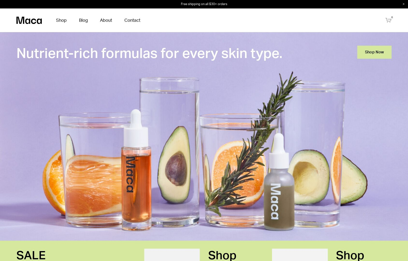
MACA
What I like:
The vibrant colors of Maca just make me happy - and I’m not even a big fan of purple! 😂 The beauty of this template is that I think it would work great even if the colors were toned down a bit. The home page of this template is also super robust with lots of content areas for everything from fave products to shop categories, informational content, and even product features. I also really appreciate the mega footer on this site - everything a customer would need is linked right there while allowing the top navigation to remain simple and tidy.
What I would add/change:
I would definitely turn on the built-in shop category navigation to help people explore the shop better. On Squarespace, you can have up to three levels of nested categories so with lots of products it’s best to put that to use to help people find what they’re looking for quickly. Speaking of categories, I would throw those in the site header just for good measure! Overall, there’s not much not to love with this template!
Paid Templates
Third-party templates like those featured below can be a great way to get a little more style and that little extra “something special” versus starting from a free template. Paid templates are still super economical compared to working with 1:1 with a designer on a complete custom project so they are still a total win in the budget department as well. My two favorite template shops are GoLiveHQ or Ghost Plugins because they are both very reputable and offer excellent customer service.
Paid templates are installed directly into your Squarespace account and you can start editing them right away just like a free template. Some of them also come with some extra CSS code already installed which can really make springing for a paid template worth it. Another bonus is that in general, paid templates tend to have more pages built out with more intricate layouts versus the free templates that may be super generic. This can help you get to “finished” even faster!
Nosa by Ghost Plugins
What I like:
So much to like! Aside from just having great style that I think could adapt to fit a range of industries and brands, there are tons of great content areas on the home page - and throughout! I love the mega footer, all the signup boxes, and even the super cute contact page! I think this template would be a great fit for a service provider who wants to integrate Squarespace Scheduling or Member Areas but it could work just as well for a subscription-based company or single-product store. Overall, a flexible design with great style!
What I would add/change:
There’s not a lot I would change but depending on the products/services being sold I might swap out the newsletter sign-up boxes in some of the hero image areas for different calls to action such as a button to check out the shop or services page. The unique shape of some of the images and the header menu is definitely a brand choice that isn’t going to work for everyone. Luckily, this can easily be made a bit more traditional by simply removing a couple lines of custom CSS.
Save 10% off any Ghost template with discount code: KRISTINENEIL

Typeset by GoLive
What I like:
This template is billed as great for service providers that have more copy than images but I think it would actually be an awesome choice for a subscription box company or a startup with just a few signature products. The template has lots of room to explain features and benefits alongside a stylish, clean design. Another thing I really love is the blog which you definitely shouldn’t skip just because your primary focus is eCommerce — blogging is a great way to attract new customers, boost SEO and show off your expertise.
What I would add/change:
I would ditch the portfolio - it’s just not needed here. But don’t worry about that leaving gaps in the content areas on the home page or navigation areas, those can be filled in with shop content or links to your subscription products! I would also beef up the footer with more links and a newsletter opt-in. Also, even though I love the fonts that have been selected as part of this template if you feel like adding a pop of color and personality, I would consider changing up the black fonts for a color that’s on-brand. It could make the bold typography really fun!
Lumi by Ghost Plugins
What I like:
This template is just so slick and cool! It is clean but still has a little edge. The floating header navigation can help keep your main links front and center (literally) but you could always disable that and keep it static if it wasn’t for you. I love the icons and features list on the home page and then all the really bold sections down below. Ghost always delivers on an awesome footer and this template is no exception - the newsletter box and links are such valuable real estate!
What I would add/change:
The demo content is set up to take advantage of a Squarespace Scheduling integration (which can be a great eCommerce tool) but if that doesn’t fit with your business, you could easily swap in membership areas, links to subscription products or boxes, or even shop categories! Also, even though I’m a fan of the black and white I wouldn’t be afraid to make this more fun, playful or bold by changing up the color palette in the site styles section. It’s so easy to update everything in just a few clicks!
Save 10% off any Ghost template with discount code: KRISTINENEIL

Kristine Neil
Fractional Web Partner
I'm Kristine Neil - a communications strategist who has spent 20+ years designing websites, first running a full-scale design and marketing agency, and now leading my own studio. I've been the creative director managing the work, the coder quietly fixing what others couldn't, and the strategist in the room asking why before how. Somewhere between the MBA and the other degrees, I decided web design was just one tool in a much bigger toolbox - the real work is figuring out what you're trying to say, who needs to hear it, and what's getting in the way. A website is just where all of that comes to life.
I build on Squarespace, and after years deep in the platform I know how far it can go and when to push past its limits. These days, I'm especially drawn to working as a fractional partner - getting to know an organization over time and helping with whatever moves them forward, whether that's a full redesign, an ongoing hand with content and strategy, or just being the person who knows their site best. I write here about eCommerce, web strategy, and making the complex feel a little more human.