More Great Squarespace eCommerce Templates
My post The Best eCommerce Templates for Squarespace features some great templates but there’s are so many to choose from that I’m back with another roundup of faves! Some of these I may like even more! For the new or uninitiated, Squarespace templates are a great jumping-off point that allow you to get to launch day faster and more affordably than starting from scratch. Templates are also great for eCommerce projects because they take care of a lot of the heavy lifting when it comes to design and layouts so that you can focus your energy and resources on the thing that really matters - your shop!
Another thing to note is that all of the templates I feature are for Squarespace 7.1. This is the newest version of Squarespace and one of the things I love about it (aside from all these awesome eCommerce upgrades) is that all templates have access to all features and functions; you no longer have to worry about picking a template based on what it can or can’t do - they all work great!
p.s. if you’re not sure what to even look for in a template, this is a great place to start: How to Pick the Right Squarespace Template for Your eCommerce site.
Free Built-In Templates
Free is a good price and all these templates are part of Squarespace’s included template gallery so you can just jump right into editing! Remember that it’s important to look at the content areas a template has as much as the style; you can (and should!) always change fonts and colors to suit your brand. Also, don’t get turned off on a template just because the demo content features a specific industry other than yours. Once your products and brand are added, any of these templates would work great for just about any eCommerce shop!
SKYLOOP
What I like:
Skyloop is super fun and vibrant right out of the gate but it’s still super clean and minimal! This template makes the list because it is so explicitly eCommerce-focused that I think it would make it easy for people who are struggling with seeing the selling potential of other templates. This one already features links to featured shop categories and super clean shop navigation which are nice selling tools. Overall this template is a great jumping-off point!
What I would add/change:
This template is really engaging so there’s not a lot I would change although I do think it would be nice to move the subscription box that’s featured on the home page into the footer so that it will be visible on all pages. I also think that every shop needs an FAQ page so I would add that and then possibly incorporate the shop categories into the footer navigation so that visitors can have access to that info again at the bottom of the page.
PASSERO
What I like:
Yum! Doesn’t just looking at this template make you hungry?! I love it for its great “above the fold” image and strong CTA but the home page also has room to highlight features of working with you or shopping from your site. The demo content is set up for a membership site but you could just as easily make those buttons to schedule with you or visit shop categories. The classes page could highlight any number of things like blog posts or help articles - even favorite products! I think this template really shows some of what’s possible on Squarespace in a fun way!
What I would add/change:
I think the footer could be made stronger with a newsletter signup linked to Squarespace campaigns - so that you could automatically send new clients or customers an offer! It may also be cool to embed an Instagram feed to add some dynamic content. I also really like the photos about midway down the demo home page but I don’t love that they don’t link anywhere. It would be really cool if those linked out to corresponding recipes, services, or products to make the site even more interactive!
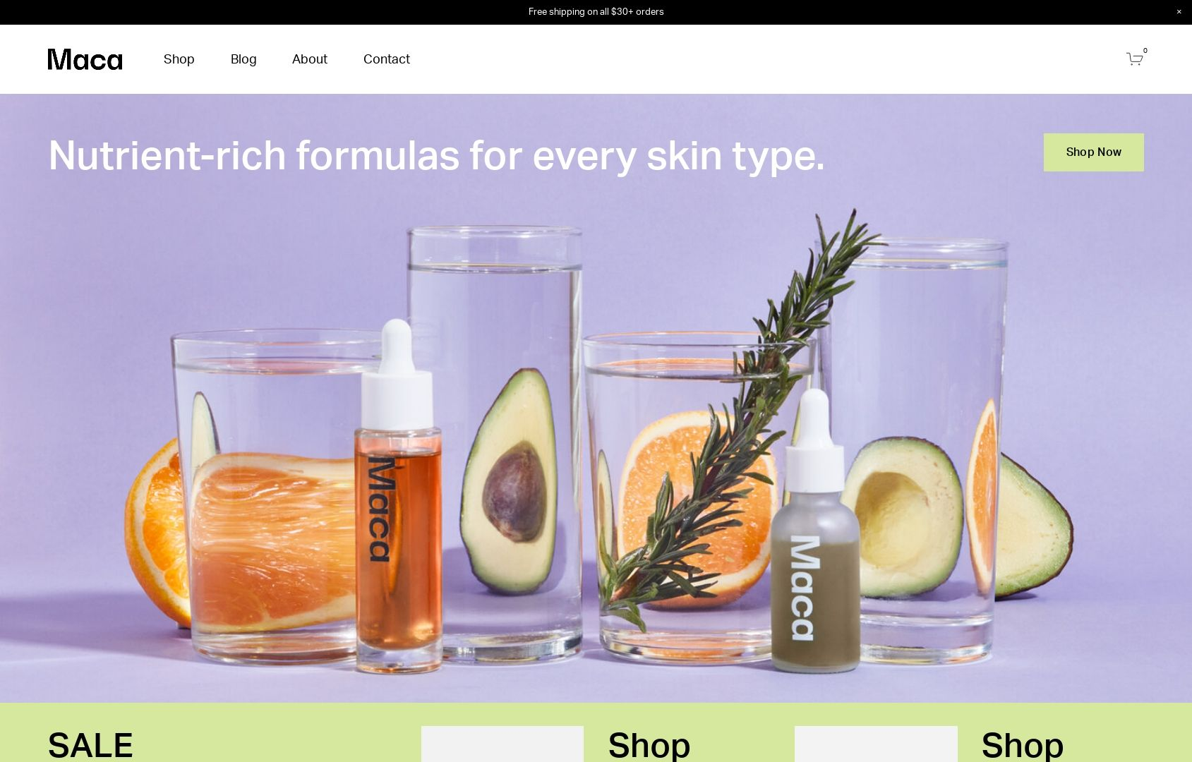
MACA
What I like:
The vibrant colors of Maca just make me happy - and I’m not even a big fan of purple! 😂 The beauty of this template is that I think it would work great even if the colors were toned down a bit. The home page of this template is also super robust with lots of content areas for everything from fave products to shop categories, informational content, and even product features. I also really appreciate the mega footer on this site - everything a customer would need is linked right there while allowing the top navigation to remain simple and tidy.
What I would add/change:
I would definitely turn on the built-in shop category navigation to help people explore the shop better. On Squarespace, you can have up to three levels of nested categories so with lots of products it’s best to put that to use to help people find what they’re looking for quickly. Speaking of categories, I would throw those in the site header just for good measure! Overall, there’s not much not to love with this template!
Paid Templates
Third-party templates like those featured below can be a great way to get a little more style and that little extra “something special” versus starting from a free template. Paid templates are still super economical compared to working with 1:1 with a designer on a complete custom project so they are still a total win in the budget department as well. My two favorite template shops are GoLiveHQ or Ghost Plugins because they are both very reputable and offer excellent customer service.
Paid templates are installed directly into your Squarespace account and you can start editing them right away just like a free template. Some of them also come with some extra CSS code already installed which can really make springing for a paid template worth it. Another bonus is that in general, paid templates tend to have more pages built out with more intricate layouts versus the free templates that may be super generic. This can help you get to “finished” even faster!
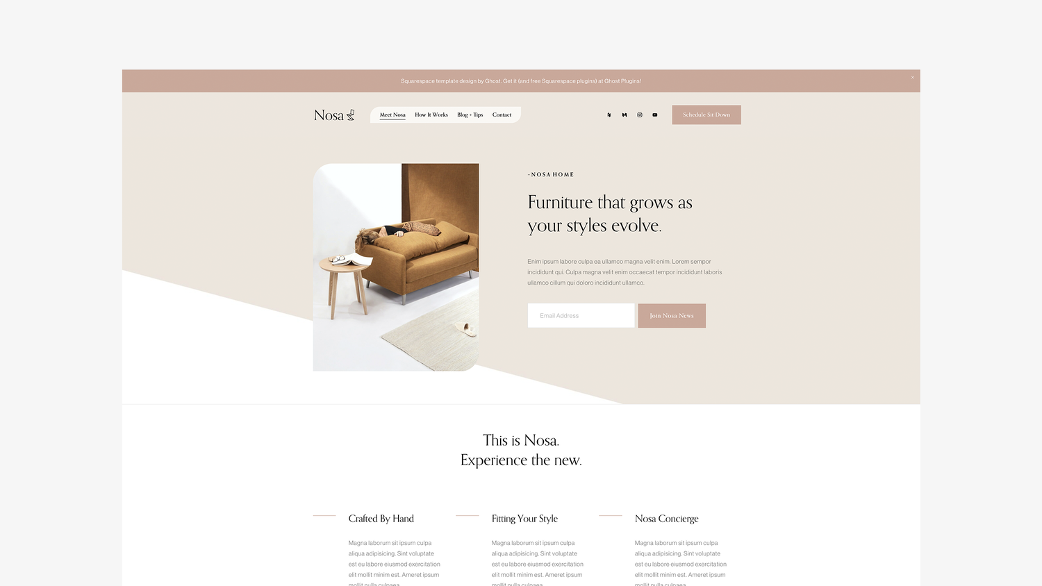
Nosa by Ghost Plugins
What I like:
So much to like! Aside from just having great style that I think could adapt to fit a range of industries and brands, there are tons of great content areas on the home page - and throughout! I love the mega footer, all the signup boxes, and even the super cute contact page! I think this template would be a great fit for a service provider who wants to integrate Squarespace Scheduling or Member Areas but it could work just as well for a subscription-based company or single-product store. Overall, a flexible design with great style!
What I would add/change:
There’s not a lot I would change but depending on the products/services being sold I might swap out the newsletter sign-up boxes in some of the hero image areas for different calls to action such as a button to check out the shop or services page. The unique shape of some of the images and the header menu is definitely a brand choice that isn’t going to work for everyone. Luckily, this can easily be made a bit more traditional by simply removing a couple lines of custom CSS.
Save 10% off any Ghost template with discount code: KRISTINENEIL
Typeset by GoLive
What I like:
This template is billed as great for service providers that have more copy than images but I think it would actually be an awesome choice for a subscription box company or a startup with just a few signature products. The template has lots of room to explain features and benefits alongside a stylish, clean design. Another thing I really love is the blog which you definitely shouldn’t skip just because your primary focus is eCommerce — blogging is a great way to attract new customers, boost SEO and show off your expertise.
What I would add/change:
I would ditch the portfolio - it’s just not needed here. But don’t worry about that leaving gaps in the content areas on the home page or navigation areas, those can be filled in with shop content or links to your subscription products! I would also beef up the footer with more links and a newsletter opt-in. Also, even though I love the fonts that have been selected as part of this template if you feel like adding a pop of color and personality, I would consider changing up the black fonts for a color that’s on-brand. It could make the bold typography really fun!
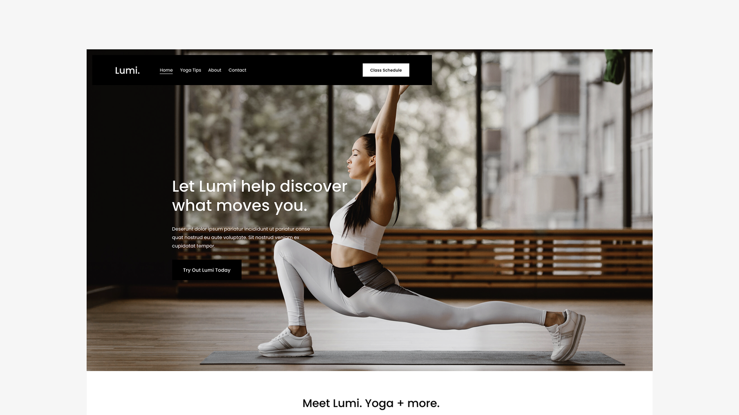
Lumi by Ghost Plugins
What I like:
This template is just so slick and cool! It is clean but still has a little edge. The floating header navigation can help keep your main links front and center (literally) but you could always disable that and keep it static if it wasn’t for you. I love the icons and features list on the home page and then all the really bold sections down below. Ghost always delivers on an awesome footer and this template is no exception - the newsletter box and links are such valuable real estate!
What I would add/change:
The demo content is set up to take advantage of a Squarespace Scheduling integration (which can be a great eCommerce tool) but if that doesn’t fit with your business, you could easily swap in membership areas, links to subscription products or boxes, or even shop categories! Also, even though I’m a fan of the black and white I wouldn’t be afraid to make this more fun, playful or bold by changing up the color palette in the site styles section. It’s so easy to update everything in just a few clicks!
Save 10% off any Ghost template with discount code: KRISTINENEIL


