How to Use Unsplash to Curate Your Website Images
Great photos can really make or break a website but sometimes it’s just not in the cards to have a bunch of your own. This could either be because it’s just not in the budget to have a photoshoot right now or because the high quality ones you do have just aren’t enough to fill out an entire website.
When I’m looking for photos for projects, the number one place I head it to unsplash.com. Check out the video below where I show you how to source royalty-free, good looking, stock images through Unsplash and also share some of my best tips for curating stock images that don’t feel too, well, stock. Watching video not your thing? Keep reading to catch the details!
p.s. Watch the video on Loom for video bookmarks to jump to specific sections or if you need a transcript/captions.
Tips on Using Unsplash
Create a free account so that you can save images you find into collections! This makes it so that you can be more organized and intentional when selecting images.
Add images to collections by clicking on the plus icon (NOT the heart icon) and either adding it to an existing collection or creating a new one.
Share a collection by heading to your profile, clicking into the collection you want to share and grabbing the url from your browser bar. That’s it - easy!
Stock Image Tips
Image Tip 1: Keep Things Consistent - Selecting images that are consistent in style is one of the best ways to make stock images look like a professional took them just for you. Select images that have the same overall colors and tones or the same photographic style, such as all black and white images. Making sure to stick to a well defined color palette is probably the number one way you can make things feel cohesive.
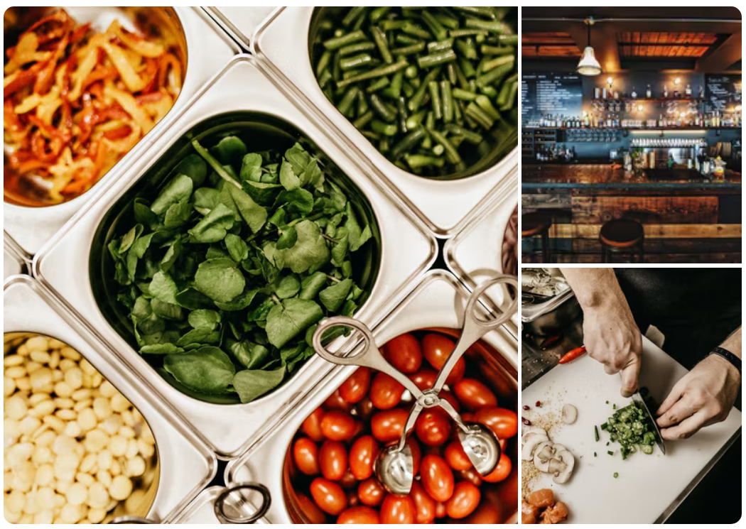
Image Tip 2: Think Micro to Macro - Try to choose a range of images that represent your industry, field or topic across the spectrum. Using the example from the video above about finding pictures for a farm to table restaurant website that might mean looking for pics of everything from individual ingredients to the fields they are grown in to the chef that selects them and finally the guests that enjoy each dish. Find images that show close ups and then others that give the bigger picture. Some of my favorite stock images are actually ones that are just used as background images on a website to “set the mood.” These images usually have alot of space that would look good with text or a button over the top of it or could even just be used as a transition between website sections.
Image Tip 3: Don't Get Lost in the Details - Don’t worry about minute details in stock photos that may not be exactly right. For example, I once had a client say that a stock photo (that was otherwise perfect for their fitness brand) wasn’t going to work because the brand of weights shown in the image weren’t the same as the brand they own 🙃 I guarantee no customer is going to notice a thing like that! Images are just there to set the mood and visually contribute to a bigger story. Find ones that work but don’t sweat the small stuff. Like I said, unless you had a photo shoot of your own you could scour all the stock photos on the whole internet and never find one of yourself!
Image Tip 4: Think Outside the Box - Get creative in the search terms you use which can help you uncover interesting photos for your site that other people in your industry may not be using. For example, it’s a pretty safe bet that every restaurant out there searched for “restaurant” photos but my bet is that not a lot of them searched for “Tokyo street food” or “friends celebrating over drinks.” Thinking about your target demographic and searching for things that may resonate with them or help them see themselves in your site is a good place to start if you’re feeling stuck on what to search for.
Example Website Photo Collections
Want to see how all these tips comes together to create four unique image collections? Check out these sample collections I created for four hypothetical food concept websites. Each of them has to do with food, cooking, baking, eating together with friends and family and yet none of them look alike at all. I’ve used a consistent photo style for each and focused on finding images that represent a wide range of keywords within each board so that there’s a wide range to choose from. I didn’t worry about little details like the brand of dishware or the type of vegetable, I just went for things that could help tell the story of each brand alongside their own personalized images and website copy.
Check out each collection to see how each could clearly represent four very different brands and let me know if you use Unsplash to curate your own image collections!


