

Notes on building smarter websites for actual humans.
Even the tomatoes need a website.
I started a garden this spring, mostly as a rebellion against the internet. Turns out even a raised bed of heirloom tomatoes couldn't get me to quit thinking about websites.
I've joked with my professional colleagues more than a few times this past year that it feels like, in a lot of ways, we're moving backwards. For twenty-plus years we've been pushing everything forward - online directories replaced phone books, QR codes replaced printed menus, websites replaced (or at least tried to replicate, in their own clunky way) the experience of walking into an actual shop. And now here we are, watching some of that swing back the other direction. Funny how that works.
I don't think it's a coincidence that this is happening right as AI floods every feed with content that reads like it was written by anyone, for anyone - and therefore by nobody, for nobody. When anyone can generate a course, a newsletter, a "here are 5 tips" post in about four seconds flat, the stuff that can't be generated starts to feel valuable again. A conversation. A person who actually shows up. A booth at the farmers market.
I've felt this pull myself, more than I'd like to admit. The more digital everything gets, the more I find myself craving things that are stubbornly, inconveniently analog. So much so that I've genuinely wondered lately whether what I do - which is design digital experiences for a living - is still relevant, or if I should just give it all up and go be a farmer instead.
This existential crisis was so real that I did the unthinkable earlier this spring: I started a garden.
I want to be clear that I am not a gardener. I am, very generously, a novice, extremely first-year, please-don't-die-on-me-now gardener. A black thumb. But something got into me and now I've got heirloom tomatoes and peppers going in the backyard, and I check on them about as often as I check Slack, which is to say, quite a lot.
Here's the part that actually got me, though, and the reason I'm writing this and not just posting tomato pictures. I was out there the other day, hands in the dirt, feeling pretty smug about my little rebellion against the algorithm, when I caught myself thinking: you know, if I ever actually sold these, like, say at a farmers market, I'd totally make myself a cute little tomato website.
Not because I'd need one to look official. Because I'd want people to know which Saturday I'd actually be at the market. I'd want a way to text the neighbors when a new batch of peppers came in. I'd want the people who missed me that week to still be able to grab a box. None of that has anything to do with looking legit online - it's just logistics. Even the most physical, dirt-under-your-nails business in the world still needs a digital way to say here's where I am and here's how to get some.
Even out there, doing the most analog, unplugged, back-to-the-land thing I could think of. My brain still drifted to the internet.
Because - surprise! - even the tomatoes need a website 🍅

Telling Your Story in Reverse: Understanding Great UX Microcopy
Strong copy isn’t reactive; it’s predictive. Learn how to “write backward” for your Squarespace site - anticipating what users will think, feel, and need next - to create seamless, story-driven UX that turns clarity into action.
Every website tells a story - but that doesn’t mean it should be written in the order you think.
That’s because most brands write copy for what they want to say. But the best ones write for what their audience is about to feel.
Your visitors are already writing the ending through their clicks, scrolls, and hesitations. The question is: are you shaping the next sentence, or waiting to read it in your analytics later?
This is the art of telling your story in reverse: designing copy around the click, the hesitation, the decision, instead of from the top down.
Start with the Ending
Good storytelling starts with the ending - and so does good UX writing.
If you know what you want someone to feel (confident, relieved, understood) or do (buy, donate, book), you can write backward from there.
That means every headline, button, and sentence becomes a setup for that emotional outcome. Especially the small ones - the buttons, errors, confirmations, and pauses where people decide whether to keep going.
Want trust? Write like you’d explain it to a friend, not a boardroom.
Want confidence? Use language that signals safety and control.
Want excitement? Add momentum through verbs, rhythm, and pacing.
Remember, you’re not writing for a screen, you’re shaping a real person’s decision in real time. You’re setting the stage for how someone will feel and what they’ll do next. That’s powerful.
Every Action is a Line of Dialogue
To better understand user behavior, I’ve found it helpful to think of user actions as a conversation - just one without any explicit words. When someone hovers, scrolls, or abandons - they’re talking to you. They’re saying:
“I’m interested, but not convinced.”
“I don’t understand what happens next.”
“You lost me halfway down.”
This is where microcopy earns its keep. It’s also where writing backwards becomes visible. Those quiet little phrases on buttons, forms, and error messages do more than fill space. They meet users where their thoughts are, answering questions they haven’t said out loud yet.
This is the heartbeat of UX storytelling: not the sweeping brand manifesto, but the subtle reassurance that keeps someone from bailing halfway through the journey. Here’s what that looks like in practice:
Examples:
Form error: Instead of “Invalid input,” say “Almost there - just double-check your email.”
Cart reminder: Instead of “Your cart is empty,” say “Still thinking it over? We saved your picks for later.”
Signup success: Instead of “Thank you for subscribing,” say “Welcome to the good stuff - check your inbox for the first one.”
These micro-moments are dialogue. They keep the story alive.
Anticipate, Don’t React
If your analytics show where people stopped, your copy can predict where they might.
Reverse storytelling means designing each step like a breadcrumb trail - a little Hansel & Gretel moment that guides visitors toward clarity before confusion sets in (minus the weird forest part, of course). Great copy anticipates what someone needs to know right when they need it, so they never lose their way.
That could look like adding short FAQ sections at key points in the journey, using tooltips to explain next steps, or weaving reassurance into form labels and button text. The goal isn’t to overwhelm - it’s to answer the question that’s about to pop into your visitor’s head before they have to ask it.
Ask yourself:
What question will they have right before this step?
What fear or hesitation might come up next?
What can I say here that removes the doubt before it forms?
This is proactive empathy. You’re not waiting for friction; you’re anticipating what might need to happen to remove it altogether.
Bring the Story Full Circle
I see so many sites where the impulse was clearly to throw all the spaghetti at the wall to see what sticks. There’s no plot, no underlying theme — just a lot of noise. And I get it - you need your website to bring in the sales and donations but your website is not a place for you to dump everything and hope for the best.
As website designers and owners, we need to often be reminded that people don’t experience websites all at once. They experience them in bits and pieces, moment by moment. Too often we get in our own way and ask users to do too much.
Every click is a small decision. Every hesitation is a question forming in someone’s head. And uncertainty is expensive. It slows people down, creates doubt, and gives them an easy reason to leave.
Thoughtful microcopy works because it lowers the cognitive load at those moments. It answers the question before it fully surfaces. It replaces friction with reassurance and turns uncertainty into momentum.
This isn’t about being clever or cute. It’s about designing language that helps people feel reassured, in control, and confident at each step as they move through your site. When someone thinks “Oh, I know what happens next,” you’ve already done most of the work.
The Bottom Line
The best websites don’t just look beautiful, they communicate beautifully. Writing your story in reverse means designing every headline, button, and sentence for what happens next. The best feedback you can ever get is when someone says, “I checked out your site and you just get me” Swoon. That’s what it’s like when we write backwards to keep things moving forwards.

The Case for Intentional Friction: Why Effort Isn’t Always the Enemy
We’ve been told to remove friction at all costs, but the smartest websites know when to slow people down. Discover how thoughtful UX friction can reduce errors, increase confidence, and create smoother, more human digital experiences.
This is my manifesto to fellow web designers and UX enthusiasts everywhere. I'm concerned. We may have spent so much time preaching the gospel of seamless design that we’ve forgotten something important: a little effort can be a good thing.
Not the kind that makes people rage-click or want to throw their laptop over the balcony, but the kind that slows them down just enough to help them make better decisions.
This is the case for intentional friction: small, thoughtful speed bumps that protect users, build commitment, and create trust.
When Friction Works
There’s a difference between accidental friction and intentional friction. Accidental friction is the stuff we all hate: broken links, confusing layouts, forms that reload when you hit “Enter.” Basically anything that's the design equivalent of a pothole.
Intentional friction, on the other hand, is more like... a crosswalk. It’s a purposeful pause that helps people think before they act. It’s not there to frustrate, it’s there to prevent regretful accidents.
Think of your online checkout. Automatically selecting the first product variant might seem convenient, until someone buys the wrong size and has to email support. A quick “Choose your size” step adds a split second of friction but saves time, money, and goodwill in the long run.
The same principle applies elsewhere: adding a confirmation page before finalizing a donation, or a quick note reminding users that digital downloads are non-refundable. Even something as small as requiring a user to check a box acknowledging store hours before booking an appointment can prevent confusion later.
These moments of purposeful pause show respect for the user - and for your time.
The Psychology Behind Productive Friction
A bit of friction can build commitment. When people have to take a small action - confirm a donation, pick a size, type in their email - it shifts them from passive observer to active participant. Behavioral researchers call this effort justification: when we work for something, we value it more.
It’s why a one-click checkout feels amazing in the moment but can backfire later with buyer’s remorse. The lack of effort means the action carries less emotional weight. Thoughtful friction, on the other hand, turns impulse into intention.
👉 Related reads:More Pricing Psychology Tips to Increase Sales and Pricing & Product Lineup Strategies for Sustainable Business Growth - both explore how buyer effort and perception shape long-term satisfaction and trust.
Where to Add (and Avoid) Friction
Add friction where clarity or confirmation matters:
Choosing product variants or customization options
Confirming high-stakes actions (donate, delete, publish, buy)
Reviewing information before submission
Avoid friction where momentum matters:
Browsing and discovery
Navigating between sections
Low-stakes conversions (like newsletter signups)
💡 Rule of Thumb: Friction should never feel like punishment, it should feel like protection.
The Bottom Line
Designing for zero friction might sound like the goal, but total ease can make experiences forgettable. Engagement lives in the balance, enough smoothness to feel intuitive, enough resistance to keep people present. The best brands know this instinctively: they design moments that feel effortless and intentional.
Good UX is like good storytelling. It needs rhythm, contrast, and the occasional pause for tension. Those pauses aren’t bugs; they’re features. This is where our users can reconnect with our purpose. Basically, too much friction and people give up. Too little, and they lose interest.

Measuring What Matters Without Losing the Plot
Analytics are helpful, but they don’t tell the whole story. This post explores how to interpret Squarespace website metrics with empathy and intention, using UX insights to improve engagement, trust, and conversion without losing sight of the humans behind the data.
If you’ve been around the internet long enough, you’ve probably heard some version of: “what gets measured gets managed.” That’s true, but only up to a point. In web design, the real danger is that once you start measuring something, you risk mistaking the metric for the meaning.
We obsess over numbers - bounce rates, conversions, time on page - but forget what those metrics actually represent: human behavior. Behind every data point is a real person making a decision based on how your site made them feel: clear, confident, or confused.
So instead of chasing better metrics, what if we used them to diagnose where people are getting stuck? That’s where my Clarity → Trust → Action framework becomes a practical lens for what your analytics are really telling you.
Step 1: Clarity Metrics
Are You Easy to Understand?
Clarity is the first hurdle. You don’t earn trust if people don’t get what you do.
Instead of asking “How many people landed on my homepage?”, ask:
How many stayed past 10 seconds?
Which pages have the highest bounce rate - and do they share a confusing headline or layout?
Where are people hovering or clicking that they shouldn’t need to?
Clarity metrics don’t measure volume, they show whether people can get their bearings. If visitors can’t tell what you do in five seconds, they’ll take those clicks elsewhere.
👉 Quick check: Open your homepage and squint. Can you still tell who it’s for? If not, your copy isn’t doing its job.
Step 2: Trust Metrics
Do People Believe You Can Deliver?
Once people understand you, they start evaluating whether to believe you. Trust lives in patterns: consistent visuals, tone, and user experience.
Look at:
Return visitor rate (are people coming back?)
Scroll depth (are they reading or skimming?)
Navigation flow (are they exploring logically or jumping around?)
Trust lives in both the data and the experience people have on the page. You can’t force it with popups or pushy CTAs, you earn it through consistency. Every broken link, mismatched font, or outdated photo chips away at credibility. Every thoughtful touch adds it back.
Step 3: Action Metrics
Are You Moving People Forward?
Once clarity and trust are solid, action should feel natural. But this is where most analytics dashboards go off the rails because we start worshiping conversion rates without asking why people took action.
Look at your actions in context:
Which CTAs convert best (and why)?
Do people complete the checkout or donation process smoothly, or do they drop off part way?
Are you seeing repeat conversions - or one-and-done interactions?
The goal isn’t just more conversions, it’s smarter ones. One rooted in understanding, not impulse. When a site rushes people to buy, it might spike short-term sales but erode long-term trust.
Remember, a good website doesn’t just make it easy to act, it makes it feel right to act.
The Mirage of Measurement
Here’s where it gets tricky. The more we measure, the easier it is to lose the plot. Metrics can only tell you what people did - not why they did it.
A high conversion rate doesn’t automatically mean the experience is working well.
A lower bounce rate doesn’t guarantee people actually liked what they found.
Numbers will show what’s happening, but not whether it aligns with what users need.
My recommendation? View data is a compass, not a script. The numbers can help orient you and provide some rough navigation, but you still need intuition, empathy, and context to interpret what the data means.
Adding Empathy to the Equation
All the analytics in the world can’t capture the complexity of real life. Numbers won’t tell you if someone abandoned their cart because they got distracted by a crying baby, a power outage, or just plain decision fatigue. Metrics capture behavior, not the feelings or circumstances behind it.
That’s why empathy belongs in your analytics conversation. So before we get to what you should be measuring, remember that every data point is a real person. Someone with context, chaos, and competing priorities. This will help you make smarter decisions with your data. You'll be able to stop optimizing for perfection and start designing for reality.
👉 Related read: 12 Ways to Build a More Empathetic Brand
A Smarter Dashboard: Metrics That Matter
Framework Phase: Clarity
Metrics to Watch:
Bounce Rate
Time on Page
What These Really Tell You:
Do people understand what you do right away?
Framework Phase: Trust
Metrics to Watch:
Scroll Depth
Return Visitors
Session Duration
What These Really Tell You:
Are people comfortable engaging with your content?
Framework Phase: Action
Metrics to Watch:
Conversion Rate
Completion Rate
Repeat Actions
What These Really Tell You:
Are you moving visitors from awareness to confidence to commitment?
The point isn’t to hit perfect numbers - it’s to use them as clues. Every conversion, bounce, or cart abandonment is your audience saying something without words. When someone doesn’t click “Add to Cart,” donate, or book now, they’re telling you a story in reverse. You have to put on your little emotional detective hat and figure out what their actions are trying to say through your metrics.
The numbers connect the dots between what we think people want and what they’re actually experiencing. They’re not admissions - they’re context. Little breadcrumbs that lead you toward empathy and better decisions.
The Bottom Line
Measuring is easy. Interpreting is art.
Your analytics should inform decisions, not dictate them. Because the real measure of a great website isn’t how many clicks it gets, it’s how confidently it guides people toward something that actually matters to them.
Good design doesn’t just look good in the data. It feels good in real life. It’s something people can understand quickly, trust easily, and move forward with confidently.

Mastering Product Variants in Squarespace
Harness the power of product variants to transform your Squarespace store. This comprehensive guide covers everything from basic setup to advanced strategies, helping you create a more efficient, user-friendly, and profitable online shop.
If you've ever felt like your product catalog is starting to resemble a digital version of that notorious junk drawer, you're in the right place. Today, we're exploring product variants - your secret weapon for turning chaos into order in your Squarespace store.
In this comprehensive guide, we'll cover everything from the basics of setting up variants to advanced strategies for optimization. You'll learn how to streamline your product offerings, improve your store's user experience, and make informed decisions about your product structure. By the end of this post, you'll have the knowledge to create a more efficient, user-friendly, and scalable Squarespace store that's primed for growth. Let’s dig in!
The Importance of Product Variants
Product variants allow you to offer multiple versions of a product without cluttering your store. While this feature is commonly used for products that come in different sizes, colors, or styles, its applications are far more versatile than you might think.
For example, if you're selling t-shirts in various sizes and colors, using variants lets you present all options under a single product listing, rather than creating separate entries for each combination. It's like having a really efficient personal shopper for your customers.
But let's think outside the box. Here are some creative ways to use variants that you might not have considered:
Customization options: Use variants to offer personalization choices, like engraving text on jewelry or selecting gift wrap styles.
Bundle building: Create a "build your own gift box" product where each variant represents a different item customers can include.
Service add-ons: For service-based businesses, use variants to offer different service levels or add-on features.
Product pairings: Use variants to suggest complementary products, like "Shirt Only" or "Shirt + Matching Accessory."
By thinking creatively about variants, you can streamline your product offerings while providing customers with more options and a smoother shopping experience while you see increased average cart values. Win-win!
ℹ️ FUN FACT! Did you know that Squarespace allows up to 6 options and 250 total variants per product, giving you ample flexibility for most product types. For context, Shopify caps at 3 options and 100 total variants without add-ons and Podia offers unlimited digital products. (Podia's living its best digital life, apparently.)
Variants vs. Separate Products: Making the Right Choice
Deciding when to use variants versus creating separate products can significantly impact your store's organization and user experience. Here's a simple decision guide:
Use variants when:
The item is essentially the same product with different options
You want to simplify inventory management
You're well within the 250 variant limit
Create separate products when:
The item has unique features beyond basic options like color or size
You need more detailed, separate tracking for inventory or analytics
You're approaching the 250 variant limit
Let's look at some examples across different industries:
Clothing Store:
Use variants: Different sizes and colors of a t-shirt design
Separate products: "Classic Tee" versus "V-Neck Tee" (different styles)
Electronics Shop:
Use variants: Storage capacity options for a smartphone (64GB, 128GB, 256GB)
Separate products: Different models of smartphones (e.g., iPhone 16 vs. iPhone 16 Plus)
Furniture Store:
Use variants: Fabric choices for a sofa
Separate products: Different sofa models (e.g., loveseat vs. sectional, or different designs)
Jewelry Business:
Use variants: Necklace chain lengths or gemstone choices
Separate products: Different jewelry types (necklaces, bracelets, earrings)
Digital Products:
Use variants: License types for a software product (personal, business, enterprise)
Separate products: Different software applications or courses
Food and Beverage:
Use variants: Different flavors of the same product
Separate products: Different product formulations (sugar free vs. regular)
Home Decor:
Use variants: Sizes of a picture frame
Separate products: Different frame styles or materials
Subscription Boxes:
Use variants: Subscription durations (3 months, 6 months, 1 year)
Separate products: Different types of subscription boxes (e.g., beauty box vs. snack box)
The key is to use variants when the differences are primarily in options or customizations of the same basic product. Create separate products when the items have distinct features, purposes, or when you need to manage them independently for inventory or analytics purposes.
How variants (or the lack thereof) can make better product pages:
There's another significant benefit to creating separate products: it allows you to craft more specific and tailored product descriptions and pages. When you're not trying to cover multiple variants in a single description, you can:
Focus on unique features: Highlight the specific benefits and features of each product without diluting the message to cover all variants.
Target specific customer needs: Speak directly to the customer who's looking for this particular item, addressing their unique pain points and desires.
Optimize for specific keywords: Create more focused SEO strategies for each product, potentially improving your search rankings for specific terms. (More on this below! 😉)
Provide detailed information: Include in-depth specifications, use cases, and customer testimonials that are relevant to the specific product.
Showcase product-specific imagery: Use photos and videos that highlight the unique aspects of each item without confusing customers about which variant they're viewing.
Tailor your call-to-action: Create more compelling and specific calls-to-action that resonate with the target audience for each product.
By not offering too many options on a single page, you can really cater to the needs of customers interested in each specific item. This approach allows you to communicate more effectively about the benefits and features of each product, rather than trying to cover all bases with a broader, less focused description.
Understanding Variant Calculations
Calculating the total number of variants is straightforward but crucial for planning your product structure. Here's how it works:
Total Variants = Option 1 choices × Option 2 choices × Option 3 choices (and so on)
For instance:
A t-shirt with 4 sizes and 3 colors: 4 × 3 = 12 variants
Adding just 3 additional colors and 5 design choices to the above: 4 × 6 × 5 = 120 variants
As you can see, the number of variants can increase rapidly as you add options! It's important to plan your variant structure carefully to avoid hitting Squarespace's 250 variant limit unexpectedly. Trust me, hitting that limit is no fun because it forces you to go back and rethink your product strategy when you’d probably rather just get to selling.
Optimizing Your Product Page for Variants
Now that you know a bit more about product variants, when to use them and how they work, let's talk about how to display your product options effectively on your product details pages. A well-designed product page is crucial for effectively presenting variants to your customers so it’s important to pay attention to the details. Here are some best practices:

Use visual elements: Implement color swatches or pattern images for relevant options. This helps customers quickly understand and select their preferred choice.
Utilize button options: For options like size or style, buttons keep the interface clean and options easy to navigate.
Clear impact display: Ensure that customers can easily see how their variant choices affect price and availability.
Descriptive labels: Use specific, clear labels for each option. "Size" is more helpful than "Option 1." After all, we're not playing a game of "Guess What This Dropdown Does."
Logical ordering: Present the most important variant options first, typically size for clothing or main feature for other products.
ℹ️ TIP! If you’ve set up specific images for each product variant (as you should), they will only display after ALL options are selected. This means that if you have a shirt in 5 sizes and 3 designs that the thumbnail will only change to match the selected after both size AND design have been selected. In this case, I would always recommend having size as the first option and the design as the second one so that as soon as the design is selected the corresponding thumbnail will display.
The key takeaway here is that a well-optimized product page with variants should be intuitive and easy to use. It should guide customers smoothly through their options without overwhelming them with choices.
I’m going to start to sound like I’m repeating myself, but it’s just SO important: your goal should always be to make the shopping experience as easy as possible, not over-complicate it. A clear, well-organized variant display can significantly reduce decision fatigue and increase conversion rates. On the flip side, a confusing or cluttered variant setup can lead to abandoned carts and lost sales. This means that when you’re thinking of how to set up your products, you’re really aiming for that perfect balance between offering variety and maintaining simplicity.
SEO and Inventory Considerations
When dealing with product variants, it's crucial to consider both search engine optimization (SEO) and inventory management. These elements can significantly impact your store's visibility on the front end and operational efficiency on the back end.
SEO for Variant-Rich Products
Optimizing variant-rich products for search engines requires a strategic approach. You need to balance providing detailed information for each variant while maintaining a cohesive overall product page. Here are some key tactics:
Strong main product title and description: This forms the SEO foundation for all variants. Ensure it encompasses the core product while hinting at the variety available.
Include key variants in the product title if commonly searched: "Women's T-Shirt - Sizes XS to 3XL" is more informative than just "Women's T-Shirt."
Use alt text on variant images: "Red V-neck T-shirt front view" is better for SEO (and accessibility) than "DSC12345.jpg".
Create unique content for significant variants: If certain variants are particularly popular or distinct, consider creating separate sections on the page with unique descriptions for these. (ℹ️ TIP! The Squarespace product additional info section is perfect for this!)
Google isn't psychic (yet 😬) so if you help it understand your products, it'll help customers find you. Create rich, informative pages that serve both your human visitors and search engine crawlers effectively. (For more on SEO, check out this video on my most recommended Squarespace SEO tool.)
Inventory Management
Effective inventory management is crucial for businesses with variant-rich products. Squarespace offers tools to help you stay on top of your stock levels across all variants. Here's how you can leverage these features:
Squarespace allows you to track stock for each variant separately. This means you can:
Set different inventory levels for each variant
Receive notifications when a specific variant is running low
Display "Out of Stock" messages for unavailable variants without removing the entire product
To make the most of these features:
Regularly review your inventory levels: Set aside time to regularly assess which variants are selling well and which might need to be discounted or discontinued.
Use low stock alerts: Set up notifications to alert you when variants reach a certain threshold, allowing you to reorder in time.
Analyze sales patterns: Use the data from your variant sales to inform future purchasing decisions and identify trends in customer preferences.
ℹ️ TIP! Use out-of-stock variants as an opportunity to collect email addresses for restock notifications. It's like turning lemons into lemonade, except the lemons are disappointed customers and the lemonade is future sales 🍋 This not only helps retain potential customers but also gives you valuable data on demand for specific variants!
Good inventory management isn't just about keeping products in stock—it's about optimizing your inventory to meet customer demand while minimizing holding costs. Your variant strategy plays a crucial role in striking this balance.
Money Talk: Variant Pricing Strategies
When it comes to pricing in Squarespace, it's important to understand the platform's capabilities and limitations. Here are some strategies you can implement:
Flat pricing: Set the same price for all variants of a product. This is the simplest approach and works well for products where all options have similar production costs.
Variant-specific pricing: Charge different prices for different variants. This is useful when some options (like different colors or premium materials) cost more to produce.
Product-level sales: While you can't discount specific variants, you can put entire products on sale. This can be useful for clearing out inventory or running promotions.
Limited-time offers: Use Squarespace's sale feature to create urgency around entire products or categories for a set period.
Here's how these strategies might look in practice:
Strategy: Flat Pricing
When to Use: Simple products with similar costs across variants
Example: All t-shirt sizes and colors for $25
Strategy: Variant Pricing
When to Use: When some options cost more to produce
Example: All red shirts are $25 but black shirts are $30
Strategy: Product-level Sales
When to Use: Clearing inventory, seasonal promotions
Example: 20% off a specific t-shirt product for a week
Strategy: Limited-Time Offers
When to Use: Create urgency, boost sales during slow periods
Example: lash sale: 15% off all hoodies for 48 hours
Remember, while Squarespace has some limitations, you can get creative within these constraints:
Create 'bundle' products: If you want to offer a deal on multiple items, create a new product that represents the bundle. (More on bundling & kitting on Squarespace.)
Use tiered products: Instead of variants, create separate products for "Standard," "Deluxe," and "Premium" versions if the differences are significant.
Leverage your product descriptions: Use this space to explain the value of higher-priced variants or to highlight limited-time offers.
ℹ️ TIP! While you can't automatically apply discounts to specific variants, you can manually adjust variant prices for sales. Just remember to change them back when the sale ends!
The key is to work smartly within Squarespace's framework. Your pricing should still reflect your brand positioning and target market. It's about finding the right balance between simplicity (which Squarespace enforces) and the flexibility your business needs.
User Experience: Don't Make Your Customers Play Hide and Seek
A great variant setup means nothing if your customers can't find what they're looking for. Here's how to ensure your store is more "helpful librarian" and less "labyrinth designed by M.C. Escher":
Organize categories logically: Group similar products together. "Tops" can include t-shirts, blouses, and sweaters, each with their own variants.
Use clear, descriptive category names: "Women's Tops" is better than "Upper Body Decor."
Implement robust filtering options: Let customers filter by size, color, style, etc. The easier it is to find, the easier it is to buy!
Optimize site search: Ensure your search function can handle variant-specific queries like "red XL t-shirt."
Create intuitive navigation paths: Think about your customer's journey. For instance, a path like Home > Women's > Tops > T-Shirts > Graphic Tees guides the user naturally through your store hierarchy.
Use breadcrumbs: These not only help with navigation but also with SEO.
Consider a mega menu: For stores with many categories and variants, a well-designed mega menu can provide an at-a-glance view of your product structure. (ℹ️ TIP! Looking for a mega menu? I love this plugin from Will Myers!)
Mobile optimization: Ensure your category structure and filters work well on mobile devices. Remember, a significant portion of your customers may be shopping on their phones.
Use the related products feature smartly: Many people use Squarespace’s built-in related products feature to display related products but did you know that you can specify exactly which categories you’d like to display for each product? This may be better than the default which is just going to show products at random based on either stock levels or what’s been most recently added to your store.
A/B test your navigation: What works best can vary depending on your specific audience. Don't be afraid to test different category structures or menu designs to see what resonates with your customers.
Ultimately, your site structure should feel invisible—guiding customers to their desired products without them having to think about the navigation process.
Future-Proofing Your Variant Strategy
As your business grows, so might your product offerings. Here's how to ensure your variant strategy scales with you:
Monitor your numbers & consider splitting high-variant products: Regularly check how close you're getting to that 250 variant limit. If you're approaching the limit, it’s probably time to think about creating separate product lines.
Consolidate when possible: Do you really need 15 ever so slightly different shades of blue tees? Would your sales really drop if you offered fewer options?
Plan for scalability: When adding new products or options, consider how they'll fit into your existing structure.
Stay flexible: The eCommerce world moves fast. Be ready to adapt your strategy as your business evolves.
Bottom Line
We've covered a lot of ground, from understanding the basics of product variants to strategizing for the future. Armed with this knowledge, you're now ready to transform your Squarespace store into a well-oiled, variant-powered machine.
Remember, mastering product variants is about finding the right balance - offering enough options to meet your customers' needs without overwhelming them (or yourself). It's about creating a shopping experience that's intuitive, efficient, and dare I say, even enjoyable.

6 Proven Ways to Create a User-Friendly Online Store
Lost in the digital aisles of online stores? Learn how to transform your shop from a confusing maze into a shopper's paradise. Discover the secrets to intuitive design that keeps customers coming back for more!
Ever walked into a store where everything seemed... off? Like the cashier was hidden behind a plant, or all the price tags were written in a foreign language you don’t understand? Welcome to the digital equivalent of that nightmare - a poorly designed online store. But fear not, we're about to embark on a journey through the wild world of user-friendly design, where we'll discover why putting yourself in your customers' shoes is your secret weapon in the battle for their hearts (and wallets).
1. Easy Navigation: Don't Make Your Customers Feel Like They're in a Corn Maze
Picture this: You're looking for a new pair of snazzy socks on "SuperSocks.com" (not a real site, but wouldn't it be great if it was?). You click on "Men's Socks," then "Patterned Socks," then "Ankle Length," and suddenly... you're staring at a page full of women's scarves. What in the name of mismatched laundry just happened?
This, my friends, is what we call a navigation nightmare. (And it's not fun like a corn maze is.)
Good navigation is like a well-organized sock drawer (sticking with our theme here). Everything should be where you expect it to be, clearly labeled, and easy to access.
Here's how to nail it:
Keep it logical: Group similar items together. Socks with socks, scarves with scarves. It's not rocket science, but you'd be surprised how often this gets messed up.
Use clear labels: "Funky Feet Coverings" might sound cool, but "Socks" is what people are actually searching for. Save the creativity for your product names.
Provide breadcrumbs: No, not the kind that mess up your keyboard. We're talking about those handy little navigation trails that show users exactly where they are on your site.
Offer search functionality: Because sometimes, people just want to type "polka dot socks" and be done with it.
Remember, every extra click is an opportunity for your customer to get frustrated and leave. And trust me, nobody wants to be responsible for sock-related rage quits.
2. Clear Product Presentation: Show, Don't Just Tell (But Also Tell)
Let's face it, we've all been burned by misleading product photos online. You order what you think is a life-sized cardboard cutout of Danny DeVito, and bam! you end up with a 2-inch keychain. Disappointing.
Good product presentation is about creating a virtual "try before you buy" experience. Here's how to do it right:
High-quality images: Multiple angles, pictures of every color option, zoom functionality, and for clothing, please, for the love of all that is holy, show it on a real person. We need to know if that shirt makes arms look like sausages wrapped in fabric.
Detailed descriptions: Don't just say "100% cotton." Tell me if it's softer than a kitten's belly or if it'll shrink the second I put it in the washing machine.
Customer reviews and photos: Encourage customers to post photos and reviews. Nothing builds trust like seeing real people using your products (and looking slightly less photoshopped than your models). People like imperfect!
3. Smooth Checkout Process: Don't Make It Feel Like Running a Marathon
Imagine you're at a grocery store. You've got your cart full, you're ready to pay, and suddenly the cashier asks for your shoe size, your mother's maiden name, and a blood sample. Bit much, right?
Your checkout process should be smooooooth and easy breezy. Here's how:
Reduce form fields: Do you really need to know my favorite color to sell me a toaster?
Offer guest checkout: Some relationships aren't ready for account commitment. It's not you, it's them.
Show progress: Let customers know how close they are to completing their purchase. It's like those "You Are Here" maps in malls, but less depressing.
4. Mobile-Friendly Design: Because Phones Aren't Just for Doom-Scrolling!
Did you know that 79% of smartphone users have made a purchase online using their mobile device in the last 6 months? The other 21% were probably lost in a corn maze.
Here's how to make your mobile experience the best it can be:
Responsive design: Your site should look good on everything from a smartwatch to a smart fridge.
Touch-friendly: Buttons should be big enough for even the clumsiest of thumbs.
Simplified navigation: Nobody wants to feel like they need to be a member of the FBI just to find the "Contact Us" page.
5. Personalized Experience: Make Your Customers Feel Like VIPs (Very Important Purchasers)
Personalization is like remembering your friend's coffee order. It shows you care, and it makes their experience smoother. But there's a fine line between thoughtful and creepy. You want to be more "You might like this based on your recent purchases" and less "I see you're running low on toilet paper."
Some ways to personalize without being a digital stalker:
Product recommendations: Based on browsing history or past purchases.
Tailored email marketing: "Hey [NAME], we thought you might like this" is way better than "Dear Valued Customer."
Remember preferences: If they always sort by price: low to high, maybe do that automatically next time.
6. Inclusive Design: Create for Your Target Demographic, Not Just For Yourself
Designing for all users isn't just nice to have, it's essential. And no, adding alt text to your images isn't just for SEO. It's for people who use screen readers. Remember, not everyone navigates the web the same way you do.
Some key points for inclusive design:
Color contrast: Make sure your text is readable. "Neon yellow on white" isn't a color scheme, it's an eye exam.
Keyboard navigation: Some people can't use a mouse. Make sure your site is navigable with just a keyboard.
Clear error messages: "Oops, something went wrong" isn’t helpful, it’s annoying.
Bottom Line: Let Understanding Your Customers Become Your Superpower
Creating a user-friendly online store isn't about mind-reading (though that would be cool). It's about putting yourself in your customers' shoes, or socks, or whatever it is you're selling.
Remember, behind every click, swipe, and purchase is a real person. They might be stressed, tired, or just really excited about finally finding those elusive polka dot socks. Your job is to make their journey as smooth and enjoyable as possible. And remember, if all else fails, just ask yourself: "Would I enjoy shopping on this site?" If the answer is no, it's time to channel your inner customer-friendly superhero to save the day.

How to Connect Shopify to Squarespace
For most sellers, there’s no need to try to connect Shopify and Squarespace. You should be looking instead at choosing which platform is best for you and going all-in on it. But for some specific use cases, the Shopify Buy Button is a great way to have a great-looking Squarespace website powered by a Shopify back end for commerce.
Updated June 2024
I usually advocate for just picking one website platform and sticking with it. This isn't just to make life simpler, it's also because stringing a bunch of systems together often means you have more opportunities for those systems to fail. It can also be wishful thinking to think that doubling up on website platforms (in this case, Squarespace + Shopify) will allow you to have your cake and eat it too. In reality, both platforms have their pros and cons and while my expert opinion is that Squarespace is the best choice for small business eCommerce websites, there may be some specific use cases where it pays to connect the two via the Shopify Buy Button.
Example Use Cases
Adding another subscription to the mix needs to make sense and there have to be compelling reasons to do it. At face value, it would seem that the Shopify Buy Button is kinda pointless; Squarespace offers eCommerce and Shopify allows you to build a website. But there are exceptions. If you really want to stick with your Squarespace website but are dealing with any of the following issues, the Shopify Buy Button may be a good solution for you:
You use a specific accounting system or POS that only connects to Shopify
You use a third-party logistics company that only offers a Shopify integration
You have multiple locations you need to either ship or sell in person from
As you can see, the reasons to connect Shopify & Squarespace usually have to do with some sort of limitation of a third-party platform and have nothing to do with any perceived limitations to Squarespace’s commerce abilities. It’s also worth noting that Squarespace has accounting, POS, and 3PL options as well so before trying to force a Squarespace/Shopify integration you may also want to just consider other third-party software that plays nice with your website platform of choice instead of the other way around.
Ok. Now that I’ve sufficiently tried to talk you out of this, here’s how to do it! 😂
About the Shopify Buy Button

The trick to connecting a Shopify shop to a Squarespace website is the Shopify Buy Button. It allows you to basically embed your Shopify shop on any Squarespace page using a small bit of code. You have the option to embed just one product or show entire collections.
The Cost
In order to score Shopify Buy Button capabilities, you’ll need to spring for the Shopify Starter plan which is $5/month. (Side note: since you won’t be needing all the commerce features on the Squarespace side of things you can probably get by with the Business plan there.)
Limitations
Important things to note if you’re considering this duo as an option:
You cannot use any apps from the Shopify app store in conjunction with the Buy Button so if one of the reasons why you were eyeing Shopify was to expand your Squarespace commerce capabilities via a third-party app or extension then this will not work for you.
Although you can provide checkout links via social media with the Buy Button and also add Facebook Messenger as a sales channel, this isn’t the same as having a fully shoppable social media or Instagram like is offered on a full Shopify plan.
How to Get Started

Adding the Buy Button Sales Channel and Creating a Buy Button in the Shopify Admin
If you’d like to give the Squarespace + Shopify combo a try and have your site ready to go on Squarespace, here’s an overview of all the steps at a high level:
Start on Shopify by signing up for a free trial here. You’ll then need to subscribe to the Shopify Starter plan as directed (don’t worry you won’t be charged until after your free trial ends).
Add your products to Shopify (Products > Add Product)
Enable the Buy Button sales channel and then follow the steps to create and style your Buy Button code
Copy the Buy Button embed code provided on Shopify anywhere on Squarespace using a Code Block!
2 Ways to Embed Your Shopify Code Into Squarespace
There are two ways to go about embedding things from Shopify and which one you choose will determine how you treat inventory on your Squarespace site:
Embed entire collections (Collection Buy Button) - You can embed entire collections onto Squarespace in one fell swoop. This tends to work best if you have a large shop because it automatically includes all products and all variants of those products.
Embed individual products (Product Buy Button) - Alternatively, you can generate embed codes for individual Shopify products one at a time. With a Product Buy Button, you are given the option of including all product variants or selecting just the product variant(s) you want to include.
Styling Shopify Buy Buttons to Match Your Squarespace site
Before generating your Shopify embed code, you are given options to customize how it will look and how it behaves on Squarespace. You can control:
Button Color
Button Size
Button Font
What happens when the button is clicked & whether it opens in a new browser window or not.
It’s important to customize the button to match the style and look of your Squarespace as closely as possible to create a seamless experience for your customers. You can preview and test how your Buy Button will look by clicking preview. Note that once your code is embedded, you cannot make changes to how it looks or acts so if you make changes you’ll need to start over to create a new button and then replace the old embed code on Squarespace with the new one.
Layout Options
There are three layout options you can select from for your Buy Button. The difference between them basically boils down to how much information is included with the embed:
Basic Layout - the embed code will just create a button for the product you choose. There won’t be an image included. This is useful if you have product images on Squarespace and then just want to put “Add to Cart” buttons below each of them to make them shoppable.
Classic Layout - this will generate an embed code that includes a product image and price next to a Buy Button. Since this doesn’t include any product details, it would probably only be useful for embedding on pages where you want to offer a quick overview of a product instead of a more complete shop page. (Just like Squarespace’s Product Block.)
Full View Layout - this will create a layout that most closely emulates a full product details page. It includes the product image, price, and description in addition to the Add to Cart button.
Bottom Line
For most sellers, there’s no need to try to connect Shopify and Squarespace. You should be looking instead at choosing which platform is best for you and going all-in on it. But for some specific use cases, the Shopify Buy Button is a great way to have a great-looking Squarespace website powered by a Shopify back end for commerce.

3 Essential Squarespace Product Page SEO Tips to Boost Sales
Discover the power of Squarespace product page SEO with these three essential tips. Learn how to optimize your titles, descriptions, and images to attract more customers and boost your online sales.
Are you struggling to attract customers to your Squarespace shop? Implementing the right Squarespace product page SEO tips can make all the difference in driving organic traffic and boosting your sales. In this post, I'll cover three essential strategies for optimizing your product pages and getting your products in front of the right people.
Why Following These Squarespace Product Page SEO Tips Matters
Picture this: you've poured your heart and soul into creating an amazing line of artisanal candles. You've spent months perfecting your scents, designing beautiful packaging, and setting up your Squarespace shop. But when you finally launch... crickets 🦗
It's a disheartening feeling, knowing that your incredible products are just sitting there, waiting to be discovered. But here's the thing: if you haven't optimized your Squarespace product pages for SEO, you're essentially leaving money on the table 💸
Think about it - when someone searches for "lavender vanilla candle", you want YOUR product to be the first thing they see. But without the right SEO strategies in place, your candles might be buried on page 5 of the search results, gathering virtual dust.
The good news is that with a few simple tweaks, you can start attracting more organic traffic (and sales!) to your Squarespace shop. Let's dive in!
1. Optimize Titles, Meta Descriptions, and Alt Text with Target Keywords
When it comes to SEO for your Squarespace product pages, your titles, meta descriptions, and image alt text are prime real estate. These elements are not only visible to potential customers on the search engine results pages (SERPs), but they also give search engines crucial context about what your page is all about.
To make the most of these elements, be sure to incorporate your target keywords naturally. For example, if you're selling artisanal candles, your product page title could be something like "Handmade Soy Candles - Lavender & Vanilla | Your Brand Name". This title includes relevant keywords while also showcasing what makes your product special.
Your meta description should expand on this, providing a compelling and concise summary of what customers will find on your product page. Aim for around 150-160 characters and be sure to reiterate your primary keyword.
Finally, don't neglect your image alt text! This is a golden opportunity to provide context to search engines about your image content while also improving accessibility for visually impaired users. Describe your product images clearly and concisely, like "Lavender and vanilla scented soy candle in a glass jar".
2. Write Unique, Keyword-Rich Product Descriptions
Your product descriptions are your chance to really sell your items - both to potential customers and to search engines. Instead of using generic manufacturer descriptions, take the time to craft unique, compelling copy that highlights your product's key features and benefits.
As you write, weave in relevant keywords where they fit naturally. But remember - your ultimate goal is to provide value and answer any questions a potential buyer might have. Focus on creating helpful, engaging content and the SEO benefits will follow. (The simple Squarespace product page SEO tips in this post are a great place to start!)
Consider using storytelling techniques or highlighting what makes your product special. Maybe your candles are hand-poured in small batches using locally sourced ingredients, or perhaps they're inspired by your grandmother's favorite scents. These details not only make your products more enticing but also give you opportunities to include valuable long-tail Squarespace product page SEO tips.
3. Optimize Your Product Images for SEO and User Experience
Your product images play a crucial role in both SEO and user experience. High-quality, visually appealing images can help your products stand out in the search results and encourage potential customers to click through to your site.
To optimize your images for SEO, start by choosing descriptive, keyword-rich file names. Instead of using generic names like "IMG_1234.jpg", go for something more specific like "lavender-vanilla-soy-candle.jpg". This helps search engines understand what your image depicts and can even contribute to your rankings for image search.
Next, be sure to compress your images before uploading them to your Squarespace site. Large image files can slow down your page load times, which is a major red flag for SEO. Squarespace recommends using images that are no larger than 2500 pixels wide and keeping file sizes below 500KB for optimal performance.
Finally, consider adding alt text to your product images. We touched on this briefly in the first section, but it bears repeating! Alt text is a great place to include your target keywords while also making your images more accessible to visually impaired users and search engine crawlers alike.
Bonus tip: If you have multiple images per product, consider using Squarespace's built-in focal point feature to ensure that the most important part of each image is always visible, even on different device sizes. This can help keep your product pages looking polished and professional, no matter how customers are browsing.
The Bottom Line
Phew, that was a lot of information! But don't worry - SEO doesn't have to feel overwhelming. By focusing on these three key areas - keywords, product descriptions, and images - implementing my proven Squarespace product page SEO tips, you'll be well on your way to boosting your Squarespace shop's visibility and sales.
Remember our example candle shop? By implementing these Squarespace product page SEO tips, they could start ranking for relevant searches like "best soy candles" or "unique scented candles gift". And that means more potential customers discovering (and falling in love with) their products every day.

A Step-by-Step Guide to Starting an eCommerce Business in 2024
Do you have a great idea for an eCommerce site but no idea where to start? This quick step-by-step guide will help you cover the basics, launch quickly, and be able to start selling with confidence on Squarespace. We’re going lean and mean!
In my many (many) years as a web design and former design agency owner, one of the biggest traps I've seen new business owners and startups fall into is wanting everything to be absolutely perfect before launch day. And not just in a “let’s make sure to spell check the copy” kind of way. No, more in an “analysis paralysis”, perfectionist kind of way. Here are some of their trademark behaviors:
They get stuck on minute details that won’t affect their initial sales or long-term success.
They put off launching while they worked on extras that could have easily been added in Phase 2 (or 3… or 5… or 10) of the project.
They research and research and research but never actually make decisions.
They stall out because they’re afraid they missed something.
And if you’re wondering why you clicked on a blog post about how to start an eCommerce business in 2024 and landed instead on a little side story about people who’ll probably never launch, here’s why:
Because I want you to see how simple it is to just do it.
One of the things I love about Squarespace is how easy it makes it to just jump in and start selling. You can’t put off making sales while you wait for your website to be ready for you. You need to start selling ASAP. The rest can come later.
Taking a Lean-Agile Approach to Web Design & Development
Let me tell you how my little minimalist heart just sings at the sound of the words “minimally viable product.” When others hear it and think “barebones”, I hear the cha-ching of that cash register ringing.
An MVP product is one that starts lean so that you can:
Keep initial investment costs in check.
Get feedback before adding on new features.
Start seeing revenue right away to fund and finance the implementation of those features.
It makes sense in product development and app development and all sorts of other areas so why not web design?
So here we are: how to actually make it happen.
The Step-by-Step Guide to Starting an eCommerce Business in 2024
I could write a college textbook-sized document that covers all the things you could ever need or want to do on your website at some point but these are the things that you need to launch your MVP site. You know, the one that’s going to start making you money ASAP before you even crack open a book. We’ll dig into each of these things in detail in a bit but here’s our shortlist of absolute must-haves:

The Right Website Subscription
A Domain Name
3 Basic eCommerce Settings (Money, Taxes, Shipping)
Simple Content + Images
Legal Policies
With these things set, just add your products and you’ll be ready to sell!
Now let’s dig into each item in more detail:
The Right Website Subscription
There are two parts to this: the right website platform + the right subscription plan.
Now, it’s no secret that Squarespace is the MVP of MVPs. It’s my eCommerce website builder of choice and it should be yours, too. Some people will tell you (falsely) that if you’re in eCommerce you’ve “got to be on Shopify” and - sure- that’s an option you could totally look at.
However, as both a longtime Squarespace Circle Member and a Certified Shopify Partner I feel like I’m uniquely qualified to speak objectively about both platforms. I’ve built sites of all types and sizes on both and yet still choose Squarespace 9 times out of 10 for the sites I work on. Here’s why:
Ease of Use - I’m guessing you didn’t get into business to also learn how to code something as simple as a landing page or contact form. You’re most likely going to be the one managing day-to-day things on your site and I don’t want you to go mental trying to do so.
More Commerce Features - Yep, you read that right. On Squarespace, you can offer more product variations and sell more product types all without the need for paid plugins.
Limited Monthly Costs - You’ll find no one that hates feeling nickel-and-dimed more than me so the type of thing that really grinds my gears is when you pay a monthly fee to a service provider only to quickly realize that in order to do what you really want you’ll need to sign up for 8,342 additional paid apps. Welcome to the Shopify experience: where the world is at your fingertips so long as you’re willing to string together multiple third-party apps with questionable security levels in order to do the one thing the platform claims to be able to do well: sell stuff. With Squarespace, everything’s built right in with the exception of a few very specific optional add-ons making it easy to not just sell but to run your entire business without the need for multiple additional paid apps.
(For more Squarespace vs. Shopify comparison notes check out this post: Squarespace vs. Shopify: Which is Best for Small Business?)
So now that we’re all on the same page with Squarespace, it’s just a matter of picking the right plan. I break down all the options in detail here but here’s the TL;DR:
Choose Basic Commerce ($27/mo) if you’re just getting started and are in super cost-saving mode. You can switch plans at any time so you can always upgrade later. This plan is probably also sufficient for smaller sellers whose primary income isn’t generated online.
Choose Advanced Commerce ($49/mo) if your eCommerce website is the centerpiece of your business. The advanced tools really are what’s going to help you compete most effectively and they come at a pretty reasonable premium over the Basic plan.
A Domain Name
Hot tip before we jump into all things domain-related: if you pay for your Squarespace subscription (above) annually you can register a new domain name FOR FREE for the first year! This will not only save you a few bucks, you’ll never have to figure out how to log in to your “web host” ever again. Because it’s Squarespace. And it’s all just right there. 🧘♀️ZEN
Ok, now on to picking a domain name. I have two slightly contradictory pieces of advice on this front:
On one hand, your domain name is super important. Probably more important than your business name or your product names or your brand colors or anything else.
On the other hand, just pick something and keep on trucking.
In this post, I give a bunch of my been-there-done-that advice on domain names but since we’re going for simple here, my number one piece of advice on domains is this:
Go for the .com version! Vanity domains are becoming slightly more ok but if you absolutely can, find a .com domain that you can live with instead. People will get your vanity domain wrong, like, 96% of the time and that’s annoying for them and bad for you.

Beyond that, I just recommend keeping things as short and easy to spell as possible!
3 Basic eCommerce Settings (Money, Taxes, Shipping)
eCommerce doesn’t have to be scary! There are 1,001 settings and features and options but what it boils down to when you’re just getting started is:
Have a way to get paid
Make sure you’ve got your tax situation on lock
Put together a simple shipping strategy
That’s it. Everything else is secondary or can be added on and taken care of later.
Money - Create a Stripe account so that you can accept cards plus Apple Pay and Afterpay. One account, all the payments. Simple. (More here.)
Taxes - Put ‘em on autopilot.
Shipping - Don’t be stubborn. Just offer free shipping already. Here’s my #1 most recommend strategy in detail!
Simple Content + Images
This is one of my 3 Mistakes New Online Sellers Make: they say too much. Yep, that’s right. Most eCommerce newbies feel the need to write way more than they need to for their websites when the truth of the matter is that people don’t read websites, they SKIM them.
Bottom line: the best sites are simple, straightforward, and highly skimmable.
Most e-commerce sites need only a few static pages (such as an about page and an FAQ page) but I often see newbies give more real estate to the history of their company than they do to what they’re actually selling. This is a huge mistake and has the unintended side effect of reducing sales, which makes people think e-commerce isn’t worth it. The truth is, we’re often getting in our own way when it comes to sales.
A good rule of thumb for web copy is to write out what you think you need to say, then cut it in half... and then cut it in half again. Upside: less to write and faster to launch!
When it comes to the images on your site, it’s also important to keep things simple. Here are two of my best simple image tips:
Don’t worry about minute details in stock photos that may not be exactly right. For example, I once had a client say that a stock photo (that was otherwise perfect for their fitness brand) wasn’t going to work because the brand of weights shown in the image wasn’t the same as the brand they own 🙃 I guarantee no customer is going to notice a thing like that! Images are just there to set the mood and visually contribute to a bigger story. Find ones that work but don’t sweat the small stuff.
Selecting images that are consistent in style is one of the best ways to make stock images look less… stock. Select images that have the same overall colors and tones or the same photographic style, such as all black and white images.
You’d also be surprised at how few photos you’ll actually need on an eCommerce website - aside from product photos, that is! A few well-chosen images for banners and backgrounds on your static pages and you’re in business!
Legal Policies
I know, I know: if the tiny print is really as important as it is, why isn’t it at least in a larger font?! 😂 Jokes aside, you really need to make sure your arse is covered in case something goes sideways. Chances are it won’t but just think of the legal policies on your site like buying insurance; you get it on the off chance that something does go wrong.
My #1 go-to for website policies is Termageddon because it’s an affordable way to make sure that I’m always covered. The policies are auto-updated any time a data privacy law changes (which is actually pretty often these days) which really aligns with my desire to make things as simple and streamlined as possible. Set things up once and you’ll be covered forever.
You may also like: Legal Checklist for New eCommerce Businesses
Putting It All Together
Now that you’ve got the basics taken care of all you need to do is add products and you’re in business! Your MVP website will be a true MVP! The most important thing you can do is just launch. That’s it. Getting started is the hardest part but with these few basics taken care of, you can start selling right away while you turn your attention to the rest of your business. By launching quickly:
You won’t be stuck obsessing over teeny, tiny, meaningless details that won’t affect your ability to sell now OR see success in the long run.
You can feel confident in selling online and add additional features funded from those first sales.
You can build on the strong foundation you have when the time is right.
Time to launch your MVP eCommerce website!

What does it cost to start an eCommerce website in 2024?
Are you thinking about starting a website on Squarespace in 2023? In this blog post, I break down the costs of getting started on Squarespace, including domain registration, hosting fees, and premium design templates. Whether you're launching a simple shop or a robust online store, I've got you covered with all the pricing information you need to make an informed decision. Find out what it really costs to start a Squarespace website in 2023 and start building your online presence today.
Starting an eCommerce website can be an exciting way to sell products or services online and reach a wider audience. It’s no secret that my favorite platform for building an eCommerce website is Squarespace, which offers a range of templates and features to create a professional-looking website and super powerful online shop. But what does it cost to start an eCommerce website on Squarespace in 2024? In this post, I’ll break down the various costs associated with building and maintaining an eCommerce website on Squarespace, including template and plan pricing, payment processing fees, and other potential expenses.
Before we jump into the details, I have a few helpful tips to keep in mind about pricing in general:
Tip #1
Choose the right tool (or suite of tools) for the job
There are still a lot of people out there who seem to think that eCommerce is a costly undertaking, completely out of their reach. While this can definitely be the case if you’re using the wrong tools, I think it’s why it’s so important to make sure you know about all the options out there and what exactly each tool does. It’s also important to have a clear idea of exactly how each piece of software or app you plan on using specifically fits into your business ecosystem. I’ve seen too many business owners paying for redundant systems because they didn’t realize that Software A had the same features or capabilities as App B. (For some of my favorite tech combos for small businesses check out this post.)
Tip #2
Don’t be afraid of monthly subscription costs - just be smart about them
Look, I hate being nickel-and-dimed as much as the next person and I know it’s super annoying that everything these days seems to come with a monthly or annual subscription cost. However, paying monthly subscription costs for apps or software is definitely no more expensive than developing something custom. In fact, custom development is often much, more more expensive. I’ve had more than a few potential clients come to me over the years and inquire about building a custom solution for them because they either “can’t afford” or “don’t like” the monthly costs associated with various apps or tools to do the job. TL;DR things didn’t work out.
Think of it like this: if a company like Squarespace spends a lot of money on R&D to build a powerful eCommerce platform they can either charge a small number of big companies a ton for it (because those companies can afford it) -- or they can charge a large number of small businesses a little for it. Monthly subscription costs offer smaller players the opportunity to use the same tools that used to only be available to the big guys and so I say this is a huge win for small businesses! Love it or hate it, that SaaS model is what has helped put the cost of eCommerce website development into the realm of possibility for many small business owners that may not otherwise be able to afford it.
Tip #3
Don’t forget about tangential costs
It would be impossible for me to estimate all of these things because there are so many variables but there can be quite a few “non-website” costs that can impact the overall success of a website. Upfront costs are things like investing in great branding, strong product photography and compelling copywriting. You might also have ongoing expenses for things like paid ads, promoted posts, social media marketing, social media strategy and SEO. All of this is just to say that while the costs I’m going to outline below are a good place to start for the actual website part of things that you should expect to budget for these other upfront and ongoing costs to get the most out of your investment in a website.
What does it cost to start an eCommerce website in 2024?
Upfront Costs
The bulk of the expenses of an eCommerce website project come in the setup / getting started stage. There are three main factors to consider: the cost of a custom website template (if you choose to go that route), the cost of working with a web design professional to design/build/develop your site, and whether you need to add any third party plugins to customize your site.
Squarespace Template
All modern websites are built off a starting theme or template. This is just a framework that’s used as a jumping-off point so that you don’t have to reinvent the wheel with every new website.
One of my favorite things about Squarespace is that even the free templates are all modern and beautiful. Even better, sites built on the Squarespace 7.1 platform don’t even really need to choose between templates like before because all templates have the exact same features. This means that you’ll never be locked into anything by choosing the “wrong” template.
You also have the option on Squarespace from buying a template design from a third-party designer which is kind of like a compromise between using one of the free templates and going all-in with a web designer (like below). Paid templates are a really affordable way to get a “custom” look without the custom price tag and allow you to get started really quickly so IMHO they are well worth their very affordable price tags!
For more on templates, check out these posts:
Total template cost: $0-$399
Web Designer
I mean, not to be too biased or anything but this is where your investment can really make the difference 😉 especially when it comes to making your chosen template stand out from the crowd. An experienced web designer can use custom CSS, HTML, and javascript to tweak templates so they don’t look so generic and will have an excellent understanding of UX/UI best practices so that your finished site looks professional and converts visitors into customers!
The cost of a web designer is going to vary based on their years of experience but also just the going rate for the type of projects they specialize in and the clients they work for. For example, a designer that works mostly for local businesses in a small, rural town is probably going to have a lower hourly rate than someone who works for brand name companies in NY or LA. This doesn’t mean that one’s work is necessarily more valuable than the other, just that they cater to different markets and meet different needs. For an average small-to-medium business looking to either build their first eCommerce site or revamp an existing one, I have seen designers charge as little as $1000 and as much as $7000 or more.
When comparing web designers, it’s important to not just compare the bottom line cost but also the deliverables. What are you getting exactly? How many pages? How many products? Will you be getting help with SEO or copywriting in addition to the web design setup? What’s not included or is going to cost extra? Take a look at all of these things so you know exactly what you’re paying for.
Last note on this subject: if you feel like you’re somewhat technically inclined and interested in learning some of the basics you could always forgo hiring a designer and go the DIY route. As with most things of this nature, you have to understand that what you save in money doing it yourself will probably cost you in time. An expert can work a zillion times faster and knows what pitfalls and roadblocks to look out for. In most cases, I think that optimizing your time to market is a super relevant factor to consider; after all, you can’t start making money until you launch so spending too long in the development phase has a cost all its own.
Total web designer cost: $0-$7000+
Squarespace Plugins
These are code snippets that extend the functionality of your site and unlike other third party apps below, most of these you only have to pay for once when you first set them up. Check out my favorite plugins for Squarespace eCommerce in this post.
Total Squarespace plugin costs: $0-$160
Recurring Costs
Beyond the initial setup, there are some website expenses that you’re going to get billed regularly for, either monthly or annually. Paying annually almost always comes with a discount over paying monthly so save yourself some $$ and always sign up for subscriptions annually!
Squarespace Costs
Here are the main expenses for a Squarespace eCommerce website:
Website Subscription $276 - 588 / year - I break down the difference in all the plans in this post but this cost is for either the Basic or Advanced Commerce plans
Domain $9-12 / year - Unless you’re new to Squarespace and pay for an annual subscription in which case you get your first year FREE!
Email (G Suite)* $6 / user / month - Same as with the domain/hosting, above - Squarespace offers this FREE for one year for new accounts.
Third Party Tools
Alright, this is where things get VARIABLE because the apps you choose to use are going to probably different than the apps someone else uses making this super unique to each business. That being said, here are the rough costs for the things that I recommend for ALL business:
Email Marketing Subscription $60 - $420 / year - Compare my top three picks in this post
LiveChat $492 / year - more on my favorite tool for this and why I think it’s so important here
Legal Policies $99 / year - make sure you protect your business with an ironclad privacy policy and terms of service
Aftership $108 - $1188 / year - a custom order tracking page can make your small business look totally awesome
Automatic Returns Platform $0 - $1188 / year - worth every penny even if no one returns a thing. Find out why in this post.
Bottom Line
Modern eCommerce software has made it so much more affordable for small businesses to enter the market and even those pesky monthly costs should be considered manageable versus the high custom development costs of yesteryear. When it comes to total expenses, there are some ways to make sure you get the best bang for your buck by carefully selecting a platform and template that meets your business needs. Armed with the right tools and people on your team, you can keep monthly expenses in check and focus on growing your business.

My Most Recommended Squarespace Shipping Strategy for eCommerce Success
Are customers tired of your surprise shipping costs? Discover my most recommended shipping strategy for Squarespace that will increase your average cart values and provide a seamless shopping experience. Say goodbye to surprises and boost your eCommerce success with Squarespace shipping.
Watch The Video
READ THE POST
Are your customers abandoning their shopping carts without completing a purchase? It's possible that your current shipping strategy is working against you! If you want to improve abandonment rates, increase your average cart values, and provide a seamless shopping experience on Squarespace, look no further than my highly recommended shipping strategy. In this post, I'll guide you through the steps of setting up this conversion-optimized shipping strategy on Squarespace. Not only will it boost your sales, but it will also leave your customers super happy. That’s what we call a win-win!
The Importance of a Free Shipping Offer on Squarespace
Setting up a free shipping offer is the key to encouraging customers to buy more on Squarespace. By providing a flat rate shipping option and allowing customers to bypass it by spending a certain amount, you eliminate any surprises and reduce friction in the cart. Customers won't feel nickel and dimed when they see the shipping cost, and they'll appreciate the added value of getting something for their money. Plus, this strategy will ultimately increase your average cart values, benefiting your Squarespace business in the long run. This is seriously a win-win strategy all around!
Step-by-Step Guide to Setting up Squarespace Shipping with My Recommended Strategy
Let's dive into the details of setting up Squarespace shipping. Start by determining your current average cart value on Squarespace. For example, let's say it's $50. Your goal is to entice customers to spend a little more, so consider setting a free shipping threshold slightly higher than your average, such as $70. Customers who don't meet this threshold will be offered a flat rate shipping cost, which covers the bulk of your shipping expenses.
To implement this strategy on Squarespace, follow these steps:
Go to your Squarespace settings and navigate to the shipping section.
Set up two flat rate options: one for the affordable, slower shipping option, and another for the faster upgrade option. For example, you can offer priority mail for $9.99 per order as the flat rate option on Squarespace. Be mindful of your shipping zones and consider limiting shipping to specific regions to avoid incurring high costs. For instance, you may choose to ship only within the United States on Squarespace.
In addition to the flat rate options, give customers the choice to upgrade to express shipping on Squarespace. This caters to those who value faster delivery and are willing to pay a premium for it. Offering an express shipping option, such as UPS second day air for $18.99, taps into the mindset of customers who are accustomed to quick deliveries from major online retailers.
Offering Free Shipping as an Incentive on Squarespace
Now, let's talk about the highlight of this strategy on Squarespace: the free shipping offer. Create an automatic discount for orders that meet the minimum spending threshold (e.g., $70) on Squarespace. This discount will remove the flat rate shipping cost, providing customers with free shipping as long as they choose the priority mail option. Make sure to communicate this offer clearly during checkout on Squarespace, so customers are aware of the potential savings.
To further promote your free shipping offer on Squarespace, utilize marketing tools like the announcement bar. Enable this feature and prominently display the message "Free shipping on orders over $70" along with a call-to-action like "Shop now." This clickable bar will redirect customers to your Squarespace shop, ensuring they don't miss out on the opportunity to benefit from the free shipping offer.
Enhancing the Shopping Experience on Squarespace
By following these simple steps on Squarespace, you can set up my most recommended shipping strategy and enhance the shopping experience for your customers. No more surprises at checkout, no more feeling nickel and dimed. Transparency and the allure of free shipping will entice customers to spend a little more on Squarespace, ultimately boosting your sales and average cart values.
Give this strategy a try on Squarespace and let me know how it works for you. Happy shipping!

Everything You Need to Know About Podia
Podia is a (nearly) all-in-one platform that been making headlines if you're looking to sell digital downloads, courses, workshops, webinars, coaching, consulting or access to a community. Should you give it a try?
Updated Oct 2024
If there’s an eCommerce trend that I don’t think is going away anytime soon (if ever!) it’s the continued productization of services. Customers love the ease of eCommerce and want interacting with other parts of their favorite businesses to be just as simple. For you, the business owner, making it easier for clients to book with you, learn from you, engage with you and even interact with your other fans is a great way to boost revenue or even create passive income. (I’ve even done this myself - learn about it here!)
The trouble I find most people have in getting started is just in the pure overwhelm of all the technology and tools out there to get the job done! (How to choose? Which is best? How to link everything together??)
With this in mind, I’d like to introduce you to Podia. Podia, meet business owner - they’re looking to create a course or launch a community or book webinars or sell digital products.
Business owner, meet Podia. The (nearly) all-in-one tool to do all of the above and more.
What is Podia?
Podia started off back in the day as a simple course-building platform that also had some cool features if you sold digital products but it has evolved into a really well-built platform with a range of capabilities for all types of businesses that have digital products. This could be anything from an ebook to a webinar, full-fledged course or even an online community.
Here’s a high level overview of the main features:
Website Builder - Podia’s website builder is SIMPLE. As in, it doesn’t hold a candle to Squarespace or any of the other builders out there. BUT. It is easy to use and there’s a case to be made for simplicity. If what you’re needing is just a simple sales page or landing page for your stuff to live on, Podia is going to make that super easy. For everything else, I would recommend checking out the section below on how to integrate Podia with Squarespace.
Email Marketing - Much like the built-in website builder, Podia’s email marketing platform is simple and easy to use. It’s another feature that I would lean on for simple updates for products within Podia itself such as notifying students of course updates, etc. Personally, I think email should be such an integral part of any eCommerce marketing strategy that most people will be better served by another platform. (Check out this post for my faves - and note that ConvertKit integrates supremely with Podia!)
Digital Downloads - Ok, now we’re getting into where Podia really shines! Digital downloads can be pretty much any file type you can think of so you can sell ebooks, templates, audio files, video files, spreadsheets - whatever your little heart desires. Selling digital products on Podia is a dream and has some powerful capabilities that Squarespace doesn’t. The biggest of these is that customers are able to access a history of all the digital products they have purchased from you by logging into their account. On Squarespace, they need to go back to their inbox, find the original order confirmation and request the download be resent to them (original download links expire after just 24 hours). Other notable features are the ability to create bundles, add upsells, do pre-sales or use digital products as free lead magnets. So many possibilities!
Coaching - Podia makes it easy to “sell your knowledge” via consultations or other session types. The built-in coaching tools are perfect for any type of expert that’s been trying to use a traditional scheduling tool to book and get paid for their time. Now, I do really enjoy Squarespace Scheduling for this type of set up as well but just like with digital downloads above, there are some features in Podia that may tip the scale in its direction. The biggest of these is that it’s just a really great customer interface! Not that Squarespace Scheduling isn’t - just that I do think customers really like using Podia. And, just like with digital downloads, coaching products can be bundled with any other product or used as upsells (or with an upsell). This makes marketing your coaching options or consulting services a breeze!
Communities - I’m going to throw a curveball out there and say that this may be one of my favorite features of Podia? I know, I know - weird, right? Well, you know I’m no fan of social media and I will tell everyone who will listen that they need to do all they can to make sure they actually own their audience and the interactions they have with them. Think of the community feature on Podia as a Facebook group that you set up except for you own everything about it and you don’t have to compete for your audience’s attention while engaging with you or one another. Communities can be free (like a private FB group) or paid (more like a VIP slack channel). You can also use a community similar to a Patron or Substack where it’s a place you release exclusive content or provide VIP access to you or your products. You can even set up things like subscription tiers with communities, giving some members more exclusive access than others.
Courses - Courses are where Podia got its start and I would say that it’s probably what most people know them for. Podia’s course builder is just like everything else they offer: well-organized and straightforward. I personally find it less overwhelming to use than other products in this category such as Teachable - which has a ton of features but is almost so bloated it’s unusable and not very intuitive to use. Podia has the features you need to set up and sell courses (bundles, drips, pre-sales, pre-launches, upsells, bundles, quizzes, etc.) but somehow just makes all those things so accessible and easy to use. Of course another strong selling point on using Podia as your course platform is that it integrates with all the other features you may also have there like digital downloads or coaching products so it’s easy to use the different parts to leverage off of and support one another.
Webinars - If you’ve been using YouTube Live or Zoom to host online workshops, webinars on Podia are a huge win; no more anonymous views or losing people to someone else’s competing content. If you offer paid webinars you can even earn passive income through replays of your content, automatically stored by Podia.
Affiliates - The last big feature worth highlighting is Podia’s built-in affiliate management capabilities. If you’re looking at adding an affiliate program (as you should) and you have everything on Podia anyways it’s nice to know that you won’t have to add a third-party system to the mix.
Are there any Podia alternatives worth trying?
As I mentioned above, there are quite a few platforms that you could look at if you’re just interested in one specific aspect of Podia and not all the others: Squarespace Member Areas, Squarespace Scheduling, Slack, Teachable, Peach’s, etc. All together though, Podia could in theory replace all those extra subscriptions except Squarespace + your email marketing platform of choice which I think are still best handled independently. Together, those three could become your ultimate tech stack!
The only other platform that I’ve come across that has similar all-in features as Podia is Kajabi but I personally find Kajabi to be a headache to work with and not worth the hefty price tag. Compared to the closest plan possible, you’ll save up to $2400 per year by skipping Kajabi in favor of Podia! Speaking of pricing…
Which Podia plan is best?
Podia has two simple plans. Here’s how they compare:

When selecting a Podia plan, the most significant factor to consider is the transaction fees. Podia has recently updated its pricing structure, simplifying it to just two plans:
Mover: $33/month with 5% transaction fees
Shaker: $75/month with 0% transaction fees
Let's break down which plan might be best for you based on your monthly sales:
If your monthly sales are less than $840, the Mover plan is more cost-effective, even with the 5% transaction fee.
If your monthly sales are $840 or more, the Shaker plan becomes more economical due to the absence of transaction fees.
Here's a quick calculation to illustrate:
At $840 in monthly sales:
Mover: $33 + (5% of $840) = $75
Shaker: $75 flat fee
Beyond the cost considerations, there is one other key feature to take into consideration: affiliates. If you're interested in using affiliates to promote your products, you'll need to opt for the Shaker plan, as this feature is not available in the Mover plan.
Summary:
Choose the Mover plan if:
Your monthly sales are less than $840
You don't need affiliate marketing capabilities
Choose the Shaker plan if:
Your monthly sales are $840 or more
You want to use affiliate marketing
Remember, as your business grows, you can always upgrade from the Mover to the Shaker plan to take advantage of the 0% transaction fees and affiliate features.
Who is Podia a good fit for?
Anyone who has knowledge to share, is an expert in their field or creates things! I’ve also seen so many of my “traditional” eCommerce clients look to add features like those that Podia offers as a way to transition some of their services into products or add a human touch to an otherwise very transactional experience. I also think Podia is a great fit for anyone who has been running a private (or public) Facebook group, allowing you to take control of your audience and message, build community and cross-sell your other products.
How to integrate Podia with Squarespace
Since I recommend you keep all of your main content on your primary domain for SEO purposes, I would suggest linking out to Podia from your Squarespace site via buttons and text links placed strategically throughout your site. Here’s a quick checklist of where and how to do that:
Podia Account Login Link - Add a link to the top level navigation on your main site for existing clients to login to their podia accounts. This makes it so people only have to remember your main domain but can then easily access their purchased products via Podia.
Links to Products - Use the provided checkout embed codes from Podia to send people directly from a sales page on your website to the Podia checkout for that particular product. Again, this allows you to keep all that great keyword content on your main site (good for SEO!) and still take full advantage of all Podia’s features.
Links Back to Your Site - Even if you keep the majority of your content on your main site, customers and clients are still going to end up on your Podia site as they interact in your community, work through courses or access digital content, etc. To keep people from ending up down a dead end road, be sure to also add a link back to your home page in the navigation area of your Podia site. You can also add links in Podia to any other frequently visited pages on your main site such as your blog.
I’m sure there are lots of other places you can think of to organically link content back and forth between Squarespace and Podia but the three things above are the must haves!
The Bottom Line
Podia is an awesome nearly all-in-one platform that people looking to sell digital content, offer workshops or webinars, sell courses, build communities or even sell coaching or consulting services should definitely check out. It’s an affordable solution that can help simplify things for both you and your customers while still being super rich in features and tools. For some, it could even replace a website builder and email marketing provider but for most I think of it as a perfect addition to those platforms.

How to Use Product Categories & Tags in Squarespace
In this post, we’ll discover the difference between a category & a tag (hint: they aren’t the same!), how to incorporate them into your site’s navigation and how to create shop subcategories on Squarespace. Plus, I’ll share 4 of my favorite ways to use categories and tags that you may not have thought of yet!
Updated November 2023
Product categories and tags sometimes get relegated to the “I’ll take care of that later” pile for busy eCommerce sellers. But I say put this off at your own peril because categories and tags are AWESOME. Not only can they help people quickly and easily find things, they also have SEO-boosting secret powers! It’s definitely worth it to think strategically about how you can use product categories and tags on Squarespace to help your customers or clients find what you’re selling, discover new things and understand what you’re all about at a quick glance. In this post, we’ll discover the difference between a category & a tag (hint: they aren’t the same!), how to incorporate them into your site’s navigation and how to create shop subcategories on Squarespace. Plus, I’ll share 4 of my favorite ways to use categories and tags that you may not have thought of yet! Let’s get started!
What’s the difference between a category & a tag?
Great question. At first glance, there doesn’t seem to be any difference between these two different classifications. However, these should not be used interchangeably and you definitely want to plan out how you’ll use them before you just go willy nilly tagging products with all sorts of crazy things.
I always use the example of a t-shirt shop because it’s pretty easy to understand but you don’t have to sell physical products to use categories or tags! So, pretend we have a t-shirt shop and we want people to be able to find what they are looking for quickly. Think of categories as the “departments” of a department store. They are what organizes what you offer by subject or category. Smart categories might be :
Men’s
Women's
Kids
Tags, on the other hand, are descriptions of products in each of those categories. So, in the example of our t-shirt shop, some helpful tags might be:
Colors (red, blue, yellow, etc.)
Brand (Hanes, Bella/Canvas, Under Armour, etc.)
Material (Cotton, Polyester, Triblend, etc.)
Another way to think about the difference between categories & tags is that most products/services will fall into only one category but may have several different tags. So a blue, cotton, Hanes youth tee is going to be in just the “Kids” category but then be tagged blue + cotton + Hanes.
Categories are great for SEO
I wasn’t lying when I said that categories have SEO-boosting secret powers! Why? Because categories and tags are considered “metadata” and it’s little language snippets like these that search engines like Google can pick up on to help decipher what you’re all about. Turns out it doesn’t take a ton of artificial intelligence to figure out that if my store’s categories are:
Haircuts
Color
Blowouts
Styling
… that I’m probably operating a salon.
Video: More on categories & tags, when to use them, and why they matter
During a live November 2023 webinar with Squarespace called Five eCommerce Tips, a viewer asked a great question about categories & tags! Check out my answer for more about how to use categories & tags on Squarespace:

Incorporating Categories Into Your Site’s Navigation
Here’s the other awesome thing about product categories on Squarespace: every category is automatically added to the navigation area of your shop. Magic. But, also: dangerous. This is why it’s so, so, so important to make sure that you have a plan in place for your categories. You don’t want your navigation to be too long or cluttered.
It’s also important to note that categories and tags are case sensitive so if you create categories named: Womens, womens and WOMENS you’ll end up with THREE navigation links in your shop with all essentially the same name but none of the same products. Messy!
Another way to use category or tag landing pages in your site’s navigation is to use them to create drop-down navigation menus. This allows you to create another layer of organization.
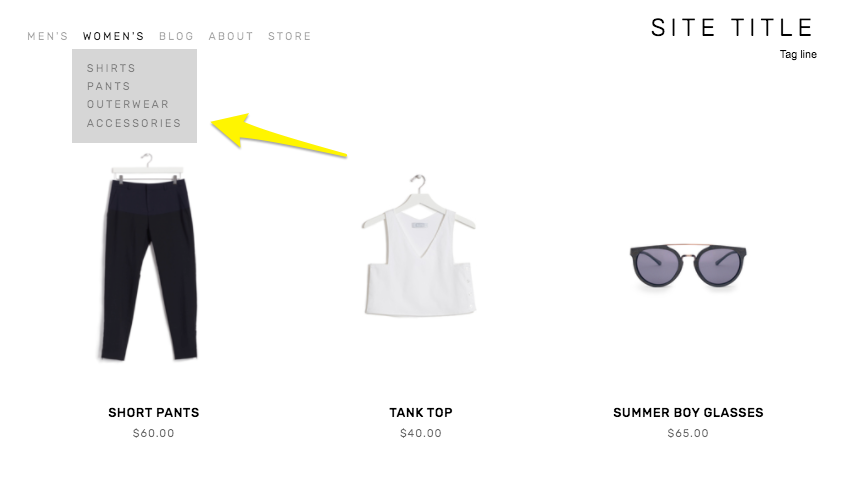
Creating Nested Categories
Creating multiple levels of shop navigation is like making sure your department store is organized logically into different departments, each with its own little “sub-departments” within them. This makes it easy for people to find what they are looking for quickly, which can reduce frustration and lead to higher conversion rates.
Let’s consider an expanded example from our simple t-shirt shop and pretend we have a full-fledged department store. It would make sense that the navigation would need to visually allow us to “nest” categories within each other. So instead of just lumping everything together in one category called “Women’s” you can instead make subcategories like this:
Women’s
Tops
Tees
Hoodies
Bottoms
Denim
Joggers
Accessories
Sunglasses
Bags
* Note that if you want to create nested subcategories like above that you can add up to three levels max. This means you can have Main Category > Subcategory > Subcategory like in the example above. You would not be able to break the Denim category into more subcategories. If you wanted to do something like that, I would recommend just moving the category up the food chain. If you have enough products that you need more than two subcategories beneath it, that probably means it’s important enough to be the main category all by itself.

Look how fast we can find exactly what we’re looking for!
Other Ways To Use Categories & Tags on Squarespace
Link to filtered collections - Another benefit of creating categories and subcategories is that doing so creates individual page path URLs for each category, optimized for SEO and allowing categories to act as standalone pages. This means that if you are running an ad or a promo for all blue shoes, you can link people right to the filtered subcategory: Shoes > Blue. 🤯 For more on this, check out this Squarespace help article.
Make summary blocks smarter - This is one of my absolute favorite things about Squarespace summary blocks! I almost always add one to a home page design as a way to feature selected categories of products… or to feature “featured” products! Doing this is simple by just clicking on the content tab of your summary block settings and then choosing “Filter Items” to have that block only show what you want it to.
Influence what related products are displayed - I recommend everyone turn on the Related Products feature in their commerce settings because why not?? This is such an amazing built-in Squarespace selling tool that I think gets underutilized by most new sellers. Not only does it help keep people on your site longer by showing them more to look at it, but it can also actually show them more of what they WANT to look at. By default, products that share the same first category are shown in the related products section. If your product happens to not have a category, then matches using the first tag will be shown. If you’re into related products, you might also like this post: How to Upsell & Cross-Sell on Your Online Store.
Display more accurate search results - Adding search blocks or using your store’s built-in search page are other ways to help customers find what they are looking for. And, you guessed it, adding categories to your products helps here too! This is because both categories and tags are indexed for search results in addition to being indexed by major search engines such as Google.
Who should be using categories & tags?
I think everyone could benefit from using categories and tags, if only for their aforementioned SEO benefits! From a size standpoint, you probably don’t need to worry about people not finding what they’re looking for if you only sell one signature service or only a handful of products. But even if you have a small shop with just a dozen or so products or services, why not add that layer of categorization to help people be able to decide what is best for them? For example, if you’re an interior designer and offer multiple virtual design sessions you could categorize them by investment level:
$
$$
$$$
This would help people self-sort and see just the services that they can afford. When you start to think about tags & categories as strategic tools to help visitors find what they need on their own, all sorts of doors start to open up! Done right, taking advantage of this simple feature can boost your SEO, help reduce visitor frustration and increase sales. Thinking about what you sell in terms of categories (and tags, to a lesser extent) can help you create ways for customers to easily discover more and help you create a more dynamic eCommerce website.

5 Simple Steps to Optimize Your eCommerce Site for Mobile Sales
With mobile purchases making up about half of all eCommerce sales, it's important to optimize your website for mobile sales. It’s not enough to just put your products or services online for people to discover. You’ve got to make sure that your site is designed for selling on devices big and small.
It's highly likely that your clients or customers are searching for your products or services on their mobile phones, regardless of what you sell. In fact, some estimates suggest that mobile purchases account for roughly half of all eCommerce sales! This means it's crucial to consider these users when designing your website. They don't just want information about your company or offerings; they want to take action, make purchases, enroll, sign up, and connect with you. For many users, the entire process from research and discovery to purchase and beyond occurs on their mobile devices.
Is “Mobile First” outdated?
Web designers have been discussing "mobile-first" web design since the first iPhone was released, but as with all things tech, there have been numerous improvements and changes over the years. Mobile-first design simply means that instead of designing a website for desktop screens first and then attempting to scale it down to fit mobile devices, it may be more effective to approach it the other way around.
While this buzzword is relevant when considering eCommerce, modern web design platforms like Squarespace and Shopify now handle responsive design so well that we don't need to focus as much on creating two separate experiences. Instead, it's more important to build an empathetic brand that considers the distractions and emotions users may experience while visiting your site. This entails paying attention to your content, organization, structure, layout, and site architecture just as much as the design of your website.
So, knowing that mobile commerce is something we need to think about as we take all phases of our interaction with brands onto our phones, here are five things you can do to optimize your website for mobile sales.
1. Have your site built on a platform that does eCommerce well.
If you're considering building your eCommerce site on Squarespace or Shopify, you're already ahead of the game! Page layouts on both platforms automatically adjust to any screen size, from the smallest phone to the largest desktop. This is crucial because users prefer vertical scrolling on small screens rather than having to zoom in or scroll sideways. Plus, Google rewards mobile responsiveness with higher search engine rankings!
If you're struggling to make your design work seamlessly on mobile devices, Squarespace 7.1 Fluid Engine has got you covered. With the added feature of adjusting layouts exclusively for mobile, you can create bespoke designs that cater to users on varying screen sizes. For more information on Squarespace 7.1 and its impact on eCommerce sites, be sure to read this post.
2. Pay attention to site speed.
Slow loading times can be detrimental to your website's success, not just because it's frustrating for users. Google takes note of this and may penalize your site accordingly. To improve the speed of your site, pay attention to page size (keep them under 5 MB) and image size (below 500 KB or with a width of no more than 2500px). You can easily compress or downsize your image files using free online tools before uploading them to your site. If you're experiencing slow loading times, start by reducing your image sizes. If you're interested in doing more to optimize your Squarespace site's SEO, I highly recommend SEOSpace!
3. Consider a minimalist’s approach to visual content.
Some design trends may look stunning on a 27-inch iMac, but they can be a disaster when viewed on mobile devices. There’s a fine line between designing for the sake of design and designing for conversion. Every aspect of your website, from headlines to images to text blocks, buttons, and even white space, should serve a purpose. If an image looks great on your giant desktop but crops weirdly on mobile, it’s not going to work. And you’d be remiss to sacrifice the mobile experience for the sake of desktop aesthetics.
Keep in mind that things need to work when stacked vertically, one element at a time, which is how they are viewed on mobile. You’ve only got a few scrolls to get your point across or visitors will abandon your site - most likely off to one of your competitors.
Struggling to keep your design in check? Check out my post on this: A Minimalist’s Guide to Branding
4. Navigation matters more than page content.
I want to emphasize that your page's content is crucial, but I often see clients fixate on minor details for a paragraph buried deep in their website while neglecting the organization of their site as a whole. The way you structure and present your information, known as information architecture, is vital to your site's success, particularly if you want to appeal to mobile users.
Of course, page content matters too - visitors shouldn't have to struggle to understand what you're offering. To be mobile-friendly, prioritize smart content and intuitive navigation. For eCommerce sites, consider using categories and subcategories to thoughtfully nest information. When it comes to main navigation, keep titles brief and limit the number of links. Or consider one of my favorite suggestions: replace your typical website navigation (Home, About, Contact) with your shop categories instead!
For more on making sure your site is as user-friendly and easily navigable as possible, check out this post: UX Lessons from a Former Sign Designer.
5. Make checkout easy.
If you’ve done all of the above and got someone to add something to their cart, don’t make it hard for them once they get there! To optimize the checkout experience, I highly recommend minimizing the amount of information required. While it may seem beneficial to gather additional details such as a customer's birthday or how they found you, these actions create friction that can lead to lost sales. The checkout process is not the ideal time to get to know your customers better. Instead, consider shifting all extraneous communications to a weekly newsletter, social media feed, or personalized post-sale follow-up email. For more information on setting up product-specific email automations, check out this helpful guide.
Bottom Line: Elevating the Mobile eCommerce Experience
To maximize your mobile sales, it's crucial to pay attention to the small details. Keep in mind that your customers may be distracted or in a hurry when browsing on their mobile devices. Therefore, your goal should be to make it as easy as possible for them to discover and purchase your products. With the increasing number of mobile shoppers, optimizing your website's size, content, and checkout process is more important than ever. For additional web design tips, check out this post: Website Tips from an eCommerce Pro!

9 Ways to Recession-Proof Your eCommerce Business
Worried about the economic times we live in? Well, I can’t do much about a lot of it, but I do have 9 strategies for you to consider implementing to help ease your customer’s spending concerns - and your worried mind. From what to focus on to how to pivot, this post is full of quick wins for hard times.
Times of economic uncertainty can undoubtedly be the cause of sleepless nights. And, c'mon - it would be weird if worries about customers' ability or willingness to spend and other general financial concerns didn't get to us!
But savvy entrepreneurs have a way of always getting creative when times seem the toughest. This is where brands, especially smaller ones, get to show off their flexibility and ability to pivot in ways that giant corporations simply cannot.
For small eCommerce brands specifically, there are some quick changes you can make to your online store to ensure you can weather any financial storm that may lie ahead. In this post, we'll explore practical ways to recession-proof your eCommerce website. We will discuss strategies for rethinking marketing, focusing on customer retention and inventory management. Bonus: these are all relatively easy-to-implement, low or no-cost ideas you can implement immediately to boost average cart values, deal with lower conversion rates and cope with less traffic to your site. Let's dig in!
Add subscriptions to your mix. If you find that customers routinely return to your shop to buy the same products repeatedly, make it easy for them by offering those same products as a subscription. Offer a discount versus paying for the same products or services piecemeal. Not only will your customers enjoy the savings and added convenience, but you'll also be able to add recurring revenue to the books.
Don't give up on your free shipping offer. I cannot preach enough about the importance of a free shipping offer. If you must rethink pricing, preserve and protect your free shipping offer with your life. Price-sensitive customers hate feeling like they were nickel-and-dimed over shipping fees and like thinking they're getting a great deal. Better yet, a free shipping option for orders over a certain amount helps boost your average cart values and reduce abandoned cart rates by people surprised by shipping costs.
Focus on customer loyalty. You know that saying about how acquiring a new customer costs more than keeping an old one? It's true. With the prospect of smaller average cart values or less traffic overall due to tightened budgets, focus on customer loyalty first and foremost. You can do this in many ways, such as setting up a loyalty program that allows customers to pay for purchases with earned points or perks.
Rethink marketing. You can reduce wasteful spending and boost revenue by cutting back on digital paid spend and going straight to the horse's mouth. Rather than continuing to invest in expensive paid advertising, consider shifting your focus to utilizing customer data to guide your marketing decisions. Consider leveraging the power of small influencers (or even your own satisfied customers!) to help spread your message. Another idea is to explore collaborations with relevant brands and creators and consider offering products as gifts to small influencers to help build brand awareness.
Manage inventory better. Does it seem like there's always either too much or too little stock on hand? If you need help with the former problem, try focusing on building industry partnerships or collabs to introduce your products to new markets. If the latter is more of your issue, it might be time to start looking for new suppliers closer to home or sourcing from multiple suppliers. And for all, try adding a custom label to products you can keep consistently in stock and ready to ship so customers know they can get those items right away. I've seen a few brands do this or even create whole "Quick Ship" categories, and I think it's such a great idea!
Focus on your brand. To make the most of limited resources, prioritize establishing a solid brand. This involves ensuring consistency in your message, tone, and visual identity, as confusing branding can hinder customer conversion. Additionally, take time to evaluate and improve your customer service and clearly understand your target audience. Remember that you can't appeal to everyone, so focusing on a segmented marketplace actually allows you to best serve your core customers.
Boost customer confidence on the product page. Optimizing your product details pages can impact your bottom line in two ways. First by increasing customer confidence in their purchase decisions and second by reducing costly returns. Be sure to include detailed and comprehensive product descriptions that accurately convey the features and benefits of the product. Incorporate video - especially 360-degree views that allow customers to thoroughly examine the product from all angles and better understand what they can expect. Also, ensure you're displaying customer reviews, as they can help build trust and provide valuable insights into the product's performance and suitability. (For more tips on optimizing your Squarespace product pages check out this post!)
Incorporate user-generated video. Studies have repeatedly shown that videos (especially short videos that answer the question "Why should I buy?") are great conversion tools - but video production can be overwhelming and expensive. Luckily, videos from past customers are just as helpful as content you might produce on your own - acting as part social proof and part explainer video all in one.
Expand local pickup & delivery options. If you're an online seller that also offers in-person buying opportunities, the Venn diagram of online customers and in-person customers probably has a ton of overlap. Offering local pickup options (and/or delivery if you can swing it) has a few benefits. First, it's generally faster and cheaper than shipping goods, which can appeal to shoppers on a budget. Second, it allows you to build stronger personal relationships with your customers and invite them to explore other offerings they may have yet to consider. Don't have a brick-and-mortar location? Try teaming up with another local business that does and see if they'd be open to allowing your customers to pick up from their location - this could be a win-win for both companies!
Silver Linings
Looking at the list above, I see a few themes that may just be the silver linings. One of the biggest is that, in many ways, while eCommerce opens up the whole world to us, locality still matters. Whether we're sourcing products from suppliers closer to home, building relationships with micro-influencers, or offering ways to bring online convenience to brick-and-mortar shopping - I love to see it!
Also, let's be honest: only some businesses have the strength or fortitude to ride out a downturn. While that's definitely sad, it also opens up opportunities for newcomers to the market to step in and fill in the gaps. Starting a business in a downturn can help you seize market share and build a strong foundation coming out the other side. If you've been sitting on a big idea, this may be just the time to take your shot.

Upcoming Privacy Laws and How You Can Protect Your Business
Those teeny little links at the bottom of every website for Privacy & Terms pages may not be super sexy but they sure are important! Learn why privacy matters so much, all about upcoming privacy laws and how you can protect your business online.
Note: This post is regularly updated to include the latest data privacy laws. (Most recently updated in Februrary 2023)
I used to pick on FAQ pages for being one of the least alluring pages on a website but I was wrong. When it comes to the ugly duckling of web pages, privacy policies and terms of service take the cake. Usually buried in teeny tiny links at the bottom of websites, only clicked on by lawyers, and almost never actually read word-for-word -- the legal pages of your website are probably the last thing on your mind every day.
So why does every website need these pages filled with what looks like gibberish and legalese? Well, #1 because it’s just good business and #2 because there are current laws - and many proposed new ones coming down the pike - that could equate to fines for violations of privacy laws starting at $2,500... per website visitor 😱 Don’t do the math on that, it will def make you sick to your stomach. And that’s just the start. In this post, we’re looking at what a privacy policy is, why it’s important that you have one that’s always kept up to date, and what I think the best solution is.
What is a Privacy Policy?
In short, a privacy policy is a document that discloses what personal information you collect on your website, what you can do with that information, and who you share it with, among other things. Your website needs a privacy policy if you use it to collect personal info such as names and email, which is pretty much every website out there. I mean, I’ve never made a website that doesn’t collect this type of information and more ever. Basically, if you even have a contact form or an email newsletter signup form on your site, you need a privacy policy.
Why is a Privacy Policy Important
Having an up-to-date privacy policy on your website can help you avoid fines and lawsuits. Remember what I said above about the only people really checking these pages out are lawyers? Well, I wasn’t exaggerating. Currently, there are a number of laws in the US and EU that require websites that collect personal information to have a privacy policy. These include:
European Union’s General Data Protection Regulation (GDPR)
The California Online Privacy Protection Act (CalOPPA)
The California Consumer Privacy Act (CCPA)
Nevada’s Revised Statutes Chapter 603A and SB220
Nevada Senate Bill 260 - signed into law June 2021
There are 6 new laws that are going into effect in 2023 that will cover even more ground:
The California Privacy Rights Act (CPRA)
Virginia Consumer Data Protection Act (VCDPA)
Colorado Privacy Act (SB190)
Utah Consumer Privacy Act
Connecticut SB6
Quebec Bill 64
These laws all are designed to protect consumers of those states and countries - which is good - but these laws are not in place to protect online businesses like yours. What this means is that these laws can apply to businesses outside of those states and countries and may apply to you if you collect the personal information of or enter into transactions with consumers from the EU, California, or Nevada. With eCommerce being a truly global endeavor, there’s no way to prevent people from anywhere accessing your site and exposing you to some level of risk.
Why You Need to Keep Your Privacy Policy Up to Date
In addition to the laws above, several US states have proposed privacy bills that, if passed, would require websites that collect personal information to have a compliant Privacy Policy. This is all well and good but things get tricky when you consider that these bills all have different requirements for the disclosures that need to be made in a Privacy Policy and would impose heavy fines for failing to include those disclosures.
In fact, some states are proposing to allow consumers to sue businesses directly for not having a compliant privacy policy. This boils down to the fact that if your website gets inquiries or does business across state lines (and let’s hope it does!) it’s not enough to just have a privacy policy; you need to have a privacy policy that complies with multiple state privacy laws. Yikes. Now, I’ve done a fair bit of research into privacy policies and website terms of service and I know for sure that I don’t have the bandwidth or legal acumen to stay on top of all of this myself.
The Best Solution I Know Of: Termageddon
Termageddon is an auto-updating privacy policy generator. This means that it will automatically update your website’s policies any time laws change, making sure you are always 100% in compliance. It works through small snippets of code that are added to your privacy and terms pages and uses information from a simple questionnaire that you only have to answer once at setup. It’s also fun to know that it is the only privacy policy tool listed as a trusted privacy technology vendor by the International Association of Privacy Professionals.
A super affordable solution:
Most people aren’t looking to spend thousands for a lawyer to draft these types of documents up for them which means that most people are out there unprotected from risk. The thing I like about Termageddon is that for just $10/mo or $99/yr, you receive the following expert-prepared policies to protect your site:
Privacy Policy
Terms of Service
Disclaimer
End User Licence Agreement
Why they’re awesome:
I mean beyond the tech magic that makes sure your site is always in compliance, you can set up your policies in 15 mins or less and the team at Termageddon is top-notch. You’ll basically have access to the best of the best when it comes to privacy and data protection if you ever have any questions. Their team has already helped some of my clients that have some pretty unique setups ensure they are protected now… and in face of whatever future laws may bring. Privacy matters a ton but so does protecting your business need to continue to do business online confidently.
BONUS: You can use this link or code KRISTINE for 10% off your first-year payment on your Termageddon subscription!

SEO Best Practices for Product Pages
How do you help the right people discover your products? Follow these tips and best practices for your product pages to appeal to customers and search engines alike.
When it comes to Squarespace SEO, I usually defer to the experts and always recommend starting from Squarespace’s own SEO checklist. This is a great resource to start dabbling in improving your site’s search performance and touches on all the site-wide best practices. There are some specific things you can do on your product pages to give things a boost as well though and that’s what we’re going to be talking about here!
First, A Big Fat Disclaimer
SEO is crazy complex and a niche unto itself. When we talk about improving things for SEO purposes, we’re talking about the super long game. Changes you make today will have virtually no impact on how things perform tomorrow but may have measurable ripple effects over time. So, if you’re here thinking that making these changes are going to magically change how your site performs in search overnight, you will be disappointed.
BUT this does not mean that they aren’t worth doing – just want to set some realistic expectations here! Ok, onward!
Squarespace eCommerce SEO
One of the most important things you can do before you jump into your product pages specifically is make sure your site is connected to Google Search Console. (Step-by-step instructions on that in this Squarespace support article.) Doing this will help serve up some pretty helpful info to your Squarespace analytics dashboard. You’ll want to use this info to help you compile a list of relevant keywords that you can incorporate into your product pages.
Related Post: Crash Course: The Squarespace Commerce Analytics Panel
Once you have that done, it’s time to head to your shop and take a look at your products.
How to Optimize Your Product Pages for SEO
Here’s a checklist of 6 specific things each of your product pages should have in place.

Product Names
Remember that keyword list I told you to make using the info from your analytics panel, above? Whenever possible, using one or more of those relevant keywords right in your product names can help connect your product to a customer's search query.
Don’t work too hard to force anything (human readers matter more than robot ones!) – and know that for the most part your product names are naturally going to be relevant without needing to try too hard. (If they aren’t, ask yourself whether they truly have a place in your shop.)
It can also be helpful to use descriptive words that might match up to your shop’s tags or categories right in the product name. Example: instead of “sweatshirt” try “Women’s 100% Cotton Vintage Sweatshirt”

Product Descriptions
For each product, you’ll want to be sure to write descriptions that include more of those keywords from your list. Describe what sets your item apart from the competition, highlight relevant features or explain what makes your product worth buying.
If you’re struggling with what to say, I always think that tapping into one of the 5 senses helps; for example - describing the way a fabric feels in detail or how a candle smells using descriptive words.
The one thing you don’t want to do is drone on for too long in your main product description. Keep things relatively short (roughly 3 sentences at most) is a good guide. Add other information, including technical details, product specs, longer descriptions and more to the Additional Information section. This makes it so people don’t have to scroll too far from the top of your page to get to the “Add to Cart” button!

Product Images
I promise not to tell you that a picture is worth a thousand words. But I can’t lie to you: your product photography can really make or break your entire eCommerce experience. There’s nothing that will make a potential customer click away faster than bad product photos (think: poorly shot, poorly lit, inconsistent in style). So don’t be stingy on product photos! For each product, include shots of the front, back and sides if you can. Depending on what you’re selling you may also want to include close-up shots of details (so people can see things like fabric texture or how a product is assembled) or other angles. Bonus points for 360 videos or gifs!
Related Post: 6 Simple Tips for eCommerce Photography that Converts

Product Prices
I’m kind of hoping that you already did this before deciding to launch your business 😬 but please take the time to research products similar to what you’re selling to make sure your prices are competitive. This is another situation where not only will your actual human shoppers notice when things feel off but so will Google and other search engines.
If there’s a reason why your products are significantly higher (or lower) than the competition, you’ll want to make sure that your copy (including relevant keywords) backs that up. Example: if your line of soda is priced significantly higher than average make sure that you’re describing why using keywords like: organic, hand-crafted, small batch, locally sourced ingredients, etc. This information can help explain that we’re not comparing apples to apples.

Product URLs
I’ve hinted at this a bit above but one of the most important things about SEO is to remember that you need to appeal to both humans and search engines alike. Sellers used to try to “trick” search engines by stuffing keywords into every nook and cranny, including product URLs. But remember that Google is very smart and you cannot get by with any dirty little tricks like this.
So, the secret to a great product URL is to keep things short and sweet. URLs with too many keywords are red flags as are keywords that contain much more than the simple product name.
If you followed the advice above on how to name your products using relevant keywords where appropriate, making your product URLs your simple product name is all you’ll need to do.
(Bonus tip: clean up any odd bits that get added automatically to URLs if you’re duplicating products. For example, change “womens-wool-socks-h3lm23” to just “womens-wool-socks.”

Product SEO Title & Description
For each of your products on Squarespace, you also get a chance to write specific information that you’d like search engines to pick up. In the absence of this info, Google will use the other info on the page to try to fill in the blanks so it’s best to just serve it up exactly how you’d like it.
SEO titles for products should be about 100 characters or between 5 and 10 words to make sure it appears correctly in search results. Longer titles may get cut off. If your product names are about this length, I would say to just make your SEO title = your product name but if you have any extra room you could add the name of your collection or another product attribute.
SEO product descriptions are what displays right below the title above in search results. You want to cap this at about 400 characters and first and foremost make it human-readable. Use product keywords naturally incorporated into a shortened product description and you’ll make it easy for customers to find your products as a result of their search queries!
Bottom Line
SEO can be a little overwhelming but most of the best practices help improve your site as much for your real life customers as they do search engines. Thinking about how your customers experience your site, what information they need and how you can best communicate to them digitally will ultimately also help your site perform better in search. When it comes to your product pages, incorporate the tips in the 7 areas above for each and every item you sell and over time you should find that more of the right people are finding you.

How to Set up a Wholesale Shop on Squarespace
Wondering how to sell wholesale on your Squarespace site? I've got you covered with several different ways you can make this happen! Plus, who should (and shouldn’t) give wholesale selling a try, my recommended wholesale tool and 4 wholesale tips to help you sell more confidently.
Updated: Sept 2023
There’s a lot to love about Squarespace Commerce (exhibit A, exhibit B, exhibit C, etc.) but if you’re interested in adding wholesale to the mix, you may have found you need something… more. This is because, in addition to normal eCommerce functionalities, B2B sellers might need to offer things like tiered pricing structures, alternate invoicing or net payment options, or ways to keep wholesale prices hidden from the public, among other features.
Ultimately, I think the fact that these things aren’t necessarily built-in to Squarespace isn’t a shortcoming at all; you wouldn’t be upset if your shipping software didn’t also manage your social media posts – these are just very different tools! In the same way, traditional eCommerce and wholesale are two very different things.
So let’s dig into a bit about wholesale, who should do it (and who shouldn’t), my recommendations for how to get started, and tips from some of my friends in the biz that know wholesale better than anyone. Stick around for some wholesale FAQs at the bottom of this post. Here we go!
First, is your business too small for wholesale?
Adding a wholesale arm to your eCommerce business can be a beneficial thing for many small to medium businesses (even startups!) and I would say the biggest mistake is waiting too long to get started! Establishing even a few solid wholesale connections early on can help you get your name out there and help you build a following.
This isn’t something just for the big guys or those who’ve already made a name for themselves. I would even say that forging some strong wholesale relationships early on can be a great indicator of long-term success. So if this is something you’ve been considering or sitting on - don’t wait!
Options for Setting up a Wholesale Shop on Squarespace
Once you’ve decided to start selling wholesale, you probably started tinkering around with the specifics of how to actually make that happen and quickly became stuck. I don’t blame you! If there are a million moving parts to traditional eCommerce, there are a billion more for a business looking to sell wholesale. But it doesn’t have to be scary or overwhelming! Below are some ideas on how to start selling wholesale on your Squarespace website.
Create a second shop and password protect it.
This solution is pretty low-tech (Squarespace does all the heavy lifting for you) but it’s not without several drawbacks. Running two mirror images of the same store (one for retail and the other for wholesale) may technically work but you’ll need to think about how you’ll manage inventory levels, what to do about duplicate SKUs and how you’ll take care of the administrative side of things.
Also, since commerce settings are set at the website level on Squarespace things like what shipping methods you offer and what payments you accept need to be able to apply to all shop pages on your site; there’s no way to offer different options that would be tailored to a wholesale customer’s needs and keep those out of sight to your retail customers.
And don’t even get me started on what happens if and when you need to change the password on the wholesale shop! What do you do then? Email all your wholesale customers with the new password?! Awkward.
Use a Wishlist Plugin
If you’re only selling wholesale and want to be able to have potential customers essentially “request a quote” from your online shop, you could look at using SF Digital’s Product Wishlist Extension. This plugin replaces your traditional cart functionality with a custom form that allows customers to send you their “wishlists” without needing to enter any payment or shipping information. I’ve used this plugin for just this purpose before and it works great with a few (kinda) major caveats.
The first big thing is that you cannot use this plugin on any site that you also want to have a traditional eCommerce shop on. So this may work well if you don’t have a retail shop and are only selling wholesale but not if you’d ever like to be able to do any B2C selling on your site.
The other things to consider are similar to the duplicate shop scenario, above. With the Wishlist Plugin, you’ll need to have systems in place to manually calculate shipping, process payments, and communicate with your customers. You’ll have all your inventory set up on Squarespace but all the commerce functionality as far as getting paid and sending notifications, etc. will need to occur off the platform. Where and how is up to you.
Use Custom Coupon Codes
Ok, ok. So we’ve encountered two not-so-perfect scenarios. What about just creating coupon or discount codes for each wholesale buyer? Not a bad idea at first. The good: you can control who has access to discounts on an individual account basis and can provide different wholesale buyers with various discount levels.
I’ve had some clients set up systems like this for things like influencer marketing, creating individual codes to distribute to each person they’re working with. Depending on how many accounts you have this system can quickly be hard to manage though and it’s very difficult to gain access to helpful metrics and analytics on usage. (Tip: in the case of influencer marketing, I would check out my tips for setting up an affiliate or referral program instead.)
For wholesale, I would say this is also a passable but imperfect solution. Just like in the duplicate shop scenario, it also assumes that your wholesale customers are interested in the same shipping and payment options as your retail customers and I can see the mess of tracking spreadsheets and semi-canned emails quickly making you swear off what could otherwise be a profitable venture.
Try Candid Wholesale (My Recommend Method!)
I’m always keeping my eye out for solutions that I feel I can wholeheartedly recommend to you and you know I’m keen on keeping a lean tech stack, meaning I never recommend adding third-party solutions haphazardly. They’ve got to do what they say they will, and they’ve got to do it well.
Meet: Candid Wholesale
Candid Wholesale is an official Squarespace Extension that makes managing the wholesale side of your business a breeze. Remember what we said about choosing the right tool for the job? This is it.
At its simplest, Candid is a wholesale order management tool but it's really a robust CRM system geared towards helping you grow your entire wholesale business. With Candid you can take orders, send quotes, set up custom invoices, create a custom wholesale storefront, manage your customer relationships, and more.
Candid is going to take care of the problems some of our other imperfect solutions couldn't, such as: syncing up SKUs and shipping information, providing meaningful data to help you make informed decisions, and creating a wholesale experience for your customers that’s as great as your products are.
You can keep your current retail side of things exactly as they are and Candid will automatically keep the wholesale side of things in sync. You can choose which products you want to show in your wholesale catalog, how you want them organized, and quickly set prices for your wholesale customers.
Other Notable Candid Wholesale Features:

Create collaborative order forms that you can send directly to your wholesale clients.
An integrated message system keeps conversations in one place.
Accept payments online - or not. (Perfect if you accept check payments from accounts with net terms.)
Send reminders for past-due invoices.
Track shipments and invoices in real-time.
Control access to your wholesale catalog.
All plans include unlimited orders and no commissions, you just pay one flat monthly fee. There are three pricing tiers and while the Pro Plan is going to be great for most, I really love the embedding feature of the Complete plan!
Wholesale Tips from The Pros at Candid Wholesale
I recently had a great conversation with the co-founders of Candid Wholesale, Avery Bloom & Dave Lowensohn. In addition to talking about Candid's features and some of the “why” behind the business, I asked if they had any sage wholesale advice to share. Here were their top tips:
Consider the benefits to your brand that come with being featured in someone else’s shop. Selling wholesale is about more than just the individual sale; a retailer that’s willing to stake their own business on your products is the ultimate endorsement! This can be a great way to get your name and brand out there and build relationships with more established sellers with their devoted followers.
Don’t think of wholesale as a feature that you can just turn on or off. Selling wholesale is more than just offering discounted prices in your regular eCommerce shop, as you can tell from the pros and cons of some of the solutions outlined above. You want to be able to offer payment terms, a clear and easy ordering process, and an experience that’s tailored to the wholesale experience.
Think about economies of scale. Selling wholesale can help you take advantage of price breaks on your raw materials or other components that go into your products. Instead of buying 10 of something, you’re able to buy 100 at a better unit price. Hint: this can also help you improve profit margins on all those retail orders as well!
Focus on building relationships. While we talk a lot about ways to personalize and customize the traditional eCommerce shopping experience, wholesale is in many ways still pretty old-fashioned. Great wholesale partnerships can last decades meaning it’s worth it to invest in the tools and systems to make those relationships successful and ensure you can consistently deliver on your promises.
Wholesale FAQs
-
Yes! Wholesale is not for everyone. Wholesale probably isn’t a good fit for your business if:
You’re selling products with already very thin profit margins. In this case, you probably don’t have any room to discount to a point that would be attractive to wholesale buyers. You never want to be swapping high-profit margin retail sales for lower-profit margin wholesale ones if you can’t do both.
You don’t have a way to keep up with accounts or manage the additional sales volume. It’s easy to let things fall through the cracks without good systems in place and failing to deliver for your wholesale clients can send things south fast.
-
Oh, I’m glad you asked! First, if you’re unfamiliar with Faire – it’s an online wholesale marketplace where sellers can post their goods and buyers can browse from a bunch of sellers all in one place. Think of it kind of like Etsy meets Match but for wholesale.
Faire’s pitch to sellers is seemingly attractive at first glance. They promise no setup fees, no long-term commitments, and access to thousands of eager buyers. It would be easy to assume that you’re just going to sign up and then sit back and watch the wholesale orders come rolling in. The reality is pretty bleak, though.
The truth is that if you sell on any sort of online marketplace, including Faire, you’re not doing anything to build your own brand. You don’t own the relationships you’ve built there and you don’t have any control of how your company is represented. There’s no promise that the marketplace will continue to exist - or that you won’t get kicked off the platform at any point for selling to customers 1:1, which is a violation of their terms of service. And where would you be then? (Hint: I take the same stance when it comes to selling exclusively on social media.)
It’s simple when you think about the economics of a marketplace that only makes money when they connect buyers to new sellers. Simply put: it means that it’s in Faire’s best interest to introduce your customers to your competitors. Faire may not charge a commission if those customers bought from you, but they make 25-30% if they connect them to your competition.
Bottom line: in an industry built on long-term personal relationships, be wary of anything that promises anything sounding too much like a “get rich quick” scheme. If it sounds too good to be true, it probably is.
-
One of my favorite myths to bust! Just like Squarespace, Shopify is a traditional B2C eCommerce platform. This means that all the same issues I talked about above for Squarespace apply to Shopify as well. They are simply not a wholesale platform out of the box. However, there are technically three ways to sell wholesale on Shopify which I’ll quickly cover here.
The first is via Shopify’s wholesale marketplace called Handshake. Let’s just say that all my warnings about Faire apply 100% to Handshake as well. I’m not even going to link to it. Caveat emptor.
The second is by adding the wholesale sales channel to your existing Shopify store to (wait for it) create a separate, password-protected storefront. Sound familiar? And don’t assume that just because it’s on Shopify that it’s somehow better than on Squarespace (it’s not). First of all, the fine print on the wholesale sales channel is that it is only available if you’re on Shopify Plus which starts at $2k per month and goes up from there based on sales volume.
Assuming you’ve passed on both of the options above, you could always head over to the Shopify app store and search for a suite of plugins to add to try to emulate wholesale functionality in a meaningful way. You’re going to need something for price lists, another for user/login management, something to create and manage client portals, another thing to host your catalogs, and something else to manage your bulk shipping options. Never mind that each of these apps comes with its own monthly cost, the likelihood of everything working together as it should and details not slipping through the cracks is crazy small. Another inelegant solution.
A Final Note on Wholesale
First and foremost, you’re never too small to give wholesale a try! Successful wholesale relationships can become a source of stable income and help you get your business and products out there. Using the right tools for the job, such as Candid Wholesale, can make the process smooth and easy for both you and your wholesale partners. Just remember to always keep your eyes on your margins and focus on building your own site where you can own and control the experience.
Ready to give wholesale a try? Get Started With a 7 Day Free Trial of Candid Wholesale PRO!

6 Steps to a Great Sales Page
If you're struggling with how to sell without feeling like a used car salesman, this post is for you! Six easy steps to show you that it's really all about building rapport and trust with your customers by clearly outlining your offer. This foolproof formula works every time!
Updated Sept 2022
“Sales page” does not have to be such a yucky word! Like, seriously, doesn’t just reading it skeeve you out a little?! Like I feel a little gross just typing this out! But, I will persist just for you! Because sales pages are important and done right can get you RESULTS.
Here’s the thing: kinda all the pages on your website are sales pages. Or at least they should be. Because really all a sales page is, is a page that is doing its damndest to get someone to buy. And isn’t that the point of your whole website? Anyways, let’s forge on.
According to Neil Patel, these are the 11 (count ‘em - eleven) components of a highly converting sales page:
Headline
Subheadline
Image
Video
Brief copy
Call to action
Trust signals
Explanation of the product or service
Benefits of the product or service
Testimonials
More CTA
Seems easy enough, right? Well, I would say that you could make it even easier! Here’s a simplified, pared-down version with just six key parts that anyone can do!
A Sales Page in Six Steps

Tip #1
Start With A Great Headline
Here’s where Neil and I (and generally the rest of the internet) are on the same page. You’ve got to start off strong with a short, compelling reason to get people to stay on the page and keep reading. Our tendency when writing is to focus on ourselves (“Here’s what I offer!) but a stronger headline would help the visitor feel heard or understood, reassuring them that they are in the right place and that the answers to whatever problems you’re going to solve for them are just a bit down the page.
Example: Sonder.com shows off how they’re different but keeps it focused on what their customers want: short term rentals with impeccable design.

Tip #2
Build Some Rapport
After you’ve caught their attention, help readers know that you really do understand them. Tell a brief story they may relate to, use words or phrases they may use, show them that you know how they are thinking or feeling right in that moment. Remember, they landed on your page because they are actively thinking about a problem they are having.
Example: Ruby.com focuses on how their services can alleviate pain points for their customers.

Tip #3
Throw Out The Opening Pitch
You’ve gotta tell them what you’re selling and ideally (if you did your job right in step #2), your offer is the answer to all their problems! 😉If you’re a service-based business, selling what you offer in the form of a product can be very powerful and really help people understand what they’ll be getting.
Example: Purebarre.com invites beginners to try a free class or download their app to jump into training.

Tip #4
Be Transparent About Cost
This doesn’t have to be a super awkward slide-a-piece-of-paper-across-the-desk moment. Again, if you’ve done a great job at framing things as problem > solution above the price almost becomes irrelevant. Also, sorry to be obvious here, but no one is under the delusion that you’re doing what you do for free so just putting the price out there in plain sight is way less awkward than having them contact you only to realize that you’re selling champagne and they have a beer budget.
Example: Headspace.com flips the script a little by leading with their cost right up front but I love how simple it is!
Tip #5
Prove You’re Worth It
Back up your claims to greatness with testimonials from past clients and/or descriptions of any guarantees you may offer. Help customers feel reassured that you’re legit and they’ll start to see themselves as one of the positive outcomes!
Example: Butcherbox.com shares testimonials people have posted to social media for a great dose of street cred!

Tip #6
Make the ask!
Whatever it is: your {“Buy Now” “Book Now” “Download Now”} button goes here! At this point, remember the 4 S’s and make it short, sweet, straightforward, and simple!
Example: Anchor.fm ends a great sales page with a simple & bold CTA - get started!

Should You Offer Free Shipping?
Free shipping is popular but may not be the best solution for everyone. Learn when it works, when it doesn’t, and 6 strategies to explore if you’re thinking of offering it as a shipping option for your online store.
If there’s an area where every single online seller seems to struggle, it’s trying to figure out what to charge for shipping and delivery. It’s such a challenge because there’s a very fine line between a solution that eats into your profits as little as possible and one that doesn’t completely turn customers off at checkout.
I tell nearly every client I work with that they absolutely should be offering some form of free shipping. It can be a hard pill to swallow but if you consider that more than 80% of U.S. shoppers say that shipping cost (combined with shipping speed) is one of the biggest factors that influence whether they’re going to buy at all.
That’s right. Your products could be amazing and the fact that you’re charging too much for delivery that takes too long is what’s tanking your sales.
So, what is it about things like free shipping that make us all feel like we just got away with sticking it to the man? Why don’t we like transparency when it comes to shipping costs? As an online seller, what are the pros and cons of offering free shipping? How do you offer free shipping without seeing red?
As a store owner, should you even consider offering free shipping?!
Keep reading for answers to all these questions + 6 strategies to explore if you’re thinking of offering free shipping in your online store.
First, Why We All Love Free Shipping
There’s probably no better way to explain it than via meme:
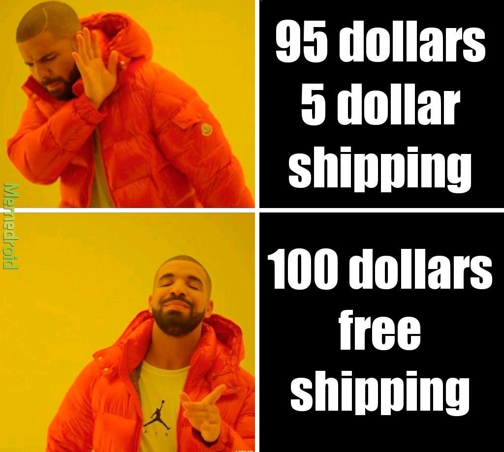
So true, right? To the average shopper, there’s just something magical about free shipping. This is probably because for most shoppers, we assigned a higher value to the cost of shipping than it actual is. (Or, transversely, perhaps we’ve undervalued the cost of whatever it is we’re buying.) Whatever it is, we like the word free. Seeing a free shipping offer is like an aphrodisiac to any online shopper - enticing us to buy things we honestly may not have otherwise.
When viewed from this standpoint, offering free shipping is really no different than running any other sale or promotion. It's a marketing tactic deployed based on the assumption that people wouldn’t buy without it. The shipping cost is just the amount of money we’re willing to spend to get the sale. (Hold this thought. We’re going to circle back to it in a minute.)
Why We Love Transparency (Except for When It Comes to Shipping Costs)
It’s funny when you look at trends in one area of business and how they compare/contrast to trends in other areas. Case in point: brands that have publicly embraced “transparency” as one of their core values are seemingly everywhere these days. There’s something raw and authentic-seeming about a company that will just lay it all out there and tell you everything: how much their CEO makes, where they source materials, how things work behind the scenes.
Instagram and social media has helped as all feel like we know the people and happenings behind the brands we shop from - and this can be a major marketing tactic.
There’s just one area it seems no one wants to see the real truth of: shipping.
I’m sure there is some psychological pricing word for this but it seems to boil down to the fact that most of us just don’t want to know how the sausage is made. We kind of just want to know the total cost and be offered some sort of guaranteed delivery date and we don’t really care how the places we buy from make that happen.
It used to be that “shipping & handling” was seen as just a necessary evil of shopping online. If you wanted something that was sold somewhere not local to you, it made sense that you’d have to pay to ship it. But we’re all too savvy & spoiled for that now. Basically, we want free 2-day shipping to apply to everything we buy ever. So the total cost matters more to us than the breakdown. We’d rather pay $30 for something and get it shipped for “free” than buy a $25 product with a $5 shipping cost.
Free Shipping Pros
Free shipping is super simple for buyers to understand
Free shipping has become an expectation for many shoppers
Free shipping can reduce cart abandonment rates
Free shipping can increase conversion rates
Free shipping can reduce customer service costs for returns (if things ship for free there’s no reimbursement of shipping costs)
Free Shipping Cons
Free shipping isn’t actually “free”
More orders don’t necessarily mean more profits
It can be hard to forecast and budget for the unknown
There may be cheaper ways to “advertise” depending on your product(s) or target demographic
Bottom Line
So, what’s the bottom line? Should you or shouldn’t you offer free shipping?
I say that if you’re a high volume shipper with products that are relatively small, lightweight, and/or similarly sized (i.e. not a lot of variation in product dims and weight) it would probably work well for you. On the other hand, if you sell products with a lot of variability in size, weight, or destination or have too low of volume to be able to average out the highs and lows, there may be better solutions (see some ideas below such as only offering free shipping on specific products, or only if a certain order minimum is met, etc.).
The last thing to consider (and I hinted at this above) is that this really boils down to a difference in mindset (and accounting). If you would like to do a promotion for free shipping or you think that offering it might help you increase the number of sales in the short term, the cost of shipping is essentially a marketing expense.
If offering free shipping is a long-term strategy or something that you just consider “the cost of doing business” then it would be considered a direct cost and classified as a Cost of Goods Sold. (BTW, just because you include it as part of your COGS doesn’t mean you can’t market it as a perk you offer on your website.)
The reason I mention this is because all too often I talk with merchants who only think of shipping costs as an expense. They then turn around and spend thousands on things like Google ads or promoted social posts. If they thought of free shipping as a marketing tool and invested in it the same way, I can almost guarantee they’d see a better ROI than any of that ad spend.
How to Offer Free Shipping And Not Lose Your Shirt
If you decide to offer free shipping, or just want to try it out for a while to see how it affects your conversion rates and the bottom line here are some tips to keep in mind:
If your product isn’t a highly commoditized one, just bake shipping costs into your product prices and just raise prices. (This is my #1 piece of advice for a reason!)
Make limitations on the shipping method that will be “free” i.e. only ground shipping is free but overnight or 2-day is an upcharge. Interestingly, people are willing to pay for express shipping so long as it is their choice to do so and they know that they had an opportunity for free (slower) shipping. In this way, any express shipping orders are a bonus since you’ve already included the cost of “free” shipping in their prices.
Offer free shipping only to certain geographic locations (sorry Alaska, Hawaii, Canada and others!)
Set a “minimum order” requirement to qualify for free shipping. This is a great way to boost average cart values as people are very often willing to spend a little more on product so long as shipping is free.
Offer free shipping only as a short term promotion for a limited period of time. This can be a good way to try it out and see how your customers respond to it.
Add free shipping as a membership perk or to reward your most loyal/repeat customers. This can give you some recurring/passive income in the form of membership payments that can then be used to offset shipping costs.
Bonus! If you decide you don’t want to offer free shipping, try these other “free” alternatives which can be just as enticing: free in-store pickup or local delivery, or free returns/exchanges.
My last piece of advice is to pick a strategy and stick with it - at least for a while. Customers will appreciate that they know what to expect when shopping with you and you’ll have enough time to gather data to determine whether your initiative was successful. You can always tweak down the road as needed. That being said, I do think that offering free shipping in some form is useful for nearly every online seller so I hope you give it a try!

Kristine Neil
Fractional Web Partner
I'm Kristine Neil - a communications strategist who has spent 20+ years designing websites, first running a full-scale design and marketing agency, and now leading my own studio. I've been the creative director managing the work, the coder quietly fixing what others couldn't, and the strategist in the room asking why before how. Somewhere between the MBA and the other degrees, I decided web design was just one tool in a much bigger toolbox - the real work is figuring out what you're trying to say, who needs to hear it, and what's getting in the way. A website is just where all of that comes to life.
I build on Squarespace, and after years deep in the platform I know how far it can go and when to push past its limits. These days, I'm especially drawn to working as a fractional partner - getting to know an organization over time and helping with whatever moves them forward, whether that's a full redesign, an ongoing hand with content and strategy, or just being the person who knows their site best. I write here about eCommerce, web strategy, and making the complex feel a little more human.