

UX Tips for Every Phase of the eCommerce Journey
This is the second post in a 2-part series about how to create a user-focused eCommerce website. If you missed Part 1 where I show you how to quickly and easily identify information that your customers need to know and walk you through how to map it to the decision-making process you can check it out here. In this step, we pick up where we left off with some concrete ideas on translating your customer’s needs to specific website content and design elements to improve your eCommerce UX.
Understanding what customers need to know and when they need to know it will help you cater to people in each phase of the decision-making process so you’re not coming out guns blazing while people are still getting to know you or not providing the right CTAs when it comes time to close the deal.
More importantly, becoming super focused on the needs of your customers is your opportunity to stand apart from big box stores and mega online retailers who have to lump everyone into one mass, generic “buyer persona” and aren’t able to niche down and be as laser-focused or as personalized as you can be. This is your chance to really shine and make sure that your website has content and CTAs that cater to people in each phase of the decision-making process. As a reminder, these are the 4 phases of the decision-making process:
Awareness → Consideration → Decision → Post-Purchase
In this post, we’re picking up where we left off using the list of what my Fake Plant Co. customers need to know and when they need to know it. For a refresher, here’s the list we made using the activities from part one along with the phases I mapped them to:
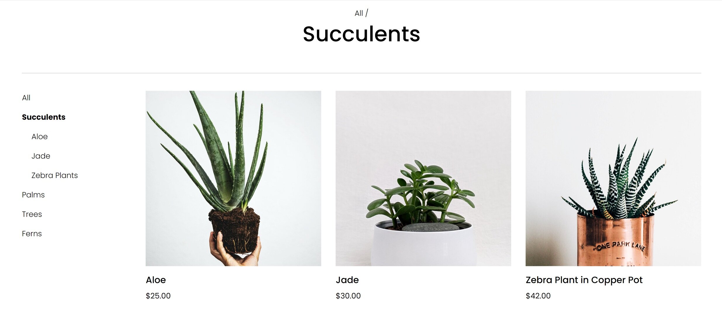
What types of plants are available (Awareness)
Why our plants are better than the kind from their local big box store (Awareness)
How we ship plants without killing them (Consideration)
Where plants are grown and sourced (Consideration)
How to decide which plants are best for them (Consideration)
What we do to guarantee their happiness (Decision)
How to place an order and what happens next (Decision)
How to care for their plant purchases (Post-Purchase)
How they can subscribe or join our plant membership club (Post-Purchase)
Let’s jump into how I can translate this road map into specific content areas and website design elements for maximum impact on an eCommerce website!
Awareness
In this phase, people are just discovering your brand and trying to quickly determine whether you’re what they’re looking for. You usually only have a few seconds to capture someone’s attention and convince them to stay. Here are some website features you can incorporate that cater to people in this phase:
Make sure you have a clear and unique header area (the info that’s “above the fold”) to capture people’s attention visually.
Include a tagline or “brand bio” that tells people about your business in one simple phrase or sentence.
Include simple navigation that highlights the categories of your shop without a whole lot of other clutter or unnecessary links.
Add a bold CTA - either a button or an announcement bar - that links to content that addresses the biggest objection you need to overcome or the main action you want people to take when first landing on your website.
Example
For my Fake Plant Co. I mapped the following two pieces of content to this phase:
What types of plants are available
Why our plants are better than the kind from their local big box store
Here’s how I could address each of them with my site’s content and design:

Since I know that most people’s first question is really going to be why they should even care to buy from Fake Plant Co. versus just hitting up their local big box store I would address that head on in the header section above the fold. In this case, I added it to the copy along with a compelling tagline. Right away, it's made clear to visitors that Fake Plant Co. will provide them with more personalized service at lower prices than they could get somewhere else. That takes care of quickly answering a couple big objections right up front!
After that, I think people would be most interested in just getting an idea of what type of plants are available so I would make sure that the top navigation (the links at the top of every page) feature the shop categories.
Now, when someone new lands on the homepage I know that I’m giving them what they need to know without them having to do any scrolling or clicking which is great!
Consideration
In the Consideration phase, people already kind of have a gist of what you’re all about and are thinking more seriously about making a purchase. They may still have some lingering doubts or questions but they like what they’ve seen so far! Here’s how you can cater to them with your website content and layout:
Highlight features and selling points midway down your homepage.
Create a FAQ page and link to it in your website footer (the links that appear at the bottom of every page).
Create educational content to help people feel guided and supported in their purchase.
Example
For Fake Plant Co. I mapped the following three pieces of info to this phase:
How we ship plants without killing them
Where plants are grown and sourced
How to decide which plants are best for them
And here’s how I could incorporate those things into my site design:

On the homepage, I would turn the things I want people to know into an easily scannable list. It doesn’t take a lot of words to help people learn about the company or address concerns or objections. In this section that I would include about midway down my home page, I turn questions I know a lot of people have while considering a purchase into features. This section has fewer than 50 words but has a major impact in moving people towards making a purchase.

Another feature that I could incorporate that would help people who are still pondering a purchase is a section that provides access to a free PDF guide that covers all the types of plant that Fake Plant Co. sells and helps people identify good picks based on lighting conditions, care needs and whether the plants are safe around kids or pets. Not only does information like this help people feel confident about their purchase it’s also a great way to build an email list!
Decision
So you’ve introduced yourself and provided all the right info people need to think about making a purchase and guess what? You convinced them! You may think that once you get here that it’s as simple as slapping in an “add to cart” button and sailing right across the finish line. But your work (and the customer journey are just barely half over) so it’s not time to let off the gas.
Remember that it may not be until several sessions in before customers decide to make a purchase so you can’t count on them remembering how to pick up where they left off - you need to explicitly guide and show them!
With those things in mind, here are some ideas for this section:
Use product tags and categories to help people move around your shop.
Enable the shop category sidebar and breadcrumbs.
Enable the Squarespace related products feature.
Highlight any guarantees directly on product pages.
Bonus: Product Pages & Checkout
Luckily, Squarespace takes care of a lot of the hard work of creating a smooth checkout experience for us but there’s always room to personalize and optimize. Here are two posts that provide even more detail if you want to dive even deeper:
Example
I identified two things that I thought people really needed to know during the decision phase for Fake Plant Co.:
What we do to guarantee their happiness
How to place an order and what happens next
Since in this phase it’s important to make sure that people can easily find the products they are looking for, I would make sure that each of my products was assigned a category (and a subcategory, too, if that’s relevant). On Squarespace you can have up to three levels of nested categories to help people quickly find exactly what they’re looking for.

It can also be beneficial to repeat any brand promises that you may have made early on in the customer journey right on the product page where customers can see them without having to click away. Because I think that some people may still be a bit nervous about buying plants online, I referenced Fake Plant Co’s “Plant Happiness Guarantee™” right in the product description. I obviously would have detailed this elsewhere on the site (home page, FAQ page) but just referencing it here would be a good reminder to shoppers that their satisfaction is important to Fake Plant Co.
Post-Purchase
Depending on who you ask, it can be up to 25x cheaper to retain an existing customer than to acquire a new one. Knowing this, I always wonder why small eCommerce businesses with presumably limited marketing budgets seem more concerned about new customer acquisition than finding ways to build better relationships with past and existing customers ¯\_(ツ)_/¯ That’s a mystery we’re going to have to solve another day!
In the meantime, here’s how you can make sure your customers don’t fall off the map post-purchase:
Enable the option to sign up for email newsletters at checkout.
Send regular email communications out. (Bonus: use customer profiles to cater communications just to those who’ve purchased in the past to really personalize the experience!)
Provide options via tools like Member Areas or Squarespace Scheduling to create an ongoing relationship with past customers.
Example
Here are some opportunities I identified for Fake Plant Co. to connect with customers after their purchase:
How to care for their plant purchases
How they can subscribe or join our plant membership club

Since I already have all my customer’s data right inside Squarespace, sending super targeted post-purchase emails to customers using Squarespace Campaigns would be a no-brainer. Big companies rarely follow up on purchases in such a personalized way so it’s a great opportunity to use the tools at your disposal to easily connect in a meaningful way.

I think some of the most successful small businesses think beyond simple eCommerce transactions and consider ways to build lasting relationships with their customers. Fake Plant Co. could leverage Squarespace’s membership areas technology to provide super-personalized service with a side of bonus recurring revenue! Win-win!
Bottom Line
Carving out areas on your website that cater to customers on each phase of their journey isn’t just smart web design - it’s absolutely necessary to be competitive online. Small and medium businesses are rarely able to compete with Amazon or Walmart when it comes to price, fulfillment capabilities, or purchasing power. But they (and you!) have so many opportunities to connect with customers on a much deeper and more personal level.
Stop thinking about what you sell as a mere commodity and start thinking about the opportunities you have to create an experience for your customers that no one else can replicate. After all, being super focused on your niche is really the best UX tip!