

Notes on building smarter websites for actual humans.

Web Design Trend: The Mega Footer
First impressions are everything and a mega footer allows you to have all the links you want on your site without compromising on a clean, minimal header. Find out why this design feature works and what to include in the footer of your eCommerce website.
Trends come and go, but some website design elements stand the test of time for good reason. Mega menus packed with images, links and features were all the rage for years. However, these cluttered menus can easily overwhelm visitors, especially on an eCommerce site. Luckily, there’s a better solution that helps make a great first impression while still providing easy access to important site content: the mega footer. By keeping your header clean and focused, you capture visitors’ attention right away. Then the mega footer at the bottom of each page conveniently houses secondary info, links and features exactly when site visitors need them. Read on to learn why mega footers work so well for eCommerce sites and what to include in your own mega footer.
For years, “mega menus” were all the rage. For anyone not up on their website developer lingo a mega menu is like a regular drop-down menu on steroids. Instead of just containing a simple column of links, a mega menu might also include images, span multiple columns, or even fill up the whole page. Here’s an example of mega menus in action on Crate & Barrel’s site:

Now I love me some C&B but this site has ALOT going on “above the fold” - or before you even scroll down on the site. And I would argue that most businesses aren’t going to be able to get away with having this amount of content or this many CTAs without losing people. We’re bordering on way too cluttered! It’s hard to know where to look or what to do first!
Luckily, there’s a solution that allows you to make a nice first impression and still get all those links out there for people: the MEGA FOOTER. To get a better idea of what I’m talking about here check out the bottom of Squarespace’s site:

All of those links would make the top of a page look CRAZY but make perfect sense in the footer. And by keeping the header simple, the first impression can be super focused with just four main things: Products, Templates, Resources, and Get Started.
Why Do Mega Footers Work?
Website visitors spend much less time looking at the top of your site than you think they do so you have only a few precious seconds to capture their attention when they first land on a page. All of the info you have is important, it just may not be TOP OF THE PAGE important, you know what I mean?
Your top navigation (the links that appear at the top of every page) should really stay focused on your primary graphic + your primary CTA. Knowing that you have room in your footer for everything else can help you create a stronger first impression. I tend to think of the header needing to appeal to newbies or first-time visitors and the footer for everyone else. (More on that topic in this post about mapping user journeys on your eCommerce site!)
Mega footers aren’t even necessarily that new or trendy, but they’ve been around long enough and there are so many new eCommerce sites made every day that web users are used to (and expect!) to go to the bottom of the page for additional info. This is one of those cases where I think the more it’s been in use, the more acceptable it is for eCommerce. Providing people with the right info at the right time can help reassure customers thinking about making a purchase.
What should you put in your mega footer?
Ok, so I’ve convinced you to give a mega footer a try but you’re wondering what are some things that you can or should include? Here are a few ideas!
Links to all your shop categories (even if they are also in your header)
Links to secondary pages such as About and Contact
Links to your FAQ page plus any other pages where you talk specifically about returns, shipping, or other common inquiries
A signup form for new customers
Instagram feed
Links to other active social media accounts
Contact info such as your address, phone number, and/or hours
List of locations or divisions of your company, if they have dedicated pages
A search block
Legal info such as your privacy policy or terms & conditions
A website footer is also a great place to include a small version of your logo and even your tagline or mission statement! It’s a nice way to end each page and just another opportunity you have to create a cohesive, branded experience on your eCommerce site.

Squarespace Discount Rules
Learn all about creating coupon codes and setting up automatic discounts on Squarespace plus what offers you can combine and which you can’t! Understanding the discount rules will help you prevent over-discounting and plan better marketing offers.
Half the battle when it comes to managing your Squarespace eCommerce website is just taking the time to learn everything that’s possible! Which is a lot! Luckily, I’ve read all the Squarespace documentation so you don’t have to :)
In this post, I’m going to walk you through the 5 steps of setting up a discount so that you know and understand all the options and what they mean. Then, I have a concise primer of all the Squarespace discount rules and exclusions. These are important to understand so that you know that 1) Squarespace has your back with controls that automatically prevent customers from stacking discounts and 2) you can plan smart promotions that you’re actually able to pull off!
Step 1
Choose Your Method
On Squarespace, there are basically two different types of discounts you can set up:
Coupon Code - offers that can be claimed with a coupon code
Automatic Discounts - don’t require a code and magically apply based on what’s in a shopper’s cart
There are good reasons to use both types but FWIW I tend to prefer automatic discounts over those that require codes because it requires less work on the customer’s part. This isn’t to say that there aren’t some times when manual discounts that require a code make a lot of sense! For example, if you’re running a targeted ad or wanting to offer something to only a select group of people using a coupon code over an automatic discount may be the way to go.
So the bottom line here is that I would use automatic discounts for things that you can market to the public on your site such as “Free shipping over $50!” Use coupon codes for situations you may want to make things seem a little more exclusive such as “$10 off for our VIP subscribers using code SD87SDFT!”
Step 2
Choose Your Promo Type
Amount Off - a flat dollar amount discount (ex: $10 off)
Percentage Off - a percentage discount (ex: 10% off)
Free Shipping - can be for any or all of the shipping methods you offer (ex: free express shipping)
Step 3
Select What Orders Your Offer Applies To
Any order - it doesn’t matter what’s in the cart or how much! Go crazy!
Orders over a certain amount - discounts only apply if the minimum order amount is met before any taxes or shipping costs are added.
Single products - apply to just one product that you specify. If you want it to apply to more than one product, use a category discount instead. Discounts for single products can come in handy if you have a new product you want to entice people to try OR if you have an old product that you’re trying to liquidate.
Product categories - apply to all products within a certain category or within multiple categories. Category discounts make it easy to apply offers to whole sections of your shop at once. If someone adds multiple items from the category that you’ve targeted, each item will receive the same discount.
Pro Tip: While shop categories are usually descriptive of the “departments” of your store, they don’t have to be! You can make a “Featured Products” category, a “Best Sellers” category, or even a “Clearance” category to make it easy to target specific items for an offer. For more on product categories check out this post.
Step 4
Set Limits
You can limit both the number of times a discount can be used in total and how many times it can be used per customer. This means that if you don’t want your discounts to have unlimited usage that you can limit usage to either one or the other of those, or both.
Unlimited - You get a discount! And you get a discount! And you get a discount! EVERYONE GETS A DISCOUNT!!!
Limit Total Uses - this counts every time the discount is used at all by anyone. Setting it to unlimited means that there’s no cap on how many times it can be used in general. For example, if you wanted to only allow the first 100 customers access to a VIP offer you could set this to 100 to create a sense of urgency and exclusivity.
Limit Per Customer - allows the discount to only be redeemed once per customer based on the email address that a customer uses at check out. This is especially handy for “Welcome” offers such as “10% off your first order of $50 more!”
Step 5
Set Expiration Date (Optional)
All discount types allow you to set an expiration date. I tend to recommend that even if your promo isn’t really time-based (i.e. 10% off all orders placed in September) that you set an expiration date of the end of the year or some other arbitrary date in the future. This just gives you a reason to go back into the discounts panel every so often to make sure you’re keeping things fresh and up to date.
Discount Limits & Rules
Now that you know all about what elements you can control when creating a discount on Squarespace, it’s important to understand what you can’t do. There are exceptions and rules to what discounts you can stack and combine to help you prevent over-discounting or creating a situation where customers can combine multiple discounts. Understanding these rules will save you the headache of dreaming up a marketing plan that you can’t actually easily pull off!
General Rules
Customers can only enter one coupon code per order
You can’t repeat coupon codes - make a new one each time even if the details are the same or similar.
Discounts apply to the subtotal amount before taxes or shipping
Discounts cannot be greater than the order total
If an order has only one product, a customer cannot combine multiple offers
If a customer tries to redeem multiple offers that aren’t compatible or an offer that is expired, they will receive an error message
Customers paying with a gift card can redeem any discounts like normal
Single Product Discount Rules
What You CAN Do:
Combine with an amount off any order offer (flat rate or percentage)
Combine with an order over offer (flat rate or percentage)
What You CAN’T Do:
Combine with a category discount
Combine multiple single product discounts
Category Discount Rules
What You CAN Do:
Combine with an amount off any order offer (flat rate or percentage)
Combine with an order over offer (flat rate or percentage)
What You CAN’T Do:
Combine multiple category discounts (for products that may be in both categories)
Flat Rate & Percentage Off Rules
If you offer both an automatic flat rate discount and an automatic percentage off discount, only the flat rate one will apply - even if it’s the smaller amount. This means that if you have multiple automatic discounts set up that could theoretically apply to the same order only the flat rate discount will be applied.
You can’t combine offers for any orders or orders over a certain amount if one of the discounts is a percentage discount.
If you do happen to have multiple automatic percentage discounts that would apply to an order, the larger of the two will be applied.
Percentage discounts can only be combined with free shipping offers.
Free Shipping Discounts
You can combine a free shipping offer with any other offer and any free shipping offers you have set up will always apply
You can limit the shipping option(s) that the discount applies to. For example, you may want to only offer free shipping for your cheapest option (like USPS Priority Mail) but still charge the full amount if someone chooses your expedited option (such as FedEx Next Day Air).
Special Notes on Discounting Memberships or Subscription Products
If you have a member area or sell subscription products on your Squarespace site, the following options are available for recurring payments:
You can choose to exclude a subscription product from a discount entirely.
You can choose to apply the discount to the first payment only (all future payments or renewals would be charged full price).
You can choose to apply the discount to all recurring payments, including the first one and all future payments/renewals.

UX Tips for Every Phase of the eCommerce Journey
Explore specific ideas and recommendations to get the most out of the Squarespace tools available to you. Learn how to translate your customer’s needs to specific website content and design elements to improve user experience for every phase of the customer journey.
This is the second post in a 2-part series about how to create a user-focused eCommerce website. If you missed Part 1 where I show you how to quickly and easily identify information that your customers need to know and walk you through how to map it to the decision-making process you can check it out here. In this step, we pick up where we left off with some concrete ideas on translating your customer’s needs to specific website content and design elements to improve your eCommerce UX.
Understanding what customers need to know and when they need to know it will help you cater to people in each phase of the decision-making process so you’re not coming out guns blazing while people are still getting to know you or not providing the right CTAs when it comes time to close the deal.
More importantly, becoming super focused on the needs of your customers is your opportunity to stand apart from big box stores and mega online retailers who have to lump everyone into one mass, generic “buyer persona” and aren’t able to niche down and be as laser-focused or as personalized as you can be. This is your chance to really shine and make sure that your website has content and CTAs that cater to people in each phase of the decision-making process. As a reminder, these are the 4 phases of the decision-making process:
Awareness → Consideration → Decision → Post-Purchase
In this post, we’re picking up where we left off using the list of what my Fake Plant Co. customers need to know and when they need to know it. For a refresher, here’s the list we made using the activities from part one along with the phases I mapped them to:
What types of plants are available (Awareness)
Why our plants are better than the kind from their local big box store (Awareness)
How we ship plants without killing them (Consideration)
Where plants are grown and sourced (Consideration)
How to decide which plants are best for them (Consideration)
What we do to guarantee their happiness (Decision)
How to place an order and what happens next (Decision)
How to care for their plant purchases (Post-Purchase)
How they can subscribe or join our plant membership club (Post-Purchase)
Let’s jump into how I can translate this road map into specific content areas and website design elements for maximum impact on an eCommerce website!
Awareness
In this phase, people are just discovering your brand and trying to quickly determine whether you’re what they’re looking for. You usually only have a few seconds to capture someone’s attention and convince them to stay. Here are some website features you can incorporate that cater to people in this phase:
Make sure you have a clear and unique header area (the info that’s “above the fold”) to capture people’s attention visually.
Include a tagline or “brand bio” that tells people about your business in one simple phrase or sentence.
Include simple navigation that highlights the categories of your shop without a whole lot of other clutter or unnecessary links.
Add a bold CTA - either a button or an announcement bar - that links to content that addresses the biggest objection you need to overcome or the main action you want people to take when first landing on your website.
Example
For my Fake Plant Co. I mapped the following two pieces of content to this phase:
What types of plants are available
Why our plants are better than the kind from their local big box store
Here’s how I could address each of them with my site’s content and design:

Since I know that most people’s first question is really going to be why they should even care to buy from Fake Plant Co. versus just hitting up their local big box store I would address that head on in the header section above the fold. In this case, I added it to the copy along with a compelling tagline. Right away, it's made clear to visitors that Fake Plant Co. will provide them with more personalized service at lower prices than they could get somewhere else. That takes care of quickly answering a couple big objections right up front!
After that, I think people would be most interested in just getting an idea of what type of plants are available so I would make sure that the top navigation (the links at the top of every page) feature the shop categories.
Now, when someone new lands on the homepage I know that I’m giving them what they need to know without them having to do any scrolling or clicking which is great!
Consideration
In the Consideration phase, people already kind of have a gist of what you’re all about and are thinking more seriously about making a purchase. They may still have some lingering doubts or questions but they like what they’ve seen so far! Here’s how you can cater to them with your website content and layout:
Highlight features and selling points midway down your homepage.
Create a FAQ page and link to it in your website footer (the links that appear at the bottom of every page).
Create educational content to help people feel guided and supported in their purchase.
Example
For Fake Plant Co. I mapped the following three pieces of info to this phase:
How we ship plants without killing them
Where plants are grown and sourced
How to decide which plants are best for them
And here’s how I could incorporate those things into my site design:

On the homepage, I would turn the things I want people to know into an easily scannable list. It doesn’t take a lot of words to help people learn about the company or address concerns or objections. In this section that I would include about midway down my home page, I turn questions I know a lot of people have while considering a purchase into features. This section has fewer than 50 words but has a major impact in moving people towards making a purchase.

Another feature that I could incorporate that would help people who are still pondering a purchase is a section that provides access to a free PDF guide that covers all the types of plant that Fake Plant Co. sells and helps people identify good picks based on lighting conditions, care needs and whether the plants are safe around kids or pets. Not only does information like this help people feel confident about their purchase it’s also a great way to build an email list!
Decision
So you’ve introduced yourself and provided all the right info people need to think about making a purchase and guess what? You convinced them! You may think that once you get here that it’s as simple as slapping in an “add to cart” button and sailing right across the finish line. But your work (and the customer journey are just barely half over) so it’s not time to let off the gas.
Remember that it may not be until several sessions in before customers decide to make a purchase so you can’t count on them remembering how to pick up where they left off - you need to explicitly guide and show them!
With those things in mind, here are some ideas for this section:
Use product tags and categories to help people move around your shop.
Enable the shop category sidebar and breadcrumbs.
Enable the Squarespace related products feature.
Highlight any guarantees directly on product pages.
Bonus: Product Pages & Checkout
Luckily, Squarespace takes care of a lot of the hard work of creating a smooth checkout experience for us but there’s always room to personalize and optimize. Here are two posts that provide even more detail if you want to dive even deeper:
Example
I identified two things that I thought people really needed to know during the decision phase for Fake Plant Co.:
What we do to guarantee their happiness
How to place an order and what happens next
Since in this phase it’s important to make sure that people can easily find the products they are looking for, I would make sure that each of my products was assigned a category (and a subcategory, too, if that’s relevant). On Squarespace you can have up to three levels of nested categories to help people quickly find exactly what they’re looking for.

It can also be beneficial to repeat any brand promises that you may have made early on in the customer journey right on the product page where customers can see them without having to click away. Because I think that some people may still be a bit nervous about buying plants online, I referenced Fake Plant Co’s “Plant Happiness Guarantee™” right in the product description. I obviously would have detailed this elsewhere on the site (home page, FAQ page) but just referencing it here would be a good reminder to shoppers that their satisfaction is important to Fake Plant Co.
Post-Purchase
Depending on who you ask, it can be up to 25x cheaper to retain an existing customer than to acquire a new one. Knowing this, I always wonder why small eCommerce businesses with presumably limited marketing budgets seem more concerned about new customer acquisition than finding ways to build better relationships with past and existing customers ¯\_(ツ)_/¯ That’s a mystery we’re going to have to solve another day!
In the meantime, here’s how you can make sure your customers don’t fall off the map post-purchase:
Enable the option to sign up for email newsletters at checkout.
Send regular email communications out. (Bonus: use customer profiles to cater communications just to those who’ve purchased in the past to really personalize the experience!)
Provide options via tools like Member Areas or Squarespace Scheduling to create an ongoing relationship with past customers.
Example
Here are some opportunities I identified for Fake Plant Co. to connect with customers after their purchase:
How to care for their plant purchases
How they can subscribe or join our plant membership club

Since I already have all my customer’s data right inside Squarespace, sending super targeted post-purchase emails to customers using Squarespace Campaigns would be a no-brainer. Big companies rarely follow up on purchases in such a personalized way so it’s a great opportunity to use the tools at your disposal to easily connect in a meaningful way.

I think some of the most successful small businesses think beyond simple eCommerce transactions and consider ways to build lasting relationships with their customers. Fake Plant Co. could leverage Squarespace’s membership areas technology to provide super-personalized service with a side of bonus recurring revenue! Win-win!
Bottom Line
Carving out areas on your website that cater to customers on each phase of their journey isn’t just smart web design - it’s absolutely necessary to be competitive online. Small and medium businesses are rarely able to compete with Amazon or Walmart when it comes to price, fulfillment capabilities, or purchasing power. But they (and you!) have so many opportunities to connect with customers on a much deeper and more personal level.
Stop thinking about what you sell as a mere commodity and start thinking about the opportunities you have to create an experience for your customers that no one else can replicate. After all, being super focused on your niche is really the best UX tip!

How to Map Your eCommerce Customer Journey in 2 Simple Steps
Learn how to map your customer’s journey from discovery to purchase and beyond by answering 2 simple questions. This post features a series of guided activities to help you identify copy or design holes on your website so that you can create a compelling eCommerce experience that’s perfectly tailored to your niche audience.
This is the first post in a 2-part series about how to create a user-focused eCommerce website. In this step, I’ll show you how to quickly and easily identify information that your customers need to know and walk you through how to map it to the decision-making process. In part 2, we take things a step further and I’ll show you some concrete ideas on translating your customer’s needs to specific website content and design elements to improve your eCommerce UX.
I hear from a lot of small to medium business owners who just seem worried sick about how to compete with Amazon and other large retailers. The truth is that if you think you’re going to be able to compete with them and win when it comes to price or fulfillment or purchasing power, you’re wrong.
But all is not lost. Especially if you stop thinking about what you sell as a mere commodity and start thinking about the advantages you have to create an experience that the big guys simply can’t. The experience you create for your customers is the je ne sais quoi, the secret sauce that you offer that no one else can replicate.
Cultivating an exceptional user experience begins by understanding the path that customers take from discovering you to becoming lifelong fans. From there we can use what we’ve learned to create a user-focused eCommerce website that caters to different customer segments at each stage in their journey.
How To Map Your User’s Journey in 2 Simple Steps
If the phrase “user journey” kind of makes you want to roll your eyes because it seems super contrived and too much like marketer-speak, I don’t blame you. But it doesn’t have to be complicated! In my post about designing an effective home page, I actually gave you a quick way to be able to identify where customers are at on their user journey - even if I didn’t use that precise phrase.
So here it is. The only two questions you need to ask yourself to be able to understand your customer’s path from A -> Z:
What do customers need to know?
When do they need to know it?
That’s it. Your answers to these two simple questions will help you write better content, create a more engaging website, attract more customers and make more sales.
Activity
Get out a piece of paper or open up a blank doc. Make a list of what people need to know about your products and services. Don’t worry yet about the when, just focus on the what. Here are some writing prompts to get you started:
What’s the biggest problem your products or services solve?
What do customers need to know about how to purchase or how things work?
What do they need to know about your company, your process, your people?
What information will help people feel more confident in buying from you?
Remember, this list shouldn’t focus on what you want customers to know. What matters is what they need to know. The goal is to cut things down to the most basic, elemental key points. Customers don’t need to know your life story. There’s also no need to make this list super long. In fact, I would say the shorter and more concise you can make it, the better.
Example
Here’s an example using a fake company that I just made up right now called Fake Plant Co. that sells (real) plants. These are the things that my customers might need to know:
What types of plants are available
Why our plants are better than the kind from their local big box store
How we ship plants without killing them
Where plants are grown and sourced
How to decide which plants are best for them
What we do to guarantee their happiness
How to place an order and what happens next
How to care for their plant purchases
How they can subscribe or join our plant membership club
The 3 Stages of Decision-Making
If you google “decision-making process” you will get 1,001 variations of this flow:
Awareness → Consideration → Decision → Post-Purchase
This really just boils down to that for every purchase we all make, we move through each of these four phases: learning about the company and/or products, thinking about buying, making the purchase, and then whatever happens after that.
Activity
Can you see how this flow looks in your business? Below are some questions to help you think about the path your customers take. Jot down notes if you find them helpful, otherwise, just think about your average customer’s experience.
Do people move through each decision-making phase quickly (hello, impulse buys!)... or are things more drawn out?
Think about all the touchpoints that people have with your brand and how they fit into this flow. Some examples:
Are people initially finding you on social media without much awareness at all about your brand?
Do you have a newsletter you send out to a growing list of regulars?
What percentage of your sales are from past customers or referrals?
For your unique business are there any additional phases you would add or changes you would make to the flow?
Putting It Together
So now you should have your list of what people need to know and you’ve thought about the decision-making process as it applies to your business. Putting the two together is super simple. We’re just going to take our “what they need to know” lists and decide which phase each item fits into best to cover the “when do they need to know it” question.
Example
I’m a spreadsheet type of person so if it was me I’d make two columns with my items from the first step of this exercise in the WHAT in the first column and WHEN in the second but you do you. I mean, sketch this out on a cocktail napkin if that’s what you have handy. For each piece of information, I decided where it should fit into the decision-making process.
What do they need to know?
When do they need to know it?
What types of plants are available
Awareness Phase
Why our plants are better than the kind from their local big box store
Awareness Phase
How we ship plants without killing them
Consideration Phase
Where plants are grown and sourced
Consideration Phase
How to decide which plants are best for them
Consideration Phase
What we do to guarantee their happiness
Decision Phase
How to place an order and what happens next
Decision Phase
How to care for their plant purchases
Post-Purchase Phase
How they can subscribe or join our plant membership club
Post-Purchase Phase
Note: I think it’s important to consider each item one-by-one because it forces you to really think about where each piece of information fits. For example, in the case of my Fake Plant Co. above, I first had “where plants are grown and sourced” classified in the “awareness” phase. However, the more I thought about it the more it seemed like something that people wouldn’t really need to know until they were more seriously considering a purchase. Initially, it makes more sense to focus on why customers should buy from an independent online plant seller versus a local big box store and give them an idea of the types of plants sold. Another way to think about it is that knowing where something is sourced doesn’t really matter if you don’t know what the thing is or why you should even consider buying it in the first place.
Activity
Take your list and map each item to a phase. Don’t worry about putting the items in order to start - just assign them a phase. You can come back when you’re all done and put them in order.
Keep in mind that for your products or services there may be no clear right or wrong answers; this can be a little bit of a chicken or egg game of just trying to pick which should come first. The best part of this is that you have complete control over things. As a small business, you’re able to be nimble and adapt quickly to customer behavior. This means that if down the road your analytics are telling you that some messaging might be off you can always revisit this list and see if there are some adjustments you can make to better connect with your audience.
Bottom Line
The end result of this exercise should be a road map that spells out a path for you to create a unique, user-focused eCommerce website. You should now be super clear with what customers need to know every step of the way and you have a checklist of sorts that can help you identify holes on your website that need to be filled.
If you need some ideas for website design elements and layouts I would recommend for each phase of the decision-making process, click here to check out part 2 of this post. It features mockups of an actual website so you can see how to turn your what/when list into a great eCommerce experience for your customers.

How Not Having Online Ordering is Costing You Sales
You may think that adding online ordering - or some way for customers or clients to purchase directly from you on your website - is too hard to set up, too expensive, or just not necessary. Here’s why that’s costing you sales + resources on how to get your business online now.
Updated August 2021
This is the tale of two Mexican restaurants and it should be prefaced by telling you that I love Mexican food. A lot. I would eat it probably every day if my husband didn’t object so strongly to the idea. Chips + salsa + a spicy margarita = happy Kristine. Pretty much my entire family feels the same way and it’s probably no surprise that one of my high school jobs was working at a popular Mexican restaurant mostly so that I could eat for free and because I was there all the time anyway so I might as well just work there? 🤷♀️
Anyways, flash forward to the present day and I’m going to pick on two local restaurants that shall remain nameless to protect the innocent. I am not going to put them on blast just so that I can have enchiladas at the touch of a button but I am going to be super brutally honest: not having an online ordering system is costing one of them sales. And you, too, if you aren’t currently offering your customers a way to buy from you without sending a fax, making a phone call or -gasp!- showing up in person.
Recently, while doing the “what should we have for dinner” dance, I was reading online menus and had narrowed the choices down to two places. When dining in person, I slightly prefer the atmosphere and ambiance of Restaurant A but consider the food and drink on par with Restaurant B. The restaurants are priced about the same (one isn’t significantly higher or lower priced than the other), both are about equidistant from where I live, both have similar menu choices. if I wanted to eat in, I may prefer Restaurant A otherwise the two options are very comparable.
With one giant exception.
Restaurant A does not offer online ordering while Restaurant B does.
That’s it. That’s the difference. And you know what? I went with Restaurant B - almost without hesitation. Why?
Because it was just so easy. Online ordering reduces the friction of a phone call and increases customer loyalty, satisfaction, and average order value. My own personal takeout purchase history is a testament to this.
Side note that if you’ve read this far and you’re not a restaurant or cafe owner, don’t think this doesn’t apply to you. Pretty much every business out there can benefit from allowing customers or clients to not just explore what they offer but take immediate action when the chances of conversion are the highest. It doesn’t matter if I’m browsing a taco menu or a menu of services, once I make my mind up on what I want you should be doing everything in your power to make it as easy and frictionless as possible to close the deal. Every hurdle you put in your customer’s way is going to reduce conversion rates. (For more on the psychology behind this, check out this post on 12 Ways to Build a More Empathetic Brand.)
Now, I can’t conceive of any reasons why a business wouldn’t want more sales and increased loyalty, and happier customers but there are still websites out there that don’t have even basic online ordering functionality so here we are. Also, just know that when I say “online ordering” please know that I am simply referring to the “checkout” process of allowing website visitors to self-serve, selecting their preferences, and paying you entirely online. This could be for food but could just as easily be for services or appointments or access to digital goods.
If I’ve been describing you and your business here, I’m going to go out a limb and guess that one of the following false assumptions is holding you back.
False assumption #1
You think it’s too expensive.
Done right, setting up an online shop should be considered an investment, not an expense. Sure it costs a little upfront to get things going but this is one of those “you’ve got to spend money to make money” situations. Also, once you consider the cost of your time (or your employee’s time) manually taking orders and factor in all the lost sales by not doing anything, this should be a no-brainer.
Helpful read: What does it cost to start an eCommerce Website?
False assumption #2
You think it’s too hard to set up.
Most online ordering systems are super easy to set up and intuitive in how they function. They are meant for people who are busy running businesses like yours that may not be super “techy”. If you can fill out a form, you can set up your inventory online.
Helpful read: A Step-by-Step Guide on How to Set Up Your First Online Shop
False assumption #3
You think it’s too hard to manage.
Again, you do not need to be a super technical person to be able to manage an online shop. Most of the work is in the setup and then just nailing down some simple business processes and systems on the back end. Once you get going, you’ll find that it’s actually so much easier to allow the majority of your customers to take care of themselves so that you can focus on the few who may need a little extra TLC. It will be so much easier to let automation and technology do a lot of the heavy lifting for you so that you can focus on what you do best and creating a great experience for your customer or clients.
Helpful read: Built-In Features to Help You Sell on Squarespace
Bottom Line
I told you this was the story of two Mexican restaurants. One that got my business because they created a way for me to order online and pick up curbside and the other that lost my business because they didn’t. Sure, it cost a little and took some time to set up but now that it’s done, the restaurant with online ordering can sit back and reap the benefits while the one that didn’t will mostly be wondering why the phone isn’t ringing. You don’t have to be in the food game to benefit from bringing your services or products online though; every business out there has something to offer that they can make available to customers. Providing the opportunity for clients and customers to serve themselves, even if it’s just a portion of what you do, is a great way to add incremental sales to your books.

Squarespace 7.0 vs 7.1: What’s Different for eCommerce
If your Squarespace site was built pre-2020 it might be time for an upgrade! Find out about all the new functions, features and capabilities that you can take advantage of on your eCommerce site.
Unless you’re deep in the web design industry trenches, you may not have realized that Squarespace released a new version of their platform in early 2020. It was a major change that could easily have been missed if you already had a Squarespace website built at that time. (If that’s you and you want to see which version you’re on, here's how to check.)
In this guide, I’ll provide a quick comparison of the two platforms: Squarespace 7.0 and Squarespace 7.1. This will be helpful if you already have a 7.0 site and are thinking about upgrading. (Hint: it’s worth it!) If you’re completely new to Squarespace you may still find reviewing this list helpful for a couple of reasons. First, because it shows that Squarespace is truly committed to making strong progress for eCommerce customers. And second, so you can get a feel for some of the features and capabilities available to you.
What’s The Same
Before we jump into all the ways that Squarespace 7.0 and 7.1 are different, it’s important to note that they are in a lot of ways very much the same. Here’s what has not changed:
Analytics & SEO
What you can sell, with some special notes about subscription products (included below)
Payment options
Shipping options
Customer notifications & emails
How you manage & fulfill orders
What’s Different
The major difference between the two platforms (aside from the Commerce options which we’ll get to in a second) is how you add content and style your site.
In brief, on Squarespace 7.0 there were lots of different template options but they did not all have the same features or functionality. This meant there could sometimes be pressure to choose the “right” one from the start or risk being locked into something that didn’t work. On 7.1, all templates have the same features and functionality. The templates just show different ways you can style or layout pages depending on your needs and design preferences. They’re all just a jumping-off point. Each page is infinitely customizable and easy to style which is just one of the reasons why I love Squarespace.
Okay! Jumping into those differences for eCommerce which is the whole reason why we’re here!
|
|
Squarespace 7.0 |
Squarespace 7.1 |
|
Number of products |
Up to 200 products per Store Page |
Up to 10,000 products per Store Page |
|
Number of product variations |
Up to 100 variants (classic editor) |
Up to 250 variants (new editor) |
|
Ability to mport product tags & categories |
Not possible |
Yes, including sub-categories |
|
Categories |
How categories are displayed depends on template, with some limited ability to show/hide categories |
Drag-and-drop organization Each category has a filtered category page that can be enabled or disabled |
|
Subcategories |
Not Available |
Yes, up to three levels |
|
Shop Category Navigation |
How categories are displayed by template with some having more options than others Categories can only be displayed alphabetically |
Categories & nested subcategories are displayed on the shop page automatically, either at the top or as a sidebar Optional: hide categories using the Filter Visibility toggle Categories can be arranged in any order you choose |
|
Etsy Product Import Limits |
200 |
300 |
|
Shopping Cart Icon |
Display depends on template; some show by default, some are hidden Some templates allow you to hide the icon but people will not be able to access their cart unless you have Express Checkout turned on |
Displays in header by default even if the cart is empty If you decide to hide it, a cart icon will appear at the bottom of the page when someone adds a product to their cart |
|
Customer Account Login Link |
Display depends on template; if your template is not one of them an account login link will need to manually be added to the navigation |
Displays automatically if accounts are enabled |
|
Product Waitlists |
Only available on sites with Advanced store pages |
Available on all plans |
|
Store Pages |
No other content can be added |
Ability to add content sections & blocks above or below store content |
|
Subscription Products |
Work best on a limited set of templates that include a sign in link automatically |
No limitations |
|
Product Images |
How images display depends on your template’s store page type |
All display options are universally available |
|
Product Thumbnails |
Shown on Advanced store pages |
Shown on all shop pages |
|
Image Hover Effects |
Depends on template, not universally available |
When more than one image is added, the second image is shown upon hover automatically |
|
Sold Out Labels |
Only available on sites with templates that have Advanced store pages, may be hidden |
Always shown |
In general, I think you can see that one of the biggest advantages to 7.1 over 7.0 is that you don’t need to worry about what template you choose as that no longer limits your ability to customize and set up your eCommerce store as you’d like. The only time limitations come into play is when choosing a Squarespace plan but I’ve got you covered on how to find the right plan for you in this post.
What to do if you’re on 7.0 and want to upgrade?
So excited! You’re gonna love it! The only caveat is that it’s not currently possible to do a direct upgrade from one platform to the other. What this means is that when you’re ready to make the switch, you’ll need to redesign your site on 7.1. You’ll still be able to use your same Squarespace account login and moving over your domains and any other subscriptions to the new site is super easy. The important thing to remember is that this is a whole new platform and a whole new website.
How to time your upgrade perfectly
A practical tip I have is to take a look at when your current website subscription is set to renew. (Not sure when that is? Here’s how to find out.) Strategically, making the leap to 7.1 a month or two before that would make a seamless transition. (If you really just can’t wait to upgrade, you can always change your billing cycle to monthly as a workaround 😉) Chances are if you’ve had your site long enough that it’s still on 7.0 it’s time for an update!

8 Tips for Designing an Impressive eCommerce Home Page
Your home page is one of the most important pages on your eCommerce website. Discover some simple elements to include to make sure that you capture the attention of visitors right away and keep them browsing around your site to discover new products!
In a recent post all about how to pick the right Squarespace template for your eCommerce site I shared a mockup of a home page and how a home page is really your best chance to capture your audience. Even if your customers don’t see your home page first (maybe they clicked through a link to a specific product or blog post), they’re still likely to check out your home page to get a feel for your brand.
I like to think of a home page as a quick summary of your site’s best content. It doesn’t need to have everything on it, but it needs just enough to pique someone’s interest and compel them to learn more.
From there, I think of each section of a home page from top to bottom and ask myself “what do people need to know and when do they need to know it?” This is a helpful way to make sure that you’re leading with the good stuff and that each section after that just reinforces your mission, which is to get them to click through to somewhere else on your site somewhere along the way!
With that general thought process in mind, here are my top 8 tips for designing an impressive eCommerce home page:
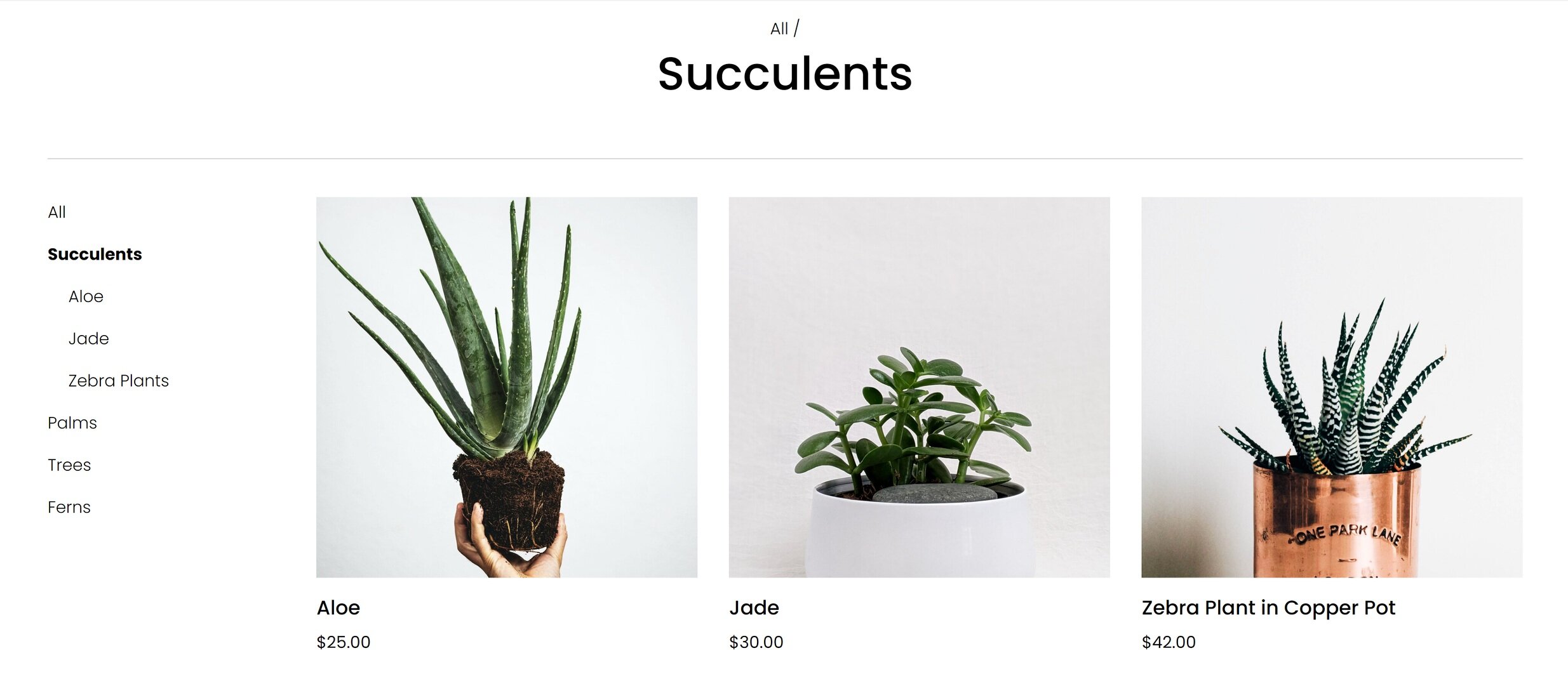
1. Make Your Main Navigation Your Shop Categories
I know, I know - this is more of a sitewide recommendation than one that’s just for your home page but it’s so important that I think it’s important to include! A common mistake I see on amateur eCommerce sites is making the top navigation (the links or “tabs” that appear at the top of every page) the same as someone would for a lifestyle or blog site. They include links such as: About, Our Story, Resources, Blog, and Contact.
But your site isn’t just an informational one; you want people to buy! So you need to make it really, super, stupidly clear exactly what it is that you’re selling. This means that instead of those standard pages the top-level navigation should really be your shop’s main categories.
Check out the top of Anthropologie’s site as an example. The links at the top of the page are: Dresses, Clothing, Petites, Plus, Shoes, etc. If I didn’t know anything about this company and landed on this page for the first time I would be able to see right away all that they offer.
And don’t worry about links to all those other pages, we’ll make room for them! (See #8!)
2. Highlight Your Best Selling Feature Above the Fold
Just like how the save icon still looks like a floppy disk even though you’ve got to be of a certain age 🙋♀️ to even have ever used one of those in real life, the phrase “above the fold” is a hangover from newspaper lingo. It just refers to the content that you see before you unfold the paper. In web speak, this same phrase is used to mean what’s seen without needing to scroll down.
It’s important to lead with your best content because it’s what’s going to set the tone for the rest of the experience and make it crystal clear what you’re most excited to share with your visitors. Strong intro content is also important because a common reason for high bounce rates is visitors feeling like there’s a mismatch between what they searched for and what they’re seeing when they first land on your site.
I always think of Apple as doing a great job at this. Right away you see their best-selling product (the one you’re probably there to check out anyway) and get a sense of the brand’s minimalist aesthetic.

3. Include Links to Your Product Categories
Yes, you already linked to them all in your footer. Link to them again. The goal is to make it as easy as possible for people to be able to discover the perfect product for them. Even if this is included a few sections down your home page, it’s just such a helpful way to get people moving around your site.
Showing thumbnails of all your categories can also help people who thought they only knew you for X also learn that you sell Y. I think of Olly’s site as one that does this well. Right there on their homepage, it’s easy to see that they sell more than just gummy vitamins. A newbie to their brand is likely to be intrigued by products specifically made for sleep, immunity, or beauty and click through to learn more.

4. Showcase Best Sellers, New Products, or Featured Products
You’re running an eCommerce site - show people your products!! I mean, it’s a given, right? (You’d be surprised.) If you have only a few products to choose from I say go for it and just include them all right there on your homepage! But for shops with larger inventories, using tags to indicate which products are new or most popular can be super powerful. This is because people in general hate making decisions and easily get overwhelmed when presented with too much information. (Take my word for it or learn more on this phenomenon in this post: Selling Psychology: Why Less is More in 3 Simple Steps.)
The Spice House is one of my personal favorite shops because I love to cook! So I’m always browsing around there to find some inspiration or discover a new spice blend. I love that they include links to their best sellers right on their homepage because they offer so much that this can help people know what other people have already tried and loved. I may not have thought to try one of the custom blends they highlight if I was to just see them in the full shop all mixed in with everything else but seeing that they’re so beloved made me check them out! (And for the record, that garlic pepper butcher’s rub is 👩🍳💋.)

5. Include Some Reviews or Social Proof
A “best sellers” section like above can definitely give people a dose of confidence but when it comes down to it you can’t beat hearing it directly from other customers. I think it’s smart of a company like Purple to include reviews because they are still a relative newcomer to the market and people may be leery of buying a mattress that comes in a box delivered to your door!
If you’re also a smaller or newer business, you should definitely include a sampling of reviews or testimonials from your customers as some social proof that you’re as awesome as you say you are.

6. Include Links to Other Resources
Once you’ve led with your best info, highlighted some of your best products and shop categories, and showed people some social proof, it’s a great time to give some links to helpful info that answers questions people may have had crop up.
A company that does this well is modern+chic. Near the bottom of their home page, they have a help section that might help seal the deal if a new customer was browsing their site. In this section, you can learn that they are a woman-owned business with great reviews and that they offer fast shipping from the USA. It lets you know at a glance who you’re doing business with and that you can feel great shopping from them!

7. Include a Sign-Up Form
You should always be working on building your email list, it’s one of your best business assets! I like the opt-ins on Artifact Uprising’s site because they are simple, minimal, and clean. They’ve chosen to include both a pop-up and a simple form at the bottom of their site. It’s up to you to decide what is best for your demographic. Sure, some people may only sign up for your list to get that discount code you promised but if you follow up with valuable content there’s a big chance they’ll stick around and turn into lifelong, repeat customers!

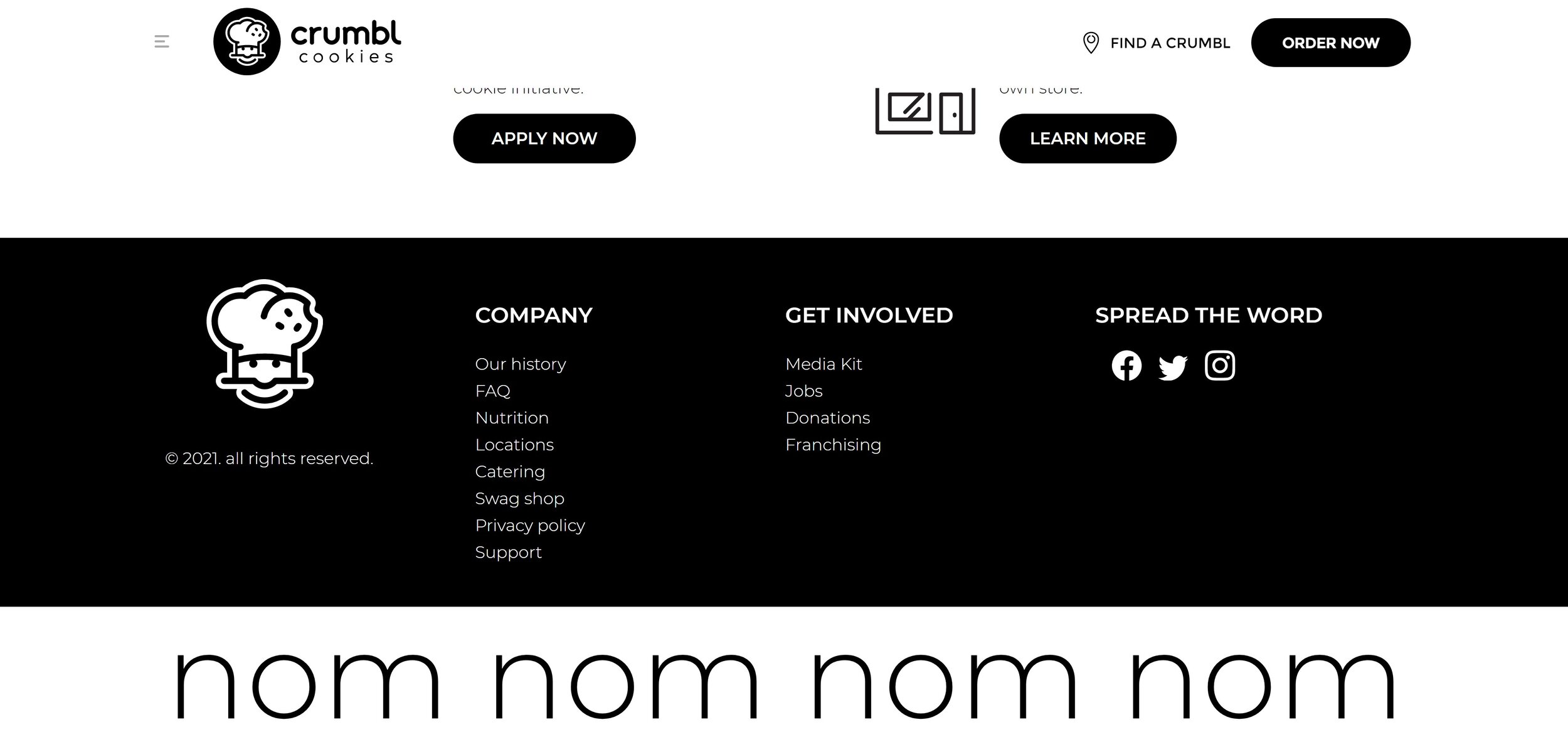
8. Save All Your Other Links for The Footer
I told you in #1 that I wasn’t going to leave links to all your secondary or supporting content without a home and they have a great one - right in the footer of your site. This is a great place to include info about shipping, your return policies, FAQs, and your contact info because it will be visible at the bottom of every page of your site.
A company that does this well is Crumbl Cookies, which I may or may not order from on a regular basis 🍪 Their header has two options: Find a Crumbl and Order Now. But their footer is where you can go to get nutritional info (lol), find out about catering, learn about the company history, learn about franchising options and so much more. They keep the header simple because they know that the majority of people just want to find or eat cookies! Everything else is still there, conveniently corralled at the bottom of every page.
Bottom Line
An impressive eCommerce homepage doesn’t have to be complicated, even though it’s arguably the most important page of your site. Beyond the advice above, I would just say that it’s important to put yourself in your customer’s shoes when thinking about this content. Think of what they need to know first, second, third, and so on. Make it easy to understand what you do and discover new products that they can’t leave your site without.

How to Launch Your Website… Even If You Don’t Have Anything to Sell Yet
Get a head start on building your audience and generate a buzz by launching your website before you’ve got anything to sell. These simple solutions will help you get more customers, charge higher prices, and generate more leads when you’re ready to flip the “eCommerce” switch!
Updated July 2021
There’s that saying that sometimes progress matters more than perfection and I have to say that it really rings true when it comes to launching a new website. I often see new entrepreneurs struggle to know when to “go live” with their idea or find out that they’ve been putting off launching a website because they are waiting until everything has all come together to do so.
The beauty of modern web platforms like Squarespace is that they are infinitely scaleable. This means they can grow with you but this also means that they’re ready to work even if you don’t have anything - or everything - ready to sell just yet. You might be wondering what to put on a website for a business that is still in the pre-launch stage in which case… keep reading! The best news is that these methods are proven to help you:
Get more customers,
Charge higher prices, and
Generate more leads when you are ready to flip the “eCommerce” switch!
First Step: Set up a Coming Soon Page with an Email Opt-In Form
A coming soon page with a simple description of who you are and what you’re all about makes for a great stand-in for a full home page. After all, people do business with other people so there’s no time like the present to introduce yourself.
The secret to making this successful is to include an email/newsletter opt-in form so that the page isn’t a complete dead end. Email marketing is the highest converting sales channel above all others so start building your list and come launch day, you’ll have a long list of people who are already eager to buy what you’re selling.
Don’t overthink what needs to go on this page. A few sentences about your or the company + a rough overview of your general industry and how you plan on being different than the rest are all you need. The goal is to create a place that your business can start to call home.
Create A Freebie or Lead Magnet That Previews Your Product or Service
You’ll have a much better time getting people to give you their email addresses if you also include the promise of a small freebie or offer. This would be most effective if this is a small teaser of your future product or service but it could also be a coupon code that they can use once your store launches or a resource that your target demographic would find helpful.
Setting up an automated email to deliver your freebie doesn’t have to be an expensive or complicated process. My preferred tool for this is built right into Squarespace: Email Campaigns! This is a great option because it’s completely free to build your list of any size and when you are ready to start sending emails you can send your first three for free.
Send Regular Updates of Your Progress
Not only is this great accountability to help keep you on track and focused on launch day, but it can also help create a sense of excitement and community around your brand that you can build on later. Remember, email is the #1 tool in your sales arsenal so any work you do building your list on the front end will pay dividends after you go live.
Helpful Email Marketing Tips for Beginners
Consistency is important so if you email your list every Friday for 3 months and then ghost them for the next three, they’re going to retaliate by marking your messages as spam when you decide to show back up. The frequency that you send messages out doesn’t matter as much as just creating a schedule you can commit to.
Use your emails as a way to casually poll or gauge interest in your products or services. Basically, if you want to know what your target audience wants, just ask them! Most people will gladly provide you with feedback or answer a simple question or two if they feel like they’re helping you create a solution that solves their problems.
Give behind-the-scenes updates and previews of what’s happening in your business even if it feels mundane or overly personal. Remember, people are there because they’re interested in what you have to offer. Show them what you’re working on even if it’s not perfect yet!
If all else fails and you don’t feel like you have much to say of your own yet, start training subscribers to look to you to be the expert in whatever it is you do by sending industry updates or links to other information on the web you think they’ll find valuable. This will help build trust with future customers that you’re willing to share about products and services that aren’t your own in order to help them.
Start a Blog
Blogging seems like it’s going to be overwhelming but it’s a great strategy to adopt for any new business. There’s no time like the present to get in this great habit! Use some of the same advice from the emails section above and create a consistent posting schedule that’s something you can stick to. Post on industry topics if you don’t have much of your own stuff to share just yet.
I’ll also tell you that there’s a secret behind-the-scenes bonus to getting your website live early even if it’s just a coming soon page + a blog: you’ll start building domain authority and SEO street cred right away! This is awesome because SEO is definitely a long game proposition. Any head start you can give yourself will really take the pressure off trying to get noticed once you launch your site and have the added pressure of needing to see the sales start rolling in.
Create waitlists for products or offer pre-sales
Pre-launching products by letting customers know that they are coming soon is a great way to validate your ideas and build on that growing email list you’re already working on. It also can generate a little bit of buzz - similar to when people excitedly wait for the release of the latest book in a popular series or try to score early access to concert tickets.
You have a couple of different options for this and I think the best one depends on how close you are to launch day. If you’re pretty far out, Squarespace makes it easy to create product waitlists where customers can sign up to be notified by email when products they are interested in become available. Once you get closer to launch, you could allow people to actually preorder - just make sure you are super clear about when products will be shipping to avoid frustration or confusion!
For more on the built-in selling tools available to you on Squarespace, check out this post.
Bottom Line
The bottom line here is that it’s ok to launch a super small, scaled-back version of what your future website will actually be. Doing so allows you to start building your audience, testing ideas, getting feedback, and building habits that will help ensure your success whenever you are ready to fully launch. Remember that progress matters more than perfection and just start! Every eCommerce business started as someone’s simple idea and it’s ok to flesh it out bit by bit as things come together. Since adding features and content to a website is so easy these days, there shouldn’t be any fear about waiting to get all your ducks in a row before just diving right in.

Order Fulfillment 101
Creating a great process to manage and fulfill your orders on the back end is just as important to your eCommerce experience as what your site looks like online. Luckily, Squarespace makes it super streamlined and simple to fulfill orders and manage customers. Once you receive an order and have it ready to ship, here’s how the order fulfillment process works.
Creating a great process to manage and fulfill your orders on the back end is just as important to your eCommerce experience as what your site looks like online. Luckily, Squarespace makes it super streamlined and simple to fulfill orders and manage customers. Once you receive an order and have it ready to ship, here’s how the order fulfillment process works.
The Workflow
Get Notified - All store managers or site admins will receive an email notification every time you receive an order. If you use the Squarespace app you can also get push notifications about new orders. If you want to send the emails to other people on your team that aren’t users on your site you can either set up a rule in your Gmail to forward copies of the emails or use a tool like Zapier to set up more advanced options.
View Order Details - From the back end of Squarespace or the Commerce app, you can view an order summary, including info submitted via any custom product forms or custom checkout forms you’re using. You can also view the order status, activity, notes, and email notifications associated with the order.
Fulfill The Order - The options available to you will depend on what you’re selling. Orders for digital products or gift cards are automatically marked as fulfilled because they are delivered immediately to your customer and no further action is needed. For physical or service products, orders are held as pending and you can mark them as fulfilled as they ship or as you complete them.
Add Tracking Info - Only orders for physical products will prompt you to enter tracking information when you fulfill the order. Squarespace recognizes tracking numbers from the following carriers and will update the carrier name automatically: Australia Post, Canada Post, DHL eCommerce, DHL Express, FedEx, UPS, USPS & Royal Mail. For any other carriers, you can just enter the name under “Other.”
Send Confirmation - After you enter tracking information you’ll see a checkbox that is automatically checked to send an “order fulfilled” email confirmation to your customer. (You can uncheck this if you want to not send the email for some reason.) To edit how this email looks or customize it with any other info check out this post about how to customize your store’s email notifications. That’s it - you’re done!
Other Options
Bulk Fulfillment - If you have more than one order that you’d like to fulfill all at once you can do that by going to Home > Commerce > Orders > and filter by pending orders. You can select any/all pending orders you’d like to fulfill. You’ll then be prompted to enter tracking info if you have it.
Cancellations & Full Refunds - The most important thing to note is that you should always process refunds and cancellations directly via Squarespace and not through the payment provider. This makes sure that your stock levels remain accurate and that order info is synced correctly. You can also only cancel pending orders so if you’ve already marked the order as fulfilled you’ll need to move it back to pending before refunding or canceling. Canceling automatically refunds the purchase and sends the customer an email about the cancellation. Marking an order as canceled also gives you the option to restock your inventory with items from the order. Customers will receive the Order Cancelled email.
Partial Refunds - The most common scenario for this is if you offer your customer a refund for their purchase less the shipping costs but you can issue a refund for any amount you enter. From the order details screen just click “Issue Refund” and enter the amount. Once you confirm the refund your customer will automatically receive an email confirming so. Note that issuing a partial refund doesn’t automatically restock any inventory so if you received a return and have that product available to sell again you’ll need to add it manually to the inventory count.
Exporting Orders - If you need to pull your order info into another program or spreadsheet for reporting or other activities, you can export orders using a range of filters by going to Home > Commerce > Orders > Export.
For more on what you can do to manage your customers and orders on the back end, check out Using Squarespace as Your CRM Part 1 and Part 2.
How a Shipping Extension Changes the Fulfillment Process
Easyship Dashboard
Connecting a shipping extension is helpful for a number of reasons. A shipping extension makes it easy to print shipping labels for your orders with all the order info filled in for you - no typing addresses! :) Besides just being convenient by saving you from waiting in line for hours at the post office, most of the extensions offer discounted rates which you can take advantage of to stay competitive on shipping costs.
There’s another big benefit to using a shipping extension that really makes it a no-brainer for anyone shipping even a few products. When an order is placed on your Squarespace site, the info is automatically pushed out to your shipping extension of choice. And then, once you print & ship that order, the tracking information is automatically pushed back to Squarespace. This means that items 3-5 in the workflow above are all taken care of for you by the extension in addition to generating the shipping label and giving you a shipping discount.
For more on how shipping extensions work and how to set up a profitable shipping strategy on Squarespace check out this post.
For a full review of all the shipping extensions available on Squarespace, including my fave Easyship check out this review post.

Crash Course: The Squarespace Commerce Analytics Panel
Understanding how your site is performing can help you meet your business and eCommerce goals in a measurable way. Learn what some of the most important metrics mean, how they are calculated and what you can do to improve your numbers!
Before you launch your site, you’re working off of a lot of guesses and hypotheses. You’re assuming a lot about your customers and their behavior based on your market research and industry knowledge. But after you launch? That’s when the fun begins. Now you have data to either back up your predictions… or help you tweak and refine your content and products.
I love the Squarespace Analytics panel because the graphs and charts are simple, easy-to-read, and straightforward. You can always head over to Google Analytics for a deep dive into some more obscure stats but there’s really no need! It’s so important to use analytic data to help you meet your business and eCommerce goals in a measurable way. Here’s a quick crash course on using Squarespace Analytics to understand how your site is performing.
Analytics Tips
The data shown in your analytics panel is almost real-time - but things may take a couple of hours to refresh. I usually wait until the first or second day of a new month to check out last month’s data.
It’s helpful if you make notes or keep track of things like ad campaigns or big site changes so that you can see how those things affect your data.
If you have reports that you look at often, you can save links to those directly to your Squarespace home screen. To do this go to Home > Settings > Advanced > Menu Shortcuts. From here you can toggle on anything you want to be able to access quickly from your main dashboard.
To ignore your own activity make sure you are logged in to Squarespace when viewing your site. This will automatically exclude your own views from the reports. You can also create a filter to exclude your IP address in Google Analytics.
Now that you know a few ins and outs of analytics, it’s time to learn about some of the most important metrics to check out and what they mean for your business!
Basics
Pageviews
This is basically a popularity ranking for all the pages on your site. If you have pages that you think should be more popular than they are, you may want to look at the navigation of your site or where/how you link to that page. This doesn’t really measure how effective your pages are though so for that check out some of the metrics below.
Time on Page
This is a measurement of how long people spend on a page before leaving for another part of your site. People who leave that page to go to a different site are not counted (those are part of the exit rate, below.) Time on page is this formula: (Total time spent on page / (Pageviews - Exits)). If you feel like people are coming to your site but not sticking around you might want to look at your messaging, keywords, or content. A short time spent on a page indicates that there might be a mismatch between your target audience and your content.
Bounce Rate
Think of this as the people who came to your site and then left without going anywhere - they just bounced right off! If your bounce rate is really high, this also signals a content problem. You’d want to look at what keywords people are using to find your site and make sure that the content and CTAs on that page are all in alignment. You want to make sure that each page clearly describes what the page is about and that it corresponds to the action you’re wanting the visitor to take.
Exit Rate
Exit rate is commonly confused with bounce rate but understanding the difference can be helpful. Whereas bounce rate can show you which initial pages people landed on that didn’t resonate with them, exit rate is going to show you where you’re losing people who have seen other pages on your site along their journey. Think of this kind of like a purchase funnel but for content.
For example, if you have a landing page that’s supposed to lead to a product/shop page it should have a low exit rate. If it has a high exit rate, you should look at why people are leaving that page without doing what you intended. Maybe you could improve the copy or button placement or make it easier for visitors by embedding your product right on the page instead of asking people to click again.
Form & Button Conversions
Forms and buttons are important CTAs (calls-to-action) and you want submissions and clicks! Squarespace makes it easy to see how people are interacting with forms and buttons and it is shown as this formula: Number of times the form or button is viewed / number of submissions or clicks. Low conversion rates might mean that people just aren’t seeing your CTAs. If that’s the case you can try moving them up the page so people don’t have to scroll so much. You may also want to adjust how much information you’re asking for in your forms - long forms are proven to be lower converting than short ones.
Commerce Analytics
Sales by Product
This is a great place to see how each product in your store is performing. Understanding which products are most popular can help you make business decisions about when to order more stock, what to put on sale, or which products might need some TLC in order to better appeal to your customers. Stats on this page include:
Revenue
Units sold
Orders
Views
Conversion Rate
Purchase Funnel
You’ve probably heard of a purchase funnel before when you were busy pulling your hair out trying to set one up manually in Google Analytics 🙃 Luckily, Squarespace makes it easy and you can check out this page to see things like how many visits result in purchases or where you’re losing customers along the way.
The four stages of the purchase funnel are: Visits > Viewed Product > Added to Cart or Started Checkout > Purchased. The percentages between each step are how many people moved on to the next stage. If you make updates to your page content, product descriptions, or prices checking out the purchase funnel analytics can help you see how conversion rates improve over time as a result.

You can also tell a lot about updates you may need to make based on where you’re losing people. For example: if you lose people on the cart page perhaps the shipping costs are too high. If people aren’t even making it that far, you may want to look at how you’re promoting or merchandising your products.
One last thing to note about the purchase funnel is that views from Product Details Pages and product Quick Views are included however views from the main store page or from product blocks or summary blocks are not. This is just something to keep in mind if you use those design elements as part of your website.
Abandoned Cart
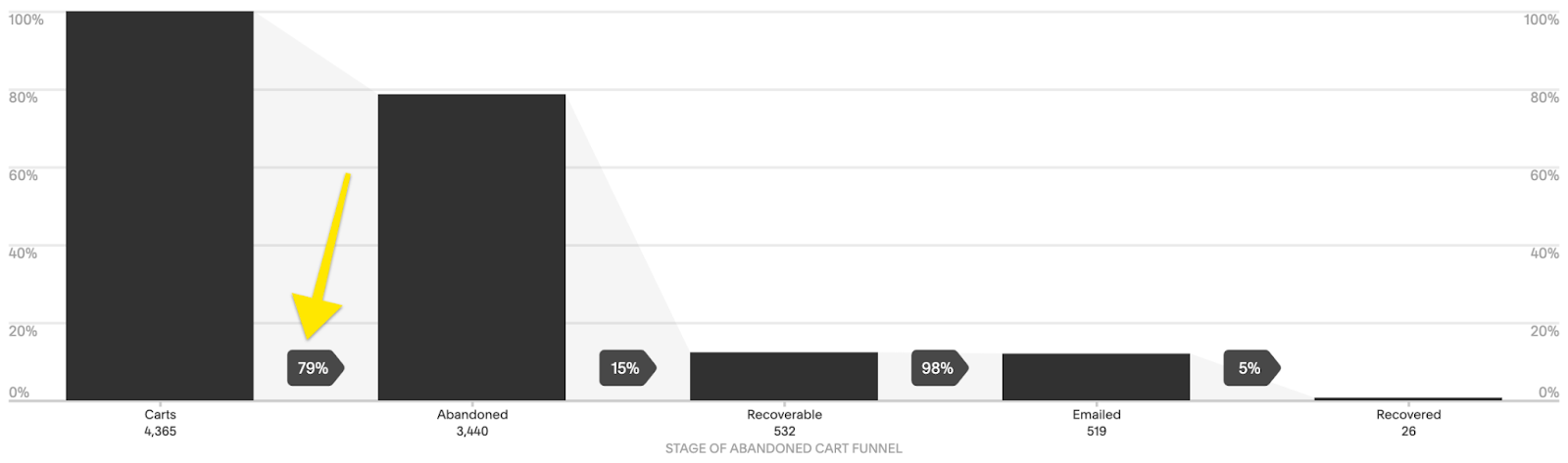
When you’re looking at your purchase funnel (above) you’re paying attention to people that made it all the way through to purchase. But some people ditch out between the Added to Cart / Started Checkout phase and purchase. Those people are counted as Abandoned Carts. The Abandoned Cart funnel includes 5 phases:
Carts - total number of carts that were started
Abandoned - total number of carts with at least one product added that didn’t result in a check out within 24 hours
Recoverable - the total number of customers who abandoned their carts that are eligible to receive an abandoned cart recovery email. (To be eligible they either need to have entered their email address into the cart without checking out or have been logged in to their account when they ditched out.)
Emailed - the number of people who received an abandoned cart recovery email
Recovered - the total number of checkouts that were completed as a result of receiving the abandoned cart recovery email + the revenue boost from those carts!
Good news if you’re seeing a high number of abandoned carts because I think this is one of the easiest metrics to improve upon! You were already doing a lot right to get people interested enough to add an item to their cart so it’s just a matter of figuring out why they aren’t checking out, fixing that, and then giving them a little nudge!
Also, before you get too worried about the reasons why people ditch out, it’s important to remember that sometimes it’s not always about you. There are always personal reasons why people might abandon their carts. Some people might have just become distracted and walked away from their computers. Others may like everything and plan on coming back on their own to purchase when their budget allows for it.
All this being said, there are some things you can do to lower your cart abandonment rates:
Consider adding another payment option so customers can pick one they prefer. If you are already using Stripe (most common), did you know that you can also enable Apple Pay or Afterpay… and if you have a Paypal business account you can also accept Venmo?
Change up your Abandoned Cart Recovery email. Personalizing the content, adding a coupon code, or even just customizing the subject line can all have a big impact. More info on that in this post!
Make sure you include a clear return policy advertised in the footer of your site and linked to in your cart. (Home > Commerce > Checkout > Checkout Page: Store Policies)
Make sure that you keep custom checkout forms short to create a seamless checkout experience.
Enable Customer Accounts so that name, address, phone number, and credit card numbers are saved for your customers to make it faster and easier for them to check out. (Bonus: this also makes sure that people get your Abandoned Cart Recovery emails!)
Other Analytics to Check Out
Google Analytics - good if you’re wanting supplemental data on anything you see in Squarespace Analytics
Stripe Reports - Squarespace reports are good for a high-level view of how your store is performing but probably aren’t going to provide enough info for accounting purposes
Squarespace Email Campaigns - if you use Squarespace Email campaigns from this dashboard you can see stats for all emails like delivered, opened, clicked, and unsubscribed. (Marketing > Email Campaigns)
Squarespace Scheduling - (Scheduling > Reports) if you use Squarespace Scheduling in the reports section you can see stats like the number of appointments, revenue, and total hours booked.

More Pricing Psychology Tips to Increase Sales
Improve your eCommerce pricing by implementing one of these 7 pricing psychology tips. Learn how to put things on sale the right way and how different scenarios call for different strategies in order to increase sales.
It’s been a while since I’ve done a post on pricing but it’s actually one of my favorite topics because I love looking at both the psychology and economics behind what motivates consumers to make a purchase. This post is another great example of this as is this one all about strategic sales. I also think that looking at pricing like this reminds us that we can (and should!) be constantly evaluating and tweaking our offering to maximize profits. It’s rare that you’ll nail things right out of the gate but once you have some sales data and analytics to help you gain more insight into how people are responding to your prices you can refine, refine, refine. Here are some common pricing strategies for you to try!
Discount Pricing
My first tip is just a formatting trick for when you decide to offer a discount. Studies have shown that for high dollar value items it’s best to display discounts in terms of dollars off (ex: Save $200!) but for lower dollar value items to display discounts as percentages (ex: Save 25%!). This is because a percentage of a small amount seems like a better deal than that same amount when displayed as a dollar value. For more on discount strategy, check out this post.
Instead of This

Was $9.99
Now $ 7.50
SAVE $2.49
DO This

25% OFF
Was $9.99
Now $ 7.50
Price Anchoring
Customers often make decisions based on the relative prices between items, especially if they may not have a firm grasp on what a “good price” for something is. By setting a “price anchor” you give shoppers a relative baseline to compare all other prices to. This works well if you sell a wide range of similar items. For example, if you sell denim and have low, mid and high end brands, setting the price of the mid-tier brand closer to the high-end cost may help you sell more of both. This is because people will see the mid-tier brand as a better value to the low-end option and may also then be willing to spend a few extra bucks for the premium brand.
It’s easier to justify a costlier option when there is a low price anchor

$9.99

$17.99

$19.99
Charm Pricing
We all see charm pricing every single day and even though it seems like we should be wise to how it works, we still all fall for it! Charm pricing is simply where you drop the price by one cent so instead of $10, it’s $9.99. This works because studies have shown that people are more likely to round prices down in their heads versus up. You’d also think this would only work on small dollar value items but there’s a reason why cars and real estate use the same strategies - it works!
Instead of This
$10.00
DO This

$9.99
Prestige Pricing
A common mistake some rookie entrepreneurs make is thinking that in order to be competitive they have to be cheaper. Prestige pricing works especially well if you have a product that you can position as higher quality or more luxurious than others on the market. A good example of prestige pricing would be looking at Sephora. They sell skincare and makeup at much higher prices than drugstore brands but have no problem doing so because of the real or perceived higher quality of the products. This pricing model works well if your branding is positioned as luxurious, high end or premium. I go way more into depth on this one plus some other strategies in this post!
People will pay for quality and luxury

$9.99

$18.99
Comparative Pricing
Implementing a comparative pricing strategy is very similar to price anchoring, above. The difference is that in this scenario instead of using a mid-tier product to anchor the price up, you set a decoy product at a comparative price just below your target. For example, if you’re selling pillows consider offering an upgrade to a premium pillow fill. People will compare the prices and you can sell them on the benefits of the premium option. They’ll be much more likely to buy the upgraded premium option when compared to the alternative than if it was sold on it’s own. (Hint: you can also use this tactic when setting up the shipping options for your website!)
Position an expensive option as an upgrade

$9.99

UPGRADE FOR $7
Price Differentiation
Shoppers don’t do well when having to compare between two items that are priced exactly the same. When this is the case, they often spend too much time trying to analyze the differences between the products in an attempt to find the one that is the better value. If you’re selling similar products, giving them slightly different prices will help people make a decision more quickly, which is proven to result in higher sales overall. The differences don’t have to be big to be effective; the important aspect of this strategy is to just not price them exactly the same.
It’s easy to compare products that have different prices

$9.97

$9.89
Price Bundling
This one is last because it’s my favorite! I love this not only as an eCommerce pro but also as a shopper! Bundling products is effective especially well if you offer things that work together as a set or when bundles contain one or two of your most popular products paired with complementary products. The reason why this works is that people are more concerned by the amount they are going to save from buying the bundle than the fact that they originally meant to spend less. When bundling, you’ll want to make sure that the total price is less than the sum of the individual products sold separately. Bundles have two other positive side effects; first, it makes it more difficult for shoppers to determine what the fair value of a product is because it’s technically “cheaper” when bought as part of the bundle. Second, it encourages repeat purchases of more items than the customer may have intended to originally purchase.
IF ALREADY SELL THESE

$9.99

$7.99

$6.99
Total Purchased Separately $24.97
OFFER THIS

Product Bundle
$21.99
Bottom Line
One of the most important things to remember isn’t that the strategies on this list shouldn’t be seen as ways to “trick” your customers. You don’t want to come across as smarmy or sleazy at all! But, if you sell products that fit into one of the scenarios above, these methods can help you increase sales. The ultimate goal to make sure that your pricing isn’t confusing so that people can compare quickly and add to the cart without second-guessing themselves or feeling frustrated. Done right, these pricing psychology tips can definitely help you boost your bottom line.

Built-In Features to Help You Sell on Squarespace
Squarespace has awesome built-in eCommerce features that make managing inventory, promoting products, and merchandising your online store easy and seamless - without the need (or expense) of added apps or plugins. Check out the latest to see what you can incorporate into your online store today!
Updated June 2021
When you’re ready to do some serious business on your website, the last thing you want to do is realize that you don’t have the tools you need to get the job done. I love that Squarespace offer so many ways to help you sell without the need to add extra plugins. Not only does this save you $$$ but you don’t have to worry about trying to string together a bunch of apps that may not play nice together. Even though there are so many built-in features to help you sell on Squarespace, my bet is you can find something new on this list that you could incorporate to help you convert more visitors into customers. Let’s dig in!

Related Products
Displaying related products allows visitors to find what they're looking for more easily and maybe even help them discover something new that they didn’t even know you had! The secret to displaying related products on Squarespace is just to make sure everything has a category or tag. From there, the related products section auto-populates based on your preferences; you can choose to display recently added products within the same category or tag, products with the highest available stock level, or just a random assortment of related products. You can even fine-tune what’s displayed on a product-by-product basis if you want even more control!

Product Waitlists
This feature is geared towards making sure you don't miss a sale if any of your items go out of stock but you could also easily hack this to build hype and collect email addresses for people interested in products that haven't even launched yet. So many possibilities! To be able to do pre-orders and gauge interest in out-of-stock items without any custom code or a plugin is 😍
Bulk Spreadsheet Editing
If you want to update all your product info there’s no need to go into each. individual. product. one. by. one. and update them - use a spreadsheet to make those edits in bulk! The ability to bulk edit things like prices, variants, categories, and inventory via spreadsheet makes managing your store on Squarespace super easy.

Limited Availability Labels
This one is simple but powerful. Showing people that stock is low creates a sense of urgency is a known purchasing motivator to potential buyers. You can enable this label for any physical or service product in your store. This would be a great feature to turn on to highlight the exclusivity of a service you offer or boost sales of a limited edition item in your shop. You have a ton of flexibility to edit exactly what this message says and looks like so that it can be 100% on-brand for you.
Customizable "Sold Out" Labels
Why is this so cool? Because it means you can use Squarespace to manage the inventory of things beyond physical products and use a customized "Sold Out" label to indicate that your class is fully booked or service is not accepting new clients at this time. Combine this with the Waitlists and Limited Availability features above and you have several very powerful and automated ways to show people what you offer, create a sense of urgency to buy, and collect info from those interested who may have missed their moment.
Product Variant Images
Show shoppers an image of exactly what they are looking for so there’s no need for them to use their imagination when it comes to your different product variations. This allows them to compare things like different colors, patterns, or bundles visually. It’s so nice to be able to click on an option and then see exactly what you’ll be getting. This is such an important way to build trust with your customers and reduce frustration, returns, or confusion. If you have products with simple or complex variations, I definitely recommend making sure you have a photo of each iteration!

Member Areas
Member Areas is a great Squarespace feature that allows you to turn virtually any content you have into gated content that members need to pay to gain access to. I dig into this more in this post but in short, this is a great way to sell classes, guides, workshops - and so much more! You can offer multiple membership tiers and everything is automated and self-managed all right within Squarespace.
Bottom Line
If you're selling on Squarespace, be sure you’re taking advantage of all these built-in features to help your store stand out and be as engaging as possible. Not only will they make sure that your customers have a great experience when browsing your site, but you also won’t have to worry about the pain (or the cost) of managing third-party plugins. Want to make sure you’re in on all my favorite high-functioning features? Check out this post!

Squarespace vs. Shopify: Which is Best for Small Business?
Whether you’re just getting started or are looking to make a switch and wondering whether to go with Squarespace or Shopify, this post lists all the major considerations I look at and compares specific features between the two website platforms.
The most popular question that pops up in my inbox is someone wondering whether to go with Squarespace or Shopify for their eCommerce website. The second most popular is how to connect the two which I describe here but then try to talk you out of doing here 😉 So I think it’s fair to say that I’m always willing to give each side its fair shot, present all the pros and cons, and then let you decide what you think is best for you. I mean I clearly have my favorite but that’s not this post.
One more little soapbox before we jump into the details on this subject is that you should definitely be looking at this from within the scope of your own business. It doesn’t matter what anyone else is using or doing. It doesn’t matter if your uncle’s best friend’s daughter’s neighbor who once had a semi-successful Etsy shop thinks you should use Shopify. Hell, it doesn’t even really matter if I think you should use Squarespace! At the end of the day, even if you want to try to be as hands-off as possible, you’re the one who will be spending the most time on your website both on the front end and back end) so aside from your customers, you’re going to be the #1 user. The point is: you have to love it and at least (somewhat) enjoy using it and that’s worth something.
Moving along, in this post, I’m going to break down the main considerations I look at when I’m trying to figure this question out with a client. Some of them have clear “right” answers and some are a little more subjective.
Considerations
What You Sell
This is always the first question I ask because it does a good job of letting me know at the highest level what the eCommerce needs will be. Do you sell mostly products or services? Do you need people to book things or make appointments? Are you offering memberships or subscriptions? Maybe you’re a mix of all the above? In the most general sense, I tend to give Shopify points for people selling very large volumes of strictly physical products but Squarespace points for everything else.
Something else that factors in is how complex or customizable your products are. Squarespace has the same capabilities as Shopify when it comes to setting up complex variants and can even do simple customizable products very well.
An example of the type of customizations I’m referring to would be if you ran a custom embroidery shop. If you just needed people to be able to enter their initials for a monogram on a product when they add it to their cart, I think Squarespace does that better than Shopify. However, if you needed the price to be variable based on what letters or how many letters were entered for the monogram, that may be a better fit for Shopify + a third-party plugin. All this being said, there are ways to solve this problem and stay on Squarespace just like there may be reasons why you wouldn’t want to go the Shopify + plugin route (i.e. cost). I’ve built shops with 10,000+ variants on Squarespace and others with 5 services on Shopify and both were right for those businesses despite initial impulse telling us it would be better the other way around!
Squarespace
10,000 products per store page (can have multiple pages if needed)
Each product can have up to 6 options and up to 250 variant combinations
You can sell physical, digital, service, and subscription products in addition to memberships, events, classes, and other scheduling-based products - all without any third-party apps.
Shopify
Technically you’re allowed an unlimited number of products but some restrictions kick in after 50,000 products
Each product can have up to 3 options and up to 100 variant combinations (more allowed with apps)
You can sell physical products. Other product types (such as subscriptions or digital products) all require a third-party app from the Shopify app store.
Access to large dropshipping network
Shipping & Fulfillment
Shipping has a way of either making it or breaking it for some online retailers. I don’t know why, it’s just a lot of merchants’ Achilles heel! Most of the time, I think it’s because they’re making things more complex than they need to be. You can check out this post on why I think you should keep it simple for yourself and your customers and just offer free shipping but if that’s not part of your strategy, it’s helpful to know the types of options you would like to offer. Flat rate or weight-based? Carrier calculated rates? Will most of your shipments be domestic or will some be international? Do you also offer local pickup or delivery… or are most of your items digital and don’t even require any shipping at all?
Squarespace
Free, flat rate or rate depending on weight shipping with any carrier you choose
Carrier calculated rates for FedEx, UPS, or USPS (US Only)
Ability to create shipping zones based on country, state/province, and zip/postal code (US & Canada)
Print & pay for shipping labels directly through Squarespace or a shipping extension
Third-party fulfillment options are possible by connecting to Shipwire or Fulfillment by Amazon through ShipStation
Mutli-origin shipping through a shipping extension allows for shipping from multiple locations
Print on Demand through Printful or Printique
Shopify
Carrier calculated rates for DHL, UPS or USPS (US) or Canada Post (Canada) via Shopify Shipping
Carrier calculated rates for FedEx if you have your own account with negotiated rates
Ability to create country-wide shipping zones. Shipping zones based on zip or postal code possible with a third-party app
Print & pay for shipping labels through Shopify Shipping or a third party extension from the app store
Custom third-party fulfillment options or Fulfillment by Amazon with an Amazon Seller Central account
Ability to activate multi-origin shipping if you need to track inventory across multiple locations
Print on Demand options through the app store
Content & Design
I often hear potential clients say that they love the look of Squarespace but feel like they need the function of Shopify. In reality, you shouldn’t need to sacrifice design for function or vice versa - both are super important! Just because you’re planning on running the next big thing in eCommerce does not mean that things like style and content don’t matter. In fact, completely the opposite is true. Content is an important way to help you build an engaging brand. You’re going to want the ability to create landing pages, sales pages, a blog, and any other great-looking easily and effectively.
Squarespace
All design layouts and features are available for all pages.
Customize any page using any product block.
Create galleries, custom forms, event calendars, and portfolio pages without the need for third-party plugins
All pages have tidy URLs. For example “example.com/about” or “example.com/landing-page”
Nearly limitless style capabilities on every single page element
Rich blogging and podcasting capabilities are built-in
Easy SEO features
Shopify
Home page content capabilities are dependant upon theme
Interior pages (anything besides the home page) are created within the Shopify admin and limited to customization via custom CSS/HTML
Pages don’t have tidy URLs. For example “example.com/pages/about” or “example.com/pages/landing-page”
Limited style capabilities, some dependant upon theme
Simple blogging capabilities; layout and style are dependent upon the theme
Simple SEO features, some more robust tasks require access to code
Cost & Payments
There are some small differences in plan costs on Squarespace and Shopify. For complete details on the various plans and their features, you can check out this post for Squarespace or this page for Shopify. It’s tough to compare apples-to-apples between Squarespace plans and Shopify plans because they don’t really break them up into similar tiers. So for comparison's sake, let’s just look at both of Squarespace’s Commerce plans (Basic & Advanced) and then Shopify Basic & Shopify. The other big thing to keep in mind is that many of the built-in features on Squarespace require paid apps on Shopify. Depending on what you need, paid Shopify apps can end up costing hundreds of dollars each month alone just to get features that are included on Squarespace such as custom forms, galleries, social media tools, product merchandising, and selling features, etc.
Squarespace
Basic Commerce
Access to everything except Abandoned Carts, some advanced shipping and discount features & Commerce APIs
Unlimited Contributor Accounts
0% Transaction Fees
$26/mo (paid annually)
Advanced Commerce
Access to all Squarespace features
Unlimited Contributor Accounts
0% Transaction Fees
$40/mo (paid annually)
Shopify
Shopify Basic
Access to all features except reports & some international settings
2 Staff Accounts
2.0% transaction fees if not using Shopify payments otherwise 2.9% + 30¢ USD
$29/mo
Shopify
Access to all features except advanced reports
5 Staff Accounts
1.0% transaction fees if not using Shopify payments otherwise 2.6% + 30¢ USD
$79/mo
Wildcards
Are you starting from scratch or revamping an existing site? All of the above being said, there are always some variables and subtle nuances that I take into account when advising a client on which platform or subscription is best for them. To me, the most important of those is: do you have an existing website? If so, are there specific features or functionalities that you feel like you’re missing on that platform that you think switching to a different platform would help with?
I think people often want to change just because they think they should, or someone else told them they should, or they think that switching is going to magically solve a business problem they’re having. In reality, there may not be a need to scrap what you’ve already built entirely and it could be a better option to stay where you’re at and work on optimizing instead of moving. Moving a website to a new platform can cause a short-term dip in SEO and if you’ve built a lot of brand authority where you’re at, that’s an additional factor worth considering.
There may also be updates to the platform you’re currently on that you’re just not taking full advantage of. For example, most Squarespace sites out there could stand to be updated to the new 7.1 platform from their current 7.0 versions which would instantly make things feel fresh and new and offer some advanced eCommerce options.
Does anyone ever really move from Shopify to Squarespace? The conversation is often framed as if Squarespace is the “starter” website and that after you find a little eCommerce success, you’re ready to “graduate” or move up to Shopify. And I’m just here to challenge this assumption!
Moves can go both ways and you should select a platform that meets your business needs and goals for the next 2-4 years, regardless of what they were in the past. And, yes, this can mean moving from Shopify to Squarespace. Why would you do this? Several reasons: you’re looking for more design options and control, you want to focus on blogging as part of your key marketing strategy or you want to trim extraneous costs associated with Shopify apps just to name a few! So, while it’s definitely more common for people on Squarespace to wonder if they should be moving to Shopify, I think the future of eCommerce makes the simple, streamlined design of Squarespace a top contender as well.

6 Steps to Creating an Effective Online Store
A successful website isn’t just about good design; it’s about how well it works, how well it sells, and how effective it is as a business tool. Whether you’re just getting ready to launch or are interested in improving your website and customer experience, these 6 simple steps will help you get things going in the right direction on your eCommerce Squarespace website.
A successful website isn’t just about good design; it’s about how well it works, how well it sells, and how effective it is as a business tool. Whether you’re just getting ready to launch or are interested in improving your website and customer experience, these 6 simple steps will help you get things going in the right direction and help you take your site from basic & blah to eCommerce mega-machine.
1. Manage Inventory in Squarespace
If you ask me, one of the first red flags I look for on a mismanaged eCommerce site is people selling physical products but marking the inventory as “unlimited.” Eek. I mean, what kind of crazy roller coaster chaotic world this must be! If you sell… pretty much anything… you have to know how much you have to sell. Heck, even events or some digital goods need “inventory” counts; you know how many seats you have to sell or how many downloads you need to break even.
For a lot of shops, managing inventory could be as simple as syncing a Google sheet up to Squarespace with a tool like Zapier.
If you want to go a step further, you could also check out one of Squarespace’s inventory extensions. (I review them all here.)
Be sure to also check out the Squarespace Commerce app which allows you to make inventory updates from your phone or tablet.
2. Add Product Categories & Tags
Product categories & tags are the backbones of a well-organized eCommerce site. Not only can you use these to help guide visitors to exactly what they’re looking for quickly, but they can also help you do cool things with your navigation - and a few other tricks (more on those below)!
For a deep dive into all the ins and outs of categories & tags check out this post: How to Use Product Categories & Tags in Squarespace
For more tips on how to keep things from getting out of control, check out the tips in this post.
3. Use Summary Blocks
Alright, I told you that categories & tags would help you do cool things and this is one of them! I think a lot of people see Squarespace Summary Blocks as great tools for pulling in an overview of posts from blogs or events but they’re also indispensable for displaying product groups on your home page - or even in blog posts, like below! You can use a summary block’s filter settings to display products from any category or with any tag. You can also use them to display only featured products. This is a great way to showcase things like bestsellers, new items, or sale items.


As an extension of this, you can also use product categories or tags to power some of my favorite Squarespace plugins like the Featured Product Tag and Product Shop Labels ones from this post.
4. Connect People to Your Email List
Beyond just sales, one of your goals really should be to always be growing your email list. It’s just such a valuable business asset! (And not just because you shouldn’t bank on social media.) I would definitely recommend asking people to sign up for your list at checkout in addition to offering a signup form in the footer of your site. Not sold on email yet? Let me convince you:
Email marketing offers a higher ROI than SEO, display, advertising, and other forms of digital marketing. It’s estimated that for every $1 you spend on email marketing, you can expect an average return of $42. More in this post.
According to another study, email marketing reigns supreme with an ROI of 4400%. No, that’s not a typo. More here: 4 Post-Sale Emails Every eCommerce Site Needs
Feeling stuck? Here are 11 Lead Magnet, Offer & Freebie Ideas to Grow Your Email List
5. Use Product Blocks
A Squarespace Product Block is like a summary block on steroids. But instead of giving you an overview of a bunch of different products in a certain category and inviting you to click through for details, a product block puts everything you need right there front and center. Product blocks turn any page you want into a shop page. Use them in blog posts, on event pages, on your home page, on landing pages - wherever they make sense for your business. Product blocks allow people to “add to cart” from right where they are, no need to navigate anywhere else.
If you’re creating targeted landing pages for paid ads or social media posts, use product blocks to add just the product you’re advertising right on the page. No distractions or other shop items to get confused by! For more on creating a great sales page, check out this post.
You could also use a product block as a way to create an interesting upsell or cross-sell layout by adding it to the additional info section of a core product. This would be a way to display super-targeted products as opposed to using the Related Products feature which is going to constantly auto-update.
6. Add Automatic Discounts
Look, I love a coupon code as much as the next person but you know what I love more than that? NOT having to remember a coupon code in order to score a deal. 🥳 Automatic discounts on Squarespace allow you to set the conditions that need to be met in order to get the discount. Once the criteria you define is met ( - boom - auto discount. This is a great way to improve the experience of shopping on your site for your customers. You can create automatic discounts that apply to any order, orders over a certain amount, single products or whole product categories!
For more on this check out this post: eCommerce Crash Course: Coupons, Offers, Discounts & Promos
If you need some ideas on some sales and offers to try out using automatic discounts check out this post.
Automatic discounts like this are separate from and in addition to any automatic free shipping offers you create. I would just keep this in mind so that you don’t create too many offers that people can stack together (just pick one or the other). Check out this post for more on free shipping and setting up a profitable shipping strategy.
Bottom Line
When it comes to creating an effective eCommerce site, you’ve got to focus on some of the little things that have a big impact on customer experience and your business. Whether it’s managing inventory effectively, properly merchandising your products, or ensuring every interaction your customer has is smooth and easy - you can do it all using the built-in tools on Squarespace.

How to Set Up Local Pickup or Curbside Delivery on Squarespace
Whether you call it local pickup, in-store pickup or curbside delivery: offering this option to your customers is easy to set up and a great service to market to your customers. Discover tips on making sure the process goes smoothly from start to finish and exactly how to add this feature to your Squarespace site.
Updated March 2022
Offering in-store pickup or curbside delivery are great ways to combine the ease of eCommerce with the familiarity of buying from a favorite local business. It’s about more than just convenience; providing these types of options can help you compete with the big guys! I think that if more businesses knew how easy it was to set these options up that they would definitely do it - and possibly attract a whole new batch of customers as a result! I mean, how nice would it be if your dry cleaning was loaded up in your trunk for you? Or what if you could pick up a wrapped gift from your favorite little store on your way home from work? Marketing curbside or in-store pickup as a service can really give you a competitive edge.
Like I said, setting this up is pretty easy to do from a technical perspective but here are a few quick tips to make sure you’re set up for success:
Create and document the system you will use for processing incoming orders. This includes making sure that everyone on your team is educated on the in-store pickup or curbside delivery procedures. Write down every step that happens between the time someone submits an order until that order is picked up. Who monitors for orders? Who marks them as fulfilled? How and when are customers notified? Be specific.
Answer FAQs about your specific curbside pickup process on your website. It’s important to set expectations early about how long it will take to fulfill an order, what needs to be done when the customer arrives at your location, etc. This is going to vary depending on whether you’re a boutique or a cafe, whether you have your own dedicated parking area or share a lot with other businesses, etc. (When in doubt, my rule of thumb is to treat every visitor like a lost tourist 😂)
Provide directions and the information again in your email confirmation. You may have put all the info on your site like above but not everyone is going to read it. Don’t worry about repeating yourself and provide the directions about what to do again in your email confirmation email. Be explicit. For example, are they to proceed directly to your location right away or will you be emailing again when their order is ready for pickup? Is there a phone number they need to keep handy? Can they stay in their car? Is there a special line to stand in for online orders?
Put up easy-to-read signage at your location regarding curbside pickup procedures. At the risk of repeating myself, I’m telling you to go ahead and repeat yourself :) If you need people to park in a certain spot or area, call or text a certain number or follow some other procedures, let them know. Make it simple and clear. The goal is to reduce frustration and confusion but great on-site signage also has the benefit of advertising to anyone passing by that you offer curbside pickup so be sure to list your website as well!
Creating a local pickup option on Squarespace is easier than ever and you have two options based on your needs.

Option 1: If you want to be able to offer local pickup to everyone:
You can use the built-in Local Pickup option to easily offer this to your customers at checkout. This will create an option at checkout toggle between shipping & pickup.
Get there: HOME > COMMERCE > PICKUP
You can write whatever you want in the “Pickup Information” text box. The name will display at checkout and the information will be included in the Order Confirmation email that is sent to your customer. You can include info like your address, pickup hours, and other instructions that will help customers know what to do or expect next.
Local Pickup orders won’t require your customers to enter a shipping address making this a super-fast checkout option!
Local pickup is an all or nothing thing - people can’t place an order that is half pickup / half delivery.
At this time, customers choosing this method cannot pay with Apple Pay (if you offer this as an option).
These orders won’t get sent to any shipping extensions you may have connected (like Easyship) because it’s assumed that you’re fulfilling them on your own + there is no shipping address provided by the customer.
Option 2: If you want to limit local pickup to certain zip/postal codes:

What you see when setting up an in store pick up option
In order to restrict local pickup options to people in certain areas using zip or postal codes, you’ll need to create a flat rate shipping option. While it isn’t technically necessary to limit this as an option at checkout, it’s nice to only show it to people who could reasonably choose it.
Get there: HOME > COMMERCE > SHIPPING > ADD SHIPPING OPTION > FLAT RATE
Make sure you give the pickup option a very clear name like “Curbside Pickup - YOUR AREA ONLY” or something that clearly differentiates this option from any other (potentially free) shipping options you offer.
Fill out the pricing or list $0.00 if you offer this option for free.
From the Shipping Zones tab, select your country (US or Canada) then your state/province. To get even more detailed, click on the state/province and add specific zip or postal codes that you’d like to limit this option to.
Keep in mind that the curbside pickup option is going to be displayed based on the “shipping address” that’s entered first so when in doubt, I would make your circle wider than narrower so that you don’t miss out on anyone.
Taking It Further:
Offering Local Delivery - You can set the price to whatever you want - it doesn’t have to be free. This is something to keep in mind if you wanted to replicate the instructions above to be able to offer local delivery. You’d use the same steps as option 2 above to restrict delivery to people in certain zip or postal codes, call it “Local Delivery” and give it a price. Now you have a paid local delivery option, too!
Order Confirmation & Order Ready Emails - People placing local pickup orders will receive two emails from you. The first is their order confirmation email, which is the same for all orders on your site regardless of shipping method chosen. The second one is the one that is sent once you mark their order as “ready for pickup.” In this second email, be sure to include things like your pickup hours, location, parking information, or what’s required at time of pickup (i.e. photo id or printed confirmation, etc. Again, if you explained this on an FAQ page or order page of your site it’s super helpful to just reiterate any pertinent info so people have it right in their inbox. For more on customizing these emails check out this post.

How to Pick The Right Squarespace Template for Your eCommerce Site
As a jumping-off point, templates can help you get to launch day faster and cheaper but how do you know what to look for in a template design? How can you make sure you pick the right one for your eCommerce site and avoid some common template traps?
In the olden days, every website was hand-coded from scratch. All the elements were built (and rebuilt) every single time. This made web design take a loooooong time (sometimes many months or years) and cost aloooooot of money. That’s ok. You’ve got to walk before you can run.
Now, all modern websites are built off a starting theme or, in the case of Squarespace, a “template.” A template is just a rough framework or layout that’s used as a jumping-off point so that you don’t have to start from scratch on your web design. After all, every website has 90% of the same elements: a home page, a header with navigation links, a footer with more calls-to-action, a shop page, cart, and checkout, etc. so why spend time and money reinventing the wheel?
Common Template Traps
When it comes to choosing a website template here are some of the most common traps I see people fall into:
They think all the templates are “pretty” but can’t pick the right one because they don’t have a clearly defined idea of their own brand or target audience.
They can’t decide between templates because they obsess over finding the “perfect” one or nitpick slight differences between templates.
They assume that their finished site will look exactly like the template it was based on and can’t find one that they think will work.
We’re going to help you avoid falling into any of these! First, by learning what three areas to focus on when reviewing a template!
Template Features That Matter
Picking the right template does require you to kind of see the forest through the trees and depending on the template’s design this can be easier said than done. However, focusing on these three areas should help you on your quest:
Home Page Layout - Your homepage is your chance to make a great first impression with your customers or clients. The right template for you should have room to feature the elements that you want “above the fold” or before you need to scroll down. You should also think about what you’re selling when looking at a home page layout. Do you need to be able to list the top three features or benefits? Do you only have a single product shop? Do you want to be able to link out to different shop categories? Look for templates that have home page layouts that include areas for those things. Keep in mind that the content itself doesn’t have to be an exact match to be a good fit; a template with a home page gallery could just as easily use that area to feature shop products. After all, a shop is really just an interactive gallery!
General Style - Strong emphasis on the word GENERAL. Don’t worry about the specific colors or fonts a template uses because those elements are easy to update to suit your brand. So what you’re looking for is a little more esoteric: the general look/feel or “mood” of the template. Does it have layouts that are fun, playful, and a little quirky? Or is it a little more serious, conservative, and traditional? Which feels right for your brand? Again, not worrying about whether the template uses the same colors or fonts you use but more whether it makes you feel the same way you want your customers to feel. Keeping the focus on your target demographic also takes away the urge to focus on your own personal likes and dislikes.
General Navigation Areas - Just like the above, you don’t need to worry about finding an exact match when it comes to the navigation areas on a template but it’s helpful to find something that’s as close as possible to what you’re looking for. For example, if you like the look of a logo centered above links to shop categories a great template for you might already have that setup. Don’t just look at the main (top) navigation, either! For lots of sites, the links that all appear at the bottom of every page are just as important.
Example: How to Check Out a Template
To give you a real-life example of putting this into practice, check out the two screenshots below. The one on the left is Exurban by GoLive. At first glance, it may be hard to see past the fact that the demo content is set up for an interior design company. Or that they offer services if that’s not something you do. Or that there’s a lot of beige if that’s not your color :)
But when I’m checking out a template, I do my best to ignore all those things and try to imagine it in a grayscale, pared-down version like the mockup I made based on this template on the right. I’m looking for places to plug in the content I know I’ll have to work with and in this template, I see spaces for promotional content, a shop, featured products, and a newsletter sign-up form, among other things. I see that when I look at just the layout - ignoring everything else - that this is a really clean design that has room for all the things a great home page typically needs. If I was looking for a modern design that included simple CTAs I think this template would be a great fit!
What the template looks like:
What You Should See:
Free or Paid?
Alright, so you’re sold on templates and know what to look for in one. But there are so many to pick from! One of the reasons Squarespace is so awesome is that even the free template designs are all pretty great but they’re not your only option.
The good news is that no matter what template you choose, you’ll have all the same features and functionalities available to you. This is an improvement over both Shopify and older versions of Squarespace where choosing a template also means you need to pay attention to what each template allows you to do because some come with major limitations that you’ll be stuck with! So no worries on that front -- you can make pretty much anything happen on any page of your Squarespace website.
With this in mind, I think it’s most important to use the criteria above in selecting a template versus whether it is free or paid. Even if you go with a paid template, you’re looking at spending <$500 which is a steal compared to the cost of a fully custom web design.
Free Templates - You can’t really go wrong with any of the free templates offered by Squarespace and they are a great choice if you feel comfortable learning how to customize and style your site on your own as you go. That being said, you may need to allot time to work on building out the interior pages of your site which tend to be less “styled” and filled with lots of dummy content on Squarespace. Also, if you’re not comfortable being super hands-on and taking care of everything yourself, it may mean that you end up paying a web designer or developer which is a cost you may not have had with a paid template that is more finished from the start.
Paid Templates - If you’re looking for something more complete from the get go and/or are looking to cut down development time and costs, try a paid template from a trusted source. This can be a great compromise between a fully unique design and a generic template and get you to launch day quickly! Paid templates typically come with very thorough instructional videos or are completely set up for you. This means that there’s very little learning or no learning curve required at all. Just add your content and brand elements and you’re good to go. Another benefit to a paid template is that even though they are super affordable a lot of people aren’t willing to pay for them ¯\_(ツ)_/¯ which means that there are tons of sites based on the free Squarespace templates and way less based on the paid ones. If you’re concerned about your finished site looking too much like everyone else's, this is definitely something worth considering!
Best Squarespace Templates for eCommerce
Here are some options for your consideration:
The Best eCommerce Templates for Squarespace which has links to some of my favorite free and paid templates!
More Great Squarespace eCommerce Templates - in case you didn’t find what you were looking for in the first post! :)
Bottom Line
It’s important that you remember that just because a template is the starting point that it does not mean that your finished site will - or should! - look exactly like that template at all! Templates are great because they get the ball rolling but if you don’t put the time and effort into customizing the copy and photos (or maybe zhuzhing things up with a little custom CSS) your site isn’t going to feel like yours.
All this said, there are tons of options available and different routes you can take when it comes to picking a website template to start from. Remember that templates are a way to cut down on both the time and money required to start a website. As a jumping-off point, they can help you get to launch day faster and cheaper which means you can start selling fast while your competitors are busy reinventing the wheel.

A Step-by-Step Guide on How to Set Up Your First Online Shop
From what brand elements you really need to have to the best place to grab your domain name, what pages your site needs, and how to get paid - this post covers everything you need to know if you’re ready to start doing business online ASAP.
Updated June 2021
If you’ve been stewing on an eCommerce business idea or are finally ready to launch that startup, when better than right now? Today. Why not?! Sure, it’s going to take time to work on all the little details but I’m a huge proponent of the “progress over perfection” mantra. It’s probably easier than you think to move the needle and make a lot of headway in a manner of days or weeks, not months or years. So while your competitors are busy having another meeting to talk about a website, you’ll already be doing business online. Look how savvy you are.
Step 1: Name & Branding
The biggest mistake I see people make in this department may actually come as a surprise. I think most people overthink - and overspend - in this phase. This comes as absolutely no offense to all the brand designers out there (hey, I used to be one so I feel I can say this!) but I see so many clients stall out in this early phase and never move forward. Too much time is spent on perfecting a logo for a concept that hasn’t been proven or products that haven’t been tested and the thing that I can 100% tell you about branding is that it really has nothing to do with design.
I just love this quote and I think it sums things up perfectly:
“A brand is not a product or a promise or a feeling. It’s the sum of all the experiences you have with a company.”
So, step 1 is to just make some decisions and move forward. You don’t have to live with them forever. Don’t overthink things because you can always change them down the road. Names, logos, fonts, colors - all totally changeable.
I would actually rather see a company bootstrap a little on this front as a startup and once their concept, product, or service has been vetted and all the kinks worked out, hire a brand designer to come in and give things a glow up. If you invest heavily in branding as a Phase 2 initiative instead of in Phase 1, you’ll be able to provide data, metrics, real feedback, and real experiences to your brand designer to work from. Early on, it’s all totally hypothetical. The goal right now is just to have something to launch with.
From a web design perspective, here’s what I think you need as a bare minimum:
A simple, text-based logo in just one or two colors. (I love this post from GoLiveHQ on 6 Easy Steps to Create a Text-Based Logo For Your Brand.)
A simple color palette that consists of no more than 3 colors:
One dark color
One light color
One accent color
Favorite brand fonts - two at most, one for headlines/buttons and another for body copy.
For more on building a minimalist brand check out this post!


Step 2: Decide whether you’ll start from a free or paid template
One of the reasons Squarespace is so awesome is that even the free template designs are all pretty great but they’re not your only option. You should think of templates as jumping-off points that will help you get to launch day fast. So when looking for a template, whether free or paid, here’s what you should be paying attention to:
Home page layout - Does it have room to feature the types of things you sell and the content you want to share?
General style - Does it make you feel the same way you want your customers to feel?
General navigation areas - Does it have a layout similar to what you’re looking to replicate?
Free or Paid?
The good news is that no matter what template you choose, you’ll have all the same features and functionalities available to you. This is an improvement over both Shopify and older versions of Squarespace. On both of those, choosing a template also meant you needed to pay attention to what each template allowed you to do - and some came with major limitations that you were stuck with! No worries on that front anymore! 👏
With this in mind, I think it’s more important to use the criteria above in selecting a template versus whether it is free or paid. Another thing to keep in mind is that even paid templates are super affordable compared to the cost of a fully custom web design.
Here are some posts to help:
For help learning how to pick the right template for you, check out this post.
You can browse all the free Squarespace templates here.
If you’re still looking for more options, check out:
The Best eCommerce Templates for Squarespace - the original template post!
More Great Squarespace eCommerce Templates - the encore!
Step 3: Sign Up for Your Website Account
Once you’ve selected your template, it’s time to sign up for a website account! Squarespace offers a free 14-day trial to give you a little time to build your first site before subscribing.
Tip: If you plan on working with a pro like me, ask if you can skip this step. Most web designers can offer you some discounts or perks if they create your account for you and just transfer ownership over to you.
How to sign up for Squarespace:
If you’re starting from a free built-in template:
Go to squarespace.com and click on the “Get Started” button in the top right corner
Click through the initial little questionnaire about who you are and what you do.
Select the template you’d like and follow the prompts to complete your account setup.
If you’re starting with a paid template and don’t already have a Squarespace account:
Go here to create a Squarespace login. This is all you’ll need to do for now.
You’ll be asked to share the username (email address) your account is under when you purchase your template so that it can be transferred into your account for you.
The company you purchase your template from will follow up on how to access your template and get started!
Now you have a website account! Squarespace has an extensive video library and help section but you may want to just start clicking around to explore a bit. Don’t worry if things seem overwhelming at first! Once you get the hang of things, you’ll soon discover that getting around is pretty intuitive and even fun!


Step 4: Domain Name
Your domain name almost matters more than your business name! That’s assuming they aren’t the same thing, of course, which ideally they should be. But great domains can be slim pickings these days so there’s always the chance that you thought you had a great business name but the matching domain name is already taken.
Helpful tidbits re: domain names:
Yes, you should really go for the .com version. Vanity domains like .shop or .whatever are becoming more acceptable these days but 99% of people are going to screw that up and type .com so don’t settle for a vanity domain just because the .com isn’t available. Find a .com that works even if it means changing your business name to match. It’s way easier to do this than the other way around. Trust me on this.
Buy up any alternative domains or common misspellings of your domain that are available. Domains are cheap (many start at just ~$10/year) and this is a small price to pay to own and re-route people to your main site. This isn’t totally necessary but you’re there buying domains, why not also at least own the variations to protect your future biz, right?
You can save yourself a login by buying your domain(s) directly from the same place you plan on hosting your website. For example, you can buy domains directly from Squarespace which makes it easy to manage all aspects of your online business from one place. (Bonus Tip - Squarespace offers a free domain for the first year once you sign up for an annual subscription so if you know that you’re going that route hold off on this for now and you can get this for free after you subscribe!)
If you’d like to host your domain independent of your website subscription, I recommend Google Domains. It’s super easy to use, affordable and has a native Squarespace integration that makes it simple to connect to your site.
Step 5: Add Your Pages & Content

The exact pages that your site will have are obviously going to be unique to you and your business but here is a list of pages that pretty much every site out there needs to have at a minimum:
Home
Shop (This may have a different name depending on what you do but the gist is the same, more on this in the next step)
About
Contact
Other page types that you’ll need to think about but that aren’t necessarily super sexy as far as content or layout are concerned are your privacy policy and your terms of service. For my recommendations on those, check out this post: How to Set Up a Privacy Policy & Terms of Service On Your Website.
Remember this is your jumping-off point. If your site has just these pages to start you’re in great shape!
Step 6: Add Your Products or Services
This is the stuff! This is why you’re here! What is it that you sell?
Physical products
Services (Either as packages or consultations)
Digital goods like downloadable or printables
Subscription-based products or services
Memberships or Courses
Bookings or Reservations
Whatever it is, the point of all of this is to be able to do it online. For each item that you sell/offer, you’ll want to be able to present it confidently to the world! To do that, compile these details for each product/service:
Name
High-quality photo(s)
Detailed description (Describe what people are getting in detail, including key features, how it benefits them, etc.)
Price
Variations, if applicable (i.e. different sizes, colors, options, etc.)
Inventory (either the actual physical count or, for things like events, this is the number of spaces available)
Exact product specs (weight and dimensions) for shipping, if applicable
Add each item to your shop page in Squarespace just filling in all the info as you go. If you have lots of items, you may also want to think about:
How you’re going to use tags/categories to organize your shop
Using a spreadsheet to bulk upload your inventory details
How you plan to connect your website with other things like your accounting software, fulfillment center, or other third-party apps/software
Step 7: The Settings
Ok, I lied to you in Step 1. The part where I told you that that was where most people stalled out. I was wrong. This is it. This is where most people give up and call in reinforcements. Why? Because it’s a lot and you can totally feel like you’re missing a tiny checkbox somewhere that is going to have lifelong impacts on the stability of your business. Don’t worry. Worst case scenario, something goes sideways, your customers/clients realize you’re a real person out there just trying to do your thing and everyone has a good laugh. (Unless it is about taxes, in which case, yeah - the government tends to not laugh off you not paying them their cut. When in doubt, it’s worth it to talk to an accountant who is local to you and familiar with your personal financial situation.)
When I first got started doing websites exactly 1,392 years ago, I basically just clicked on every single settings menu available at least 3 times each to make sure I didn’t miss anything. All that clicking boils down to these basics:
Payments (see: How to Choose an eCommerce Merchant Processor)
Taxes (see: How to Set Up Automatic Tax Calculations on Squarespace with TaxJar)
Shipping (see: How to Set Up a Profitable Shipping Strategy on Squarespace)
On Squarespace, most settings that you’ll need to take care of are in the Commerce panel (just click on Commerce from the left-hand dashboard menu) but there are also some additional settings available under Settings. Remember, the goal is just to launch. Taking care of payments, taxes and shipping will get you in business. You can always keep refining settings and options later on as you grow.
Step 8: Subscribe & Launch
When you have everything added and the basics set up, it’s just a matter of subscribing to a plan to make your site live! If you’re not sure which plan to go with check out this post but the TL;DR is that most sellers should choose the Basic Commerce at a minimum.
To subscribe go to: Settings > Billing & Account > Billing > Upgrade > Select a Plan
Congrats! You’re in business!
At its simplest, these are the steps to launching a new online shop for the first time. This will get you to a place where you can do business online on your very own website! There are lots of ways to continue to improve and expand from here whether it’s working on email marketing, SEO, automations, order management, shipping/fulfillment, promotions and offers… the list can really go on and on.
But the goal is just to start, to have something you can grow and build on. The best brands and businesses are iterative, adaptive, and always learning. Your first site is not going to be your best one and things are likely to change (a lot!) over time. To be honest? I would be more worried if they didn’t. ;)

How to Set up Product-Specific Email Automations with Squarespace Campaigns
I love that Squarespace Campaigns allows you to send emails based on what people buy - it’s just such a great way to create a personalized experience with your shop! Learn how to set up your first product-specific email automation (or series of emails) plus get some ideas on how to really use this feature to its full potential.
I love tools that make life simpler and that means choosing programs and platforms that offer the most functionality possible. Squarespace is definitely where it’s at on that front because of Squarespace Campaigns, their built-in email marketing platform. And one of the things I like best is that Squarespace Campaigns offers the ability to send super-targeted, automated emails based on purchase behavior. If you want to get a primer on Squarespace Campaigns in general check out this post but here we’re going to get into sending product-specific emails because I think it’s cool enough that it’s worthy of a post all its own!
Customer Activity Automations
Squarespace emails that are triggered after someone purchases a product on your site are called “customer activity automations” and the thing to keep in mind is that the emails we’re talking about here are separate and in addition to the standard Order Confirmation and Shipping Confirmation emails that get sent out. (For more on those, check out this post.) So, just remember that these emails are ones that are set up via Squarespace Campaigns as follow-ups to the standard order communication emails that are managed in Commerce > Customer Notifications. Here are some things to note on Customer Activity Automations:
They are tied to products on your site and triggered when people buy those specific products.
Sending this type of email doesn’t automatically sign customers up for your mailing list. (That is something you can ask people to do during checkout though!)
People can unsubscribe from customer activity emails from you but that doesn’t unsubscribe them from any email lists they may have also signed up for.
This type of email does count towards the monthly send limit that your plan allows but isn’t counted as a campaign.
Now that you’ve got a good idea of what these emails are and how they work in general, here’s how to set one (or a few!) up plus some ideas on how to really use this feature.
Setting Up A Triggered Email
You’ll start by clicking on the “Create” button and then selecting “Automation.”
On the next screen, click on the Customer Activity tab and select from one of the three options.
Hint: there’s nothing different about any of the actual behind-the-scenes set up to any of these options, you’re just picking one because Squarespace will then display templates for you to choose from that fit what you select. If you plan on re-using one of your own templates it doesn’t really matter what you pick here at all!

Once you’ve selected from one of the premade templates or chosen one of your own, the email editor screen will open up. You’ll create, edit and style your email like normal. However, on the “Email” tab to the right you’ll also see the automation options available to you.

The top section is already set for you indicating that the automation will be sending after a purchase is made so the only things left to take care of are 1) which products this email should be connected to and 2) when to send it.
Products - you can select as many or as few products as you want to be connected to this email. If the content of your message is pretty generic (it could apply to any product someone purchased from you) there’s also a quick option to just toggle it on for “Any Product”. Other than that, you just click on the specific product(s) that you want to connect. Hint: although at the moment you can’t trigger based on shop categories you CAN use the search box above the product list to search by category. This makes it fast to filter down and see products that are just in that category even if you do have to select them one-by-one!
Timing - You can choose from any of the preset time delays or choose your own. Emails can be scheduled as far as 60 days out after the date of purchase. Also, although you can technically choose to send your automated email “immediately” after purchase I would recommend not doing so. The reason is that the standard order notification email gets sent immediately after purchase as well and getting two emails back-to-back might seem confusing or spammy. Even if you’re wanting to send an initial “thanks for your purchase” email, I would schedule it for at least 1-2 days out so that it feels more personal. You can also then use that email as an opportunity to get people excited that you’re working on their order or that it should be shipping/arriving soon, etc. (More on that below!)
When you have everything set up the way you like it be sure to hit “Activate Automation!”
Sending Multiple Emails Per Purchase

Here are some automations I have set up on my own site.
Now that you’ve seen how easy it is to set up an email triggered by a product purchase, you may have some ideas about other follow-up emails you want to send too! It’s easy to see all of your automated emails in one place by clicking on Automations from the main Campaigns screen. Here, you’ll see an overview of all the automated emails you have set up - including ones that are triggered by both subscriber activity AND customer activity. For this reason, I recommend giving your emails helpful names and even numbering them if you have to. Customers won’t see these names (they’re just for you!) so these are just a way for you to keep track of what emails do what!
If you want to set up an email series triggered by the purchase of your signature product, you’ll just repeat the steps above to create each individual email. In the Timing settings, you’ll then define when you’d like each email to send. I love this setup compared to some other email marketing platforms that require you to create duplicate workflows for each product series. In Squarespace Campaigns if everyone gets the same initial email but different second emails, you only need to create the initial email once and just tell it to apply to any product purchase. You can then set up your next emails based on either a specific product or a group of products.
Product-Specific Email Ideas
Squarespace provides templates for the following types of post-purchase emails for a reason - they’re all great ideas for ways to follow up with your customers after the sale!
Say Thanks to Customers
Recommend Additional Products
Send a Coupon to Customers
In addition to these ideas, here are some that go even further in creating an exciting brand experience for your customers. (Note that some of them require you to set up some things outside Campaigns as well, such as using Customer Profiles or Zapier.)
Let customers know when similar products or services go on sale
Send a delivery confirmation email asking if they received everything ok
Ask for feedback or a testimonial/review
Send an email that includes the most common product-specific FAQs right in the body to save them having to hunt them down on their own
Send links to product use/care guides to help them take care of or get the most out of their purchase
If your product is something they would run out of or need more of, follow up to remind them it’s time to purchase again
If your product is a service, send emails to remind them to log in or access your resources
Hopefully, these ideas spark some of your own that are specific to your own brand and what you’re selling! The most important thing is to just think of emails like this as a way to extend the brand experience. And just because they’re automated doesn’t mean that they shouldn’t feel personal! In fact, this is a great way to really make a lasting impression on each and every customer or client to encourage them to keep coming back for more. If you liked this post, be sure to also check out this one: 4 Post-Sale Emails Every eCommerce Site Needs!

Squarespace eCommerce Launch Checklist
Check out my quick list of commonly missed or easily overlooked items that you should make sure you’ve taken care of before you hit publish on your new eCommerce website.
I have several posts out there about how to set up your first online shop, what to include on your eCommerce setup checklist, or even how to launch an eCommerce site even if you don’t have anything to sell yet. But what about launch day? There are lots of moving parts to launching an eCommerce site and when you’re staring down launch day it can be easy to overlook something simple out of sheer fatigue! You feel like you’ve taken care of everything but how can you really know?!
I’m all about checklists as a way to take some of the guesswork out of things. I use the same checklist for nearly every project I work on for a reason - there’s no point in reinventing the wheel each time! (For the record, my checklist tool of choice is ClickUp which I highly recommend!)
If you’re getting ready to launch your eCommerce website (or even if you launched already and want to make sure you didn’t miss anything!) here’s my quick list of what you should make sure you have taken care of before you hit that “publish” button!
Make sure you’ve added a site title
Check all links & buttons
Make sure your domain is connected & secure
Test payments through your chosen merchant processor
Make sure taxes are set up appropriately
Make sure you have at least one shipping option set up
Place a test order
Set up any third-party sales channels (such as FB or Instagram)
Make sure your custom email address is working
Test all contact forms & signup forms
Work through Squarespace’s SEO checklist
Disable test mode to prepare for accepting orders
Customize & review your site’s email notifications
Make sure your checkout page is customized
Check out how your site looks on mobile
Verify your site with Google Search Console
Add your Google Analytics account info
As you can see, most of the things on this list are things that you’ll probably have taken care of during site set up but these are also commonly missed or overlooked items so make sure you’ve got them all checked off. Once you do, remove your site password and hit publish! You’re ready to launch!

4 Post-Sale Emails Every eCommerce Site Needs
Email marketing isn’t just about asking people to buy something -- it’s also a great way to interact with people after the purchase! Adding these 4 types of post-sale emails will help you take things from basic and automated to personal and engaging.
Of all the marketing options available to you as an eCommerce business owner, the one I think worthy of most of your time and attention is: email marketing. That’s right. Not social media. Not paid ads. Not influencer marketing. Nope, the thing worth most of your attention is probably one of the most straightforward.
The funny thing is that I’ve been hearing naysayers say for… oh, I dunno, at least the last 15 YEARS that email is dead and every year they’re proven wrong again and again. According to this study even though there are lots of marketing tools available to you if you look at effectiveness, email marketing reigns supreme with an ROI of 4400%. There are lots of reasons to not bank on social media but I would say that kind of ROI really should speak for itself.
The biggest mistake eCommerce businesses make when it comes to email marketing is assuming it’s all always about the sale. But there are lots of other reasons to send emails! Here’s a quick list to get you thinking outside the box when it comes to the types of emails you have in the queue. Of course, if you use something like Squarespace Email Campaigns, you can have these all automated, making life even easier!
Thank You Emails - Go beyond a basic order confirmation email and include a heartfelt thank you! After all, you just convinced someone on the internet to type their credit card information into a form. The least you can do is not be a robot. Taking the time to customize your shop’s email notifications to inject a little of your brand’s personality into the stock layouts and content will go a long way in starting to build brand loyalty.
Delivery Notifications Emails - People expect a shipping notification to know when their orders are going to arrive at their door. Luckily Squarespace makes it easy to send these out automatically along with the shipment tracking information! I say to take this a step further than that and send another follow-up email when their order is delivered. You can easily do this with a shipping extension like EasyShip + Zapier.
Product or Service Information Emails - Don’t assume that everyone reads your site or FAQ pages word for word and send out some helpful information on how to get the most out of your products after they’ve arrived. This could include helpful things like helpful PDF downloads if your product is very technical or even just links to blogs or video content about how to use or care for their purchase. If what you’re selling isn’t a thing at all but a service or something customers experience instead, send emails reminding them about their purchase and how to get the most out of it.
Surprise & Delight Emails - Another thing I love about customer profiles on Squarespace is how easy it makes it to send super-targeted emails. Use this tool to your advantage and send special promo codes, offers, or free gifts to your VIPS. You can narrow customer groups down based on how long people have been customers, how many purchases they’ve made, or even how much they’ve spent in total with you. Since you know that these are your most loyal fans make sure they feel seen and recognized!
Bottom Line
Email marketing isn’t just about asking people to buy something -- it’s also a great way to interact with people after the purchase! Adding these 4 types of post-sale emails will help you take things from basic and automated to personal and engaging. The best part is that for the most part this can all be done using Squarespace’s built-in tools!