

8 Tips for Designing an Impressive eCommerce Home Page
In a recent post all about how to pick the right Squarespace template for your eCommerce site I shared a mockup of a home page and how a home page is really your best chance to capture your audience. Even if your customers don’t see your home page first (maybe they clicked through a link to a specific product or blog post), they’re still likely to check out your home page to get a feel for your brand.
I like to think of a home page as a quick summary of your site’s best content. It doesn’t need to have everything on it, but it needs just enough to pique someone’s interest and compel them to learn more.
From there, I think of each section of a home page from top to bottom and ask myself “what do people need to know and when do they need to know it?” This is a helpful way to make sure that you’re leading with the good stuff and that each section after that just reinforces your mission, which is to get them to click through to somewhere else on your site somewhere along the way!
With that general thought process in mind, here are my top 8 tips for designing an impressive eCommerce home page:
1. Make Your Main Navigation Your Shop Categories
I know, I know - this is more of a sitewide recommendation than one that’s just for your home page but it’s so important that I think it’s important to include! A common mistake I see on amateur eCommerce sites is making the top navigation (the links or “tabs” that appear at the top of every page) the same as someone would for a lifestyle or blog site. They include links such as: About, Our Story, Resources, Blog, and Contact.
But your site isn’t just an informational one; you want people to buy! So you need to make it really, super, stupidly clear exactly what it is that you’re selling. This means that instead of those standard pages the top-level navigation should really be your shop’s main categories.
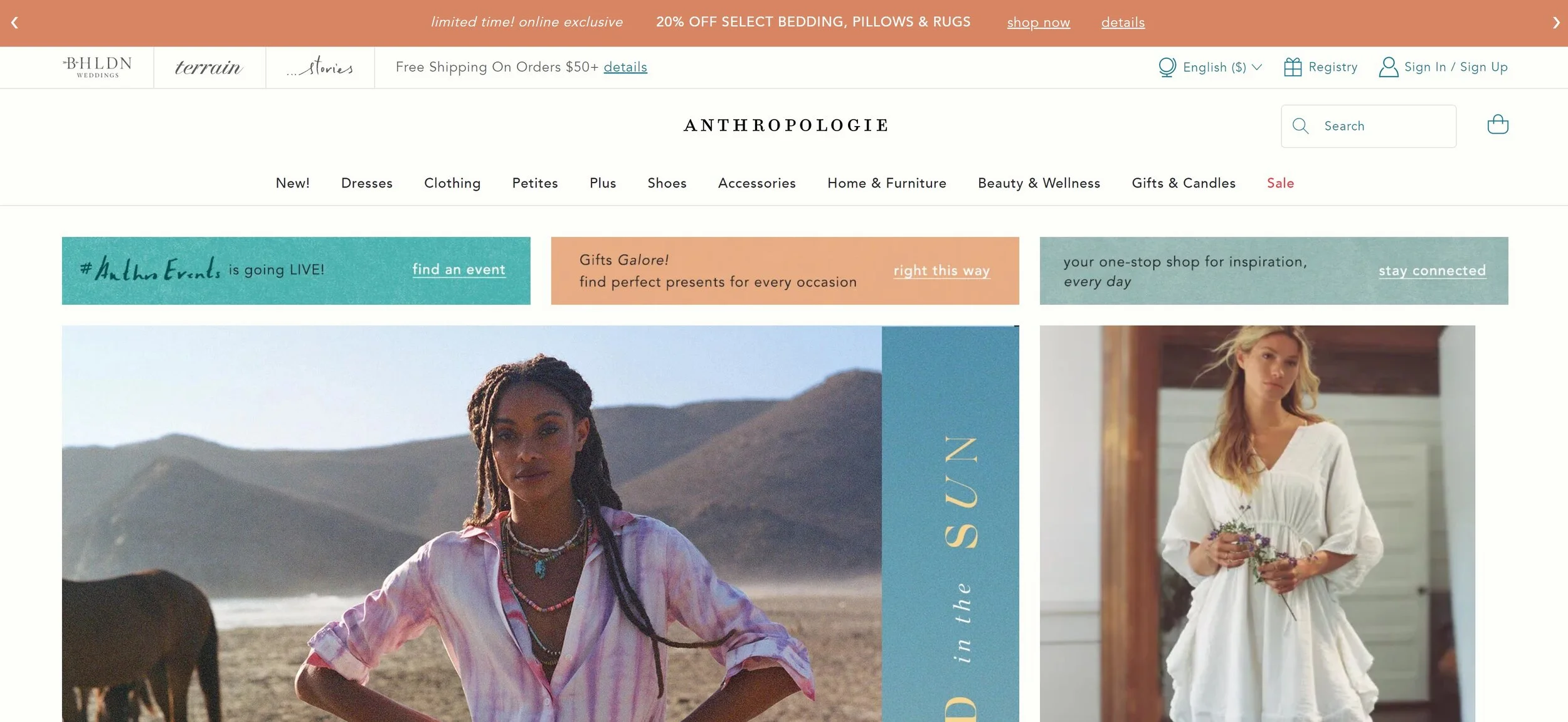
Check out the top of Anthropologie’s site as an example. The links at the top of the page are: Dresses, Clothing, Petites, Plus, Shoes, etc. If I didn’t know anything about this company and landed on this page for the first time I would be able to see right away all that they offer.
And don’t worry about links to all those other pages, we’ll make room for them! (See #8!)
2. Highlight Your Best Selling Feature Above the Fold
Just like how the save icon still looks like a floppy disk even though you’ve got to be of a certain age 🙋♀️ to even have ever used one of those in real life, the phrase “above the fold” is a hangover from newspaper lingo. It just refers to the content that you see before you unfold the paper. In web speak, this same phrase is used to mean what’s seen without needing to scroll down.
It’s important to lead with your best content because it’s what’s going to set the tone for the rest of the experience and make it crystal clear what you’re most excited to share with your visitors. Strong intro content is also important because a common reason for high bounce rates is visitors feeling like there’s a mismatch between what they searched for and what they’re seeing when they first land on your site.
I always think of Apple as doing a great job at this. Right away you see their best-selling product (the one you’re probably there to check out anyway) and get a sense of the brand’s minimalist aesthetic.

3. Include Links to Your Product Categories
Yes, you already linked to them all in your footer. Link to them again. The goal is to make it as easy as possible for people to be able to discover the perfect product for them. Even if this is included a few sections down your home page, it’s just such a helpful way to get people moving around your site.
Showing thumbnails of all your categories can also help people who thought they only knew you for X also learn that you sell Y. I think of Olly’s site as one that does this well. Right there on their homepage, it’s easy to see that they sell more than just gummy vitamins. A newbie to their brand is likely to be intrigued by products specifically made for sleep, immunity, or beauty and click through to learn more.

4. Showcase Best Sellers, New Products, or Featured Products
You’re running an eCommerce site - show people your products!! I mean, it’s a given, right? (You’d be surprised.) If you have only a few products to choose from I say go for it and just include them all right there on your homepage! But for shops with larger inventories, using tags to indicate which products are new or most popular can be super powerful. This is because people in general hate making decisions and easily get overwhelmed when presented with too much information. (Take my word for it or learn more on this phenomenon in this post: Selling Psychology: Why Less is More in 3 Simple Steps.)
The Spice House is one of my personal favorite shops because I love to cook! So I’m always browsing around there to find some inspiration or discover a new spice blend. I love that they include links to their best sellers right on their homepage because they offer so much that this can help people know what other people have already tried and loved. I may not have thought to try one of the custom blends they highlight if I was to just see them in the full shop all mixed in with everything else but seeing that they’re so beloved made me check them out! (And for the record, that garlic pepper butcher’s rub is 👩🍳💋.)

5. Include Some Reviews or Social Proof
A “best sellers” section like above can definitely give people a dose of confidence but when it comes down to it you can’t beat hearing it directly from other customers. I think it’s smart of a company like Purple to include reviews because they are still a relative newcomer to the market and people may be leery of buying a mattress that comes in a box delivered to your door!
If you’re also a smaller or newer business, you should definitely include a sampling of reviews or testimonials from your customers as some social proof that you’re as awesome as you say you are.

6. Include Links to Other Resources
Once you’ve led with your best info, highlighted some of your best products and shop categories, and showed people some social proof, it’s a great time to give some links to helpful info that answers questions people may have had crop up.
A company that does this well is modern+chic. Near the bottom of their home page, they have a help section that might help seal the deal if a new customer was browsing their site. In this section, you can learn that they are a woman-owned business with great reviews and that they offer fast shipping from the USA. It lets you know at a glance who you’re doing business with and that you can feel great shopping from them!

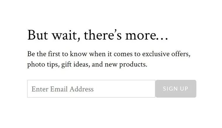
7. Include a Sign-Up Form
You should always be working on building your email list, it’s one of your best business assets! I like the opt-ins on Artifact Uprising’s site because they are simple, minimal, and clean. They’ve chosen to include both a pop-up and a simple form at the bottom of their site. It’s up to you to decide what is best for your demographic. Sure, some people may only sign up for your list to get that discount code you promised but if you follow up with valuable content there’s a big chance they’ll stick around and turn into lifelong, repeat customers!

8. Save All Your Other Links for The Footer
I told you in #1 that I wasn’t going to leave links to all your secondary or supporting content without a home and they have a great one - right in the footer of your site. This is a great place to include info about shipping, your return policies, FAQs, and your contact info because it will be visible at the bottom of every page of your site.
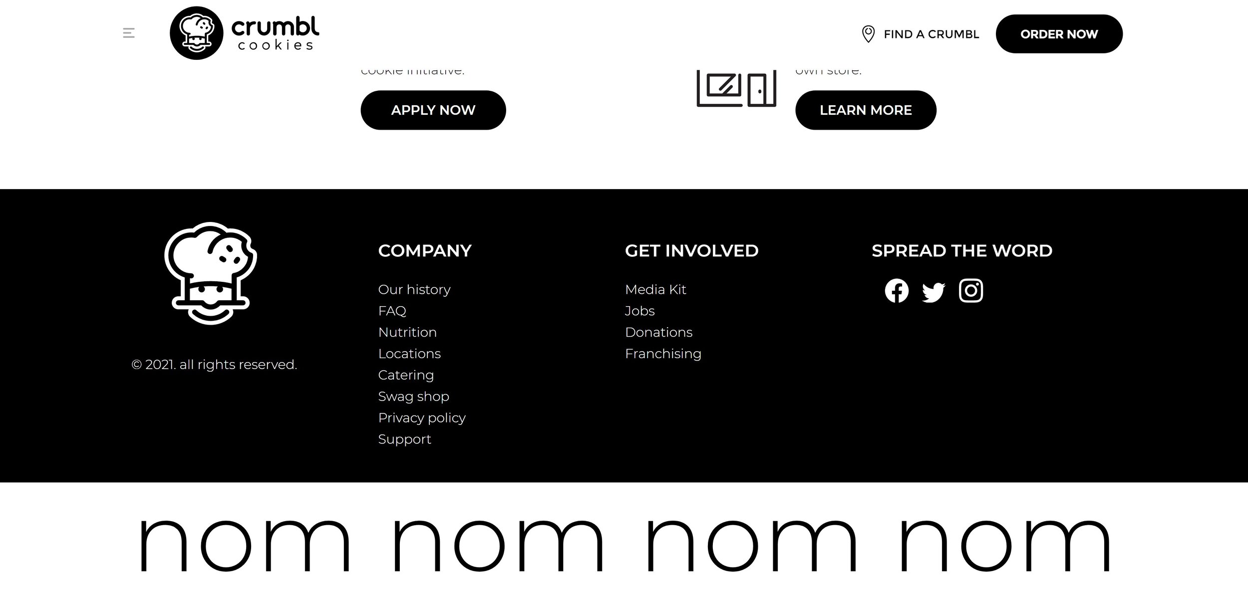
A company that does this well is Crumbl Cookies, which I may or may not order from on a regular basis 🍪 Their header has two options: Find a Crumbl and Order Now. But their footer is where you can go to get nutritional info (lol), find out about catering, learn about the company history, learn about franchising options and so much more. They keep the header simple because they know that the majority of people just want to find or eat cookies! Everything else is still there, conveniently corralled at the bottom of every page.
Bottom Line
An impressive eCommerce homepage doesn’t have to be complicated, even though it’s arguably the most important page of your site. Beyond the advice above, I would just say that it’s important to put yourself in your customer’s shoes when thinking about this content. Think of what they need to know first, second, third, and so on. Make it easy to understand what you do and discover new products that they can’t leave your site without.