

Notes on building smarter websites for actual humans.

How a Flash Sale or Strategic Product Drop Can Help You Increase Engagement & Boost Sales
Break out of the traditional sales rut and plan a promotion that puts you in control. Strategic product drops and flash sales can help control demand, increase engagement and boost sales. Here are tips on how to make this a successful part of your eCommerce strategy.
Updated: May 2021
Something I love about eCommerce is that it’s been such a disrupter to the traditional shopping seasons and really given merchants the ability to set their own rules - smaller shops especially! Merchants are shaking things up and spreading promotions throughout the year instead of focusing on just a few traditional sales seasons. This trend signifies that we’re really moving into a different era of eCommerce where there will be less reliance on things like holiday sales to create buzz and profits. There are so many popular brands that have already shown that things like flash sales or strategic product drops can be super successful any time of year. In this post, learn all about using product scarcity as a marketing method, all product drop strategy and why it works, and how to plan and promote a successful drop or flash sale.

The Psychology Behind Product Scarcity
When Skims sells out an entire new product drop in minutes, it doesn’t surprise my inner economist one bit. After all, we all know that low supply + high demand = major sales. And this isn’t a phenomenon that’s only cropped up as of late, as any of us who have parents who waited in long lines to score a Cabbage Patch Kid back in the day can attest to. The difference is that contemporary drop culture is less a result of true scarcity and more intentional, highly marketed, and hyped. This is a strategic scarcity that uses things like online flash sales or planned product drops to give shoppers that feeling of scoring a product with limited availability - no camping outside a big box store required. Turns out FOMO is a great marketing tactic!
Benefits to a Product Drop Strategy
Control your own timeline and message- planning a product drop with some strategic scarcity puts you in the driver’s seat. You don’t have to wait for traditional “sales holidays” like Black Friday (or Memorial Day weekend, or Back to School season, or whatever it is). The pressure to develop a sales strategy around arbitrary dates just because you feel like you have to is gone. This works on a couple of fronts. First, those dates just may not be ideal for your business - maybe you don’t have inventory ready or your production schedule requires something different. Second, having a sale on a traditional sales holiday just may not align well with your brand or messaging. So if you’d rather spend a popular holiday weekend holed up at an Airbnb having fun with your friends and family - you do it! You can have a sale whenever you want to!
Enjoy reduced competition - Trying to stand out during traditional or holiday selling windows can be tough for even the biggest of brands. If you’re a small to medium business, it’s a billion times harder to get noticed when everyone around you is also busy vying for attention. Planning a strategic product drop or flash sale can allow you to plan it so that you can be the #1 story.
Worry less about delays - If you’ve experienced longer lead times from suppliers or shipping delays that leave you with little inventory to sell anyways, transform “supply chain issues” into “marketing opportunities” and just make this part of the hype. Not only does this approach allow you to worry less, but it can also save you big bucks if you would have otherwise paid to expedite production or shipping. That’s taking lemons and making lemonade, friends. 🍋🍸
Boost social media engagement - As I said above, FOMO is a great motivator and there’s nothing better than getting people who love your brand to talk online with fellow fans about what's coming next. Word of warning: the one thing you don’t want to do is make people feel like you’re taking advantage of their excitement. So make sure that you’re doing everything you can to be transparent in your communications and that you’re offering the same value and experience regardless of the hype.
Ideas, Strategies & Tips for a Successful Product Drop or Flash Sale
After all of the benefits above, a product drop or flash sale may seem like the easy road to fast profits but a successful drop takes lots of preparation and work behind the scenes. Here are some tips!
Make sure you’re ready to ship.
After placing an online order, 66% of consumers expect things to arrive within 1-3 days and more than half are expecting overnight shipping. Blame Amazon for setting these high expectations if you want but the fact is that what happens after the sale is arguably more important than anything so make sure your shipping strategy is on point. For more on how to set up a profitable shipping strategy on Squarespace check out this post.
Plan out your social media & email marketing well in advance.
This includes mapping out all of your posts, emails, PR activities, and other content with your planned sale or drop in mind. Once things get going, the flurry of orders and customer service inquiries is going to keep you busy enough; you don’t want to be worrying about whether or not you posted an Instagram story that day on top of it all. My favorite tools for social media are Canva (for graphics) and Planoly (for planning and posting).
Train & prepare your customer service team.
Since product drops are engineered to sell out, you have to plan for what happens if some of your fans feel like they missed their moment. You can mitigate feelings of disappointment by being super clear and upfront well in advance that inventory is limited. This not only creates a sense of urgency that can motivate people to buy, but it also lets people know in advance that there’s a chance they won’t score.
You’re also bound to get more inquiries than normal leading up to and during a product drop so having some pre-scripted snippets that you can easily send to potential customers will make sure they get their questions answered quickly and get them back to their cart. Lastly, one of the best things you can do is add a live chat widget to your site to make sure shoppers have a quick and easy way to reach you. For more on this, check out my post 3 Live Chat Tips for Your eCommerce Website.
Schedule Product Publish Dates
Get all your products ready to go so you aren’t waiting up until 11:59pm on the day of your drop to flip the switch! This is just another thing you can prepare in advance so that you can focus on customer service. On Squarespace, you can set products to “Scheduled” status so they are only visible on the future date/time you choose. To schedule a product that you just added just hover over DONE and click SCHEDULE. Set the date and time that you’d like that product to become visible in your store and then click APPLY. On the product’s scheduled date, the status will change to VISIBLE.
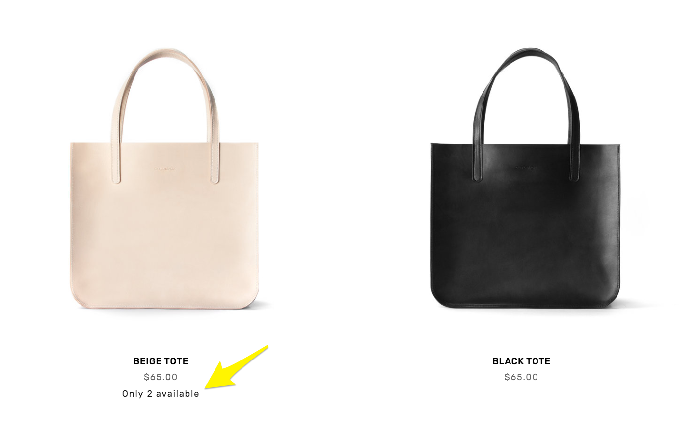
Limited availability labels can reduce disappointment in the cart and create a sense of urgency.
Track Inventory and Show Stock Levels
One way to reduce disappointment (and also build a little hype!) is to display stock levels along with your product descriptions. Both Shopify and Squarespace have this capability but I think that Squarespace makes it easiest! You can customize the message that’s displayed and at what point you’d like to display it. For example, if you only want a limited availability label to show up when the stock drops below a certain level that’s totally possible! Letting people know right up front what’s available is great customer service. For more on Limited Availability Labels check out this Squarespace support article.
Plan Website Updates
I’m realizing that this list is basically boiling down to: “get everything organized in advance.” But I mean it! Just because a flash sale or product drop seems spontaneous to customers doesn’t mean you shouldn’t plan out every little detail well in advance! You’ll most likely need to make a few small website updates to go along with your promo and things will go a lot smoother if you have them all mapped out in advance. Edits you may need to make are things like changes to your homepage or hero images, temporary changes in navigation, adding special landing pages for the event and scheduling changes to collections or categories. If you’re wanting to take some of the work out of updating prices for a sale, check out the Flash Sale plugin I highlight in this list of My Favorite Squarespace Plugins for eCommerce Sites.
Make It Exclusive
If you’re feeling like you may truly have way more demand than stock, consider offering promos to only certain groups of people, like past customers or VIPs who have already spent a certain amount in your shop. Making a flash sale or product drop exclusive can be a great way to treat repeat customers and build a community of loyal fans. I have a couple posts that might help you in your planning here. First, there’s one all about coupons, offers, discounts and promo codes and then be sure to also check out the one about building Customer Profiles on Squarespace. Together, you’ll be able to target very specific groups of customers with the perfect offer just for them!
Bottom Line
Changes in how people shop online mean you have an opportunity to break out of the traditional sales rut and plan a strategy that better suits your business and messaging. And this isn’t just good news if you’re staring down a holiday sales weekend without having already planned something 😱 because strategic product drops and flash sales are a great tactic that can help you control demand, increase engagement and boost sales!

3 Live Chat Tips For Your Ecommerce Website
Adding a live chat widget can be a quick win for your business when it comes to customer service and making a great impression with customers. It’s easy to add one and becoming the norm for quick convos with online visitors!
Updated: May 2021
Looking to add a simple feature to your eCommerce website that will instantly boost your customer’s experience? Add a live chat widget! When website visitors have a question or problem they expect to be able to communicate directly and quickly. This means that a plain old contact form that asks them to fill out their info and then wait for a response won’t always cut it. One of my favorite things about live chat is actually not techy at all; it’s that implementing a live chat system on your eCommerce website gives your site an interactive element and reminds visitors that real humans are on the other side of the screen to help them.
For small to medium businesses, this is also one quick and relatively inexpensive way to look and act like a major player! It shows everyone that your biz is tech-friendly, responsive, and focused on customer service. Those are all great wins! If you’re interested in some more of the psychology and stats behind why live chat is such a winning tool check out this post but read on for some tips on how to implement it successfully + a couple of recommendations on my fave live chat widgets for Squarespace.
Live Chat Tip 1
Get Everyone on the Same Page
If you have a team, make sure you go through some training so that everyone knows and understands how to chat. This means not just what to say but how to say it. You can have some answers to common questions written out in your brand’s voice but people need to be able to communicate on the fly in the same way. The goal is to make it seem like it’s not a robot chatting! You should also cover things like your expectations around response times and what options are available for resolving issues. For example, you could have some generic discount codes or links for tracking shipments at the ready so issues can get resolved quickly. Consistency is one of those things that customers can’t quite put their finger on when asked why they love a brand but will be quick to point out the second it’s missing so getting everyone on the same page is really important.
Live Chat Tip 2
Choose a Tool that Works for You First
Live chat does require integrating a third-party program and there are lots of options depending on what internal software and systems you use. For example, you could use one that connects all your chat messages to Slack or Facebook Messenger if that’s where you’re guaranteed to never miss a message. This is especially important if you’re flying solo or have a very small team of people that are busy doing things other than just monitoring your chat activity.
This may be obvious to point out but I think that while most tools need to work for customers first and you (the business owner) second, this is one that actually needs to be the other way around. Customers will use whatever tool you present to them but if it’s one that’s inconvenient for you to check and use then it’s pointless. You could also check out using a tool like Zapier to help you integrate your live chat widget into your existing business systems or semi-automate some responses when needed.
Live Chat Tip 3
It’s OK to Set Boundaries
When it comes to adding live chat one of the biggest concerns I hear about is that business owners are afraid they’ll have to be “on-call” all the time, ready to answer questions at 3 am. Here’s the thing: most chat widgets allow you to set “office hours” or simply turn the chat off if you’re going to be out of office or not able to reply right away. This is perfectly ok and normal! Use these features! I still think it’s better for an eCommerce site to have live chat turned on for 8 hours a day than not at all. The only thing you’ll want to consider is whether you’re in the same time zone or region as most of your customers. If you’re in Bali but your customers are in Cali, having chat only during your daytime hours really does nothing for your customers on the other side of the world.
Something else you could consider versus just setting an “out of office” auto-reply on your live chat is just temporarily removing the widget altogether when needed. For example, if you’ll be gone on vacation or your team is swamped with other deadlines making chatting super impossible. Having the chat icon there indicates that you’re ready and willing to talk with customers so it’s going to be a real letdown if they submit a message and never hear back. There’s no shame in turning off the chat widget if you need to and turning it back on when you’re ready.
Recommended Widgets
Facebook Messenger - if you’re down with Facebook, this is probably the easiest route. It’s free to use and most people already have and use FB Messenger. Another bonus is that people can chat on your site but then also pick up the chat thread on their phone which is really convenient. Check out this post with step-by-step instructions on adding FB Messenger to your Squarespace site.
Tidio - As far as more traditional “stand-alone” type widgets Tidio is one of my favorites because it has a lot of options and features but is still easy to use. Pricing ranges from free to $18/mo so there’s guaranteed to be a plan to fit whatever stage you’re at. Another thing I like about Tidio is that if you are interested in going the chatbot route (where you set up automated responses to common questions) this is a great tool for that on one of the paid plans. I do think that having a chatbot is still better than having nothing at all so if you’re one of the people I mentioned above who’s wary of being committed to a life of being a customer service chat agent maybe check this out?
LiveChat - A step up from Tidio is LiveChat which I think is best for eCommerce businesses that really want to make chat a core part of their eCommerce experience. You can also add ChatBot features to automate some aspects of the chat. LiveChat is super easy to install and comes with a 14-day free trial so you can tinker around in it before paying. The thing that sets LiveChat apart from the other tools on this list is that it pulls communications from all sorts of channels into one central hub. There are also some really cool features like a ticketing system for escalating issues that require some offline time to work on and the ability to share products right in the chat. Definitely check this one out if you're wanting to go the premium route!
Bottom Line
Adding a live chat widget can be a quick win for your business when it comes to customer service and making a great impression with customers. It’s easy to add one and becoming the norm for quick convos with online visitors. To make sure you’re successful with implementing live chat, make sure to get everyone on the same page, use a tool that works for you first, and remember that it’s ok to set boundaries on your chat if you need to!

How to Create a FAQ Page on Squarespace
In this quick post, get four tips for making your FAQ page customer-friendly and informative plus two options for how to quickly create a FAQ page on your Squarespace site.
I’ve mentioned before that I love a great FAQ page. These innocuous little pages are great not just for helping people learn more about what you sell or how to work with you but can also boost SEO because they are usually just naturally keyword-rich! Another thing I love about FAQ pages is that having one is another way that you can keep your product pages looking clean and simple. Here are some tips for making your FAQ page plus a couple of options for how to add a good-looking one to your site.
Tip 1:
Create Sections & Keep Things Organized
Think of organizing your FAQ page just like you would your shop by keeping like with like. Creating sections to group your FAQs together also keeps the page skimmable. Remember, people aren’t going to read this page word for word. They are there to get an answer to a… frequently asked question. If you have just a handful of FAQs, go ahead and lump them all together but if you have quite a few break them up into sections by topic such as those about shipping, ordering, your products, your company, etc.
Tip 2:
Focus on Your Customer & Use Their Voice
Have you ever stumbled upon a super passive-aggressive FAQ page? One where you know for a fact that no one has ever asked any of the questions and the store owner is just using it as a way to blast some rules and talk about themselves? Don’t be like this. Your FAQ page should always be focused on your customer - not you or your business. Think of what problems they have that you can help solve and not the other way around. A great FAQ page should really just be an extension of your great attitude towards customer service. Lastly, on this point, use their voice and ask questions from their point of view!
Tip 3:
Add Links To Keep People Moving
Don’t send your visitors on a scavenger hunt for info by telling them to check out another page or a product description -- link them right to it! I liken this to the real-life experience of asking a grocery store employee where to find a certain product. The lazy employee just vaguely points you in the general direction and maybe tells you what aisle the product might be on; the helpful one walks you right to it and stays to make sure you found what you need. Do the same thing on your site! This not only ensures that customers find exactly what they are looking for but also reduces the chances of them leaving empty-handed out of frustration.
Tip 4:
Keep It Short
Both your answers and the questions :)
2 Ways to Create an FAQ Page on Squarespace
There are two main ways to add a FAQ page to your Squarespace site and the one you choose is really going to depend on 1) how many FAQs you have and 2) the look & aesthetic you’re going for.
Use a FAQ Page Layout
The first option is to use one of the designer page layouts already in Squarespace in the same way you’d add any other new page. This is super easy because you can just type over the placeholder text with your own content!

Step 1: Add a new page and choose “Page Layouts”

Step 2: Scroll down to FAQs and select one of the pre-designed layouts
Add Content using the NEW Squarespace accordion block
If you want to get fancy and/or if you have a ton of FAQs and hiding the body content so it’s only visible when you click on it is a popular option. You used to have to add FAQ accordions using (usually) paid code but Squarespace has recently added a new accordion block so you can just one like any other element on your pages! Here’s an example:
-
And you could put the answer here!
-
And another awesome answer!
-
Yep, it sure is!

How to Optimize Your Squarespace Product Pages
Say goodbye to boring product pages that don’t convert with some simple strategies and tips that will help you sell without being salesy and easily convert interested visitors into paying customers.
One of the key things that set eCommerce web design apart from just any old-business web design is product pages! Product pages are so important to get right because there are going to be lots of times when that page is the only one your customer ever sees; they may get to it by clicking an ad or social media link, like what they see, and then go directly to checkout!
This is why it’s so important to make sure that you focus on optimizing your product pages almost more than any other page on your website. I see lots of people who spend a ton of time worrying about perfecting their home page layout or writing the perfect about page copy - those things are good but they’re not what’s keeping your lights on and with the exception of maybe your homepage they aren’t going to get viewed nearly as much as actual product pages. If you’re looking to launch quickly, I say pair this with my Step-by-Step Guide on How to Set Up Your First Online Shop and you’ll be in business!
So, being strategic and intentional in your product page design and being mindful of your customer’s experience with those pages is clutch! My tips below keep that user experience in mind. They may never be able to pinpoint exactly why they loved interacting with your business but all of these elements help make sure it’s a great experience that will keep them coming back time and again!
Layout
Luckily, Squarespace makes it super easy to nail the basic structure of your product pages right out of the box - all the key elements are there for you! But you still need to make sure you’re paying attention to how you’re utilizing the different sections if you’re looking to maximize sales. The basic tip: think like a newspaper editor!
What You Can Do To Optimize
Put Important Info Above the Fold - A common eCommerce mistake that I see is too-long product descriptions “above the fold”. In this case, the “fold” isn’t really a page scroll, it’s the “add to cart” button! So, think about what info people need to know and when they need to know it. Only the most important things need to be said before the “add to cart” button. You’ve got to find the “headline” -- whatever the biggest selling point is for your product(s). I love a one-sentence (or even one simple phrase or even a few words!) main description. Something that’s easy to digest, highly skimmable, and on-brand.
Put All Additional Info Below or in Drop Down Tabs - People are going to want to know more but that doesn’t mean you need to word vomit on them all upfront. Once you’ve added just the most important info “above the fold” move everything else into the “additional info” section. It will be there for people who want/need it but it won’t be a roadblock for those that don’t.
Remove the Clutter - If you have a ton to say or offer a really technical product, consider adding drop-down FAQ-style tabs to house all that additional info like sizing info, care instructions, manufacturing/sourcing info, tech specs, or other attributes like dimensions or suggestions.
Be Consistent - Once you know what to prioritize (and also de-prioritize!), stick with that layout for each and every product to create consistency.
Don’t Reinvent The Wheel - Lastly, there’s a reason why most eCommerce pages look kiiiinda the same - because they are effective and that familiarity actually helps people feel comfortable in shopping online. This is not the place to become super creative with funky buttons or odd layouts, it may win you design awards but it will cost you in sales.
Photos
Almost more important than what you say about your product are your product photos! A picture speaks a thousand words so it’s worth spending money here, whether that’s with a pro photographer or even with a photo editor who can help polish up your own photos. Here are my best product photo optimization tips!
What You Can Do To Optimize
Be Consistent in Photo Style (& Make Sure They’re “On Brand”) - If your brand is clean and minimal, simple product photos on white backgrounds make sense. If your brand is vibrant and fun, the same photos would look drab and boring. Once you’ve nailed the photo style for your products, be consistent! This will make even the smallest shops look super professional!
Add Multiple Photos of Each Product - Show the front, back, and sides of products if that makes sense. Show a lifestyle photo AND a minimal “flat lay” style layout. Give your customers an idea of what it’s like to use and enjoy what you’re selling. I would say 3-5 images per product is a great rule of thumb.
Add Photos for Each Variant - Look, most people are super bad at imagining on their own how things are going to look. So you’ve got to show them! If you sell t-shirts, make sure you have a thumbnail image of your design in each color available. Squarespace makes it super easy to sync up images to product variations which can really help take the mystery out of things and help boost conversion rates!
Add Video! - I wouldn’t say this is imperative because it doesn’t make sense for everyone and videos are considerably more expensive and time-consuming to produce than great photos BUT if you’ve got great (high-quality, professionally-produced) videos, they have proven to be really effective! I would suggest adding it as the last thumbnail in your photo lineup.
Content / Copy
It may surprise you that most people get product copywriting completely wrong by thinking that they just need to focus on describing their products to death. The thing is that if people aren’t buying, it’s probably not because you just didn’t tell them enough about you. It’s because you didn’t tell them enough about how your product is going to benefit them. Consumers are ultimately pretty self-absorbed, and rightfully so - you’re asking them to give you some of their hard-earned money in exchange for whatever it is you’re selling. So, cater to those self-interests and keep copy customer-focused.
What You Can Do To Optimize
Use Your Brand Voice - Most people don’t buy products based on bullet points of attributes. They buy products from brands that they feel inspired by and connected to. Your products are a way for them to bring some of that brand home with them so be sure to inject product descriptions with your personality. Describing how your products benefit your customers or how using your product will make them feel also makes it much easier to differentiate from your competitors.
Use Relevant Keywords in Title & Descriptions - Using descriptive, natural language can make your products easier to find by humans and search engines alike- win, win!
Remember That Most People Don’t Read, They Skim - Because of this, you want to really think again about how to prioritize what people need to know when they need to know it. Hierarchy matters when it comes to website copy so put the most important things first and remember that you can always link out to things like product guides or FAQs for anyone who wants to do some in-depth research or reading before buying.
Product Merchandising
Think of product merchandising for your online store like all the little “extras” that make your shop look exciting and that encourage people to buy. These are things that help guide, encourage and entice customers to explore all you have to offer and can boost things like average cart values and also satisfaction rates.
What You Can Do To Optimize
Display Reviews or Social Proof - Most online shoppers will at least glance at a reviews section before buying to get an idea of what others are saying. If you’re new and don’t have many reviews (or you don’t want to open it up to a review free-for-all), you can always just add some selective quotes to a product description so that you at least have a little street cred.
Recommend, Upsell, and Cross-Sell Relevant Products - Using these selling tools can help people discover new products that they may not even know that you had or encourage them to add additional items to their cart that they just couldn’t resist! (More on upsells & cross-sells this here.)
Add Product Tags & Categories - This can help your customers find discover new things or find what they are looking for quickly. (More on how to use product tags & categories on Squarespace here.)
Display Stock Levels or Let People Know About Limited Availability - These built-in Squarespace tools do two things: 1) helps reduce the disappointment of adding something to your cart that is no longer available by the time you check out and 2) create a sense of urgency about products that are going fast to encourage checkouts!
Lastly: Go For The Ask!
This last item seems obvious but it’s the most important thing on the page: the “Add to Cart” button! In web speak, buttons like this are called CTAs (calls-to-action), and making sure yours is crystal clear is key. If you’ve paid attention to the optimizations I’ve noted above, your Add to Cart button should be sitting right above the fold, below a simple, attention-grabbing, skimmable headline. There are great photos, some strategic merchandising tools in use, and additional info below if needed. Most importantly? There’s nothing to distract from the reason why the page exists in the first place - to sell!

How to Create a Seamless Checkout Experience
Creating a seamless checkout experience is pretty easy on Squarespace because it’s simple, streamlined and pretty well-designed as a default. You don’t have to do a ton of work to improve on things but there are a few simple tweaks to make sure that checking out on your site is as fast, easy and painless as possible.
I’m not the best at sports analogies but I would say that the checkout experience is not a whole lot different than rounding home base and making the final sprint towards home plate. You’ve already hit the ball out of the park and now you just need to bring it home. As an online seller, you’ve already done the hard work of putting what you’re selling out there, marketed and merchandised it effectively, and convinced someone to hit the Add to Cart button. Now, it’s just time to close the deal.
Creating a seamless checkout experience makes sure that checking out on your site is as fast, easy, and painless as possible. It makes for happy customers and home runs for you! (Home runs = sales.) With this in mind, here are my top 3 tips for creating a checkout experience customers will love!
Enable Express Checkout
Express Checkout is a super cool Squarespace feature that you can enable that automatically directs customers right to checkout, bypassing the shopping cart altogether. Without Express Checkout enabled, items are added to a customer’s cart for them to go to check out whenever they are ready. However, if you sell something that people typically just buy one of enabling Express Checkout saves users a click and can reduce both frustration and cart abandonment rates!
So, if you have just a single-product store or most people just buy one thing at a time on your site, I would suggest enabling Express Checkout by going to COMMERCE > CHECKOUT > EXPRESS CHECKOUT. Doing this will change the name of the button on your product page(s) from “Add to Cart” to “Purchase.” This feature not only saves people from having to hunt down the shopping cart icon in order to buy, it also gets them right to the checkout page when they are most likely to complete a transaction.
🚨 Note that if people typically buy multiple items from you that this is not the way to go for you. In that case, I would just make sure that you have your shopping cart icon clearly displayed in your site’s header. (Check out this Squarespace support article for instructions on how to display and style your shopping icon in your site’s header.)
Keep Required Info to a Minimum
File this one under: “just because you CAN doesn’t mean you SHOULD”. For example, can you ask your customers a bunch of questions at checkout? Yes. Should you? No.
This is because people really, really dislike having to divulge more information than is absolutely necessary, and with every additional question you ask the chances of customers bailing out increase exponentially.
There are several ways to reduce the amount of required information at checkout. You can edit most of these by going to COMMERCE > CHECKOUT.
Custom Checkout Forms - Use custom checkout forms only for absolutely imperative information that pertains to the order being placed ONLY. For example, as a way to include a gift message or to add helpful delivery information. I’ve seen some carts where I feel like I’m taking a survey because there are so many questions. Where did I hear about you? Would I recommend you to a friend? What’s my birthday? What is my favorite color? TOO MUCH.
Additional Fields - Do you really need to know a customer’s billing AND shipping phone number. Do you even really need their phone number at all? My bet is nope. Turn off the phone number field as required under the Additional Fields section.
Billing & Shipping Info - Can you default to assuming customer’s billing addresses are the same as their shipping addresses so that they don’t have to enter that info twice? My bet is yes and people can still opt to enter something different if they need to. Enable this as the default by checking the Use Shipping Address box.
There are so many easy ways that you can make things easier by reducing the workload for your customers at checkout. For more on this idea check out this post: 12 Ways to Build a More Empathetic Brand.
Be Strategic About Accepted Payment Methods
I’ve talked before about how reducing the number of options available can actually help people in making decisions and the same concept holds true when it comes to deciding what payment methods to accept at checkout. Some sellers want to try to appeal to everyone by offering a ton of different payment options thinking that then there will always be something for everyone.
I see this pretty often on Shopify sites because it’s a lot easier to do on Squarespace but IMHO the simplicity of acceptable payment methods on Squarespace is part of the genius. Sure some people would use Google Pay if you gave them that option at checkout but not offering it isn’t going to deter them at all from checking out; they’ll just go with whatever option you offer.
On Squarespace, you can get paid via Stripe, PayPal, Apple Pay, and AfterPay but this doesn’t mean you need to offer them all. That would just make your checkout clunky and slow people down. Instead, choose to enable just the options you think your target demographic uses and likes the most. I would say that 99% of shops only need to offer Stripe (for regular credit/debit card payments) + possibly Apple Pay. For more on getting paid, check out this post: How to Choose an eCommerce Merchant Processor.
Style Your Checkout Page
A few quick edits to the default settings on your site’s checkout page will make sure that it feels on-brand and cohesive with the rest of your site. This helps shoppers feel confident that their transactions will be safe and secure at checkout and keeps them from slowing down because they feel uneasy. At a minimum, I would recommend customizing the following elements by going to DESIGN > CHECKOUT PAGE:
Display Your Logo - Toggle the option ON to display your logo on the checkout page. This is the best way to help things visually appear seamless.
Background Color - Ideally make it the same color as the background on the rest of your site!
Button Color - Make it the same as your main buttons (aka the Add to Cart buttons) on your website.
There are some more checkout page style tweaks available but if you just do just the three things above they make the biggest impact in making things feel custom vs. generic.
Bottom Line
Creating a seamless checkout experience is pretty easy on Squarespace because it’s simple, streamlined, and pretty well-designed as a default. You don’t have to do a ton of work to improve on things but you can choose to use a little restraint when it comes to what info to ask or how many payment options to provide. You can also enable some of the additional features available to you to make things as fast, efficient, and on-brand as possible. Just a little TLC here to make sure your checkout is a home run!

The Squarespace Plugins for eCommerce Sites a Pro Uses
Plugins are a great way to take your Squarespace site to the next level, especially if you’re an eCommerce business! If you can copy and paste, you can achieve some really cool things that will make the shopping experience more engaging, easier to manage and just a little bit cooler than the norm.
If you’re looking for a way to take your eCommerce site from basic to the next level, Squarespace plugins can really come in handy! Think of them as the little copy-and-paste snippets that you can use to tweak some of the out-of-the-box functionality. The one thing I want to stress is that you shouldn’t be stressed when you click on any of these links and see code staring back at you! For the most part, all the heavy lifting is done for you and where things are a little more complicated, well, that’s what tech support is for :)
At the least, checking these out will let you know what’s possible on your Squarespace eCommerce website! I’ve built tons of eCommerce sites and write a lot of code myself but the plugins on this list are some of my favorites that I find myself either turning to time and again or keeping in my back pocket for just the perfect occasion!
Upsell Page (Free)

Product Breadcrumb Extension (Paid)

Squarespace built-in breadcrumbs will get you back to your shop’s home page but what about the product categories & subcategories?! No worries, this extension makes it easy to display nested category breadcrumbs on any Squarespace 7.1 site.
Featured Product Tag (Free)

I contributed this plugin to Ghost so, of course, I had to include it on this list :) In this plugin, I used the featured item toggle to create a special product tag. This is a great way to draw attention to featured items in your shop.
Done! Go to Cart Message (Paid)

Something that’s cool about Express Checkout for single product stores is that it automatically directs people right to their cart after choosing an item. To replicate a similar experience for a multi-product store, grab this super plugin! It just makes it easy and engaging for people to get to checkout faster.

I really like this plugin because it offers you a way to engage customers after they purchase. It’s a great way to provide or ask for more information without cluttering up your checkout experience, something I expand more on in this post: Website Tips From an eCommerce Pro. The demo shows an email sign-up form and social media links which are both great options but you could also use this to let people know what to expect next or provide other helpful links.
Testimonial Slider (Paid)

I really like this minimal-looking testimonial slider and providing some social proof like this is a great thing for almost any site. This is a paid plugin but there are so many awesome customization options that make it easy to change up the look! Ghost also has some other paid testimonial slider plugins with some slightly different styles so if this one isn’t for you in terms of aesthetic, be sure to check the others out!
2nd Nav Button (Free)

If your solo nav button is feeling lonely, give it a friend! This plugin allows you to add a second header navigation button to any Squarespace 7.1 site. You do have to edit the code just a little depending on how many menu items you have in your navigation but that could not be any easier!

If you sell items with lots of color variations, this is a great plugin that allows you to display a color picker instead of the standard text menu. I will say that this is probably one of the more technical plugins but SQSP themes has great email support. Bonus: if you’d rather show an image of a fabric, texture, or pattern for each option instead of just a color - you can do that, too!

This plugin is great if you are looking for a way to display things like sizing charts or other additional product info as a pop-up versus including it in the product details or even as a FAQ-style accordion dropdown. You can include any type of info in the pop-up just like a regular page!
Simple Pricing Tables (Free)

I really like following Beatriz Caraballo’s posts because she does a great job at walking you through how and why the code works but if the sight of code makes you a little 🤢 you can always just skip to the bottom of the post to grab the code to copy and paste! I really like this solution for pricing tables because it doesn't require using the markdown block, which I typically use for things like FAQ pages. If you’re a service-based business you def need this!
Product Shop Labels (Free)

This is another one from Beatriz Caraballo that walks you through each line of code and it’s similar to my featured product tag code, above. This takes things a step further and allows for different labels based on what you tag a product which is a good solution if you want to have multiple labels such as “coming soon”, “new” and “sale”. For just one tag, I would just go the featured product route because it’s less code.
Universal Filter (Paid)

Ok, this is definitely the most technical plugin on this list but it’s also one of the most powerful. This is not one you’re probably going to want to install yourself but once it’s up and running, it makes filtering through multiple categories and tags super easy. This makes for such a nice shopping experience to be able to filter down to just exactly what you’re looking for. Awesome customer support via email!
Bottom Line
Plugins are a great way to take your Squarespace site to the next level, especially if you’re an eCommerce business! If you can copy and paste, you can achieve some really cool things that will make the shopping experience more engaging, easier to manage and just a little bit cooler than the norm.

A Minimalist’s Guide to Squarespace Inventory & Product Extensions
If you’re checking out some of the inventory management and product extensions on Squarespace, read this post first! I review all of the extensions available to help you manage everything from stock levels to print-on-demand services so that you can add just the right tools for your business.
Welcome to my latest installment of a Minimalist’s Guide to Squarespace extensions! In this post, we cover all things inventory and product management. Why the Minimalist’s Guide you ask? Well, because I just hate adding apps or plugins willy nilly and I like to keep things as simple as possible, only adding third-party programs when absolutely necessary. With that in mind, I think it’s important to really understand what each extension does so that you know what you’re going to get and at what price. Then, you can decide for yourself whether the additional functionality is worth investing in and how you are going to incorporate it into your business. Let’s go shopping!
Extensions To Help With Inventory
If you’re struggling to manage inventory and stock levels or if you sell on multiple different platforms, these extensions will all help you get things under control. I love a simple spreadsheet as much as the next girl but as you grow a spreadsheet just may not cut it.
inFlow Cloud
What it does: With inFlow Cloud, you can update Squarespace stock levels automatically and manage inventory and orders from your phone or tablet. You also have the option to purchase a scanner so that you can scan barcodes to receive stock or fulfill orders. inFlow Cloud is a complete inventory management system that can help you manage everything from purchasing to sales.


Who should try it: Companies with medium-large inventories and a small team that need more than a spreadsheet to stay on top of things. inFlow Cloud can help you save time counting inventory and also plan ahead so you don’t run short.
Pricing: The cheapest plan is $71/mo but only allows up to 100 orders and 2 team members which most people who need something like this will quickly exceed. The Standard plan is $179/mo and gets you 1,000 orders and 5 team members, plus some additional features like being able to control user access permissions. The other thing to factor in is whether scanning barcodes for tracking is something you want to do; the optional inFlow Smart Scanner will set you back $799.
Trunk
What it does: I have reviewed Trunk before in this post all about how to sync inventory between Squarespace and Shopify but really it does much more than that! You can also use it to loop in Quickbooks, Square, Amazon, Etsy, Faire, and other popular platforms. I especially love how simple and straightforward the user interface is. Another thing I like about Trunk is that it puts the focus on Squarespace as the center of what you sell, looping in everything else around it. It can save you time with real-time SKU-based stock level syncing and also allow you to seamlessly track quantities across packs and sets or have available stock automatically calculated based on materials.


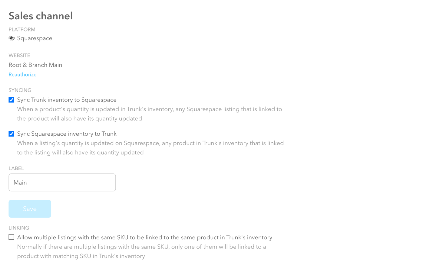
Who should try it: Anyone who sells on multiple platforms and wants to make their life easier by not having to worry about overselling on one site and erroneously looking sold out on another. If you sell bundles or kits that involve multiple SKUs, Trunk will also make sure that you have availability across all items which can help you with ordering and planning. Trunk would be perfect for the smaller online shop that needs a little help getting inventory organized but doesn’t need all the features (or expense) of something more robust like inFlow Cloud, above.
Pricing: Plans start at $35 which gets you real-time stock level syncing and low stock alerts but only 100 orders/month. Trunk does have nice incremental pricing tiers that allow for additional orders/month even on the lowest plan which is nice if you have a moderate number of orders but don’t want or need the features of the pro plan. Speaking of which, the Pro plan allows for bundling & kitting and duplicate SKU syncing which are both pretty cool features if you need them especially considering the pro plan starts at just $39/mo.
My Pick:
If you’re just needing something basic, start with Trunk. It has all the most popular sales channels and inventory-tracking features without a lot of bloat at a very reasonable price point. inFlow Cloud has more advanced features but a price tag to match - although when you’re ready for those extended capabilities I would say the higher price could be worth it.
Extensions For Print On Demand Services
If you’re an illustrator, artist, or photographer you probably want to sell custom products that feature your work but don’t want to invest in products that you’re not sure you can sell or have to worry about production and shipping. These apps take care of all those headaches to free you up to focus on your work.
Printful
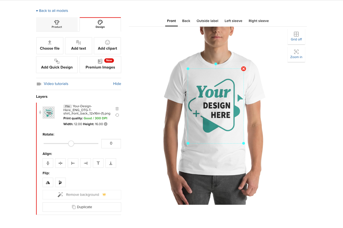
What it does: Printful allows you to sell print and embroidery products without needing to invest in inventory or manage production, fulfillment, or shipping. Just upload your designs, pick your products and you’ve got yourself a shop! Most people think of Printful for apparel like tees and sweatshirts but they also allow you to sell your own custom accessories (like hats, bags, and phone cases) and home goods (like mugs, pillows, and wall art). They also offer warehousing services if you have other items that you want to combine with your custom Printful items and you can also send them your own custom inserts like stickers or cards that they will include with all your shipments so that things look like they came right from you. Another feature I really love with Printful is their mockup generator which makes it easy to have high-quality, realistic-looking mockups that look awesome in your store!


Who should try it: Any designer, illustrator, or artist who is looking to sell custom pieces without needing to keep inventory in stock and who doesn’t want to hassle with order fulfillment or shipping. With Printful, you can create as many items as you want and adjust the pricing markup to any amount that you like.
Pricing: There is no subscription fee to sign up for Printful, you just pay the wholesale price per order placed. For example, someone places an order for a poster on your website and you charge them $39. The wholesale cost on Printful might be $9 + shipping. You pay Printful for that order and pocket the difference. So basically, you only pay when you get paid.
Printique
What it does: The premise with Printique is the same as Printful, above. They allow you to sell premium photo products while they handle all the production and white-label shipping. Printique is more art-focused than Printful so the products are things like photo books and albums, framed and unframed prints, and wall decor plus some other miscellaneous items like calendars and other little gift items.


Who should try it: Printique is perfect for professional photographers and artists who are looking for some more advanced features like being able to control how things crop for different proportions and want to be able to sell on a wide range of materials like canvas, acrylic, and wood or who are interesting in offering framed prints or photo books.
Pricing: Just like with Printful, you don’t pay Printique until you have an order so you never have to worry about paying for unsold inventory or monthly subscription fees!
My Pick:
I think both Printful and Printique are great services that allow you to start an online shop without needing to invest in inventory or worry about the hassles of shipping and fulfillment. The reason to pick one over the other is really just based on what you’re selling; go for Printful for graphic designs printed on high-quality apparel and other fun things like posters and pillows. Check out Printique if you’re selling anything with a photo like framed prints.
Dropshipping Extension
Spocket
What it does: Look, I’m going to be honest here. Dropshipping is not my jam. But this extension is on the list and I wanted to be thorough and give it a quick review. If you’re a serious drop-shipper, I would say that you may want to check out Shopify over Squarespace but if you’re just wanting to supplement your other inventory on Squarespace with a few drop-shipped products, Sprocket is the way to go! They pre-vet suppliers from across the globe and you just select the items you want to sell and they push through to your shop for purchase! They have a wide range of products and you can see a review of each seller and where the items ship from.


Who should try it: I think Spocket would work well for a Squarespace shop owner that sells their own products and is just looking to supplement with a few other items. In theory, you could run an entire Squarespace shop just filled with all drop-shipped products if you wanted! You do you!
Pricing: The Starter plan is $24/mo and allows you to include up to 25 unique products. I think that most people would want to be on the next plan up though: the Pro plan which is $49/mo. This plan allows for 250 unique products and 25 “premium” products. I read Spocket’s help documentation to try to figure out the difference between “unique” and “premium” products and TL;DR you’re gonna wanna sell premium products 😉 as these are the highest quality items with the best discounts. On the Pro plan, you also get branded invoicing, which I think would be imperative for any drop shipper to help things feel cohesive.
Bottom Line
I think there are some real winners on this list, depending on what your exact needs are. From Trunk to save you time and headaches keeping inventory in sync across all the platforms you sell on, to Printful and Printique for allowing you to sell custom products completely hands-off - there are lots of good options that will allow you to connect your Squarespace website to the tools you need to grow your business. When it comes to extensions, my biggest piece of advice is to just understand what you’re going to get and at what cost. When incorporated strategically, they can really help you take things to the next level!
Looking for more hot takes on Squarespace extensions? Be sure to check out my other MInimalist’s Guides on sales & marketing extensions and shipping extensions!

How To Set Up a Privacy Policy & Terms of Service On Your Website
There are options available for setting up the legal things required on your website (like a privacy policy and terms of service) at a range of price points. Here are my recommendations from free to high cost so that you can decide which is best for you.
Breaking Down the Options from Free to High Cost
Terms & Conditions and a Privacy Policy are some of those non-glamorous things about a website that no one ever really needs or refers to… until they need them. It’s like having a contract between two parties IRL; the purpose is just to set expectations of who is responsible for what, outlining the parameters of the relationship, and explaining what will happen in the event that your contract is breached.
When it comes to these things, I typically say there are 4 options to consider. There are low/no-cost routes that come with a little bit more risk/exposure. There are higher-paid options that are more iron-clad. You’ll need to decide which is best for you based on where your business is at now. You can always update later on as your business changes or grows.
Also, just as a reminder: I am not a lawyer and so all of the information I provide here is just based on my own experience in building hundreds of websites for clients in a wide range of industries. It is ultimately your responsibility to make sure that your site is legal and compliant with all pertinent laws. If you have any questions about privacy, GDPR, or other legal things, I am happy to give you my opinion but it should not be considered a substitute for the actual guidance of a legal professional.
Now that I’ve provided the legal fine print, here are my recommendations:
Free
Do a quick Google of “free website privacy policy” or something like that and you’ll get a bunch of results. Most of them look pretty spammy or come with a catch, naturally.
If you are using Shopify, I recommend checking out their free policy templates. If you want to check these out before signing up, just be sure to click the box to opt-out of the 14-free trial and you can have some pretty rock-solid templates sent to your inbox in seconds.

Check this box to opt out of the free trial of Shopify.
<a href="https://www.shopify.com/tools/policy-generator/terms-and-conditions" class="sqs-block-button-element--medium sqs-block-button-element" rel="sponsored" target="_blank" data-initialized="true" >Shopify Terms & Conditions Generator</a>
The biggest thing to really note on these is that they are free because they are as generic as humanly possible. They are meant to be one-size-fits-all which, just like clothing, may not actually fit you. So, caveat emptor.
Low Cost
Terms & policies are often seen as a set-it-and-forget-it type thing but laws change (often!) and when they do, you should make sure you’re up to date with the latest. My recommended low-cost option to create semi-custom policies is Termageddon. (Hint: this is where I get my own privacy policy & terms of service from.)
At just $10/mo or $99 for the year, Termageddon will make sure that you’re always legal and in compliance with all the latest security and GDPR laws. A license includes a privacy policy, terms & conditions, disclaimer, and EULA. (Note that all but the privacy polilcy are good for the US only.) You just answer some simple questions and a small snippet of code is generated that you can share with me to embed on your site. Once that’s done, you really can forget about this!
AFFILIATE BONUS: You can use my code KRISTINE for 10% off your first year!
Medium Cost

Right at the sweet spot of affordable + prepared by an actual lawyer are the templates provided by The Creative Law Shop. For the record, this is where I source all of my own contracts, agreements, and other legal templates from. I feel good knowing that a real lawyer has prepared all of the documents and that I have lifetime access to any future template updates. Although some of the templates on the site do cater to those in creative/service fields such as mine, the privacy policy and terms & conditions templates are perfect for any business. I highly recommend these if you’re looking to save money versus hiring an attorney.
AFFILIATE BONUS: You can use my code KRISTINENEIL10 for 10% off any purchase!
Website Basics Bundle (This combines both of the templates below into one bundle and saves $25 versus buying them separately.)
High Cost
Of course, there’s no substitute for the real thing so if you have a very unique business, do some really out-of-the-ordinary things with user data, or just want to make sure you’re 100% covered, hire a lawyer. Preferably one that is familiar with your business, your industry, and (most importantly) eCommerce / websites. This is obviously the highest cost option but worth talking to your attorney about especially if they are working on other contracts or agreements for you. If you get lucky, you may even find a lawyer who is willing to just review the documents you generated yourself using one of the options above which would help keep costs down. It never hurts to ask!

How To Set Up a Profitable Shipping Strategy on Squarespace
The secret to not losing your shirt (and your mind!) when it comes to shipping is to take care of both sides of the shipping equation - what your customers see and what you do behind-the-scenes. Check out this post to also find out which shipping method and shipping extension combo I recommend most!
Ah, shipping - the apparent bane of every online seller’s existence. It can sometimes feel like you’re being squeezed on shipping at both ends; customers want low/no cost while carriers seem to charge more and more at every turn.
A lot of eCommerce shop owners start looking at shipping extensions as a solution thinking that will magically take care of everything - but they only take care of half the problem. In this post, we’ll look at understanding both sides of the shipping equation and how you can optimize both. Keep reading to also find out which shipping method and shipping extension combo I recommend most!
The Shipping Equation
Shipping is just like any other product you sell in that there are two sides to the equation and both need to be taken into account to determine profitability. On one side we have what you charge your customers for shipping, on the other side what carriers are charging you. The difference between the two (if there is any) is profit.
Despite how obvious it seems, I often see online sellers ignore either one side of the equation or another. Some people set unnecessarily high shipping costs for their customers in an attempt to “recoup” what they are being charged. Others offer free shipping because they know it’s an attractive option but then don’t limit who is eligible for it and end up seeing red because of it. So, you have to take care of both sides, okay? Here’s how:
Taking Care of the Customer Side
The first side of the shipping equation is the customer side, or what you charge your customers. When it comes to setting up shipping rates on Squarespace you have a few options:
Flat Rate Shipping - charging the same cost per order, with the option to increase the cost per each additional item in the order
Rates Based on Weight - charging based on the total weight of all items in the order; requires you to input your own cost tiers
Carrier Calculated Rates - charging based on weight, dimensions, and destination address; cost is calculated automatically from the carrier(s) you choose (FedEx, UPS, or USPS)
Free Shipping (for all orders) - set up in the Shipping section as a shipping option
Free Shipping (for only certain orders) - set up in the Discounts section either as a promo code or an automatic discount based on criteria you set
From a purely cost control point of view, carrier-calculated rates appear to be the best option since you’re getting variable rates directly from the carrier you’re going to ship with. This makes you think that you’re going to be able to charge your customer exactly what you’re going to get charged but variable shipping rates can be super frustrating and off-putting to customers. Since they never know what to expect and are often surprised by what they see when they get to the checkout, this option results in super high cart abandonment rates and discourages higher dollar value orders. If we’re working through a process of elimination, I would rule out Rates Based on Weight for these same reasons.
This leaves us with flat rate shipping or a couple of free shipping options. My recommendation? Go with a combo of both!
Game Plan:
Set a per order flat rate cost that covers some nominal amount of whatever it costs you to ship your average order. Don’t worry about making it cover everything, just make it something easy. Like $5. Or $7. Or something relatively easy to stomach.
Set up an automatic free shipping discount for orders above a certain amount, ideally somewhere just north of your current average order value. You’ll be surprised at how many people choose to add just a little something to their cart in exchange for free shipping! I wouldn’t offer free shipping to just anyone though so be sure to set this up in the discount section, not the shipping section!
Why This Combo Works:

Oprah keeps it real.
People hate feeling nickel-and-dimed and love feeling like they got a deal. Offering a flat rate that will apply to orders under your free shipping threshold feels honest and transparent and ensures that shoppers won’t face any nasty surprises in their cart.
Setting up an automatic free shipping discount encourages people to spend just a little bit more while still making it easy - no coupon code required! This combo is also super easy to promote! Imagine how simple it would be to boil your shipping offerings down to something as easy as: “$5 flat rate shipping. All orders over $45 ship free, no code required!”
The Quick Case for Free Shipping
I go into all the pros and cons of free shipping in this post: eCommerce Strategy 101: Should You Offer Free Shipping? but here are some of the benefits of this for anyone with lingering doubts about how well it works as a strategy. Free shipping:
Reduces cart abandonment rates
Increases conversion rates
Boosts revenue
Increases order volume
Increases average order value
Helps attract new customers
Encourages repeat visitors
Boosts loyalty, and more!
Combined with a minimum order amount requirement and a low flat rate for any orders below that amount, you’ve got a winning combo for the customer side of our shipping equation.
Taking Care of the Merchant Side
Alright, now that we have the customer side under control it’s time to get things in order behind the scenes. Just like on the customer side, you have some options:
Set up an account with the carrier(s) directly and manage shipping on your own. I used to work in shipping and logistics and let me tell you, this is a full-time job in and of itself! If you go this route you’ll need to take care of setting up and maintaining the system that you’ll use to pull in order info, generate and print shipping labels, and then send shipping data like tracking information back to Squarespace. You’ll also be responsible for negotiating your own shipping rates which may be tough if you don’t have the order volume to use as leverage.
Manually process shipments without an account by just showing up at the post office (or FedEx/UPS store) and hoping for the best! 🙃 With this option, you still have to do all the work as the option above (manually creating labels and entering tracking information) with the additional wildcard of having absolutely no negotiating leverage and absolutely no idea of what each shipment will cost.
Use a shipping extension that will automatically pull in order data to an organized system, generate shipping labels for you and send order data back to Squarespace without you needing to lift a finger. With this option, you also get to take advantage of discounted shipping rates that have been negotiated and set up on your behalf.
I think you know what I’m going to recommend here, right? :) Using a shipping extension is a no-brainer because it saves you both time and money, working to trim down the cost of shipping on the merchant side of our shipping equation.
What Are Shipping Extensions & How Do They Work
Shipping extensions are basically apps that use the Commerce API to pull in order data to a third-party platform that takes care of all things shipping for you. Some popular Squarespace shipping extensions are ShipStation, GoShippo, ShipBob, and Easyship - see the section below for my fave!
All of the shipping extensions with native Squarespace shipping integrations work pretty much the same way. You’ll sign up for an account directly with the app you’d like to use, then sign in and connect it to your Squarespace site. When orders are placed, the order information will get automatically pulled into the extension and a shipping label will be created for you to print when you are ready to ship. Once shipped, the tracking information will get sent back to Squarespace and automatically included in a shipping confirmation email to your customer. The rates you receive will be based on whatever discount the app has negotiated with the carriers you’ve selected.
One quick note: a common misconception about shipping extensions is that connecting one to your site somehow “takes over” the shipping options that are displayed to your customers at check out. What you need to remember about shipping extensions is that they only take care of the merchant side of the equation. The time and cost savings they offer still need to be balanced out with a winning customer-facing strategy like above!
My Favorite Shipping Extension: Easyship
Knowing that all shipping extensions work in essentially the same way, how do you go about choosing one over the other? Well, let me save you the agony of starting a bunch of free trials and testing them for yourself :) My fave is Easyship. Here’s why:
As its name implies… it’s easy. Some of the other extensions have complicated user interfaces and offer a bunch of unnecessary options. Easyship has a nice, clean interface and offers just enough options to allow you to customize the experience without feeling bloated.
The discounts are great! You can check them out using their shipping rate calculator here.
They have some of the best zap triggers, including one of my favorite ones: being able to trigger an email once a package is delivered! I love getting an email when orders are delivered so that I know to be on the lookout for my packages. This is just another helpful way to extend the customer service experience beyond the sale.
If you’re interested, you can also check out this post for more on each of the shipping options: A Minimalist’s Guide to Squarespace Shipping Extensions.
Bottom Line
A profitable shipping strategy needs to take into account both sides of the shipping equation: the rates and options you offer to your customers + the service and rates charged to you from carriers. You can’t just work one side or the other, you need to pay attention to both. On the customer side, a combo of flat rate plus free shipping for orders over a strategically set amount will create happy customers and increase orders. On the merchant side, a shipping extension like EasyShip will make sure you have the best rates available and save you time and headaches when it comes to shipping and fulfillment. Win-win!

Website Tips From an eCommerce Pro
Part actionable list, part pep talk - this post has 7 tips on eCommerce, web design and websites in general from me, an eCommerce pro! These are the things that I think would make every website more engaging, more successful and just more fun to use!
If you sometimes wonder what advice an eCommerce pro would give about your website, you’re in the right place! I got to thinking the other day about the biggest things I would suggest to people about eCommerce, web design, and websites in general and I came up with this list. It’s certainly not comprehensive but I would say if you paid attention to just these 7 things you could take your site from novice to pro-level! Some are simple fixes, others are a little more abstract but I think all are totally doable!
When In Doubt, Cut It Out
I talk about this idea a bit more in this post about 3 Mistakes New Online Sellers Make but I think it bears repeating. And the good news is that it lightens your load as well! Overall, I think one of the things that really sets beginner websites apart from more professional ones is editing.
Over-explaining and providing too much information can be just as harmful as not providing enough so the key is to trim down copy and cut out the clutter. You want to inform but you also want people to be able to skim. (If you feel like you have a lot to say or tons of technical details you want to include, just make sure you have a great FAQ page to put all that info on so you can keep your main pages lean and mean.)
Keep Categories & Tags in Check
I talk about tags and categories as they pertain to shops in this post but this could also apply to your blog as well! Remember back in the day when blogs all had a ginormous sidebar with a crazy tag cloud that looked like this:

Hahahaha. Those were the days. To me, all this says is that this person had too many tags/categories! Take my blog, for example. I have only 5 major blog categories: eCommerce, Shopify, Squarespace, Web Design, and Marketing. I have one bonus category called “Kristine Neil Studio” that I use sparingly for posts that are more personal or “behind-the-scenes” type posts. I have just over a dozen tags. That’s it. Keeping things minimal has a couple of benefits: 1) it keeps me focused on creating just the content that I know works and 2) it makes it easy for readers like you 👋 to find what they are looking for!
The same principle applies to shops as blogs - in fact, it’s probably even more important there. I sometimes see shops where some products have been tagged “blue” and others “Blue”. Well, that’s not helpful (tags are case sensitive) because if I’m looking for some blue suede shoes I may miss what I’m looking for because you’ve called them Blue suede shoes. So, just keep a really refined list, don’t add tags/categories at every whim, and make sure you’re not making a ginormous tag cloud mess of things by paying attention to spelling and case.
Learn to Love (or at Least Not Loathe) a Spreadsheet
If you have a store on Squarespace (and if you’re reading this, I’m betting you do!) the fact that you can view, edit, import, and export your products via CSV file is ✨magic✨. Want to update the prices of all the products in one particular category in bulk? Spreadsheet. Need to hide everything with a certain tag? Spreadsheet. Want to adjust inventory levels without needing to open every.single.product? Spreadsheet. Check out this post for more info on CSV product imports on Squarespace.
While you’re playing with spreadsheets you can also export customer profiles and order info to a sheet which is great for creating reports or extracting data to help in your marketing or advertising efforts.
Enable & Customize Your Abandoned Cart Emails
Cart abandonment causes eCommerce businesses to lose up to $18 Billion annually so it just makes sense to enable this built-in feature of your Squarespace website and yet so many people aren’t using it! This is such a simple way to bring back some lost revenue and even if a small percentage re-convert, it can still be a nice little boost to the bottom line.
You can check out this post for more about customizing your store’s email notifications, which includes everything you need to know about how to style and update all the emails your site sends (which includes cart abandonment emails).
If you’re looking for where to turn to enable Abandoned Cart Recovery on your own Squarespace website, it’s super easy! From your home screen just go to COMMERCE > CHECKOUT > enable ABANDONED CART EMAILS > hit save! That’s it! You’re in business!
Keep Your Header Navigation Simple
Your header navigation is the links that appear at the top of your site and contrary to popular belief, it’s not actually helpful to include links to everything there. You know that saying that says “if everything is important, nothing is”... well, it definitely applies here! If you have lots of important content, it’s better to organize it strategically into folders or by linking to it from your home page or other landing pages instead of trying to include links to everything in your header.
A popular trend that I am really liking these days is a mega footer instead! People are now used to seeing just the most important links at the top of the page but love being able to scroll to the bottom of a site to see more info. This is helpful because when you first land on a site a minimalist header allows you to quickly get an understanding of where to start or how to dig deeper. Keeping your header navigation simple is also much more mobile-friendly and is just another way you can make your small business look big.
White Space is Your Friend
A couple of items above refer to keeping things minimalistic in terms of content but some of the same principles should apply to the design of your site itself. In design terms, white space is the negative space where nothing is really happening (it doesn’t have to be white) and it’s an important tool you can use to help people take in and digest the information you’re presenting in a meaningful way.
Fun fact: did you know that when I was an undergrad I spent a couple of years teaching public speaking? I found it so rewarding and it’s funny: even though a lot of people say they have a fear of public speaking, I think the more frustrating thing is feeling like you’re just not being understood. The goal was always really to help students learn to better express themselves or communicate their ideas more clearly and effectively. Some of the techniques are just learning how to breathe when speaking and using pauses to create buffers around certain content to help it stand out or make a point.
White space in design is the visual representation of the same thing. It’s the design equivalent of not speaking in onelongrunonsentence and nevertakingabreath and makingeverythingruntogether. White space is just creating room for each point to live on its own and giving some things more prominence than others with hierarchy. It’s just slowing things down a bit so it doesn’t feel frantic. Something I love about Squarespace is that it’s just naturally going to help you create sections that have nice, even borders but don’t be afraid to use things like spacer blocks or padding to give things the space they deserve. (Looking for more on this topic? Check out my Minimalist’s Guide to Branding!)
Don’t Be Afraid to Be Real!
One of the last website tips I have for you regardless of which industry you’re in or what you sell or what your website goals are: don’t be afraid to be yourself! Even if you’re a big company, letting a little personality show through is way more alluring than being too poised and polished. Of course, you’ll need to determine what level of “raw” fits with your brand voice but with so many brands online competing for limited attention, the last thing you want to do is blend into the background.
I’ve mentioned this before but I used to be a perfectionist when it came to writing blog content. I would spend DAYS writing, re-writing, and scrutinizing every post. And while I certainly don’t advocate for any deliberate typos or misspelled words, once I stopped worrying about being perfect and just writing, blogging became one of my favorite things to do. It was great that it was no longer the log jam in my business but the unintended side effect: I realized that people liked my voice. If there are some mistakes here or there, it’s a reminder that a real human is on the other side of the screen. So, just being real helped me be able to create more content but also to create content that people actually liked. Win-win!
For you, being real may be using an appropriate dash of humor or writing some really witty copy. Maybe being real is telling people what you honestly think of one product over another or not being afraid to show your face every now and again. Letting people see what’s happening behind the scenes can also help you create a more empathetic brand. Whatever it is, the most engaging brands are the ones where we can see and feel the humans behind them.

Which Squarespace Plan is Right for You?
Which Squarespace plan is best for eCommerce? It depends! But in this quick read, I break down exactly which one to go with based on your exact needs.
Updated April 2024
Like most software these days, Squarespace offers several different plans to pick from based on your exact requirements and needs. The SAAS model frustrates some people because they don’t like the idea of paying for something every month (or year) but I think it’s great! It allows much smaller businesses than ever before to have access to the same tools and resources that used to only be available to big power players. All subscriptions come with world-class technical support and Squarespace is incredibly stable and easy to use and maintain. Lots of wins! So which plan is best for you? Let’s quickly work through each option, ruling out ones that won’t work until we have a clear winner!
Plans Overview
Squarespace has four plans, two are called “website” plans and two are called “commerce” plans:
—— Website Plans ——
Personal
$16/mo (paid annually)
$25/mo (paid monthly)
Business
$23/mo (paid annually)
$36/mo (paid monthly)
—— Commerce Plans ——
Basic Commerce
$28/mo (paid annually)
$40/mo (paid monthly)
Advanced Commerce
$52/mo (paid annually)
$72/mo (paid monthly)
Looking at these options, I’m going to narrow it down really quickly to just a couple of choices for us to examine in depth.
Monthly vs. annual subscription - unless you only plan on being in business for a few months, just pay annually. It saves you up to 31% and it’s just taken care of for the year.
No business has any business being on the personal plan. It’s called personal for a reason. You can’t sell on it. You can’t add any custom code. Analytics are limited. Don’t do it.
Do the math on transaction fees. The only thing that’s somewhat misleading about the way the plans are positioned is that you can technically also sell things on the Business plan. BUT on that plan, you’ll have to pay a 3% transaction fee (in addition to your merchant processing fee). When you do the math on that, it means that if you have more than $1700 in annual sales coming in from your website that you should definitely go with one of the Commerce plans. That’s a pretty low number so we’re going to rule it out as not viable.
Alright, so pretty quickly we’ve ruled out all monthly plans and both of the Website plan options. This leaves us with either the Basic Commerce plan or Advanced Commerce plan - paid annually.
Both of these plans have all the basics in common such as no transaction fees, secure checkout on your own domain, mobile-optimized checkout, eCommerce analytics, customer accounts, and more. So really we just need to look at the features that are only available on the Advanced Commerce plan to see if those are valuable to us.
Squarespace Features Only Available on the Advanced Commerce Plan:
Subscriptions - can be either products or services that you can set up to bill on a recurring basis
Abandoned cart emails - automatically send a branded email when people don’t complete checkout to recoup lost sales
Advanced shipping tools - use real-time, carrier-calculated shipping rates from UPS, USPS, or FedEx; set up advanced shipping zones down to the Zip Code (US) or FSA level (Canada)
Advanced discounts - set up more flexible discount options including automatic discounts or limit discount usage
Commerce APIs - use the Commerce APIs to build custom integrations to connect Squarespace to anything
The Verdict
If you ask me, all of the additional options on the Advanced Commerce plan are super valuable to any serious eCommerce business. Sure, they’ll cost you an additional $14/mo but I could argue that your abandoned cart recovery alone would more than make up for that. But here’s what I would say:
Choose Basic Commerce if you’re just getting started and are in super cost-saving mode. You can switch plans at any time so you can always upgrade later. This plan is probably also sufficient for smaller sellers whose primary income isn’t generated online.
Choose Advanced Commerce if your eCommerce website is the centerpiece of your business. The advanced tools really are what’s going to help you compete most effectively and they come at a pretty reasonable premium over the Basic plan. Just like other plans, you can downgrade later if you find you’re not using the additional features to their full potential but a pro like me would 100% make sure you are!
Bonus: Use code KRISTINE10 for 10% off your Squarespace subscription.
Now that you’ve decided on a plan, finish getting started with this Step-by-Step Guide on How to Launch Your First Online Shop!

When Not to Integrate Shopify and Squarespace
Taking a look at the reasons not to integrate Shopify into Squarespace by asking some tough questions and getting really real! Learn about the 5 worst reasons to integrate these two eCommerce platforms, plus some disadvantages and alternatives to this idea.
Sometimes it’s as important to know when NOT to do something as it is to know when to do it. A lot of people ask about how to integrate a Shopify shop into a Squarespace website and there are a couple of options for this that might work well for some. But although some think this hybrid approach is going to be a “best of both worlds” solution, the actual answer to whether this is a practical solution for you depends on what you’re attempting to get out of doing so.
So, if those other posts are the argument FOR doing this (or at least letting you know that it’s possible) this post is the argument AGAINST. I just think it’s important to define both sides of the argument so that you can fully understand the pros and cons of each setup and decide for yourself which is the best route!
Why Do You Want To Do This?
Whenever someone reaches out to me asking about integrating Shopify into Squarespace, I usually reply to them with some initial questions along the lines of:
Are there features you feel like you’re missing on Squarespace that you think Shopify offers instead?
Is it because someone else told you that you should be on Shopify?
What do you really love about your current site? What’s not working?
What is the potential desired outcome of doing this? What would be your ideal?
Here’s why I ask these questions:
By digging deeper into the WHY behind wondering about integrating a Shopify store into a Squarespace website, we can get to what the real “pain points” are. Sometimes they are real issues; sometimes it’s just because someone felt like they “should” do it ¯\_(ツ)_/¯
Asking about what someone really loves about their current site also lets me know what to prioritize. This is as important as understanding the pain points because it would be horrible to fix one small problem only to have a bigger one crop up.
Keeping the desired outcome in mind allows us to focus on the bigger picture instead of nit-picking silly little details.
5 Bad Reasons for Wanting to Integrate Shopify & Squarespace
Someone told you to - this is a horrible reason to make any kind of business decision but if I had a dollar for every person who started their query with “Well so and so said I really needed to be on Shopify…” well, let’s just say I would be on a beach somewhere with a margarita right now. Honestly - are you going to let someone else armchair quarterback YOUR business?
You want to use an app from the Shopify app store - sorry to be the bearer of bad news but this isn’t going to happen. Shopify apps are NOT compatible with the Shopify Buy Button so if you’re thinking you’ll be able to use a Shopify app on your Squarespace site by doing this you’re going to be disappointed.
You think it will be “easier” to manage - LOL why? When has managing two systems ever been easier than managing one? Walk me through that. Explain it to me like I’m five.
You think the checkout experience is better on Shopify - this is a myth stranger than the existence of the Loch Ness Monster. Squarespace’s checkout experience is simple, smooth, and proven to be a highly converting experience for customers.
You want to use Shopify POS - perfect but before you go through all that work, did you know that Squarespace has a pretty awesome POS setup that’s 1) automatically connected to your website and ready to go right now 2) allows you to sell in person and collect payments via Square 3) included for free with Squarespace commerce plans and 4) super mobile friendly? (Check it out here.)
Disadvantages & Alternatives
In addition to the notes above, here are some other general disadvantages to integration:
Even though the Shopify Lite Button is only $9/mo, it’s still an additional expense that you may not need to take on. Worst yet, sometimes people end up paying the full subscription cost for both platforms and then running essentially dual platforms for no reason. Twice the cost, twice the work. No bueno.
Styling options for embedding Shopify are pretty decent but a keen eye will still be able to distinguish between what elements are native Squarespace and which aren’t. Nothing is going to compare to just using the built-in Squarespace shop and checkout options when it comes to brand consistency (fonts, colors) and style.
You should also remember that both platforms (Shopify & Squarespace) come with their unique strengths and weaknesses. As great as it would be to be able to cherry-pick just your favorite parts of each and meld them together into one “perfect” solution, that’s just not realistic. You’re still going to have pain points if you don’t address the actual issues.
Alternatives to Integration
Clearly identify what you feel isn’t working on Squarespace and fix it there. It’s honestly probably way easier to do this than bring on a whole other system as a band-aid. Chances are there are some features or elements of Squarespace that you’re just not using to their fullest potential that would make life a whole lot easier. There may also be a simple plugin or code solution to your problem that would hold up better in the long run.
If you truly must have two sites, I think using a tool like Trunk (see my review here) to sync inventory between multiple shops is often a cleaner solution than embedding. A bonus with Trunk is that you can also sync inventory with all your other sales channels like Square, Quickbooks, Faire, Etsy, or Amazon!
Sometimes what people think is a website problem is actually a business, systems, or people problem 😬 Eek, I know, right?? It’s tough to admit but true. While your website is definitely a super-powerful business tool, it’s still just one part of your ecosystem. Making a huge change with your website to avoid making a small change to your business processes or your people is short-sighted and will severely limit growth in the long run. We put a lot on our websites because we think technology can handle everything but at the end of the day, even the best website can’t make up for broken people or processes.
Bottom Line
Real talk: 9 times out of 10, I end up advising someone to just go all-in on one platform or the other. Using the Shopify Buy Button as a solution is super cool IF you need it but with so many ongoing improvements on the Squarespace commerce front, I think those specific use cases are becoming fewer and farther between.
Integrating seems like it’s going to be the “best of both worlds” solution BUT it also means that you’ll always end up feeling like you’re dividing your attention between your “website” and your “shop.” And really, you want your website and your shop to be united and cohesive; when it comes to eCommerce, they definitely should be one and the same.
You know I love a minimalist solution that keeps things as simple as possible so instead of dividing and conquering, I would just choose the best tool for the job from the get-go and focus on getting the most out of it as possible.
p.s. If you’re wondering what tool I think is best check out this post: What eCommerce Platform am I Recommending Most These Days!

Using Squarespace as Your CRM, Part 2: Crash Course on Updated Member Profiles
Learn how to view, understand and manage your relationships with your website visitors and customers using Squarespace Profiles. Armed with the right information and some key strategies, you’ll be able to more effectively grow your business and communicate more effectively.
I love checking out my blog’s analytics because it tells me what you are interested in learning and one of my most popular past blog posts is this one all about using Squarespace as your CRM. There have been quite a few notable updates and improvements to how customers are managed and organized so I thought an updated version was called for! All of the info in the original post is still possible, but it’s pretty quick and surface-level compared to this deep dive. Check out that post for an overview of CRM-like activities you can take on Squarespace and then come back to this post for a crash course on how to take things to the next level!
When it comes to eCommerce, there’s lots of info out there about things like pricing, shipping, inventory, and marketing but less on what really matters: customers! One of the great things about Squarespace is that it offers one place where you can see everything about your customers, mailing list subscribers, and members or donors so that you can really dig into how people are engaging with your brand.
The built-in tools in the Squarespace Profiles panel are so powerful but I think they are probably underutilized by most shop owners. In this post, we’ll dig into the details so that you can learn how to view, understand and manage your relationships with your website visitors and customers. Armed with the right information and strategies, you’ll be able to more effectively grow your business. Let’s dig in!
How to Get There & Main Panel Overview
From the home menu > PROFILES. From here you can choose to see everyone all lumped together in one list, or filter the view to see just subscribers, customers, members, or donors. Keep in mind that some people can be subscribers but not yet be customers and vice versa. You can also see on the main list who has opted in to receive marketing from you and who has created an account on your site without needing to click into anyone’s individual profile. (One thing to note throughout this post is that all info about “subscribers” assumes that you use Squarespace Email Campaigns, which you can learn more about in this post.)
Individual Profiles
Each person who has interacted with your site in one of the following ways automatically gets a profile created for them:
They make a purchase of any kind (regular product, subscription product, membership, etc.)
They create an account
They sign up for one or more of your mailing lists
They opt-in to receive marketing messages from you
They make a donation
If you click on someone’s name, you’ll get into their individual profile. This contains the following info:
Name
Email Address
An overview of engagement with your site
Tags
Notes
From inside an individual profile, you can also click on the customer or subscriber cards to get more details.
Customer Details

The Customer Details card
For people who have bought from you, a Customer Details card will be visible in their profile.
Clicking into it will show you the following info:
Total amount spent
Date of their last order
Average order amount
Total number of orders
Last addressed used
Default payment method (if they have one)
A listing of all their orders, which is clickable through to the Orders panel where you can do things like mark orders as fulfilled, resend notifications, add specific order notes, etc. (For more on what you can do there, check out this post.)
Note: if you are using Member Areas, anyone who purchases a membership will also show up as a customer! This is helpful to know because you can technically then access this person on both your “Customer” and your “Members” lists; they are just going to give you a different look at the same interaction. The Member Details card contains their membership status, the date they first became a member, how many member areas they have access to, and a list of exactly which member areas those are.
Subscriber Details
If people are subscribers, their profile will include a card just like the Customer Details card above except this one will drill into details like:
Subscriber status
How long they’ve been a subscriber
How many lists they are subscribed to
Exactly which lists they are subscribed to
From this panel, you can also manually unsubscribe someone from any of the lists they are subscribed to by clicking REMOVE.
Profile Notes
For each profile, you have the ability to add private, internal notes so just to be super clear your customers cannot see your notes!! Like I said above, you also have the ability to add notes in the Orders panel so, in order to keep things organized, you’ll want to determine for your business when notes should be added to specific orders and when they should be added to the whole profile.
For example, if a customer emailed and asked for a certain order to be left with their neighbor because they weren’t going to be home for delivery -- order note. If the same customer included some specific delivery info such as gate instructions or to always leave packages in a certain location -- profile note. Make sense?
Notes are helpful especially if you’re working with a team and want to log interactions or other info that might be helpful to document for reference later on. The thing about notes though is that they are not searchable and you can only see them by intentionally clicking into the specific profile or order info. For this reason, some things that you may want to include as notes would actually be better off as tags!
Tags
Think of tags as quick notes that many different customers, subscribers, or members have in common. These are attributes that can help you organize profiles, analyze trends, and drill into specific niches in your audience. Tags are also searchable (more on that below)!
You’ll want to use tags instead of notes any time you’re thinking about putting someone into a group along with others. So, say you have a subset of your customers that are social media influencers. You could definitely add a note to their profile indicating as such but this would be lost data. You would have no way of pulling together everyone onto one list that contained a similar note. But you could do this by adding a simple “influencer” tag!
Other ideas for tags are things like:
VIP tag - for people who are your best customers, spend the most, have placed the most orders, or have been around the longest, etc.
Tags based on preferences - for example, you could create a tag for each of your product lines or for specific brands and tag based on what customers like
Tags based on customer info - you could create a tag for each month of the year and tag customers based on their birthday month
Tags based on dates - for example, a tag for all members who signed up for a specific membership before or after a certain date
Remember that just like notes, tags aren’t visible to customers in any way!
Creating Filtered Searches
Here’s where the magic really happens and where all of the above starts to come together! With filtered searches, you’ll really start to see the power of Squarespace to help you have more insight into your audience and also better communicate with them. Filtering narrows down your list so that only see people who fit certain parameters.
Filter By Tag
One of the most obvious ways to filter your list is by tag because tags are already a way that you’ve set up as important to your business.
Filter By Other Criteria
Squarespace has provided a super robust range of built-in filters that you can use for segmentation. Here’s an overview of all the things you can filter your list by drilling down to just very specific profiles:
Whether someone has an account or not
Subscriber details:
Whether they’ve agreed to accept marketing or not
By specific mailing list
By subscriber date (users who subscribed either before or after a selected date)
Customer details:
Customers who’ve spent a specific minimum or maximum amount over their customer lifetime
Number of orders (max or min)
By last order date (customers who ordered either before or after a selected date)
By how long they’ve been a customer (either before or after a selected date)
Member details:
By specific member areas
By how long they’ve been a member (either before or after a selected date)
Combine Factors for Super Specific Searches!
Getting fancy here but you can combine any number of the factors above to create super specific segments. For example, if you want to just see people who are tagged that they love XYZ brand and haven’t ordered in a while you can do that. If you want a list of only your biggest spenders who have also opted in to receive marketing messages AND who have a May birthday? Go wild.
Creating Saved Segments from Searches
Being able to filter your list down by all sorts of criteria for your casual browsing pleasure is fun and all but before you can do anything with the info, you’ll need to save the search as a segment. When you’re satisfied with the list you’ve created by applying all the filters you want, just click on Save Segment and give it a name. Now you can refer back to it quickly any time you want and use it as the basis for email campaigns or other marketing or reporting activities.
Hint: Something to keep in mind is that if you choose a profile type (i.e. just Subscribers or Customers) in the left panel before applying search filters, the resulting segment will only include users of that type. For example, if you click on subscribers and then filter down and click Save Segment, the segment will only ever show Subscribers. This may be your intention but if not, be sure to always start your searches from the “All” list.
How to Put This Info to Work
Up until this point, sifting through all this user data has just been for you. But when you’re ready to start thinking about how to put this info to work, here’s how!
In one of my hypothetical examples above, I mentioned the idea of creating a tag for each month of the year and tagging customers based on birthday month (you could use a simple form to gather this info). As each month approaches, you could create a Saved Segment for that month, create a special coupon code and then send them a special birthday offer!
You have two options for how to do this:
Squarespace has made it super easy to jump right into drafting an email campaign where recipients will just be people that are in that segment by clicking the Create Campaign button.
If you don’t use Squarespace Email Campaigns, you can also export your profile info as a CSV and then use Google Sheets to manipulate your list and import it into your own email marketing platform.
I’m hoping that this crash course has you thinking of how you can grow your email list, cultivate your relationships with customers and build your brand by creating super-specialized content that’s catered to each of your saved segments!
Squarespace Profile FAQs
-
Nope - they are there as a record of the activity of each unique email address on your site.
-
Not unless they have more than one email address. It’s a user’s email address that is used to link everything together: account info, order info, subscriber info, etc. That being said if a customer placed an order with a different email address than they used to previously sign up for your email newsletter that would result in two different profiles.
-
250 (that’s a lot!) - I would recommend not having more than you could reasonably scan through. Maybe a dozen or so max?
-
Split answer: Right now you are not yet able to auto-tag customers :( I’m hoping this will be a feature that is added soon! However, you can add or update other profile information automatically using the Squarespace Commerce API. More on that here!
-
Users that create accounts and purchase a membership are automatically tagged by Squarespace as “accepts marketing.” Members of free member areas will be sent an automated opt-in confirmation after signing up that they will need to click on to confirm that they want to receive emails from you.
-
People who are customers through Squarespace Scheduling are not pulled into the Profiles panel. However, you can manage customers, set up automated emails, and do similar CRM-like activities for scheduling customers from within the Scheduling area. For more info on this, check out this post: How to Use Squarespace Scheduling as an eCommerce Tool
-
In addition to being able to view and manage customers from the Profiles panel you can also see some customer info in the Squarespace Commerce mobile app. Check out this post for 5 Squarespace Commerce App Tips & Tricks!

What eCommerce Platform am I Recommending Most These Days?
A behind-the-scenes look at which eCommerce website platform I am endorsing most these days and what factors cause my recommendations to change from time to time.
This post was inspired by some questions I’ve received lately from past clients and subscribers to my weekly eCommerce newsletter. A lot of these are folks who’ve been around for a while, even some from way back in the day when I ran a design agency where I was the creative director and project manager on hundreds of website projects. We’ve built relationships over the years and they’ve stuck with me as we’ve all grown and our businesses (and the world!) have changed.
The questions I often get are things like:
“When we worked together a few years ago you had originally recommended X and I guess it works okay. Do you still think it’s a good fit?”
“I read that you thought that X was better at {{insert feature here}} than Y but I thought it used to be the other way around. What gives?”
“Are you no longer recommending XYZ? I think I read this on your blog somewhere?!”
“If your recommendations change, how can I feel confident making a decision about what to go with now? What if something happens and you no longer recommend it?! I can’t decide what to do! Help!”
That last one is more from newer clients than old ones, but still - a totally valid question! And, look, I get it and I agree with how confusing it can all be! The world of technology changes super fast and what’s in one day can quickly be out the next. For you, the small business owner just trying to find your way online, it can sometimes cause things like analysis paralysis, decision fatigue, and even a fair case of buyer’s remorse. These are all also totally valid feelings.
Oddly, the exact thing that drives a lot of clients nuts is probably what I love most about my job. I love trying out all the new technology and learning new ways to continue to improve things for you. So, think of me like your little technology guinea pig; I’ve tried it all so you don’t have to :)
In this post, I’m going to give you a rundown of what website platforms I’ve used and recommended over the years. (I built my first full-fledged eCommerce website way back in the early 2000s so it’s quite the history!) Then, I’m pulling back the curtain and letting you in on some of the behind-the-scenes factors for why my recommendations change from time to time. Finally, I’m revealing which platform I am without a doubt, definitively giving my stamp of approval to most these days. Let’s go!!
The History
(A Very Rough, Somewhat Incomplete Timeline of What Platforms I’ve Used & Recommended Over The Years, In Order of Preference)
2002 - WordPress
2011 - (1) Wix (2) Weebly (3) Squarespace 5
2012 - (1)Squarespace 6 (2) Wix
2015 - Squarespace 7
2017 - (1) Squarespace 7 (Distant 2nd) Shopify
2018 - (1) Squarespace 7 (Distant 2nd) Shopify (Distant 3rd) Webflow
2020 - (1) Squarespace 7.0 / 7.1 (2) Shopify (3) BigCommerce
2021 - (1) Squarespace 7.1 (Distant 2nd) Shopify
As you can see, I’ve dabbled in them all. Some platforms, like WordPress, stuck around for a long time but have been outdated since the late aughts as far as I’m concerned. Other platforms, like Webflow, seemed kinda cool when I first tried them out but didn’t have much staying power, and for one reason or another and I quickly ruled them out as viable options. Squarespace has had my heart the most over the past 10-ish years although there have been others (namely Shopify and BigCommerce) that I have used and recommended recently.
Why My Recommendations Change
Changing economic conditions - 2020 was HUGE for eCommerce and has shifted things perhaps forever. So many factors here as you can imagine including what small businesses need in order to be competitive online and what price point makes they can afford.
Change is Good - I always want to recommend the best and that can fluctuate over time. If you check out my super rough timeline, I may have recommended WordPress to you in 2008. Sorry about that but it was a good call at the time! Change is good and I never want to feel stuck in a lane just because it’s “what’s always been done.” It’s a lot of work to stay up to date on all the latest technology and trends but it’s worth it to make sure I’m not just recommending something because it used to be the best choice.
It’s my prerogative - lol this last point is rather selfish, I’ll admit. But 40-year old me is willing to niche down into what I like to do in a way younger me would have been afraid to. It’s my prerogative to only take on certain projects or prefer working on one platform over another. I try to be as objective as possible and offer as much info as I can so you can decide for yourself what is best, but I obviously have my own opinions. While this means that my solutions are not going to be the best for everyone - a fact that I’m perfectly ok with - it’s worth noting that there's definitely a platform that I personally enjoy working on more than others.
What I’m Recommending Most These Days
DRUMROLL. These days, I am recommending Squarespace the most. Hands down. It’s true, we’ve had our ups and downs but this is the eCommerce platform I end up recommending for the majority of business owners I talk with. Here are the 3 biggest reasons why Squarespace is what I recommend for eCommerce in 2021:
I realized that the grass isn't always greener - remember, I work on website stuff all day every day so sometimes various platforms look exciting because they are new or different. But tried-and-true wins out over shiny and new! I’ve had some projects that I’ve built on *other* platforms that I’ve actually ended up regretting for various reasons and wished I would have just stuck with Squarespace. Luckily, you can learn from my mistakes!
I honed in on who my audience is to tailor my suggestions for them - large or even mid-market brands have way different needs from a website platform than small businesses and startups (the latter being my core audience). I put out a quiz for a while about whether you should use Squarespace or Shopify and after tons of responses, I started seeing some very significant trends in what people need and are looking for and Squarespace is clearly the best fit for the majority of them. (Depending on which metric I look at, between 80-98% of respondents are the best fit for Squarespace over Shopify based on their business needs - that’s huge!)
Squarespace has been rolling out eCommerce & platform improvements like crazy - basically eliminating the pain points that pros like me were feeling (they do listen and respond to what we ask for!). I want to always recommend the best and for a while, Squarespace was honestly lagging a bit on the eCommerce front. I can confidently say this is no longer the case! Some specific updates Squarespace has made that are my most favorite:
Improved management of product variations in the updated product composer
Increase in product limits per store page from 200 -> 10,000
Addition of nested navigation (subcategories) in the shop
Addition of Afterpay as a payment option
Updated member profile management
Squarespace Scheduling as an eCommerce tool
There are other, more fundamental aspects that I also think are better but the items above are commerce-specific. For more on what I love about Squarespace check out here and here!
Answering the big questions:
“If your recommendations change, how can I feel confident making a decision about what to go with now? What if something happens and you no longer recommend it?! Help!”
The honest answer here is that even though it seems like a MAJOR decision at the time that your website is more than the platform it’s built on. So you pick what’s the best today and be willing to change if it’s no longer working in time. I know that can be hard to hear when it seems like such a huge investment but technology changes fast and your business needs will be different in just a couple of years anyway. Squarespace is the frontrunner for me these days and if/when that changes, you’ll be the first to know!
“Do you still also use and recommend Shopify?”
Short answer: yes! Shopify is a great eCommerce platform and I always believe in choosing the best tool for the job. Sometimes that will be Shopify, sometimes it will be Squarespace, sometimes it will be something else completely! Here’s what I’ve experienced lately with Shopify though: clients moving there from Squarespace are quickly realizing that in terms of design freedom, ability to customize anything they want and not end up with a thousand paid plugins that the grass wasn’t greener in Shopify land. Shopify is very customizable - IF you know how to code and you have the budget for it.
The thing about advanced customizations on Squarespace is that a pro like me can help you get all those set up in the beginning but then you’ll be able to manage your site on your own from there. On Shopify, you may find yourself needing tech support for even simple things like creating landing pages or updating plugins; this is something that I’ve found discouraging to small business owners who would prefer to manage day-to-day updates on their own. There are certain types of shops and industries that 100% need to be on Shopify. They just need to understand all that comes with that, especially if they are moving from an environment like Squarespace where they’re used to a different level of freedom.

How to Choose an eCommerce Merchant Processor
Taking a look at what factors to consider when choosing a payment processor, including what options are available on both Squarespace and Shopify. Not sure which way to go? Check out my recommendations for either platform!
I wish there was an internet version of putting the first dollar you earn in a little picture frame and hanging it behind the cash register. I actually Googled why people do this and it basically boils down to wanting to have a little reminder of everything they put in to build their business, or as a way to honor their first customer or to motivate them that there is a pot of gold at the end of the rainbow. (The pot of gold is getting paid.)
Online businesses don’t seem to have a similar ritual - maybe because we get paid in digital money versus paper bills? In any event, how you get paid is actually an important decision as it can determine how much you net or even your conversion rates. Choosing how you’re going to get paid may not be as glamorous as framing a dollar bill but it’s definitely just as significant.
Factors to Consider
Is it a native integration or a third-party merchant?
How easy is it to sign up and get started?
How fast is the checkout process?
Do you have to sign a contract?
What are the fees?
Where are you located and/or where are your customers located?
Options
On Squarespace
Stripe
PayPal
Apple Pay (via Stripe)
Afterpay - must be on one of the Commerce plans and also use Stripe
Square - for in-person payments through Squarespace POS
On Shopify
Shopify Payments (includes ShopPay, Apple Pay, and Google Pay)
PayPal
Accelerated Checkouts (i.e. Amazon Pay)
Third-Party Providers (varies by country, includes things like Stripe, Affirm, authorize.net, Klarna, and Quickbooks Payments)
Alternative Payments (i.e. cryptocurrencies like BitPay)
Manual Payments (such as COD, bank transfer, email money transfer, etc.)
My Recommendation(s)
Some merchants make the mistake of setting up too many payment options because they think that more options = a better experience. This is wrong. Sure, if given the choice I might choose to use Apple Pay but I’m not going to NOT check out if it’s not an option; I’ll just choose my next favorite thing.
If you’re trying to decide between Squarespace and Shopify…
I honestly wouldn’t let the fact that Shopify has more options overall be the tiebreaker in looking at it over Squarespace. There are many more important considerations that should drive you to one over the other. That being said, if you’re in a country that has limited access to PayPal or Stripe you may just have more choice on Shopify. For merchants in the US and Canada, I would say this is kind of a draw as both have the most popular options available.
If you’re already committed to a platform…
Getting Paid On Squarespace - I would recommend Stripe. It takes just a few minutes to set up, the rates are competitive and processing is fast and simple. Since you’re using Stripe, go ahead and enable Apple Pay too. IF you want to offer a “Buy Now, Pay Later” option, you can also enable AfterPay with Stripe but read this post first to decide if it’s really for you: Should You Offer “Buy Now, Pay Later” Options on Your eCommerce Website? I don’t really recommend PayPal unless your audience just really seems to prefer it because it’s a pain to have to manage to transfer in/out of PayPal to your bank in addition to adding processing time before you actually have access to your funds.
Getting Paid on Shopify - Just go with Shopify Payments, which is Shopify’s built-in merchant processor. It’s fast to set up and makes getting started super easy and painless. If you’re on the Basic Shopify plan, the rates are the same as Stripe (2.9% + 30¢ USD) and the rates go down the higher plan you are on. Because Shopify Payments already includes the most popular accelerated checkouts (ShopPay, Apple Pay, and Google Pay) I would only recommend adding in a Buy Now, Pay Later option as an alternative (see link above for more on this!). Other options are nice for international sellers but I wouldn’t recommend them for US or Canadian merchants.
There you go! My recommendations on how to choose an eCommerce merchant processor! If you’re just getting started, you may also want to check out this quick guide to getting started with your first eCommerce site.

How to Connect Squarespace to Anything
Learn how to connect Squarespace to pretty much any other app you use for your ecommerce business - without needing to pay for or manage a bunch of random third-party apps!
This is probably going to be one of the more “techie” blog posts I’ve written recently but I’m going to put a giant disclaimer right here upfront: DON’T BE DISCOURAGED BY TECHNOLOGY! Once you learn how things work, even in general, the mystery kind of falls away and even if you don’t want to take on any of the nitty-gritty yourself you will at least know what’s possible! Because if you’re running an eCommerce business on Squarespace, knowing stuff like this is GAME CHANGER status. First, some background!
One of the reasons people seem to think they need to go with Shopify over Squarespace is because they see an app they like from the Shopify app store. And I can see why - there are tons of shiny apps there that seem like they are going to be revolutionary for your business. A few problems I have:
It’s way too easy to fall into needing 3-5 paid Shopify apps and even if you’re only paying a few bucks a month for each, those subscriptions can add up to major $$$ each month.
Not all apps play nice with each other and adding a bunch of random apps can add a ton of unnecessary bloat to your site. This can cause bugs or problems that Shopify isn’t responsible to help you fix since they are caused by third-party apps.
If you’re using the Shopify Lite Button to connect Shopify with Squarespace, you can’t use any apps at all anyways since they are just straight-up incompatible. So there you go.
You know that I’m a huge fan of a highly functioning site AKA one that works as hard for your business as you do. This is exactly why I rely on Squarespace Commerce APIs to strategically add capabilities to my beautiful Squarespace websites without the need for apps or bloat. In this post, I’m going to give you a 30,000-foot view of how this works, how to get started and some ideas on how to connect Squarespace to pretty much anything else. Because, as the title suggests, with Squarespace Commerce APIs you can do ANYTHING your little heart desires.
How APIs Work
Simple answer: APIs are just the way different apps talk to one another. Each software has data/information that it can send in response to a request for that information from another app or software. Each software (like Squarespace) determines what information it will make available and sets the parameters for how to inquire about it.
I think of it kind of like this (using Squarespace commerce as an example): your site has tons of info about who ordered what and when, whether things have shipped and how, how you were paid, etc. And without asking any questions, that information is mostly just stuck in Squarespace. BUT all that data is there and available to you - if you know to ask for it. And (here’s the fun part) you can use that information in all sorts of behind-the-scenes aspects of your eCommerce business. From marketing campaigns to fulfillment and logistics, using the data your site has stored up for you to automatically inform/trigger other actions is magic.
The last cool thing about APIs is that now that you’ve got systems talking to one another, you can do more than just ask for information -- you can also PROVIDE information! This means you can do things like telling Squarespace you shipped an order or to adjust a stock level automatically after receiving a shipment of inventory. 🤯
Webhooks
So, where an API is a request for information that demands a response, a webhook is more passive; waiting for the information to roll out. One is a push and the other is a pull. A webhook is basically like when you sign up to get notified about when something comes back into stock. Sure, you could ask every day: Is it in yet? Is it in yet? Is it in yet?... but with a webhook, you can just sit back and wait. You’ll get the news when there’s news to share.
Zapier
A Lot of people start zoning out when it comes to APIs/webhooks because they see things like this and just say NOPE 🙅♀️

But remember what I said at the beginning of this post? You are not going to let strange-looking code freak you out! Why? Because you have Zapier. There’s a reason why the tagline is “Zapier makes you happier” and it’s not just to help you remember how to pronounce it. :)
Zapier basically takes what can otherwise be a little overwhelming (code!) and turns it into simple formulas AKA zaps. Each formula (zap) contains one trigger and at least one action. The trigger is the catalyst that sets the whole rest of the chain in motion and the action is the thing (or chain of things) you want to happen. Zapier makes it easy to piece together all the bits and pieces all your apps require to talk to one another and gives the conversation a home.
Most people love Zapier because all their favorite services (like Squarespace) have built-in triggers or actions that make setting up zaps crazy simple. You can literally just pick from the list, fill in the blanks and you’re in action.
But let’s check out the built-in options for Squarespace:

Boo :( Just one trigger - and a kinda boring one at that: new form submission. I mean, this is helpful for some marketing activities and can help you get subscriber info into other apps (more on my favorite tech stacks here) but beyond that, it’s kind of MEH.
This is where just even having a basic understanding of APIs and webhooks comes into play. Because now that we know that there’s info there and we just need to either know to ask for it or to sign up to get notified about it, Zapier can help us connect Squarespace to literally ANYTHING-even if there aren’t any built-in triggers or actions for us to choose from. The trick is the unassuming-looking Webhooks by Zapier integration which can be set up to kick off a workflow or send info as a result of another trigger.
Now, I will admit that this is where things can get a bit technical but just a reminder: the goal here is that I think it’s important that you know what’s possible, even if setting it up yourself isn’t your jam. Just understanding that you can connect Squarespace to whatever email marketing platform you want, or that you can automate parts of your fulfillment process, or that you can connect your website to your CRM or project management software is what matters.
✅ It’s important to know that just because Zapier shows only one measly built-in trigger that you’re not limited to just that.
✅ It’s important to know you shouldn’t rule out Squarespace as a super-powerful commerce solution just because there isn’t a native integration between it and your other favorite apps.
✅ It’s important that you feel empowered to explore out-of-the-box solutions for your Squarespace eCommerce business with confidence.
The Squarespace Commerce APIs
Ok. So. The first half of this post was pretty heavy-duty. You learned a lot. You got a little pep talk. You’re (hopefully) ready to explore just all you can do to connect Squarespace to whatever other apps you’re using in your business. Enter: the Squarespace Commerce APIs. This is where Squarespace tells us exactly what information is available to us and what information we can edit ourselves from outside the platform.
Remember, just like above, some things push for info, others pull. Some things are triggers, others actions. If you dig into the API documentation you’ll see that slightly different words are used for these: GET and POST. This is just the API way of saying push or pull. A GET is a request for information, a POST is a depositing of information.
In the sections below, I’m going to give an overview of all the different triggers and actions you can set up in Zapier so that you know what’s possible! Hopefully, it will help you start to see just how powerful Squarespace commerce can be and get your mind thinking about ways to connect and integrate it into your own workflows.
Inventory API
What it does: Allows you to access and/or edit stock information for products + product variations on your site
What you can do:
Retrieve all inventory
Retrieve specific inventory
Adjust stock quantities
Ideas:
Automatically pull inventory into a spreadsheet so you can manage things like stock levels or product availability without needing to go item-by-item on your site
Automatically adjust stock quantities based on incoming shipments or sales through other channels
Orders API
What it does: Allows you to access the order history for your site, including both one-time orders and recurring orders/subscriptions.
What you can do:
Create an order
Fulfill an order
Retrieve all orders
Retrieve a specific order
Ideas:
Import orders from other sites or sales channels, mark orders as fulfilled, and then trigger shipment notifications through Squarespace.
Automatically mark orders as fulfilled when you mark them as done in your project management system
Pull all pending orders into a spreadsheet so you can have a list of what needs to get shipped out that day
Lookup order info and pull it into your CRM automatically so that you can instantly see the status and details of what people ordered when chatting with them
Products API
What it does: Allows you to manage your products and product variations. You can also manage product images and add/delete/modify products.
What you can do:
Create a product
Create a product variant
Upload a product image
Retrieve all store pages
Retrieve all products
Retrieve specific products
Product image upload status
Assign a product image to a variant
Reorder a product image
Update a product
Update a product variant
Update a product image
Delete a product
Delete a product variant
Delete a product image
Ideas:
Manage product info in bulk from a spreadsheet
Automatically adjust pricing for specific products or shop categories without needing to open each product and/or product variant in Squarespace
Automatically delete products that are discontinued or no longer available
Update product images after a new photoshoot in bulk
Profiles API
What it does: Allows you to manage site users
What you can do:
Retrieve all profiles
Retrieve specific profiles
Create or update a profile
Update a profile
Ideas:
Pull all site user information into a spreadsheet for analysis or reporting
Lookup specific user profile information and add it to your CRM so that you can automatically see things like how long they’ve been a customer, how many total orders they’ve placed, and how much they’ve spent over their lifetime.
Automatically update a Squarespace user profile to indicate that they’ve opted out of receiving marketing emails in a third-party email marketing platform to make sure you’re complying with anti-SPAM laws.
Transactions API
What it does: Allows you to access transaction history for orders (or donations) on your site
What you can do:
Retrieve all transactions
Retrieve specific transactions
Ideas:
Automatically pull all transaction history before or after a certain date into a spreadsheet for analysis or reporting
Create a backup of transaction history for auditing purposes
Webhook Subscriptions API
What it does: Allows you to subscribe to notifications from your site with webhooks.
What you can do:
Create a webhook subscription
Update a webhook subscription
Retrieve all webhook subscriptions
Retrieve a specific webhook subscription
Delete a webhook subscription
Send test notification
Rotate a subscription secret
Ideas:
Automatically send notifications to production any time a new order comes in
Automatically send a notification to management any time an order is updated
Automatically receive a notification any time a Squarespace extension is uninstalled from your site
Bottom Line
As I’ve said a few times now, the point of this kinda technical post is really just to let you know what’s possible with Squarespace. I’ve seen a lot of shop owners choose Shopify over Squarespace just to take advantage of slick-looking apps only to be frustrated by mounting monthly subscription costs and let down by a bloated, disjointed experience managing everything. Even if it’s not your ambition to understand exactly how APIs and webhooks work, my hope is that learning just a bit about these things can help you feel empowered to make more informed decisions when it comes to your business website.
If You Want to Learn Zapier
I’ve used Zapier casually for many years but last year decided that I really wanted to dig deeper because I knew I wasn’t using the tool to its fullest potential. I’m kinda obsessed with productivity and automation so learning more about Zapier was really fun and helped me be able to explore some of the more technical aspects with confidence. I 100% attribute this to taking Jimmy Rose’s Zapier Mastery course.
Of all the online courses I’ve taken over the years, this one has offered the best ROI by far. Jimmy explains things in an easy-to-understand way and uses lots of examples that help bring the concepts to life. The course link above is an affiliate link but this post is by no means sponsored by Jimmy; I just thought I’d give it a shout-out because if you’re also interested in learning more about Zapier, it’s definitely worth checking out. If you’re looking for some more on this topic you can also check out this other post of mine: Fun With Zapier for eCommerce!

15 Things to Update on Your eCommerce Website
This post features 15 actionable tips and tools to make sure you’re getting the most out of your eCommerce website. Updated from my previous series with tools & strategies to help small businesses cope with COVID, these are strategies you can use now and in the future.
I originally wrote a variation of this post as a series around the beginning of COVID. I was feeling somewhat hopeless and didn’t know what else to do but try to come up with all the ideas I could to help businesses that were struggling and just trying to find their footing online. As we settle into a new normal (one where eCommerce reigns supreme) I thought it was time to run through those old posts and pick out my favorite tips - plus a few new ones!
These are all actionable things that you can do yourself on your eCommerce website. Some of these tips are improvements that will just take you a few minutes to set up (#11 Display Limited Availability Labels), others are a little more long-form (#4 Work on Your Website’s SEO)... but all of these are things that will help you make sure you’re getting the most out of your eCommerce site on Squarespace.
1. Keep Customers in the Loop with Email Newsletters
Email Marketing Use email newsletters to directly inform customers and drive sales. With Squarespace Email Campaigns, beautifully designed and personalized emails are made simple.
Best practices include:
Send a monthly newsletter with promotions and new product highlights
Make signup frictionless with opt-in forms across your site
Customize coupon codes and product recommendations using customer data
Craft compelling subject lines that get opened
Test layouts, content types and timing to see what best resonates
Set up automated post-purchase and win-back flows
Email is your owned digital real estate. Use it to build relationships and boost repeat business from current customers.
2. Set Up Pinterest Rich Pins
Pinterest is pretty much the only “social media” platform I actively participate in as a business and that’s because it’s not really a social media platform at all - it’s a search engine! People are on Pinterest every day to find new things to try and research purchases so you should definitely make sure that this is part of your marketing strategy.
Taking just a little time to make sure your domain is verified will make sure that all pins from your domain are Rich Pins - making them full of data like price and links right to your shop, blog, or site!

3. Add an Announcement Bar
This is that little blurb or strip at the top of your site that can be used to communicate news, sales, discounts, or even just changes in business operations - like if your business hours are variable right now or you’re closed for a holiday. I would keep whatever you put in your announcement bar short and sweet! If you have a lot to say, link the announcement bar to a full page instead of trying to cram a fat note in a little space (Tommy Boy reference for the win)!

4. Work on your site’s SEO
SEO is definitely a long game situation and not something that you’re going to be able to see the results of tomorrow or even next week. But, if you keep working at it I promise your efforts will pay off - no special plugins or hacks required! If you want to learn more about eCommerce SEO, check out this post on my site all about it. Otherwise, the link below from Squarespace support has a pretty awesome checklist of all the things that you can be working on to make sure your site is getting noticed by search engines and humans alike!
5. Create Trackable Links
If you’re setting up ads on platforms like Facebook, Google, Instagram, YouTube, etc. there’s a tool from Squarespace that you probably didn’t know would make it so much easier to track your efforts! Using the Squarespace URL builder you can create unique tracking links so that in your analytics you can see cool stuff like how many visitors came from each ad and how much revenue was generated. This can really help you plan your advertising more strategically since you’ll be able to make more informed decisions about what’s resonating with your audience and performing well.
6. Create a Promotional Pop-Up
Love ‘em or hate ‘em - pop-ups can be effective when done right! The key is to switch it up often so that people don’t get fatigued by seeing the same thing all the time. You also don’t want to have a pop-up just for pop-up’s sake. Make sure the content you’re showing really needs to be in your face. It can also pay off to be more strategic about using a pop-up only when you have super cool stuff - like a sale or promo. Those links are much more clickable than repeated requests to sign up for your mailing list 😊

7. Sell Online Gift Cards
This is such an easy way to allow people to buy from you and lots of people are still in the habit of buying gift cards to use for themselves as a way to show support for their favorite small businesses. Gift cards are easy to set up on Squarespace and redeeming them is as simple as entering a coupon code!

8. Add Product Waitlists
If you have a product that isn’t quite ready for sale -- or one that’s been sold old that you want to allow people to be notified of when it’s back in stock -- product waitlists on Squarespace are for you! This system is pretty cool and automatic and it’s just based on the inventory count levels you set up - another reason to make sure your inventory counts are accurate in Squarespace. The one confusion that I see people often have with this is that it’s confused as a backorder system but this doesn’t actually process an order from the customer, just allows them to sign up to be notified when a product becomes available or is back in stock. They then have to visit the site again to make the actual purchase.

9. Mark a Product as Sold Out
This can go hand-in-hand with the tip above but the reason why I mention it separately is that it’s worth noting that you can modify that “sold out” label to say anything you want! So, if that wording doesn’t really vibe with what you’re selling or how your site works you can change it. For example, if you sell unique items that only have one quantity available for each changing the label so it just says “Sold” makes more sense than “sold out”. You could also make it say something like “Workshop Full” or “Coming Soon!” - whatever works for you!
10. Have a Sale
When you’re looking to drum up some fresh eyes on your brand, go with one of the oldest tricks in the book - have a sale! The best sales are planned strategically well in advance and the Squarespace help article linked below does a great job at laying out all the built-in tools at your disposal. You can also check out this post all about coupons, offers, discounts, and promos if you’re wanting to really dig into some of the deeper pricing strategy and buyer psychology behind sales and discounts.

11. Display Limited Availability Labels
Effectively merchandising your online store is an ongoing process but using tools like limited availability labels is a great quick win! These call outs can create a sense of urgency and encourage customers to not put off purchases. If you’re looking for another way to highlight products, check out this plugin created by yours truly over on Ghost Plugins! It involves a little bit of cut-and-paste code so that you can highlight any products you’ve tagged as featured.

12. Display Related Products
This tool offers two different opportunities to win. The first is obvious: helping people to discover more products that you offer that they might want to purchase. The second: keeping people clicking and on your site increases the length of time people spend on your site which is great for your SEO, even if they don’t end up buying anything. Something I like about this feature in Squarespace is that you can set up the related products for each product independently, so if it makes sense for one product to only show more products that are in the same category but another to show products in a related category - go wild!
13. Add a Scheduler to Your Site
I recently wrote a post all about how Squarespace Scheduling is the secret eCommerce tool you’re probably not using yet. (Check it out here!) The hidden power of this feature is that it is nearly infinitely customizable to fit any business type; you don’t need to use it to just set up Zoom meetings 😂 You can use Scheduling to set up in-store shopping appointments, sell tickets to workshops, create packages of services and more.
14. Train a Chatbot
A chatbot powered by LiveChat enables you to simulate real conversations to provide customer support, product info, and promotional offers around the clock. Rather than staffing live chat yourself, you can create conversational chatbot flows to engage site visitors.
For example, your chatbot can answer frequently asked questions about shipping, sizing, returns and more. It can also proactively reach out to start discussions, send coupon codes, get feedback through surveys, and capture email signups, leading to more sales. With predefined responses andredirects to human agents when needed, your customers get quick answers and you recoup hours previously spent managing live chat.
Key benefits of investing time in chatbot training include reduced strain on your customer service team, the ability to capture leads and promote 24/7 regardless of your real-life availability, and hyper personalized 1-on-1 conversations. LiveChat seamlessly integrates with Squarespace too, making setup a breeze.
Don't let your store go silent when you walk away. Implement a chatbot to keep quality conversations with customers going around the clock and drive more conversions.
15. Set Up Curbside or In-Store Pickup
I go into complete detail on how to set up in-store and curbside pickup on either Squarespace or Shopify in this post and also give some tips and caveats to keep in mind. Adding this as a “shipping” option can help your customers see your website and your physical location as related parts of the same business - which is a great thing! Traffic online can lead to traffic in-store and vice versa. Also, offering free local pickup can be a great way for your business to compete since it means people can get their hands on your products faster and cheaper than buying from someone else online.


3 Features of a High Functioning eCommerce Website
The key to a successful eCommerce business? Building on a platform that does more than just manage a storefront. Learn more about my favorite Squarespace features that turn your average website into an eCommerce powerhouse.
Oh, if only all it took was having a great website. It would definitely make my job easier. I could just make pretty things all day without a care in the world about how things worked, or integrated with the rest of your business, or just functioned in general. But we all know that pretty ≠ high functioning. Yes, it definitely takes more than a great website to run a successful business.
Here’s the problem that I have though: typically increasing a website’s functionality - basically how well it serves your business - usually requires adding more tools. Tools to help strategize and improve user experience, tools to help communicate and manage, tools to ship and schedule and socialize. My minimalist heart just breaks a little sometimes when it requires 1,001 apps and subscriptions to download and sign up for -- just to get simple things done.
As small business owners flock to eCommerce in record-breaking droves, I think it’s more important than ever to consider platforms that can offer simple solutions for all parts of a business. A website, like the cheese, does not stand alone.
Best Solution: Squarespace
Listen, Squarespace is like the all-inclusive resort of website platforms. And trust me on this because over the last 20 years I’ve tried and used them allllll. There are some naysayers out there that say Squarespace isn’t where to be for eCommerce but I call BS. When it comes to a platform that just works, and that has all the tools and capabilities built-in, Squarespace beats out all of the others hands down. (Related: Squarespace or Shopify: Which eCommerce platform is best?)
The biggest reason I cast my vote for Squarespace in this category is that it’s so important that your eCommerce website doesn’t just have eCommerce capabilities. You need to be able to tend to things like design, marketing, analytics, and accounting. You need to be able to manage the parts of your business that extend beyond your website and you need to be able to do them as seamlessly and efficiently as possible.
Not convinced that you can consolidate your business software and make life simpler by choosing Squarespace? Here are three of my favorite Squarespace functions and the other apps they can replace:
Campaigns
Replaces: Third-party email marketing platforms like MailChimp, Flodesk, ConvertKit, or MailerLite.
What It Does: Campaigns allows you to build and manage mailing lists and create visually stunning emails and newsletters that match the style of your site. And because they’re connected inside Squarespace, Campaigns makes it crazy simple to put together emails that feature items from your shop and/or blog! You can even create automated emails to follow up after purchase and welcome new subscribers with a coupon code or send targeted emails to customers based on their interactions with your site.
Learn More: You can add a Campaign subscription to your existing Squarespace site by just going to MARKETING > EMAIL CAMPAIGNS. That’s it. If you’re not ready to subscribe to a plan, there’s no charge to just build your list and you can send your first three email campaigns for free.
Member Areas
Replaces: Apps and software like MemberSpace or Memberful, some learning tools like Teachable or Thinkific, or other “all-in-one” platforms like Podia.
What It Does: This feature from Squarespace is a literal game-changer. It allows you to create members-only content that is either free or paid. Sharing your expertise through gated content like a “members only” area or with an e-course is one of the most rapidly growing segments of eCommerce and people love learning new things online directly from experts! Member Areas can handle recurring billing for things that are ongoing memberships and even allows your users to manage their own accounts and subscriptions so that you can focus on creating content instead of being an admin.
Learn More: I did a quick review of the Squarespace membership feature here. If you’re looking to give this a try, you can enable it on your existing site just by going to SETTINGS > MEMBER AREAS and toggling it on. You’ll need to take care of a few eCommerce settings before you can sell access to any content but it’s a pretty easy process and it’s built right in alongside the pages and tools you’re already used to using in Squarespace.
Scheduling
Replaces: Online scheduling apps like Calendly, Square Appointments, Acuity, or those offered by other platforms like Dubsado or Honeybook.
What It Does: Squarespace Scheduling allows customers to make appointments with you but, honestly, that just scratches the surface! You can also allow people to book group classes, sell packages and gift cards, set up subscriptions, and automatically set up Zoom meetings. You can also send custom reminder emails or follow-up text messages and even gather information via intake forms. I’ve found that this tool is almost infinitely customizable to fit any type of business especially because they allow you to change the language of the buttons and booking pages so that everything is perfectly personalized for your business! There are some clients I’ve had that use Scheduling exclusively as an “eCommerce” solution for their service-based businesses which I think is so smart!
Learn More: To get started with Squarespace Scheduling, just click on the “Scheduling” link from the home screen. If for some reason it’s not in the list of available items, you can turn to add it so that it’s easy to access by going to SETTINGS > ADVANCED > MENU SHORTCUTS and toggling the Scheduling one on. There are lots of features to this powerful tool but if you’re setting Scheduling up for the first time, Squarespace has super helpful tips and a checklist to help you get started.
Remember: Less is More
When it comes to the best eCommerce website platforms, you have to look at your needs beyond just having a storefront. There are so many other aspects to running a successful online business that are just as, if not more, important. How your website looks and functions, including how easy it is for you to access the tools and features you need every day, can make or break your experience. Set yourself up for success by building on a platform that has everything you need built right in from the start and be leery of platforms that may seem to do eCommerce better but make it difficult to do anything else.

The Best eCommerce Templates for Squarespace
Selecting a Squarespace template is easy if you know what to look for and how things work. In this post, I’m also shouting out my favorite free and paid Squarespace template for eCommerce!
In my recent post all about what it costs to start an eCommerce website in 2021, I touched on one of the bigger variables: your website template. And it’s not just the actual Squarespace template cost that you need to consider when deciding which one to go with; it’s important to factor in how closely the template design is to your vision for the finished look & feel of your site as that will impact the time and resources needed to get there, whether on your own by hiring a designer/developer to work on things for you. On Squarespace, you have the option of choosing one of the built-in templates or buying one from a third-party seller. I’ll break down the pros and cons including some of my faves in each category! If you’re looking for more on how to decide or what to look for in a template, definitely check out this post as well: How to Pick the Right Squarespace Template for Your eCommerce Site.
Built-In Templates
As I’ve mentioned before one of the strongest selling points of Squarespace is that the templates are all modern-looking and stylish (and free!). Another bonus is that all templates have the same functionality so you can’t really go wrong by choosing one and then making changes later. I still think it’s worth it though to select a strong contender from the start to save time and money in the long run and help you be able to launch faster. Check out the details for my three favorite built-in Squarespace templates for eCommerce!

Crosby
What I like:
Don’t let the darkness of Crosby dissuade you from selecting it for your eCommerce site! Colors are super easy to change! The reason why I think this is one of the better starting point templates for eCommerce is because I just love the home page layout! I love that you get an overview of everything followed by links to some popular shop categories. I like that it’s both informational (links to blog posts) and transactional (gift cards!). It’s nicely organized and would be easy to customize to suit pretty much any type of shop.
What I would add/change:
I would definitely add some shop categories and a filter to the shop page so that people can drill into the exact items they’re looking for faster. I also hate dead ends on websites (I know that this is just a demo, but still!) - so I would make sure that all the non-shop pages like the blog and the About pages all have links to relevant areas of the shop to keep people moving in the right direction.

Almar
What I like:
Almar is just clean and fun right out of the box! The “Get Started” page the demo has would make a great home page layout for a service-based business or shop with only a few items. If you had a larger store, adding links to the home page to shop categories or sections with summary blocks of new products would be a great way to tell your story + get people shopping. I also like that there is a consistent and clear call-to-action: booking a free 30 minute call. For a more traditional take, this could become a link to your most popular product(s) or a special offer that you’d like to highlight.
What I would add/change:
I’m not a fan of vague-ly titled web pages so I would definitely rename the “You” page to something more clear and direct. If this was the site for a real shop, I would also make sure that the contact page has a form on it since that’s an important feature for online shoppers. I would also be sure to add an FAQ page since those are invaluable to an eCommerce website!

Myhra
What I like:
The Myhra template is a hidden gem! It really showcases all that a small business owner can do on their Squarespace website; the fictitious Myhra offers coaching and consulting, online courses, live events and has an interesting blog! She could definitely add a little shop of food-related merchandise and I’d be a customer 😂 What I think is really working here is that the navigation makes it so easy to see all that is offered at a glance and even though there are lots of options and ways to interact with this site, I’m not overwhelmed at all.
What I would add/change:
I would turn the blog categories for the seasonal recipes and menus into clickable filters so that people could easily find, say, all fall recipes with blueberries, for example. If this site had a shop I would also make sure to feature products from the shop in each of the posts and then link to them with product blocks. I also love that when I land on each of the pages for things like Services and Coaching that I can see all the options but it might be even better to also add the individual offerings to a drop down menu so that a user could jump to them right to them instead of having to click twice.
Third-Party Templates
If you’re looking for a little more style and something that’s kind of a “step-up” from having to work on making the most of a standard template yourself, it may be worth it to invest in a paid Squarespace template. There are lots of people out there selling Squarespace templates these days and with most templates well under the $500 mark, this is an economical option if you’re not able to go all-in with a dedicated web designer.
Of all the options out there, I think it’s important to choose one that has an established reputation and provides great customer service. I recommend either GoLiveHQ or Ghost Plugins because they win on both of these fronts. GoLiveHQ templates tend to be a little more feminine/playful in style and Ghost is a little more modern/trendy.
Both work in pretty much the same way; upon purchase, your chosen template will be installed into your Squarespace account as a new trial site. You don’t have to watch hours of training videos, understand how to code, or need to be super techy to make the most of them… although just like with standard Squarespace templates, I would definitely recommend making tweaks as needed to suit your brand and make your site unique. You’d be surprised how just some easy style updates via the built-in Squarespace style editor to colors and fonts will help make your site feel like you! Here are some of my faves!

Club Collective by GoLive
What I like:
This template would go so well with Squarespace’s new Member Areas feature! It’s got some of the signature GoLiveHQ style but I think it could still be easily customized to fit a different theme or color palette and look just as good! The interesting thing about this template is that it’s really just a one-pager - every except the “Get Started” page is just a section on the home page that’s linked to in the top navigation. This is a great idea if you only have one signature product or call-to-action that you need to focus on since it just drives everyone right down all the main info they need without even needing to click! I also really like the “pricing table” section on the homepage! If you have a more traditional “shop” this template may not be for you but I think it’s got great style and structure for a modern, service-based business owner looking to sell a membership or course.
What I would add/change:
I would pay attention to how long the top navigation words/phrases are since they stack onto a second line when I view the demo on my laptop and that kinda drives the organizational freak in me a little nuts 🙃 Beyond that, I would really just focus on making sure all the unique backgrounds and graphics scale well on mobile since that can be one of the tricks to making sure this type of design works for all users.

Mint by Ghost Plugins
What I like:
This template perfectly shows how to take an average Squarespace template and bump up the design factor big time with a little CSS and some creative layouts. The demo is set up to showcase a shop with just a few signature products or subscriptions but it would work just as well for a shop with more products that also wanted room to tell their brand story with a little flair. I especially love the contact page layout because it combines typical contact info plus some room for FAQs - such a great idea! Another strong point is the super organized footer - web visitors are used to heading to that space to find all the links!
What I would add/change:
There’s not a lot I would change about the general page layouts (unless the content just called for something different, of course!) but I can understand how if you’re checking this template out you might be concerned about the graphic dot background and some of the color/gradients that are used because they’re definitely not a match for everyone’s brand! Luckily, these are both super easy swaps - the dots are just an image background and the gradient can be controlled with CSS or removed if that’s just not your style.
Save 10% off any Ghost template with discount code: KRISTINENEIL

Harvest by Ghost Plugins
What I like:
This is a Squarespace template that does not look like a Squarespace template! I just love its style and TBH I would totally dine at this restaurant! 😋 It takes advantage of some current web design trends that will make your restaurant, cafe, or local shop really stand out: bold typography, bright color blocking, and some unique elements like the vertical navigation on the side. I also really like the way the template handles a brand with multiple locations - they’re organized nicely in the footer and have a great dedicated page for them as well. The primary call to action is clear (book a table!) but the secondary actions like connecting on social media are also inviting. My final favorite thing about this Squarespace template is that the menus are super engaging; digital menus are a trend that is NOT going anywhere and they are guaranteed to be mobile friendly!
What I would add/change:
In the real-life version of this site, I would work to build out the menus even more. I love the idea of the menu items having photos so I would just make dedicated pages that are similar in layout to the one they use in the demo version for all the different areas of my menu. The only other thing I would possibly add is a secondary button to the top for ordering online - these are both important CTAs and online ordering is an awesome feature to be able to highlight!
Save 10% off any Ghost template with discount code: KRISTINENEIL
Final Thoughts
Takeaways: you can’t really go wrong with any of the free templates offered by Squarespace. They all look great and offer the same functions and features. You may need to pay a little more to have a web designer or developer help you get the most out of one of the designs. If you’re looking for something even more unique and are looking to cut down development time and costs, try a paid template from a trusted source like one of those I mentioned above. This can be a great compromise between a fully unique design and a generic template and get you to launch day quickly!

UX Lessons From a Former Sign Designer
Trying to figure out how to communicate with your website visitors in the simplest way possible, minimizing confusion and boosting sales along the way? Take some lessons from real world wayfinding sign design and apply them to your website!
Fun fact: in a previous life before working in eCommerce web design full time, I owned a design studio and also a print shop. One of the things we did a lot of was wayfinding signage or signs that are used to provide direction. To me, a successful wayfinding design was always about finding a way to communicate in the simplest way possible, using the fewest number of words and without any complicated elements that needed more than about 0.3 seconds to understand. So, basically, it was the analog version of a great website! 😂
Finding your way online can be just as confusing as rolling up to a major intersection or trying to find your way into a big building you’re visiting for the first time. And in many instances, it can actually be even harder without the built world to lean on to guide the way. Below, three UX web design tips that I’ve gleaned from the world of sign design:
Assume Everyone is Lost
If everyone already knew their way around we wouldn’t have signs with street names or directories in building lobbies. We put those things there because it’s best practice to just assume that everyone is lost and provide direction accordingly. This is just standard practice in the real world but often missing online.
This is because when it comes to web design we don’t always treat our users the way we should: basically, like lost tourists. We’re familiar with our business/website content and the context so we assume it’s going to be immediately apparent to everyone else, too. Ever land on a website and wonder… “Wait? What are they trying to tell/sell me here?” You were a victim of someone else’s inability to show you the way. To prevent doing the same to your visitors, solicit feedback from people unfamiliar with your business/industry/website and see if they can accurately relay your mission. Can they identify the #1 call to action? Can they find their way to do whatever it is you’re asking them to do?
You can also help lost visitors by creating clear navigation areas and providing plenty of opportunities to get help if they need it. Keep menus simple and add hierarchy when it helps prioritize content instead of just adding unnecessary clicks. Add product tags & categories to all your products and incorporate links to them in your navigation and shop. Incorporate clear contact info or add a live chat bubble to the lower right corner so when in doubt people can just get in touch.
Understand That People Just Want To Be Reassured
I often told my clients that even in situations where they thought a sign would be too obvious that they couldn’t go wrong by putting one up. Sure, it may seem redundant or a little like overkill… but people want to feel reassured. They want to know that they are in the right place and doing the right things. They don’t want to worry or feel uncertain and confused.
Online, we need to provide even more reassurance than IRL and there are lots of subtle ways that you can build trust and boost confidence on your eCommerce website. (Check out this post for my top recommendations!) More than anything, I think it’s important to use clear language and provide clarity about what’s going to happen with each action you’re asking users to take. For example, if clicking on a button opens up a form make the button say… wait for it... Open Form. Call your blog a “blog” and your shop a “shop.” It’s not time to be cutesy and rename those things your “diary” and the “boutique.” People want to know what’s going to happen when they click on something and being opaque about the outcome does nothing but sink conversion rates.
Be Empathetic
This may encompass everything above but it’s such an important point that it’s worth standing on its own. When it comes to building a more empathetic online brand, there are several lessons we can learn from real-world wayfinding. Physical signage tends to take into account things like how far away a sign will be viewed and what external factors might affect comprehension. For example, when designing a billboard for the side of a busy freeway, we take into account the speeds drivers are moving at and try to account for how to communicate effectively to them while still allowing them to safely operate a moving vehicle.
Online shoppers and website users require similar levels of empathy; they may be viewing our sites while also keeping an eye on the kids or searching for solutions to a distracting problem. Let’s just hope they’re not also trying to drive down the freeway at 70mph though! 😨 In all seriousness, remember at minimum that people don’t read the internet, they skim it. Help visitors who are busy and probably multitasking to find what they need without having to filter through a bunch of fluff. Simple isn’t just a design aesthetic, it’s a specific design choice; one that’s made to improve user experience with the added benefit of optimizing conversion rates. Win-win!
Final Thoughts
If you’re getting feedback that your site is confusing or people aren’t clear on what you’re offering, listen to them! You would never have a brick-and-mortar store and not put up signs letting people know where to enter or how to order. It seems obvious in real life to provide direction and guidance to visitors. Treating your website with the same level of detail will make for happier customers and higher sales. Assume that everyone is new, knows nothing and that you have literal seconds to help reassure them. Adding some digital “wayfinding” signage to your eCommerce website will go a long way to help get everyone pointed in the right direction in style.