

Notes on building smarter websites for actual humans.

Why I Love Squarespace for eCommerce
Proving that some things really do get better with age, Squarespace’s latest platform offers all the eCommerce features you need plus the design freedom you want. This post covers the highlights of Squarespace versus other platforms, Squarespace 7.0 versus 7.1, and tips for when it’s time to give your site an update.
I’ve been building eCommerce sites since the early 2000s and Squarespace sites since the mid-aughts so it’s safe to say that I’ve used pretty much every web design platform and tool out there and been through plenty of updates on all of them. In the tech world, it’s pretty easy to get left in the dust; things evolve fast and you have to adapt to stay relevant.
I’ll be honest, Squarespace did go through some awkward early teenage years but it’s really turning out to be aging like fine wine. In 2020, Squarespace launched its latest version of the platform - Squarespace 7.1 - and dare I say it’s the best one yet. If you’ve been at the eCommerce game for a while you may have been convinced that Squarespace was just a mediocre option but buckle up - here’s why it’s turning out to be the best of the bunch and why I love it not just for beautiful websites but awesome eCommerce sites.
Squarespace eCommerce Features
If you’re starting from scratch, you’re likely comparing Squarespace to other commerce platforms such as Shopify. Here are the standout features & differences:
You can sell literally anything. Products, services, subscriptions, appointments, digital content, memberships, and more… online, or in person.
No need to rely on third-party apps or plugins. The features, capabilities, and tools you need are just built right in. Examples: abandoned cart recovery, discount codes, gift cards, membership areas, related products, and product merchandising tools are all just standard features on Squarespace.
It’s secure and stable. With secure checkout on every device, you never have to worry about your customer’s data. Squarespace is PCI compliant and SSL-enabled right out of the box.
It’s an all-in-one platform that can handle everything you need. eCommerce life is just easier with everything under one roof including things like email marketing, SEO, order management, customer service, sales tax, and shipping tools.
Every single page is customizable. Other commerce platforms give you some options to personalize a home page layout but not much else without knowing how to code. With Squarespace, it’s easy to create a consistent and professional site that feels like you through and through.
Why Squarespace 7.1 is Awesome
You can have unlimited products per store “page”. On Squarespace 7.0, even though there’s no limit to the number of products you can add to your site overall, you’re limited to 200 products per Product page. This means that a lot of store owners had to come up with hacky ways to divide products up into lots of different shop pages, creating not just a nightmare mess on the back end but an impossible way for shoppers to fully see everything offered. On Squarespace 7.1, you only need one Store page because the limit is 10,000 products.
Subcategories & nested menus. I mean, this feature alone is worthy of being a standalone item on this list. Being able to create nested subcategories in your online shop makes it infinitely easier for customers to shop, browse, and discover all you have to offer. This is a game-changing feature over the flat shop hierarchy on 7.0.
Improved page editing, more flexible page layouts, and way more design freedom. Because all templates on 7.1 are just jumping-off points and include all of the exact same features, you’re not limited by the template you initially choose. In 7.0, selecting the wrong template from the start means you either have to live with its limitations or recreate your entire site when you invariably hit a roadblock. Bonus: on Squarespace 7.1, all pages are super customizable. You don’t have to choose between index pages or regular pages or gallery pages 🤷♀️ - they're all just pages and you can do anything and everything you want on them. You can even add additional content to store & product pages!
Improved mobile design. On Squarespace 7.1 your design will adapt to mobile devices and smaller browser windows automatically. There’s no need to tinker with separate mobile styling or worrying that what looks good on desktop is going to look disastrous on mobile. Again, it all just magically works.
It’s time to launch or switch your eCommerce site to Squarespace 7.1
Bonus: How often should you update your website?
Trick question because I think that you should always be updating your website :) but how often should you completely overhaul your website? Like, tear it down and build it back up again? Different people will tell you different things but for me, the rules are pretty simple:
If your products or services change? Update.
If your branding or messaging changes? Update.
If it’s been 3 years since your last big overhaul? Update.
That’s it. Pretty simple. Also, keep in mind that an update doesn’t have to be huge. If you’re on Squarespace 7.0, just moving to Squarespace 7.1 will make things feel fresh and modern even if you keep a lot of the same content and structure. And just like moving IRL, a new website is a great time to clean out old junk and start clean again!

How to Upsell & Cross-Sell on Your Online Store
Learn the ins and outs of these classic selling strategies so that you can boost customer lifetime value without becoming a sleazeball salesman. Discover when and how to upsell and cross-sell effectively along with tips for selling on both Shopify & Squarespace.
Updated Feb 2022
Ok, starting off with the elephant in the room which is that sometimes talking about selling can feel kind of icky. I mean, are you or are you not envisioning a used car salesman just thinking about it?! 😂 But selling doesn’t have to feel scammy! In fact, when done right, your customers will feel like they received some personal recommendations on products or services that were right for them… AND you’ll get a little boost in average order value. Win-win.
In this post, you’ll learn the differences between two selling mainstays: upselling and cross-selling. We’ll cover when and how to go for it and look at some tips & strategies for these sales techniques on Squarespace. Let’s go!
Step 1: What is upselling and how is cross-selling different?
At its most basic, upselling is selling to someone who was already going to buy from you and it only sounds silly if you think that it’s going to be easier to sell to someone new than someone who’s already added to their cart. (Hint: it’s not.)
Studies have shown that existing customers are way easier to speak to than new ones because they’ve already expressed that they like you or your products or your mission or whatever. When we look at the numbers while you have only a 5-20% chance of selling to someone new, your odds jump to 60-70% with a repeat customer. Even better, first-time buyers are 27% likely to return, but after their second or third purchase, this grows to 54%!
All of this may lead you to believe that upselling is where it’s at but I say not really.
Example: Let’s pretend that I’ve decided to buy Widget A from you. I’ve presumably done this because I like the product, and you’ve convinced me that it’s going to solve one of my problems, and also that you’re a legitimate business that I should give my money to. In a classic upsell scenario, you would then say something like “Hey, don’t you really like Widget B better?? It’s only X more and does all these other cool things.”
Here’s where the wheels start to fall off: classic upselling breeds doubt. If all your copy and social proof and marketing prowess have convinced me to buy Widget A only to turn around and tell me that it’s actually an inferior product to Widget B I can only think one of two things; either 1) I can’t trust myself to suss out what’s best for me and make a decision on my own or 2) you lied to me about the awesomeness of Widget A. It feels like a bait and switch.
The last thing we want to do when people have successfully added something to their cart is to give them any reason at all to not complete the purchase. Upselling done wrong can actually increase cart abandonment because it will force people to go back and rethink their decision to buy.
Enter: the Cross-Sell. In our pretend scenario above, an effective cross-sell would recognize that I added Widget A to my cart and suggest other, complementary items that I might also like. Cross-sells feel like a good friend making a recommendation: “Hey, you like this thing? You may also like that thing too!”
All of this isn’t to say that upsells aren’t an effective option but there’s an art to knowing how to do them well!
Step 2: Should you offer options before or after the sale?
Most merchants start to think about upselling and cross-selling opportunities as a way to increase their average order value (AOV). They understand that it’s going to be easier to sell a little more to an existing customer than a lot more to a new one. But here’s the surprise twist that maybe we all didn’t see coming: upsells and cross-sells don’t have to happen before (or even at the same time) as the original purchase 🤯
The secret is that focusing on just AOV is a short game. The AOV point-of-view says, “just sell them as much as possible right now.”
Focusing on Customer Lifetime Value (LTV) is a long game. The LTV point-of-view says, “this sale is the beginning of a beautiful friendship.”
There’s a place for both but here are some tips:
Consider the value - Upsells before purchase work great for low-risk/low-value items. A good rule of thumb is to keep offers at about 25% of the original order value for the highest success rate.
Not everything is an offer - Displaying “related items” on a product page should be considered navigational (helping people discover new products) more than transactional (trying to sell them those things in addition to the item they are currently viewing)
Make it worth their while - Sweeten post-purchase offers by including a discounted complementary product or free gifts with purchase.
Make sure things make sense - If you sell a range of products, don’t offer random upsells. They should make sense and “go with” the original purchase so that it feels personalized and not spammy.
The conversation doesn’t stop once an order is placed! - Sure, you can include upsell or cross-sell offers directly after adding to the cart or after a successful checkout but don’t think that those are your only options! Continue the conversation by email. Send a note asking how they are liking their purchase after delivery and include some other things they may want to check out. Email marketing is a great way to facilitate a more personal relationship with customers and keep you top of mind.
Step 3: How to Not Be a Sleazeball
Ok, I mean I hate to even have to include this section but you start talking sales and some people just turn into a telemarketer, you know? 🤣 Some of these practices are also so prevalent that some people think that using them must work so why not give them a go? (Hint: not everyone on the internet plays nice and some people really are out to swindle you.)
Here’s are some good UX tips to keep in mind:
Make it easy for people to nope out - If you’re going for a pre-purchase offer, make it super easy for people to say no. Don’t hide the “X” or “Skip/Close” options or obscure them with low contrast colors or odd placements. This will just frustrate people and could cost you the sale altogether.
Don’t add things to the cart automatically!!! - There’s a certain web hosting company that rhymes with DoGaddy that does this and as much as I love them, I feel like I’m playing a game of whack-a-mole every time I buy something. They have a sneaky way of adding unnecessary “add-ons” to your cart that you have to be on guard for and then manually delete. I don’t think any of you good people would ever do this but still, it deserved a call out.
Be honest - Describe your products honestly and accurately. If a certain product is priced lower than other items in that category, explain why. If you don’t do this, your upsell product positions the first item as subpar which makes your whole offer seem suspect and may make people wonder why you would even consider selling an inferior product. Maybe the cheaper product is great for X but not for Y. Maybe you were able to source it directly from the maker. The less expensive item may be a good fit for some of your customers (otherwise you wouldn’t be selling it, right?) - so be honest about its qualities and attributes so that it’s still seen as a good option.
Step 4: Selling Apps & Tools To Check Out!
Here are some pre-purchase and in-cart upsell options for use on Squarespace:
Squarespace Upsell Page Plugin - The best plugin that I use often on client sites and recommend is this one from Ghost Plugins. Note that it says it works on 7.0 sites but I have used it on 7.1 sites and it works just as well!
Related Products on Squarespace - If you’re on either of the Squarespace Commerce plans, turn on Related Products! (HOME > COMMERCE > RELATED PRODUCTS). By default, the related products section uses the product's first category and then displays up to 5 products from that same category. I think this default makes the most sense but you can also change this on a product-by-product basis from the Options tab of the product editor. Check out this post for more about product categories: How to Use Product Tags & Categories on Squarespace
eCommerce Email Marketing - Coded options aside, both the built-in Squarespace Campaigns and the Squarespace Commerce API offer ways to tag people based on what they’ve purchased. Use this data to your advantage and send automated follow-up emails that are personalized and tailored to each customer.
Bottom Line
While you probably started reading this post with the idea of increasing your sales and average order sizes in mind, remember that it’s important to consider customer experience and relationships first and foremost. Remember, you’re going for LTV! You can pitch as many products as you want but it’s hard to turn things around once you annoy and confuse people. Consider what makes the most sense for where customers are on their journey with you and tailor solutions to them that make your recommendations feel like nothing more than a good friend telling you about something you might like because they just know you that well.

How Small Businesses Can Compete With Amazon on Shipping
Using all the tools, technology, and resources available, you can offer a premium shipping experience without seeing red. Combined with some simple pricing strategies, your small business can ship as smart as the big guys and create happy, loyal customers in the process.
As a small business, there are lots of things you can do better than the big guys. You can offer more personalized service. You can pivot quickly to respond to trends. You really understand your specific niche or demographic. One thing that’s not the easiest? Competing with big-box retailers or online giants like Amazon when it comes to shipping. Amazon Prime has trained all of us to expect deliveries fast and (almost) free... and it means that smaller retailers need to find ways to offer similar options. Or at least the illusion of them :) Here are 5 tips and ideas on how to optimize your shipping processes, lower costs, and improve your bottom line.
1. Use the free tools available to you!
Almost every carrier (UPS, FedEx, and USPS) offer some free boxes. Not only does this eliminate the need to buy your own packaging but can save you money on shipping, too! Shipping providers are optimized to use the standard size boxes they offer and often charge more for other shapes or sizes. So, as cute as a custom printed box is, it could be worth it to focus on what’s inside instead (branded tissue paper or inserts, for example) and just use the standard or flat rate boxes offered by your carrier of choice.
2. Set shipping tiers strategically.
Consumers are hesitant to pay for shipping but will often gladly spend the same amount to get their cart above a minimum requirement in order to get it for free. Paradoxically, people are often willing to pay extra for express shipping methods to guarantee a faster delivery. So how do you use this little bit of odd buyer psychology to your advantage? Set your shipping tiers strategically. For example, offer free ground shipping - but only on orders over $X. Then, offer an upgrade option to express delivery for $Y. The result will be higher average cart values (people spending more in order to get “free” shipping), or people spending more AND paying a premium for faster delivery.
3. Bake the cost of shipping into your products.
This one always seems to rub merchants the wrong way but I’m telling you this works! Abandoned cart data everywhere shows us that people bail out the second they see your sky-high shipping rates. The solution? Just bake those costs right into the cost of your products. Instead of selling something for $24 plus $12 shipping, make it $36 + free shipping. Or $30 + $5 flat rate shipping. The psychology here is that paying for a product has value (you get something in exchange for your money) but paying for shipping feels like a loss (you’re just paying to get the good you already paid for). I think the biggest mistake I see smaller merchants make is feeling like they need to pass on all of their business expenses to customers outright. That’s like going out to dinner and getting charged to use a fork and knife ☠ No one wants to see how the sausage is made.
4. Use a shipping extension like Easyship!
The reason the big guys can offer free or low-cost shipping is because of the sheer volume of shipments they send out. They’ve negotiated with carriers to get their rates way down and also have high-tech fulfillment centers to make sure every step of the shipping process is as optimized as possible. But even if your fulfillment center looks more like your laptop + a roll of packing tape, using a shipping extension like Easyship can be your secret weapon. It’s the #1 way to make sure you’re in the best position to compete with the Amazons and Walmarts of the world.
How does Easyship work?
Short version: they negotiate with 100s of couriers all over the world on your behalf giving you enough purchasing power to take advantage of discounts of up to 70% off retail. The cloud-based software then automates everything: you can compare shipping quotes, create rules or filters for different products or countries, generate and print shipping labels, schedule pickups, and monitor everything from one simple dashboard. You can also offer a branded shipment tracking page for your clients which can help boost buyer confidence and reduce time spent responding to customer service inquiries.
Even if you ship just a few shipments each month, a shipping extension like Easyship is a no-brainer just for the time savings alone! It’s also the winner for me when it comes to easy automations with Zapier. I love it when I get an email the second a package is delivered!
Bottom Line
Using all the tools, technology, and resources available, you can offer a premium shipping experience without seeing red. Combined with some simple pricing strategies, your small business can ship as smart as the big guys and create happy, loyal customers in the process.

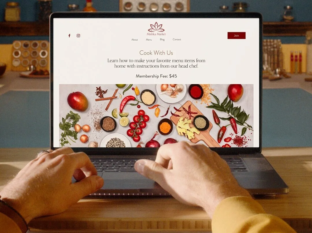
Feature Review: Squarespace Member Areas
When it comes to setting up gated or members-only content (whether free or paid), I’ve tried nearly all of them but the one I'm most excited about (and will probably solely recommend in the future) is the newest Squarespace feature: Member Areas!
So Squarespace just keeps coming with the eCommerce improvements this year and the latest is one that I know everyone has been waiting on for a long time - member areas! When it comes to setting up gated or members-only content (whether free or paid), I’ve tried nearly all of them: Memberspace, Podia, Mighty Networks, and Kajabi to name a few. I’ve even done the whole password-protect-a-single-page thing! These solutions all have some good things to offer depending on what you’re looking for but you know my mantra when it comes to software and programs: why use two things when one would do just fine?
Say Goodbye to Stringing Things Together
I just love a seamless user interface but that can be hard to achieve when you’re using multiple tools. The result is either a disjointed experience, too much time spent on admin to keep things propped up, too much spent on monthly subscription fees - or all the above! So, get ready to say goodbye to spending your time babysitting a hodgepodge of programs. And if you’re new to creating members-only content altogether? This is a great way to expand your offerings right from where you’re currently doing business: Squarespace.
Hello Squarespace Member Areas
Ok, I’ve hyped it enough. You’re here for the dirt on Squarespace Member Areas. Let’s dig into the highlights of this new feature!
How to Create Secure, Gated Content on Squarespace
Old days: Create a password-protected page. Give everyone the world over access to the page with the same password. Cross your fingers and hope all goes well. Security rating: 0/10
Now: Create any page (complete with the same design/style as the rest of your site) and add it to a member area. It will now be gated and only members who 1) create an account and 2) sign up for a membership can see the content. No passwords to manage or code to fiddle with. Security rating: 10/10.
There is no limit to the number of pages you can add to a member area or to how those pages are designed. This is probably the biggest selling point to me because Squarespace pages are just so nice and the design possibilities on some other membership platforms are just so… not nice. Your gated content can also be things like downloadables, videos, a “VIP” blog, or really anything else that you’d normally create a web page for - just that now you can restrict access to it!
Share Your Expertise
Whether you’re offering classes, guides, workshops, or a whole host of other possible ideas, Squarespace Member Areas is a great place to share your expertise with the world. This is your chance to show the world that you are a thought-leader in your industry and all the stats out there about online learning show us that people are eager and willing to invest in learning from pros like you!
Get Paid for Your Content… or Not
p.s. Since writing this post, the “One-Time” option is now called “Set Amount” and it allows you to charge members to pay your membership fee either all at once or in installments! Check out more about this here.
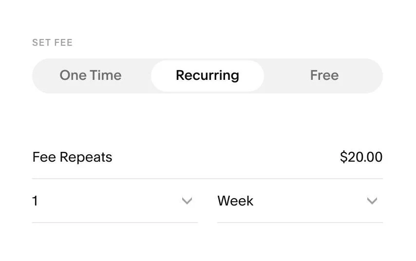
The beauty of Member Areas is that you can control exactly how you’d like to get paid for the content you’re sharing - even if the cost of admission is just an email sign up! You can offer membership plans with one-time or recurring fees or no fees at all.
You also have the option to customize payment intervals so they fit perfectly for your business. You could set up a one-time payment for lifetime access to your program or an ongoing monthly membership instead. If you’ve been using Squarespace digital products, switching those things up to Members Area content may also make a lot of sense. Think of this as just another eCommerce tool!
What It’s Not
As I said, all platforms have their pros and cons and since this is a brand new launch from Squarespace, it may not have all the bells and whistles of some other platforms that cater to more specific audiences. Keep in mind that this is a way to create gated members-only content, which can contain any info that you’d like including things like workshops or classes. But Member Areas is not an online learning platform so if you’re looking for things like course completion tracking, tests, or certificates - this isn’t it. For those things, you’d probably want to check out something like Podia, Thinkific, or Teachable instead.
Steps to Get Started
Select a Plan
Just like Campaigns or Scheduling, adding Member Areas to your existing Squarespace site requires an add-on to your subscription. Some people will say that they think it should all just be included in your regular monthly/annual Squarespace subscription but I disagree. I like that you can choose just the tools you need. Don’t need Campaigns or Scheduling? Don’t pay for them! If everything was included, the monthly cost for everyone would go up. So, with that said, I still think that the monthly costs for Squarespace Member Areas are totally worth it. Here’s what the current plans look like:
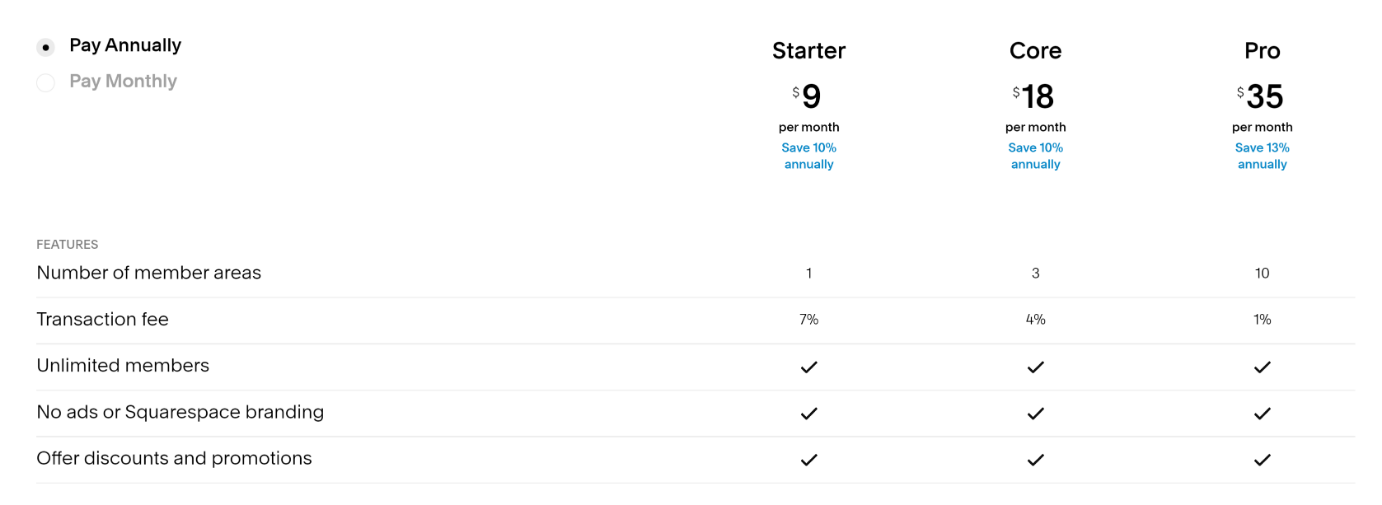
The thing to pay attention to here is the transaction fee. Depending on what you’re offering, you may be better off just paying for a higher monthly plan to get a lower transaction rate. For example, if you have just 30 members who all paid $12/month, you’d actually pay less on the Core Plan than on Starter. Starter makes sense if you’re mostly offering free content since you would never have to contend with the higher transaction fee and your monthly cost would just cover the added functionality. So, do your math first and don’t just go with the cheapest thing as it may end up costing you in the long run.
Create a Great User Experience
Once you get going, there are lots of opportunities to create a seamless user experience right on your domain. In addition to your actual content, Members Areas also allow you to customize the member area navigation, the checkout, customer email notifications, and even the screen that shows up if people don’t have access! There’s also a new “Member Area” block that you can add to any other non-gated page on your site to direct people to your offering and turn any page into an eCommerce sales page! The key here is to just make it as easy as possible for people to engage with your content and Squarespace Member Areas just made it that much easier!

How to Sync Inventory Between Squarespace & Shopify
Multi-channel selling is where it’s at but keeping track of inventory can be a nightmare! I’m reviewing an inventory-syncing app that will help you keep things up to date on Squarespace, Shopify, Square, and more.
One of the biggest questions I get (aside from just how to connect Shopify to Squarespace) is at least how to manage inventory across all the different sales channels you may work on. Think about it: you probably have your main inventory on your Squarespace website but you also sell on Etsy, in person via your Square POS, on Amazon, or maybe also on a Shopify version of your site that’s geared towards a different audience. Being a multi-channel seller these days is a super smart strategy but the amount of admin time it takes you to keep all these things current, make sure you don’t oversell here so that you can meet demand there… well, my bet is that your time is worth wayyyyy more than $35/month.
Enter the solution: Trunk!
Trunk is a relatively new app to the Squarespace Extensions list but it caught my attention because it’s a simple solution to what could be a very complex problem: how to centralize your inventory between Squarespace and everywhere else you sell. Revolutionary, right?
How It Works
Whether you have just a few SKUs or thousands, getting set up is super fast and easy. Once things are synced you can think of Trunk as the hub for managing all your inventory. It will know when you sell something on Squarespace so that it needs to adjust inventory on Etsy. If you added some inventory on Shopify, adjustments are made across the board. The only secret is that you need to give all the products the same SKU number across all platforms; this will be how Trunk knows to keep them in sync.
Now, here’s the beauty of this: say you have a product that you market to different audiences. The best example I have of this is a product that you sell retail on one site but wholesale on another - same product, same inventory counts but possibly different names, descriptions, or costs. NOT A PROBLEM. So long as the SKUs match, sales on one platform will automatically adjust available inventory on any others you have connected.
You can also sync things down to the variant level so if you need to keep track of red shirts and blue shirts and black shirts, you can do that, too!


You Can Sync Inventory Between:
Shopify
Squarespace
Square
Amazon
eBay
Etsy
Faire
Quickbooks Online
Xero 🆕
If You Decide to Give it a Try
You can try Trunk out free for 14-days, which I’m always a fan of - just to see if you like it before committing. Pricing from there just depends on how many orders you process each month + whether you need basic or more advanced features. This also seems super fair to me since you only have to pay more if you actually sell more. If you’re thinking of expanding your business to take on multiple sales channels, just the time savings alone from having to keep track of and sync inventory on multiple platforms is worth its weight in gold. Keep in mind that if you’re actually looking for a way to just have a shop on Shopify + a site on Squarespace that that’s not necessarily what Trunk is for; for that, you should check out the Shopify Buy Button!

eCommerce Crash Course: Coupons, Offers, Discounts & Promos
Before you go creating coupon codes all over the place, check out this crash course in eCommerce discount strategies. Assess whether they are right for you, and find out how to implement a discount strategy successfully. If you’re also feeling a little stuck in a discount rut, I also provide some new ideas you can try to mix things up!
I’ve talked before about pricing strategy here and whether you should offer free shipping here. These are both key components of your overall eCommerce strategy that you can - and should - tweak from time to time to make sure you have things juuuust right. But there’s another leg of the stool that needs to also be considered: coupons, offers, discounts, and promotions. All of these things are part pricing strategy and part marketing strategy, and they can have a big impact on online sales.
There are a few schools of thought when it comes to online coupons and such. For me, it’s easiest to think of them this way:
Luxury - Never has sales, ever. Period. Think: Gucci
Mid-Market - Has well-publicized annual and semi-annual sales only. Outside of those times, no sales. No coupons. Think: Nordstrom
Budget - Everything is always on sale. Coupons or other marketing promotions are easy to come by. Somehow never pay full “retail” price. Think: Kohl’s
Questions to Ask Before Getting Started
There are merits to each of these so if you’re still trying to decide which bucket you fall into, ask yourself these questions:
Is it on brand? Shoppers are actually super adept at picking up any discrepancies between what you are saying about your brand and what your pricing strategy is saying about your brand, including whether and how you discount. If your branding says “luxury” but your discount strategy says “budget”, that’s a mismatch.
Are you training people to only buy from you when there’s a discount? This is an important thing to point out in a post all about coupons, offers, discounts & promotions. Before you read any further and decide how to implement any of these, ask yourself if these things need to be part of your strategy. This is a prime example of just because you can do something doesn’t mean you should. One of the biggest eCommerce mistakes I see merchants make is training their customers to only shop when there’s a discount. This devalues what you’re selling and is often only a successful strategy for the highest volume sellers.
Is the timing right? If you’ve decided that offering discounts or promos is on brand and right for your business, there should still be a method to your madness. Discounting willy nilly makes no sense. The best offers are strategized well in advance and are supported by external marketing activities like newsletters, social media posts, etc. Consider the season, popular trends, or other promotions you can leverage off of.
Do you have enough margin to discount? I mean, this should go without saying but if your regular prices don’t leave enough room for you to discount when needed and have you not lose your shirt, you should start by adjusting your retail prices across the board before venturing into the wide world of coupon codes. (More on this below!)
How To Do It Right
Now that you know where you fall on the Gucci-Nordstrom-Kohl’s spectrum™ and you’ve considered all the factors above, let’s explore some of the reasons why you may want to adopt a discount/coupon strategy:
It can quickly drive sales. Everyone loves a bargain so putting something on sale should definitely boost conversions. What this means is that what you lose on tighter margins, you can make up with volume.
It's a good way to move excess or outdated inventory. Think of this in the same way you can buy super cheap Halloween candy on November 1. Most products (and not just the edible kind) have a “shelf life” - even if that means the time period when they’ll be most attractive and potentially sell for the highest price. You may also be at a place where you’re willing to sell products for a near loss just to get them off the books and make room for new goods.
It can attract new customers. We’ve all seen the popups offering X% off our first purchase if we sign up with our email. I would argue that this is getting to be a bit overused and I tend to dislike it because it encourages only buying with a discount but it can be a way to sweeten the deal if you have built that discount into your normal prices. Running a promotion before you officially launch a new product or service can also help build hype!
Strategies To Try
Exit Popup - We’d always prefer people to pay full price so triggering an offer only once someone goes to exit your site can be a way to only offer a discount to people who were going to leave without buying something.
Separate Sales from Non-Sales Items - One of the worst things you can do is put two items that are relatively similar side-by-side and expect people to buy the higher-cost item. For example, if you’re selling this season’s shirt at full price and right next to it I can see that I can score last season’s tee for half off… well, maybe I’m not the most stylish but I’m going to go for the half-off version. To try to prevent this, move all sale items to a separate sales category or page on your site. This means that most shoppers (who are looking for the latest and newest) will shop in your regular section without price distraction and bargain-hunters will head to the sales section first. Everyone wins!
Offer Free Shipping - Shipping discounts are my favorite for a few reasons. First, everyone loves free shipping. Second, shipping discounts don’t devalue what you’re selling. Third, people often assume shipping is going to be super expensive so they may actually think the discount is worth more than it really is. I always say it’s better to mark up your prices across the board and offer free shipping no matter what but I realize that’s not always feasible. If you're in an industry where product-to-product comparisons are easily made, it may be important that you keep your individual prices low. If that’s the case, I would recommend offering free shipping with a minimum cart value (i.e. free shipping on all orders over $X)
Abandoned Cart savings - I mention this briefly above but if I think if you’re going to discount, you might as well only offer that to people who weren’t otherwise going to pay full price. Utilizing your abandoned cart email to deliver a coupon or incentive to return to your site to make a purchase is a way to only show discounts to certain people. Word of warning: there are a lot of people who have become savvy to this tactic and will purposely leave an item in their cart and wait for a coupon to show up in their inbox the next day. I think this kind of is what it is, but just know that these people are out there.
Make Discounts Automatic - Think beyond the coupon code and make things as easy as possible for people by just automatically applying whatever offer you’ve set up to their cart once the criteria are met. I think that this helps make happier customers because it reduces mental load (no need to remember a coupon code!) and makes people feel like they achieved a goal.
Set an Expiration Date - Not only do expiration dates create a sense of urgency, making sure all your discounts and coupons have an expiration date ensures that you can make changes down the road without people feeling like they got the old bait-n-switch.
Limit Usage - This is a good hype-building way to discount. Limiting your offer to only a certain number of people, only a specific group of customers, or by how many times it can be redeemed is a great way to encourage people to buy quickly or even boost brand loyalty by encouraging people to attain a certain “tier” status in order to qualify for a discount.
Other Misc Ideas (That Don’t Really Need Any Commentary)
Discount entire categories or brands versus the whole store
Offer BOGO or B2G1 offers
Offer a tiered discount so people get more off based on buying more of an item
Discount orders over a certain amount
Offer a free gift with a purchase total over a certain amount
Offer a discount on the most or least valued item in their cart with a total purchase over a specific amount
Provide discounts based on customer loyalty to encourage repeat purchases
Hopefully, you now feel like you have a better handle on coupons, offers, discounts, and promos and know how to incorporate one of these strategies successfully. My last piece of advice is to implement and then monitor often. Don’t be afraid to give something a try and adjust as needed once you see how your audience responds. This is another great reason to put an expiration on offers - so that you can tinker with things as needed to find the perfect sweet spot for your brand.

Should You Offer “Buy Now, Pay Later” Options on Your eCommerce Website?
It's becoming super popular to see "Buy Now, Pay Later" options on websites big and small. In this post, I explain how they work, whether you should give one a try and how to add an alternative payment option to your eCommerce website.
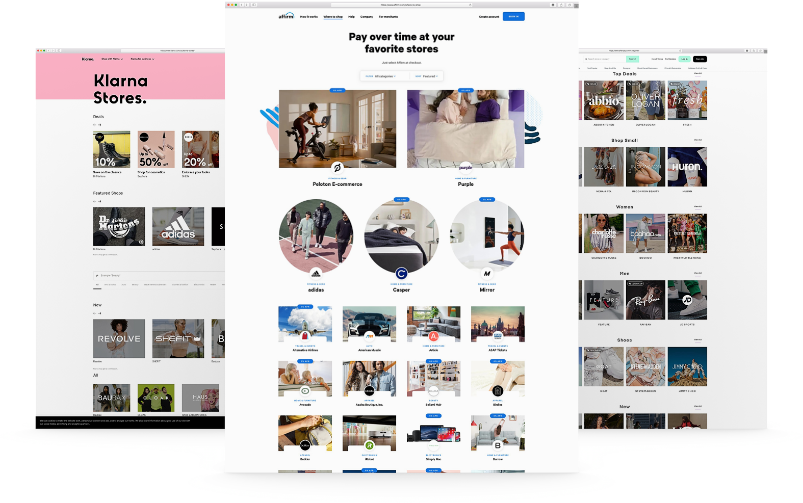
Installment payments aren't new - layaway plans have been around forever. But "Buy Now, Pay Later" (BNPL) services like Affirm and Afterpay have put a digital spin on installment financing in the world of online shopping.
I took notice when BNPL options started proliferating across checkout pages. These services promise higher conversion rates and order values. Flexible financing is clearly enticing for shoppers seeking to avoid credit card debt.
Still, I wondered if BNPL delivers everything it claims for merchants. Is it really a miracle conversion booster, or a potential consumer debt trap? I suspect the truth lies somewhere in between.
I was mulling this over while listening to Marketplace on NPR the other day. They featured a segment on BNPL and the growing popularity of deferred payment services. It got me thinking we should dig deeper into the merchant side of things.
In this post, we’ll explore how BNPL actually works and break down potential upsides and drawbacks for eComm shops. My goal is to arm you with enough info to decide if BNPL deserves a spot at your checkout. Sound good? Alright, let's get into it - but first here’s that little audio snippet if you’d like to check it out for yourself:
They begin, of course, by stating the obvious; which in this case is the fact that the pandemic drove everyone to online shopping like never before. If you’re one of those people, you’ve most likely noticed a few new payment options popping up everywhere online. And these aren’t just the normal “alternate” ways to pay like Apple Pay or Google Pay. These new offerings offer financing and payment plans in addition to traditional payments run through a merchant payment processor like Stripe or Paypal.
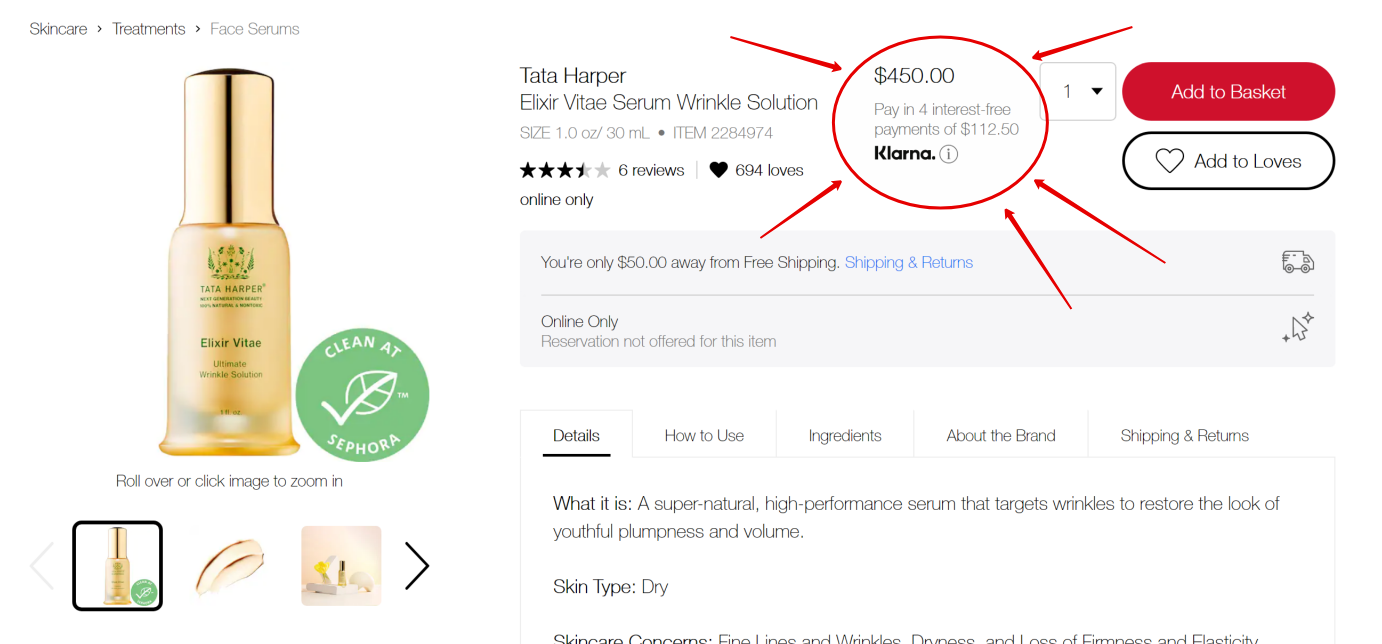
Here’s one of my faves, Sephora - letting me know that this $450 wrinkle serum can be mine for 4 easy payments of just $122.50!

Here’s Anthropologie encouraging me to buy this super cozy looking blanket at the low, low price of just 4 interest free payments of $37.

And it’s not just luxury or premium brands getting in on the action. Here’s Walmart letting me know that this super big TV can show up at my door for just $74/mo. It’s enough to make you want to sort prices from high to low, right?
This Ain’t Your Grandma’s Layaway Plan
Online sellers of all sizes are turning to services like Klarna, Afterpay, Affirm, and others to offer financing for purchases big and small. Payment plans are obviously nothing new but unlike old school layaway plans where the retailer held the item until it was paid in full, in this case, people can check out and receive their orders on the promise of making their monthly payments to the company the merchant has partnered with.
The idea of merchant-side financing also isn’t exactly new. Home shopping networks like QVC and HSN have offered things like “Easy Pay” and “Flex Pay”, respectively, for a while. They were early adopters of the idea that there are profits to be had if you make it as easy as humanly possible for people to buy from you, and reduce any and all friction in the process - even if that’s financial friction.
When it comes to eCommerce, my friends at NPR pointed out that payment plans like these are especially popular amongst younger shoppers who are leary of amassing credit card debt. This doesn’t mean that the arrangement is without some risk to the consumer… and some cost to the seller. So, what are the benefits and drawbacks? Let’s dig in!
How It Works
Whether you call it financing, “Buy Now, Pay Later” or payment plans, all of the services pretty much work like this:
Customer Side
Shop like normal. At checkout, select the alternative payment method and sign up for an account with the provider (i.e. Klarna, Afterpay, Affirm, etc.). Make the regular payments as agreed directly to the payment service provider.
Merchant Side
Orders come in and are fulfilled like normal. You’re paid in full, less the processing fee charged by the payment service provider. They’re basically stepping in as the middle man, offering to pay you now while they get paid overtime.
By The Numbers
All of the various companies have different stats to promote their services but when I dug into the numbers offered up by all of them and compared them, there were some definite commonalities.
Adding an alternate payment method:
Increases average order value
Increases conversion rates, especially amongst first-time visitors
Boosts repeat visits
Reduces cart abandonment
Reduces return rates
Another hidden perk offered by pretty much all of the companies doing this right now is that your brand will automatically show up on their list of merchants, right alongside other big names who use the same service. This can be a huge way to get noticed by fresh eyes and help you get some traction if you’re on the smaller side or your brand is completely new.
What’s the catch?
If you’re thinking that all of this seems too good to be true, you’re only partly right. In the NPR story, they reported that it’s easy for some consumers to get in over their head on payment plans and, of course, if payments are missed there are financial ramifications. At least one of the providers, Affirm, does tout that although applying does require a quick credit check to determine eligibility that this won’t negatively impact the shopper’s credit score and that on time payments can actually help them boost their rating.
Merchants will also see higher merchant fees charged on orders that used the financing gateway to checkout, though payment service providers are also quick to point out that increased cart values, higher conversion rates and lower return costs among other benefits all offset the small percentage they charge over traditional merchant processors. And, in case you’re wondering, that extra percentage will vary but is between 2% and 6% on average.
Should You Do This?
In short, my answer is yes. Here’s why. Even though you will pay more in merchant fees for each order where the customers select this option you have to keep the following things in mind:
Just because you offer financing as an option, doesn’t mean everyone will take it. The people who were going to buy from you anyways will still use their credit cards like normal.
A percentage of something is better than a fraction of nothing. The people who weren’t going to buy from you but needed this as a little incentive are all incremental sales.
It can make you look bigger and more established if you’re a new or smaller brand. Think of the sales pages and apps offered by financing providers as another sales channel. The percentage you pay to them is just your entrance fee to be listed on their pages. New fans may come to you through those pages but then become fans that buy from you again and again! (If this resonates with you, you may also like this post on how your small business can compete with Amazon on shipping.)
If you’re not sure, I would say there’s nothing to lose by adding a “Buy Now, Pay Later” option and just see how it resonates with your fans. You can always decide later that it’s not for you or if this fad fades out just turn it off. My guess is that it won’t, but - hey, just know you have the option!
For instructions on how to add Afterpay to Squarespace, check out this post!

A Minimalist's Guide to Branding
A minimalist brand doesn’t mean boring! Find out why I think it’s great to start simple and iterate as you grow along with my checklist for the things you actually need - so you can know what to save for later!
I pin pretty brands to my secret Pinterest boards just like you do. Branding is fun and creative, and can make things feel really “official”. But it can also be a startup’s Achilles heel because while it’s true that all of the finer details of a brand are important to get right, branding is ultimately an art that's super subjective. This means that there really are no “right” or “wrong” answers.
In true minimalist fashion, my take on brand design tends to lean towards getting something out there that works rather than getting mired in details that no one will ever notice. As a former brand designer, I have definitely seen lots of clients with great products and services miss their moment by spending too much time and money obsessing over whether they should go with the bold or regular version of a font.
From a business perspective, the more time & resources you sink into your new brand, the less cost-effective it becomes and I can almost 100% guarantee that the finer details you’re obsessing over will be lost on customers. This is because branding is more than a design - it’s an experience. More importantly, a minimalist brand design can be powerful, adaptive, and even bold if you want it to be. Keep reading for more, plus my shortlist of the brand essentials you absolutely need.
Simple Is Powerful
Have you ever noticed that some of the most expensive products have some of the most minimal branding? Complicated design actually ends up looking pretty cheap, and cluttered labels or packaging can make it look like you don’t know what you’re doing or who you want to appeal to. Picking one or two fonts or one signature brand color shows confidence and is often all consumers need to be able to connect with a brand. Too many elements, doodles, illustrations, and colors are just noise that stands to distract people from your message. It’s also important to remember that legible matters more than cute so if your fonts are so ornate or swirly that people literally aren’t sure what you’re saying this is also a problem.
Minimal is Adaptive
Sure having a 42-page brand identity handbook seems cool but let’s be honest - most new businesses and startups don’t have enough info to be able to know what will resonate with customers or what will perform well in their space. Not only does this make committing to a complicated brand design upfront not very smart from a business standpoint, it means that when feedback and analytics do start rolling in, the design system can’t pivot or keep up with all the changes. I always think it’s better to launch and iterate. Just make some initial decisions and move forward. You don’t have to live with them forever; things like logos, fonts, colors, even names - all totally changeable down the road. Being able to adapt quickly to market shifts, customer preferences or industry trends is a competitive advantage!
Refined Doesn’t Mean Boring
Minimal doesn’t have to be generic. Simple can be bold, colorful, or even edgy. Check out this post from Canva that has some great examples of minimal brands that are impactful and engaging. Some tricks to making a minimal design stand out are to play with scale (making things much larger or smaller than expected) or to use color in an expected way. This could be anything from going all-in with one bold signature color or using a refined palette that’s completely different from anyone else in your industry. Lastly, as I’ve mentioned before, consistency matters more than anything. You may be “bored” with a minimalist brand that doesn’t have a lot of elements to “play” with but that’s because you see it every day. Customers are bombarded with thousands of messages and brands every minute and need the simplicity and clarity of a consistent, simple-to-identity brand.
What You Need
In this post on how to set up your first online shop, I included a quick list of what brand details I think you need at a minimum from a web design perspective. Here’s that same list, expanded with a few extra details and examples.
Logos
A primary text-based logo in just one or two colors


A simplified square logo to be used as a favicon and social media profile pics. (This is often a monogram or icon.)


Colors
A simple color palette which consists of 3-4 colors:
One dark color, preferably something neutral that will be used for copy and to use a background for white/light text
One light color, used mostly for backgrounds
One bold accent color used to attract attention for things like buttons, links, and other CTAs
One softer accent color (optional), to be used sparingly for secondary CTAs and liven up the design


Fonts

There are lots of resources out there about picking great fonts. I really like some of the posts that GoLiveHQ has like this one or this one. Something that I really recommend when it comes to fonts that makes life wayyyyyyy easier is to make a list of all the software/programs that you’re going to be using and pick fonts that are available on all those apps.
For example, Proxima Nova is a popular Squarespace font but it’s not available on Canva. This means if you use Canva to make your social media graphics that you’ll have to pick something close to but not exactly the same as Proxima Nova. A lot of programs do let you add custom fonts but many don’t and even if this is a possibility it’s often an extra tech step that most people would rather skip.
Beyond making sure that the fonts you want to use are available on all the programs that are essential for your business, I recommend keeping fonts simple. Select one headline font, one complementary body font and if you really must, just one accent font that is used super sparingly.
Headline Font
Body Font
Optional “Accent” Font
That’s it!
The key is to set some initial brand elements up so you have things to work with… but then build yourself in some flexibility to adapt and change your brand as your business grows and evolves!

Fun With Zapier for eCommerce
If you’re not already using Zapier to make running your eCommerce business easier, don’t be intimidated by it! I’m breaking down the best apps for shipping, email marketing and eCommerce - plus some fun zap ideas to get you started!
Of all the business stats I track, there’s one that I really look forward to seeing more than all the others: the number of tasks my Zapier account runs each month. Seeing how many mundane tasks I’ve automated that used to eat up my precious time just makes me so happy!
The surprising thing to me is always learning just how many business owners aren’t already using the power of Zapier to simplify their lives. Zapier is like having a very well-behaved personal assistant that never asks for a day off - plus, it’s fun! You don’t have to be really technical at all and I promise that you can’t help but get a little giddy when work gets done magically in the background for you.
Not sure what to automate? The rule of thumb is that anything you have to do over and over could and should probably be automated. This is going to look different for every business depending on the exact tools you use but to get your wheels turning, below are some ideas specifically for eCommerce businesses!
Zapier 101
If you’re a Zapier neophyte, here’s the gist. You have triggers and you have actions. This is basically saying when this one thing happens (the trigger), do this other thing (the action). Each “zap” needs to have at least one trigger + one action. (Some advanced setups can string lots of different actions together or get really complex with different things like filters and conditional rules but that’s for another day.)
When you are setting up a Zap, Zapier will ask you which apps you want to connect but I think if you remember that you’re not just connecting them but rather asking them to talk to one another, that's the key. Each app that is connected to Zapier comes with its own playbook; a certain set of actions and triggers that that particular app’s developers built into it.
The reason why this is important is, as you’ll see below, knowing which actions can trigger other actions is the start of building yourself a future where you make technology work for you instead of the other way around. Now, while all my apps are busy talking to one another, I can be hanging out doing nothing. No more babysitting my apps. That’s it. Easy!
Ok, on to what I think are the best apps for shipping, email marketing, and eCommerce, along with some zap ideas to get your creative juices flowing.
Shipping Extensions
Shipping is kind of the linchpin of eCommerce, right? A lot of businesses are already using a shipping extension to make shipping faster, easier, or more affordable so why not take things a step further and include your shipping activity in some fun automations?
Winner: Easyship
Easyship just released their Zapier integration and it has some of the best triggers available when it comes to shipping extensions.

Fun Zaps to try:
(Bonus: these both can go hand-in-hand with the email marketing recommendations from the next section.)
Shipment Delivered (Trigger) - How awesome would you look to your customers if you sent them a nice little note right after their shipment was delivered saying thanks, letting them know what to expect or what to do if something isn’t right? You can use the Shipment Delivered trigger to do this or even to tag a customer in your CRM so you know to follow up X number of days later.
Shipment in Transit (Trigger) - Build some hype and excitement for what’s en route by letting customers know not just that their order has shipped but that it’s getting close. Depending on what your product is, this could also be useful if you are shipping anything timely or perishable that you want to make sure people know to keep an eye out for.
Runners Up: ShipStation and Shippo
ShipStation and Shippo don't have all the same cool triggers that Easyship does but they are both still plenty powerful. ShipStation has an “Order Shipped” trigger and Shippo has a “New Shipping Label” trigger that could both be used to keep customers in the loop on their order status.
Email Marketing
You know I preach the power of an email list time and again. Your email list is clutch and, when connected to all the other apps you use in business, worth its weight in gold.
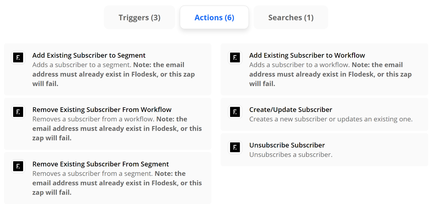
Winner: FloDesk
This was a close one because Klaviyo (below) is super powerful when it comes to eCommerce email marketing and nice integrations with both Shopify & Squarespace, but when it comes to Zapier, Flodesk (use my code K4I8S1 to get 50% off for life!) has more triggers and actions to play with and that’s what makes it the front runner to me. This should show you that with Zapier it doesn’t matter if the apps you love have native integrations or not - you just make them on your own!
Fun Zaps to try:
Add or Remove Subscribers to/from Segments (Action) - Fun triggers to pair with this action would be things like when someone buys X, add them to X segment; when someone buys Y, remove them from Y segment, etc. This is especially useful when paired with the internal automations within Flodesk so that certain workflows are triggered based on getting added to certain segments.
Subscriber Added to Segment (Trigger) - This is different from above in that you can also think of what you might want to happen after someone gets added to a segment. Using the subscriber added to segment trigger, you could set up an email to automatically get sent out to someone on your sales team so they can follow up with leads personally or you could also add the subscriber’s name to your CRM so you don’t have to worry about double entry.
Remove from Workflow (Action) - Think of this as the escape hatch out of your email funnel! There’s nothing more annoying than companies that still send you sales emails after you’ve already become a customer. It really underscores how automated things are instead of using automation to make things feel personalized. Use a trigger that says when someone finally buys [the thing you’re selling], to remove them from the sales workflow so they no longer receive any of the sales emails.
Runner Up: Klaviyo
In much the same way as above, you can connect Klaviyo to a number of apps to help you send highly targeted messages. Some ideas are to create an event in Klaviyo anytime someone fills out the contact form on your website or to update a subscriber based on their activity so they only receive the messages that are most pertinent to them.
eCommerce
Help make sure your website isn’t lonely by connecting it to other apps! Keep in mind that I definitely wouldn’t choose a platform based on Zapier alone but it is definitely nice to know what the capabilities are for each of these if you’re starting to explore making a move to one of them from another.
Winner: Shopify
Shopify is the leader when it comes to Zapier with a whopping 10 Triggers, 9 Actions, and 6 Search functions available. The best thing to me is that even the lowest-paid Zapier plan (Starter, $19.95) could replace a ton of third-party apps that most Shopify store owners find themselves needing to add in order to get the functionality they’re looking for. All these apps add bloat - and cost! A little Zapier savviness could help on both those fronts.

Fun Zaps to try:
New Abandoned Cart (Trigger) - give people a reason to come back to your site with a custom abandoned cart email. Use this trigger to connect to an email marketing action (see above) and you can send abandoned cart emails that are 1000x better looking - and higher converting - than something generic.
Update Product (Action) - want to keep all your inventory in a nice little Google sheet and then have any updates automatically show up on Shopify? Totally possible and a total game-changer if you find logging in to your website every time you want to put something on sale super tedious and unnecessary.
Runner Up: Squarespace
Squarespace is woefully lacking in the primary triggers and actions department, but their Commerce API and some creative advanced Zapier tricks can make almost anything possible! For more on this, check out this post: How to Connect Squarespace to Anything!

The Secrets to Quick eCommerce Success
No get rich quick schemes, here! Just some super simple not-so-secret secrets to help you get to launch day faster so you can start building on your eCommerce successes early.
Whether you’re just embarking on your eCommerce journey or have been around for a while, it’s easy to get overwhelmed and overloaded with apps, tools, details, and ideas that you incorporate with the best of intentions but that ultimately distract from the task at hand AKA getting people to buy from you.
My pure little minimalist heart just loves paring things down to the most minimally viable product, a concept co-opted from the product development realm where it refers to the idea of putting out a version of your product that has just enough features to satisfy early adopters, who will, in turn, provide feedback for future iterations.
Put simply, it’s finding the Goldilocks version of a product -- one that lives in that sweet spot between “not enough” and “too much”. So, when it comes to eCommerce, what’s the sweet spot? What are the bare minimum things you’ll need to get crossed off that to-do list in order to get you to launch day?
The Keys to Success: Launching Quickly & Focusing on The Essentials
As I’ve mentioned before here, one of the biggest mistakes new online sellers make is trying to go too big from the start. In doing so, they lose time that they could be selling working on nitpicky things that don’t really matter. I say the key to success is launching fast, even if it’s not “complete”. To get to launch day fast, select a great template, and then complete this quick checklist of the most essential eCommerce tasks. Get these taken care of and you’re off to the races; the rest you can work on later while you watch the first sales from your early adopters roll in.
1. Product Info
I mean, you have to have the details of what you’re selling, right? Depending on what that is, this may be more or less complex, but at minimum, you’ll need to have the following attributes organized for your core products. These are your “best sellers” - or the things you think will be most popular or profitable if you haven’t launched yet.
Product Name
Product Description
Price
Product Photo(s)
Product Variations (things like size or color)
Inventory count for each variation, if you’ll be tracking inventory
Shipping dimensions and weight (See #3 below on how to skip this one!)
2. Money Info
All of this means nothing if there’s not a direct connection between your website and your bank account 🤑 When it comes to getting paid, you have “traditional” or more “mainstream” options like Stripe, Square, or Paypal, but options Afterpay that provide deferred or multiple payments (or that are accepted in more countries worldwide) are becoming more popular and in demand.
3. Shipping Info
Shipping is usually any new online seller’s Achilles heel. Seriously. It seems easy but can get really complicated super fast. This is why I recommend either offering free shipping or setting up flat rate shipping. (Bonus, this also gets you out of needing to come up with the shipping size and weights of all your products from #1, above.)
To set up shipping, you just need to know these basic things:

Shipping origin address (where you’ll be shipping from)
Any limits you’d like to have on where you’ll ship to (i.e. only certain states/provinces or countries, etc.)
Which options you’d like to offer: free shipping, flat rate, or others. When in doubt, don’t overthink this: just offer free shipping. Make it simple. People like free shipping and you should price your products to account for this cost. Don’t fall into the trap of thinking that shipping costs are too high and that you need to nickel and dime your customers in order to make up for it. Also this is the perfect excuse to pull my favorite Drake meme out. And because I know you’re wondering, yes, I do have this image saved to my desktop. That’s how often I have to refer to it.
4. Tax Info
Thinking about taxes are usually the last thing on any online seller’s mind and rightfully so as setting up and collecting sales tax online is confusing at best and maddening at worst. Trying to understand all the rules, which ones you have to comply with and which ones aren’t applicable and then setting things up correspondingly is a literal nightmare. And that’s coming from someone who does this for a living.
To me, the best solution is the automatic one. Let the tax experts do their thing.
Getting to Launch Day Faster by Focusing on The Essentials
Ok, good news? By focusing on just the four areas above, you can go from zero to launched in no time at all. Will there be more to work on in the future? Sure. But you’ll be up and running and have something viable to build on. You’ll have the bare basics without sacrificing one iota of user experience. And that, to me, is the first step towards success.

How to Create an eCommerce Brand Experience that Attracts Customers for Life
Creating amazing brand experiences may look different for online businesses but has the power to attract loyal brand followers for life. From great UX to stellar customer service, discover simple ways to go the extra mile.
It can be hard to think about creating great experiences for our clients or customers when we often don’t see them face-to-face and their interactions with our brand are entirely digital. The good news is that guest blogger Alexandra Greiner is on the case to remind us that focusing on creating awesome brand experiences for your online business doesn’t need to be super complicated or even that expensive. Alexandra is the Founder and Creative Director of Zagga Creative, a one-stop-shop for your biggest + baddest branding dreams, and I’m so excited to share this post with you that features tons of examples you can implement right now to start attracting customers for life. Her take on creating user-friendly experiences reminds me a lot of this post of mine all about building a more empathetic brand + human-centered design. It’s just really that extra step that’s so many brands fail to take but can really pay off when done right. - Kristine
Close your eyes and think back to the best shopping experience you’ve ever had. Was it online or in-person? My guess is, it was in person. We tend to have more memorable experiences shopping in person because it’s well, more personal. Companies can train their employees to interact with their customers in a way that aligns with their brand and what they stand for.
For example, lululemon is all about innovation so their retail associates educate customers on all the features in each product and how it can help them in their workouts. lululemon associates are literally called “educators”.
When we move online we lose that human to human interaction but that doesn’t mean you have to lose out on the opportunity to create a stand out brand experience.
What do I mean when I say “brand experience”?
Look at your customer journey, list every single touch point and stage of the journey. For a physical product e-commerce site the customer journey might look something like this…
Alexandra comes across your profile on Instagram
She clicks the link in bio and is taken to the homepage of your website
From their she searches for the item she saw in the post that she liked
When she finds what she’s looking for she goes to the product page to read the details and reviews
She clicks ‘add to cart’ and continues to the checkout page to fill in her personal information
After she hits ‘purchase’ she receives an emailed receipt
The next day she receives the shipping notification via email
A few days later and her package is delivered to her door
She starts using the product and a few weeks later gets an email checking in to make sure everything is going smoothly and that she loves the product.
Then put on your customer hat and see each touch point from the customers perspective. What’s the experience like?
Is it unique? Do you feel taken care of? Is there something you’re left wanting?
Anything on that list that is less than amazing is an opportunity to elevate your brand experience and create customers for life. And I’m not talking about just slapping your logo everywhere. Be intentional about each moment.
Now for the fun part! You get to be creative and take each of those moments from your customer journey that are less than stellar and turn them into something unforgettable. And it doesn’t have to be hard.
Let’s say you sell digital products and you’re looking for a way to make the delivery of those products more memorable. You can surprise and delight with a digital freebie. People LOVE free stuff. Seriously. LOVE it.
You could even do one better and have a few freebies that they get to choose from. The only thing better than a freebie is a freebie you get to pick out. My favorite supplement brand, Hum Nutrition, does this on their site every time you order. It makes me super happy and excited to order AND it gets me to try new products so I’ll buy more of their stuff.
When you’re deciding how to elevate your brand experience, always look at it through the lens of your core values. If you’re a company that stands for reducing climate change including a freebie in the box, like let’s say a sheet of branded stickers, that increases waste would not be a good idea. On the other hand investing in dope, environmentally friendly packaging would greatly enhance the experience and convey your brand’s core values.
If you’re still scratching your head, wondering exactly what you should do for your brand experience there’s a simple solution...ASK YOUR CUSTOMERS. There is an unlimited fountain of knowledge right at your fingertips and all you have to do is send a survey. This is also a brand experience opportunity! You’re engaging with your customers and asking their opinion and then (hopefully) you’ll take action based on the feedback.
The ways that you can create a stand out brand experience for your e-Commerce store are endless. Here are some more ideas based on the customer journey…
Find you on social media
Respond to their DMs with more than just an emoji
Ask a question in posts so your customers can engage in the comments
Show some behind the scenes action
Make it SUPER easy to shop your products from posts
Create a hashtag customers can use when posting about your products so potential customers can see them IRL
Clicks a link and is taken to the homepage of your website
Site navigation is super clear and makes it easy to find what they’re looking for
Pop-up that offers them a discount on their first order so they can try your products without a big investment
Use eye-catching branded photos and graphics so they know exactly who you are and can imagine themselves using your products
Searches for the product they saw in an ad and liked
Search bar is easy to find
They don’t have to have the exact wording to find what they’re looking for
Create a quiz customers can take to direct them to the right products
Navigates to the product page
Upload lot’s of high quality, cohesively styled product photos so they know exactly what they’re buying
Add videos to the product page, showing how to use the products
Organize the product information in a way that is easily digestible making the most important features and info jump off the page
Clicks add to cart and checks out
Give back to a charity or non-profit that aligns with your core values with every purchase
Make it easy to enter their discount codes and payment information
You know that loading message when they submit their order? Why not use some branded graphics instead of the standard loading bar?
Emails
Make sure they get great email communication every step of the way i.e. receipt, shipping notification, delivery notification.
Brand your emails with your brand colors, fonts and logo
Make it easy for them to reach out with questions
Delivery
Surprise and delight with a handwritten note in their box
Send a check in email after they’ve been using their purchase for a few weeks to make sure everything is going well and answer any questions they may have
You don’t need to do all of them. You don’t need to spend thousands of dollars. You just need to know what you stand for and what your customers want so you can be intentional in creating the best possible brand experience.
And have fun with it for God’s sake! That energy is contagious and your customers will keep coming back and then tell all of their friends about it and they’ll also keep coming back and pretty soon you’ll have so many customers you won’t know what to do with all of them.

How to Increase Customer Lifetime Value Through Email Marketing
Discover five email marketing automations (plus a bonus!) you should be using to increase customer lifetime value with guest blogger Madeleine Murrey of Madeleine Murrey Media!
Any savvy business owner will tell you that it’s never smart to put all your eggs in one basket and yet so many still rely almost solely on social media in an attempt to build relationships with customers. But, as guest blogger Madeleine Murrey explains in this awesome post, email marketing is really where it’s at! If you’ve never done much work in email marketing, it can feel overwhelming at first since it definitely takes a bit of upfront work — but the payoff is so worth it! And lucky for us, Madeleine has put together some great tips and super actionable advice on how some simple email automations and strategies can seriously help build legions of loyal fans. I think you’ll find this post super helpful even if you’ve been dabbling in upping your email game for a while and are looking for ways to continue to optimize. I’m happy to share it with you! - Kristine
When it comes to starting an email list - most business owners know the basics - welcome emails, abandon cart emails, and post-purchase thank you emails… but then put the others on the backburner.
You’ve got the basics down, which are great low hanging fruit to monetize your audience - however, there is so much more room for growth with your email marketing!
Email marketing is an essential part of your business and creating those VIP customers who will be fans for life.
Yeah, social media and advertising can appear flashier, fancier and more appealing, but the best part about email marketing is you OWN your list - you are not tied to Facebook, or Instagram, or even Google. Even if something happens with your email provider, you are in full ownership of your list and have the ability to pivot quickly with email marketing. Kristine has a great post on why you shouldn’t bank on social media and why you need to build an email list here.
But that’s not the only thing - email marketing to this day still brings in more ROI than SEO, display, advertising and other forms of digital marketing. Even DMA says “For every $1 you spend on email marketing, you can expect an average return of $42.”
Now that we’ve covered how much of an impact email marketing can have on the bottom line, you might be thinking “well, how do I even get started?!”
Let’s cover the best type of email marketing - automated emails. The reason why I say this is the “best” is because this is the kind of emails that you can set up, and it automatically triggers based on users behaviors.
Someone signs up for emails through your website? They get a welcome email series!
Someone purchases through email? Once they’ve received the item, let’s offer them another product that pairs well with the first item?
Someone makes a reservation at your restaurant? Offer them a special promotion 30 days after their purchase to get them back in.
The opportunities are endless… and once you get this set up, it is running essentially on autopilot.
Let’s talk about the types of automated emails you can get in place to hit that $1 spent on email marketing to $42 in return.
Welcome Emails
I break this down into a 3 series email that way you give your audience little pieces at a time.
Welcome email #1
This email is literally welcoming your audience to your brand. You can cover who you are, how you started, what types of emails you will be sending (tips, tricks, promotions, discounts, new product announcements, sales, etc.). I also always like to add a 10-15% off coupon to people who haven’t purchased before - this way you get them at the first touchpoint in email and while they are still very engaged.
Welcome email #2
This email is what I like to call the “social sharing” email. Get them to like your page! If you are on Instagram, Facebook, YouTube, Pinterest, Twitter, or any other social channels - get them to follow you! This will make sure you are able to communicate with them through multiple different touch points which will help keep you connected to your audience.
Welcome email #3
In the third email, I like to promote “favorites”, which is basically any item or service that you offer that’s a favorite of your frequent purchasers, promote this here and get them to see what others like about your offerings!
Cart Abandonment Emails
This one is pretty straightforward. If a user adds an item to their cart, enters their email address, but doesn’t complete the transaction (put in their CC details) then this email will get triggered. This email can be as simple as “you forgot xxx in your cart, grab yours today before we run out of stock”. Creating that urgency, or offering a discount, can certainly increase the likelihood of the end user purchasing!
Upsell/Cross Sell Emails
Upsell/Cross Sell Emails have typically been one of the top performing emails I’ve set up for clients. These emails promote products/services that are like the other products/services that customer has bought before. Maybe your customer didn’t know the other products existed on your site, and this can help showcase all of your offerings that are specifically tailored to that customer.
Birthday Emails
Who doesn’t like a happy birthday message? It shows you care, it shows you notice them, and creates a sense of relationship with your subscribers. Note, this one will only work if you capture your subscribers birthday in the sign up form on your website, or if you have it stored and can import that data into your email marketing software.
VIP Emails
Everyone likes knowing if they're a VIP of a certain brand, right?! We like what we like and it’s nice knowing you might be a special customer because you love their products/services (so much so, their purchase history proves it!)
Depending on your product or service, you can define who your VIP customers are. If you sell mattresses, your VIP customers might look a little different than if you’re selling moisturizer since you only get a mattress every 10 years, or so. So take into consideration how frequently your customer needs to purchase to be the top 5-10% of your customers, and create an audience around that to acknowledge and incentivize them for being so loyal to you and your brand. This email works really well if you offer a 10-15% discount to encourage them to keep coming back for more and show your appreciation!
And, one other type of automated email as a bonus!
Bonus: Review Request Emails
While this email might not generate revenue, I wanted to include this one in if you have the ability to leave reviews for certain products/services on your website. This can really help future customers navigate through to find out what others think of what they are about to purchase. Asking for a review is a simple way to get more feedback, too!
I could go on and on with other email marketing tactics that are great for generating revenue for your business.… browse abandonment (not to be confused with cart abandonment), 1st purchase anniversary emails, winback emails, sunsetting subscribers, optimizing emails, email deliverability, and more!
However, these types of automated emails have been the staple to taking a subscriber and turning them into a first time purchaser or even celebrating a huge milestone with a valued customer through VIP automated emails.
Summary
Get your automated emails in place as these are low-hanging fruits to increase your overall revenue!
Welcome Emails
Cart Abandonment Emails
Upsell/Cross Sell Emails
Birthday Emails
VIP Emails
Bonus: Review Request Emails
Overall, you want your customers to stick with you as long as possible, that is why the CLV metric is one of the most important metrics for your business. Strengthen your relationship with your customers through email marketing and you will soon turn many more customers to those VIP’ers.

How to Boost Your eCommerce SEO
Guest blogger, Alex from HeySugar SEO, gives us a crash course in all things SEO for eCommerce sites. From keyword research to schema, here’s everything you need to know to boost your eCommerce SEO!
I was cruising through Instagram, as one does, not too long ago and I came across a post from HeySugarSEO and immediately thought to myself that Alex, Founder and Creator of HeySugar SEO, would make for an awesome guest blogger here. I’m all about knowing what your niche is and seeking out experts who know their niche way better than you ever could and if there’s one topic that really takes an expert’s touch let me tell you, it’s SEO. Not that things need to be complicated (but sometimes they are)… really just that there’s so much information out there that it can sometimes know where to start. I asked Alex if she wouldn’t mind sharing with us all some of her advice on all things eCommerce + SEO and boy did she deliver! There’s a ton of great info in this post, I just know you’re going to bookmark it and come back often :) - Kristine
Search engines are our digital shopping guide, taking the random things we search and returning a strategic list of the best match, but not necessarily the best products. While you may sell the best version of a particular good, Google and other search engines may not give it the rank visibility it deserves. That's where SEO can make or break an ecommerce site. SEO, or search engine optimization, is the tactics and strategies behind most (if not all) of the leading ecommerce sites' digital strategies.
What is SEO?
Search engine optimization is essentially a chess game between your site and Google. Google makes the rules and generally speaking, they're clear. But as with most things, the more technical it is, the more difficult the solution is to find. And e-commerce SEO is no exception to this rule.
SEO is a mix of research, writing, tech, and strategy that all combine to help your site rank better.
SEO can supplement or completely create traffic for sites. It's best used in tandem with branding, social, and paid campaigns, but - in my biased opinion - SEO can easily sustain a business with minimal branding and social content on the side.
93% of all searchers stop looking at links past the first page of search results. That means if you're beyond page one, only 7% of people MAY take a look at your site (and click-through rates on page two and beyond are crazy low) so SEO is of the utmost importance when it comes to getting online traffic.
Key Factors in Ecommerce SEO
SEO strategies require different mixes of tactics depending on the industry, client goals and the functionality of a site. Ecommerce is a beast of its own, with many tactics exclusive to online shopping. The categories below cover the standard and critical components of SEO on an ecommerce site.
Keyword Research
On-Page Optimization
Site Functionality and UX
Technical SEO
Keyword Research for Ecommerce Sites
Understanding what your potential clients are searching online is an ideal start to creating an online store. If you have a store already - no worries! Keyword research, along with your own experience in selling online, will help you further hone your best keyword targets.
When doing your research for the ideal keywords, it's important to understand that data doesn't lie. Here's a prime example:
Let's say you own an online candle company. You want to show up in search so you can make more sales, so you start finding your ideal keywords. Your best-selling candle is called "Peach Blossoms on a Shady Hillside" and you are determined to rank for that exact term. You probably will, which is good. But do you know how many people online search for the exact term: Peach Blossoms on a Shady Hillside? You. Only you. Well, maybe your husband when you made him search for it on his phone.
But that's it. Just because a keyword fits your brand or product name or specialty idea perfectly, doesn't mean it is the right target for your SEO.
BTW, the ideal keyword term here would be something as simple as "handmade candles" or "fruity candles," both of which have several hundred to thousands of searches per month.
In order to get the most out of your keyword research, you'll need to take a step back from the peach candle fumes and think: does this keyword have the breadth and depth I need to focus on it?
How to do keyword research
Keyword research tools are a dime a dozen, but there's a few that are worth using to get useful and actionable data from, including:
Moz offers free keyword reports (up to 5 a day on a free account) that give you clear data on search volume, competition and click-through rates. Just put in a term you're interested in and Moz will give you a look at 1,000 related keywords and their data. You can export these into csv or Excel docs to sort, filter, and clean your data. More on cleaning below!
I use this Chrome extension to see related terms on anything I search. Just install the extension and capture fresh search data on anything you search online.
This is a great tool for creating content. You can put in a search and see all variables on that term, plus any long-term keywords it may be associated with. It's a great starting point for crafting data-driven written content for your site. This site allows two reports per day on a free account.
This is probably the most "advanced" of the tools I'm mentioning here, but it does offer the most robust data. A report from GKP will include monthly keyword volume for terms you choose, plus the minimum and maximum Adwords costs, all with the added feature of zeroing in on specific geographic areas for your keywords. They can go as deep as a zip code! This is great data to use if you plan to target a specific city or state with your content.
Google itself
This is the easiest one to use with the least quantifiable data to gain. Sounds grim, but it's not! You can gather loads of information on your site, your competition, and the way your ideal customers search just by performing the search yourself. I always suggest clients search for their ideal keywords as well as their brand name as if they're a customer to really understand how and why their SEO goals matter.
Once you have some keyword data, you'll need to analyze and clean it. For instance, remember the fictitious candle brand we had? We would probably want to remove any keyword data for Yankee Candle from our reports. We don't really care how many searches a different brand name gets - we care about the nonbranded terms that can bring clients to you! Here's a quick checklist to refer to when cleaning your keyword reports:
Does this keyword reference a brand other than mine?
Could this keyword bring a client to me?
Does this keyword have enough volume (searches) to warrant my attention?
Can I create enough content to make this keyword valuable for my site?
Could this keyword be a supporting role to my main keywords?
Here's a run-through on these questions for another example brand. Let's say we're a dropshipper for tech accessories. Here's how I would evaluate their keywords if I was their SEO:
Keyword: iphone charger walmart with 1,500 searches per month
Answers:
Yes, Walmart has enough domain authority in search to outrank my site
Probably not.
Yes, 1,500 people a month is plenty!
No, creating content around this keyword would be difficult and probably turn out spammy
No, you'd just add to Walmart's keyword value
Keyword: portable charger for iphone with 750 searches per month
Nope!
Yes, and probably a good one
Yes, half of the one above, but still enough to make it worthwhile
Yes, I could wax poetic on my need for a portable charger all day long!
Absolutely. It could easily be the "lead role" in a keyword map as well.
If your keyword can't get past question one, I would strongly recommend not using it. The amount of time you would put into ranking for another brand's keyword is typically not worth the potential payoff. You can spend your SEO efforts better elsewhere.
Once you've cleaned your keywords through this system, you've got a good start on your list of keyword targets for your site!
On-Page SEO
Now that you have your best keywords, you can start plugging them into your site, most specifically your product pages and category listings. You'll hear the term on-page SEO a lot in SEO blogs, podcasts and the like. All it refers to is optimizing the visual and experiential parts of a site that a consumer could interact with, including the meta title, meta description, header tags, images and alt tags.
Meta Data on Ecommerce Sites
Every single page of your site has meta data. Whether you've set your meta data parameters or plugged them in yourself, meta data is there, waiting for some juicy SEO content to be added to it.
Meta data is sort of like a label for each page of your site. It not only tells consumers, but also Google, what content is on the page and what to expect when you see it. When you search for "summer sandals" you'll see what the SEO world refers to as blue links. The blue, larger text of each result is the meta title. The text below in smaller print is your meta description.

There's two big reasons these matter: it's one of the first things Google "sees" on your page. Google bots crawl pages from the top down and meta data is always at the very top of your page. It sets the expectation of what the bot can expect when it reads your whole page. The second reason is this is usually the very first touchpoint you get with a customer. What they read in search results can inspire them to click or prompt them to look elsewhere.
Basically, creating good meta data is a balancing game between keyword data and copy that converts.
The formula I typically stick to when writing ecommerce meta data is this: Shop [Keyword 1] and [Keyword 2] | [Brand Name]
Here's a couple of examples:
Shop Women's Flat and Heeled Sandals | Sassy Shoes
Shop Affordable Lamps and Lighting | Bright Ideas
Shop Keto and Gluten-Free Snacks | Yum Foods
I like using action terms like shop at the beginning of meta data because it's a subtle but clear call to action, especially when we can easily assume that someone searching for "affordable home decor" is most likely looking to shop.
Meta descriptions tend to get less read time from consumers, but still get plenty of attention from Google. Meta descriptions, in my opinion, are simpler to write. Just create two sentences about what's on the page and make sure you include at least one of your target keywords.
Here's a checklist to keep in mind as you create meta data:
Use your target keyword in both title and description.
Include an action word - or call-to-action - in your meta title.
Include your brand name when you can, but cut it if you need space.
Character limits: meta data should be between 40-60 characters and meta descriptions should be about 150 characters.
When you publish your meta data, go look at it from a consumer perspective. Think about what they would want to see while shopping and tweak as you see fit.
Image SEO on Ecommerce Sites
Photos are a key ingredient in online sales. If you can't touch, taste, or hear the product in person, you need all the visual cues to be able to make a purchase decision. The downfall of having several great photos of each product is the load time it forces on your site.
Site speed is a critical algorithm measurement for all search engines. The quicker and more efficiently a site loads, the better a consumer's experience is on the site, which means Google is more likely to rank that site.
Loading dozens or even hundreds of images on a single page of your site can slow your pages down dramatically. A site load lag of just half a second can move a page from the top rank spots to page 5 or more.
Thankfully, many online shopping template sites try to minimize this issue by offering pagination. Pagination is what happens when you have more products than one page of your site can handle, so it gives the user multiple pages of products to scroll through.
If you have the option, I would highly recommend limiting your single page product capacity to 10-15 products. This way, your site can load a smaller set of products per page and have an easier job loading the page quickly.
Limiting the number of images on a page isn't the only tactic. You can compress your images to smaller files, making it less of a burden on the page to load.
Here are the two image compressor programs I use all the time: Compressor.io and Web Planet Compressors. Both are free tools that let you drag an image file in and download a compressed file out. 99% of the time, this compression process will not affect the image quality. If it does, you may need to manually compress images incrementally to test the quality.
Alt Tags on Images
Alt tags, or alternative tags, are the names behind the pictures. Google bots can't see pictures and interpret them the way humans can (at least not right now - Google is up to some crazy innovative things!) But bots can read alt tags. It's essentially a text description of what's in the image.
Alt tags tend to be a place people stuff keywords, so Google is paying close attention to them. If it feels spammy, they won't like it. So keep it simple. I find that writing alt tags for ecommerce sites are easier than others because most photos are pretty obvious. You have photos of the product, photos of people using the product, different shots of the product with specs and measurements and whatnot. On many other sites, it's just stock photos of people smiling. Those are the complicated pictures to write alt tags for.
Long story short: be clear, concise, and conservative on your keyword usage in alt tags.
Site Functionality and UX for Ecommerce SEO
In case you didn't know, Google is smart. So smart in fact, that they have developed ways to quantify a user's experience on your site. User experience is CRITICAL to Google's algorithm. Their ultimate goal is to make sure they rank the pages with the best match for your search and best experience for a customer at the top of search results.
The functionality of your site plays a large role in how Google grades your site. They use Google Analytics to measure these factors.
BTW - if you don't have Google Analytics on your site, go put it in there now!
There are millions of data points in GA that measure user behavior, but these are the big ones Google pays attention to:
Session Length - does a user stay on your site for a significant time?
You want this to be a significant length! 30 seconds is a good, healthy starting point, but of course longer is typically better.
Pages/Session - how many pages does someone look at when they visit your site?
You want to see 2+ pages per session
Bounce Rate - do users see one page and immediately back out or leave your site?
Ideally, this is low. Below 25%
Conversion Rate - do consumers click, call, submit forms, add to their shopping cart, and make purchases on your site?
We all want these! The rate and importance will depend on your site and goals.
So what are things you can do to make the above numbers as Google-friendly as possible?
Make your site navigation clean and clear
Put obvious CTAs in the header, footer, and throughout the body of your site
Make sure your folder structure of products or services is logical
Keep your menu options to minimal tabs - don't clutter your nav bar!
Make your CTAs a clear contrast from the site - bold font, contrasting color, clear language
Give your pages enough good content to make them worth reading
Site Architecture and SEO
Anyone running an online shop has probably made use of the categories and tags on the backend of your site. If you need a refresher on these, Kristine has a great article on how to use both categories and tags in your ecommerce shop. The SEO magic she mentions? It's real! And it's crazy simple to implement if you know what to do.
I'll use Kristine's example here. Let's say I'm running an online t-shirt shop. To rank for the term t-shirt would be a feat - that term averages about 50,000 searches a month with some decent competition. For the amount of time, effort, and money it would take to rank at the top of that search, it's not worth it in my opinion.
So let's go one layer deeper. My most general categories are men, women, and children’s shirts. What kind of keyword volume and competition is there for men's shirts, women's shirts, and children's shirts?
I pulled this keyword data from Moz.
men's shirts - 30k/month with a 52 difficulty score
women's shirts - 3,100/month with a 46 difficulty score
children's shirts - 14/month with a 42 difficulty score
From an SEO perspective, what am I taking away from this?
Men's shirts are still too broad to tackle - I need to find a more descriptive, lower volume and higher converting keyword to name my men's categories with.
Women's shirts - it's in the ideal range of keyword volume, but probably not descriptive enough to catch high converting traffic. We gotta dig a little deeper there.
The monthly volume here isn't worth the time! But people obviously search for kid's clothes online - we need to find a better keyword to use when naming this category.
For the sake of brevity, I'll just dig into the kid's category here. After combing through my keyword data, here are the better keywords I think we could use to further sort and rank our kid's line of t-shirts:
girls shirts - 1,700/month
shirts for girls - 1,650/month
clothes for boys - 750/month
boys shirts - 750/month
boys long sleeve shirts - 700/month
kids tshirts - 625/month
While this data may push you to make more category pages, it clearly defines and targets your keyword goals, making ranking (AND SELLING) much more possible.
As for content on these pages, I highly recommend adding a couple of paragraphs of written content, a few small and fast-rendering pictures of your products with the right alt tags, and of course, meta data to match your category parameters. Be sure that your content is clearly defined on each category page so that you don't create duplicate content. That's a big no-no for Google.
The long and short of it is: take advantage of categories. If you target them correctly, they will most likely become your cash cows in terms of bringing in organic traffic. You can measure all this with the organic traffic reports in Google Analytics.
Technical SEO for Ecommerce Sites
The tech side of SEO is a harder one to define. The best way I've heard it put is that it's everything that shapes the way bots interact and experience your site. SEO is catering to two big groups: users and bots. Tech SEO is the tactics you need to make sure you're taking care of the bots.
Sitemaps
As the name explains, a sitemap is a map of your site, showing the bots around and letting them know which pages to pay attention to. If you are using Squarespace or Shopify, you're in luck! Both these tools create sitemaps automatically on your behalf. If you're using a CMS like Wordpress, I would recommend finding a plugin to make sure your sitemap is properly built.
A sitemap, in the simplest terms, is a list of all the URLs on your site with a few key details on each URL:
Is this URL crawlable? This detail requires a follow/nofollow tag.
Is this URL indexable? This detail involves an index/noindex tag.
Does this URL have a canonical source? This detail uses a canonical tag.
For the most part, you will only ever need to use an index/noindex tags. These are best used for landing pages built specifically for paid campaigns that you don't want competing with your main, organic content. Otherwise, I doubt you'll need to use follow or canonical tags.
Once you have your sitemap, you'll need to submit it to Google and other search engines for indexing. This means that instead of waiting around for Google to find your site and crawl it, you give Google a formal nudge to say, "Hey! My site is ready for you to see it!"
Schema for Ecommerce Websites
Schema! My favorite! I doubt you came here for a history lesson, but I think a brief backstory on schema may make it easier to understand its significance.
Years ago, when the internet's total amount of content was just a drop in the bucket compared to today, the crawling that search bots did was simple. There was a reasonable amount of content to crawl and few features of pages that needed to be acknowledged. Ranking was pretty simple! But then the internet grew and that made categorizing, sorting, and understanding all these pages and sites much harder.
Imagine a map with a couple of roads on it. It's pretty easy to understand. Now throw several thousand other roads, bodies of water, parks, monuments, and the like on the map without a key. Are the red lines roads? Are the dotted blue lines walking paths? Nobody knows!
Schema is the map key for this. It made an insane amount of content not only more efficient from a crawling standpoint, but also understandable.
Schema is the key to your "map" of a site. Instead of making Google bots do all the work to understand what the name of your business, logo, phone number, and products are, schema rolls out the red carpet for bots and gives them a concise digital tour of your content.
It's not just about making life on the bots easier, either! It plays a giant role in the consumer experience in search results. If you went to Google and searched for "smart home speakers," you'd get results like this:

The photo cards of products there? Those are powered by schema. The sites those products are hosted on have schema behind each product listing to make sure they can show in search results in the cleanest (and easiest for consumers to understand and click) way possible.
Using schema correctly and strategically can get your products ranking in search the same way those Google Homes and Alexas are doing right now.
If you mosey on over to Schema.org, you'll see there are thousands of types of schema. Don't overwhelm yourself by reading through them all. The main types of schema you need in ecommerce are:
Organization Schema - this schema allows your business to show up in search professionally, with content and links you control. It also validates your business for more SEO brownie points to Google
Reviews or Ratings Schema - this schema allows reviews or ratings to show up in search results for your products to make a richer SERP (search engine results page) and a better user experience for your potential customers
Product Schema - this one positions your content to rank for product cards in search, making conversions and engagement higher
There are sites to help you build and test your schema before uploading it into your site. You can also find help in building the correct schema at heysugarseo.com.
Ultimately, SEO is about user experience. If you get stuck making decisions about your site's SEO, think about what would be simplest, cleanest and most beneficial for a user to experience and purchase from your site. That will most likely be the right answer.

7 Ways to Build Trust (and Boost Sales) on Your eCommerce Website
Building trust with online customers and clients online can be an uphill battle - but not if you incorporate these 8 things on your website! Simple trust signals can go a long way in boosting sales on your eCommerce site.
If there’s one thing that watching too much Catfish will teach you is that you basically can’t trust anyone on the internet. Pretty much anyone can make a website these days and unfortunately that includes schemers and scammers out there making it hard for the rest of us who run legit businesses online. When it comes to eCommerce, you definitely have a hurdle to overcome that you don’t have IRL and that is: how do you get people to trust you?
Turns out there are a few subtle things that people look for on websites that are like little beacons of hope that they aren’t going to be robbed of their life savings by working with you and they are called TRUST SIGNALS. Incorporating some (or all) of these into your site goes a long way towards letting people know that amid all the nonsense happening online, you’re one of the good guys.
To build trust online, make sure your site has these:
Social proof. Incorporate reviews, recommendations, feedback, or testimonials from past clients on your website so that future customers can see what it’s like to work with you or buy from you. Bonus points if they are third-party verified like those from Google or Wiremo.
A clear shipping & return policy, if you sell physical products. People will look to the footer of your website for info on shipping and returns and without this info, you could look like you’re trying to be kinda shady. Also, a secret little eCommerce trick to instantly building trust: offering free returns. As it turns out, scammers won’t tell you that you can send your order back at no charge.
A picture of you or your team. This one is so simple and yet so effective: show your face. People do business with people and that means being able to look you in the eye, even if it’s virtual ;) This is one I can personally attest to the effectiveness of; despite my years of hesitation in putting a picture of myself on my website, I finally added one about a year ago. The analytics don’t lie and I truly believe that this had a major impact on an uptick in leads and inquiries. Give it a try!
Your address, if you have a physical location. (Although I will say there’s no shame if you’re completely virtual and either doesn’t have or don’t want to put your address out there!) That being said, if you have a physical location, adding an address is a huge trust builder. I would say that even if it’s not a street address saying something like “Based in the Pacific Northwest” is better than nothing.
An SSL certificate. Not only does the little lock symbol in your browser bar mean that people can confidently trust that transactions on your site are secure, but this also matters a ton to Google and insecure sites give everyone major red flags! Don’t worry if you just had to actually Google what an “SSL certificate” is -- my fave platforms (Squarespace & Shopify) take care of this for you! Winning.
Social media links - but only links to active accounts! LOL, I had to add that little caveat there because there’s nothing more unnerving than clicking on a social link and realizing that the last time someone was actually on Twitter was 2013. I mean, does this mean you’re no longer in business? Are you in jail? Did you get abducted by aliens? Add links to accounts you’re active on so that people can engage with you. That’s the point of social, after all.
Clear ways to contact you. This can be a simple contact page with a contact form, or a page that lists contact phone numbers and email addresses for your business. You could also go a step further and add a live chat widget. Not convinced that live chat is where it’s at? Check out this post or this one where I dig into this specific feature even deeper!
Hopefully, you see how adding even just a few of these trust signals to your eCommerce website can help you build major consumer confidence!

5 Squarespace App Tips & Tricks
If you’re using your Squarespace site to sell… pretty much anything… you should totally be using the Squarespace Commerce App! It’s basically like having a powerful little store right in your pocket wherever you go and it makes it super easy to manage orders, shipments and inventory right from your phone or tablet!
If you’re using your Squarespace site to sell… pretty much anything… you should totally be using the Squarespace App! It’s basically like having a powerful little store right in your pocket wherever you go and it makes it super easy to manage orders, shipments and inventory right from your phone or tablet!
The funny thing about the Squarespace app is that I think it’s one of the most underused resources available to Squarespace store owners and it’s actually a super robust tool that’s free to download as a companion to the desktop experience. Most of the functionality is what you think it might be - it allows you to see orders as they come in and mark them as shipped, etc. but there are some things I bet you had no idea it could do!
Here are 5 tips and tricks to using the Squarespace app that I hope inspire you to think about how you can incorporate it to help make the behind-the-scenes part of running your online business look as good as your website. Before I get into all my favorite functions, here’s an overview of all the things you can do in the Squarespace app:
Add and delete product photos
Add order notes
Add products
Contact a customer
Create and manage discounts
Edit basic product information
Fulfill orders and scan shipping labels
Redeem gift cards
Refund and cancel orders
Sell in person via Squarespace Point of Sale
Track shipments
Update stock levels
View customer details
View order details
Share products to social media (Android version only)

Scanning barcodes like a shipping boss!
Redeem Gift Cards in Person - This is a new capability and definitely one of the coolest! Not only does this mean that you can redeem online gift cards in person (great if you’re a restaurant, cafe, salon, boutique, or any other retailer with a physical location) but that you can even lookup people’s gift cards using their email address if they don’t have their gift card code handy.
Scan Shipping Labels - Because typing all those numbers out can be tedious and an invitation for human error! Basically, the app turns your phone into one of those fancy handheld delivery guy device things. Just choose the order you’re fulfilling, scan the barcode and the info is sent to the customer. This works especially well if you’re not using one of the available Squarespace shipping extensions - most of which will automatically sync tracking info back to Squarespace for you anyways.
Add Order Notes - TBH is this something most people don’t know they can do in Squarespace anyways, let alone also on the app. The ability to add internal notes to orders can be super handy. Because notes automatically save not just the date and time they were added but also which site contributor added them, I think order notes are a great way for dispersed teams to make sure everyone’s on the same page about an order. Leave notes about client convos, delivery instructions, or reminders to help you make sure every customer has a great experience with you. For more on how you can manage customers in Squarespace, check out this post: How to Use Squarespace as Your CRM.
Organize Customers Using Tags - Another feature to help you manage your customers better is the ability to tag them! This is another CRM-like feature that could definitely be used to help you target customers in a really personalized way. You could give your best customers a VIP tag or indicate customer preferences using tags that go beyond just what they purchased. For example, you could tag people based on which member of your team they work with, or by what month their birthday is, or even by their likelihood of purchasing again. You can really get creative with tags!
Create Discounts Codes on The Fly - iOS users can now also use the app to create, edit, and share discounts! Just tap the tag icon in the Commerce menu to get started. This ability really comes in handy so that you can create or manage your shop’s active discounts without having to log in to your full desktop website. This might be helpful if you’re on a call or chat with a customer and need to make something really quick just for them or just so you can update active codes while you’re away from your desk.
Ready to give it a try?
The app is available for download for both iOS and Android and I think it’s essential for anyone who is using their Squarespace site to sell goods or services as a way to streamline order fulfillment or just to make sure you’re offering the best user experience to your customers and clients.

A Minimalist's Guide to Squarespace Shipping Extensions
Looking to up your shipping game… or just stop wasting afternoons in line at the post office? Try a Squarespace shipping extension to help you process orders, print labels, manage returns, track shipments, and more!
For small- to medium-sized businesses, managing shipping is typically one of the biggest headaches and often eats up tons of resources - time, money, and sanity! Luckily, there are a handful of extensions that can help take a load off. In true minimalist fashion, you know I’m not a fan of adding software to the mix unnecessarily so here’s my take on each extension so that you can strategically add just what you need. There are solutions for high-volume or low-volume shippers and even things to help you upsell, manage returns or just offer more advanced order tracking than Squarespace does out-of-the-box.
AfterShip Tracking
You can totally send shipment notification emails directly from within the orders management panel in Squarespace but sending just one lonely tracking email could mean that you’re missing out on other opportunities to connect and engage with your customers… after things ship ;) Guess the name makes sense, right?


What it does:
Allows you to track all your shipments on one dashboard and also send customers to a branded tracking page so that they can see their order’s status. The coolest feature is that you can feature other items there to upsell!
Who should try it:
Anyone looking to reduce the number of customer service-type emails and is looking to bring customers back to their site to make another purchase.
Pricing:
Free plan available that includes up to 50 trackings per month, but you don’t get notifications or a custom domain. The next plan up is $9/month and you get all the features + 100 trackings per month. Beyond this plan, you just pay per how many trackings/month you need.
Easyship
I used to think that Easyship was really only geared for international shipping or very large, enterprise-level stores but the recent Squarespace partnership shows that they’re just as committed to the smaller shippers out there.


What it does:
With Easyship, you can connect your store, sync your orders, generate labels, and more - even on the free plan. Syncing is easy and you can set up rules to help you automate shipment processing.
Who should try it:
Business owners who appreciate a clean interface and who are looking for a good all-in-one shipping platform to automate their process.
Pricing:
Free plan for up to 100 shipments per month but you don’t get a branded tracking experience to offer customers. For $29/month you get more features and up to 500 shipments per month. The Plus plan comes with a 30-day free trial so you can try it out before committing!
Aftership Returns
Aftership Returns is by the same company as Aftership Tracking, above, but they are separate subscriptions. Aftership Returns does just what the name implies: lets you set up an automated returns management portal for customers to initiate self-service returns.


What it does:
Allows customers to request return requests, generate return shipping labels, and then keeps them in the loop on how things are going. You can also set up automations and rules that comply with your return policy.
Who should try it:
Anyone who finds themselves processing a lot of returns! ;) Even though there is a free plan (see below) I wouldn’t add this unless you’re actually having a lot of returns. The bigger question I would have is WHY so many people want to give your products back?! 😬
Pricing:
Free for 3 returns per month (although at this rate you could probably manage them yourself). Higher level plans start at $9/month and have additional features that may be attractive such as also being able to offer exchanges.
ShipBob
If you like Amazon Prime 2-day shipping, you’re going to love ShipBob. More than just a shipping platform, however, ShipBob is full-on order fulfillment. They have inventory locations across the US so that you can offer fast, 2-day shipping just like Amazon from pretty much any location.


What it does:
Allows you to warehouse your inventory at their location(s) to automatically fulfill online orders and make sure they show up at your customer’s door in 2 days. You can use your own packaging to ensure that even the unboxing experience is on-brand.
Who should try it:
Store owners with larger inventories that can absorb the setup costs of using a fulfillment center or anyone who has a static inventory that hates processing shipments themselves!
Pricing:
The cost of ShipBob is going to vary depending on how much storage space you use each month in their warehouses, how many orders you have each month to pick and pack, and how often you need to ship new inventory to them to process. In addition to the fulfillment cost, you’ll pay for the shipping costs per shipment but they offer competitive rates and (bonus!) free plain boxes and tape if you decide to not use branded.
Shippo
I mean, I’m just a fan of this company’s name. Because, honestly, I’m jealous that I didn’t think of it. It’s a shipping hippo! You can import your orders and compare discounted rates for various USPS options.


What it does:
Shippo allows you to offer on-demand tracking, customer notifications, and seamless handling of returns in addition to the standard order syncing / shipment label printing capabilities. Shippo will also automatically sync orders from your Squarespace account and then send back tracking information.
Who should try it:
Anyone who may run multiple stores but just wants to process orders from one platform or who wants to take advantage of their “Pay As You Go” pricing without a big commitment. This is perfect if you have varying shipment quantities from month to month.
Pricing:
I’m a big fan of the “Pay As You Go” option which allows you to print up to 5,000 labels per month for just $0.05 per label. (And actually, at the time of this post, they’ve waived those fees entirely through July 7, 2020, due to Coronavirus which is pretty cool of them!)
ShipStation
I always think of ShipStation as kind of the OG of shipping platforms. It has tons of features and a very robust platform although it may be overkill for some. You can just quickly and easily manage your Squarespace shipments or also take advantage of some of their other fulfillment and inventory tracking features.


What it does:
Allows you to import Squarespace orders and then shop rates from a wide lineup of carriers. You can create customizable automation rules, crate branded labels, and packing slips
Who should try it:
Higher volume shippers who want or need all.the.features. The interface is a little busier than some of the others but that’s because they offer a lot!
Pricing:
There is no free plan. The cheapest option starts at $9/month and allows you to process up to 50 shipments. Like most of the others, prices and features go up along with the more advanced plans.
Bottom Line
Most of these extensions offer free plans or trial periods so that you can try them out before signing up for a long-term relationship. I would definitely recommend adding a shipping extension to your software lineup if you’re finding yourself spending too much time each week waiting in line at the post office, wasting time on carrier websites trying to get quotes, or need some help processing orders & returns in general. If you’ve not yet outsourced some of the “grunt” work for your business, I say that shipping is the best area to leave to the pros. Managing printing labels and sending notifications and monitoring tracking numbers can be a headache that you just don’t need to worry about!
Want more on shipping? Check out this post: eCommerce Strategy 101: Should You Offer Free Shipping?

Simple eCommerce Marketing Ideas
Launching an online store? Don't forget marketing details like email lists, upsells, post-purchase emails, live chat, and branding. Build customer loyalty and repeat sales with these simple yet effective ecommerce marketing tactics.
With everything that goes into launching an online store, it's easy to forget about some of the little details that will help you with marketing. There are lots of great ways to get people shopping and help you stay connected with past customers. Here are a few to get you started:
Ask Shoppers to Sign Up For Your List at Checkout
An easy way to build your email list while also increasing repeat purchases and building customer loyalty is by asking shoppers to join your mailing list at checkout. This is an easy, low-pressure way to ask people if they’d like to hear from you in the future and chances are if they are buying from you once that they love your products or services and might be interested in shopping again when you launch new products or have sales or promotions. Whether you use MailChimp, Squarespace Campaigns (my favorite), or any other email marketing platform - ask shoppers if they’d like to be added to your list at checkout.
Related Post: How to Create a Seamless Checkout Experience
Add Upsells & Cross-Sells
One of the easiest ways you can get people to buy more is by simply asking them. (Ha! This isn’t really a mind-blowing strategy, is it?) But really, adding upsell and cross-sell opportunities for your products and services are a great way to let site visitors discover more of what you offer. Even if they don’t go for it this time, it’s a good marketing opportunity to just remind them of other things you sell or do. It may be something they decide to purchase next time or something they tell their friends about now that they know you offer it. (Hint: Before you can do this, you really need to make sure have all your product categories figured out!)
Related Post: How to Upsell & Cross-Sell on Your Online Store
Send an Automated Email to Follow Up
Go beyond the standard order confirmation email and send a customized message automatically to your customers or clients. Automated commerce emails that are linked to your products or services can be a great way to follow up with additional information, check to see if customers enjoyed their purchase, or ask them to share about their experience on social media. So many options!
Related Post: How to Set Up Product-Specific Email Automations with Squarespace Campaigns
Add Live Chat
Live chat is proven to be one of the most impactful ways to connect with potential customers and clients before, during, and after they purchase from you. How do you use this as part of your marketing strategy? Easy! Every interaction with a real person (you or a member of your team) is an opportunity for you to help, engage and provide support and build strong brand affinity.
Related Post: 3 Live Chat Tips for Your eCommerce Website
Inject Your Branding Wherever Possible
The standard order fulfilled, order confirmed, and order refunded emails are functional enough that if you don’t want to write anything custom you’d certainly be just fine. However, these are all great opportunities to show off some of your unique brand personality and voice! Make the writing sound like you and match the rest of your site, make sure your logo or branding is incorporated, and invite customers to have a conversation with you if you’d like. If you ship physical products, make sure things arrive in a branded box or with some other brand material. A little personalization goes a long way in building loyal customers!
Related Post: A Minimalist’s Guide to Branding

The Key To A Strong Brand: Communicating Consistently
Establishing your visual brand identity and brand voice can help you communicate better with your target demographic. Done consistently, you can build a strong reputation that keeps customers coming back for more.
Have you ever been texting with a friend and said something totally sarcastic… and that friend totally took it the wrong way because sometimes it’s just really hard to convey emotion via text message? Managing your brand voice online can sometimes be just like that.
You say one thing. Your dear visitors read something else entirely. The outcome is at best confusion. At worst, controversy.
Communicating with our potential customers and clients digitally poses so many potentially similar opportunities for things to be misconstrued, misunderstood, or just plain missed out on. It doesn’t have to be, though! Understanding a few basics on how we communicate with one another as humans can help you craft more authentic user experiences and (more importantly) a more consistent brand.
Sender-Message-Channel-Receiver Model of Communication
To better understand how to communicate with our website visitors, blog readers, and potential clients/customers, I think it might first be helpful to understand the Sender-Message-Channel-Receiver Model of Communication. Now, way back in the day, I majored in Communication and spent years studying how we can better understand one another as humans, so this topic is my jam. Just being more mindful of this exchange can help build awareness, empathy, and opportunities for a deeper connection - all great things for us as people and as brands!

The SMCR Model is the simplest breakdown of how we communicate and is used as the basis for most other communication models.
Breaking It Down
Think of my scenario with my poor friend I offended earlier via text message. In that scenario, here’s how the communication process between us breaks down. Note that all of this happens almost instantaneously, even though it seems all drawn out here.
Sender: Me
Encode: My intended message (the idea I have in my brain) is translated into words (and probably emojis 🤓) that I hope my friend can understand. As I write my text message, I take all my emotions, past experiences, culture, language, and thoughts about the world into account to try to convey my message. The process of translating my ideas into words and symbols is called encoding.
Transmission (Channel): Text Message
Decode: My friend receives my message and interprets it based on all their emotions, past experiences, culture, language, and thoughts about the world. Their interpretations of my words + emojis result in what they understand the message to be about. The process of translating the sender’s words and symbols into thought is called decoding.
Receiver: My Friend
Other Factors
Noise: In this model, noise is all of the external factors that may influence the encoding, decoding, or transmission of the message. It could be that I wrote my text message in a hurry while trying to get out the door or that my friend read it in the middle of a busy workday with lots of other emails and texts already stressing her out. Maybe my phone autocorrects a crucial word into something it isn’t supposed to be! Factoring noise into the equation is HUGE.
Feedback: Feedback is what my friend either consciously or unconsciously sends back to me in response to my message. Maybe it is a single tear emoji 😢. Perhaps it’s a long reply or no reply at all. This starts a feedback loop that can either positively or negatively impact our relationship. It’s either an opportunity to ask for clarity and seek deeper understanding or remain divided because we let all the encoding, decoding, and noise get the better of us.
{{ Intermission: Thank you for coming to my TED talk on the importance of communication. }}
What does this mean for our brands?
Well, just like in that childhood game of telephone where you whisper a message into someone’s ear, and they whisper it to someone else, and down the line, the message goes… when we attempt to communicate, we all just hope that everyone is picking up what we’re putting down. The real truth is that we know that the end message in the game of telephone usually only vaguely resembles the original intent. This is true whether via text message like in the example above, or in person, via social media… or even on a website.
Reading up to this point, you may think that the rest of this post is going to be about copywriting, but (surprise!) it’s really about branding. Why? Because it’s your branding that establishes your voice, and all of the visual shorthand (logos, submarks, icons, patterns, fonts, and colors) that help convey intent without needing to say anything at all 🤯
Building a Strong Brand Reputation
The channel that we’re all here to learn about is your website! Noting that this is important because your website is (typically) the most significant asset you own and, therefore, the most potentially important place for you to establish consistency. Consistency is vital because it’s what your reputation is built on.
Your website is vital to your brand because:
You can establish your brand, voice, and messaging on your own turf
You can control the content and message about your business
You can measure and understand how your content is engaged and interacted with
No algorithms are dictating what’s seen or not
There are no ads or other elements to distract users
You can establish yourself as a thought leader and expert in your industry
You can build a strong reputation that can speak for itself
Fringe Benefits
Think about that last point: you can build a strong reputation that can speak for itself. Think about how that affects our communication model from above. If your brand has established a strong brand reputation, think of how this might impact your customers:
They may be more forgiving of a mistake or snafu
They are likely to be more loyal because they feel seen and understood
They may be more willing to refer you to their friends
They may spend more time on your site engaging with content
They are likely to become long-time, repeat customers
If all of these things sound great to you, read on!
Creating a Consistent Brand Experience Online
Ok, down to the nitty-gritty. Hopefully, I’ve made my case for why it’s not just what you say that matters but how and where and why. Here are some ways to put this into action within the framework of the Sender/Receiver model above. Consistency in all of these aspects goes a long way towards improving your overall customer experience.
Establish Brand Guidelines - Establish firm brand guidelines that you use to gauge whether new communications or “on brand” or not. This can be for everything from brand voice to colors, fonts, and even design motifs.
Stay Focused - Just being mindful of your intention and thinking ahead to how it will be interpreted (decoded) can be a great system of checks and balances. This works for both written and visual communication. (It’s too easy to let “light blue” become “baby blue” become “sky blue,” and before you know it, you’ve diluted your brand by being all over the place.)
Think About Your Customer - Consider your user (receiver) in all things; do they come from a different cultural background than you? Are specific colors likely to mean something different to them than to you? Do they understand humor and sarcasm in the same way as you, or are they likely to prefer a more toned-down approach? Avoid internal jargon or industry lingo that they aren’t likely to understand.
Get Organized - Create organized and intuitive navigation and ways to move around your website. This is a subtle way of building trust with your users. If your site is hard to interact with, visitors are likely to become frustrated and disinterested. Examples of how to improve this can be things like keeping your forms short, making clear calls-to-action, tagging your content or organizing it by category, and making sure key content is never more than a click or two deep.
Go the Extra Mile - Make sure that you extend your brand beyond your website to the communications and interactions that happen outside of it. This can be making sure that your customer service emails are visually and linguistically consistent, that your live chat agents are trained in brand voice, and even that your packaging is well branded. You could also pay attention to your other business systems: does your invoice have your logo? Do your payment reminders use your brand voice?
Reducing Noise
It’s difficult to control the environmental situations our website visitors are in when they choose to visit our sites, but being aware of the potential noise surrounding your messaging can be so helpful. Think about your target demographic. Are they mostly single moms? They likely have kids in the background and not much time to research what you’re selling. Depending on what products or services you offer, maybe it means they mostly view your site on their iPad late at night. Knowing this could help you know that you need to design your website to work well displayed on a tablet in dark mode.
If your target demographic is busy professionals in your industry, you could do your best to fight through the noise by offering to send them a once-monthly digest of great articles or tips. The keys here would be to send something consistently (so they can count on you) and to position it as a valuable way for them to save time, not having to search out all that info for themselves. You get the idea.
Be Open to Feedback
Last but not least, one of the most important elements of our communication model is feedback. Luckily, it’s pretty easy to pick up on the feedback that your customers and website visitors are sending you. One easy way to do this is just by monitoring and tracking your site analytics, but you can also just listen to what people are saying. Customers will tell you what they need. Do you regularly get the same questions over and over? Maybe it’s time to add a FAQ page to your site. Have negative reviews increased lately? Maybe time to check in with your customer service team to see what’s going on.
Treat your website as a dynamic resource, updating it as often as you need to. Using feedback from visitors, you can continuously improve how you communicate your unique brand to the world.

5 Trending Benefits of Live Chat
Simply adding a live chat option to your eCommerce website has the power to reduce abandoned carts, increase the likelihood of visitors making a purchase, increase average order value and decrease returns. And that’s just the tip of the iceberg! Learn more about how live chat can become your small business website’s secret weapon.
I’m not one to jump on just any, average, over-hyped fad because it’s trending. I’m more the type of person that lets a new restaurant be open for a few months before giving it a try. Let them work the bugs out on everyone else, you know? When it comes to websites, web design, and eCommerce I do try to be a bit more on the cutting edge of what’s new and am willing to jump in as an early adopter of something looks promising. So, though the concept of conversational commerce isn’t necessarily new, I can definitely tell you that it’s a wave that you’re going to want to jump on ASAP if you haven’t incorporated it into your overall business strategy yet.
What is Conversational Commerce? Simply put, it’s using live chat or messaging to build relationships with your eCommerce customers. This can happen at any stage of the relationship: before, during, or after the purchase.
Live Chat Trends
Before we dig deeper, I thought it would be helpful to outline just how customers are using and experiencing live chat or messaging currently:
61% of customers say they have messaged with a business in the last 3 months
69% expect messaging to enable better customer experiences
61% of customers expect to use messaging more to make a purchase in the future
These trends make sense when you think about them. Chat and messaging are where people spend most of their time talking with friends and family so it’s natural to want to talk to a business in the same way. Overall, people have very positive associations with live chat vs. other support methods such as making a phone call or submitting a ticket/email. They know that they are getting a better experience and a more authentic, honest interaction with your brand. This builds trust and loyalty.
Looking ahead, many people are looking to move their entire commerce experience (getting product info, accessing a shopping cart link & checking out) all completely within the messaging conversation.
1. Live Chat Helps Meet Customer Expectations
Conversational commerce isn’t just a buzzword for big retailers like Amazon and Walmart. The technology is there for small businesses to take advantage of it and not only that - customers are demanding live chat as part of their online shopping experience.
What is the most satisfying way to communicate with a business?
Live chat really shouldn’t be a “wish list” integration on your web design list anymore; it’s become a baseline requirement for anyone and everyone in the eCommerce game whether you sell physical, digital, service-based, or subscription-based products. Even those offering online courses, memberships, and digital downloads should be thinking of how to incorporate live chat into their website experience. When asked, 44% of online consumers say that having questions answered by a live person during an online purchase is one of the most important features a website can offer - even for small retailers they shop with!
2. Live Chat Builds Trust With Buyers
One of the biggest objections to adding live chat - especially from small business owners - is the worry that it will suddenly take up all their time responding to live questions from online shoppers. To this I say 1) good problem to have if it was true and 2) in reality out of every several hundred visitors you may only get one who actually chats.
Now, you may be thinking that if every visitor isn’t going to chat, why even bother adding the feature? Here’s why: a staggering 90% of customers said that just seeing a live chat button reassures them that they could get help if they need it and gives them confidence even if they don’t actually chat. (!!!) So, basically just setting up the widget itself is worth it even if it never gets used! Going farther, 77% of customers surveyed actually said they won’t make a purchase on a site if there’s no live chat option available which even furthers reinforces the point.
What all of this says is that just the mere presence of a live chat option helps build trust with visitors and the absence of one may mean you’re missing out on sales for no other measurable reason. Bonus: 63% of consumers said they are more likely to come back to a website that offers live chat. Now that’s brand loyalty!
“90% of customers said that just seeing a live chat button reassures them that they could get help if they need it and gives them confidence even if they don’t actually chat. ”
3. Live Chat Increases Sales & Conversions
I think the biggest mindset shift I could offer my clients when it comes to their eCommerce experiences is to start thinking of it as if they were running a brick-and-mortar location. If you sell physical products, envision the physical retail space your store would take up if it existed. If you’re a service provider, do you have a comfortable office to meet with clients? Are you meeting over coffee in a lively coffee shop? What would it feel like in person?
You likely imagined having a friendly, interactive, and personal exchange with your customers or clients. This is the heart of conversational commerce: building a connection with another human.
If someone walked into your location in real life would you ignore them? Let them wander around confused and try to figure things out on their own? Of course not! You’d welcome them warmly, ask how their day is, get to know them as a person so that you could help them find what they’re looking for. Just because you’ve taken your business online doesn’t mean you can abandon your responsibility to take care of your customers personally.
The correlation between live chat and sales & conversions is clear. 57% of customers abandon their purchase if they cant’ get their questions answered quickly.
Customers who chat with a brand are 3x more likely to make a purchase.
Customers who chat with a brand have a 10-15% higher average order value
Customers who chat with a brand are 50% less likely to make a return
Starting to think about commerce from a conversational standpoint has so many benefits. You can reduce abandoned carts, increase the likelihood of visitors making a purchase, increase average order value and decrease returns. Just by adding live chat!
4. Live Chat Boosts ROI on Paid Ad Campaigns
This benefit is short and sweet but good! If you’re running paid ad campaigns on Google or Facebook, you need to have live chat on your website! Since we know that having it can help convert more visitors to buyers, why would you pay to send people to your site without it? Adding live chat basically makes all of your ads more powerful by making sure that you’re actually getting the most bang for your buck on your ad spend.
5. Live Chat Helps You Understand Your Customers & Get Direct Product Feedback
Has anyone ever said they love Google analytics? No. No one says that. It’s cold and impersonal and sure it’s fun to see that someone visited your site from their iPad in Finland but what does this really tell you? Not a lot. Site analytics are telling you the who and what but if you listen closely your customers will tell you the why.
Customers and clients are seeking authentic interaction which means listening to them, sharing your knowledge, making recommendations based on what they’re telling you. Through the conversations you have with your site visitors, you can learn more about them than Google analytics will ever tell you.
Are they concerned about how earth-friendly your packaging is? Are they wondering about the safety of your products for their kids? Are they interested in which services go best together? Through listening to your customers you can find out how to target messages to your core demographic. Through conversation, you can help them make the right product or service choices, send them a coupon for their loyalty or help them track a package.
You can also start to see patterns in the types of questions that are asked and use that to inform future content creation or website updates. If people are always asking you whether upgrading to a certain product/service is worth it, maybe add a comparison chart to those pages. If people seem to wonder a lot about sizes, product specs, shipping questions, or other basic info it’s probably a sign that this info needs to be added to your site on either product info pages or a FAQ page.
Chances are if 10 people have asked, 100 more aren’t and are leaving your site without making a purchase because they couldn’t quickly find the answers to their questions.
How to Implement:
Here are some ways you can use live chat at each stage in a customer’s journey. You may also find this post with tips for adding live chat to your website helpful!
Pre-Purchase
During the deliberation stage you can help personalize & enhance a customer’s shopping experience, or just start building the customer relationship.
Purchase
During the purchasing process, the goal is to have a conversation with your customer, removing all friction and (if possible) helping them with their transaction directly within the conversation.
Post-Purchase
After a purchase, you can provide customer support and nurture the customer relationship. This builds loyalty and increases the customer lifetime value.
Here’s the TL;DR if you skipped to the bottom!
Live Chat Can Be Your Key Competitive Advantage
If you’re a small business owner here’s where you're not going to be able to beat the big guys: purchasing power, shipping rates, turnaround time, ad spend…
And here’s where you can win: you can be personal. You can be authentic. You can use tools and technology available to you to build relationships and loyalty. Live chat can be your competitive advantage. No one knows your products or services as you do and getting to speak 1:1 with someone with that level of knowledge isn’t happening over at Amazon or Walmart. There’s a tremendous advantage here to increase the value of the customer over time. Just by having a conversation.

SEO & Squarespace
SEO doesn't have to be scary - and it also doesn't require any plugins! The only thing you need is a simple checklist to remind you of all the content strategies and tips that will help you get noticed organically.
Highlighting Features & Busting Myths about SEO and Squarespace
As a web designer & developer, I naturally get a lot of questions about SEO or search engine optimization. As a Squarespace designer & developer, I also get plenty of questions about how choosing the platform itself affects SEO. This can be a complex and confusing subject with lots of information out there meant to confuse and conflate things and there are plenty of myths that I love busting whenever possible. Let’s do this!
The Backstory
Somehow back in the day, Squarespace got a bad rep when it comes to SEO. This may have been relevant in the early days of the service (Squarespace 5, anyone?! 😜) but the current platform which all new websites are built on features a robust toolkit when it comes to SEO. The best part is that no third-party apps are needed to be able to work on the SEO features of your site and you don’t need to get into any super-technical code either.
Built-In Squarespace SEO Features
All Squarespace sites are optimized for mobile and all templates have been scanned with Google’s Mobile-Friendly Testing Tool to ensure that they are mobile-friendly. Google prioritizes mobile-optimized sites in search results.
Areas where you can edit the search engine and page descriptions on both a site-wide and per-page basis. No third-party plugins are needed for this!
Sitemaps are automatically generated and itemize all of the URL and image metadata on your site. Everything is given proper priority and is ready to index regardless of the template you choose.
SSL Certificates are included in every domain that is connected to a Squarespace site. SSL-secured websites rank higher than those that are not secure.
Squarespace automatically generates clean HTML markup that can be read by search engines when your site is indexed without the need for any extra code or tags.
The tags that improve search engine indexing (alt, title, meta, and link tags) are automatically included.
Clean URLs for all primary pages that are easy for search engines to read and index.
If you have multiple domains or use a custom domain on your Squarespace site, automatic redirects ensure that search engines will only see your primary domain.
Easy enabling of Accelerated Mobile Pages (AMP) to create lightweight versions of every page on your site so that they can load faster when people view your website on their phones. Sites with AMP may rank higher in mobile searches.
Products on Squarespace are structured so that data like the product name, image, description, price, and URL so that Google can display this information as a rich search result.
Automatic and easy integration with Google Search Console so that you can see Google search keywords analytics directly in your Squarespace analytics platform.
The Secret to Getting Seen: Content
One of the greatest misconceptions out there is that SEO is as easy as adding a plugin (something like Yoast if you use WordPress). The real truth is that plugins like Yoast are nothing more than a checklist. You’d be just as well off printing an actual to-do list and putting it on a clipboard next to your desk. These plugins do nothing for your SEO just by being connected. The secret to getting noticed is having great content, something that is completely independent of what platform your site is on or what SEO tools you may be using. That being the case, I know that people love checklists so here’s one you can work off of:
Site Title (less than 60 characters, include keywords)
Site Description (50-300 characters, make it a readable description)
Location Info (i.e. a map and business contact information)
Use a Custom Domain
Connect Your Social Media Accounts
Add SEO Descriptions (for each page, 50-300 characters)
Page & Title Formats (for all individual pages, home, blog, shop)
Custom 404 Page
Clean Blog post URLs (include post title in URL)
Clean Page slugs (use real words and make it relevant)
Verify site with Google Search Console
Index your site with Google
Verify your site with Bing Webmaster Tools
Connect your site to Google Analytics
Regularly check Google analytics search keywords panel and update content as needed
As content updates and changes over time, be sure to redirect or fix any broken links using URL redirects
Update your site frequently by blogging
Use keywords strategically
Use Squarespace’s built-in features for creating headings
Add alt text to images
Add social sharing images to every page
Give images readable file names
Use tags & categories on blog posts, products, and galleries
Link to other relevant content on your site
Keep images under 500KB
If you’re looking for a great article that goes into more depth on some of these topics, I highly recommend checking out this post from Style Factory: Squarespace SEO (2021) — Checklist and Tips which has been updated for 2021 and has step-by-step info on a lot of the items on the list above!