

Notes on building smarter websites for actual humans.
In defense of the knob.
Everyone's racing to replace buttons and sliders with a blank chat box. Here's why that's a downgrade - and why some friction is actually information.
I had to rent a car recently, one of those with basically no buttons or knobs anywhere. Everything lived in a touch screen. There was no way to turn the volume up while zooming down the freeway without looking at a screen, no tactile knob to crank the AC, no button to tell it I wanted the radio without swiping through three menus while dodging traffic. It was horrible and I hated it.
I don't know who decided that every interface in a car should be touch-based, but here's the thing about a physical knob or a toggle: you can build muscle memory around it. You can operate it safely while also operating a moving vehicle. There's feedback - a click, a resistance, a little bump under your thumb - that tells you the thing you meant to do got done. You can feel it. A touch screen can't come close to replicating that, especially not safely at (or above?) the speed limit.
Anyways, somewhere around mile forty of white-knuckling that touch screen, it hit me: we're doing the exact same thing to the web right now. We've decided, collectively and kind of suddenly, that all friction is the enemy. That the ideal interface is no interface at all - just a blank box where you type what you want and it appears. And look, sometimes that's magic. But we've badly overcorrected, because sometimes friction is information.
Now, you might be thinking it's great that I design websites and not cars, which, fair. But sit down and buckle up, because my obsession with the analog doesn't stop at vehicle design. Let me introduce you to my love of a digital knob, button, or toggle.
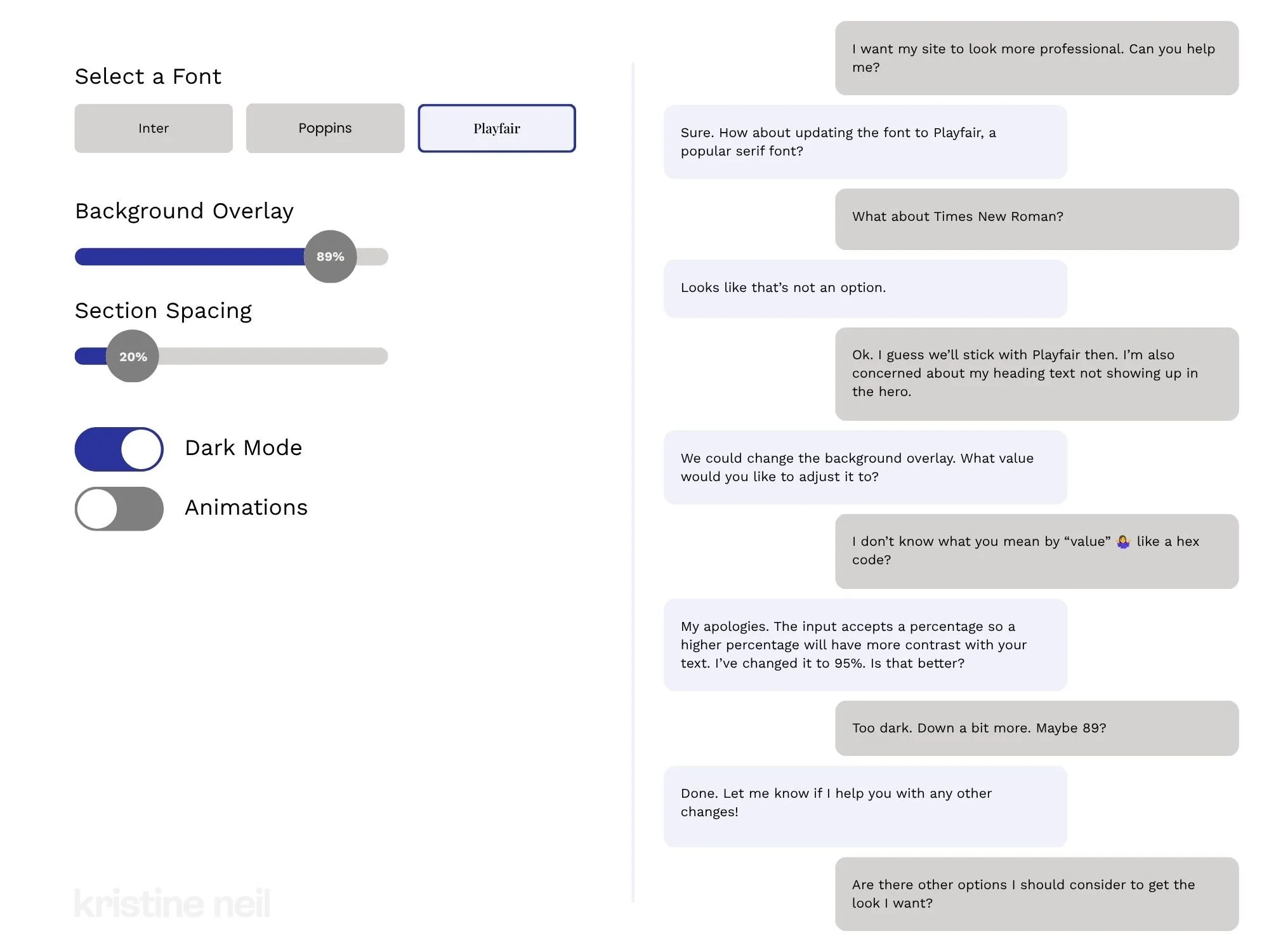
On the left, all options are surfaced and clear. On the right, well, let’s hope you know what you’re asking for.
Take something small and simple, like changing a few settings on a website. On a real dashboard, every option is sitting there in front of you. You pick a font by looking at it. You drag a slider until it looks right. You flip a toggle and watch the thing change. You didn't have to know the name of anything. You didn't have to know the font was even an option - you just saw it and grabbed it. A few seconds and you're done.
Now do that same thing in a chat window. Suddenly none of it is visible. You have to already know what you want to change, what it's called, and roughly what value you're after - and then describe all of that clearly enough for something on the other end to act on it. You wanted to nudge the overlay a little darker and now you're being asked for "a value" and you're sitting there going... a hex code? A percentage? What are my options? You can't rule things in or out because you can't see anything to rule out.
And this is the part people miss. Because the chat still has friction - not from the assistant being dumb, but from the medium itself. A dashboard lets you work by seeing and doing. Chat makes you work by knowing and describing. And describing a feeling or even a thought or idea is genuinely hard, way harder than dragging a slider until your eyes go "there, stop." You cannot choose from options you cannot see. You simply don't know what you don't know.
This is the whole trick of a good control, digital or otherwise. It doesn't just do the thing. It shows you the thing exists, shows you the range, shows you where you are in that range, and gives you something to push against. A good dashboard tells you at a glance that the fan's already on high and the station's set to 94.7 - you know your whole situation before you touch anything. The blank chat box does none of that. It doesn't tell you the fan is on high because it doesn't even tell you there is a fan.
I'm looking forward to seeing more people skip the trend of everything needing a chat bot, a blinking cursor in a blank box. Because what we need instead is clearer information. And sometimes that's best done with a toggle, a button, a dropdown, a slider. I've spent enough time jabbing at a touch screen at freeway speeds to know some things are just better with a knob.

Measuring What Matters Without Losing the Plot
Analytics are helpful, but they don’t tell the whole story. This post explores how to interpret Squarespace website metrics with empathy and intention, using UX insights to improve engagement, trust, and conversion without losing sight of the humans behind the data.
If you’ve been around the internet long enough, you’ve probably heard some version of: “what gets measured gets managed.” That’s true, but only up to a point. In web design, the real danger is that once you start measuring something, you risk mistaking the metric for the meaning.
We obsess over numbers - bounce rates, conversions, time on page - but forget what those metrics actually represent: human behavior. Behind every data point is a real person making a decision based on how your site made them feel: clear, confident, or confused.
So instead of chasing better metrics, what if we used them to diagnose where people are getting stuck? That’s where my Clarity → Trust → Action framework becomes a practical lens for what your analytics are really telling you.
Step 1: Clarity Metrics
Are You Easy to Understand?
Clarity is the first hurdle. You don’t earn trust if people don’t get what you do.
Instead of asking “How many people landed on my homepage?”, ask:
How many stayed past 10 seconds?
Which pages have the highest bounce rate - and do they share a confusing headline or layout?
Where are people hovering or clicking that they shouldn’t need to?
Clarity metrics don’t measure volume, they show whether people can get their bearings. If visitors can’t tell what you do in five seconds, they’ll take those clicks elsewhere.
👉 Quick check: Open your homepage and squint. Can you still tell who it’s for? If not, your copy isn’t doing its job.
Step 2: Trust Metrics
Do People Believe You Can Deliver?
Once people understand you, they start evaluating whether to believe you. Trust lives in patterns: consistent visuals, tone, and user experience.
Look at:
Return visitor rate (are people coming back?)
Scroll depth (are they reading or skimming?)
Navigation flow (are they exploring logically or jumping around?)
Trust lives in both the data and the experience people have on the page. You can’t force it with popups or pushy CTAs, you earn it through consistency. Every broken link, mismatched font, or outdated photo chips away at credibility. Every thoughtful touch adds it back.
Step 3: Action Metrics
Are You Moving People Forward?
Once clarity and trust are solid, action should feel natural. But this is where most analytics dashboards go off the rails because we start worshiping conversion rates without asking why people took action.
Look at your actions in context:
Which CTAs convert best (and why)?
Do people complete the checkout or donation process smoothly, or do they drop off part way?
Are you seeing repeat conversions - or one-and-done interactions?
The goal isn’t just more conversions, it’s smarter ones. One rooted in understanding, not impulse. When a site rushes people to buy, it might spike short-term sales but erode long-term trust.
Remember, a good website doesn’t just make it easy to act, it makes it feel right to act.
The Mirage of Measurement
Here’s where it gets tricky. The more we measure, the easier it is to lose the plot. Metrics can only tell you what people did - not why they did it.
A high conversion rate doesn’t automatically mean the experience is working well.
A lower bounce rate doesn’t guarantee people actually liked what they found.
Numbers will show what’s happening, but not whether it aligns with what users need.
My recommendation? View data is a compass, not a script. The numbers can help orient you and provide some rough navigation, but you still need intuition, empathy, and context to interpret what the data means.
Adding Empathy to the Equation
All the analytics in the world can’t capture the complexity of real life. Numbers won’t tell you if someone abandoned their cart because they got distracted by a crying baby, a power outage, or just plain decision fatigue. Metrics capture behavior, not the feelings or circumstances behind it.
That’s why empathy belongs in your analytics conversation. So before we get to what you should be measuring, remember that every data point is a real person. Someone with context, chaos, and competing priorities. This will help you make smarter decisions with your data. You'll be able to stop optimizing for perfection and start designing for reality.
👉 Related read: 12 Ways to Build a More Empathetic Brand
A Smarter Dashboard: Metrics That Matter
Framework Phase: Clarity
Metrics to Watch:
Bounce Rate
Time on Page
What These Really Tell You:
Do people understand what you do right away?
Framework Phase: Trust
Metrics to Watch:
Scroll Depth
Return Visitors
Session Duration
What These Really Tell You:
Are people comfortable engaging with your content?
Framework Phase: Action
Metrics to Watch:
Conversion Rate
Completion Rate
Repeat Actions
What These Really Tell You:
Are you moving visitors from awareness to confidence to commitment?
The point isn’t to hit perfect numbers - it’s to use them as clues. Every conversion, bounce, or cart abandonment is your audience saying something without words. When someone doesn’t click “Add to Cart,” donate, or book now, they’re telling you a story in reverse. You have to put on your little emotional detective hat and figure out what their actions are trying to say through your metrics.
The numbers connect the dots between what we think people want and what they’re actually experiencing. They’re not admissions - they’re context. Little breadcrumbs that lead you toward empathy and better decisions.
The Bottom Line
Measuring is easy. Interpreting is art.
Your analytics should inform decisions, not dictate them. Because the real measure of a great website isn’t how many clicks it gets, it’s how confidently it guides people toward something that actually matters to them.
Good design doesn’t just look good in the data. It feels good in real life. It’s something people can understand quickly, trust easily, and move forward with confidently.

Why Boring Websites Often Convert Better
Sometimes “boring” is just another word for effective.
We’ve all seen those websites - loud, over-designed, stuffed with animations. Why is everything scrolling and floating everywhere? Are we playing a game of chase the button? What is going on??
Sites that are trying to do so much and yet still somehow leave you feeling very, very confused.
Landing on one is like watching a movie that’s all explosions, chase scenes, and stupid sound bites - but at the end you walk out of the theater still wondering what the movie was... about? Flash may grab your attention, but it doesn’t hold it. Without a story or a clear plot, its all just noise.
The same thing happens online when a website tries way too hard to impress without giving visitors something to understand or trust right away.
So here's your permission slip (not that you needed one) but you don’t need a louder website. You need one your audience’s brain doesn’t have to decode.
Because clarity, not chaos, is what earns trust.
We live in a design world obsessed with “standing out,” but the truth is, the sites that quietly guide visitors with confidence are the ones that win. The best part is that this all isn’t just luck - it’s proven psychology. And double bonus? It doesn't take a zillion dollar mega studio budget to pull off.
🎥 Related Watch: Why "Boring" Websites Convert Better
The Science of Familiarity Bias
Humans are creatures of habit. When something feels familiar, our brains release a little hit of safety. That’s familiarity bias - we naturally trust what we recognize. And while we should all work hard to overcome our biases IRL, when it comes to UX and web design it's time to embrace our little monkey minds.
It's why checkouts from Amazon to Target look nearly identical.
It’s why “Add to Cart” buttons are usually in the same spot across eCommerce stores.
It's how we nearly all know to scroll to the footer for more info or click on a logo to go to the home page.
Consistency helps users relax and focus on the content, not the structure. For websites, it’s the same principle. A clear CTA in a predictable place outperforms an experimental layout every time.
Predictability builds trust, and trust builds action.
Cognitive Load: The Hidden Conversion Killer
Every unexpected design choice adds mental effort - what psychologists call cognitive load. The more effort it takes to understand your site, the faster people leave. Because let's face it, we've all got enough going on and are processing just an insane amount of information every day. Unless your site is the NYT puzzles app, I simply do not want to have to work at it.
And I'm not just making this up based on my own inclination towards simple. Studies show that visitors make a stay-or-go decision almost immediately - often within just a few seconds of landing on a page - and the likelihood of them leaving drops sharply after the first 30 seconds, which is forever in internet time.
In short, if they don’t feel confident they can find what they need right away, people will bounce.
Your job as a designer or as a brand owner is this: make every step effortless. Now, this doesn’t mean boring or without friction where needed; it means intentional.
The Predictabile to Professional Pipeline
Predictability doesn’t just make a website feel polished - it signals competence.
When visitors see consistent spacing, steady typography, and patterns that behave the way they expect, they subconsciously read that as professionalism. It’s the same reason we trust brands whose tone and visuals never feel off-script. Basically, consistency = credibility.
The trick here is just to not confuse predictability with sameness.
The best sites balance consistency with a little spark - something that’s uniquely you but still easy to navigate. It’s the tension between structure and surprise that keeps visitors engaged.
If your website were a film, predictability would be the plot structure. It’s what keeps people oriented so your creativity can shine in the details: the cinematography, the dialogue, the pacing. Good design, like a well-told story, gives your audience clarity about what they’re watching and, ultimately, why they should even care.
Familiar layouts don’t just make users comfortable - they make your brand feel established. A calm, structured website signals confidence. An over-designed one often reads as overcompensating. The brands that “feel big” usually aren’t the loudest, they’re the clearest.
👉 Further reading: You Don’t Need More Traffic, You Need More Trust
The Bottom Line
At the end of the day, clarity and consistency aren’t the enemies of creativity - they’re what make it possible. Predictability gives your story structure; creativity gives it spark. A great website blends the two so effortlessly that users don’t even notice the design, they just feel understood.
So, if your site is the movie trailer, your job isn’t to boost the pyrotechnics budget. It’s to make sure people know exactly what they’re signing up to watch and hype them up so that they can’t wait to see more.
That’s not boring. That’s brilliant design.

What Your Website Is Really Saying (and Why Most People Get It Wrong)
Your website communicates long before anyone reads a word. Learn how Squarespace web design, UX strategy, and clear communication shape first impressions, build trust, and convert visitors into confident buyers.
Picture this: someone lands on your site for the first time. They don’t read a single word - not yet, anyway. They scan, they scroll, they feel.
In about three seconds, they’ve already decided whether your site gets them or not.
That’s not magic - that’s communication design. Your layout, colors, and copy are already saying something. The only question is: is it the right thing?
Most sites unintentionally send mixed signals - they’re trying to be helpful and unique but end up confusing or overwhelming their visitors. As a designer and strategist, I’ve seen this across eCommerce shops, nonprofits, and service-based businesses alike. The fix isn’t another redesign. It's not about picking a new template or adding more copy. It’s about taking a step back and getting the conversation right.
Websites Are Conversations, Not Brochures
Your website is having a conversation with every visitor - even before they start reading. Layout, photography, copy, and structure all speak volumes.
Think of your site as a stand-in for you at a networking event. Are you friendly and confident, offering a clear sense of who you are from the first handshake? Or do you ramble, jump between topics, and make people guess what you actually do?
That’s the difference between a clear website and a confusing one. A good site introduces itself, makes eye contact, and leads the conversation in a way that puts others at ease. A bad one leaves people looking for the nearest exit or begging for a friend to come save them from the conversation.
Your job is to make sure that first impression feels natural and intentional, not awkward or unclear. When your website opens the conversation confidently, the rest of the interaction flows naturally - visitors lean in, not away. And now that we have them, the real work begins which we're going to get to next.
👉 Related reading: You Don’t Need More Traffic, You Need More Trust
Three Common Mixed Messages
Every site, no matter how well designed, can end up saying the wrong thing in subtle ways. Here are three of the most common mixed messages I see across client projects - moments when the website’s conversation with its visitor goes sideways. If you’re a visual learner, you can also watch me walk through these same examples in my guest video on Inside the Square’s YouTube channel:
1. The Mystery Headline
If your main headline could apply to ten different industries, it’s not helping you. Remember: clarity first, clever second. “Custom Squarespace websites that build trust and drive sales” works far better than “Design that inspires.”
2. The Menu Maze
Your navigation should guide, not confuse. The biggest impulse people seem to have is to just keep adding more links but I would argue that it's way better to keep it short (five or fewer top-level links) and label pages in everyday language. “Work With Me” says far more than “Experience.”
3. The Everything Button
When every section shouts for attention - Shop Now! Learn More! Subscribe! - visitors stop listening. Prioritize one clear goal per page. A calm, confident site feels more trustworthy than a busy one. If you're worried that this sounds boring, buckle up, I've got news for you.
👉 See also: UX Tips for Every Phase of the eCommerce Journey
Why Familiar ≠ Boring
There’s a myth that familiar design equals bland design, but let’s be honest - that myth was probably started by someone who confuses chaos with creativity. Familiarity isn’t boring; it’s comforting. It’s the quiet confidence of a site that knows exactly what it’s doing. It's a big 'ol mug of hot cocoa.
Our brains are wired to trust patterns we recognize - it’s called familiarity bias. When your layout behaves the way users expect, they don’t have to think about where to click or how to navigate. They just get it. That sense of “I know how this works” lets them focus on your message instead of figuring out your interface.
Think about your favorite neighborhood coffee shop. You don’t need to re-learn where the sugar packets or napkins are every time you visit - they’re always in the same spot. You go there because it’s predictable in the best way. A good website should work the same: welcoming, easy, and familiar enough to feel safe, even if it’s your first visit.
Familiar design doesn’t mean unoriginal. It means frictionless at all the right points, stepping in only when necessary to engage and guide (think product variant choices or confirmation steps). Familiar means your visitors are free to notice your story, your offer, your value - instead of your layout. Creativity still belongs, but it’s there to serve the experience, not steal the spotlight. Use it in your copy, your photography, and your little brand moments, not in hiding your navigation or rethinking the contact button. Visitors want reassurance, not puzzles. Unless you're a puzzle site in which case, maybe that would work nicely for you!
👉 Try this next: How To Decide Between Sales & Discounts
The Bottom Line
Design is not decoration, it’s communication. The best websites don’t shout to be seen; they lead with confidence and clarity. Every element, from layout to language, should help your visitor understand who you are and what you want them to do next. When you design with purpose instead of polish, you create trust. And when you create trust, you don’t need gimmicks or flash to stand out - you simply feel solid, credible, and right.
I love design as a tool to earn trust and provide reassurance. Done right, design can close the loop between what your brand promises and how it behaves online. It allows you to show up with intention, invite people in, and leave them thinking, that felt easy. It should make you feel the same way a great conversation at that imaginary networking event ends - comfortable, confident, and clear about who you just met and why they made such a good impression.

6 Proven Ways to Create a User-Friendly Online Store
Lost in the digital aisles of online stores? Learn how to transform your shop from a confusing maze into a shopper's paradise. Discover the secrets to intuitive design that keeps customers coming back for more!
Ever walked into a store where everything seemed... off? Like the cashier was hidden behind a plant, or all the price tags were written in a foreign language you don’t understand? Welcome to the digital equivalent of that nightmare - a poorly designed online store. But fear not, we're about to embark on a journey through the wild world of user-friendly design, where we'll discover why putting yourself in your customers' shoes is your secret weapon in the battle for their hearts (and wallets).
1. Easy Navigation: Don't Make Your Customers Feel Like They're in a Corn Maze
Picture this: You're looking for a new pair of snazzy socks on "SuperSocks.com" (not a real site, but wouldn't it be great if it was?). You click on "Men's Socks," then "Patterned Socks," then "Ankle Length," and suddenly... you're staring at a page full of women's scarves. What in the name of mismatched laundry just happened?
This, my friends, is what we call a navigation nightmare. (And it's not fun like a corn maze is.)
Good navigation is like a well-organized sock drawer (sticking with our theme here). Everything should be where you expect it to be, clearly labeled, and easy to access.
Here's how to nail it:
Keep it logical: Group similar items together. Socks with socks, scarves with scarves. It's not rocket science, but you'd be surprised how often this gets messed up.
Use clear labels: "Funky Feet Coverings" might sound cool, but "Socks" is what people are actually searching for. Save the creativity for your product names.
Provide breadcrumbs: No, not the kind that mess up your keyboard. We're talking about those handy little navigation trails that show users exactly where they are on your site.
Offer search functionality: Because sometimes, people just want to type "polka dot socks" and be done with it.
Remember, every extra click is an opportunity for your customer to get frustrated and leave. And trust me, nobody wants to be responsible for sock-related rage quits.
2. Clear Product Presentation: Show, Don't Just Tell (But Also Tell)
Let's face it, we've all been burned by misleading product photos online. You order what you think is a life-sized cardboard cutout of Danny DeVito, and bam! you end up with a 2-inch keychain. Disappointing.
Good product presentation is about creating a virtual "try before you buy" experience. Here's how to do it right:
High-quality images: Multiple angles, pictures of every color option, zoom functionality, and for clothing, please, for the love of all that is holy, show it on a real person. We need to know if that shirt makes arms look like sausages wrapped in fabric.
Detailed descriptions: Don't just say "100% cotton." Tell me if it's softer than a kitten's belly or if it'll shrink the second I put it in the washing machine.
Customer reviews and photos: Encourage customers to post photos and reviews. Nothing builds trust like seeing real people using your products (and looking slightly less photoshopped than your models). People like imperfect!
3. Smooth Checkout Process: Don't Make It Feel Like Running a Marathon
Imagine you're at a grocery store. You've got your cart full, you're ready to pay, and suddenly the cashier asks for your shoe size, your mother's maiden name, and a blood sample. Bit much, right?
Your checkout process should be smooooooth and easy breezy. Here's how:
Reduce form fields: Do you really need to know my favorite color to sell me a toaster?
Offer guest checkout: Some relationships aren't ready for account commitment. It's not you, it's them.
Show progress: Let customers know how close they are to completing their purchase. It's like those "You Are Here" maps in malls, but less depressing.
4. Mobile-Friendly Design: Because Phones Aren't Just for Doom-Scrolling!
Did you know that 79% of smartphone users have made a purchase online using their mobile device in the last 6 months? The other 21% were probably lost in a corn maze.
Here's how to make your mobile experience the best it can be:
Responsive design: Your site should look good on everything from a smartwatch to a smart fridge.
Touch-friendly: Buttons should be big enough for even the clumsiest of thumbs.
Simplified navigation: Nobody wants to feel like they need to be a member of the FBI just to find the "Contact Us" page.
5. Personalized Experience: Make Your Customers Feel Like VIPs (Very Important Purchasers)
Personalization is like remembering your friend's coffee order. It shows you care, and it makes their experience smoother. But there's a fine line between thoughtful and creepy. You want to be more "You might like this based on your recent purchases" and less "I see you're running low on toilet paper."
Some ways to personalize without being a digital stalker:
Product recommendations: Based on browsing history or past purchases.
Tailored email marketing: "Hey [NAME], we thought you might like this" is way better than "Dear Valued Customer."
Remember preferences: If they always sort by price: low to high, maybe do that automatically next time.
6. Inclusive Design: Create for Your Target Demographic, Not Just For Yourself
Designing for all users isn't just nice to have, it's essential. And no, adding alt text to your images isn't just for SEO. It's for people who use screen readers. Remember, not everyone navigates the web the same way you do.
Some key points for inclusive design:
Color contrast: Make sure your text is readable. "Neon yellow on white" isn't a color scheme, it's an eye exam.
Keyboard navigation: Some people can't use a mouse. Make sure your site is navigable with just a keyboard.
Clear error messages: "Oops, something went wrong" isn’t helpful, it’s annoying.
Bottom Line: Let Understanding Your Customers Become Your Superpower
Creating a user-friendly online store isn't about mind-reading (though that would be cool). It's about putting yourself in your customers' shoes, or socks, or whatever it is you're selling.
Remember, behind every click, swipe, and purchase is a real person. They might be stressed, tired, or just really excited about finally finding those elusive polka dot socks. Your job is to make their journey as smooth and enjoyable as possible. And remember, if all else fails, just ask yourself: "Would I enjoy shopping on this site?" If the answer is no, it's time to channel your inner customer-friendly superhero to save the day.

9 eCommerce Design Tips I Love from GoLive's eCommerce Template
Check out my review of GoLive’s beautiful new Trove ecommerce template. I highlight seven specific design elements from Trove that any online shop should implement to drive more sales, along with a link to my full video walkthrough of the template.
I recently had the chance to dive into Trove, the latest eCommerce template offering from web design mavens GoLive. As a proud Squarespace partner myself, I was drooling over how beautiful and retail-ready this template is right out of the gate!
Whether you sell furniture, run a fashion boutique or curate artisanal wares, Trove provides a polished yet flexible foundation for your online shop. But beyond just being pretty, this template packs in smart eCommerce features that drive sales.
I highlighted some of my favorite elements in a recent YouTube template walkthrough. Check that out below to see Trove in action!
For those looking for hard-hitting tips to improve your own online shops though, here are 9 key eCommerce design takeaways from the Trove Template:
Include Shop Categories in Your Main Navigation - Having clearly labeled shop categories prominently placed in your header navigation helps visitors immediately understand the different products you offer.
Spotlight a Best Sellers Section - Featuring your most popular products front and center builds credibility by showcasing what you do best and what shoppers love.
Share Your Company Values and Story - Devoting website space to communicate your brand values, ethical sourcing commitments or origin story allows visitors to connect with the real people and passions behind your business.
Incorporate Customer Reviews and Testimonials - Sprinkling in social proof through reviews, testimonials and press features helps reinforce quality and trustworthiness.
Add a Visible New Arrivals Section - Giving customers an at-a-glance place to view your latest product drops and inventory additions encourages discovery of items they may have missed otherwise.
Structure Intuitive Category Pages - Clean sidebar navigation on your category pages lets visitors easily self-serve and find what they are looking for.
Keep Your Product Page Descriptions Focused - Leading with scannable yet hard-hitting product details helps visitors quickly grasp the essence of each item.
Include Supplementary Product Sections - Extended areas covering FAQs, care instructions, shipping specifics etc. answer common questions without cluttering up the main description.
Show Related or Recommended Products - Suggesting complementary or popular items encourages customers to shop more.
As you can see, beyond just looking absolutely stunning, Trove sets up some ecommerce best practices that any online seller should have in their playbook!
Ready to check out Trove for your own upcoming store build or redesign? Hop over to GoLive’s site for all the details on this standout template.
Hopefully these tips sparked some ideas on how to better spotlight products and craft intuitive experiences for your online shop! For more eCommerce web design inspiration, check out one these popular posts:
Watch The Video Walkthrough of Trove:

6 Simple Tips for eCommerce Photography that Converts
The secret to more orders and fewer returns? Great photos! Learn the ins and outs of impactful product photography for your eCommerce site. Whether you choose to DIY or go professional, these tips will make sure your images really shine. Plus, discover my resources for great eCommerce photos to fit any budget!
Updated Jan 2024
I’ll avoid starting this post with the whole “a picture is worth a thousand words” schtick and just get right down to it: crap photos are killing your shop’s vibe. Images that are dark, blurry, inconsistent or make it difficult for people to see what they’re actually buying are more than just a turn off. Did you know that an estimated 22% of online purchases are returned simply because the item looks different in person than it did online? That’s a huge number but one we can easily improve upon simply by having better photos to begin with. More orders and fewer returns? Yes, please.

ECOMMERCE PHOTO TIP #1
Lighting is everything.
The best thing you can do to make your DIY photos look more professional is pay attention to the lighting. Just like none of us likes how we look when our pics turn out dark and gloomy, your products feel the same way!
Depending on the style you’re going for you could either wait around for some great natural light or invest in a few items to set up your own little photo studio. There are lots of options out there for stands, lights, backdrops and other accessories to make sure your products are shown in the best possible light.

ECOMMERCE PHOTO TIP #2
Go for clean backgrounds, or none at all.
I almost always recommend that each product have at least one image that has either a white/light background or no background at all. Photos with clean backgrounds make your shop look super modern and easy to browse, cutting down on too much visual clutter.
You can add fun photos with colored backgrounds or patterns as additional product images but the main product thumbnail almost always looks best with a very simple background. To achieve this look on your own, you will need to brush up on your Photoshop skills and pay attention to things like shadows to keep things looking professional.

ECOMMERCE PHOTO TIP #3
Keep your style consistent.
Coming up with new photoshoot ideas is great and all but remember that your product photos are all part of the bigger brand story you’re trying to tell. Keeping your style consistent can also help people identify your brand at a glance even if they interact with it on several different platforms i.e. your website, your social media + any other channels you may be selling on such as Etsy or Amazon.
You can create consistency in your photos by using the same backgrounds or scenes or by sticking to a well-defined color palette in your images.

ECOMMERCE PHOTO TIP #4
Use high-res images that are “zoom-able”.
One of the hard things about shopping online is that you miss out on the sense of touch. Without your potential customers being able to feel what they’re buying, give them the next best thing and make sure your images are high resolution and look great even when zoomed way in. I can’t tell you how many times I’ve been shopping online and appreciate the ability to zoom in to really see things like fabric details or the texture of a product. So helpful!
To enable product image zoom on Squarespace: from the product details page, click EDIT > click the Pencil icon > select ZOOM from the HOVER ACTION drop down menu.
Image size tip! Even though you can upload images up to 20MB, using images that are 500KB or less will help make sure that your site loads quickly.

ECOMMERCE PHOTO TIP #5
Show the whole product from all angles.
Again, the goal of eCommerce is to give people as much information as they could get if they were shopping with you in person. One way to do this is to make sure that you have images of the front, back and sides of your product. Even better - a 360° video or spinning gif!
It’s also important (and this really should go without saying) that you show your whole product in photos! This isn’t the time to get artsy with weird cropping, either intentionally or unintentionally.
One of the most common questions I get is how to fix product images from getting cut off on Squarespace. For this, you’ll just want to make sure that your finished photos all have the same ratios. They can be square or 2:3 or whatever you want them to be, they all just need to be the same to make sure they always look as intended.

ECOMMERCE PHOTO TIP #6
Have a photo of every product variation.
Lastly, even if you think your product variations are super simple and straightforward - take a picture of each and every one of them! This is obviously important for things like color variations but are also nice for product variations that come in different sizes or flavors. For example:
Color variations - example: you sell sweatshirts available in red, blue and green. Have one main pic that shows all three together + one image for each color variation.
Size variations - example: you sell candles and offer a one pack or a three pack. Have your main image be the single candle and a secondary image that shows three candles together.
Flavor variations - example: you sell CBD gummies that come in four flavor options. Have one main pic that shows all four flavors + one image for each flavor variation.
Bonus Budget eCommerce Photography Tip
If you’re going to invest in photography, I say it’s 100% worth it to spend the money photographing your products first. You can check out this post all about how to integrate free stock images for things like website backgrounds or other non-shop pages of your website. So, if you need to, don’t feel bad about using some carefully curated stock photos to set the mood or tone for your site. Just come in strong with your stellar product photos and things will feel personalized, professional and ready to sell.
My Recommended Source for Easy eCommerce Product Photos

Let’s say your calling in life isn’t to be a photographer. What to do? Meet Soona. Finally, an easy way to get great-looking photos and take the stress out of finding and hiring a photographer you can trust. Soona calls themselves a “self-service content creation platform” and here’s how they work:
You book a virtual shoot (or in-person if you’re near LA, Seattle, Austin, Minneapolis or Denver). You can choose from their different image or video packages or just select what you need ala carte. You can add-on special things like having a hand model, full body model, or even a pet model 😻 depending on your needs.
Mail them your products.
On the day of your shoot, you join in virtually where you can interact with the crew to give real-time feedback so the photos are exactly what you’re looking for.
Once your shoot wraps, you select the photos (or videos!) that you love and the finished, ready-to-upload results are sent to you within 24 hours. Flat-rate pricing ($39 photos & $93 videos) makes it easy to stick to your budget.
Here’s what I love the most about this process: you only pay for what you love and know that you’re actually going to use… versus paying a photographer hourly for a photoshoot where you’re not even sure what the results will be for weeks, sometimes months.
Overwhelmed by choices? Check out the eCommerce Starter Pack!
p.s. All pics in this post are from Soona!

Take the Extra Step: Customizing Your Store’s Email Notifications
Let your customers know that they matter to you beyond the sale by bringing your brand into their inbox. Customizing the default emails your site sends is a quick way to create a personalized experience and Squarespace offers lots of options to quickly and easily edit all the stock emails in one place.
Updated Dec 2023
Customer email notifications are one of those things that often get overlooked or skipped by eCommerce novices. They assume the defaults will work just fine and don’t do much beyond maybe adding a logo. This is a giant missed opportunity! Taking just a small amount of time to customize your store’s email notifications lets your customers know that you care about their experience beyond the sale and goes a long way in helping build brand credibility.
Customers get email notifications for a whole bunch of different activities they may take on your site including when they buy something, create an account, join a membership area, or even make a donation! Squarespace recently updated the entire email editor to provide more design and personalization options so it’s a great time to revisit this even if your site’s been live for years.
WATCH THE VIDEO
GET THE DETAILS
How to Personalize Your Emails
Something that’s a great time-saver is the ability to set some global styles that will apply to ALL the emails that your site sends. (Also points for keeping branding consistent!) To get to the settings, just click on COMMERCE > CUSTOMER NOTIFICATIONS. To change the style options, just click the EDIT EMAIL button in the Global Email Styles preview pane. Business settings are under the… Business Settings link. Here’s a summary of all the possibilities and some important things to note:
Global & Business Settings
Global Email Styles
In terms of style, you have lots of control. You can edit colors, fonts, buttons, and the header & footer appearance.
Colors - I would recommend keeping a white/light background so that your emails are always easy to read. Then, just add in your signature brand color as buttons, below. Choose colors that match the ones in your Site Styles exactly.
Fonts - You’re only allowed to select from certain custom-paired font packs and cannot use custom fonts in emails (more on this at the end of the email if you need an explanation on why). You can change things like font sizes and text & link colors to suit your brand but you’ll need to pick a font pack that feels like your brand even if the fonts aren’t exactly the same. A good tip if you used one of the font packs in your Site Styles for your website, just pick a similar themed one for your emails; i.e. serif, sans, or mixed.
Buttons - You can change the style, alignment, colors & font of the buttons that appear in your emails. Don’t think too hard on this and just make them match your site’s settings!
Header & Footer- You have lots of options to be able to set your email headers & footers up so they don’t look so “default-y” 🙃 Play around with some great preset layout options but then choose colors and fonts that match the other choices you’ve made, above. I always think it’s a good idea to choose to display your logo in emails - it makes things look really official and personalized vs just having your site title. Or, you could choose to show your site title in the header and your logo in the footer! Another great footer option that you should enable if you are active on social media is including social links!
Don’t worry if this seems like a lot of options. The best part about taking the time to just edit the global email settings is that you only have to do it once and it automatically applies to everything!
Business Settings
You’ll want to make sure that you’ve added your business info by clicking on SETTINGS > BUSINESS INFORMATION from the home screen. This will feed that info into the email notifications section. Don’t omit this information because not only is it helpful to your customers, in some places it’s actually legally required to include in the footer. Here are a few tips when it comes to the business settings in this section:
The “From” email address should absolutely be a custom, branded email address. Do NOT use a Gmail, Yahoo, or other free email address! Not only does this look unprofessional but it can also affect email deliverability issues. You don’t want to end up in everyone’s spam box!
The “Reply-To” email should be whatever inbox you or your team check the most often. You want to be able to read and reply to customer emails quickly. If you’re setting up an email alias for all your shop emails (ex: shop@yourdomain.com) that’s not your main inbox, I would suggest also setting up forwarding on that email. This could be simple (all shop emails go to X person/dept) or more complex using a tool like Zapier.
💁♀️ Note: if you send test emails to yourself to check out how things look, they are all going to come from “no-reply@squarespace-mail.com” but that’s just for testing! Your actual reply-to email will be used for real emails sent from your site!
Customize With Merge Tags
Before we get into all the different types of emails you can customize, a quick review of merge tags! Honestly, these are the key to making sure your customers feel loved and appreciated. It’s like getting a piece of snail mail that isn’t junk! Here are the different elements you can insert into your emails:
Customer first name - abandoned cart, product restock, customer account welcome, password reset & password updated emails
Linked site title - all emails
Order number - order confirmed, order refunded, order fulfilled, and digital download emails
Subscriber first name - subscription canceled and subscription authorization required emails
Subscription name - subscription canceled, subscription authorization required and subscription payment declined emails
Donor first name - donation confirmation emails
To add a merge tag, just highlight the text you want to customize and click the arrow icon in the formatting bar. Then just select the tag from the options. Here’s what it looks like:

💡 Merge Tag Tip! You can also work merge tags into subject lines or the email preview text to make emails really feel personalized and stand out in your customer’s inbox!
Descriptions of All The Email Types
Ok, now for the fun part! I promise that this may seem like a TON of emails to have to work on but for the most part, you’re going to let the default language and global style settings do most of the work and then just pepper in some personalization and merge tags here and there so that your emails stand out from the rest. I’ve listed out all the emails below and then added some ideas for how to customize them where I feel like it would be most impactful.
🤓 Remember in general I wouldn’t mess around at all with styling individual emails; do that at the global level! This is just focusing on the content or the actual wording of the emails.
💡 Tip! Squarespace is going to automatically fill in things like order numbers, order details, transaction info, tracking info, etc. into the various emails so you don’t need to add any of that info on your own. Along those lines, keep the personalized copy you add as general as can be as the same email(s) will be sent for all of your products/orders even if you sell lots of different things.
🚩 I’ve bolded the emails below that I think are most important so if you’re short on time, customize these ones first and come back to the others. I’ve also noted some emails as self-explanatory which is… self-explanatory.
General Orders
Order confirmed - this is arguably the most important email your site will send to a customer. It has the potential to go way beyond just providing a record of their order. A great confirmation email reassures the customer that they made a great choice, expresses gratitude for their business, and opens up the 1:1 conversation between them and your brand. It allows you to use your brand voice beyond your website and welcome customers into the fold. You can do things like asking them to follow you on social media or provide additional value by directing them to additional content on your site that relates to what they ordered. If you customize nothing else, do this one.
Customizing Product Emails by Product Type
Update! Since this post was first published, Squarespace released the option to create custom order confirmation emails based on the product purchased. This means that if you sell a mix of physical, digital & service products your order confirmation emails can have a custom copy for each one. This is super helpful because it means that if you want to include special information about shipping or lead times that would make sense for an order for a physical product but not for a digital good or service you can do that. It may make sense to include a link to your scheduler in a service email order confirmation or download instructions for a digital good order. Lots of possibilities! To customize these from the Customer Notifications panel go to General Orders > Order Confirmed > Edit > Add an optional custom message based on product type.
Order fulfilled - this is the email that’s going to include the tracking information that you’ve added (or your Squarespace shipping extension has added) to the order. Get people excited for what’s on the way by including an opening sentence or two thanking them for their order and getting them hyped for the delivery.
Ready for Pickup - if you offer a local pickup option, this email is sent instead of the “order fulfilled” email, above. Use this email to provide locals with precise pickup information. Some suggestions are to repeat the hours you’re available for pickup orders, your address, and what’s required to pick up their order. For example, you might require a photo ID or just for them to show you their order confirmation on their phone. If your location has any special parking instructions or a special area for curbside pickups be sure to note that as well.
Order refunded - self-explanatory
Digital downloads - if you sell digital products, apply everything I said for the order confirmation email, above, to this email instead.
Donation confirmed - if you’re a nonprofit or an organization that accepts donations, apply everything I said for the order confirmation email, above, to this email instead.
Payment declined - haha never a fun email to get but you could lessen the sting by injecting some humor into the situation!
Product not available - this email only gets sent if the product inventory drops to zero while an order is processing. If you’re releasing product drops that often sell out or have lots of traffic competing for a small amount of product, this one can be worth customizing. Otherwise, default is probably ok because for most sellers this will not ever end up ever being sent out.
Point of Sale
Order receipt - think of this as the in-person version of the order confirmation email so if you sell via Squarespace POS you could add some pizazz here. I think it’s less important than strictly eCommerce order confirmations because the customer presumably had some sort of in-person interaction with your brand but it’s still an opportunity to continue the conversation or make a good impression.
Refund receipt - self-explanatory
Customer Engagement
Abandoned Cart - according to this recent study, roughly 3 out of every 4 shoppers will leave a site without completing check out. Enabling - and customizing! - your abandoned cart email can help you recover 10% or more of that otherwise lost revenue. I think a strategic abandoned cart email cuts straight to the point so I wouldn’t add too much in the way of copy but your subject line and an opening header or sentence could really make things stand out in a crowded inbox. Don’t forget that you can use merge tags in email subject lines and preview lines!
Waitlists - if you’ve enabled waitlists for sold out, back-ordered or not-yet-launched products, this email is what will let people know when a product they were interested in is available for purchase. Note: these emails aren’t automatically sent by the system; you’ll need to indicate that you’re ready to send them by going to COMMERCE > WAITLISTS.
Customer Accounts
Account created - if you’ve enabled customer accounts, I think this is a good email to give a little love to. Add some personality and let people know what to expect and what they can do to manage their own accounts.
Reset password - self-explanatory
Password updated - self-explanatory but keep in mind that the reset password link expires after 24 hours.
Gift Cards
Gift card issued - this is admittedly not the best-looking feature on Squarespace BUT you can make the best of the situation by at least adding some exclamation points!? Yay! A gift!!
Gift card voided - self-explanatory
Subscription Orders
Subscription canceled - self-explanatory, but make sure they know if there is any fine print just to cover your bases
Subscription verification needed - self-explanatory
Payment failed - self-explanatory but see the payment declined email, above. (TL;DR when in doubt, make a joke.)
Member Areas
Membership Welcome - if you’re using the awesome new Squarespace Member Areas feature, this email is the equivalent of an order confirmation email (minus the transaction info, that’s sent separately). This email is your opportunity to offer valuable “getting started” type info, suggest the best next steps, and let people know how to contact you or manage their membership. Don’t make it too long but know that a lot of people will save or bookmark emails and refer back to them later!
Membership Canceled - express some sadness if you must but please don’t do that thing where you guilt/shame people for canceling. Just confirm what happened and move on.
What You Can’t Do
Just a reminder of a few requests that come up occasionally that are not possible:
You can’t turn off any of the emails to stop them from sending. If you are wanting to do this, I would suggest working through WHY. There may be something about the way you have the product or service set up or your own internal process that needs to change if you’re thinking about needing to do this.
You can’t change the default portions that automatically populate i.e. order details, transaction info, tracking info, etc. This is for a good reason - it saves you time! Just like above, if you’re thinking about trying to edit these types of things I would look instead at your fulfillment process or internal business systems first.
Change styles on an email-by-email basis. Another time-saver. Set these things at the global level and be done with it.
Use custom fonts. The reason for this is that the fonts need to be universal so that they display nicely in all different email providers. Custom fonts can be tricky and you’re better off picking something similar but standard even if it’s not a perfect match. Some brand designers will even provide recommended system fonts to use for situations like this since it’s pretty common.
Other Site Emails
While all of the emails above may seem like a lot, there are actually even more emails that your site can send depending on what other features you’re using. These features are:
Squarespace Scheduling
Squarespace Email Campaigns
Afterpay payment plan emails
Email notifications to the store owner & contributors about orders and low inventory
The thing to remember on these emails is that you’ll need to set them up and style them in addition to any of the customer notification emails described in the main part of this post. Most of them have similar options for things like adding a logo to the email header or customizing button colors, etc. but they may not look 100% the same. Just do your best to make them look as cohesive as possible and don’t sweat the small stuff on this. It’s ok if these emails look like sisters instead of twins.

The Importance of Accessibility in Web Design
Web accessibility is essential for creating an inclusive online experience. It helps websites reach a wider audience, improve search engine rankings, and reduce maintenance costs. Here’s how to do it.
Dream scenario: A world where everyone is able to enjoy every website online, regardless of their ability.
Accessibility has been a topic close to my heart for years. It's not just about creating an inclusive online experience; it's about ensuring that every individual, regardless of their abilities, can access and engage with digital content. In this post, I want to emphasize the significance of accessibility in web design, provide you with practical tips to make your website more inclusive, and share my favorite accessibility tool. But first, let's talk about why accessibility matters.
Designing for All
When we discuss accessible design, we often think about people with permanent visual, auditory, or cognitive disabilities. However, the scope is much broader. Accessibility also encompasses those with temporary disabilities as well as individuals with varying levels of ability, like the elderly. Additionally, we must consider users with limited internet access or those who rely solely on mobile devices to browse the web. It’s why designing with empathy is so important. By designing with inclusivity in mind, we ensure that everyone, regardless of their situation, can access and navigate our websites seamlessly.
Four Tips for Creating an Accessible Website
Keep layouts clean and minimal: Cluttered layouts not only hinder comprehension but also pose challenges for interaction. Design your website with a clear and intuitive structure, making it easy for visitors to find information and take desired actions. Remember, simplicity is key.
Use color wisely: While aesthetics play a vital role in web design, it's important to go beyond visual appeal. Consider users with color blindness or those accessing your site in challenging lighting conditions. Provide high contrast elements and alternative visual cues to ensure that your content remains accessible to all.
Put alt text, metadata, and links to work: Enhance both user experience and search engine optimization by incorporating descriptive alt text for images and providing additional context through captions and text transcripts for multimedia content. Avoid using vague hyperlinks like "read more here" and opt for clear, descriptive language instead.
Remember, boring and consistent can be good things: While innovative design concepts are exciting, when it comes to web accessibility, consistency is key. Users rely on familiar structures and functionalities to navigate websites efficiently. By sticking to established design patterns, you create a more inclusive and user-friendly experience.
Everyone Wins with Inclusive Design
By implementing accessible design principles, you not only ensure that your website is available to a broader audience but also reap various benefits. Accessible websites tend to:
Perform better in search engine rankings 📈
Reduce maintenance costs 📉
Increase audience reach 🌎
As technology evolves the long story short is that we all benefit from accessible design, whether we interact with the web through smartphones or voice assistants, screen readers or other accessibility tools.
How to Make Your Website Accessible Today
Designing an accessible website is not only the right thing to do, but it's also essential for legal compliance. The Department of Justice has made it clear that business websites should align with specific accessibility standards. Non-compliance can lead to potential lawsuits, putting your business at risk. But don't worry, I've partnered with accessiBe to provide you with a simple, streamlined solution.
accessiBe is an AI-powered web accessibility solution that ensures your website complies with WCAG, ADA, and other accessibility regulations. By incorporating accessiBe, you empower individuals with disabilities to adjust how they view and interact with your website without compromising the codebase, layout, or design. With accessiBe's continuous monitoring and personalized reports, you can easily prove compliance and maintain an inclusive online presence.
Remember, designing for accessibility isn't just about meeting legal requirements; it's about embracing diversity, empathy, and equal opportunities. Join me in creating a digital landscape that truly serves everyone with accessiBe!

How FAQs Can Boost SEO and Customer Satisfaction on Your Squarespace eCommerce Website
Are you looking to enhance your online business and provide a seamless customer experience? Discover the power of FAQ pages! Learn how FAQs can answer burning questions, boost trust, save time, smooth the shopping experience, showcase your expertise, and amp up your SEO awesomeness.
Real talk: FAQ pages aren't exactly the most glamorous topic in web design. Let's face it, no one starts a conversation about their website by raving about their awesome FAQ page. But here's the thing: FAQ pages are often overlooked or added as an afterthought, leaving visitors searching for missing information. That's why I believe it's smart to include a FAQ page right from the start, even if you're not sure how "frequently" those questions are asked!
Here are my tips to ensure your FAQ page does its job:
Pay attention to design & organization: While FAQ pages may seem a bit mundane, they don't have to be ugly. Organize your page effectively using accordion menus, tabs, or dropdowns to prevent it from looking overwhelming. Headers and subheaders can make the page skimmable, and anchor links improve the user experience. Function matters more than form, but a messy FAQ page can be a red flag.
Answer the questions no one asked: Sure, FAQs are meant to address frequently asked questions, but they can also be an opportunity to showcase your brand's personality. Consider including questions that no one would think to ask, but that allow you to share a bit of your brand's story or values. Think of them as the "I'm so glad you asked that" type of questions.
It's okay to repeat yourself: Don't assume that visitors have read every page on your site. Even if you have a dedicated shipping page, include shipping-related FAQs on your FAQ page. People tend to skim websites, so your FAQ page serves as a highlight reel of important information from across your site. Include key details that visitors may have missed and provide links to relevant pages for more in-depth information.
If you're unsure about what to include on your FAQ page, here are some ideas:
Contact information
Unique selling points of your product or service
Guidance on choosing the right product/service
Things customers might need to know but haven't thought to ask
Return policy
Shipping options and timelines
Password reset instructions
Refund policy
In a nutshell, every website can benefit from a well-crafted FAQ page, even if it's short and sweet. Think of it as an opportunity to educate your customers and build their confidence in doing business with you. A well-organized FAQ page with thoughtful answers shows your commitment to providing exceptional customer support. So, let's give your visitors the answers they're looking for and create an FAQ page that truly shines.

5 Simple Steps to Optimize Your eCommerce Site for Mobile Sales
With mobile purchases making up about half of all eCommerce sales, it's important to optimize your website for mobile sales. It’s not enough to just put your products or services online for people to discover. You’ve got to make sure that your site is designed for selling on devices big and small.
It's highly likely that your clients or customers are searching for your products or services on their mobile phones, regardless of what you sell. In fact, some estimates suggest that mobile purchases account for roughly half of all eCommerce sales! This means it's crucial to consider these users when designing your website. They don't just want information about your company or offerings; they want to take action, make purchases, enroll, sign up, and connect with you. For many users, the entire process from research and discovery to purchase and beyond occurs on their mobile devices.
Is “Mobile First” outdated?
Web designers have been discussing "mobile-first" web design since the first iPhone was released, but as with all things tech, there have been numerous improvements and changes over the years. Mobile-first design simply means that instead of designing a website for desktop screens first and then attempting to scale it down to fit mobile devices, it may be more effective to approach it the other way around.
While this buzzword is relevant when considering eCommerce, modern web design platforms like Squarespace and Shopify now handle responsive design so well that we don't need to focus as much on creating two separate experiences. Instead, it's more important to build an empathetic brand that considers the distractions and emotions users may experience while visiting your site. This entails paying attention to your content, organization, structure, layout, and site architecture just as much as the design of your website.
So, knowing that mobile commerce is something we need to think about as we take all phases of our interaction with brands onto our phones, here are five things you can do to optimize your website for mobile sales.
1. Have your site built on a platform that does eCommerce well.
If you're considering building your eCommerce site on Squarespace or Shopify, you're already ahead of the game! Page layouts on both platforms automatically adjust to any screen size, from the smallest phone to the largest desktop. This is crucial because users prefer vertical scrolling on small screens rather than having to zoom in or scroll sideways. Plus, Google rewards mobile responsiveness with higher search engine rankings!
If you're struggling to make your design work seamlessly on mobile devices, Squarespace 7.1 Fluid Engine has got you covered. With the added feature of adjusting layouts exclusively for mobile, you can create bespoke designs that cater to users on varying screen sizes. For more information on Squarespace 7.1 and its impact on eCommerce sites, be sure to read this post.
2. Pay attention to site speed.
Slow loading times can be detrimental to your website's success, not just because it's frustrating for users. Google takes note of this and may penalize your site accordingly. To improve the speed of your site, pay attention to page size (keep them under 5 MB) and image size (below 500 KB or with a width of no more than 2500px). You can easily compress or downsize your image files using free online tools before uploading them to your site. If you're experiencing slow loading times, start by reducing your image sizes. If you're interested in doing more to optimize your Squarespace site's SEO, I highly recommend SEOSpace!
3. Consider a minimalist’s approach to visual content.
Some design trends may look stunning on a 27-inch iMac, but they can be a disaster when viewed on mobile devices. There’s a fine line between designing for the sake of design and designing for conversion. Every aspect of your website, from headlines to images to text blocks, buttons, and even white space, should serve a purpose. If an image looks great on your giant desktop but crops weirdly on mobile, it’s not going to work. And you’d be remiss to sacrifice the mobile experience for the sake of desktop aesthetics.
Keep in mind that things need to work when stacked vertically, one element at a time, which is how they are viewed on mobile. You’ve only got a few scrolls to get your point across or visitors will abandon your site - most likely off to one of your competitors.
Struggling to keep your design in check? Check out my post on this: A Minimalist’s Guide to Branding
4. Navigation matters more than page content.
I want to emphasize that your page's content is crucial, but I often see clients fixate on minor details for a paragraph buried deep in their website while neglecting the organization of their site as a whole. The way you structure and present your information, known as information architecture, is vital to your site's success, particularly if you want to appeal to mobile users.
Of course, page content matters too - visitors shouldn't have to struggle to understand what you're offering. To be mobile-friendly, prioritize smart content and intuitive navigation. For eCommerce sites, consider using categories and subcategories to thoughtfully nest information. When it comes to main navigation, keep titles brief and limit the number of links. Or consider one of my favorite suggestions: replace your typical website navigation (Home, About, Contact) with your shop categories instead!
For more on making sure your site is as user-friendly and easily navigable as possible, check out this post: UX Lessons from a Former Sign Designer.
5. Make checkout easy.
If you’ve done all of the above and got someone to add something to their cart, don’t make it hard for them once they get there! To optimize the checkout experience, I highly recommend minimizing the amount of information required. While it may seem beneficial to gather additional details such as a customer's birthday or how they found you, these actions create friction that can lead to lost sales. The checkout process is not the ideal time to get to know your customers better. Instead, consider shifting all extraneous communications to a weekly newsletter, social media feed, or personalized post-sale follow-up email. For more information on setting up product-specific email automations, check out this helpful guide.
Bottom Line: Elevating the Mobile eCommerce Experience
To maximize your mobile sales, it's crucial to pay attention to the small details. Keep in mind that your customers may be distracted or in a hurry when browsing on their mobile devices. Therefore, your goal should be to make it as easy as possible for them to discover and purchase your products. With the increasing number of mobile shoppers, optimizing your website's size, content, and checkout process is more important than ever. For additional web design tips, check out this post: Website Tips from an eCommerce Pro!

How to Design Your Own Squarespace Template
Your search for the perfect template for your new eCommerce website ends here. In this post, I’m going to show you how you can design your own custom template in just a few easy steps. Includes a walk-through video showing you exactly what to do!
I know what you’re thinking — designing your own custom Squarespace template must be a super hard process that only the most advanced and skilled Squarespace web designers can pull off, right? Don’t worry; it’s easier than it sounds!
Sure, there are a lot of templates out there to comb through and pick from, and I even have a bunch of posts all about templates if you’d like to check those out:
But I really think that designing your own template is an option worth your serious consideration.
Here’s why:
It’s fast and easy to customize your own template, so you can spend more time on other things.
It's free and included on Squarespace, so you can just jump in and start editing.
It’s flexible, so no matter how you decide to pivot or grow, there’s room to build on.
Get Started
So how exactly do you design your own template for your eCommerce website on Squarespace? The exact steps are covered below, but if you prefer to watch, check out my walkthrough of this process in my YouTube video.
You can also follow along with my steps by starting your own free trial of Squarespace. Click the button below to get started and you can work along with me!

Squarespace Blueprint’s Step-by-Step Guide
We’re skipping the template library and building our very own template. Squarespace makes this as easy as pie! Just by selecting from a few preliminary options and settings, a completely custom site is created for you, ready to fill in with your content and products.

STEP 1
Add Your Site Title
The first step asks you to give your website a name. This is important because even if you end up adding a logo to your site later on, the Site Title is what search engines see. So don’t get weird - just give this your company name!

STEP 2
Build Your Homepage
In this section, you’ll work through recommendations for your home page layout from top to bottom. You can change up any of these if they aren’t perfect but try to pick layouts and sections that are as close as possible as you’d like each to look like to save yourself time later on. You can choose as many or as few sections as you like, but I recommend definitely adding one from each, as it will help you frame out a complete home page.

STEP 3
Add Additional Pages
This section is where you can define which other pages you’d like Squarespace to populate for you, so take the shortcut! Select all but Services (unless you also offer services, of course). That means that Shop, About & Contact should all be selected.

STEP 4
Choose Your Color Palette
Here you’ll be presented with some designer-approved color palettes to select from. It’s probably not very likely that your exact brand colors are represented, and that’s ok - just pick something close. If you’re unsure where to start, I recommend selecting from an option in the “Neutral” section - most of those make for a nice jumping-off point and work with a wide range of brand accent colors.

STEP 5
Choose Your Font Pairing
Lastly, you’ll need to select a set of fonts to use as a (you guessed it) jumping-off point. Just like with colors, it’s ok if you have some predefined fonts you use for your brand and don’t see them represented in the options. You can always tweak them later as needed. That being said, if you don’t already have any brand fonts picked out or aren’t sure that the fonts you’ve chosen will work well for the web, these are all great options. Choose a sans serif font pairing if your brand skews minimal/modern, a serif font pairing for a traditional/elevated brand or a mixed pair to make things feel dynamic/fun.
TADA!
Check Out Your New Site & Next Steps
Once you’ve worked through the 5 onboarding steps, Squarespace will do its magic and generate your own custom template to match your preferences and selections! It’s ok if everything isn’t exactly perfect; my guess is that it’s already feeling a lot more YOU than a generic template. From here, you’ve got the groundwork set to go in and customize the placeholder text and swap out the stock images with your own. Use the template wording as a guide for how much copy you need to write and what spaces you have to fill. If you’re needing a little help with stock photography, check out this post all about how to use Unsplash to curate your website images. W
When you’re ready to start selling, follow these steps in A Step-by-Step Guide on How to Set Up Your First Online Shop and use code KRISTINE10 for 10% off your Squarespace subscription! You’re in business!

My Favorite Squarespace eCommerce Templates for 2023
Check out 6 of my favorite new templates + exactly what I would do to each of them to make them eCommerce ready.
I’ve posted before about some great templates to check out if you’re looking to launch or update your Squarespace eCommerce website (see here and here) but I’m back with some of the latest and greatest for 2023!
Keep in mind that while not all of these are necessarily eCommerce-forward right out of the gate, there’s no reason why you can’t add a shop big or small to any of them. This is one of the things I love most about Squarespace: that you can have a beautiful content-rich website AND an eCommerce storefront all in one place. If you’re feeling skeptical about how to transform any template you may find into your online shop’s new home, be sure to read the notes on each template below on what I would do for each of these to make them more shop-able. It may be easier than you think!

Plate
GHOST - $199
What I like:
This fun template by Ghost (one of my faves!) immediately stands out because of it’s bright color but that’s not the only thing to love. I really like how the lines and shapes create well-defined sections. This template’s design allows for plenty of areas to call out content without feeling cluttered in any way.
What would make it even better for eCommerce:
This template could easily transform into something perfect for an online shop. I would use the sections at the top of the home page to call out shop categories and the section on the home page that currently features the menu a place for shop bestsellers. This template would work especially well for a brand with a mission that needs to be conveyed - think: a B Corp or woman-led business, etc.
Save 10% off any Ghost template with discount code: KRISTINENEIL

Quinn Method
GOLIVE - $299
What I like:
GoLive always does a great job at providing lots of space for content to shine so I would use this template to show off benefits and features of your online course, membership, classes or community. I love that it has a place for reviews and that pricing table is also pretty cool!
What would make it even better for eCommerce:
This template is already set up as a sales page for an online course so I think it would be perfect if you’re selling any sort of digital good or services. I think this template would also work well if you’re using Squarespace Scheduling or Podia to book classes, sell memberships, provide access to a community and more.
Seen
Squarespace - FREE
What I like:
This free template from Squarespace is already set up as an eCommerce shop so it’s a great jumping off point. I love the minimal aesthetic and it would expand easily to fit almost any brand. I especially enjoy the scrolling banner on the homepage with the featured coupon code. Many sites put this at the very top so adding it a little below the fold makes it unique and eye-catching.
What would make it even better for eCommerce:
I would bulk up the home page content by adding a section about the brand plus ones that help shoppers discover helpful information such as a FAQ page or returns info. Also, instead of the section with a featured product I might make that for featured shop categories so that people can see at a glance what the shop is all about.

Boho Social
Applet Studio - $189
What I like:
This template by Applet Studio is a great mix of cheerful + minimal which is an aesthetic right up my alley! I love the strong CTA in the home page banner and that there’s a spot right away to sign up for an email list - so important for eCommerce! I could easily see this template working well for a fashion, jewelry or home good line.
What would make it even better for eCommerce:
Something to keep an eye out for whenever you’re looking for an eCommerce template is a template that already highlights a blog, as this one does. It’s easy to convert section highlighting posts into ones featuring products. A shop is really just a blog that you can take action on!

Tilt - Paper Template
Ghost - $149
What I like:
If you have a hard time seeing the forest through the trees, any of the Paper templates from Ghost should be on your radar. These are just like regular templates except there’s no placeholder branding to have to update; everything is in black and white making it a blank slate ready for you to customize to match your brand. Genius!
What would make it even better for eCommerce:
What I like about this template (be sure to check out the demo) is the tidy header area. I would add shop categories and just like my tip above, change any featured blog posts out to shop products instead. All those pics on the home page could be featured products or categories!
Start Your Site With Tilt - Paper →
Save 10% off any Ghost template with discount code: KRISTINENEIL
Affiliate Shop Page Add-On
GoLive - $99
What I like:
The last item on this list is another one that’s a little different but I think is so smart! This template from GoLive is designed to be an add-on to any existing website. It will automatically update to match your existing site’s branding and is perfect if you are looking to add an affiliate shop to your site so that you can show off sponsored content or even link out to your Like To Know It.
What would make it even better for eCommerce:
I wouldn’t change a thing! This add-on is already perfectly designed for adding an affiliate shop to your existing Squarespace site. I think it’s so important that this add-on allows you to keep all this content on your own site - great for a SEO boost!

SEO Best Practices for Product Pages
How do you help the right people discover your products? Follow these tips and best practices for your product pages to appeal to customers and search engines alike.
When it comes to Squarespace SEO, I usually defer to the experts and always recommend starting from Squarespace’s own SEO checklist. This is a great resource to start dabbling in improving your site’s search performance and touches on all the site-wide best practices. There are some specific things you can do on your product pages to give things a boost as well though and that’s what we’re going to be talking about here!
First, A Big Fat Disclaimer
SEO is crazy complex and a niche unto itself. When we talk about improving things for SEO purposes, we’re talking about the super long game. Changes you make today will have virtually no impact on how things perform tomorrow but may have measurable ripple effects over time. So, if you’re here thinking that making these changes are going to magically change how your site performs in search overnight, you will be disappointed.
BUT this does not mean that they aren’t worth doing – just want to set some realistic expectations here! Ok, onward!
Squarespace eCommerce SEO
One of the most important things you can do before you jump into your product pages specifically is make sure your site is connected to Google Search Console. (Step-by-step instructions on that in this Squarespace support article.) Doing this will help serve up some pretty helpful info to your Squarespace analytics dashboard. You’ll want to use this info to help you compile a list of relevant keywords that you can incorporate into your product pages.
Related Post: Crash Course: The Squarespace Commerce Analytics Panel
Once you have that done, it’s time to head to your shop and take a look at your products.
How to Optimize Your Product Pages for SEO
Here’s a checklist of 6 specific things each of your product pages should have in place.

Product Names
Remember that keyword list I told you to make using the info from your analytics panel, above? Whenever possible, using one or more of those relevant keywords right in your product names can help connect your product to a customer's search query.
Don’t work too hard to force anything (human readers matter more than robot ones!) – and know that for the most part your product names are naturally going to be relevant without needing to try too hard. (If they aren’t, ask yourself whether they truly have a place in your shop.)
It can also be helpful to use descriptive words that might match up to your shop’s tags or categories right in the product name. Example: instead of “sweatshirt” try “Women’s 100% Cotton Vintage Sweatshirt”

Product Descriptions
For each product, you’ll want to be sure to write descriptions that include more of those keywords from your list. Describe what sets your item apart from the competition, highlight relevant features or explain what makes your product worth buying.
If you’re struggling with what to say, I always think that tapping into one of the 5 senses helps; for example - describing the way a fabric feels in detail or how a candle smells using descriptive words.
The one thing you don’t want to do is drone on for too long in your main product description. Keep things relatively short (roughly 3 sentences at most) is a good guide. Add other information, including technical details, product specs, longer descriptions and more to the Additional Information section. This makes it so people don’t have to scroll too far from the top of your page to get to the “Add to Cart” button!

Product Images
I promise not to tell you that a picture is worth a thousand words. But I can’t lie to you: your product photography can really make or break your entire eCommerce experience. There’s nothing that will make a potential customer click away faster than bad product photos (think: poorly shot, poorly lit, inconsistent in style). So don’t be stingy on product photos! For each product, include shots of the front, back and sides if you can. Depending on what you’re selling you may also want to include close-up shots of details (so people can see things like fabric texture or how a product is assembled) or other angles. Bonus points for 360 videos or gifs!
Related Post: 6 Simple Tips for eCommerce Photography that Converts

Product Prices
I’m kind of hoping that you already did this before deciding to launch your business 😬 but please take the time to research products similar to what you’re selling to make sure your prices are competitive. This is another situation where not only will your actual human shoppers notice when things feel off but so will Google and other search engines.
If there’s a reason why your products are significantly higher (or lower) than the competition, you’ll want to make sure that your copy (including relevant keywords) backs that up. Example: if your line of soda is priced significantly higher than average make sure that you’re describing why using keywords like: organic, hand-crafted, small batch, locally sourced ingredients, etc. This information can help explain that we’re not comparing apples to apples.

Product URLs
I’ve hinted at this a bit above but one of the most important things about SEO is to remember that you need to appeal to both humans and search engines alike. Sellers used to try to “trick” search engines by stuffing keywords into every nook and cranny, including product URLs. But remember that Google is very smart and you cannot get by with any dirty little tricks like this.
So, the secret to a great product URL is to keep things short and sweet. URLs with too many keywords are red flags as are keywords that contain much more than the simple product name.
If you followed the advice above on how to name your products using relevant keywords where appropriate, making your product URLs your simple product name is all you’ll need to do.
(Bonus tip: clean up any odd bits that get added automatically to URLs if you’re duplicating products. For example, change “womens-wool-socks-h3lm23” to just “womens-wool-socks.”

Product SEO Title & Description
For each of your products on Squarespace, you also get a chance to write specific information that you’d like search engines to pick up. In the absence of this info, Google will use the other info on the page to try to fill in the blanks so it’s best to just serve it up exactly how you’d like it.
SEO titles for products should be about 100 characters or between 5 and 10 words to make sure it appears correctly in search results. Longer titles may get cut off. If your product names are about this length, I would say to just make your SEO title = your product name but if you have any extra room you could add the name of your collection or another product attribute.
SEO product descriptions are what displays right below the title above in search results. You want to cap this at about 400 characters and first and foremost make it human-readable. Use product keywords naturally incorporated into a shortened product description and you’ll make it easy for customers to find your products as a result of their search queries!
Bottom Line
SEO can be a little overwhelming but most of the best practices help improve your site as much for your real life customers as they do search engines. Thinking about how your customers experience your site, what information they need and how you can best communicate to them digitally will ultimately also help your site perform better in search. When it comes to your product pages, incorporate the tips in the 7 areas above for each and every item you sell and over time you should find that more of the right people are finding you.

12 Ways to Build a More Empathetic Brand
Discover how taking an empathetic approach to eCommerce may be the competitive advantage you’ve been missing. Use my 12 tips to connect with stressed out and distracted customers on a more human level before, during and after each purchase.
In business, we usually focus on things like product and price as places to differentiate and optimize. But let’s be honest: there’s more than enough advice to go around out there on how to boost profit margins, how to price strategically, or how to drum up alternate revenue streams. That’s business. But what we know is that now more than ever, all business is really about people. It’s your people that are the true competitive advantage.
It’s you, your team, and anyone your customers or clients interact with on your behalf. That’s one-half of the people equation.
The other half is your customers. Despite our tendency to refer to them as visitors, readers, or buyers, they’re human, too! And the one thing they don’t want is to be sold to. What they want is to be understood. So how can you go about building a connection with people… online, no less? How can you start today to build a more empathetic brand?
A Quick Crash Course on Human-Centered Design
“Empathy sells in ways pricing tricks and sneaky buttons and fancy websites never will.”
There are lots of fancy official-sounding definitions of human-centered design out there but my take boils down to this: human-centered design asks us to use empathy to put aside our own notions in favor of what our customers need. It asks us to try to understand them before implementing a solution to any perceived problem(s) they may have.
In the case of eCommerce, it’s using an empathetic approach to thinking about how or why people shop, how to help them with whatever they are trying to do, and, ultimately, what needs to happen for them to feel comfortable enough to reach for their wallets.
The reason I bring this up before we jump into some ways to build a more emphatic brand is that as you think about the general ethos of your company right now you may discover that changes need to be made. You may decide that there’s room for improvement when you view your eCommerce website through a more empathetic lens.
Also, lastly, before you click away thinking this is a little too woo woo for you, that you thought you were here to learn how to make some money online and not get a philosophy lesson from a web designer… lemme tell you. Empathy sells in ways pricing tricks and sneaky buttons and fancy websites never will. After all, people do business with other people.
The eCommerce Process in Three Easy Steps
This may seem obvious but just so we’re on the same page: within the framework of commerce - online sales in particular- I always think of things as what happens before, during, and after the sale. In this case “the sale” is whatever action you’re asking people to take. The trap lots of eCommerce websites fall into is they only seem to care about the middle part: the actual sale. They forget about all that needs to happen before a customer or client decides to purchase. They forget about all the opportunities they have to build a human-connection relationship after the sale. Not you. You’re going to nail this from discovery to inquiry to purchase and beyond.
And just so we’re clear: to me, any website that does more than just provide static information is an eCommerce website. If you’re not sure if you have an eCommerce website, the best litmus test is to check out what all your buttons say.
Ecommerce website buttons say things like:
BUY NOW
BOOK NOW
DOWNLOAD
EXPLORE
SCHEDULE A CALL
RESERVE YOUR SEAT
ENROLL TODAY
SIGN UP
DISCOVER
DONATE
SUBSCRIBE
ADD TO CART
BASIC website buttons say things like:
READ MORE
LEARN MORE
CONTACT
See how the eCommerce buttons are all active and the others are all passive? That’s my definition of eCommerce. Are you asking people to take action? Then you have an eCommerce site! So, when I say “action” below, I want you to insert whatever your primary button asks. Really think about it. Before the “BOOK NOW”. During the “ENROLL TODAY”. After the “ADD TO CART”. Whatever it is for you.
Before The Action
“I often see people who are actively monitoring abandoned cart metrics attempt to find fault in the checkout process when, in fact, it’s their lack of empathy before the sale that’s likely the culprit.”
This is arguably the most important phase and offers some of the greatest opportunities to use empathy to build trust with visitors. If you do things right in this step, the others are much easier hurdles to get over. Conversely, I often see people who are actively monitoring abandoned cart metrics attempt to find fault in the checkout process when, in fact, it’s their lack of empathy before the sale that’s likely the culprit.
Tip 1: Show your understanding of the problem - This is probably what you think when you think of empathy but it’s a great place to start because too often we think of our websites as a great place to talk about ourselves. Wrong-o. When thinking about the copy for your eCommerce website, think first about what problems or challenges your target demographic has that your product or service solves. Address those points head-on. Customers want to feel seen, heard and understood first and foremost.
Tip 2: Envision the situation - Think about your target demographic again. Your people. Who are they? Are they older and less comfortable with technology? Focus on creating an online experience that’s accessible to them. Think about fonts sizes that are readable, high-contrast colors, buttons that feel natural. Is your audience more likely to visit your website on desktop or mobile? Are they searching for your product or service during leisure time or work time? While sitting on the couch in the evening at home or during a quick moment waiting in line somewhere? Is it quiet or noisy?
Tip 3: Offer ways to ease friction - Make it easy for people to discover and engage with your content, products or services. Organize things with tags and categories, add search functionality, or advanced filtering abilities so people can jump right to what they need. Bundle products that are frequently purchased together into one product to save people time and clicks. Highlight your best-selling items on your homepage. In short, think about any roadblocks that might come up between discovery and checkout and try to eliminate as many of them as possible.
Tip 4: Reveal the realness - Oddly, one of the best ways to show our customers and clients that we understand that they are real, human people is to reveal to them that we are also real, human people. I overcame one of my own hang-ups on this front when it comes to blogging, actually! As a bit of a perfectionist, it used to take me forever to write a blog post. As a result, I rarely blogged and my writing ended up feeling stiff and bland. When I gave up the ghost and decided I would just write the way I talk, blogging became so much easier and - surprise bonus! - it started feeling real. It resonated with readers because it was obvious another human was behind the keyboard. I’m not saying I don’t care about typos or grammatical errors anymore. I just care more about sounding like myself so that when you get an email from me in the future you aren’t wondering if I had a ghostwriter sub in for me that day.
During The Action
Ok, by “action” here I almost always mean adding to cart and the checkout process itself but as you’ll see there are lots of supporting ways to show empathy towards your customers during this phase. Since so much of these things are kind of “standard” (meaning there’s not a lot of room for variation or creativity when it comes to checkout procedures), this is one area that most commerce sites get mostly right. But that’s not to say there’s no room for improvement!
Tip 5: Empower your team - Whatever kind of customer service or support you provide, whether it’s by email, live chat, or phone, empower your customer service team to actually follow through on whatever promises you’ve made, be they implied or explicit. If you write on your home page about being a family-run business with down-home roots but your live chat is answered curtly by someone who is very clearly… not your family… you’ve broken a promise to me and now I feel lied to and I’m two seconds from calling this whole purchase off. Empower your team to be kind, understanding and flexible. Encourage listening and understanding. The worst leaders ask their customer service teams to be nothing more than code enforcers and hall monitors. When in doubt, take a lesson from Zappos on how to do it right.
Tip 6: Prioritize ease over information - This is another trap I see newbie commerce folks fall into: asking too many damn questions. Think back to the situation you envisioned above. With all the distractions people are facing these days, both internal and external, does it really matter if you ask them during checkout to answer no less than 27 questions about how they found you, what their favorite color is, and what’s their astrological sign? No. These things don’t matter. The truth is that people hate long forms and are petrified of too many choices so don’t go mucking your checkout process up with them! Keep checkout as simple as humanly possible. Ask only what’s absolutely necessary at the exact moment and save the rest for a follow-up.
Tip 7: Put technology to work - The cool thing about technology is that there’s so much that’s accessible to even the smallest of businesses these days to really wow customers. Find ways to use the tech and tools available to you to make buying from you (or booking, subscribing, enrolling, whatever it is) as easy and awesome as can be. Are they a repeat customer? Auto-fill their info from last time so they don’t have to type everything out again and only need to give it a quick verification. Find a way to productize your services, automating part of the process so they can get access more quickly. Use scheduling tools to make booking time with you a breeze.
Tip 8: Personalize everything - Every aspect of your cart and checkout process can (and should!) be personalized not just to your brand but also to your customer or client whenever possible. Inject your personality into the standard forms offered by Squarespace to follow through on the brand promises you made elsewhere on your site. Order confirmation emails, shipping notifications and booking confirmations are all places you can use technology to address your customers and clients by their first name, proactively answer questions you anticipate they may have about what’s next and provide a human touch.
After The Action
Amateurs assume that once someone makes the purchase, books the event or schedules the call that everything else is smooth sailing. But as you’ll see, there are several places in the post-checkout experience to show your customers some TLC and start to build that human connection that will hopefully lead to repeat business down the road.
Tip 9: Be consistent - Whoa! You got someone to trust you enough online to give you some money. Don’t drop the ball now! Haha! No, seriously. Buyer’s remorse is a real thing and you don’t want anyone feeling that way about you and your business. Keep your branding and messaging consistent once people move beyond your website. If you sell physical products, this can be making sure your packaging and follow up emails are on point. For service-based sellers, proposals, contracts, and invoices need to be on-brand. At this point in the process, people have shown that they trust your business enough to work with. Continue to build on that with every touchpoint after the “action”.
Tip 10: Show your appreciation - Telling your customers that you appreciate them is just a lovely thing to do. Period. But there’s a little empathy at play here too. Telling them thank you is your way of acknowledging that they had a choice. They could have chosen your competitor but instead, they chose you. They could have decided to do nothing but they didn’t. Let them know through your words that you understand what it took for them to be there or even provide them with a little bit about how your company gives back with product-specific email automations.
Tip 11: Follow up and then follow up again - Don’t leave people guessing or hanging about what to expect or what’s next. Especially for large dollar value purchases, follow up immediately and then clearly outline the next steps so that people can rest easy knowing they made the right investment. But you don’t have to sell big-ticket items to make following up a winning strategy; I always think of food delivery services that show the status of your order all along the way: dinner’s in the oven, it’s getting packed up, it’s out for delivery, here’s a little map of where it’s at exactly, etc. The goal here is to anticipate the questions or concerns that people are going to have after they purchase and just answer them without them needing to ask. Being proactive is a great way to show empathy. Even just linking out to your FAQ page lets people know that you’re there for them with answers to their questions.
Tip 12: Reward loyalty - Most long-term sustainable businesses are built on repeat customers and clients. They are your backbone. They’re your biggest fans, the ones most likely to recommend you to their friends and family, the ones who rave about you without even being asked to. Reward this as aggressively as you can afford to through a great referral program. I’ll never forget how a hotel we once stayed at in Vegas remembered that we’d stayed with them just once before. We hadn’t really planned to be repeat guests, it was just a good deal and we took it. But when the front desk agent greeted us by our first names and thanked us for coming back and gave us a complimentary newspaper every morning and an upgrade to a higher floor? You better believe we’ve stayed with them numerous times ever since. It was just so nice to be recognized. We felt like we were part of a VIP club. The cost to the hotel of all this? Negligible. The newspaper? The moving us to a room that was probably going to be empty for the weekend anyways? These things cost them nothing but meant the world to us. Reward your loyal customers and clients. Greet them by name. Remember their birthdays or how their dog really loves long walks on the beach. Go out of your way to accommodate them.
What will you do first?
Like I said above, there’s a chance that some of the ideas I’ve provided are making you think about changes that need to happen. Maybe they’re in how you train your staff, how you word or set up your email marketing, or in what info you provide on your website for all to see. Perhaps there’s room to improve your site’s navigation so it’s more clear and understandable or to update your checkout process so it’s respectful of the stresses and challenges your target demographic are likely feeling. Whatever it is, I can guarantee this: there’s no better ROI than starting now to build a more empathetic brand. Even small shifts in messaging, layout and experience can yield amazing results.

How to Use Unsplash to Curate Your Website Images
Finding great looking stock images sometimes feels like trying to find a needle in a haystack. Learn how to find the hidden gems and put together a cohesive selection of images for your eCommerce website - all for free!
Great photos can really make or break a website but sometimes it’s just not in the cards to have a bunch of your own. This could either be because it’s just not in the budget to have a photoshoot right now or because the high quality ones you do have just aren’t enough to fill out an entire website.
When I’m looking for photos for projects, the number one place I head it to unsplash.com. Check out the video below where I show you how to source royalty-free, good looking, stock images through Unsplash and also share some of my best tips for curating stock images that don’t feel too, well, stock. Watching video not your thing? Keep reading to catch the details!
p.s. Watch the video on Loom for video bookmarks to jump to specific sections or if you need a transcript/captions.
Tips on Using Unsplash
Create a free account so that you can save images you find into collections! This makes it so that you can be more organized and intentional when selecting images.
Add images to collections by clicking on the plus icon (NOT the heart icon) and either adding it to an existing collection or creating a new one.
Share a collection by heading to your profile, clicking into the collection you want to share and grabbing the url from your browser bar. That’s it - easy!
Stock Image Tips
Image Tip 1: Keep Things Consistent - Selecting images that are consistent in style is one of the best ways to make stock images look like a professional took them just for you. Select images that have the same overall colors and tones or the same photographic style, such as all black and white images. Making sure to stick to a well defined color palette is probably the number one way you can make things feel cohesive.
Image Tip 2: Think Micro to Macro - Try to choose a range of images that represent your industry, field or topic across the spectrum. Using the example from the video above about finding pictures for a farm to table restaurant website that might mean looking for pics of everything from individual ingredients to the fields they are grown in to the chef that selects them and finally the guests that enjoy each dish. Find images that show close ups and then others that give the bigger picture. Some of my favorite stock images are actually ones that are just used as background images on a website to “set the mood.” These images usually have alot of space that would look good with text or a button over the top of it or could even just be used as a transition between website sections.
Image Tip 3: Don't Get Lost in the Details - Don’t worry about minute details in stock photos that may not be exactly right. For example, I once had a client say that a stock photo (that was otherwise perfect for their fitness brand) wasn’t going to work because the brand of weights shown in the image weren’t the same as the brand they own 🙃 I guarantee no customer is going to notice a thing like that! Images are just there to set the mood and visually contribute to a bigger story. Find ones that work but don’t sweat the small stuff. Like I said, unless you had a photo shoot of your own you could scour all the stock photos on the whole internet and never find one of yourself!
Image Tip 4: Think Outside the Box - Get creative in the search terms you use which can help you uncover interesting photos for your site that other people in your industry may not be using. For example, it’s a pretty safe bet that every restaurant out there searched for “restaurant” photos but my bet is that not a lot of them searched for “Tokyo street food” or “friends celebrating over drinks.” Thinking about your target demographic and searching for things that may resonate with them or help them see themselves in your site is a good place to start if you’re feeling stuck on what to search for.
Example Website Photo Collections
Want to see how all these tips comes together to create four unique image collections? Check out these sample collections I created for four hypothetical food concept websites. Each of them has to do with food, cooking, baking, eating together with friends and family and yet none of them look alike at all. I’ve used a consistent photo style for each and focused on finding images that represent a wide range of keywords within each board so that there’s a wide range to choose from. I didn’t worry about little details like the brand of dishware or the type of vegetable, I just went for things that could help tell the story of each brand alongside their own personalized images and website copy.


Check out each collection to see how each could clearly represent four very different brands and let me know if you use Unsplash to curate your own image collections!

8 Ways to Make Your Small Business Look Big Online
Just because you're small doesn't mean you have to look it! Here are 8 ways your small business can turn up, compete with the big guys, and use your size as a competitive advantage!
Updated April 2022
Most of the businesses I work with are startups or small-medium businesses so if anyone has a soft spot for SMBs, it’s me. And there are tons of reasons why you should actually really lean into the fact that you’re on the smaller side because it is definitely not a weakness. In fact, it can be a real competitive advantage! Small businesses can offer more personalized service than larger businesses and are often much more capable of pivoting to adapt quickly to new trends or changing marketing conditions. All this being said, there are still some things you can do to make sure your SMB looks big - in a good way.
1. Understand that your brand matters more than your logo.
Big companies get this right. To them, the brand ethos - everything the brand stands for, the brand voice, the mission and goals, and all the visual collateral is the grounding force. Many small businesses make the mistake of overthinking their logo and not thinking enough about how they’re going to fulfill the promises they want their brand to make to their customers. Branding is important but when it comes to logo design, think minimal to look big and remember that consistency matters more than anything.
2. Think global.
The beauty of the internet is that it makes almost anyone the world over a potential customer. Unless you also have a brick-and-mortar location you need to promote, being too hyperlocal can really limit your growth potential and alienate potential shoppers from outside your area. This applies to everything from your actual business name to your choice of photos.
3. Add a live chat widget.
Live chat isn’t just a trend, customers have come to expect it as a key way to interact with brands they love. The biggest concern I’ve heard from SMBs is that enabling live chat on their site will somehow chain them to their desk like a customer service agent but so many of them can allow you to set up automations and link to FAQs or help articles based on what people are asking. This leads us to...
4. Use automation to look like a superhero.
By now I think you may know about how much I love Zapier - and one of the biggest reasons why is that I can automate a ton of mundane tasks that make me look like I’m super on it, even if I’m not even at my desk. There are lots of other tools and apps that have automations that you can (and should) be taking advantage of. From email marketing workflows, the automated emails your eCommerce store sends out or your CRM, there are lots of ways to “set it and forget it” in the name of better customer service. (Looking for some new tech tools? Check out this post all about refining your tech stack or my resources page here for links to my recommendations.)
5. Branded email is your friend.
Email addresses are cheap. You have no excuse for using a Gmail email address for your business. Get GSuite for your brand and make sure everyone in your company has an email, plus general addresses for things like returns, shipping, orders, etc. If need be, you can even just use aliases to route those all to your inbox. No one needs to know that you’re the CEO, creative director, returns specialist, customer service agent, and shipping department! 🤣
6. Keep your inventory up to date.
Managing your inventory and keeping everything up to date is super important. If you’re feeling overwhelmed by this, you can always outsource it but it’s actually probably easier than you think to manage inventory or even fulfill orders yourself right from your phone. All of the eCommerce platforms have mobile apps that you can download on your phone or iPad that make it super easy to scan in new inventory as you receive it. Some of them even help you with shipping so that’s a bonus, too!
7. Add a “Buy Now, Pay Later” option to your site.
Not only are "Buy Now, Pay Later" services super popular, but they also make your store look big! Adding one of these payment gateways puts you amongst big name brands which instantly shows everyone that you may be small but you mean business! All of the big providers in this realm (Afterpay, Affirm, Klarna) include merchants who use their services in their own special shopping portals, and having your name on their list is a definite perk!
8. Do what you can to stand out.
Many startups and SMBs fall into the trap of doing exactly what their competitors are doing, not just in terms of how they look and feel but even in their websites, products, and service offerings. Just because everyone else offers a certain package or has a specific feature on their website, does not mean you need to follow suit. Big brands aren’t afraid to be different and know that they will benefit from the courage to stand out. If things are feeling a little stale or too much like everyone else, sometimes something as simple as a website template switch can really give things new life!

Web Design Trend: The Mega Footer
First impressions are everything and a mega footer allows you to have all the links you want on your site without compromising on a clean, minimal header. Find out why this design feature works and what to include in the footer of your eCommerce website.
Trends come and go, but some website design elements stand the test of time for good reason. Mega menus packed with images, links and features were all the rage for years. However, these cluttered menus can easily overwhelm visitors, especially on an eCommerce site. Luckily, there’s a better solution that helps make a great first impression while still providing easy access to important site content: the mega footer. By keeping your header clean and focused, you capture visitors’ attention right away. Then the mega footer at the bottom of each page conveniently houses secondary info, links and features exactly when site visitors need them. Read on to learn why mega footers work so well for eCommerce sites and what to include in your own mega footer.
For years, “mega menus” were all the rage. For anyone not up on their website developer lingo a mega menu is like a regular drop-down menu on steroids. Instead of just containing a simple column of links, a mega menu might also include images, span multiple columns, or even fill up the whole page. Here’s an example of mega menus in action on Crate & Barrel’s site:

Now I love me some C&B but this site has ALOT going on “above the fold” - or before you even scroll down on the site. And I would argue that most businesses aren’t going to be able to get away with having this amount of content or this many CTAs without losing people. We’re bordering on way too cluttered! It’s hard to know where to look or what to do first!
Luckily, there’s a solution that allows you to make a nice first impression and still get all those links out there for people: the MEGA FOOTER. To get a better idea of what I’m talking about here check out the bottom of Squarespace’s site:

All of those links would make the top of a page look CRAZY but make perfect sense in the footer. And by keeping the header simple, the first impression can be super focused with just four main things: Products, Templates, Resources, and Get Started.
Why Do Mega Footers Work?
Website visitors spend much less time looking at the top of your site than you think they do so you have only a few precious seconds to capture their attention when they first land on a page. All of the info you have is important, it just may not be TOP OF THE PAGE important, you know what I mean?
Your top navigation (the links that appear at the top of every page) should really stay focused on your primary graphic + your primary CTA. Knowing that you have room in your footer for everything else can help you create a stronger first impression. I tend to think of the header needing to appeal to newbies or first-time visitors and the footer for everyone else. (More on that topic in this post about mapping user journeys on your eCommerce site!)
Mega footers aren’t even necessarily that new or trendy, but they’ve been around long enough and there are so many new eCommerce sites made every day that web users are used to (and expect!) to go to the bottom of the page for additional info. This is one of those cases where I think the more it’s been in use, the more acceptable it is for eCommerce. Providing people with the right info at the right time can help reassure customers thinking about making a purchase.
What should you put in your mega footer?
Ok, so I’ve convinced you to give a mega footer a try but you’re wondering what are some things that you can or should include? Here are a few ideas!
Links to all your shop categories (even if they are also in your header)
Links to secondary pages such as About and Contact
Links to your FAQ page plus any other pages where you talk specifically about returns, shipping, or other common inquiries
A signup form for new customers
Instagram feed
Links to other active social media accounts
Contact info such as your address, phone number, and/or hours
List of locations or divisions of your company, if they have dedicated pages
A search block
Legal info such as your privacy policy or terms & conditions
A website footer is also a great place to include a small version of your logo and even your tagline or mission statement! It’s a nice way to end each page and just another opportunity you have to create a cohesive, branded experience on your eCommerce site.

8 Tips for Designing an Impressive eCommerce Home Page
Your home page is one of the most important pages on your eCommerce website. Discover some simple elements to include to make sure that you capture the attention of visitors right away and keep them browsing around your site to discover new products!
In a recent post all about how to pick the right Squarespace template for your eCommerce site I shared a mockup of a home page and how a home page is really your best chance to capture your audience. Even if your customers don’t see your home page first (maybe they clicked through a link to a specific product or blog post), they’re still likely to check out your home page to get a feel for your brand.
I like to think of a home page as a quick summary of your site’s best content. It doesn’t need to have everything on it, but it needs just enough to pique someone’s interest and compel them to learn more.
From there, I think of each section of a home page from top to bottom and ask myself “what do people need to know and when do they need to know it?” This is a helpful way to make sure that you’re leading with the good stuff and that each section after that just reinforces your mission, which is to get them to click through to somewhere else on your site somewhere along the way!
With that general thought process in mind, here are my top 8 tips for designing an impressive eCommerce home page:
1. Make Your Main Navigation Your Shop Categories
I know, I know - this is more of a sitewide recommendation than one that’s just for your home page but it’s so important that I think it’s important to include! A common mistake I see on amateur eCommerce sites is making the top navigation (the links or “tabs” that appear at the top of every page) the same as someone would for a lifestyle or blog site. They include links such as: About, Our Story, Resources, Blog, and Contact.
But your site isn’t just an informational one; you want people to buy! So you need to make it really, super, stupidly clear exactly what it is that you’re selling. This means that instead of those standard pages the top-level navigation should really be your shop’s main categories.
Check out the top of Anthropologie’s site as an example. The links at the top of the page are: Dresses, Clothing, Petites, Plus, Shoes, etc. If I didn’t know anything about this company and landed on this page for the first time I would be able to see right away all that they offer.
And don’t worry about links to all those other pages, we’ll make room for them! (See #8!)
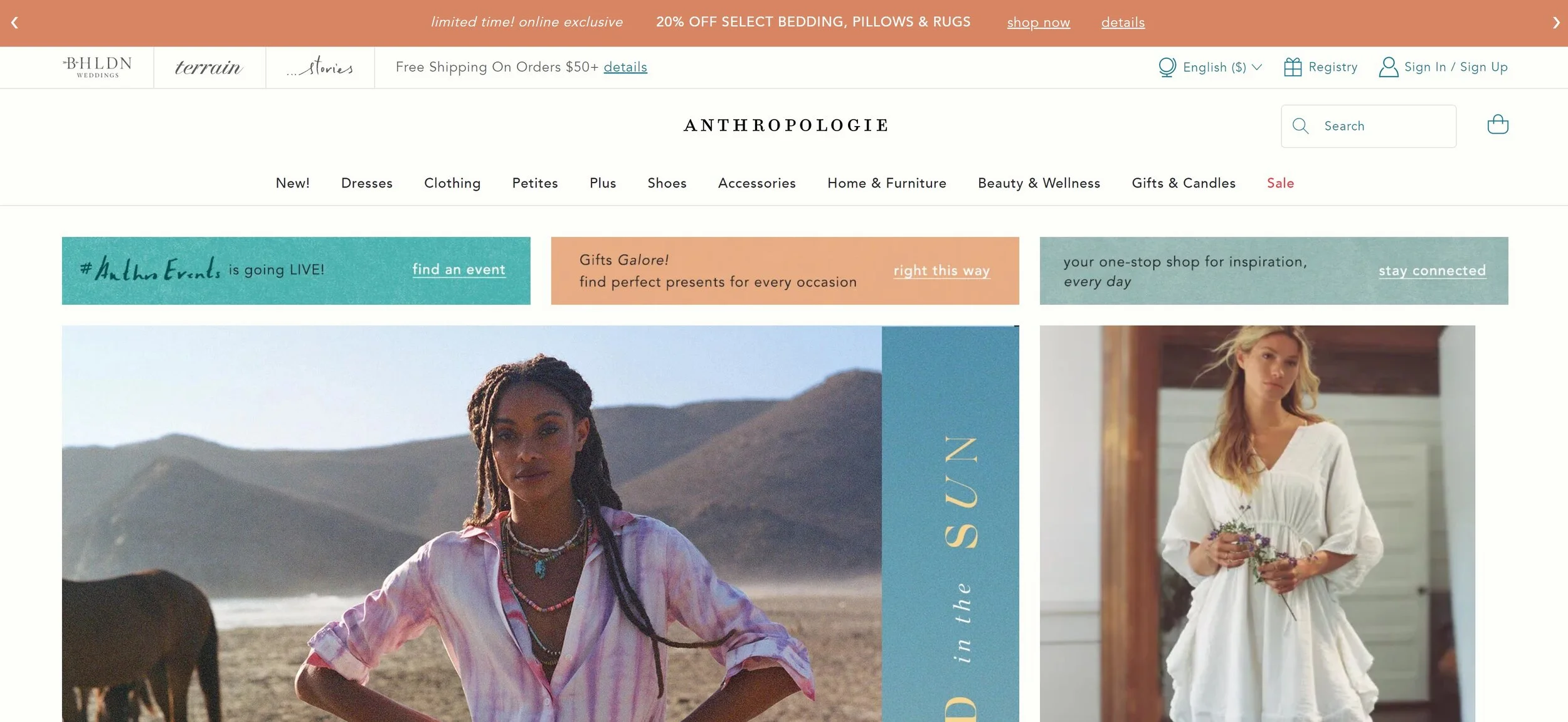
2. Highlight Your Best Selling Feature Above the Fold
Just like how the save icon still looks like a floppy disk even though you’ve got to be of a certain age 🙋♀️ to even have ever used one of those in real life, the phrase “above the fold” is a hangover from newspaper lingo. It just refers to the content that you see before you unfold the paper. In web speak, this same phrase is used to mean what’s seen without needing to scroll down.
It’s important to lead with your best content because it’s what’s going to set the tone for the rest of the experience and make it crystal clear what you’re most excited to share with your visitors. Strong intro content is also important because a common reason for high bounce rates is visitors feeling like there’s a mismatch between what they searched for and what they’re seeing when they first land on your site.
I always think of Apple as doing a great job at this. Right away you see their best-selling product (the one you’re probably there to check out anyway) and get a sense of the brand’s minimalist aesthetic.

3. Include Links to Your Product Categories
Yes, you already linked to them all in your footer. Link to them again. The goal is to make it as easy as possible for people to be able to discover the perfect product for them. Even if this is included a few sections down your home page, it’s just such a helpful way to get people moving around your site.
Showing thumbnails of all your categories can also help people who thought they only knew you for X also learn that you sell Y. I think of Olly’s site as one that does this well. Right there on their homepage, it’s easy to see that they sell more than just gummy vitamins. A newbie to their brand is likely to be intrigued by products specifically made for sleep, immunity, or beauty and click through to learn more.

4. Showcase Best Sellers, New Products, or Featured Products
You’re running an eCommerce site - show people your products!! I mean, it’s a given, right? (You’d be surprised.) If you have only a few products to choose from I say go for it and just include them all right there on your homepage! But for shops with larger inventories, using tags to indicate which products are new or most popular can be super powerful. This is because people in general hate making decisions and easily get overwhelmed when presented with too much information. (Take my word for it or learn more on this phenomenon in this post: Selling Psychology: Why Less is More in 3 Simple Steps.)
The Spice House is one of my personal favorite shops because I love to cook! So I’m always browsing around there to find some inspiration or discover a new spice blend. I love that they include links to their best sellers right on their homepage because they offer so much that this can help people know what other people have already tried and loved. I may not have thought to try one of the custom blends they highlight if I was to just see them in the full shop all mixed in with everything else but seeing that they’re so beloved made me check them out! (And for the record, that garlic pepper butcher’s rub is 👩🍳💋.)

5. Include Some Reviews or Social Proof
A “best sellers” section like above can definitely give people a dose of confidence but when it comes down to it you can’t beat hearing it directly from other customers. I think it’s smart of a company like Purple to include reviews because they are still a relative newcomer to the market and people may be leery of buying a mattress that comes in a box delivered to your door!
If you’re also a smaller or newer business, you should definitely include a sampling of reviews or testimonials from your customers as some social proof that you’re as awesome as you say you are.

6. Include Links to Other Resources
Once you’ve led with your best info, highlighted some of your best products and shop categories, and showed people some social proof, it’s a great time to give some links to helpful info that answers questions people may have had crop up.
A company that does this well is modern+chic. Near the bottom of their home page, they have a help section that might help seal the deal if a new customer was browsing their site. In this section, you can learn that they are a woman-owned business with great reviews and that they offer fast shipping from the USA. It lets you know at a glance who you’re doing business with and that you can feel great shopping from them!

7. Include a Sign-Up Form
You should always be working on building your email list, it’s one of your best business assets! I like the opt-ins on Artifact Uprising’s site because they are simple, minimal, and clean. They’ve chosen to include both a pop-up and a simple form at the bottom of their site. It’s up to you to decide what is best for your demographic. Sure, some people may only sign up for your list to get that discount code you promised but if you follow up with valuable content there’s a big chance they’ll stick around and turn into lifelong, repeat customers!

8. Save All Your Other Links for The Footer
I told you in #1 that I wasn’t going to leave links to all your secondary or supporting content without a home and they have a great one - right in the footer of your site. This is a great place to include info about shipping, your return policies, FAQs, and your contact info because it will be visible at the bottom of every page of your site.
A company that does this well is Crumbl Cookies, which I may or may not order from on a regular basis 🍪 Their header has two options: Find a Crumbl and Order Now. But their footer is where you can go to get nutritional info (lol), find out about catering, learn about the company history, learn about franchising options and so much more. They keep the header simple because they know that the majority of people just want to find or eat cookies! Everything else is still there, conveniently corralled at the bottom of every page.
Bottom Line
An impressive eCommerce homepage doesn’t have to be complicated, even though it’s arguably the most important page of your site. Beyond the advice above, I would just say that it’s important to put yourself in your customer’s shoes when thinking about this content. Think of what they need to know first, second, third, and so on. Make it easy to understand what you do and discover new products that they can’t leave your site without.

How to Pick The Right Squarespace Template for Your eCommerce Site
As a jumping-off point, templates can help you get to launch day faster and cheaper but how do you know what to look for in a template design? How can you make sure you pick the right one for your eCommerce site and avoid some common template traps?
In the olden days, every website was hand-coded from scratch. All the elements were built (and rebuilt) every single time. This made web design take a loooooong time (sometimes many months or years) and cost aloooooot of money. That’s ok. You’ve got to walk before you can run.
Now, all modern websites are built off a starting theme or, in the case of Squarespace, a “template.” A template is just a rough framework or layout that’s used as a jumping-off point so that you don’t have to start from scratch on your web design. After all, every website has 90% of the same elements: a home page, a header with navigation links, a footer with more calls-to-action, a shop page, cart, and checkout, etc. so why spend time and money reinventing the wheel?
Common Template Traps
When it comes to choosing a website template here are some of the most common traps I see people fall into:
They think all the templates are “pretty” but can’t pick the right one because they don’t have a clearly defined idea of their own brand or target audience.
They can’t decide between templates because they obsess over finding the “perfect” one or nitpick slight differences between templates.
They assume that their finished site will look exactly like the template it was based on and can’t find one that they think will work.
We’re going to help you avoid falling into any of these! First, by learning what three areas to focus on when reviewing a template!
Template Features That Matter
Picking the right template does require you to kind of see the forest through the trees and depending on the template’s design this can be easier said than done. However, focusing on these three areas should help you on your quest:
Home Page Layout - Your homepage is your chance to make a great first impression with your customers or clients. The right template for you should have room to feature the elements that you want “above the fold” or before you need to scroll down. You should also think about what you’re selling when looking at a home page layout. Do you need to be able to list the top three features or benefits? Do you only have a single product shop? Do you want to be able to link out to different shop categories? Look for templates that have home page layouts that include areas for those things. Keep in mind that the content itself doesn’t have to be an exact match to be a good fit; a template with a home page gallery could just as easily use that area to feature shop products. After all, a shop is really just an interactive gallery!
General Style - Strong emphasis on the word GENERAL. Don’t worry about the specific colors or fonts a template uses because those elements are easy to update to suit your brand. So what you’re looking for is a little more esoteric: the general look/feel or “mood” of the template. Does it have layouts that are fun, playful, and a little quirky? Or is it a little more serious, conservative, and traditional? Which feels right for your brand? Again, not worrying about whether the template uses the same colors or fonts you use but more whether it makes you feel the same way you want your customers to feel. Keeping the focus on your target demographic also takes away the urge to focus on your own personal likes and dislikes.
General Navigation Areas - Just like the above, you don’t need to worry about finding an exact match when it comes to the navigation areas on a template but it’s helpful to find something that’s as close as possible to what you’re looking for. For example, if you like the look of a logo centered above links to shop categories a great template for you might already have that setup. Don’t just look at the main (top) navigation, either! For lots of sites, the links that all appear at the bottom of every page are just as important.
Example: How to Check Out a Template
To give you a real-life example of putting this into practice, check out the two screenshots below. The one on the left is Exurban by GoLive. At first glance, it may be hard to see past the fact that the demo content is set up for an interior design company. Or that they offer services if that’s not something you do. Or that there’s a lot of beige if that’s not your color :)
But when I’m checking out a template, I do my best to ignore all those things and try to imagine it in a grayscale, pared-down version like the mockup I made based on this template on the right. I’m looking for places to plug in the content I know I’ll have to work with and in this template, I see spaces for promotional content, a shop, featured products, and a newsletter sign-up form, among other things. I see that when I look at just the layout - ignoring everything else - that this is a really clean design that has room for all the things a great home page typically needs. If I was looking for a modern design that included simple CTAs I think this template would be a great fit!
What the template looks like:
What You Should See:
Free or Paid?
Alright, so you’re sold on templates and know what to look for in one. But there are so many to pick from! One of the reasons Squarespace is so awesome is that even the free template designs are all pretty great but they’re not your only option.
The good news is that no matter what template you choose, you’ll have all the same features and functionalities available to you. This is an improvement over both Shopify and older versions of Squarespace where choosing a template also means you need to pay attention to what each template allows you to do because some come with major limitations that you’ll be stuck with! So no worries on that front -- you can make pretty much anything happen on any page of your Squarespace website.
With this in mind, I think it’s most important to use the criteria above in selecting a template versus whether it is free or paid. Even if you go with a paid template, you’re looking at spending <$500 which is a steal compared to the cost of a fully custom web design.
Free Templates - You can’t really go wrong with any of the free templates offered by Squarespace and they are a great choice if you feel comfortable learning how to customize and style your site on your own as you go. That being said, you may need to allot time to work on building out the interior pages of your site which tend to be less “styled” and filled with lots of dummy content on Squarespace. Also, if you’re not comfortable being super hands-on and taking care of everything yourself, it may mean that you end up paying a web designer or developer which is a cost you may not have had with a paid template that is more finished from the start.
Paid Templates - If you’re looking for something more complete from the get go and/or are looking to cut down development time and costs, try a paid template from a trusted source. This can be a great compromise between a fully unique design and a generic template and get you to launch day quickly! Paid templates typically come with very thorough instructional videos or are completely set up for you. This means that there’s very little learning or no learning curve required at all. Just add your content and brand elements and you’re good to go. Another benefit to a paid template is that even though they are super affordable a lot of people aren’t willing to pay for them ¯\_(ツ)_/¯ which means that there are tons of sites based on the free Squarespace templates and way less based on the paid ones. If you’re concerned about your finished site looking too much like everyone else's, this is definitely something worth considering!
Best Squarespace Templates for eCommerce
Here are some options for your consideration:
The Best eCommerce Templates for Squarespace which has links to some of my favorite free and paid templates!
More Great Squarespace eCommerce Templates - in case you didn’t find what you were looking for in the first post! :)
Bottom Line
It’s important that you remember that just because a template is the starting point that it does not mean that your finished site will - or should! - look exactly like that template at all! Templates are great because they get the ball rolling but if you don’t put the time and effort into customizing the copy and photos (or maybe zhuzhing things up with a little custom CSS) your site isn’t going to feel like yours.
All this said, there are tons of options available and different routes you can take when it comes to picking a website template to start from. Remember that templates are a way to cut down on both the time and money required to start a website. As a jumping-off point, they can help you get to launch day faster and cheaper which means you can start selling fast while your competitors are busy reinventing the wheel.

Kristine Neil
Fractional Web Partner
I'm Kristine Neil - a communications strategist who has spent 20+ years designing websites, first running a full-scale design and marketing agency, and now leading my own studio. I've been the creative director managing the work, the coder quietly fixing what others couldn't, and the strategist in the room asking why before how. Somewhere between the MBA and the other degrees, I decided web design was just one tool in a much bigger toolbox - the real work is figuring out what you're trying to say, who needs to hear it, and what's getting in the way. A website is just where all of that comes to life.
I build on Squarespace, and after years deep in the platform I know how far it can go and when to push past its limits. These days, I'm especially drawn to working as a fractional partner - getting to know an organization over time and helping with whatever moves them forward, whether that's a full redesign, an ongoing hand with content and strategy, or just being the person who knows their site best. I write here about eCommerce, web strategy, and making the complex feel a little more human.