

In defense of the knob.
I had to rent a car recently, one of those with basically no buttons or knobs anywhere. Everything lived in a touch screen. There was no way to turn the volume up while zooming down the freeway without looking at a screen, no tactile knob to crank the AC, no button to tell it I wanted the radio without swiping through three menus while dodging traffic. It was horrible and I hated it.
I don't know who decided that every interface in a car should be touch-based, but here's the thing about a physical knob or a toggle: you can build muscle memory around it. You can operate it safely while also operating a moving vehicle. There's feedback - a click, a resistance, a little bump under your thumb - that tells you the thing you meant to do got done. You can feel it. A touch screen can't come close to replicating that, especially not safely at (or above?) the speed limit.
Anyways, somewhere around mile forty of white-knuckling that touch screen, it hit me: we're doing the exact same thing to the web right now. We've decided, collectively and kind of suddenly, that all friction is the enemy. That the ideal interface is no interface at all - just a blank box where you type what you want and it appears. And look, sometimes that's magic. But we've badly overcorrected, because sometimes friction is information.
Now, you might be thinking it's great that I design websites and not cars, which, fair. But sit down and buckle up, because my obsession with the analog doesn't stop at vehicle design. Let me introduce you to my love of a digital knob, button, or toggle.
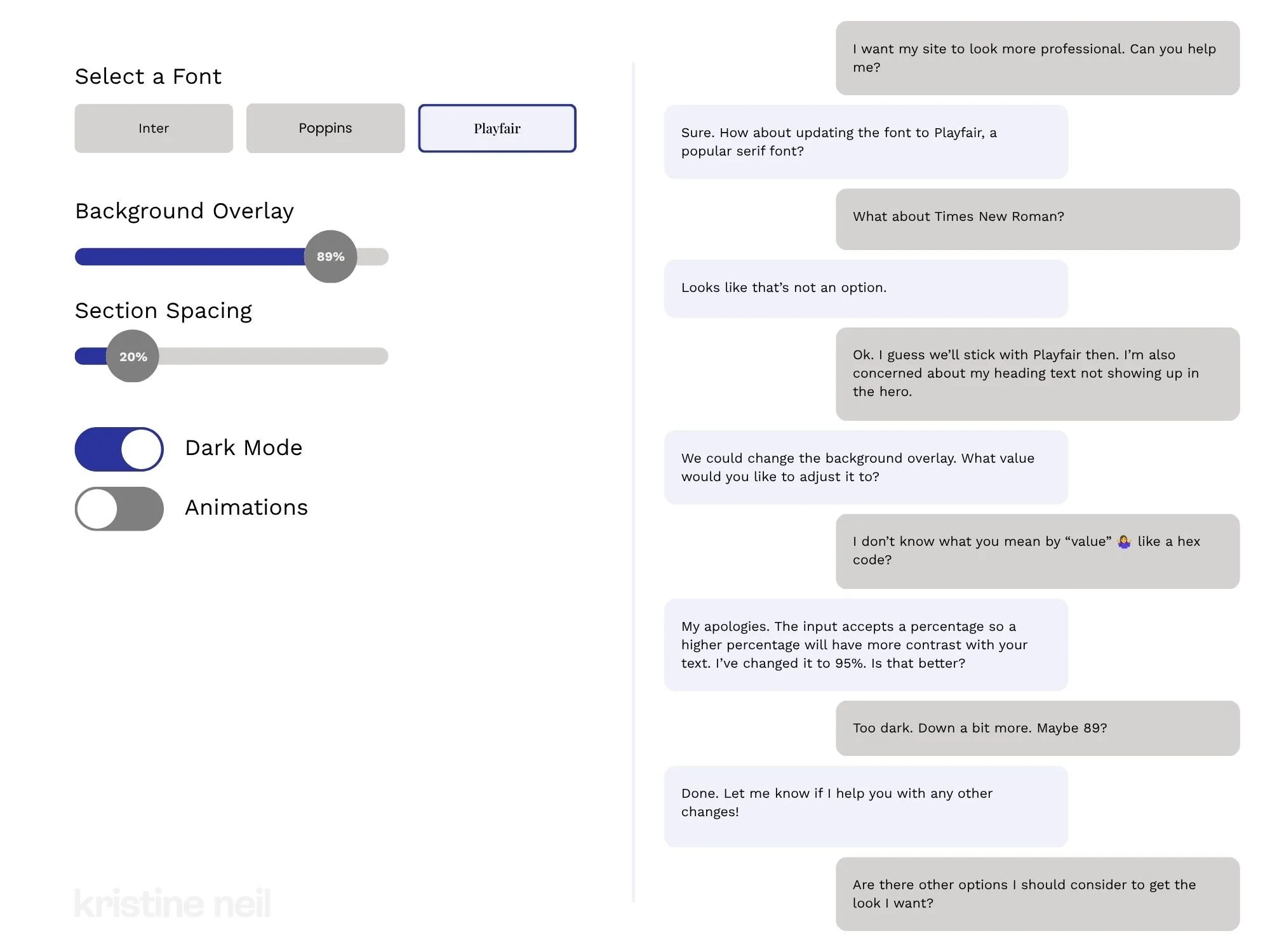
On the left, all options are surfaced and clear. On the right, well, let’s hope you know what you’re asking for.
Take something small and simple, like changing a few settings on a website. On a real dashboard, every option is sitting there in front of you. You pick a font by looking at it. You drag a slider until it looks right. You flip a toggle and watch the thing change. You didn't have to know the name of anything. You didn't have to know the font was even an option - you just saw it and grabbed it. A few seconds and you're done.
Now do that same thing in a chat window. Suddenly none of it is visible. You have to already know what you want to change, what it's called, and roughly what value you're after - and then describe all of that clearly enough for something on the other end to act on it. You wanted to nudge the overlay a little darker and now you're being asked for "a value" and you're sitting there going... a hex code? A percentage? What are my options? You can't rule things in or out because you can't see anything to rule out.
And this is the part people miss. Because the chat still has friction - not from the assistant being dumb, but from the medium itself. A dashboard lets you work by seeing and doing. Chat makes you work by knowing and describing. And describing a feeling or even a thought or idea is genuinely hard, way harder than dragging a slider until your eyes go "there, stop." You cannot choose from options you cannot see. You simply don't know what you don't know.
This is the whole trick of a good control, digital or otherwise. It doesn't just do the thing. It shows you the thing exists, shows you the range, shows you where you are in that range, and gives you something to push against. A good dashboard tells you at a glance that the fan's already on high and the station's set to 94.7 - you know your whole situation before you touch anything. The blank chat box does none of that. It doesn't tell you the fan is on high because it doesn't even tell you there is a fan.
I'm looking forward to seeing more people skip the trend of everything needing a chat bot, a blinking cursor in a blank box. Because what we need instead is clearer information. And sometimes that's best done with a toggle, a button, a dropdown, a slider. I've spent enough time jabbing at a touch screen at freeway speeds to know some things are just better with a knob.
Additional read I found a couple months after writing the above: Nobody wants a blank page. Nobody touches a perfect one. “The empty field reads as a demand rather than an invitation.”
