

A 410-acre park, 3.5 million visitors, and a marketing team of 1.5.
Summary
A grant-funded rebuild of explorewashingtonpark.org: WordPress to Squarespace 7.1, accessibility-first, with real-time transit and parking data - built so a small team can run it for years.
Timeline: Oct 2025 – Aug 2026 launch, three phases
Platform: Squarespace 7.1
Standard met: WCAG 2.1 Level AA
Funding: Travel Oregon grant, with additional investment from EWP
Integrations: Swiftly, Parking Logix, TriMet, Eventually, live weather
Scale: 3.5M annual visitors, 410 acres, 16 attraction and amenity pages
Cost to the organization: 51% less than the previous site and maintenance process, per EWP
The Short Version
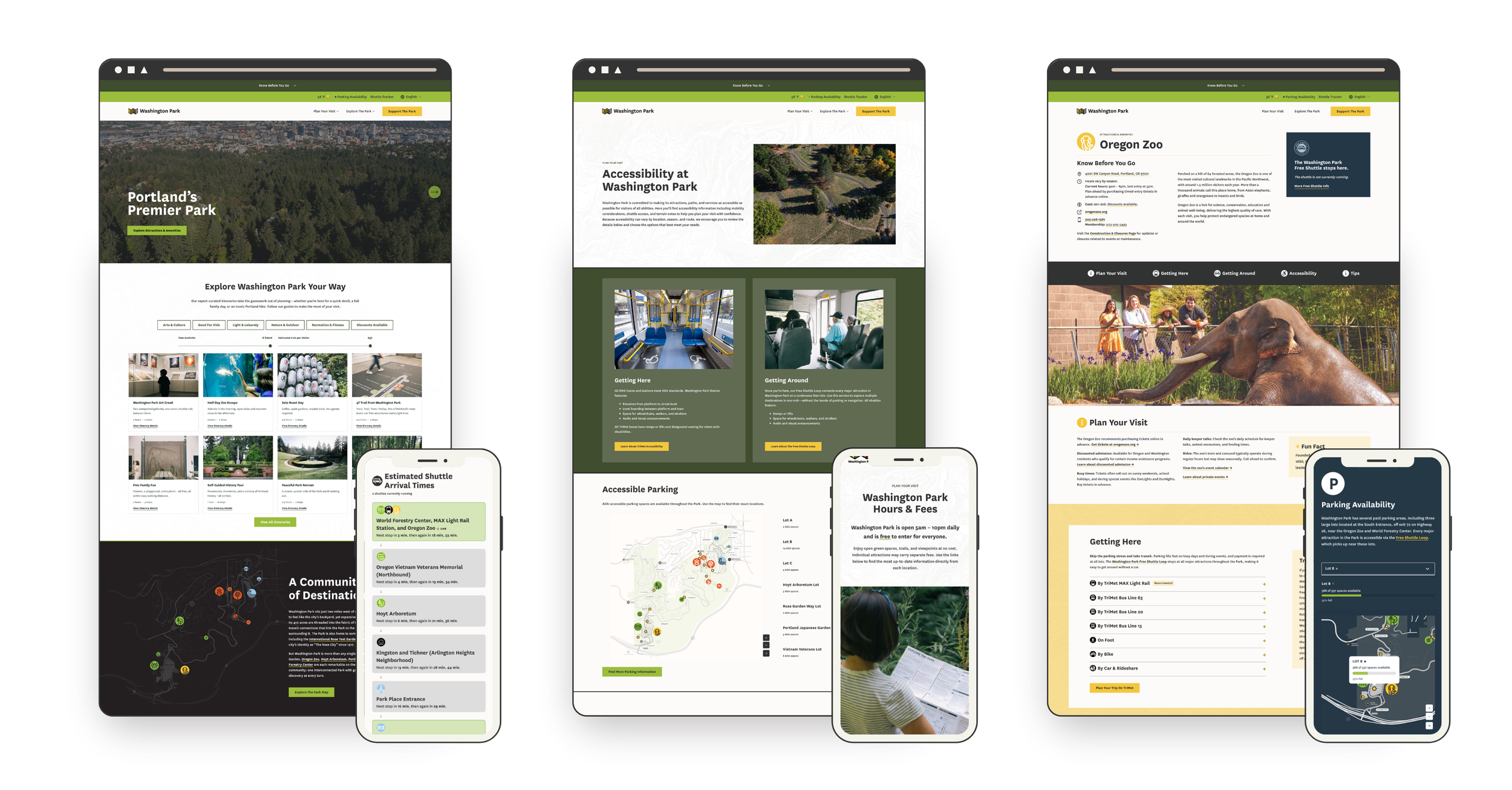
Explore Washington Park manages transportation and visitor services for Portland's most-visited park - home to the Oregon Zoo, Portland Japanese Garden, Hoyt Arboretum, the International Rose Test Garden, and the World Forestry Center Discovery Museum. A Travel Oregon grant helped fund a new site with one job: make it easier to get to the Park without a car and easier to plan your day once you're there. The constraint was that a marketing team of 1.5 people has to own it after handoff. So I built it on Squarespace, with custom development reserved for the handful of things that needed it - live shuttle tracking, live parking availability monitoring, interactive maps, and a feed of expert-curated itineraries with something for everyone - and launched it on schedule at WCAG 2.1 Level AA.
“The final product is better than we could have dreamed: a real-time resource for visitors of all backgrounds and abilities that’s easily managed by Explore Washington Park’s in-house marketing team and costs the organization 51% less than our previous website and maintenance process.”
This was never just a website project
It was Phase One of EWP's ten-year Transportation Access Plan, with a target of moving more of the Park's visitors onto transit and the Park's shuttle loop, a free service that runs daily and stops at every major attraction in the park. Nearly six in ten peak-season visitors travel more than 50 miles to Washington Park, and most of them decide how they're getting to the Park before they leave home. The old site gave them almost nothing to decide with - so they drove, and found out about parking when they were already in it. The goal was to put transit, the shuttle, and live parking data in front of people at the moment that decision gets made, and move the Park's transit share toward the plan's 20% target.
The starting point was an aging WordPress site the internal team couldn't confidently update, which meant every small change was a ticket... and an invoice. The accountability was public grant money, a board, and required reporting intervals with success measures we needed to hit. And the constraint that shaped every technical decision: after handoff, the team has exactly 1.5 people to devote to managing the site on a day-to-day basis.
Doesn't this need a custom build?
A site built against four separate APIs - Swiftly for the shuttle, Parking Logix for parking, TriMet for transit, and a live weather feed - plus custom interactive tools and a WCAG 2.1 Level AA accessibility requirement looks like it needs a custom CMS or a headless build. For a nonprofit, that assumption is expensive both up front and in the long run: a custom build that eats most of the grant before anything launches, a developer on retainer, a stack nobody on staff understands, maintenance debt that outlives the grant.
The actual tradeoff was simpler. Squarespace handles the roughly 80% that staff touch every day - pages, events, content, imagery. Custom development was reserved for the other 20% that needed it, built as isolated, documented components that don't break when someone edits a page. The custom pieces sit on top of native Squarespace features - list sections, portfolios - so staff edit the content underneath the same way they'd edit any other page. This means staff can make updates now and in the future without a developer.
The work nobody sees
The other half of the answer came before the platform mattered at all. Because as tempting as it is to start designing right away, projects like this succeed because the content and structure are solid and strategic. Meghan and I spent the first phase of the project on copy before anything was really designed. Doing this hard content work up front, in a series of Google docs and sheets, may sound like a lot but it's also the reason why the site works. We thought about whether calling a trail "easy" is a judgment or a fact (maybe my easy trail is your hard one). Whether the tone should draw conclusions or give people the information to draw their own. How someone without the budget for a Zoo ticket finds out about free and reduced-cost options clearly and without judgment. What a parent needs to see when they're at the playground with tired kids and it's starting to rain.
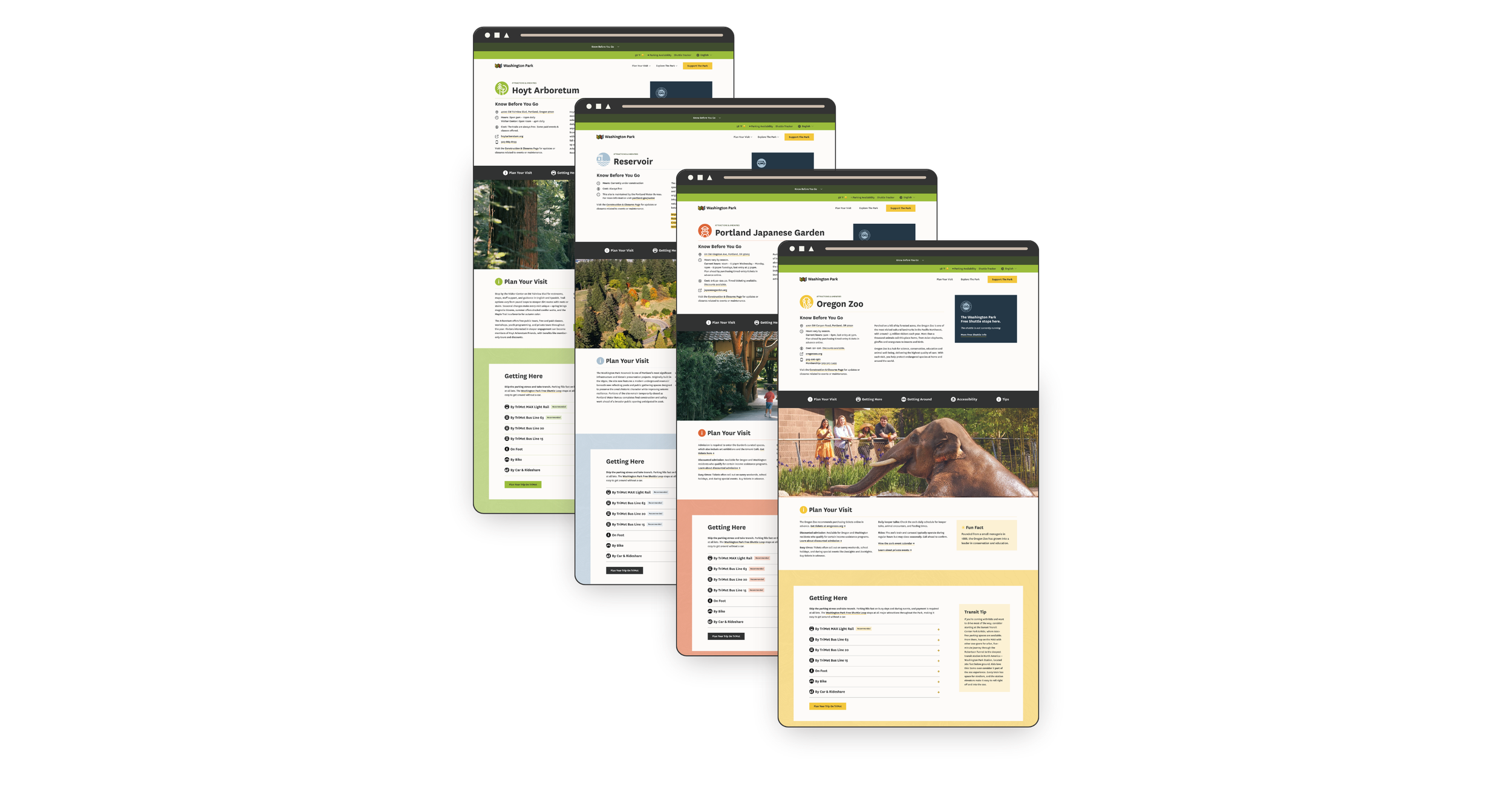
On top of the words themselves, there were 16 attraction and amenity pages, each with its own hours, fees, routes, shuttle stops, and tips - and all of it needed to be mapped and standardized so the site talks about these things the same way on every page, and every page follows the same structure.
A website is wayfinding, so the site borrows from the Park's real signage: a palette that matches the printed maps and iconography that tells people what to expect before they've read a word. On a site like this, that means the answer to whatever someone is nervous about sits in the same place on every page, so nobody has to hunt for it. Once a visitor learns how one page works, they don't have to start over on the next one. (Hint: this predictability is also what makes such a large website maintainable by a small team.)
What we built
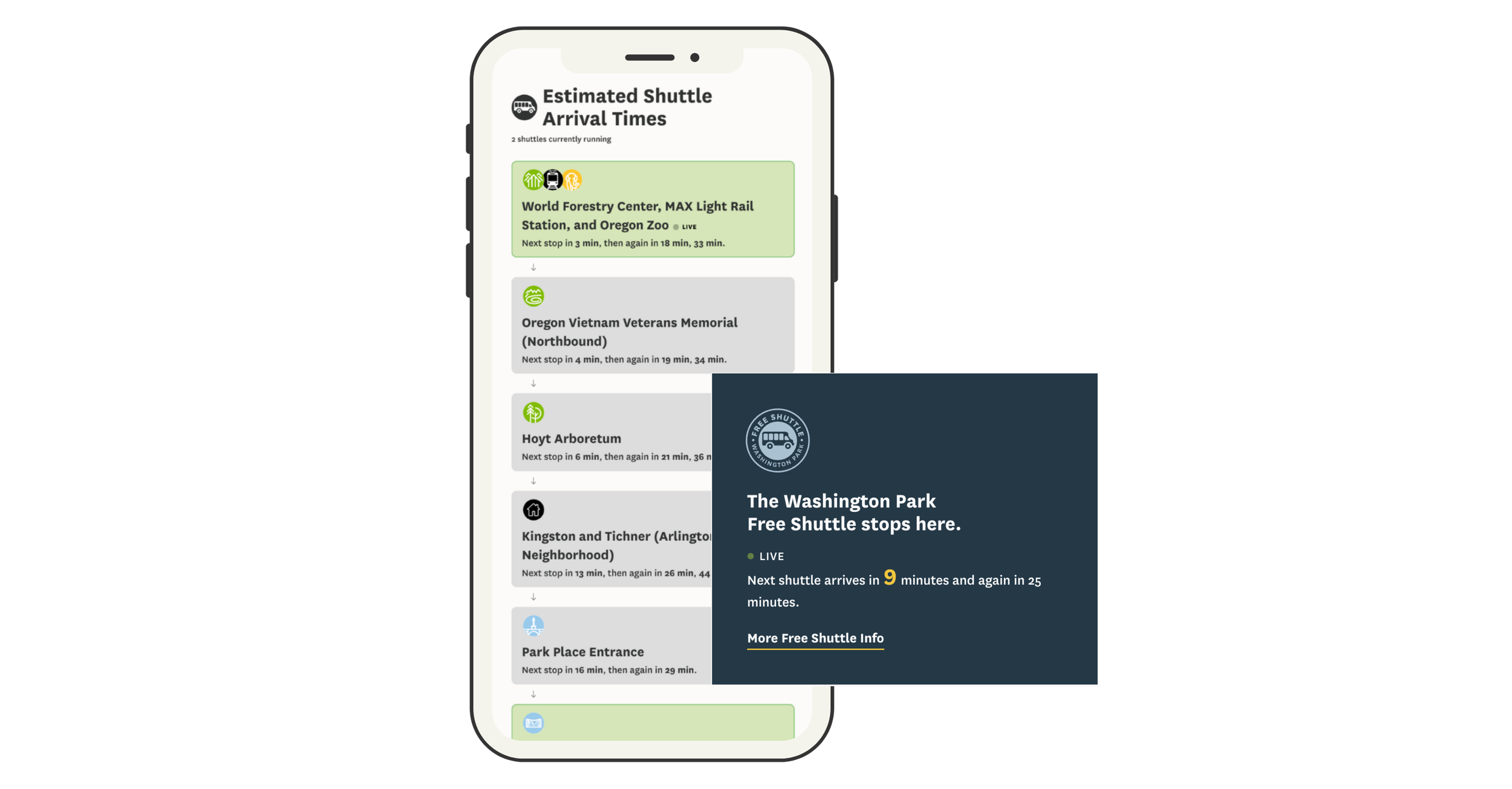
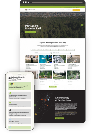
Live shuttle tracker - The old site had a tracker, but it wasn't mobile-friendly, which is a real problem when everyone using it is standing in the Park on their phone. Swiftly data now shows active shuttles, upcoming stops, and arrival estimates refreshing every 30 seconds.
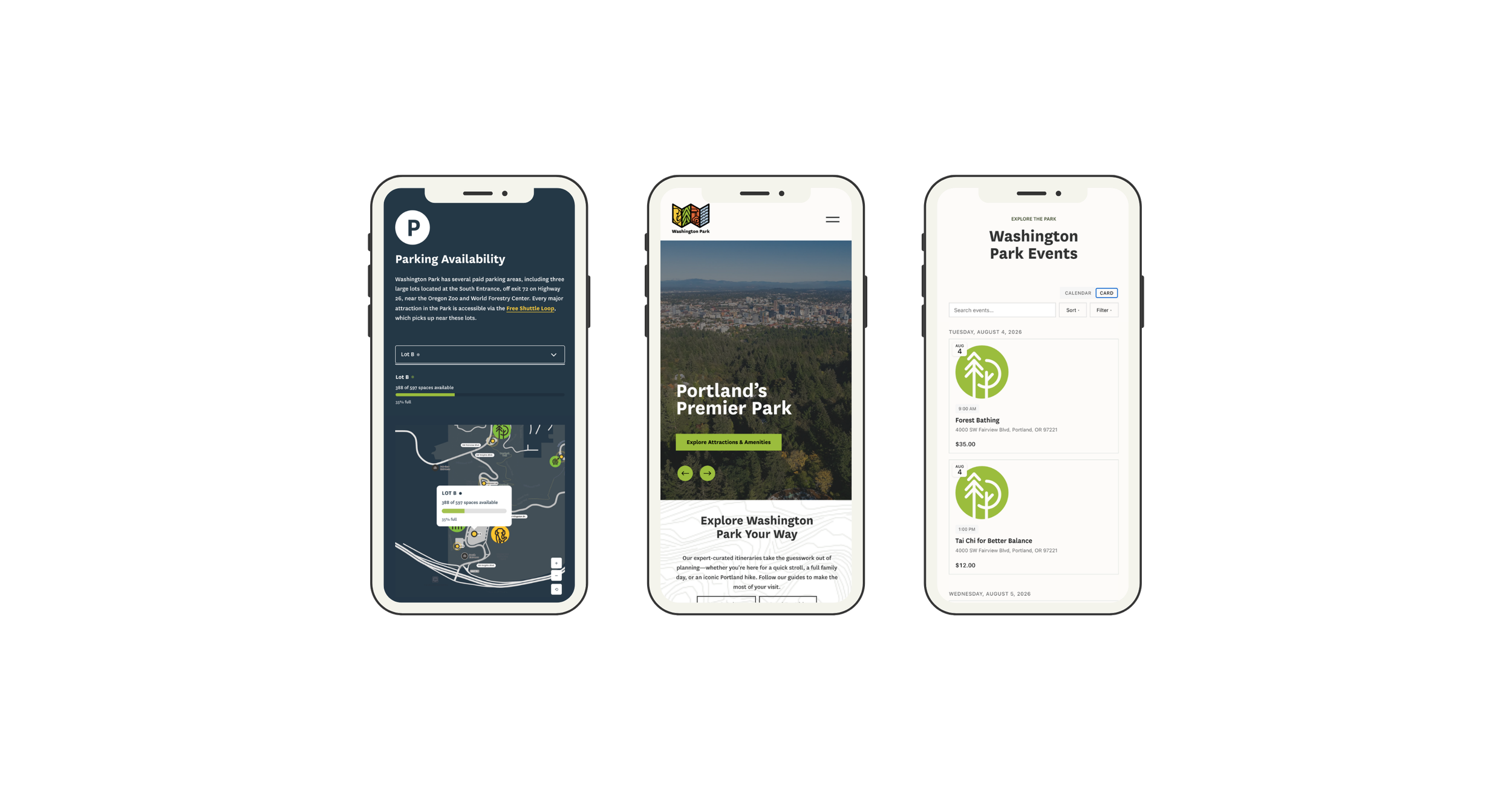
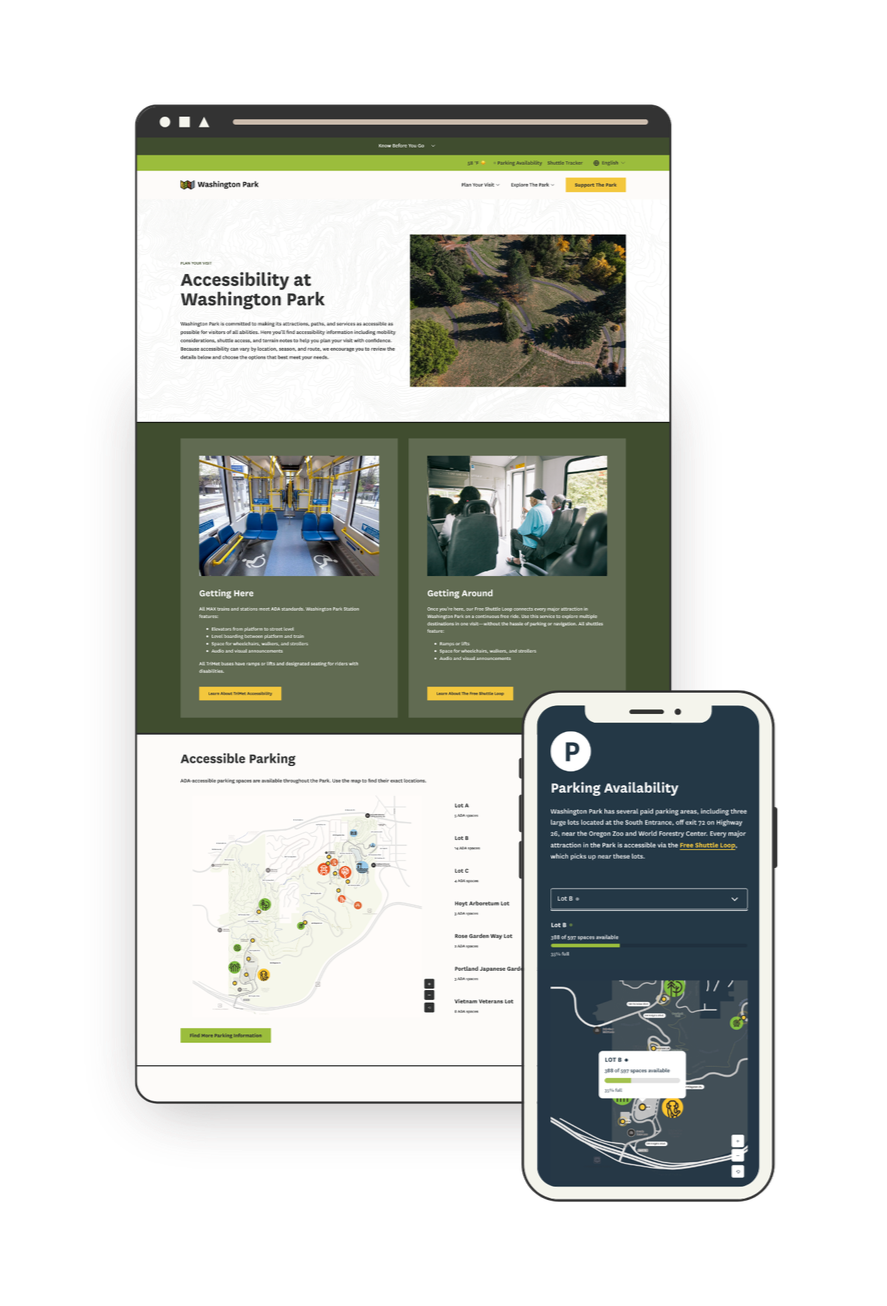
Real-time parking availability - Open spaces for the three major lots from Parking Logix, rendered in EWP's brand on a custom interactive map rather than as a bolted-on widget.
Interactive maps - It's easy to get lost in 410 acres, so giving visitors a sense of where things actually are mattered as much as telling them what's there. Transit stops, ADA parking, rideshare pickup, and car-free entrances, with every marker connected to a location list. Bonus: most map interfaces are notoriously inaccessible, but this custom solution works for all users, including those navigating by keyboard or screen reader.
Itinerary Explorer - EWP's team had already written some great itineraries - things like a Self-Guided History Tour, Cozy Car-Free Exploring, and (my favorite) Dog's Day Out - but they were buried in old blog posts where nobody found them. Now they live in one place, filtered by category, available time, and estimated cost, because "I have 3 hours and I don't want to hike in the rain" is the actual question people are asking. They're built to be fun and shareable, which matters: this is content EWP can now promote instead of just host. Designed so EWP staff can publish new itineraries without a developer.
Transit first - The "How to Get Here" pages don't just list transit as an option, they recommend it above all others: the MAX or a bus is the easy, safe way in, with no traffic and no parking to think about. Every attraction page carries the same message, with the recommended route highlighted and a direct link to TriMet's trip planner.
Events calendar - Each major attraction runs its own event calendar, so this is the one place a visitor can see what's happening across the whole Park at once. When this project started, an events calendar at this level wasn't possible on Squarespace. It is now because of Eventually, an events platform Kelsey Gilbert-Kreiling and Zack Gilbert were building at the same time - I was its first tester, and EWP was built alongside it. Some of what EWP needed found its way into the product along the way, and this site got a calendar nothing off the shelf could match.
Accessibility information - Paved trail information, places to stop for a rest, available accommodations, and what to expect at each attraction, treated as primary content rather than a compliance page. This is the information that decides whether someone visits at all, so it lives where people plan, not hidden in a footnote.
“Having spent the last 20 years working with Squarespace websites, I have rarely been as bowled over as I was by the Washington Park website. Kristine has skillfully pulled together many complex elements and turned them into an incredibly user focused and inclusive website. I honestly couldn’t think of any ways this could be better. This website is truly a model for other venues like this.”
Accessibility as a discipline, not a badge
Accessibility shaped design decisions from the first wireframe, not the final QA pass. When the build was done, an independent consultant, Nicole Nault, audited the site, identified what still needed remediation, and ran user testing. I made the fixes, she verified them, and the site was certified WCAG 2.1 Level AA. The hardest parts were exactly where most "accessible" sites fall short. Heading hierarchy on native elements that Squarespace won't let you control. Keyboard navigation through custom components like the maps and the shuttle tracker, which is why having a developer who structures things properly matters - code thrown together to "just work" doesn't work for a screen reader. And color: I built area-specific color themes from EWP's brand palette so the site could carry the Park's visual identity while keeping text almost entirely black on white.
“Kristine asked smart questions, welcomed feedback, and was always willing to refine the work until we got it right.”
One Person to Call
A project like this has a lot of moving parts: a custom development partner, an accessibility consultant, three data providers with their own APIs, an events platform still in development, a client team, organization partners, and community stakeholders. My job was to take all of that off Meghan's plate, and to be someone she could trust to do it. I decided where I was most effective and when to tap in Will Myers, a key engineer on this project and a true collaborator rather than a subcontractor.
I kept vendors on schedule, timed the accessibility audit so the fixes landed before launch, and reported into the grant timeline - without anyone at EWP having to chase a single thread. And nearly every specialist on this project was someone I'd worked with before, which is the difference between hiring strangers and working with people who already trust each other.
The team included:
Will Myers - software engineer
Nicole Nault - accessibility consultant
Kelsey Gilbert-Kreiling and Zack Gilbert - events calendar
Meg Sheeley - design
Christy Price - consulting
Lily Price - content migration
Results
Launched on schedule and within grant funding. WCAG 2.1 Level AA achieved. Covered by Oregon Business. And per EWP's marketing director, the new site and maintenance process costs the organization 51% less than what it replaced.
“The site’s focus on accessibility and inclusion makes planning a visit easier for everyone.”
The grant's accomplishment report is due in November 2026. Results on visitor growth, trip-planning tool usage, and transit awareness will be added here then.
