

Notes on building smarter websites for actual humans.
Software for a User of One™: Why I Built My Own Dubsado
After nine years with Dubsado, I built my own client management app in about eight days. It’s not for sale, and that’s the point.
Timeline: About 8 days of actual building, fit around client work. 3 days to a working core.
Users: One. Me.
Built with: Next.js, Postgres, Stripe, Google Workspace, Vercel, and Claude Code as my build partner
Replaces: a Dubsado subscription
For sale: No. Not now, not ever.
The short version
For almost nine years, Dubsado ran the business side of my design studio. Then it got a redesign, and I couldn't stand it. So I built my own.
I gave myself a month. I had the core rebuilt in three days, and all in, it took about 8 days of actual building, squeezed in around my regular client work, to get it where it is today. It's called Kristine Neil Studio (creative, I know), and it runs my whole client process, from the moment someone fills out the inquiry form on my website to the last payment hitting my bank account.
Most people know me as a Squarespace web designer, but I've been writing code and building things for a long time. What's new is putting that side of my work out there, because it's the kind of work I want to do more of. So I'm going to show you not just what I built, but why it works the way it does. That second part is the bit I actually care about.
How I got here
Last year, Dubsado launched version 3.0, and despite being a long-time user, I hated it. Everything I was used to had been made clunkier. Actions that should take one or two clicks suddenly took five, if I could find them at all. The whole look was off, too. It just felt... vibe coded.
I know updates sometimes just take getting used to, so I gave it my best effort. I never used all of Dubsado's features, but I relied on it for the core of how I bring on clients. Leads came in through my contact form, and once we'd connected and agreed to work together, Dubsado was where I built the proposal, sent the contract and managed the payment installments. It could do more, but that's what I needed it for, and it held my client history going back to 2017.
The thing about a redesign is that it forces you to look around and ask whether things still work for you. When I did, I realized I was paying for a subscription full of features I didn't use, while still wishing it did a handful of things it didn't. The redesign just made that impossible to ignore.
I looked at other CRMs and tools that claim to do the same job, and none of them impressed me. Other alternatives meant stringing together a suite of third-party tools. Why do that when I could own the whole experience? So I set out to make my own.
I built it with Claude Code as my build partner. But AI doesn't know how a design studio should run. I do. Before any code existed, I distilled 15 years of running my own businesses into a written plan: how I actually work, what the app should do and, just as importantly, what it shouldn't. That's why it came together so fast.
Question: why are we all settling for software built for everyone else?
Here's the question I kept coming back to: in today's world, why are people settling for software that's built for many?
Every tool you pay for is a compromise. It has to work for the wedding photographer and the bookkeeper and the agency with twelve people. So you get feature request boards, public roadmaps, and features that get watered down until they're palatable to the most users possible. You get the stuff you don't need cluttering up the stuff you do.
I built this app with absolutely zero intention of ever adding other users. (I could. I won't.) It's not for sale. It's built exactly for how I think and how I work. There's no feature request board because I am the feature request board. When testing showed me that a whole layer of the app was just getting in my way, I tore it out. A company with a roadmap and a customer base can't make that change on a Friday afternoon. I could. It works exactly for me and no one else.
I call it Software for a User of One™, and it's not the first time I've done it. I built a gardening app for myself the same way. Not because gardening apps don't exist (there are literally thousands of them in the App Store), but because none of them looked and acted the exact way I wanted them to.
What my app does
My app covers the whole loop:
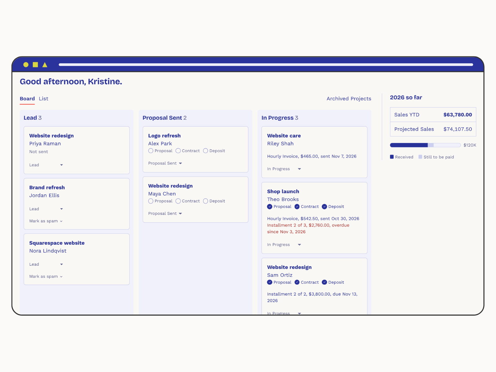
Inquiries become Leads automatically. The form on my website creates a Client and a Lead Project on its own. If someone I already know inquires again, it adds the new Project to their existing record instead of making a duplicate.
Proposals built from my own services and packages. I pick a Package and the Proposal is mostly written before I start.
Payments through Stripe, bank transfer first, with an optional card surcharge, deposits, installments, autopay and monthly retainers.
A real Ledger that records every payment, Stripe fee and surcharge on its own, so I stop reconciling against my bank by hand. (Dubsado never recorded the fees. It drove me nuts.)
My own MCP, so I can talk to all of this through Claude. More on that below, because it's the coolest part.
My design review, all of it. Every yellow sticky is a note on a real screen. Click to enlarge if you dare.
Why the screens look the way they do
This is where designing for one person gets interesting. A lot of the decisions below would be wrong for a product with ten thousand users. They're exactly right for me.
The Board tells me whose move it is. Dubsado's project statuses described the project. Mine describe who has the ball: Lead is my move, Proposal Sent is the client's, and when the proposal is accepted, the contract signed and the deposit paid, the project moves itself to In Progress.
No instructions on screens I use every day. During my design review, I went screen by screen with notes (in a Canva whiteboard, naturally, with arrows pointing at everything). One note came up over and over: take the instructions off. Home, Archive, Invoices, every overview page had a little line explaining what you were looking at, because that's what building with AI does: it explains everything. But explainer text is for strangers, and I'm not a stranger to my own app. Every one of those lines came out. Instead, I focused on building my User of One™ experience so that it didn't need explaining.
The app works where I can't see it. Most of the app's best work happens where I never see it. Every morning it sends whatever invoices are due, runs autopay and sends reminders. It knows not to send an overdue reminder while a client's bank payment is still clearing, because nothing says disorganized like chasing someone who already paid. If something goes wrong, it emails me. If nothing does, I never hear about it
Color tells me where to look. The goal was to take some of the mental load out of managing projects. The first version of the Project page had every section in the same light blue, so nothing stood out. Now every section sits on white by default. Only the section that needs me next gets the light blue: the Proposal while it's unsent, the Payment Schedule when something is due. Overdue gets red.
Color is one of the easiest ways to fast-track understanding, and it's something I knew to build in that AI, left to its own devices, would not. One button at the top answers "what should I do now?" and takes me to the place where that step happens, instead of trying to do it from the header.
I can't fiddle with fonts (on purpose). My biggest frustration in Dubsado was rebuilding every proposal: resetting fonts, reconnecting pieces, tinkering with styles every single time. I'd spend hours getting things to look just the way I wanted, and then obsessively test in an incognito window just to make sure. Sending proposals was such a time suck, especially given that's not time I'm paid for.
So my proposal editor has no styling controls at all. My logo, fonts and colors are set once in Settings and every Proposal, Contract, Invoice and email just looks like me. And instead of checking in incognito, the editor shows a live preview of exactly what my client will see. And all of it is styled to match kristineneil.com, so my clients see my colors and my fonts everywhere.
Emails that look like I wrote them, because I did. Every email the app sends to a client goes out through my own Google Workspace account. It looks like a normal Gmail message, ends with my real Gmail signature, and lands in my Sent folder. When a client replies, it shows up in the same conversation in my inbox. A sending service would have been easier to set up, but then my emails would come from a robot and live somewhere I never look.
And just as important, the things it doesn't do. Dubsado had dozens of features I never touched. They're gone. When I finished importing my clients from Dubsado, I deleted the import screen. When I stopped needing test data, I deleted the button that cleared it. Software for a User of One™ gets to shed things.
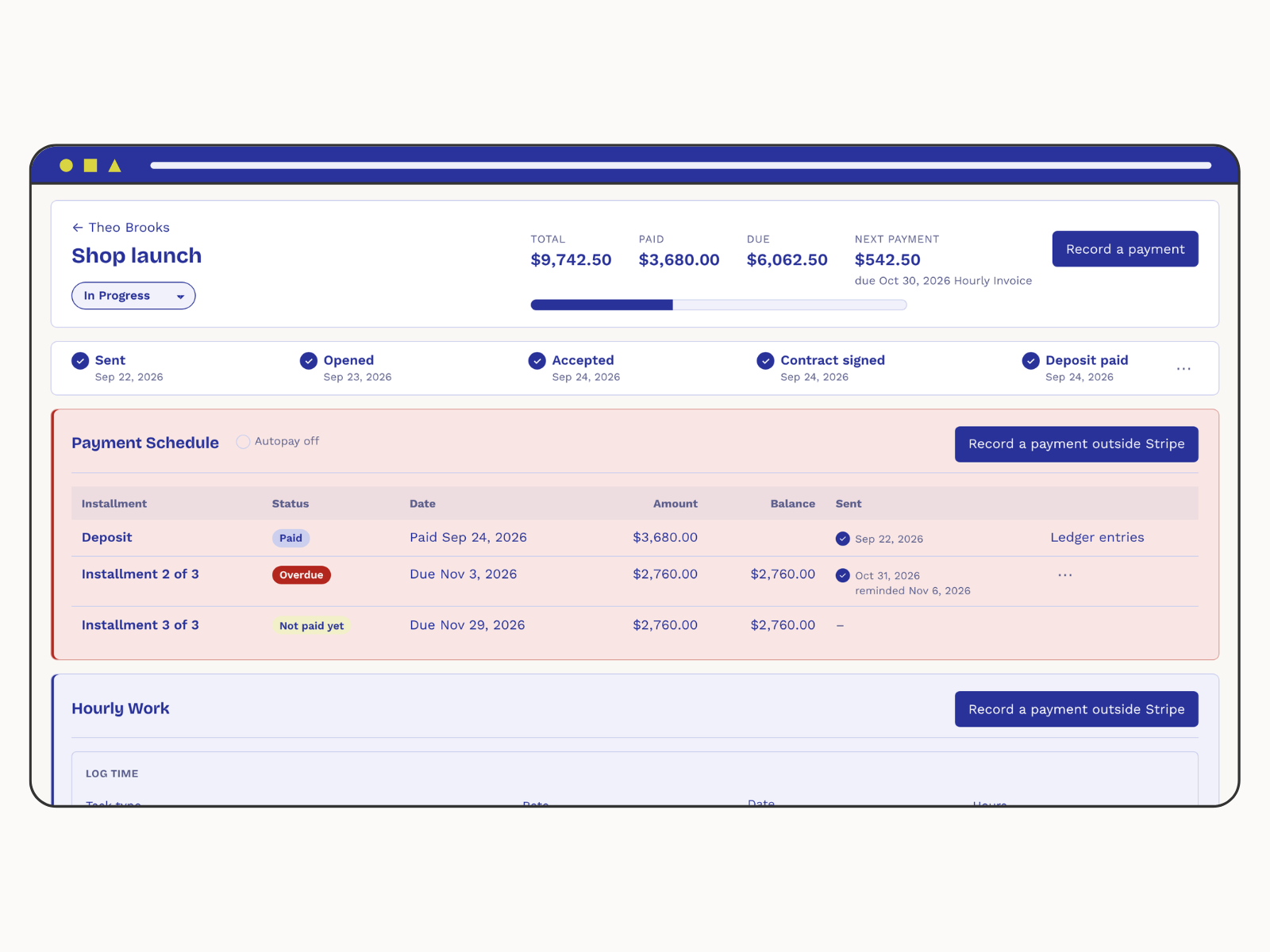
Color is one of the easiest ways to fast-track understanding, here I’m using it to some of the mental load out of managing projects.
Layers of security
This app holds my clients' names, contracts and payment history, so I took security as seriously as I would for any client. Probably more.
One login, ever. I sign in with a passkey (Face ID or Touch ID), with recovery codes stored in my password manager. There's no password to steal and no user management to get wrong, because there's no way to create a second account.
Clients never get accounts. They get links instead: unguessable, limited to one proposal or one invoice, set to expire, and revocable. A forwarded link can't expose anything else.
Card numbers never touch my app. Card payments happen on Stripe's own secure pages.
My email keys are encrypted, with the key kept outside the database. Even if someone got a copy of the database, they couldn't send email as me.
Backups I've actually tested. Every day, the app's database is backed up and then restored into an empty database to prove the backup actually works. (Until you've actually restored a backup, you don't really know you have one.) Those are kept for 35 days.
Then a second copy is encrypted and sent to a separate Backblaze account I own. I picked Backblaze over the alternatives for one reason: its keys can be set to add files and never delete them, so even if someone broke into everything else, they couldn't wipe my backups. The only key that can read those copies lives in my password manager. Not in GitHub, not in the app, not anywhere else.
Google, Stripe... and my own MCP!
Google handles my email. Stripe handles payments, and the app records every payment, fee, refund and dispute in the Ledger on its own. Any tool like this needs those.
The part I'm proudest of is that I built my own MCP.

An MCP is a way to plug an app into an AI assistant like Claude. Mine means I can open Claude on my phone and say "log 1.5 hours of design work on Maya's website project," or "how close am I to my sales goal this year?", or "draft a proposal for a site refresh from my usual package." Claude looks it up in my app, shows me exactly what it's about to save, and waits for my yes.
But I didn't give it the keys to everything. It has reasonable constraints on what it can and can't do:
It can look things up, log time, add ledger entries, start a Lead for an existing client, and draft proposals.
It can never send anything to a client, delete anything, or change anything once it's saved (except a proposal that's still a draft).
Everything it creates is tagged "Added through Claude", so if it ever gets something wrong, I can find it and fix it by hand.
My clients' privacy, especially around payments, is built into the app's rules, so it holds no matter what anyone types into a chat.
SaaS may be dead, but the interface isn't
So why share all of this? More people are building their own apps every day, and honestly, mine is nothing special. What matters is why I built it and how. And that puts me in the middle of a bigger conversation.
On one end are people building software to sell it. (Honestly, it's never been easier, which is exactly why it's such a bad idea.) On the other end are people who say it's not even worth building an app or designing an interface, even for your own Software for a User of One™, because you could just get the agent of your choice to remember and handle it all for you.
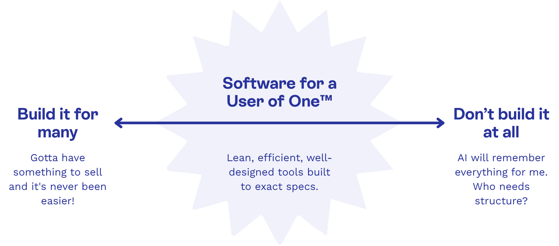
My answer lies in the middle. Build it, because building it is what makes it good. Designing the structure, working out how each piece of information relates to the next, deciding what every screen should and shouldn't do: that thinking is where the value is. Skip it, and even the smartest AI has nothing solid to work with.
The only reason my MCP works so well is that my app works so well without it. It has real databases. It has my own security. It's portable to anywhere I want to take it. It's owned by me. Claude is a very good way into the app. It is not the app.
If I'd built this as a super advanced Claude artifact, say, it would ultimately be at the whims of Anthropic. The ground could move out from under me at any time, and the app might start behaving differently. It would really be no different than Dubsado redesigning something I generally liked enough to keep, even if it was imperfect. My app has rules and structure and logic that I've carefully thought through, and they won't change unless I change them.
So to me, designing the interface, the database, the underlying structure, all of it is 1000% still necessary. It makes my work better than whipping up a series of zaps in Zapier that string other people's tools together, and better than an AI-native solution with no interface at all.
Built for one
I still don't know what to call what I'm doing now. "Web designer" is changing fast, and so is my work along with it. Developer? AI engineer? Designer who builds? Maybe it doesn't matter much. What I do know is how good it feels to have spent almost nine years bending my business around a tool built for everyone, and now open one every morning that fits me. That's Software for a User of One™.
Kristine Neil
Fractional Web Partner
I'm Kristine Neil - a communications strategist who has spent 20+ years designing websites, first running a full-scale design and marketing agency, and now leading my own studio. I've been the creative director managing the work, the coder quietly fixing what others couldn't, and the strategist in the room asking why before how. Somewhere between the MBA and the other degrees, I decided web design was just one tool in a much bigger toolbox - the real work is figuring out what you're trying to say, who needs to hear it, and what's getting in the way. A website is just where all of that comes to life.
I build on Squarespace, and after years deep in the platform I know how far it can go and when to push past its limits. These days, I'm especially drawn to working as a fractional partner - getting to know an organization over time and helping with whatever moves them forward, whether that's a full redesign, an ongoing hand with content and strategy, or just being the person who knows their site best. I write here about eCommerce, web strategy, and making the complex feel a little more human.